User Guide
|
RTView® EM User Guide |
|
Using the Monitor - Introduction RTView EM uses visual cues (such as color coding, graphic charts and sizing of shapes) to communicate the current state of all elements in your system. This section describes how to interpret EM displays, as well as display behavior and GUI functionality. EM comes with Solution Packages that you can optionally install (such as the GlassFish or Business Works Monitors). The optional Solution Packages are not described in this document. This section includes:
NOTE: It typically takes about 30 seconds after a server is started to appear in an RTView EM display. By default, data is collected every 15 seconds, and the display is refreshed 15 seconds after that.
To interpret EM displays it is essential to understand that which drives the structure of all EM displays--the Service Data Model. The Service Data Model also enables data aggregation and filtering in displays. For these reasons, we begin this section with the Fundamental Structure of Displays, followed by discussion of how to read specific display objects. This section includes: Fundamental Structure of Displays To interpret EM displays it is helpful to understand the Service Data Model. The Service Data Model, also referred to as the CMDB, is a database that forms the fundamental structure of all EM displays. The Service Data Model has a four level hierarchy which are, from the highest level (Owner) to the lowest level (Service):
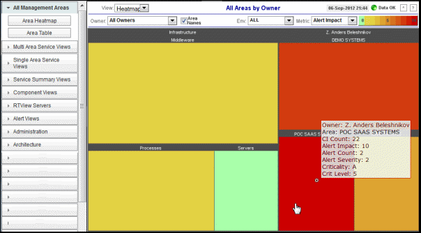
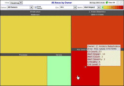
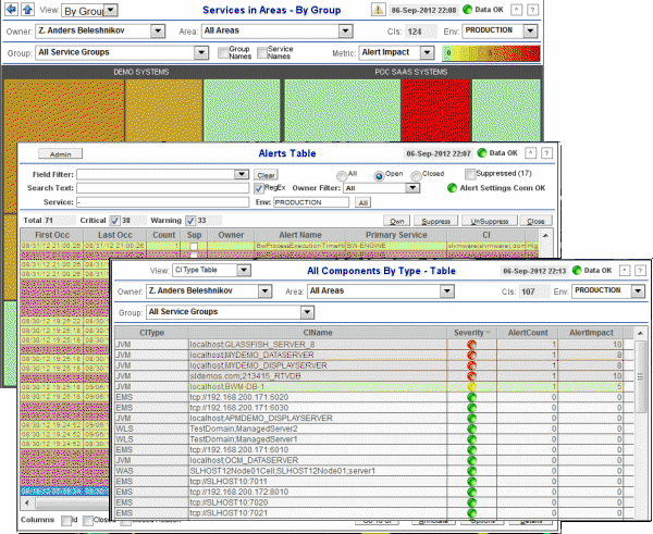
The Service Data Model maps all the Configuration Items (CIs) in your EM system to one or more Services (CIs are items being monitored by EM--servers, processes and so forth--anything that can be configured). Each Service is mapped to a Group, each Group to an Area and each Area to an Owner. Displays are organized and populated with data according to this hierarchy. This mapping enables EM to aggregate data for several hundreds of CIs, and allows objects (heatmaps, tables and so forth) to filter data shown according to user selections. For details about the Service Data Model, see Configure Service Data Model. RTView EM heatmaps organize CIs (according to the Service Data Model) into rectangles and use color to highlight the most critical value in each. Heatmaps enable you to view various alert metrics in the same heatmap using drop-down menus. Each Metric has a color gradient bar that maps relative values to colors. In most heatmaps, the rectangle size represents the number of CIs in the rectangle; a larger size is a larger value. Heatmaps include drop-down menus to filter data by Owner, Area, Group, Service, Region and Environment. The filtering options vary among heatmaps. For example, the Area
Heatmap (in the
following figure) illustrates a
typical EM
heatmap. The heatmap contains
a Metric drop-down menu with options to show Alert Impact,
Alert Severity,
Alert Count and
Criticality
(menu options vary according to the data populating the heatmap).
Alert Impact is
selected and its corresponding
color gradient
Continuing with our example, there are two filtering options. You can choose to show all Owners or a single Owner, and all Environments or a single Environment. Each rectangle represents an Area. The rectangle size represents the number of CIs in the rectangle; a larger size is a larger value. You can also mouse-over a rectangle to see more values. The following figure illustrates the mouse-over feature in which we see all the Metric drop-down values.
In most
heatmaps, you can also drill-down to more detail by clicking a rectangle in the heatmap. Or, open a new window
by using the
As previously mentioned, each Metric has a color gradient bar that maps relative values to colors. The following summarizes the heatmap color code translation for typical EM heatmaps:
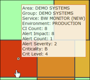
Mouse-over The mouse-over functionality provides additional detailed data in an over imposed pop-up window when you mouse-over a heatmap. The following figure illustrates mouse-over functionality in a heatmap object. In this example, when you mouse-over a host, details are shown such as CI Count, Alert Impact, Alert Severity, and Criticality.
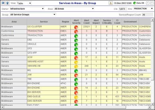
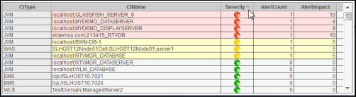
RTView EM tables organize CIs (according to the Service Data Model) into columns and rows of data. EM tables contain the same data that is shown in the heatmap in the same view. Tables provide you a text and numeric view of the data shown in that heatmap, and additional data not included the heatmap.
Table rows also sometimes use color to indicate the current most critical alert state for all CIs associated with a given row. For example, the figure above illustrates a table in which each row is a different Service. The color coding is as follows:
The CI Count column indicates that one or more CIs are associated with each Service. The first row in the table is the OC-CLUSTER Service. The CI Count column indicates the Service has four CIs. The yellow row color indicates that one or more alerts exceeded their warning threshold for one or more CIs associated with the Service. Continuing with the above example, the second row in the table is the TRANSACTION Service. The CI Count column indicates the Service has one CI. The red row color indicates that one or more alerts exceeded their critical threshold for one or more CIs associated with the Service (in this case there is a single CI). Sorting RTView EM allows you to sort the rows of a table for any defined columns. To do so, you click on the column title. A symbol appears when sorting in ascending order, and the inverted symbol when sorting in descending order. The following figure illustrates the usage of the
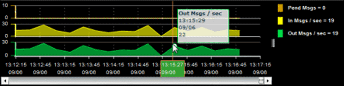
RTView EM trend graphs enable you to view and compare various important metrics over time, such as server memory utilization, server throughput, the number of clients being served by the server, or the total amount of data sent to clients. You can use trend graphs to assess utilization and performance trends. For example, the following figure illustrates a typical EM trend graph. In this example, metrics for Pending Messages, Incoming Messages and Outgoing Messages are traced.
Mouse-over The mouse-over functionality provides additional detailed data in an over imposed pop-up window when you mouse-over trend graphs. The above figure illustrates mouse-over functionality. In this example, when you mouse-over a single dot, or data point, in the Out Msgs / sec trend graph, a pop-up window shows data for that data point. In this case, the X-axis value is 13:15:29 hours on September 6th, and the Y-axis value is 22 Outbound messages per second. Log Scale Typically, trend graphs provide the Log Scale option. Log Scale enables you to see usage correlations for data with a wide range of values. For example, if a minority of your data is on a scale of tens, and a majority of your data is on a scale of thousands, the minority of your data is typically not visible in non-log scale graphs. Log Scale makes data on both scales visible by applying logarithmic values rather than actual values to the data.
This section describes EM GUI organization and functionality that is shared by all RTView EM displays. This section includes:
The navigation tree (in the left display panel) is organized by views and shared by all EM displays. Each View contains a different scope of data and different drop-down menus for organizing or filtering data. You can install additional Solution Packages which are subsequently situated in the navigation tree between Component Views and RTView Servers displays. This section describes the views that come with EM.
RTView EM displays share the same top layer in the title bar, described below.
The following illustrates the
usage of the
|
||||||||||||||||||||||||||||||||||||||||||||||||||||||||||||||||||||||||||||||||||||||||||||||||||||||
|
|
|
JMS, JMX and Java are trademarks or registered trademarks of Sun Microsystems, Inc. in the United States and other countries. They are mentioned in this document for identification purposes only. |