 or by selecting Edit>Add.
This section contains the following:
§ “Add/Edit Objects” on page 32
§ “Object Properties” on page 36
§ “Object Descriptions” on page 41
RTView features a wide variety of objects accessible through the Object Palette or from the Add Objects toolbar at the top of the Display Builder.
Open the Object Palette by clicking on the Open Object Palette button or by selecting Edit>Add.
Choose a tab from the Object Palette and click on an object. When an object is selected, a black border outlines the object and the class name of that object appears in the status bar at the bottom left of the palette.

Move the cursor into the Working Area. A + symbol appears next to the cursor, indicating that the application is in Add mode.
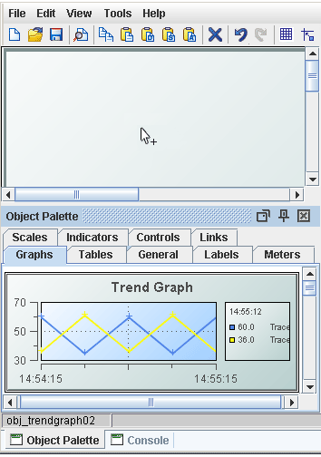
Click in the Working Area to place the object. To cancel Add mode, press the <Esc> key.
For more detailed information on each type of object, see “Object Descriptions”.
Connecting Objects (applies to Links only)
With two objects in your Working Area, choose the Links tab from the Object Palette and click on a link. A rectangle appears on the link when it is selected and the class name of the link appears in the status bar at the bottom left of the palette.
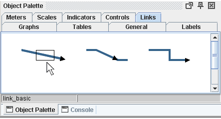
Move the cursor into the Working Area. An arrow appears next to the cursor, indicating that the application is in Connect mode.
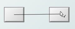
Click on the two objects in your display to connect them. To cancel Connect mode, press the <Esc> key.
Set Location
Set the position in pixels of the objects in the display area with the objX and objY properties.
Move Objects
Click-and-drag to move objects within the Working Area or use the keyboard arrows to nudge objects. Select Tools>“Builder Options” to set the Keyboard Arrow Movement Amount. Click on the Grid  button in the toolbar to toggle grid visibility. When the Snap to Grid
  button is selected, objects align to the grid while being dragged. See the Grid tab in the Builder Options dialog for additional settings.
Select Objects
Hold down <Ctrl> or <Shift> on your keyboard to select or deselect objects in the Working Area or click-and-drag to select multiple objects.
Note: The first object selected and objects not entirely included in the Select by Extent rectangle will not be selected.
Select by Extent replaces any current selection, unless you hold down <Ctrl> or <Shift> on your keyboard while performing the operation. You can also click on the Select by Extent  button in the toolbar to enter Select by Extent mode. Select Edit>Select All (or Ctrl-A) to select all objects.
Note: When selecting multiple objects, object properties and scaling only apply to the last object selected.
For a list of all objects currently in the Working Area, select Tools>Object List. Within the Object List hold down the <Ctrl> or <Shift> key to select or deselect objects in the list, which will be simultaneously selected in the Working Area.
Copy and Paste Objects
Select one or more objects from the Working Area and click the Copy button  in the toolbar (or right-click on an object). Then click the Paste button
  . This will put you in Add or Connect mode depending on the object you have selected. If you are in Add mode, click in the Working Area to paste the object. If you are in Connect mode, click on two objects in your display to paste the link. When copying and pasting nodes with their links, select all nodes connected to the links in order to include them.
Copy and paste are also available via keyboard shortcuts:
• Ctrl-C to Copy
• Ctrl-V to Paste
Scale Objects
To resize an object, click and drag one of the green selection handles on the object.
Order Objects
Right-click on an object and choose Order (or select Edit>Order), then select Move to Front or Move to Back to move the selected object in front of or behind other objects in the Working Area.
Note: Objects are always drawn in front of links.
Align Objects
Hold down the <Ctrl> or <Shift> key and select at least two objects. Right-click on an object and choose Align from the popup menu (or select Edit>Align) and one of the following options. The alignment is based on the first object you select.
• Top - To align the tops of all objects against the first object selected.
• Bottom - To align the bottoms of all objects against the first object selected.
• Left - To align the left sides of all objects against the first object selected.
• Right - To align the right sides of all objects against the first object selected.
• Center Horizontal - To align the objects along their horizontal centers.
• Center Vertical - To align the objects along their vertical centers.
Distribute Objects
Hold down the <Ctrl> or <Shift> key and select at least two objects. Right-click on an object and choose Distribute from the popup menu (or, select Edit>Distribute) and one of the following options. The alignment is based on the first object you select.
• Horizontally - To put equal amounts of horizontal space between the objects without changing their vertical location.
• Vertically - To put equal amounts of vertical space between the objects without changing their horizontal location.
Preview Control Objects
Control objects are not active in the Display Builder main editing window. This enables you to setup a control objects without activating their associated action commands. To preview a control object in the Display Builder, save your file and click the Preview button  in the toolbar. Your display opens in a Preview Window that allows you to activate control objects. The Preview button becomes disabled when you edit your display. Save the display again to enable it.
Delete Objects
Click on the object and click the Delete button  in the toolbar or press <Delete> on your keyboard to remove an object from the Working Area.
Edit Object Properties
See the “Object Properties” section for information on how to edit objects from the Object Properties window.
Undo / Redo
Click the Undo / Redo button  in the toolbar to cancel or reapply up to one thousand consecutive actions. Select Tools>“Builder Options” to set the History List Size. Default setting is 20 consecutive actions.
RTView features a wide variety of objects. The Object Properties window lists attributes of the selected object and lets you edit property values. (See “Object Descriptions” section for descriptions of each object.)
To open the Object Properties window, select an object and click the Object Properties button  on the toolbar. In the Object Properties window, you can view and/or edit the property values of the object selected in the Working Area.
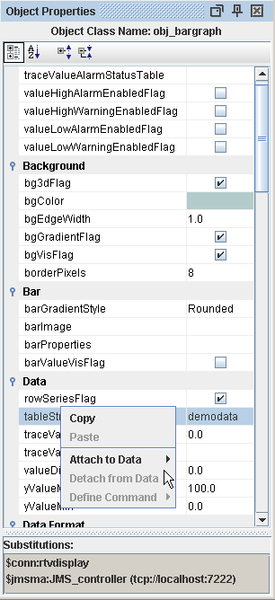
Property Names listed in the first column cannot be changed. Property Values, listed in the second column, can be set to static values or attached to dynamic data.
• Blue text signifies that a Property Value is static and cannot be attached to a dynamic data source.
• Green text signifies that a Property Value is currently attached to a dynamic data source and therefore it is no longer possible to edit this value from the Object Properties window. See the Attach to Data section specific to your data source for information on attaching dynamic data.
To remove a data attachment and resume editing capabilities from the Object Properties window, right-click on the Property Name (e.g., value) and select Detach from Data from the popup menu. An object property has been detached from the data source when the Property Name and Value are no longer green.
Copying and pasting makes it easy to transfer property values from one object to another.
There are two options for copying object properties:
• Copy All Properties - To copy all object properties, both static properties and data attachments, select an object and click the Copy button  on the toolbar.
• Copy Single Property - To copy an individual property from the Object Properties window, right-click on the Property Name and select Copy. To copy a property from the Edit Function dialog, right-click in a text field and select Copy.
There are four options for pasting object properties:
• Paste Data Attachments - To paste only data attachments, select one or more objects and click on the Paste Data Attachments button  on the toolbar or use the keyboard shortcut Ctrl+Shift+V. Note: Only properties common to both objects will be pasted onto the selected object(s).
• Paste Static Properties - To paste only the static properties, select one or more objects and click on the Paste Static Properties button  on the toolbar. Note: Only properties common to both objects will be pasted onto the selected object(s).
• Paste All Properties - To paste all properties, select one or more objects and click on the Paste All Properties button  on the toolbar. This will paste all static properties as well as all data attachments. Note: Only properties common to both objects will be pasted onto the selected object(s).
• Paste Single Property - To paste an individual property into the Object Properties window, right-click on the Property Name and select Paste. The Paste option will only be enabled if the copied attribute can be set on the selected property (e.g., data attachments cannot be pasted onto static properties). To paste a property in the Edit Function dialog, right-click in a text field and select Paste.
In the Object Properties window, double-click on columnFormat in the Property Name field to bring up the Column Format Properties dialog. In the Column Format Properties dialog you can assign numerical and date formats to columns.

|
Field Name |
Description |
|
Column Name |
This list is populated based on the table's data attachment. If you have not yet attached the table to data, this list will be empty. |
|
Column Format |
Enter or select a format from the drop down menu and press <Enter>. Specify numerical formats using the Java format specification, or with the following shorthand: $ for US dollar money values, $$ for US dollar money values with additional formatting, () for non-money values, formatted similar to money, or # for positive or negative whole values. Specify date formats using the Java date specification. |
|
Add Column |
Enter the name of the column and click the Add Column button to insert a column into the table. |
|
Clear |
Click the Clear button to remove all Column Formats listed. Note: Text columns containing data where all the values represent numbers are treated as if they are numeric columns, so number formats can be applied. |
Click in the image Property Value field and type the name of the image or select the  button to open the Select Image dialog containing up to three directories:
• Current Directory - Contains images in the current directory and one level of subdirectories.
• Custom Image Library - If you have specified a custom image library, this directory contains those images. See the “Creating a Custom Image Library” section for details.
• Symbol Library - Contains symbolic images (for example, symbols for various types of hardware, shapes, lights, arrows, etc.).
Navigate to the image you want to use and select it. A preview of the image appears in the pane to the right. Click OK or Apply to set the image on your object. If an image is not listed, enter the name of the file, including the relative path.
To scale your image to the size of the object, check the imageScaleFlag. The visFlag property controls the visibility of the object. The transparencyPercent property controls the transparency of the object.
The sample display file general_objects.rtv (located in demos/tutorials) features information on working with objects from the General tab.
Creating a Custom Image Library
The custom image library enables you to make your own images available in the Select Image dialog. To add your own image library, perform the following steps.
1. Place your images in a .jar file and add it to the “RTV_USERPATH” environment variable.
Note: The images must be in a directory and not at the top level of the .jar file. They can be organized into subdirectories of one top level directory.
2. In the Display Builder, select Tools>Builder Options and, in the Custom Image Library Path field, set the path to the directory containing your .jar file.
For example, suppose you have a .jar file with the following directory structure:
com/mycompany/Images
com/mycompany/Images/Blue Images
com/mycompany/Images/Red Images
com/mycompany/Images/Green Images
In the Custom Image Library Path field you would enter com/mycompany/Images to add a directory named Images to the tree in the Select Image dialog. The Images directory will have three subdirectories: Blue Images, Red Images, and Green Images.
Note: Only directories containing images will be added to the Select Image dialog.
To access your custom image library, edit any property that allows you to set an image on an object (e.g. image, barImage, and filterProperties properties) or select File>“Background Properties” and edit the Image Name field.
In a Display Server deployment when the webLabelFlag property is selected, the object will be rendered as an HTML element in the thin client rather than rendered in the image by the Display Server. This allows the Display Server to update the individual object (if necessary) when the display is refreshed, instead of regenerating the entire display image. In some cases, this can improve the performance of the Display Server and thin client.
The webLabelFlag property also enables you to select an object's text and copy it to the clipboard.
General objects that support webLabelFlag are:
obj_rect
obj_rect_il
obj_rect_ilv
obj_rect_ilvs
obj_rect_ilvx_da3
obj_rect_ilvx_ra4
obj_circ2d
obj_circ2d_il
obj_circ2d_ilv
obj_circ2d_ilvs
obj_circ2d_ilvx_da3
obj_circ2d_ilvx_ra4
Use the following entry to set webLabelFlag in an rtview stylesheet (.rts) file:
rtv-all {
webLabelFlag: 1;
}
Limitations
In the following situations, an object with webLabelFlag selected will still be rendered in the image by the Display Server:
§ Display is opened in Internet Explorer 8 or older.
§ Display Server is run with the -nohtml5 option set on the command line.
§ labelTextPosY is set to "Tab Top" (obj_rect*)
§ labelTextPosY is set to "Title Top" and bgBorderFlag is set to "true" (obj_rect*)
§ obj_rect* with non-html object above it in Z-order which overlaps (e.g. obj_rect* used as a background behind several meter objects)
§ Object is inside an object grid, and is not inside a composite object in that grid.
In other cases, an object may have a slightly different appearance in the thin client when it is rendered as HTML:
§ bgGradientMode property set to "Diagonal Edge" or "Diagonal Center" is treated as "Vertical Edge" (Only vertical and horizontal gradients are supported on HTML objects in the thin client.)
§ bgShadowFlag property is ignored
RTView objects are categorized in the Object Palette according to the appearance and behavior of each type of object. This section describes how to work with each type of object and assumes you have already reviewed the following: “Add/Edit Objects”, “Object Properties”, and the Attach To Data section for your data source.
To view sample displays with tutorials, product features, and data source specific examples go to the demos directory, run the data simulators that apply to your “RTView Data Sources” and start the Display Builder. Open the file alldisplays.rtv and double-click on your selection.
Note: To learn how to start the Display Builder and run the data simulators refer to the “Quick Start Tutorial”.
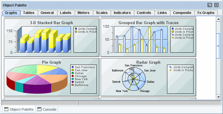
Graphs
Graphs are useful for comparing data. Trend graphs are used to display a single variable per trace over time. Bar, pie, radar, and XY graphs are designed to display information returned by a tabular element in your data attachment. See “Graph Objects” for details.
Tables
Tables offer the ability to display large amounts of data. See “Table Objects” for details.
General
The General tab contains flexible objects that can be used to display data and images in addition to executing commands either manually or based on thresholds. To display values on these objects, attach the value property to numeric data or the valueString property to text data, and the label property to text data.
If you have a very long label or valueString and do not want to have the label/valueString extend past the edges of the rectangle, you can select the bgClipTextFlag option in the Background category in Object Properties to clip the edges of the text so that only that portion within the rectangle displays. Note: The bgVisFlag must be enabled for bgClipTextFlag to work.
General objects that feature the image property can be customized to display your image (.gif, .jpg, or .png) file.
The styleClass property allows you to enter the style class name for this object as defined in your “Style Sheets”. If not specified, the object class name is used.
Note: The value entered must not contain spaces and cannot start with rtv-.
The “webLabelFlag” property allows select objects to be rendered as HTML elements in a thin client deployment.
Threshold Objects
Objects labeled Range Dynamic and Discrete Dynamic on the General tab support threshold functionality, allowing you to change the image and color of the object as well as execute a threshold command from the object based on the current value of the value property. Both the range dynamic and the discrete dynamic objects have the thresholding functionality turned off by default. In the descriptions below, the object's value is the current value of the value property. See “Threshold Commands” for more information.
Range Dynamic
Range dynamic objects allow you to setup your threshold so that if the object's value is within a range of numbers, the threshold functionality executes. To enable the high alarm threshold, check the valueHighAlarmEnabledFlag. This will enable several related properties. When the object's value is greater than or equal to the valueHighAlarm property, the background of the object will change to the valueHighAlarmColor, the bitmap on the image will change to the valueHighAlarmImage and the valueHighAlarmCommand will be executed. To enable the high warning threshold, check the valueHighWarningEnabledFlag. When the object's value is greater than or equal to the valueHighWarning, but less than the valueHighAlarm, the background of the object will change to the valueHighWarningColor, the bitmap on the image will change to the valueHighWarningImage and the valueHighWarningCommand will be executed. The low alarm and low warning threshold properties work the same way, but activate when the object's value is less than or equal to the valueLowAlarm or valueLowWarning properties.
For both the discrete dynamic and range dynamic objects, threshold commands will only execute if the number of seconds specified in the valueCommandTimeout has elapsed since the previous threshold command was executed and the value has changed to another threshold. For example, if the high warning threshold range is between 40 and 50, when object's value enters this range, the valueHighWarningCommand will be executed. The valueHighWarningCommand will not be executed again until the object's value leaves the high warning threshold range and then re-enters it. If this occurs in less time than is specified in the valueCommandTimeout property, it will not be executed until that time elapses. If the valueCommandTimeout is set to 0, the internal default, 5 seconds, is used.
Discrete Dynamic
Discrete dynamic objects are similar to range dynamic objects, except that the threshold functionality is executed when the object's value equals the threshold value instead of when it is within the range of threshold values. To enable the high alert threshold, check the valueHighAlertEnabledFlag. When the value property equals the valueHighAlert, the background of the object will change to the valueHighAlertColor, the bitmap on the image will change to the valueHighAlertImage and the valueHighAlertCommand will be executed. To enable the medium alert threshold, check the valueMediumAlertEnabledFlag. When the value property equals the valueMediumAlert, the background of the object will change to the valueMediumAlertColor, the bitmap on the image will change to the valueMediumAlertImage and the valueMediumAlertCommand will be executed. The low alert threshold property works the same way, but activates when the object's value is less than or equal to the valueLowAlert property.
For both the discrete dynamic and range dynamic objects, threshold commands will only execute if the number of seconds specified in the valueCommandTimeout has elapsed since the previous threshold command was executed and the value has changed to another threshold. For example, if the high warning threshold range is between 40 and 50, when object's value enters this range, the valueHighWarningCommand will be executed. The valueHighWarningCommand will not be executed again until the object's value leaves the high warning threshold range and then re-enters it. If this occurs in less time than is specified in the valueCommandTimeout property, it will not be executed until that time elapses. If the valueCommandTimeout is set to 0, the internal default, 5 seconds, is used.
Labels
The Labels tab includes several types of labels. All of the labels have at least one of the following properties: value, valueString, and label. The value property used to display numeric data, either from a data attachment or static values. Some labels can be designed to change color according to value property or feature vu meters to dynamically display that data. The valueString and label properties are both used to display text data, either from a data attachment or static values.
Meters
Meters are useful for displaying data that falls within a known range. You can control the range of data displayed in the meter by setting the valueMax and valueMin properties. Attach your data to the value property.
The styleClass property allows you to enter the style class name for this object as defined in your style sheet. If not specified, the object class name is used. See “Creating Style Sheets” for more information.
Note: The value entered must not contain spaces and cannot start with rtv-.
Scales
Scales are useful for displaying data that falls within a known range. You can control the range of data displayed in the scale by setting the valueMax and valueMin properties. Attach your data to the value property. All of the scales, except the pie scale, support a variety of axis styles and can be oriented vertically or horizontally. See “Scale Objects” for details.
Indicators
The Object Palette features four types of “Indicator Objects”:
• Discrete - Supports 3 discrete comparisons.
• Limits - Supports 2 high and 2 low thresholds.
• Multi - Supports an unlimited number of comparison values.
• Panel - Panel of 2 or 3 indicator lights, each supports a discrete comparison.
For all indicators, attach your data to the value property and setup comparisons using the properties in the Alert category. Indicators that feature the “Image Property” can be customized to display your image (.gif, .jpg or .png) file.
Note: Objects previously featured on the Indicators tab will continue to function in existing displays, but are no longer available in the Object Palette.
Controls
Controls allow you to issue action “Commands” and update variables (see “Add/Edit Variables”) that may be used to control other objects in the display. The visFlag property controls the visibility of the object. See “Control Objects” for details.
Links
The Links tab features three objects. The Direct link draws a straight line between the objects it connects. The Direct Offset link attaches to objects at a right angle, but draws a diagonal line for the remainder of the link. The Orthogonal link draws a line at right angles between the objects it connects. See “Link Objects” for details.
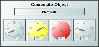
Composite
The Composite tab features pre-configured composite objects. The composite object allows you to show a display (.rtv) file within an object. This is useful for creating groups of objects that you want to use multiple times, either directly in your display, or in an object grid. See “Composite Object” for details.
Fx Graphs
Our Adobe® Flash graphs have been designed specifically for use in a Thin Client deployment. These graphs are similar to objects featured on the Graphs tab, but support additional interactivity. See the “Fx Graphs” page for details.
The composite object (class name: obj_composite) allows you to show a display (.rtv) file within an object. This is useful for creating groups of objects that you want to use multiple times, either directly in your displays or in the “Object Grid”.
First, create the display that you want to use inside of a composite object. This display is referred to as the composite display. While any display (.rtv) file can be used as a composite display, there are some rules about constructing that display:
• Property names for composite objects cannot be used as variable names, in the Composite section this only includes rtvName and substitutions.
• Only public variables that are not mapped to data or substitutions will show up as properties on the composite object.
• Names of all public variables used for tabular data must have Data Type set to Tabular. See “Add/Edit Variables” for more information.
• Composite displays can use any object from the Object Palette, except the composite object.
• Nested composite objects are not supported.
Next, open new display and add a composite object. On the composite object, set the rtvName property to the name of the composite display you just created.
Note: The rtvName property should be set before any other properties.
Once you have set rtvName, all public unmapped variables in the composite display will show up as properties on the composite object. Like any other property, you can attach those properties to data or set them to static values. See “Add/Edit Variables” for more information.
Note: If you do not want a variable to be exposed as a property, mark it as private.
For example, you can create a display (.rtv) file with two meters that are attached to two public variables: value1 and value2. When you enter the name of that display (.rtv) file in the rtvName property of the composite object, then value1 and value2 will show up in the Composite section of the Object Properties list. These properties can be set to static data or attached to data to drive the values in the composite display. When the composite object is used in an “Object Grid”, these properties will also show up in the iconProperties dialog, which allows you to assign them to either values or data columns.
Note: Composite objects used in Object Grids must have their bgOpaqueFlag property selected.
Use the tabcomposites property to enable the Tab key to switch focus to controls that are inside composite objects. See “Command Line Options: Display Builder and Display Viewer” for more information.
Using Interaction Properties
The specified drillDownTarget or command for objects in the composite display will take precedence over the drillDownTarget or command set on the composite object when it is instanced directly in a display. When the composite object is used in an Object Grid, the specified drillDownTarget or command for objects in the composite display will take precedence over the drillDownTarget or command set on the Object Grid.
For example, let's say you have a composite display with an object that drills down to display A and you set a drillDownTarget on the composite object to display B. When you click on the composite object, if you click directly on the object that drills down to display A, then display A is opened. If you click anywhere else in the composite display, then display B is opened.
A similar thing happens when you use that composite object in an Object Grid. However, in this case, you can't set a drillDownTarget on the composite object, you can only set the drillDownTarget on the Object Grid. So, let's say you set the Object Grid to drill down to display B. Again when you click directly on the object in the composite display that drills down to A, display A is opened. When you click anywhere else in the composite or in the Object Grid, display B is opened.
Commands
To assign a command, right-click in the Property Value field of the command property and select Define Command. Commands can be set up to execute when you click on an object or automatically execute the command when the value of an object reaches a specified threshold. See “Define/Execute Command” for information on how to set up commands.
Drill Down Displays
To specify a drill down display, double click on the drillDownTarget property. Any display (.rtv) file can be targeted as a drill down. Once a drill down target has been set, double-click to activate the drill down. Drill down displays can be activated in the same window or opened in a separate window. This allows you to build a customizable hierarchy of displays. See “Drill Down Displays” for more information.
|
Property Name |
Description |
|
bgBorderColor |
Select the |
|
bgBorderFlag |
If selected, a border is drawn around the background rectangle, |
|
bgColor |
Select the |
|
bgEdgeWidth |
Set the width of the 3D edge on the background rectangle. This property is only available if the bgStyle selected is 3D Rectangle. |
|
bgGradientColor2 |
Select the The bgColor property sets the first color in the gradient. |
|
bgGradientMode |
Display a gradient in the background rectangle. Select from the following options: None - No gradient Diagonal Edge - Gradient is drawn at a 45 degree angle from the top left to the bottom right corner of the object. Diagonal Center - Gradient is drawn at a 45 degree angle from the center to the top left and the bottom right corners of the object. Horizontal Edge - Gradient is drawn horizontally from the top to the bottom of the object. Horizontal Center - Gradient is drawn horizontally from the center to the top and bottom of the object. Vertical Edge - Gradient is drawn vertically from the left to the right of the object. Vertical Center - Gradient is drawn vertically from the center to the left and right of the object. |
|
bgOpaqueFlag |
When a composite object is used in an “Object Grid”, the bgOpaqueFlag property must be selected. If deselected, then objects inside a composite that is clipped by the edge of the Object Grid may be drawn outside the Object Grid. In order to avoid showing a border around each composite object in the Object Grid, select Edit>Model Properties and deselect the bgBorderFlag. |
|
bgRaisedFlag |
Reverses the direction of the gradient, as well as that of the 3D edge if the bgStyle selected is 3D Rectangle. |
|
bgRoundness |
Set the arc length of the rounded corners. This property is only available if the bgStyle selected is Round Rectangle. The value of bgRoundness cannot exceed half the value of the objWidth or the objHeight. If bgRoundness does exceed that value, then half (of the smaller of the two values) of objWidth or objHeight will be used instead. For example if objWidth is 100 and objHeight is 50, then the value of bgRoundness cannot exceed 25. If it does, then half the value of objHeight (25) will be used instead. |
|
bgShadowFlag |
Select to display a drop shadow on the background rectangle. |
|
bgStyle |
Choose one of the following three options from the drop down menu: Rectangle - Select to display a background rectangle. 3D Rectangle - Select to display a 3D edge on the background rectangle. If selected, use bgEdgeWidth to set the width of the 3D edge. Round Rectangle - Select to display a background rectangle with rounded edges. If selected, use bgRoundness to set the arc length of the rounded corners. |
|
bgVisFlag |
Select to display the background rectangle. |
|
borderPixels |
Set the amount of space (in pixels) between the object and the border. |
Composite Properties
There are two standard properties in the Composite section: rtvName and substitutions. Once you have set the rtvName property, the composite display will show up in your composite object and all of the public variables from the composite display that are not mapped to data or substitutions will be added as Composite properties. See “Add/Edit Variables” for more information.
|
Property Name |
Description |
|
resizeMode |
Specify how the composite object is resized. There are two modes: Size to Display -The size of the composite object is determined by the size of the display it contains. The composite object cannot be resized. This is the default setting. The dock and anchor properties should not be used in this mode. Layout -The composite object can be resized. Objects in the composite display are situated according to their anchor and dock properties. The dock and anchor properties can be set on the composite object so that it resizes during a window resize if the window resize mode is also set to Layout. If the window resize mode for the display containing the composite object is set to Scale, the composite object performs a scale instead of a layout. |
|
rtvName |
Specify the name of the display (.rtv) file to show in your object. This display is referred to as the composite display. See “Creating Composite Displays” for details. |
|
substitutions |
Specify the substitutions for the composite display. Note: The composite display also inherits substitutions from the display that contains the composite object. Substitutions are optional and must use the following syntax: $subname:subvalue $subname2:subvalue2 If a substitution value contains a single quote, it must be escaped using a / : $filter:Plant=/'Dallas/' If a substitution value contains a space, it must be enclosed in single quotes. Do not escape these single quotes: $subname:subvalue $subname2:'sub value 2' A substitution string cannot contain the following: : | . tab space , ; = < > ' " & / \ { } [ ] ( ) |
Historian Properties
|
Property Name |
Description |
|
historyTableName |
Specify name of table in your history database in which to store tabular data. See “Configuring the Historian” for information. |
|
historyTableRowNameFlag |
If selected, data from the row name field will be stored in the first column of the table specified in historyTableName. |
Interaction Properties
|
Property Name |
Description |
|
command |
Assign a command. See “Define/Execute Command” for information. |
|
commandCloseWindowOnSuccess |
If selected, the window that initiates a system command will automatically close when the system command is executed successfully. This property only applies to system commands. With data source commands, the window is closed whether or not the command is executed successfully. For multiple commands, this property is applied to each command individually. Therefore if the first command in the multiple command sequence succeeds, the window will close before the rest of the commands are executed. Note: The commandCloseWindowOnSuccess property is not supported in the Display Server. |
|
commandConfirm |
If selected, the command confirmation dialog is enabled. Use the commandConfirmText property to write your own text for the confirmation dialog, otherwise text from the command property will be used. For multiple commands, if you Confirm the execution then all individual commands will be executed in sequence with no further confirmation. If the you Cancel the execution, none of the commands in the sequence will executed. |
|
commandConfirmText |
Enter command confirmation text directly in the Property Value field or select the |
|
drillDownTarget |
Name of display (.rtv) file targeted as a drill down. See “Drill Down Displays” for information. |
Label Properties
|
Property Name |
Description |
|
label |
Edit label text directly in the Property Value field or select the |
|
labelMinTabWidth |
Specify minimum width of the label tab. This property is only applies if labelTextAlignY is set to TabTop. |
|
labelTextAlignX |
Select x-axis position of label text from the drop down menu. |
|
labelTextAlignY |
Select y-axis position of label text from the drop down menu. Outside Top - Position label well above the background rectangle. Top - Position label just above the background rectangle. Title Top - Position label along the top line of the background rectangle. Tab Top - Position label tab just above the background rectangle. Height and width of the tab is dependent on the height and width of the text. Use the labelMinTabWidth property to specify a minimum tab width. Inside Top - Position label inside the top of the background rectangle. |
|
labelTextColor |
Select the |
|
labelTextFont |
Select font style of label text from the drop down menu. |
|
labelTextHeight |
Set the height of the label text in pixels. |
Object Properties
|
Property Name |
Description |
|
anchor |
Specify where to anchor an object in the display. If an object has the dock property set, the anchor property will be ignored. The anchor property is only applied when the dimensions of the display are modified, either by editing “Background Properties” or resizing the window in Layout mode Select None, or one or more the following options: None - Object not anchored. This is the default. Top - Anchor top of object at top of display. Left - Anchor left side of object at left of display. Bottom - Anchor bottom of object at bottom of display. Right - Anchor right side of object at right of display. When a display is resized, the number of pixels between an anchored object and the specified location remain constant. If an object is anchored on opposite sides (i.e. Top and Bottom or Left and Right), the object will be stretched to fill the available space. If the Resize Mode is set to Scale and an object is anchored on opposite sides, then the object with be moved rather than stretched to fill the available space. |
|
dock |
Specify the docking location of an object in the display. An object should not be docked if the Resize Mode is set to Scale. Select from the following options: None - Object is not docked. This is the default. Top - Dock object at top of display. Left - Dock object at left of display. Bottom - Dock object at bottom of display. Right - Dock object at right of display. Fill - Dock object in available space remaining in the display after all docked objects are positioned. If the dimensions of the display are modified, either by editing “Background Properties” or resizing the window in Layout mode, the properties (objX, objY, objWidth, and objHeight) of docked objects will automatically adapt to match the new size of the display. When multiple objects are docked to the same side of the display, the first object is docked against the side of the display, the next object is docked against the edge of the first object, and so on. When objects are docked to multiple sides of the display, the order in which objects were added to the display controls docking position. For example, let's say the first object added to the display is docked at the Top and the second object is docked at the Left. Consequently, the first object will fill the entire width of the display and the second object will fill the left side of the display from the bottom of the first object to the bottom of the display. |
|
|
Objects in a display have the dock property set to Fill, are laid out across a grid in the available space remaining after all docked objects are positioned. By default, the grid has one row and as many columns as there are objects in the display. You can modify the grid in the Background Properties dialog. |
|
|
Once an object is docked, there are some limitations on how that object can be modified: § Docked objects cannot be dragged or repositioned using objX and objY properties. § Docked objects cannot be resized using the objWidth or objHeight properties. To resize you must drag on the resize handle. § Docked objects can only be resized toward the center of the display (e.g. If an object is docked at the Top, only its height can be increased by dragging down toward the center of the display). § Docked objects set to Fill cannot be resized at all. § Docked objects cannot be moved using Align. Non-docked objects can be aligned against a docked object, but a docked object will not move to align against another object. § Docked objects are ignored by Distribute. |
|
objHeight |
This property is read only. It shows the height in pixels of the composite object. See “Creating Composite Displays” for more information. |
|
objName |
Name given to facilitate object management via the Object List dialog. Select Tools>Object List. |
|
objWidth |
This property is read only. It shows the width in pixels of the composite object. See “Creating Composite Displays” for more information. |
|
objX |
Set the x position of the object. |
|
objY |
Set the y position of the object. |
|
styleClass |
Enter the style class name for this object as defined in your style sheet. If not specified, the object class name is used. See “Creating Style Sheets” for more information. Note: The value entered must not contain spaces and cannot start with rtv-. |
|
transparencyPercent |
Sets the transparency of the object. This property only applies to the background of the composite object. |
|
visFlag |
Set the visibility of the object. |
The Controls tab features objects that allow you to issue commands and update variables that may be used to control other objects in the display. The sample display file controls.rtv (located in demos/tutorials) features information on working with objects from the Controls tab.
The value, valueString, and selectedValue properties allow you to set the value for the controls. The varToSet property allows you to update the attached variable with the value from the control.
The actionCommand property allows you to set up a command which will be executed from the control. This actionCommand can reference the value from the control by using the keyword $value. To enable selecting, moving and editing the controls without activating the associated action command, the controls are not active in the main window of the Display Builder.
The tabIndex property allows you to define the order in which table and control objects will receive focus when navigated from your keyboard. Initial focus is given to the object with the smallest tabIndex value, from there the tabbing order proceeds in ascending order. If multiple objects share the same tabIndex value, then initial focus and tabbing order are determined by the alpha-numeric order of the object names. Objects with a tabIndex value of 0 are last in the tabbing order.
Note: The tabIndex property does not apply to Slider objects or objects that are disabled, invisible, or have a value of less than 0.
To preview a control object in the Display Builder, save your file and click the Preview button  in the toolbar. Your display opens in a Preview Window that allows you to activate control objects. The Preview button becomes disabled when you edit your display. Save your display again to enable it.
Some control object properties cache their colors and therefore do not update when a custom color definition changes. You will need to either to restart RTView or reload the display to see the color change for these objects.
The Controls tab features the following objects:
Navigation Controls
Navigation controls allow you to create a rich and compact visual presentation of hierarchical data. Navigation controls are most often used in a multi-panel application for display navigation. Typically, the navigation control is shown in one panel and another panel contains the displays which you drill-down to by selecting items in the navigation control. Navigation controls can also be used in any application where hierarchical data is most effectively displayed using expandable/collapsible nodes.
You can optionally configure status icons for navigation controls, using images of your choice, to visually indicate whether an element is in a critical state, and to also propagate the status of elements to the top of the navigation control (see the tree control, for example, below).
Tree Control
With the tree control (class name: obj_c1tree), multiple nodes can expand at a time. The tree control not only allows you to configure status icons and to propagate the status up to parent nodes - you can also configure type icons. Type icons are static images you assign to tree nodes to visually indicate the element type (for example, Production or Sales) or the node depth.
For details, see “Tree Control”.
Accordion Control
With the accordion control (class name: obj_c1accordion), nodes appear as pushbuttons and a single node expands at a time. The accordion control visually indicates whether an element in the accordion is closed or open. As with the tree control, the accordion control allows you to configure status icons and to propagate the status up to parent nodes. The accordion control does not display type icons (as the tree control can).

For details, see “Accordion Control”.
Text Entry Fields
There are three text entry fields to choose from:
• obj_c1textedit: Allows you to enter numeric or text information. Attach your data to valueString to update the value shown in this text entry field from your data.
• obj_c1textedit_i: Accepts only numbers without decimal points.
• obj_c1textedit_d: Allows numbers with decimal points.
Attach your data to value to update the values shown in these text entry fields from your data.
Note: To get initial values from an internal RTView variable and base those values on user interaction, you must attach the value and varToSet properties to the same variable.
The actionCommand is executed and the variable attached to varToSet is updated with the data you typed into the text entry field when you press <Enter> and, if the executeOnFocusLostFlag is selected, when the text entry field loses focus. To disable text entry, deselect the editableFlag check box. If the editableFlag is off and enabledFlag is on, the mouse and arrow keys can still be used to move the cursor. If the executeOnKeystrokeFlag check box is selected, then each keystroke that modifies the text field will set the varToSet variable and execute the actionCommand, if applicable, using the modified text.
Note: In a Thin Client deployment there may be a delay between the keystroke and the response, depending on the speed of your network and server.
The following properties support input validation. Attach inputValidVarToSet to a local variable and this variable will be updated when the control executes with a value of 1 if the input is valid or a value of 0 if the input is invalid. Attach invalidInputMsgVarToSet to a local variable and this variable will be updated when the control executes with an error message if the input is invalid or an empty string if the input is valid. If validation fails, the actionCommand will not be executed. By default, input validation occurs whenever a control executes (i.e. when you press <Enter>). If executeOnFocusLostFlag is selected, then the control will also execute whenever the object loses focus. If executeOnKeyStrokeFlag is selected, the control will also execute whenever a key is pressed while the object has focus. For numeric validation, set valueMax and valueMin to specify the maximum or minimum valid values. If left blank, there will be no maximum or minimum value validation. Additionally, the following properties apply for text string validation:
• characterCase - Select from the following options: Mixed Case, Upper Case, or Lower Case.
• minCharacters - Specify minimum number of characters allowed in the field. If left blank, there will be no validation of minimum number of characters.
• maxCharacters - Specify maximum number of characters allowed in the field. If left blank, there will be no validation of maximum number of characters.
To set the bgColor and fgColor properties of a text entry field, click on the  button and choose a color from the palette. The bgColor property sets the color of the object's background area and the fgColor property sets the color of the text. When bgColor and fgColor properties are set to Default, then the text entry field will adopt default settings for background and foreground colors. For example, in the Display Viewer the text entry field in your display will adopt a standard Java appearance. When that same display is viewed via Thin Client Browser, the text entry field will conform to that browser's color preferences.
Use the valueTextAlignX property to set text alignment: Left, Center, or Right.
Note: The selected alignment can only be applied if the length of the text is less than the length of the text entry field.
Use the mouseOverText property to enter a tool tip for this control. To display the tool tip, move your mouse over the object. To enter a multi-line tool tip, use \n to delimit the lines (e.g. control\nobject).
Note: The object must be visible (i.e. visFlag property is selected), in order for the tool tip to be visible.
The styleClass property allows you to enter the style class name for this object as defined in your style sheet. If not specified, the object class name is used. NOTE: The value entered must not contain spaces and cannot start with rtv-.
The numeric text entry controls (obj_c1textedit_i and obj_c1textedit_d) support a validation option for blank entries. To enable this feature, select the validateBlankValuesFlag property. If selected and a blank string is entered, the actionCommand will not execute and invalidInputVarToSet and invalidInputMsgVarToSet will indicate an invalid entry.
Set the executeOnlyIfChangedFlag property to true to have the control's command execute only when the text in the control is changes. The text control's varToset and valueString or value property must be attached to the same local variable. By default, executeOnlyIfChangedFlag is false. When false, the control's command is executed when the control loses focus (if executeOnFocusLostFlag = true or the control is a text area), or when the user presses the Enter key in the control (if the control is not a text area), regardless of whether the text in the control was changed. (This matches the text control behavior in all previous releases.)
Text Area Object
The text area control supports display and entry of multi-line text with optional word wrap. Scrollbars will appear as needed. Attach your data to valueString to update the value shown in this text area from your data.
The actionCommand is executed and the variable attached to varToSet is updated with the data you typed into the text area control when the text area control loses focus. To disable text entry, deselect the editableFlag check box. If the editableFlag is off and enabledFlag is on, the mouse and arrow keys can still be used to move the cursor. If the executeOnKeystrokeFlag check box is selected, then each keystroke that modifies the text area will set the varToSet variable and execute the actionCommand, if applicable, using the modified text.
Note: In a Thin Client deployment there may be a delay between the keystroke and the response, depending on the speed of your network and server.
To set the bgColor and fgColor properties of a text area object, click on the  button and choose a color from the palette. The bgColor property sets the color of the object's background area and the fgColor property sets the color of the text. When bgColor and fgColor properties are set to Default, then the text area control will adopt default settings for background and foreground colors. For example, in the Display Viewer the text area control in your display will adopt a standard Java appearance. When that same display is viewed via Thin Client Browser, the text area control will conform to that browser's color preferences.
Use the mouseOverText property to enter a tool tip for this control. To display the tool tip, move your mouse over the object. To enter a multi-line tool tip, use \n to delimit the lines (e.g. control\nobject).
Note: The object must be visible (i.e. visFlag property is selected), in order for the tool tip to be visible.
The styleClass property allows you to enter the style class name for this object as defined in your style sheet. If not specified, the object class name is used.
Note: The value entered must not contain spaces and cannot start with rtv-.
maxCharacters - The maximum number of characters that is submitted to the control's actionCommand. The default value is blank (no limit). The limit does not restrict the length of the text in the control, instead the limit is checked before the command is executed and if the limit is exceeded, the command is not executed.
inputValidVarToSet - Attach to a local variable. This variable is updated with a value of 1 if the maxCharacters limit is blank or the text is less than or equal to the maxCharacters limit, or updated with a value of 0 if the text length exceeds the maxCharacters limit.
invalidInputMsgVarToSet - Attach to a local variable. This variable is updated with an error message if the text length exceeds the maxCharacters limit, or updated with an empty string if the text length is less than or equal to the maxCharacters limit.
In the Display Viewer, pressing the <Tab> key inside a text area control inserts a tab character in the text. To move the keyboard focus away from a text area control, either click outside of the control or press <Ctrl-Tab>. In the Display Viewer Applet, pressing the <Tab> key inside a text area will move the keyboard focus.
Button
The actionCommand is executed and the variable attached to varToSet is updated with the value from the valueToSet property when you click on the button.
Use the hotKey property to enable keyboard activation on a button. Assign an alphanumeric value (A-Z or 0-9) to be used on the keyboard with the Alt key. The button is activated when the panel it resides in has focus and the user holds down the Alt key and simultaneously selects the assigned value on the keyboard. For example, Alt+B, where B is the assigned key.
When keyboard activation is enabled and the defaultButtonFlag is selected, a button can be activated by pressing the <Enter> key. In the display, the activated button will be highlighted with an extra border. While multiple objects in the display can have the defaultButtonFlag selected, it will only apply to first one added to the display.
Note: The defaultButtonFlag property does not apply to objects that are disabled or invisible. If you are viewing the Display Server in Firefox, another control object must have focus when the <Enter> key is pressed in order for the button to be activated.
To set the bgColor and fgColor properties of a button, click on the  button and choose a color from the palette. The bgColor property sets the color of the object's background area and the fgColor property sets the color of the text. When bgColor and fgColor properties are set to Default, then the button will adopt default settings for background and foreground colors. For example, in the Display Viewer the button in your display will adopt a standard Java appearance. When that same display is viewed via Thin Client Browser, the button will conform to that browser's color preferences.
Use the mouseOverText property to enter a tool tip for this control. To display the tool tip, move your mouse over the object. To enter a multi-line tool tip, use \n to delimit the lines (e.g. control\nobject).
Note: The object must be visible (i.e. visFlag property is selected), in order for the tool tip to be visible.
The styleClass property allows you to enter the style class name for this object as defined in your style sheet. If not specified, the object class name is used.
Note: The value entered must not contain spaces and cannot start with rtv-.
Use the menuItemIndex, menuItemGroup and menuItemSubmenu properties with the button to extend the RTView context menu. For details, see “Extending the Context Menu”.
The image property enables you to customize a button to display your image (.gif, .jpg or .png) file. Click in the Property Value field and type the name of your image. Or, click on the  button to open the Select Image dialog.
A button can display an image, a label, or both. If both the image and label properties are set, the image will be to the left of the label. It is best to leave several pixels of padding between the image and/or label of a button to avoid wrapping or clipping of text.
The appearance of a button with an image and/or label can vary slightly between the Display Viewer and supported browsers. You may notice the following variations:
• Alignment of the image inside the button: The image may be somewhat closer to the top or bottom edge of the button.
• Vertical alignment (if any) of the image with the button's label: The center of the image may be somewhat lower or higher than the center of the label.
• Appearance of the image and label if they don't fit inside the button: In some cases the label may be clipped with an ellipsis (...) replacing the clipped text, or the label may be clipped with no indication, or the label may wrap and may extend below the button.
Note: In Firefox a button with an image will not depress when it is clicked, however the button's command will still be executed.
Check box
Attach your data to the value property to update the value displayed by the check box. Note: To get initial values from an internal RTView variable and base those values on user interaction, you must attach the value and varToSet properties to the same variable.
If the value of your data attachment equals the valueToSetChecked property, the check box will be selected. Default values for valueToSetChecked is 1 (On) and for valueToSetUnchecked is 0 (Off).
The actionCommand is executed and the variable attached to varToSet is updated when you click on the check box. If clicking on the check box selects it, then varToSet will be updated with the value of valueToSetChecked. If you click on the check box and it does not become selected, varToSet will be updated with the value of valueToSetUnchecked.
Use the mouseOverText property to enter a tool tip for this control. To display the tool tip, move your mouse over the object. To enter a multi-line tool tip, use \n to delimit the lines (e.g. control\nobject).
Note: The object must be visible (i.e. visFlag property is selected), in order for the tool tip to be visible.
The styleClass property allows you to enter the style class name for this object as defined in your style sheet. If not specified, the object class name is used.
Note: The value entered must not contain spaces and cannot start with rtv-.
Radio Button Group
Use the radioListValues property to specify the labels and values for each radio button (e.g., Low,25;Medium,50;High,75), or make a data attachment to a two-column table. When attaching to a table, the first column is used for the radio button labels, the second column is used for radio button values. If only labels are specified, they will also be used as values. Specify which radio button is selected using the selectedValue property.
The orientationMode property specifies how radio buttons are populated, horizontally (by row) or vertically (by column). Specify the width, in pixels, of the space between radio buttons using the horizontalGap and verticalGap properties.
The actionCommand is executed and the variable attached to varToSet is updated with the selected value when you select a previously unselected radio button from the group.
Use the mouseOverText property to enter a tool tip for this control. To display the tool tip, move your mouse over the object. To enter a multi-line tool tip, use \n to delimit the lines (e.g. control\nobject). The object must be visible (i.e. visFlag property is selected), in order for the tool tip to be visible.
Note: In a Thin Client deployment, multi-line and non-static tool tips are not supported.
The styleClass property allows you to enter the style class name for this object as defined in your style sheet. If not specified, the object class name is used.
Note: The value entered must not contain spaces and cannot start with rtv-.
Slider
The valueMin and valueMax properties control the range of values for the slider. Attach your data to the value property to update the value displayed by the slider from a data attachment.
Note: To get initial values from an internal RTView variable and base those values on user interaction, you must attach the value and varToSet properties to the same variable.
The actionCommand is executed and the variable attached to varToSet is updated with the value from the slider when you release the slider thumb after dragging it or when you click on the slider to advance the thumb one unit. Select the updateWhileAdjustingFlag to receive updates while dragging the slider thumb.
The fgColor property sets the tick mark color. Click on the  button to select a color or select Default to use the best color for your look and feel. The fgColor is only applied when the Slider control is enabled, so tick marks on sliders in the Display Builder's Working Area are not visible. Select Tools>Preview Window to see the fgColor applied.
Note: In the Thin Client deployment, Slider controls do not have tick marks and therefore the fgColor property does not apply.
Use the mouseOverText property to enter a tool tip for this control. To display the tool tip, move your mouse over the object. To enter a multi-line tool tip, use \n to delimit the lines (e.g. control\nobject).
Note: The object must be visible (i.e. visFlag property is selected), in order for the tool tip to be visible.
The styleClass property allows you to enter the style class name for this object as defined in your style sheet. If not specified, the object class name is used.
Note: The value entered must not contain spaces and cannot start with rtv-.
The axisDirection property allows you to set the axis direction of the scale. Select from the following options:
Bottom to Top - Vertical orientation with min on bottom and max on top.
Left to Right - Horizontal orientation with min on left and max on right.
Top to Bottom - Vertical orientation with min on top and max on bottom.
Right to Left - Horizontal orientation with min on right and max on left.
List Box
Use the listValues property to:
• Specify the labels and values for each radio button (e.g. Low,25;Medium,50;High,75),
• Make a data attachment to a single cell table containing a semicolon (;) delimited list of values, or
• Make a data attachment to a two-column table, where the first column is used for the radio button labels, the second column is used for radio button values. NOTE: If only labels are specified, they will also be used as values.
To set the selected list item from a data attachment, attach your data to the selectedValue property.
The actionCommand is executed and the variable attached to varToSet is updated with the selectedValue when you chose a previously unselected item from the list box.
To set the bgColor and fgColor properties of a list box, click on the  button and choose a color from the palette. The bgColor property sets the color of the object's background area and the fgColor property sets the color of the text. When bgColor and fgColor properties are set to Default, then the list box will adopt default settings for background and foreground colors. For example, in the Display Viewer the list box in your display will adopt a standard Java appearance. When that same display is viewed via Thin Client Browser, the list box will conform to that browser's color preferences.
Use the mouseOverText property to enter a tool tip for this control. To display the tool tip, move your mouse over the object. To enter a multi-line tool tip, use \n to delimit the lines (e.g. control\nobject).
Note: The object must be visible (i.e. visFlag property is selected), in order for the tool tip to be visible.
The styleClass property allows you to enter the style class name for this object as defined in your style sheet. If not specified, the object class name is used.
Note: The value entered must not contain spaces and cannot start with rtv-.
Combo Box
Use the listValues property to:
• Specify the labels and values for each radio button (e.g. Low,25;Medium,50;High,75),
• Make a data attachment to a single cell table containing a semicolon (;) delimited list of values, or
• Make a data attachment to a two-column table, where the first column is used for the radio button labels, the second column is used for radio button values. NOTE: If only labels are specified, they will also be used as values.
To set the selected menu item from a data attachment, attach your data to the selectedValue property. Check the textEditEnabledFlag to allow the user to type a selection in addition to selecting from the drop down menu.
The actionCommand is executed and the variable attached to varToSet is updated with the selectedValue when you choose a previously unselected item from the drop down menu or type a new item into the text entry area of the combo box.
To set the bgColor and fgColor properties of a combo box, click on the  button and choose a color from the palette. The bgColor property sets the color of the object's background area and the fgColor property sets the color of the text. When bgColor and fgColor properties are set to Default, then the combo box will adopt default settings for background and foreground colors. For example, in the Display Viewer the combo box in your display will adopt a standard Java appearance. When that same display is viewed via Thin Client Browser, the combo box will conform to that browser's color preferences.
Use the mouseOverText property to enter a tool tip for this control. To display the tool tip, move your mouse over the object. To enter a multi-line tool tip, use \n to delimit the lines (e.g. control\nobject).
Note: The object must be visible (i.e. visFlag property is selected), in order for the tool tip to be visible.
The styleClass property allows you to enter the style class name for this object as defined in your style sheet. If not specified, the object class name is used.
Note: The value entered must not contain spaces and cannot start with rtv-.
Date Chooser
Use the selectedValue property to specify an initial date value. The maximumDate and minimumDate properties control the selectable dates in the popup calendar. It is recommended that initial date you specify is within the maximumDate/minimumDate value range so that the user will not have to navigate to a valid date.
The actionCommand is executed and the variable attached to varToSet is updated with the selectedValue when either the user selects an date from the popup calendar or, if the date is typed in, when the user presses <Enter> or clicks out of the field.
The dateFormat property controls both the input of a date typed into a field, as well as the output to a local variable or action command. If dateFormat is not specified, then a locale dependent format will be used. When users mouse-over the text entry field, a tooltip will display the specified dateFormat so they will know which format to enter.
Since the dateFormat controls both the input and the output of the Date chooser, information not included in the dateFormat will be lost. For example, if the date format is MMMM dd, yyyy (e.g. January 01,2000), and the timeEntryEnabledFlag is selected, even if you enter a time it will not be stored since it was not included in the specified dateFormat. Or, if the specified dateFormat does include the time (e.g. MM/dd/yyyy hh:mm) and the time you entered was PM, it would be stored in the AM since am/pm was not specified in the dateFormat and AM is the default.
The dateFormat should be specified using format specifiers from the SimpleDateFormat class. The dateFormat property does not support backslashes (\). In the Display Viewer Applet, the text entry field validates the date string as you enter it. It is very strict about allowing only dates in the format specified. In the Display Server the parsing is more flexible, but not guaranteed unless the date entered is in the same format as the specified dateFormat.
Note: In the Display Server, the text entry field is not validated and the following format specifiers are not supported: G, w, W, D, F, E, k, K, S, z, Z.
The timeEntryEnabledFlag property controls the visibility of the Time field in the popup calendar. Times entered into this field must be in the following format: hh:mm:ss a. When timeEntryEnabledFlag is selected, an OK and Cancel button are added to the popup calendar, so you can select a date and enter a time before closing the popup. If the timeEntryEnabledFlag is deselected, the popup calendar closes as soon as you select a date.
The validColor property sets the font color to use while editing in the text entry area if the entered value uses the correct format. The default validColor is green. The invalidColor property is the font color used during and after editing in the text entry area if the entered value does not use the correct format. The default invalidColor is red. The fgColor property sets the color of the text entry area. The default fgColor is black.
Note: The validColor and invalidColor properties are not supported in the Thin Client deployment.
The styleClass property allows you to enter the style class name for this object as defined in your style sheet. If not specified, the object class name is used.
Note: The value entered must not contain spaces and cannot start with rtv-.
Localization:
• The Time field, OK and Cancel buttons are localized by SL, currently only English and Japanese are available.
• In the Display Builder, Display Viewer Application and Display Viewer Applet the month and day names will use the language settings on the client system.
• In the Display Server, the month and day names can be localized by replacing the date.js file in the Display Servlet with a localized version.
Note: The Display Viewer Applet uses JCalendar 1.3.2 which is distributed under Lesser GPL and can be downloaded from www.toedter.com/en/jcalendar. The Display Server uses the Datejs date library for parsing and formatting dates and times.
Password Field
The Password Field control object works just like Text Entry Fields except that instead of displaying entered text, it displays asterisks (*).
Tab Control Object
The tab control (obj_c1tabs) has two temporary tabs labeled A and B when initially drawn on the palette, and also when the user places an instance on a display. The temporary tabs are replaced with the actual tabs when you attach the tab control's valueTable property to a data table containing one row for each tab.
The size given to the control in the Builder determines the space available for tabs. The tabs are drawn horizontally with the first tab at the left edge of the control. If the control is not wide enough to show all of the tabs, the tabs wrap vertically. If the control is not tall enough to show all of the tabs, some of the tabs might be clipped or invisible.
Changing the control's labelTextSize property changes the size of the tab label text, which also affects the size of the tabs.
The tab control is populated from a data table attached to its valueTable property, with one tab created for each row in the table. The following tab control properties are used to map the columns of the data table to each tab:
• labelColumnName: The value from this column is used as the tab label. If labelColumnName does not specify a column in the valueTable or contains an empty string, then the tab for row N in the valueTable is labeled "Tab N". The labelColumnName property appears in the Label category.
• valueColumnName: The value from this column is assigned to the variable (if any) attached to the tab control's varToSet property when the corresponding tab is selected by the user. If valueColumnName does not specify a column in the valueTable, then the tab's index (0 through N - 1, for a table with N rows) is used as the tab value. The valueColumnName property appears in the Data category.
• imageColumnName: The value from this column is used to load an icon image, shown to the left of the tab's label. If imageColumnName does not specify a column in the valueTable, or if the column is empty, or if the image cannot be found, the tab does not contain an icon. An icon affects the size of the tab. The imageColumnName property appears in the Image category.
• mouseOverColumnName: The value from this column is used as the tooltip for each tab. If mouseOverColumnName does not specify a column in the valueTable, or if the column is empty, the tab does not display a tooltip. The mouseOverColumnName property appears in the Interaction category.
The tab control supports the drillDownColumnSubs property, which can be useful in cases where the tab's command is a drilldown. As with other objects that support drillDownColumnSubs, it can be used to set the values for substitutions and local variables from columns in the row of the valueTable that corresponds to the selected tab.
The control's visFlag property can be used to toggle the control's visibility. Unlike the other control objects, the tab control does not support the enabledFlag property so it is always enabled.
The selectBgColor and selectTextColor fields in the Interaction region in Object Properties allow you to specify the background and text colors for the selected tab. To set the colors, click in the field in the Interaction region, click on the  button, and select a color from the Color Chooser palette that displays. When selectBgColor and selectTextColor properties are set to Default, then the tab will adopt default settings for the background and text colors. Both options are set to Default initially.
The paddingVertical and paddingHorizontal options in the Label category in Object Properties provide extra padding, in pixels, above and below (paddingVertical) and left and right (paddingHorizontal) of the label of each tab. These options enable you to make the tabs taller and wider without increasing the font size. The default value for both options is zero.
The webHoverTabColor and webHoverTextColor options in the Interaction category in Object Properties define the background color and text color for an unselected tab when the cursor is positioned over the tab. The default values are the same as the normal tab background and text colors. This property only affects the thin client and is ignored in the builder/viewer.
As on other control objects, the predefined substitution named $value can be used in the control's command. The value of the selected tab is substituted for $value when the command is executed. (See the valueColumnName property for a description of how a tab's value is determined).
If a tab control has a command defined and the commandConfirm property is checked, the user is asked to confirm the command when a tab is clicked, but the clicked tab becomes the selected tab regardless of the user's response.
Limitations / Differences:
• In the Thin Client, the tab control is not supported in IE version 8 or older and will not appear in displays opened in those versions.
• The tab sizes and appearance may differ somewhat when viewed in the Builder/Viewer versus the Thin Client.
• In the Thin Client, the background color of the selected tab is brighter than the unselected tabs, while in the Builder/Viewer the selected tab is darker than the other tabs. (This difference is intentional, to conform with the standard appearance of tabs in Swing versus a browser.)
In a Display Server deployment when the webLabelFlag property is selected, the object will be rendered as an HTML element in the thin client rather than rendered in the image by the Display Server. This allows the Display Server to update the individual object (if necessary) when the display is refreshed, instead of regenerating the entire display image. In some cases, this can improve the performance of the Display Server and thin client.
The webLabelFlag property also enables you to select an object's text and copy it to the clipboard.
Use the following entry to set webLabelFlag in an rtview stylesheet (.rts) file:
rtv-all {
webLabelFlag: 1;
}
Limitations
In the following situations, an object with webLabelFlag selected will still be rendered in the image by the Display Server:
• Display is opened in Internet Explorer 8 or older.
• Display Server is run with the -nohtml5 option set on the command line.
• Object is inside an object grid, and is not inside a composite object in that grid.
In other cases, an object may have a slightly different appearance in the thin client when it is rendered as HTML:
• bgGradientMode property set to "Diagonal Edge" or "Diagonal Center" is treated as "Vertical Edge" (Only vertical and horizontal gradients are supported on HTML objects in the thin client.)
• bgShadowFlag property is ignored
Display your data in navigation controls by attaching it to the valueTable property. The input of tabular data determines the content of the navigation control, as well as the appearance of each object in the navigation control. As with other controls, to configure a drill-down, set substitutions, or execute a command when a user clicks an navigation control node, use the actionCommand property. As with other table-driven objects, the drillDownColumnSubs property can be configured to set substitutions to column values from the row in the valueTable that corresponds to the selected navigation control node. If the navigation control is not large enough to display all of the data, scroll bars are automatically added.
You can configure user access control for nodes in navigation controls based on user roles. For example, the specified displays are not visible (nor accessible) to users with the associated role.
There are two types of navigation controls: the tree control (class name: obj_c1tree) and the accordion control (class name: obj_c1accordion). Both controls allow you to configure status icons and to propagate the status up to parent nodes.
Tree Control
Multiple nodes can expand at a time and you can configure type icons for tree nodes (static images that visually indicate the element type, such as Production or Sales, or the node depth).

To configure, see “Tree Control”.
Accordion Control
A single node expands at a time and icons visually indicate whether an element in the accordion is closed, open, or a leaf node.

To configure, see “Accordion Control”.
Table Formats for Navigation Controls
There are two table format options for navigation controls, each with their own requirements:
§ Row-Leaf: This format is intended for use when the valueTable property is attached to an indexed table and all leaves in the navigation control are at the same depth. For example, where the navigation control is attached to the current table of an indexed cache.
Typically, the RTView cache data source is indexed. That is, the cache indexColumnNames property specifies the columns to index. If those index columns represent a hierarchy (for example, server, application, process or country, state, city), the cache current table could be used as the valueTable property of a control in the Row-Leaf format. In other cases, a table in the Row-Node format might be required.
To configure, see Creating a Row-Leaf Format Table (below).
§ Row-Node: If the Row-Leaf format is not suitable for your data, use the Row-Node format. This format is intended for use when the valueTable property is attached to an un-indexed table. Your data table must also contain a row for each node in the navigation control, including the top-level node (rather than just the leaf nodes, as with the Row-Leaf format), as well as a column for the node and a column for the parent node. The Row-Node format allows each leaf of the navigation control to have a different depth.
To configure, see Creating a Row-Node Format Table (below).
Note: If you have an XML file that has the navtree.xml format you can convert it into a row-node format. For details, see “navtree.xml For Navigation Control Objects”.
The default table format is Row-Leaf. The following are examples of the Row-Leaf and Row-Node table formats which both produce the tree control below the table:
|
Row-Leaf |
Row-Node |
||
|---|---|---|---|
|
App Name |
PID |
Node |
Parent |
|
App0 |
1000 |
app0 |
<blank> |
|
App0 |
1004 |
1000 |
app0 |
|
App0 |
1008 |
1004 |
app0 |
|
App1 |
1001 |
1008 |
app0 |
|
App1 |
1005 |
app1 |
<blank> |
|
1001 |
app1 |
||
|
1005 |
app1 |
||
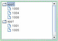
Creating a Row-Leaf Format Table
In the Row-Leaf table format, there is one row in the table for each leaf node in the navigation control. A leaf node is added to the navigation control for each row in the valueTable. The path to a leaf node (that is, the ancestor nodes of the leaf) is determined by the values in each of the table columns specified by the nodeIndexColumnNames property. When the valueTable property is attached to the current table of an indexed RTView cache, the navigation control nodeIndexColumnNames property is typically set to the same columns that are specified for the cache index columns.
To illustrate how to create a navigation control using the Row-Leaf format, let us say we have a cache named Applications that has two index columns, App Name and PID, and the current table in that cache has the following rows:
|
App Name |
PID |
|
App0 |
1000 |
|
App0 |
1004 |
|
App0 |
1008 |
|
App1 |
1001 |
|
App1 |
1005 |
We set the navigation control valueTable property to attach to the cache data, with the following fields specified in the Attach To Cache Data dialog:
Cache: Applications
Table: Current
Specify Row-Leaf format for the valueTableFormat property, and App Name;PID for the nodeIndexColumnNames property. The following figure illustrates the structure of the navigation control. There are two nodes labeled App0 and App1. Node App0 has three child nodes labeled 1000, 1004, 1008. Node App1 has two child nodes, labeled 1001 and 1005.
We add another index column, AgentName, to the Applications cache, so that the current table now has the following rows:
|
Agent Name |
App Name |
PID |
|
Agent1 |
App0 |
1000 |
|
Agent1 |
App0 |
1004 |
|
Agent1 |
App0 |
1008 |
|
Agent1 |
App1 |
1001 |
|
Agent1 |
App1 |
1005 |
|
Agent2 |
App0 |
1000 |
|
Agent2 |
App0 |
1004 |
|
Agent2 |
App1 |
1001 |
We also update the navigation control nodeIndexColumnNames property to AgentName;App Name;PID. The following figure illustrates the new structure of the navigation control: two top-level nodes labeled Agent1 and Agent2, each with two child nodes, app0 and app1.

As illustrated above, the label string for a node at depth N is taken from the Nth column in nodeIndexColumnNames property. Therefore, the labels for the top-level nodes come from the first column in the nodeIndexColumnNames property (AgentName), the labels for the second-level nodes come from the second column in nodeIndexColumnNames property (App Name), and so forth.
To specify node labels from a different set of valueTable columns, use the nodeLabelColumnNames property. Enter a semicolon-separated list of column names in the nodeLabelColumnNames property, one for each level in the navigation control, where the Nth column name in the list contains the labels for navigation control nodes at depth N.
Return to “Tree Control”.
Return to “Accordion Control”.
Creating a Row-Node Format Table
In the Row-Node table format, there is one row in the table for each node in the navigation control, including the top-level node (rather than just the leaf nodes, as with the Row-Leaf format).
Note: For a demo of an tree control that uses a data table in the row-node format, see the treecon.rtv display, located in the RTV_HOME/demos/features directory. The tree in that display is attached to an XML file (navtree_rownode.xml) that defines a navigation tree containing display titles and filenames in the row-node format. To view the demo: in an initialized command window, navigate to the RTV_HOME/demos/features directory, and type: run_viewer -panelconfig:PANELS_treecon.ini. See “Initializing a Command Prompt or Terminal Window” for more information on initializing a command window.
There are two columns in the table that help define the navigation control structure:
§ One of the table columns contains a node ID string and is identified by the nodeIdColumnName property. By default, the node ID string is used as the node label in the navigation control. The node ID string must be unique among all nodes with the same parent. Or, if the uniqueNodeIdFlag property is checked, each node ID string must be unique in the entire navigation control.
§ Another table column contains the ID of the parent node, which is identified by the parentIdColumnName property.
To create the same navigation control as with our Row-Leaf format example, a table representation of the navigation control using the Row-Node format would be as follows:
|
Node |
Parent |
|
app0 |
<blank> |
|
1000 |
app0 |
|
1004 |
app0 |
|
1008 |
app0 |
|
app1 |
<blank> |
|
1001 |
app1 |
|
1005 |
app1 |
The <blank> entries represent an empty string, which indicates that nodes app0 and app1 have no parent, making them top-level nodes in the navigation control.
We set the navigation control:
• valueTable property to attach to the unindexed table
• valueTableFormat property to the Row-Node format
• nodeIdColumnName property to Node
• parentIdColumnName property to Parent
We then have the following navigation control structure. There are two top-level nodes labeled App0 and App1. Node App0 has three child nodes labeled 1000, 1004, 1008. Node App1 has two child nodes, labeled 1001 and 1005.
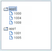
To add another navigation control level for the AgentName, as we did with the Row-Leaf format example, we modify our table as follows:
|
Node |
Parent |
|
Agent1 |
<blank> |
|
app0 |
Agent1 |
|
1000 |
app0 |
|
1004 |
app0 |
|
1008 |
app0 |
|
Agent2 |
<blank> |
|
app0 |
Agent2 |
|
1000 |
app0 |
|
1004 |
app0 |
|
app1 |
Agent2 |
|
1001 |
app1 |
|
1005 |
app1 |
We also uncheck the uniqueNodeIdFlag property to allow for node IDs that are not unique, such as the app0 and 1000 nodes in our example which are used in multiple navigation control levels. Because some of the rows are also identical, the order of the table rows is important. For example, this row appears twice in the table: 1000 app0. In each case the row comes after a unique parent row: first under app0 Agent1 and then under app0 Agent2. The navigation control uses this information to determine where to place the node for 1000 in each case.
The following figure illustrates the new structure of the navigation control. The navigation control now has two top-level nodes labeled Agent1 and Agent2, each with two child nodes, app0 and app1.
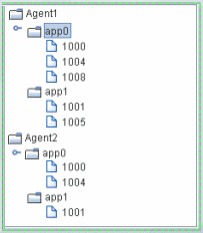
By default, the node ID string is used as the node label in the navigation control. If a different column in the table must provide the label, specify the name of that column in the nodeLabelColumnName property.
Note that in the Row-Node format each branch of the navigation control can have a different depth, while in the Row-Leaf format all branches typically have the same depth (the number of columns specified in the nodeIndexColumnNames property).
Return to “Tree Control”.
Return to “Accordion Control”.
Status Icons
Status icons indicate the current state of a node. You can optionally configure status icons by assigning images that are used when an element in the navigation control has a specified value. You can also configure the status in order of priority so that the most critical status is propagated up to ancestor nodes. The status icon shown for an ancestor node corresponds to the current highest status priority of all of its descendants. By default, no status icons appear in navigation controls.
The status icon for a node is determined by the discrete value of a specified column in the valueTable. The values can be strings or numbers. The comparison is done for an exact match. If the current status value for a navigation control node does not match any of the values you specify in the nodeStatusProperties property, no status icon is displayed for that node.
When a status icon is configured for the tree control, by default the status icon appears on the left of the node label. The value, Left or Right, is specified in the nodeStatusIconPos property. If a node has both a type icon and a status icon, the type icon always appears to the left of the status icon. By default, no status icons appear in the tree.
When a status icon is configured for the accordion control, by default the status icon appears inside the node button, either to the left or right of the button label, according to the value of the nodeStatusIconPos property.
Configuring Status Icons
This section describes how to configure status icons for the navigation controls using the Node Properties dialog.
Note: Status icons can also be configured by Attaching a Status Icon To Data (see below).
To configure the Status Icon
To configure the status icon, specify the status table column name in the nodeStatusColumnName property, then use the nodeStatusProperties property to define a three-column table of data and configure icon behavior.
Note: The nodeStatusProperties property is only visible if the nodeStatusColumnName property is non-blank.
Select the nodeStatusProperties property in the property sheet, then click the  button to open the Node Properties dialog.
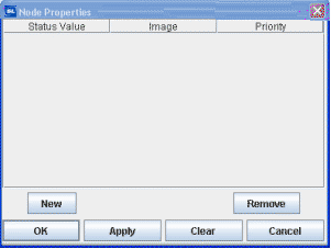
To map an image to a node status
Click New, then click in the Status Value column. A drop-down list appears containing all values in the node status column of the valueTable (which you previously specified in the nodeStatusColumnName property). Select a value from the drop-down list.
Click the  button in the Image column for the node and choose an icon from the Select Image dialog. The icon is used as the status icon for all nodes that match the value selected in the Status column.
Click the  button in the Priority column for the node and assign a integer value: 0, 1, 2, 3, 4, 5, or a higher number (there is no upper limit on the number), where the largest number is the highest priority and propagated up the navigation control first, and a value of zero (0) is not propagated. A value of zero (0) can be assigned to multiple nodes (so that they do not propagate up the navigation control). Non-zero values must be assigned only once.
For example, if we set the nodeStatusColumnName property to our Application Status table column of our valueTable, and define the mapping for the nodeStatusProperties as follows:
|
Status Value |
Image |
Priority |
|---|---|---|
|
blocked |
|
2 |
|
running |
|
1 |
The values in the Application Status column of each row in the valueTable is compared to the two values listed in the Status Value column (blocked and running). If the Application Status value in one of the rows is blocked, the  status icon is displayed as the status icon for that row. If there is no match (for example, the Application Status value in one of the rows is unknown), no status icon is displayed in the navigation control node for that row. Because the
  status icon is assigned the highest priority, the
  status icon is always propagated up the navigation control first. If none of the rows has a blocked status, the
  status icon is propagated up the navigation control.
For example, in the following illustration the priority status of a single node, app3/1003, is propagated up to its parent, app3, and also to the top-level ancestor, Agent1.
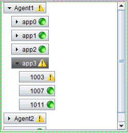
For details about creating an application with multiple panels, see “Multiple Display Panels”.
Attaching a Status Icon To Data
For convenience, the status icon can be attached to data. Typically, an attachment to a static XML file containing the appropriate tables is used. To attach the status icon to data, use the nodeStatusProperties property. The data attachment must be a three-column table. Typically, a static XML file containing the table is used. The first column must contain string values that match values from the column in valueTable specified by the nodeStatusColumnName property. The second column must be the path to the .png, .gif, or .jpg image. The third column must contain the non-negative integer priority value.
Note: A static XML file is only read once each time you run RTView. If you specify (or modify) an XML source using the Application Options dialog, you may specify whether that XML source is static. For details, see “Creating XML Sources”.
navtree.xml For Navigation Control Objects
This section describes how to populate a navigation control object from an XML data source using the navtree.xml format. Using the navtree.xml format enables the XML data source to parse the navtree.xml content and convert it into a table in the row-node format, which is a format accepted by “Navigation Control Objects”. A navigation control--the tree control (class name: obj_c1tree) or the accordion control (class name: obj_c1accordion)--can then be used on an RTView display.
When the XML data source parses the navtree.xml file it creates a table and gives it the data key navtree. When you use the Builder Attach to XML Data dialog, enter navtree in the Data Key field. The table has one row for each node that is defined in the navtree.xml file. The table contains the following columns:
|
Node ID: |
An unique integer assigned to a navigation control object node. |
|
Parent ID: |
The ID of the node's parent, or blank if the node is a top-level node. |
|
Label: |
The value of the node's label attribute. |
|
Display: |
The value of the node's display attribute. |
|
Subs: |
The value of the node's subs attribute (a string containing sub:value pairs, separated by spaces). |
Typically, you attach the valueTable property of a navigation control object to the navtree table, and the navigation control object's valueTableFormat property is set to Row-Node. Subsequently, the column names listed above are specified as values for other properties on the navigation control as follows:
nodeIdColumnName = Node ID
nodeLabelColumnName = Label
parentIdColumnName = Parent ID
uniqueNodeIdFlag = <checked>
valueColumnName = Display
To see an example of an accordion control configured in this manner, use the Builder to examine the display named accordcon.rtv, located in the RTV_HOME/demos/features directory. The XML file used by the example is demos/features/navtree.xml. To see the working example, type the following commands in an RTView command prompt:
cd %RTV_HOME%\demos\features
run_viewer -panelconfig:PANELS_accordcon.ini
In addition to the columns mentioned above, the navtree table's Subs column can also be used to configure the drilldownColumnSubs property of a navigation control. In the “Drill Down Column Substitutions Dialog”, find the row for Column Name = Subs, and in the Substitution String column enter the string __parse (there are two underscores in the prefix), that is:
|
Column Name |
Substitution |
|
Subs |
__parse |
This tells RTView to parse the string found in the Subs column for the node selected in the navigation control, which is expected to contain one or more sub:value pairs, separated by spaces. For example, if the Subs column contains this string:
$sub1:abc $sub2:xyz
and if the navigation control's drilldownColumnSubs property is configured as described, a drilldown from the navigation control the $sub1 and $sub2 substitutions is assigned the values abc and xyz, respectively.
This section describes how to create a tree control (class name: obj_c1tree).
There are two methods for creating a tree-driven multi-panel application: the static tree navigation panel and the tree control. Use the static tree navigation panel method if you know the specific sources that are to populate the tree and they remain constant for the life of the application. For example, if you know all the displays that compose your application and the static representation of a tree will only be used for navigating those displays, the static tree navigation panel is suitable (and is easier to configure). To configure the static tree navigation panel, add the tree using the rtvTreePanel tag to the PANELS.ini file. For details about configuring the tree, see “Multiple Display Panels”.
Use the tree control method if the number of nodes or leaves, labels or icons of the tree change during the lifetime of the application. Data can be provided that will change the nodes and leaves of the tree and also change the labels, and icon representations on the tree with dynamic data.
When constructing an application with multiple panels using the tree control, one panel displays an RTView file that has instanced the tree control and the other contains the displays which are drilled down to by selecting items on the tree. The following illustrates a two-panel application in which the tree control in the left panel updates the display in the right panel:

To see an example of a multi-panel layout that uses a tree control to display live status information (based on alerts) and perform navigation via drill-down in another panel, see the “Navigation Control Demo”.
For details about creating an application with multiple panels, see “Multiple Display Panels”.
Creating a Tree Control
To create a tree control:
1. Attach tabular data to the tree control valueTable property.
2. Specify the table format for the tree in the valueTableFormat property. There are two table format options for navigation controls. The Row-Leaf format is intended for use when the valueTable property is attached to an indexed table and all leaves in the navigation control are at the same depth. Otherwise, the Row-Node format is used. See “Navigation Control Objects” for details.
3. Optionally, configure type icons.
4. Optionally, configure status icons.
Type Icons
Type icons indicate the type of node in the tree. The type icon for each node is determined either by the value of a column in the valueTable property, or by the node position in the tree. By default, the type icon appears to the left of the node label. Also by default, a folder image is used for all non-leaf nodes, and a document image is used for all leaf nodes. If a node has a type icon and a status icon, the type icon appears to the left of the status icon.
You can optionally assign images for type icons. For example, if you have groups of elements based on geographic location, you could assign an icon for the country, state and city (for example, US, California, San Francisco). Or, if you have groups of elements based on their function, you could assign an icon for each function (Purchases, Operations, Sales, and so forth). You can also assign images for each depth in the tree for a visual indication of where you are while navigating within the tree.
Configuring Type Icons
This section describes how to configure status icons for the navigation controls using the Node Properties dialog.
Note: Status icons can also be configured by Attaching a Status Icon To Data.
Use the nodeTypeProperties property to define a two-column table of data. Select the nodeTypeProperties property in the property sheet, then click the  button to open the Node Properties dialog.
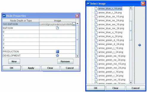
In the Node Properties dialog, the Node Depth or Type column lists the available nodes. The first two rows, non-leaf node and leaf node, indicate the default settings: non-leaf nodes in the tree use a folder image and leaf nodes use a document image. To change the default setting, click the  button in the Image column for the node and choose an icon from the Select Image dialog.
The next five rows, numbered 0 - 4, represent the node depth or level, zero (0) being the root node. The Image column lists the icons being used for each node. By default, the Image column for all of those rows is <blank>, indicating that the non-leaf node and leaf node icon assignments are used. Icon assignments override non-leaf node and leaf node assignments.
Mapping an Image to a Node Level
You can assign an image icon based on node level. The icon provides a visual indication of where you are while navigating in the tree. To assign an image to a specific node level in the tree, click the  button for one of the rows numbered 0 - 4 in the Image column and choose an icon from the Select Image dialog. Repeat for each node level.
Mapping an Image to a Node Type
You can assign an image icon based on node labels you create that describe the nodes as a group. For example, in the following illustration the Node Depth or Type column contains the string PRODUCTION with the  image selected, and the string DEVELOPMENT with the
  image selected.
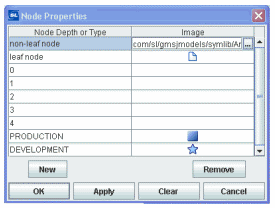
This means that all nodes whose label matches the PRODUCTION string display the  image in the tree, and all nodes whose label matches the DEVELOPMENT string display the
  image in the tree.
To assign an image to a specific node type in the tree, assign a column name in the nodeTypeColumnName property. Select the nodeTypeProperties property in the property sheet, then click on the  button to open the Node Properties dialog. Click New to add a custom row to the table. A drop-down list of values for the column assigned to the nodeTypeColumnName property appears in the Node Depth or Type column. Select a column name from the drop-down list. Click the
  button in the Image column and choose an icon (to use for all nodes that have that column name in the valueTable row that corresponds to the node) from the Select Image dialog.
You can also type a string in the Node Depth or Type column and the Image column.
To not use an icon, in the Node Properties dialog, select the icon in the Image column, then click Clear.
Note: The root node is invisible if the rootNodeLabel property is blank.
For details about type icon determination, see Logic for determining type icon (below).
For details about creating an application with multiple panels, see “Multiple Display Panels”.
Attaching an Icon To Data
For convenience, the type icon can be attached to data. Typically, an attachment to a static XML file containing the appropriate tables is used. To attach the type icon to data, use the nodeTypeProperties property. The data attachment must be a two-column table. The first column must contain string values of _node (for non-leaf nodes), _leaf (for leaf nodes), numeric values for depth, or string values that match the node labels, or the values from the column in valueTable specified by the nodeTypeColumnName property. The second column must be the path to the .png, .gif, or .jpg image. The default assignments are _node, rtvTreeNode16.png and _leaf, rtvTreeLeaf16.png. The column names are not important.
Note: A static XML file is only read once each time you run RTView. If you specify (or modify) an XML source using the Application Options dialog, you may specify whether that XML source is static. For details, see “Creating XML Sources”.
Background Properties
Specify how the background is displayed in the tree control.
|
Property Name |
Description |
|
bgBorderFlag |
When checked, a one pixel dark border is drawn around the tree. If unchecked, no border is drawn. By default, the flag is checked and the border is visible. Note: The border color and width are not configurable. |
|
bgColor |
Select the |
Data Properties
Specify how data is displayed in the tree control.
|
Property Name |
Description |
|
nodeIdColumnName |
This property is available when the valueTableFormat is Row-Node. With the Row-Node format there are two table columns that define the tree structure: the nodeIdColumnName property and the parentIdColumnName property specify the two columns. The nodeIdColumnName property specifies the table column containing the node ID string. The node ID string must be unique among all nodes with the same parent. Or, if the uniqueNodeIdFlag property is checked, each node ID string must be unique in the entire tree. By default, the node ID string is used as the node label in the tree. |
|
nodeIndexColumnNames |
This property is available when the valueTableFormat is Row-Leaf. Specifies the path to a leaf node (that is, the ancestor nodes of the leaf). When the valueTable property is attached to the current table of an indexed RTView cache, the nodeIndexColumnNames property is typically set to the same columns that are specified for the cache index columns. Enter a semicolon-separated list of column names, where the Nth column name in the list contains the labels for tree nodes at depth N. The labels for top-level nodes are defined by the first column in the nodeIndexColumnNames property, the labels for the second-level nodes are defined by the second column, and so forth. |
|
|
For example: AgentName;App Name;PID The labels for the top-level nodes are defined by the AgentName column, the labels for the second-level nodes are defined by the App Name column, and labels for the third-level nodes are defined by the PID column. To specify node labels from a different set of valueTable columns, use the nodeLabelColumnNames property. |
|
nodeLabelColumnName |
This property is available when the valueTableFormat is Row-Node. By default, the node ID string is used as the node label in the tree. Use the nodeLabelColumnName property to specify a different valueTable column to provide the label. |
|
nodeLabelColumnNames |
This property is available when the valueTableFormat is Row-Leaf. Use the nodeLabelColumnNames property to specify a different set of valueTable columns to provide node labels. Enter a semicolon-separated list of column names, one for each level in the tree, where the Nth column name in the list contains the labels for tree nodes at depth N. |
|
nodeStatusColumnName |
This property applies to the status icon. Specifies the name of the valueTable column containing node status values. The column specified populates the Node Properties dialog Status Value column, in which you map node status values to image icons. The icons are displayed for any node whose value matches the value selected. |
|
nodeTypeColumnName |
This property applies to the type icon. Specifies the name of the valueTable column containing values to use for mapping icon images to node types in the tree. The column specified populates the list of available values in the Node Properties dialog Node Depth or Type column, in which you map node types to image icons. The icons are displayed for any node whose value matches the value selected. |
|
parentIdColumnName |
This property is available when the valueTableFormat is Row-Node. With the Row-Node format there are two table columns that define the tree structure: the parentIdColumnName property and the nodeIdColumnName property specify the two columns. The parentIdColumnName property specifies the table column containing the parent node ID. |
|
roleCheckColumnName |
The name of a string column in the data table containing display the names to be checked against the user's role. The default value is Display. Use this property to show/hide tree nodes based on user role definitions. If a row's value in the specified column is the name of a display to which the user's role is denied access, the tree does not show a node for that row. For details about user roles and display access, see “Role Definitions”. |
|
selectedValue |
This column specifies the value of the currently selected node in the tree. |
|
selectedValueColumnName |
If specified, the values in this column will be compared to the selectedValue in order to set the tree selection. If not specified, the selectedValue will be compared to the values in the column specified in valueColumnName property. |
|
uniqueNodeIdFlag |
This property is available when the valueTableFormat is Row-Node. When enabled, specifies that each node ID string must be unique in the entire tree. When disabled, specifies that each node ID string must be unique among all nodes with the same parent. |
|
valueColumnName |
Specifies the name of the column whose value is assigned to the $value variable when a node in the tree is selected. If not specified, the label string of the selected node is assigned to the $value variable. The $value variable is the only substitution that can be used in the Display Name field of a drill-down command. |
|
valueTable |
Attach your tabular input data to this property. There are two valueTable format options you can use to create your table: § Row-Leaf format: See “Navigation Control Objects” for details about creating the table. § Row-Node format: See Row-Node for details about creating the table. If you have an XML file that has the navtree.xml format you can convert it into a row-node format. For details, see “navtree.xml For Navigation Control Objects”. Note: As with other table-driven objects, the drillDownColumnSubs property can be configured to set substitutions to column values from the row in the valueTable that corresponds to the selected tree node. |
|
valueTableFormat |
Specifies the format of the valueTable: Row-Leaf or Row-Node. |
|
varToSet |
Allows you to update the attached variable with the value from the control. |
Interaction Properties
Specify interactions in the tree control.
|
Property Name |
Description |
|
actionCommand |
Use the actionCommand property to assign a command to the tree. You can configure the tree to open a drill-down display, set substitutions, or execute a command in response to a user click on a tree node. The actionCommand can reference the value from the tree by using the keyword $value. When the command is executed, the variable attached to varToSet is updated with the selected node data. The drillDownColumnSubs property can be configured to set substitutions to column values from the row in the valueTable that corresponds to the selected tree node. If the execOnLeafOnlyFlag property is checked, the tree actionCommand property executes only when a leaf node is clicked (a click on a non-leaf node expands only the node). If unchecked, the tree actionCommand property executes on all nodes, not just the leaf. |
|
commandCloseWindowOnSuccess |
If selected, the window that initiates a system command will automatically close when the system command is executed successfully. This property only applies to system commands. With data source commands, the window is closed whether or not the command is executed successfully. For multiple commands, this property is applied to each command individually. Therefore, if the first command in the multiple command sequence succeeds, the window will close before the rest of the commands are executed. Note: The commandCloseWindowOnSuccess property is not supported in the Display Server. |
|
commandConfirm |
If selected, the command confirmation dialog is enabled. Use the commandConfirmText property to write your own text for the confirmation dialog, otherwise text from the command property will be used. For multiple commands, if you Confirm the execution then all individual commands will be executed in sequence with no further confirmation. If the you Cancel the execution, none of the commands in the sequence will executed. |
|
commandConfirmText |
Enter command confirmation text directly in the Property Value field or select the |
|
drillDownColumnSubs |
Use the drillDownColumnSubs property to set substitutions to column values from the row in the valueTable that corresponds to the selected tree node. Select the |
|
drillDownTarget |
Name of display (.rtv) file targeted as a drill down. See “Drill Down Displays” for information. |
|
enabledFlag |
If unchecked, the tree nodes are the color gray and do not respond to user input. |
|
execOnLeafOnlyFlag |
If checked, the tree actionCommand is executed only for leaf nodes, and a click on a non-leaf node only expands the node. Also, the mouseover tooltip only appears for leaf nodes. If unchecked, the tree actionCommand property executes on all nodes, and the mouseover tooltip appears for all nodes. |
|
menuItemGroup |
Use the menuItemGroup property to extend RTView context menu items. For details, see “Extending the Context Menu”. |
|
mouseOverFlag |
Specifies whether a tooltip appears when the cursor is positioned over a node. The tooltip shows the node path (the node label preceded by the labels of all of its ancestors), the node status (if the nodeStatusColumnName property is specified), and its value (if the valueColumnName property is specified). |
|
rightClickActionFlag |
Use the rightClickActionFlag property to extend RTView context menu items. For details, see “Extending the Context Menu”. |
|
tabIndex |
Use the tabIndex property to define the order in which the tree receives focus when navigated from your keyboard. Initial focus is given to the object with the smallest tabIndex value, from there the tabbing order proceeds in ascending order. If multiple objects share the same tabIndex value, initial focus and tabbing order are determined by the alpha-numeric order of the table names. Tables with a tabIndex value of 0 are last in the tabbing order. Note: The tabIndex property does not apply to tables in the Display Server, nor to objects that are disabled, invisible, or have a value of less than 0. |
Label Properties
Specify the label in the tree control.
|
Property Name |
Description |
|
labelTextColor |
Select the |
|
labelTextFont |
Select font style of label text from the drop-down menu. |
|
labelTextSize |
Set the height of the label text in pixels. |
Node Properties
Specify the node structure in the tree control.
|
Property Name |
Description |
|
initialExpandDepth |
Specify the depth that nodes automatically expand (open) to when the tree is populated. All non-leaf nodes at a depth that is less than or equal to the initialExpandDepth property are expanded automatically. By default, the value is 0 (zero). When calculating node depth, the root node has a depth of zero. (All trees have a root node but it is visible only if the rootNodeLabel property is set). Because the default value of initialExpandDepth is zero, only the root node is expanded automatically. Changing the value of initialExpandDepth from a larger value to a smaller value has no effect until the display containing the tree is reopened. Note: Use this property with caution on large trees as the automatic expansion of a large number of nodes can cause slow performance. |
|
nodeClosedImage |
This property specifies the name of the images to be shown to the left of a closed parent (non-leaf) tree node. This property is blank by default, which indicates that the default closed images should be used. |
|
nodeOpenImage |
This property specifies the name of the images to be shown to the left of an open parent (non-leaf) tree node. This property is blank by default, which indicates that the default open images should be used. |
|
nodeSelectColor |
This property sets the background color for the selected tree node. If set to Default, then the platform or browser default selection color is used. |
|
nodeSelectTextColor |
This property sets the text color for the selected tree node. If set to Default, then the platform or browser default selection color is used. |
|
nodeStatusIconPos |
Specify the status icon position in the tree: Left or Right. By default, the status icon appears on the left of the node label. If a node has both a type icon and a status icon, the type icon always appears to the left of the status icon. By default, no status icons appear in the tree. |
|
nodeStatusProperties |
This property applies to the status icon. Specifies the status icon for a node. By default, no status icon is displayed. Select the Note: The nodeStatusProperties property is visible only if the nodeStatusColumnName property is non-blank. You can also use the nodeStatusProperties property to attach a status icon to data. The data attachment must be a three-column table. Typically, a static XML file containing the table is used. The first column must contain string values that match values from the column in valueTable specified by the nodeStatusColumnName property. The second column must be the path to the .png, .gif, or .jpg image. The third column must contain the non-negative integer priority value. Note: A static XML file is only read once each time you run RTView. If you specify (or modify) an XML source using the Application Options dialog, you may specify whether that XML source is static. For details, see “Creating XML Sources”. |
|
nodeTypeProperties |
This property applies to the type icon. Specifies the type icon for a node. By default, non-leaf nodes in the tree use a folder image and leaf nodes use a document image. Select the You can also use the nodeTypeProperties property to attach a type icon to data. The data attachment must be a two-column table. Typically, a static XML file containing the table is used. The first column must contain string values of _node (for non-leaf nodes), _leaf (for leaf nodes), numeric values for depth, or string values that match the node labels, or the values from the column in valueTable specified by the nodeTypeColumnName property. The second column must be the path to the .png, .gif, or .jpg image. The default assignments are _node, rtvTreeNode16.png and _leaf, rtvTreeLeaf16.png. The column names are not important. Logic for determining which type icon is used: If the nodeTypeColumnName property specifies column C, and the value of C in the valueTable row that corresponds to N is V, and there is a row in nodeTypeProperties that assigns value V to image I1, I1 is used as the type icon for N. Otherwise: § if the label of node N is XYZ, and there is a row in the nodeTypeProperties property that assigns value XYZ to image I2, I2 is used. Otherwise, § if the depth of node N is D, and there is a row in the nodeTypeProperties property that assigns depth D to image I3, I2 is used. Otherwise, § if N is a leaf, and the leaf node image is I4, I4 is used. If I4 is blank no type icon appears. Otherwise, § if the non-leaf node image is I5, I5 is used. If I5 is blank no type icon appears. Note: A static XML file is only read once each time you run RTView. If you specify (or modify) an XML source using the Application Options dialog, you may specify whether that XML source is static. For details, see “Creating XML Sources”. |
|
rootNodeLabel |
Specify whether the tree root node is visible. By default, this property is blank and the root node is not visible. |
Object Properties
Specify the layout in the tree control.
|
Property Name |
Description |
|
anchor |
Specify where to anchor an object in the display. Note: If an object has the dock property set, the anchor property will be ignored. The anchor property is only applied when the dimensions of the display are modified, either by editing “Background Properties”or resizing the window in Layout mode Select None, or one or more the following options: None - Object not anchored. This is the default. Top - Anchor top of object at top of display. Left - Anchor left side of object at left of display. Bottom - Anchor bottom of object at bottom of display. Right - Anchor right side of object at right of display. When a display is resized, the number of pixels between an anchored object and the specified location remain constant. If an object is anchored on opposite sides (i.e. Top and Bottom or Left and Right), the object will be stretched to fill the available space. If the Resize Mode is set to Scale and an object is anchored on opposite sides, then the object with be moved rather than stretched to fill the available space. |
|
dock |
Specify the docking location of an object in the display. Note: An object should not be docked if the Resize Mode is set to Scale. Select from the following options: None - Object is not docked. This is the default. Top - Dock object at top of display. Left - Dock object at left of display. Bottom - Dock object at bottom of display. Right - Dock object at right of display. Fill - Dock object in available space remaining in the display after all docked objects are positioned. If the dimensions of the display are modified, either by editing “Background Properties” or resizing the window in Layout mode, the properties (objX, objY, objWidth, and objHeight) of docked objects will automatically adapt to match the new size of the display. When multiple objects are docked to the same side of the display, the first object is docked against the side of the display, the next object is docked against the edge of the first object, and so on. When objects are docked to multiple sides of the display, the order in which objects were added to the display controls docking position. For example, let's say the first object added to the display is docked at the Top and the second object is docked at the Left. Consequently, the first object will fill the entire width of the display and the second object will fill the left side of the display from the bottom of the first object to the bottom of the display. Objects in a display have the dock property set to Fill, are laid out across a grid in the available space remaining after all docked objects are positioned. By default, the grid has one row and as many columns as there are objects in the display. You can modify the grid in the Background Properties dialog. |
|
|
Once an object is docked, there are some limitations on how that object can be modified. § Docked objects cannot be dragged or repositioned using objX and objY properties. § Docked objects cannot be resized using the objWidth or objHeight properties. To resize you must drag on the resize handle. § Docked objects can only be resized toward the center of the display (e.g. If an object is docked at the Top, only its height can be increased by dragging down toward the center of the display). § Docked objects set to Fill cannot be resized at all. § Docked objects cannot be moved using Align. Non-docked objects can be aligned against a docked object, but a docked object will not move to align against another object. § Docked objects are ignored by Distribute. |
|
objHeight |
Sets the height (in pixels) of the object. |
|
objName |
Name given to facilitate object management via the Object List dialog. Select Tools>Object List. |
|
objWidth |
Sets the width (in pixels) of the object. |
|
objX |
Set the x position of the object. |
|
objY |
Set the y position of the object. |
|
styleClass |
Enter the style class name for this object as defined in your style sheet. If not specified, the object class name is used. Note: The value entered must not contain spaces and cannot start with rtv-. |
|
visFlag |
Set the visibility of the object. |
Unique Behavior
The following describes properties that behave uniquely with the tree control.
valueColumnName: This property specifies the name of the column whose value should be assigned to the $value variable when a node in the tree is clicked. If not specified, the label string of the selected node is assigned to $value. Note the $value is the only substitution that can be used in the Display Name field of a drill-down command.
mouseOverFlag: If this property is checked, a tooltip appears when the cursor is positioned over a leaf node. The tooltip shows the node path (the node label preceded by the labels of all of its ancestors), the node status (if the nodeStatusColumnName property is specified), and its value (if the valueColumnName property is specified).
execOnLeafOnlyFlag: If this property is checked, the tree actionCommand property executes only when a leaf node is clicked (a click on a non-leaf node expands only the node). If unchecked, the tree actionCommand property executes on all nodes, not just the leaf.
rootNodeLabel: This property specifies the tree root node (of which there is only one). By default, this property is blank and the root node is not visible.
Limitations
§ In the Display Viewer, mouseover text is displayed only if the tree has focus.
§ If the valueTableFormat property for the tree control is Row-Leaf, the context menu feature applies to a right-click or a double-click on leaf nodes only. That is, a right-click on a non-leaf node does not add items to the menu and a double-click on a non-leaf node simply expands or collapses the tree node, it does not invoke the double-click action.
In the Thin Client:
§ The tree node appearance, such as spacing and fonts, might vary slightly as compared to the Display Viewer, and also may vary slightly between different browsers.
§ A tree node cannot expand/collapse by double-clicking on it. The +/- icon must be clicked.
§ In Internet Explorer, nodes expand/collapse even if the tree enabledFlag property is unchecked. (However, the tree actionCommand cannot be invoked).
§ In Mozilla Firefox, the horizontal scrollbar might appear and disappear after each mouse click in the tree.
§ In iOS Safari (iPad), if the tree mouseOverFlag property is checked, a user must click a tree node twice to invoke the tree command. The first click only displays the node mouseover text.
§ In iOS Safari (iPad), scrollbars will not appear in a tree control. If the tree contains more nodes than are visible, use a two-finger drag gesture inside the tree area to scroll.
§ In iOS Safari, a click on the +/- icon expands/collapses the node as expected. However, if the execOnLeafOnlyFlag property is unchecked, the tree command is also executed.
§ In Internet Explorer, if you double-click directly on a leaf node the node is selected but the double-click action is NOT invoked. The double-click action is invoked only if you click on the empty space in the tree to the left or the right of the leaf node, or in the small hollow square located to the left of the leaf node.
This section describes how to create an accordion control (class name: obj_c1accordion).
There are two methods for creating an accordion-driven multi-panel application: the static accordion navigation panel and the accordion control. Use the static accordion navigation panel method if you know the specific sources that are to populate the accordion and they remain constant for the life of the application. For example, if you know all the displays that compose your application and the static representation of an accordion will only be used for navigating those displays, the static accordion navigation panel is suitable (and is easier to configure). To configure the static accordion navigation panel, add the accordion using the rtvAccordionPanel tag to the PANELS.ini file. For details about configuring the accordion, see “Multiple Display Panels”.
Use the accordion control method if the number of nodes or leaves, labels or icons of the accordion change during the lifetime of the application. Data can be provided that will change the nodes and leaves of the accordion and also change the labels, and icon representations on the accordion with dynamic data.
When constructing an application with multiple panels using the accordion control, one panel displays an RTView file that has instanced the accordion control and the other contains the displays which are drilled down to by selecting items on the accordion. The following illustrates a two-panel application in which the accordion control in the left panel updates the display in the right panel:
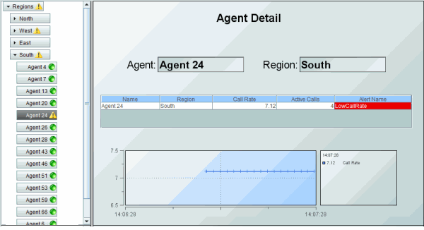
To see an example of a multi-panel layout that uses an accordion control to display live status information and perform navigation via drill-down in another panel, see the “Navigation Control Demo”.
For details about creating an application with multiple panels, see “Multiple Display Panels”.
Creating an Accordion Control
To create an accordion control:
1. Attach tabular data to the accordion control valueTable property.
2. Specify the table format for the accordion in the valueTableFormat property. There are two table format options for navigation controls. The Row-Leaf format is intended for use when the valueTable property is attached to an indexed table and all leaves in the navigation control are at the same depth. Otherwise, the Row-Node format is used. See “Navigation Control Objects” for details.
3. Optionally, configure accordion icons.
4. Optionally, configure status icons.
Accordion Icons
Nodes in an accordion control appear as pushbuttons and a single branch is expanded at a time. Accordion control icons indicate whether an element is closed, open, or a leaf node.
Each node in an accordion is either a parent node or a leaf node. A parent node has one or more child nodes that are visible when the node is expanded (opened) and are invisible when the node is collapsed (closed). When a parent node is expanded, a small down arrow icon is displayed near the left edge of the button. When a parent node is collapsed, a small right arrow icon is displayed.
A leaf node has no children and thus cannot be expanded or collapsed.
Configuring Accordion Icons
The images used for these icons are specified by the accordionOpenImage and accordionClosedImage properties, respectively. Note that a leaf node never displays either of these icons.
The color of accordion node buttons that are not selected is specified by the accordionColor property, the color of the accordion node button that is selected is specified by the accordionSelectColor property, the text color for the accordion node that is selected is specified by the accordionSelectTextColor property and the width for each accordion button is specified by the accordionWidth property.
Background Properties
Specify how the background is displayed in the accordion control.
|
Property Name |
Description |
|
bgBorderFlag |
When checked, a one pixel dark border is drawn around the accordion. If unchecked, no border is drawn. By default, the flag is checked and the border is visible. Note: The border color and width are not configurable. |
|
bgColor |
Select the |
Data Properties
Specify how data is displayed in the accordion control.
|
Property Name |
Description |
|
nodeIdColumnName |
This property is available when the valueTableFormat is Row-Node. With the Row-Node format there are two table columns that define the accordion structure: the nodeIdColumnName property and the parentIdColumnName property specify the two columns. The nodeIdColumnName property specifies the table column containing the node ID string. The node ID string must be unique among all nodes with the same parent. Or, if the uniqueNodeIdFlag property is checked, each node ID string must be unique in the entire accordion. By default, the node ID string is used as the node label in the accordion. |
|
nodeIndexColumnNames |
This property is available when the valueTableFormat is Row-Leaf. Specifies the path to a leaf node (that is, the ancestor nodes of the leaf). When the valueTable property is attached to the current table of an indexed RTView cache, the nodeIndexColumnNames property is typically set to the same columns that are specified for the cache index columns. Enter a semicolon-separated list of column names, where the Nth column name in the list contains the labels for accordion nodes at depth N. The labels for top-level nodes are defined by the first column in the nodeIndexColumnNames property, the labels for the second-level nodes are defined by the second column, and so forth. For example: AgentName;App Name;PID The labels for the top-level nodes are defined by the AgentName column, the labels for the second-level nodes are defined by the App Name column, and labels for the third-level nodes are defined by the PID column. To specify node labels from a different set of valueTable columns, use the nodeLabelColumnNames property. |
|
nodeLabelColumnName |
This property is available when the valueTableFormat is Row-Node. By default, the node ID string is used as the node label in the accordion. Use the nodeLabelColumnName property to specify a different valueTablecolumn to provide the label. |
|
nodeLabelColumnNames |
This property is available when the valueTableFormat is Row-Leaf. Use the nodeLabelColumnNames property to specify a different set of valueTablecolumns to provide node labels. Enter a semicolon-separated list of column names, one for each level in the accordion, where the Nth column name in the list contains the labels for accordion nodes at depth N. |
|
nodeStatusColumnName |
This property applies to the status icon. Specifies the name of the valueTable column containing node status values. The column specified populates the Node Properties dialog Status Value column, in which you map node status values to image icons. The icons are displayed for any node whose value matches the value selected. |
|
parentIdColumnName |
This property is available when the valueTableFormat is Row-Node. With the Row-Node format there are two table columns that define the accordion structure: the parentIdColumnName property and the nodeIdColumnName property specify the two columns. The parentIdColumnName property specifies the table column containing the parent node ID. |
|
roleCheckColumnName |
The name of a string column in the data table containing the display names to be checked against the user's role. The default value is Display. Use this property to show/hide accordion nodes based on user role definitions. If a row's value in the specified column is the name of a display to which the user's role is denied access, the accordion does not show a node for that row. For details about user roles and display access, see “Role Definitions”. |
|
selectedValue |
This column specifies the value of the currently selected node in the accordion. |
|
selectedValueColumnName |
If specified, the values in this column will be compared to the selectedValue in order to set the accordion selection. If not specified, the selectedValue will be compared to the values in the column specified in valueColumnName property. |
|
uniqueNodeIdFlag |
This property is available when the valueTableFormat is Row-Node. When enabled, specifies that each node ID string must be unique in the entire accordion. When disabled, specifies that each node ID string must be unique among all nodes with the same parent. |
|
valueColumnName |
Specifies the name of the column whose value is assigned to the $value variable when a node in the accordion is selected. If not specified, the label string of the selected node is assigned to the $value variable. The $value variable is the only substitution that can be used in the Display Name field of a drill-down command. |
|
valueTable |
Attach your tabular input data to this property. There are two valueTable format options you can use to create your table: § Row-Leaf format: See “Navigation Control Objects” for details about creating the table. § Row-Node format: See “Navigation Control Objects” for details about creating the table. If you have an XML file that has the navtree.xml format you can convert it into a row-node format. For details, see “navtree.xml For Navigation Control Objects”. Note: As with other table-driven objects, the drillDownColumnSubs property can be configured to set substitutions to column values from the row in the valueTable that corresponds to the selected accordion node. |
|
valueTableFormat |
Specifies the format of the valueTable: Row-Leaf or Row-Node. |
|
varToSet |
Allows you to update the attached variable with the value from the control. |
Interaction Properties
Specify interactions in the accordion control.
|
Property Name |
Description |
|
accordionCollapseFlag |
When checked, only one branch of the accordion will be open at a time. If you click a node to open another branch, then the previously open branch is automatically closed. If this flag is unchecked, opening another branch has no affect on other open branches. This flag is checked by default. |
|
actionCommand |
Use the actionCommand property to assign a command to the accordion. You can configure the accordion to open a drill-down display, set substitutions, or execute a command in response to a user click on an accordion node. The actionCommand can reference the value from the accordion by using the keyword $value. When the command is executed, the variable attached to varToSet is updated with the selected node data. The drillDownColumnSubs property can be configured to set substitutions to column values from the row in the valueTable that corresponds to the selected accordion node. If the execOnLeafOnlyFlag property is checked, the accordion actionCommand property executes only when a leaf node is clicked (a click on a non-leaf node expands only the node). If unchecked, the accordion actionCommand property executes on all nodes, not just the leaf. |
|
commandCloseWindowOnSuccess |
If selected, the window that initiates a system command will automatically close when the system command is executed successfully. This property only applies to system commands. With data source commands, the window is closed whether or not the command is executed successfully. For multiple commands, this property is applied to each command individually. Therefore if the first command in the multiple command sequence succeeds, the window will close before the rest of the commands are executed. Note: The commandCloseWindowOnSuccess property is not supported in the Display Server. |
|
commandConfirm |
If selected, the command confirmation dialog is enabled. Use the commandConfirmText property to write your own text for the confirmation dialog, otherwise text from the command property will be used. For multiple commands, if you Confirm the execution then all individual commands will be executed in sequence with no further confirmation. If the you Cancel the execution, none of the commands in the sequence will executed. |
|
commandConfirmText |
Enter command confirmation text directly in the Property Value field or select the |
|
drillDownColumnSubs |
Use the drillDownColumnSubs property to set substitutions to column values from the row in the valueTable that corresponds to the selected accordion node. Select the |
|
enabledFlag |
If unchecked, the accordion nodes are the color gray and do not respond to user input. |
|
execOnLeafOnlyFlag |
If checked, the accordion actionCommand is executed only for leaf nodes, and a click on a non-leaf node only expands the node. Also, the mouseover tooltip only appears for leaf nodes. If unchecked, the accordion actionCommand property executes on all nodes, and the mouseover tooltip appears for all nodes. |
|
mouseOverFlag |
Specifies whether a tooltip appears when the cursor is positioned over a node. The tooltip shows the node path (the node label preceded by the labels of all of its ancestors), the node status (if the nodeStatusColumnName property is specified), and its value (if the valueColumnName property is specified). |
|
tabIndex |
Use the tabIndex property to define the order in which the accordion receives focus when navigated from your keyboard. Initial focus is given to the object with the smallest tabIndex value, from there the tabbing order proceeds in ascending order. If multiple objects share the same tabIndex value, initial focus and tabbing order are determined by the alpha-numeric order of the table names. Tables with a tabIndex value of 0 are last in the tabbing order. Note: The tabIndex property does not apply to tables in the Display Server, nor to objects that are disabled, invisible, or have a value of less than 0. |
Label Properties
Specify the label in the accordion control.
|
Property Name |
Description |
|
labelTextColor |
Select the |
|
labelTextFont |
Select font style of label text from the drop-down menu. |
|
labelTextSize |
Set the height of the label text in pixels. |
Node Properties
Specify the node structure in the accordion control.
|
Property Name |
Description |
|
accordionClosedImage |
Specify the icon that appears to the left of the label for a closed (collapsed) accordion node. The default is a small right arrow. |
|
accordionColor |
Specify the color of the accordion node buttons that are not selected. |
|
accordionOpenImage |
Specify the icon that appears to the left of the label for an open (expanded) accordion node. The default is a small down arrow. |
|
accordionSelectColor |
Specify the color of the accordion node that is selected. |
|
accordionSelectTextColor |
Specify the text color for the accordion node that is selected (all unselected nodes use labelTextColor). |
|
accordionWidth |
Specify the width, in pixels, for each accordion button. If a value of zero (the default) is specified, the width of each node is computed automatically and might be different for each node. Specify a nonzero value if you want all buttons to have the same size, for a more uniform appearance. |
|
nodeStatusIconPos |
Specify the status icon position in the accordion: Left or Right. By default, the status icon appears on the left of the node label. By default, no status icons appear in the accordion. |
|
nodeStatusProperties |
This property applies to the status icon. Specifies the status icon for a node. By default, no status icon is displayed. Select the The nodeStatusProperties property is visible only if the nodeStatusColumnName property is non-blank. You can also use the nodeStatusProperties property to attach a status icon to data. The data attachment must be a three-column table. Typically, a static XML file containing the table is used. The first column must contain string values that match values from the column in valueTable specified by the nodeStatusColumnName property. The second column must be the path to the .png, .gif, or .jpg image. The third column must contain the non-negative integer priority value. A static XML file is only read once each time you run RTView. If you specify (or modify) an XML source using the Application Options dialog, you may specify whether that XML source is static. For details, see “Creating XML Sources”. |
|
rootNodeLabel |
Specify whether the accordion root node is visible. By default, this property is blank and the root node is not visible. |
Object Properties
Specify the layout in the accordion control.
|
Property Name |
Description |
|
anchor |
Specify where to anchor an object in the display. Note: If an object has the dock property set, the anchor property will be ignored. The anchor property is only applied when the dimensions of the display are modified, either by editing “Background Properties” or resizing the window in Layout mode Select None, or one or more the following options: None - Object not anchored. This is the default. Top - Anchor top of object at top of display. Left - Anchor left side of object at left of display. Bottom - Anchor bottom of object at bottom of display. Right - Anchor right side of object at right of display. When a display is resized, the number of pixels between an anchored object and the specified location remain constant. If an object is anchored on opposite sides (i.e. Top and Bottom or Left and Right), the object will be stretched to fill the available space. Note: If the Resize Mode is set to Scale and an object is anchored on opposite sides, then the object with be moved rather than stretched to fill the available space. |
|
dock |
Specify the docking location of an object in the display. Note: An object should not be docked if the Resize Mode is set to Scale. Select from the following options: None - Object is not docked. This is the default. Top - Dock object at top of display. Left - Dock object at left of display. Bottom - Dock object at bottom of display. Right - Dock object at right of display. Fill - Dock object in available space remaining in the display after all docked objects are positioned. If the dimensions of the display are modified, either by editing “Background Properties” or resizing the window in Layout mode, the properties (objX, objY, objWidth, and objHeight) of docked objects will automatically adapt to match the new size of the display. When multiple objects are docked to the same side of the display, the first object is docked against the side of the display, the next object is docked against the edge of the first object, and so on. When objects are docked to multiple sides of the display, the order in which objects were added to the display controls docking position. For example, let's say the first object added to the display is docked at the Top and the second object is docked at the Left. Consequently, the first object will fill the entire width of the display and the second object will fill the left side of the display from the bottom of the first object to the bottom of the display. Objects in a display have the dock property set to Fill, are laid out across a grid in the available space remaining after all docked objects are positioned. By default, the grid has one row and as many columns as there are objects in the display. You can modify the grid in the Background Properties dialog. |
|
|
Once an object is docked, there are some limitations on how that object can be modified. § Docked objects cannot be dragged or repositioned using objX and objY properties. § Docked objects cannot be resized using the objWidth or objHeight properties. To resize you must drag on the resize handle. § Docked objects can only be resized toward the center of the display (e.g. If an object is docked at the Top, only its height can be increased by dragging down toward the center of the display). § Docked objects set to Fill cannot be resized at all. § Docked objects cannot be moved using Align. Non-docked objects can be aligned against a docked object, but a docked object will not move to align against another object. § Docked objects are ignored by Distribute. |
|
objHeight |
Sets the height (in pixels) of the object. |
|
objName |
Name given to facilitate object management via the Object List dialog. Select Tools>Object List. |
|
objWidth |
Sets the width (in pixels) of the object. |
|
objX |
Set the x position of the object. |
|
objY |
Set the y position of the object. |
|
styleClass |
Enter the style class name for this object as defined in your style sheet. If not specified, the object class name is used. See “Creating Style Sheets” for more information. Note: The value entered must not contain spaces and cannot start with rtv-. |
|
visFlag |
Set the visibility of the object. |
Unique Behavior
The following describes properties that behave uniquely with the accordion control.
valueColumnName: This property specifies the name of the column whose value should be assigned to the $value variable when a node in the accordion is clicked. If not specified, the label string of the selected node is assigned to $value. Note the $value is the only substitution that can be used in the Display Name field of a drill-down command.
mouseOverFlag: If this property is checked, a tooltip appears when the cursor is positioned over a leaf node. The tooltip shows the node path (the node label preceded by the labels of all of its ancestors), the node status (if the nodeStatusColumnName property is specified), and its value (if the valueColumnName property is specified).
execOnLeafOnlyFlag: If this property is checked, the accordion actionCommand property executes only when a leaf node is clicked (a click on a non-leaf node expands only the node). If unchecked, the accordion actionCommand property executes on all nodes, not just the leaf.
rootNodeLabel: This property specifies the accordion root node (of which there is only one). By default, this property is blank and the root node is not visible.
Limitations
In the Display Viewer, mouseover text is displayed only if the accordion has focus.
In the Thin Client:
§ The accordion node appearance, such as spacing and fonts, might vary slightly as compared to the Display Viewer, and also may vary slightly between different browsers.
§ In iOS Safari (iPad), if the accordion mouseOverFlag property is checked, a user must click an accordion node twice to invoke the accordion command. The first click only displays the node mouseover text.
§ In iOS Safari (iPad), scrollbars will not appear in an accordion control. If the accordion contains more nodes than are visible, use a two-finger drag gesture inside the accordion area to scroll.
This section describes how to extend items in the RTView context menu. The context menu appears when you right-click on an object. The context menu can be extended for a table object (obj_table02), heatmap object (obj_heatmap), grid object (obj_objectgrid) or tree control (obj_c1tree). Configure the context menu if you want to click an element on a tabular object (for example, a row in a table, a cell in a heatmap or grid, or a node in a tree control) and then choose one of several possible actions from a menu. The context menu appears when you right-click on an object (illustrated in the following figure).
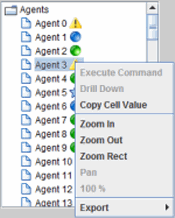
The extended context menu is not supported in the Thin Client in iOS Safari (iPad/iPhone).
To configure the context menu, you create a button for each of the possible actions (for example, an Ack button, an Unack button, and an Own button) and edit button control properties (menuItemIndex, menuItemGroup, and menuItemSubmenu). You also edit properties on the table, heatmap or grid object (menuItemGroup and rightClickActionFlag), which are referred to as the target object. The buttons in the menuItemGroup define the items that are added to the context menu, when the target object with the same menuItemGroup value on the same display is right-clicked. The context menu items are, effectively, shortcuts to the buttons. The buttons are not affected by the properties of the associated target object.
Context menu items can be organized into submenus. The target object can be configured to invoke the first associated menu item when the user double-clicks on the object.
Summary of Steps
1. Verify that the following is your desired outcome: When a user selects an element on a tabular object (for example, a row in a table), several possible actions are available and the user can choose one to execute.
2. Configure the target object to set drillDownColumnSubs as necessary to record the selected row. Typically, the rightClickActionFlag property is checked, too.
3. Configure buttons on the display to perform each of the possible actions, using the drillDownColumnSubs set in step 2.
4. Choose a name for the menuItemGroup property and specify that name on the target object and all of the buttons.
5. Set the other menuItem* properties on each of the buttons as appropriate.
Example
To illustrate the how to configure the context menu, consider a display containing a table object.
Note: A heatmap object is configured similarly to a table object, and has the same behavior when a cell in the heatmap is right-clicked or double-clicked.
In our example, the table object shows the RTView AlertTable. A list of actions (Ack, Unack, and Own) are associated with each row in the table. The display also contains three buttons labeled Ack, Unack, and Own which execute different alert commands. A single left-click on a row could select the corresponding alert, or be followed by a click on the Ack (or Unack) button to acknowledge (or unacknowledge) the selected alert, or a click on the Own button could set the alert's owner to the current RTView username.
To configure the above described behavior, the table object's drillDownColumnSubs property is configured to set a substitution variable, $alertID, that is equal to the value of the ID column for the selected row. The table object's command property is configured to drill-down to the current display window. This simply means that each click on a row stores the ID of the selected alert in the $alertID substitution variable. Also, the actionCommand property of the Ack button is configured to execute an Acknowledge Alert on ID = $alertID. The actionCommand for the Unack and Own buttons is configured similarly. If necessary, the enabledFlag of each button is attached to a function that determines whether the button's action is appropriate for the current selection.
When an extended context menu is configured on the display:
• In addition to clicking on the button to execute an action, each action can also be executed from an item in the RTView context menu (selecting an extended context menu item is equivalent to clicking on the corresponding button.).
• By double-clicking on a row in a table (or a cell in a heatmap or grid), the object's drill-down can be executed or, if the object has no drill-down, the first action in the list can be executed.
The extra menu items appear at the top of the menu. One extra item appears in the menu for each button object (obj_c1button) on the display that meets these requirements:
• The button's visFlag property is set to 1.
• The button's menuItemIndex property has a nonzero value.
• If the menuItemGroup property of the currently selected table or heatmap object is set, it matches the menuItemGroup property of the button.
If multiple buttons meet the requirements above, they also appear in the context menu, ordered by the menuItemIndex property in increasing order.
Continuing with our example, let us assume we want context menu items for the Ack, Unack, and Own actions to appear in the context menu when the alert table object is selected, and in that order. To accomplish this, the menuItemIndex property of the Ack, Unack, and Own buttons is set to 1, 2, and 3 respectively. Also, to ensure that the menu items only appear when the alert table object is selected, the menuItemGroup property of the table object and all three buttons is set to the same string, for example "alert_group".
The extra menu items are added to the context menu by increasing order of their menuItemIndex property values. That is, if button X has its menuItemIndex set to a value that is less than the menuItemIndex of button Y, the item for X is situated above (nearer the top of the menu) the item for Y. Note that menuItemIndex can be assigned a value less than or greater than 0 (zero), but a value of 0 (zero) means that no item is added to the menu for that button.
The final required configuration step is to check the rightClickActionFlag property on the table object. This accomplishes two things:
1. Ensures that the substitutions for the right-clicked row are set before the menu is opened.
2. Enables the following double-click behavior on a table row:
• The table's command, if one is specified, is executed. Typically this sets substitutions on the current display for the selected row.
• The table's drill-down is executed. If the table has no drilldownTarget, the first enabled button on the display with the same menuItemGroup value is activated.
To summarize, configuring the table and buttons as described in our example, the table object behaves as follows:
• A single left-click or right-click on a row in the alert table executes the table's command, setting the $alertID substitution variable to the ID of the alert in that row.
• A right-click on a row in the alert table opens the context menu, in which the Ack, Unack, and Own menu items appear below the Drill Down item. (These menu items are either enabled or disabled, according to the state of the corresponding button).
• A double-left click on a row executes the Ack command on that row's alert, because the Ack button is the first button in the table's menuItemGroup property (it has the smallest menuItemIndex value in the group, 1 in this example).
Optionally, the extra menu items on the context menu can be organized into one or more submenus. This is done by assigning the same value to the menuItemSubmenu property of each button whose item is to appear in the same submenu. For example, to have the Ack, Unack, and Own menu items appear in a submenu (rather than the top-level context menu), we set the menuItemSubmenu property of the Ack, Unack, and Own buttons to (for example) "Alerts". This adds an item labeled "Alerts ->" to the top-level of the context menu, and selecting that item opens a cascading submenu with the Ack, Unack, and Own menu items.
If multiple submenus are defined, they are ordered by increasing value of the lowest menuItemIndex of the all the buttons in each submenu.
If a grid object is configured to use the context menu and the grid's cells contain a composite display, the behavior is as described above except when a user right-clicks or double-clicks an object in the composite display that has its own drillDownTarget or command property configured. In that case, the click is processed by the object inside the composite and not by the grid.
Limitations
The extended context menu is not supported in the Thin Client in iOS Safari (iPad/iPhone). All of the new properties (rightClickActionFlag, menuItemIndex, menuItemGroup, menuItemSubmenu) are ignored by the Thin Client on iOS Safari, therefore no menu items are added to the context menu and no double-click actions are supported. In particular, if a button is configured on the display so that it is off-screen but has a nonzero menuItemIndex, the button's command is not accessible on iOS Safari.
Extra menu items do not appear in the context menu in the main editing panel of the Builder. (They do appear in the Builder's preview window).
The double-click feature on the obj_table02, obj_heatmap, and obj_objectgrid objects does not work in any window in the Builder.
In the Thin Client, a double-click on a table, heatmap, or grid object that performs the first action in the menu group is sometimes ignored instead. This happens if the Display Server is slow to respond to the first click (which might enable the first button in the menu group), so the button is still disabled when the second click occurs. Its most likely to occur if the user double-clicks on several different cells in quick succession.
The Fx Graphs tab of Object Palette features Adobe® Flash graphs designed specifically for use in a Thin Client deployment. There are three Fx graphs available: Trend, Bar and Pie. Due to the fact that these objects use Adobe® Flash, they have additional requirements and limitations.
To enable developers to build displays using Flex objects without having to allow for deployment situations where Flex is unacceptable, it is possible to replace Fx graphs with corresponding standard graphs.
Note: In the Thin Client, Fx graphs are acceptable in any supported browser that has the Flash Player installed. If a display containing an Fx graph is loaded into the Thin Client and the Flash Player is not installed, a link to the Flash Player download page will appear.
Fx graphs are automatically replaced with standard graphs if:
§ A PDF file is generated from a display (.rtv) file using the Export menu or the RTView reporting tool. (Fx graphs do not support PDF generation.) Fx graphs are replaced and then restored to the display after the PDF file is generated.
§ The Flash player (or wrapper) is unavailable when a display (.rtv) file is opened in the:
– Display Viewer Application
– Display Builder Preview Window: Fx graphs are only automatically replaced in the Preview window of the Display Builder in order to avoid inadvertently saving a file with replacement graphs.
– Display Viewer Applet: In order to replace unsupported Fx graphs with standard graphs, the applet's ARCHIVE parameter must include gmsjflash.jar.
To replace Fx graphs with standard graphs in all display (.rtv) files opened in the in the Display Builder, Display Viewer Application or Display Server, set the fxreplace option via the command line or in your OPTIONS.ini file.
Note: Once Fx graphs have been replaced, a file saved in the Display Builder will be saved with replacement (i.e. standard) graphs.
|
The Fx trend graph (obj_fxtrend) is generally used for tracing two types of data in one graph: real-time (i.e. live data) and archived data. Displaying these two types of traces in conjunction is useful for comparing data trends. |

|
|
The Fx bar graph (class name: obj_fxbar) is useful for comparing columns or rows of numeric data from a tabular data element returned by your data attachment. |
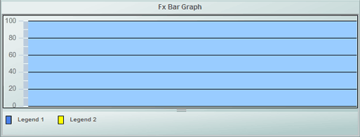
|
|
The Fx pie graph (class name: obj_fxpie) is useful for comparing values from a single column or a single row of the tabular data element returned by your data attachment. |

|
Requirements and Limitations
Requirements
§ The Fx graphs require version 9.0 or newer of the Adobe® Flash Player.
§ In the Thin Client, the Fx graphs are supported in any supported browser that has the Flash Player installed. If a display containing an Fx graph is loaded into the Thin Client and the Flash Player is not installed, a link to the Flash Player download page will appear on the display.
§ In the Display Viewer Applet, the ARCHIVE parameter must include gmsjflash.jar in order to replace unsupported Fx graphs with standard graphs.
Limitations
§ In the Display Builder and Display Viewer Application, Fx graphs are supported on Windows platforms only. In the Display Builder, the Fx Graphs tab will still be visible.
§ Fx graphs are not supported in the Display Viewer Applet on any platform.
§ Fx graphs can be resource intensive during display loading and updating. This should be kept in mind when designing displays. A display containing several Fx graphs may load slowly.
§ The Fx graphs are drawn inside a Flash Player window. This means that Fx graphs will be drawn above all other objects in a display, except other Fx objects, regardless of the object order. The Move to Front and Move to Back operations have no effect on Fx graphs. Also, in the Display Builder, if an Fx graph extends beyond the edges of the display, it will obscure other panels in the Display Builder, such as the object palette, property sheet, etc. When zooming or scrolling in the Display Builder or Display Viewer, Fx graphs will obscure any portion of the vertical and horizontal scrollbars that they overlap.
§ In the Thin Client, if the context menu is opened near an Fx graph, the menu will be partially hidden by the Fx object. Also, a right-click inside an Fx graph will open the Flash Player menu, not the Thin Client's context menu.
§ When moving an Fx graph in the Display Builder, it is best to grab and drag the object by one of its edges, just inside the selection highlight rectangle. The graph can't be dragged from within the plot area, since that will initiate a zoom. It can be dragged by other interior areas, but it may not move smoothly.
§ Fx graphs store RGB values for all colors, this causes two problems:
– If you assign a custom color to a Fx graph and then change the custom color definition, the Fx graph will not update since it stored the RGB value of the custom color instead of the Color Index number. The only way to update it is to manually pick a new color in the Display Builder. See “Custom Colors Tab” for more information.
– If you apply a custom color to the Fx graph with the same RGB value as a standard color, when you close and re-open the standard color will be selected not the custom color. Because Fx graphs store RGB values, the corresponding color in the standard palette will be selected first.
§ Replacement (i.e. standard) graphs do not exactly match the Fx graphs in appearance. There are minor differences in colors, gradients, fonts for legends/axis labels, tick marks, axis line style/thickness, spacing/placement of graph components, etc.
§ The following object properties of the Fx Trend Graph (obj_fxtrend) are not available in the standard Trend Graph (obj_trendgraph02): legendPosition, logAxisFlag, alarmGlow, traceNShadowFlag. Therefore, the replacement will always have a linear y-axis and its legend, if visible, will be on the right.
§ Interactive changes made to an Fx graph's scrollbar knob position, legend size, or time range are not applied to the replacement.
§ Current data applied to an Fx trend graph is not re-applied to the replacement. So, the trace data, legend position, scrollbar position, and time range will appear as though the display was opened.
§ The Fx pie graph (obj_fxpie) appears as a circle, the replacement (obj_pie) is drawn as an ellipse that fills the available rectangular area.
§ Custom Fx graphs cannot replaced by a standard graph.
The Fx trend graph (obj_fxtrend) is generally used for tracing two types of data in one graph: real-time (i.e. live data) and archived data. Displaying these two types of traces in conjunction is useful for comparing data trends. The Fx trend graph supports up to eight traces, set the traceCount to control the number of traces.
Using Trace* Properties
The Display Builder automatically creates a set of trace* properties according to the number you specify using the traceCount object property. Attach your data to trace*Value or trace*ValueTable, where * is the trace number. For example if you set the traceCount to three (3), you will have three traces in your graph (Trace01, Trace02 and Trace03) and a corresponding trace*Value (trace1Value, trace2Value and trace3Value) for each.
All traces in the Fx trend graph have the option to display historical or current data:
Historical Data
To display historical data, attach to trace*ValueTable, where * is the trace number, and include two columns in your attachment. The first column must be the time value and the second column the value to plot.
Optionally, include a third (string) column in your attachment if you want to display a data label for each corresponding data value. See the Attach to Data section specific to your data source for details on how to use the Select Columns dialog.
Current Data
To display current data, attach to trace*Value, where * is the trace number. When you attach data to the trace*Value property, the time displayed on the Fx trend graph is automatically updated each time data is received. Your data attachment can contain either a single point of data or two columns of data. See the Attach to Data section specific to your data source for details on how to use the Select Columns dialog.
If your attachment contains a single point of data, RTView assigns a time stamp when the graph receives the data.
If your attachment contains two columns of data, the first column must be the time value and the second column the value to plot. Optionally, include a third (string) column in your attachment if you want to display a data label for each corresponding data value.
Supported formats for the time value column are: mm/dd/yyyy hh:mm:ss (e.g., 01/16/2004 12:30:03), yyyy-mm-dd hh:mm:ss (e.g., 2004-01-16 12:30:03), and the number of milliseconds since midnight, January 1, 1970 UTC. In order to view all available data, you must set the properties timeRange to -1 and timeShift to a negative value. This negative value will be used to round the start and end times for the y-axis. For example, if you specify -15 for the timeShift property, the start and end times for the y-axis will be rounded to the nearest 15 seconds.
Data labels will be displayed (enclosed in parentheses) in the fixed legend and in the popup legend, between the trace value and the trace label. If the cursorFlag property is selected, then the data label in the popup legend is for the data value that is directly under or to the left of the cursor.
Alert Properties
To set trace marker colors and styles based on a threshold value, select the corresponding value alarm or value warning flags.
|
Property Name |
Description |
|
alarmGlowFlag |
If selected, the border of the trend graph will glow if a trace point exceeds an alarm or warning threshold. Note: The visibility of the border glow is based on trace points that are currently visible. The color of the border glow is the specified value*TraceColor. If multiple trace points have exceeded an alarm and/or warning threshold, whether they are on the same trace or multiple traces, the value*TraceColor of the border glow will be chosen in the following order: HighAlarm, LowAlarm, HighWarning, LowWarning. Note: The color of the border glow is based on trace points that are currently visible. If the yAxisMultiRangeMode selected is Strip Chart, then each chart will display its own border glow. |
|
valueHighAlarmEnabledFlag |
Select to enable the high alarm threshold and the following related properties: valueHighAlarm - Set the value of the high alarm threshold. valueHighAlarmLineVisFlag - Select to display a dotted line at the high alarm threshold. The color of the line is set to the valueHighAlarmMarkColor. valueHighAlarmMarkColor/ valueHighAlarmMarkStyle - When a trace marker's value is greater than or equal to the valueHighAlarm property, the marker will change to the valueHighAlarmMarkColor and valueHighAlarmMarkStyle. If set to Default, the corresponding AlarmTraceColor and AlarmTraceStyle will be used. valueHighAlarmTraceColor/ valueHighAlarmTraceStyle - When the value of any segment of a trace line is greater than or equal to the valueHighAlarm property, that segment of the trace line will change to the valueHighAlarmTraceColor and valueHighAlarmTraceStyle. If set to Default, the corresponding trace*LineColor and trace*LineStyle will be used. |
|
valueHighWarningEnabledFlag |
Select to enable the high warning threshold and the following related properties: valueHighWarning - Set the value of the high warning threshold. valueHighWarningLineVisFlag - Select to display a dotted line at the high warning threshold. The color of the line is set to the valueHighWarningMarkColor. valueHighWarningMarkColor/valueHighWarningMarkStyle - When a trace marker's value is greater than or equal to the valueHighWarning property but less than the valueHighAlarm property, the marker will change to the valueHighWarningMarkColor and valueHighWarningMarkStyle. If set to Default, the corresponding WarningTraceColor and WarningTraceStyle will be used. valueHighWarningTraceColor/valueHighWarningTraceStyle - When the value of any segment of a trace line is greater than or equal to the valueHighWarning property but less than the valueHighAlarm property, that segment of the trace line will change to the valueHighWarningTraceColor and valueHighWarningTraceStyle. If set to Default, the corresponding trace*LineColor and trace*LineStyle will be used. |
|
valueLowAlarmEnabledFlag |
Select to enable the low alarm threshold and the following related properties: valueLowAlarm - Set the value of the low alarm threshold. valueLowAlarmLineVisFlag - Select to display a dotted line at the low alarm threshold. The color of the line is set to the valueLowAlarmMarkColor. valueLowAlarmMarkColor/valueLowAlarmMarkStyle - When the trace marker's value is less than or equal to the valueLowAlarm property, the marker will change to the valueLowAlarmMarkColor and valueLowAlarmMarkStyle. If set to Default, the corresponding AlarmTraceColor and AlarmTraceStyle will be used. valueLowAlarmTraceColor/valueLowAlarmTraceStyle - When the value of any segment of a trace line is less than or equal to the valueLowAlarm property, that segment of the trace line will change to the valueLowAlarmTraceColor and valueLowAlarmTraceStyle. If set to Default, the corresponding trace*LineColor and trace*LineStyle will be used. |
|
valueLowWarningEnabledFlag |
Select to enable the low warning threshold and the following related properties: valueLowWarning - Set the value of the low warning threshold. valueLowWarningLineVisFlag - Select to display a dotted line at the low warning threshold. The color of the line is set to the valueLowWarningMarkColor. |
|
|
valueLowWarningMarkColor/valueLowWarningMarkStyle - When the trace marker's value is less than or equal to the valueLowWarning property, but greater than the valueLowAlarm property, the marker will change to the valueLowWarningMarkColor or valueLowWarningMarkStyle. If set to Default, the corresponding WarningTraceColor or WarningTraceStyle will be used. valueLowWarningTraceColor/valueLowWarningTraceStyle - When the value of any segment of a trace line is less than or equal to the valueLowWarning property, but greater than the valueLowAlarm property, that segment of the trace line will change to the valueLowWarningTraceColor and valueLowWarningTraceStyle. If set to Default, the corresponding trace*LineColor and trace*LineStyle will be used. |
Background Properties
Specify how the background is displayed in your graph.
|
Property Name |
Description |
|
bg3dFlag |
Select to display a 3D edge on the background rectangle. |
|
bgColor |
Select the |
|
bgGradientFlag |
Select to display a gradient in the background rectangle. |
Data Properties
Specify how data is displayed in your graph.
|
Property Name |
Description |
|
historyOnlyFlag |
If selected, the graph will plot only data that is applied to the trace*ValueTable properties and will ignore the timeShift property and any data that is applied to the trace*Value properties. This is useful when same graph is used to view Historical data or Historical and Current data by setting substitutions on the display. |
|
maxPointsPerTrace |
The default is set to 1000. The maximum value for this property is 30000. |
|
yValueMax yValueMin |
The yValueMin and yValueMax properties control the range of the y-axis if the yAxisAutoScaleMode property is Off. Select On for the yAxisAutoScaleMode to calculate y-axis range according to data values being plotted. To calculate the y-axis range including yValueMin and yValueMax, select On - Include Min/Max. |
Data Format Properties
|
Property Name |
Description |
|
yValuePrecision |
Specify the number of digits displayed for y-axis values in the legend and data tips. |
Interaction Properties
Specify how you interact with the data in your graph. See the “Thin Client Deployment - Additional Interactivity” section for more information on how to interact with this graph at runtime.
|
Property Name |
Description |
|
command |
Assign a command to your trend graph. See “Define/Execute Command” for information. |
|
commandCloseWindowOnSuccess |
If selected, the window that initiates a system command will automatically close when the system command is executed successfully. This property only applies to system commands. With data source commands, the window is closed whether or not the command is executed successfully. For multiple commands, this property is applied to each command individually. Therefore if the first command in the multiple command sequence succeeds, the window will close before the rest of the commands are executed. Note: The commandCloseWindowOnSuccess property is not supported in the Display Server. |
|
commandConfirm |
If selected, the command confirmation dialog is enabled. Use the commandConfirmText property to write your own text for the confirmation dialog, otherwise text from the command property will be used. For multiple commands, if you Confirm the execution then all individual commands will be executed in sequence with no further confirmation. If the you Cancel the execution, none of the commands in the sequence will executed. |
|
commandConfirmText |
Enter command confirmation text directly in the Property Value field or select the |
|
cursorColor |
Select the |
|
cursorFlag |
Select to enable the cursor. When the cursor is enabled, select the graph and point to a location on a trace to see a cursor line at that location and display the time and values of all traces at the cursor line on the legend. Hold down the control key to snap the cursor to the closest data point. |
|
drillDownTarget |
Name of display (.rtv) file targeted as a drill down. See “Drill Down Displays” for information. When you double-click on a trace in the graph, the following predefined substitutions will be set on the specified drillDownTarget: § $traceNumber - number of the trace (1 to 8) that contains the selected point § $traceLabel - label of selected trace § $pointValue - data value of point § $pointTimestamp - timestamp of point § $pointLabel - data label (if any) of point § $pointIndex - position of point in trace data (0 to maxPointsPerTrace) |
Label Properties
|
Property Name |
Description |
|
label |
Edit label text directly in the Property Value field or select the |
|
labelTextAlignX |
Select x-axis position of label text from the drop down menu. |
|
labelTextColor |
Select the Note: Color properties are treated differently on Fx graphs than on other objects, see the “Fx Graph Colors” section for more information. |
|
labelTextFont |
Select font style of label text from the drop down menu. |
|
labelTextSize |
Set the size of the label text in pixels. |
Legend Properties
Specify the way the legend is displayed in your graph. Click and press a trace's entry in the legend to temporarily hide all other traces in the graph.
|
Property Name |
Description |
|
legendBgColor |
Select the Note: Color properties are treated differently on Fx trend graph than on other objects, see the “Fx Graph Colors” section below for more information. |
|
legendBgGradientFlag |
Select the legendBgGradientFlag to display a gradient in the legend background. |
|
legendPosition |
Select Top, Bottom, Left or Right to position the legend relative to the plot area. |
|
legendTextFont |
Set the font to use for the legend text. Note: Bold fonts are not supported. |
|
legendTextSize |
Set the font size for the legend text. |
|
legendVisFlag |
Select to display the legend. |
|
legendWidthPercent |
Set the percent of the total width of the object used for the legend. Note: If the legend is positioned at the top or bottom, this will be a percentage of the height instead. |
Marker Properties
Specify the way markers are displayed in your trend graph.
|
Property Name |
Description |
|
markDefaultSize |
Set markDefaultSize to specify the size of the markers in pixels. |
Object Properties
|
Property Name |
Description |
|
anchor |
Specify where to anchor an object in the display. Note: If an object has the dock property set, the anchor property will be ignored. The anchor property is only applied when the dimensions of the display are modified, either by editing Background Properties or resizing the window in Layout mode Select None, or one or more the following options: None - Object not anchored. This is the default. Top - Anchor top of object at top of display. Left - Anchor left side of object at left of display. Bottom - Anchor bottom of object at bottom of display. Right - Anchor right side of object at right of display. When a display is resized, the number of pixels between an anchored object and the specified location remain constant. If an object is anchored on opposite sides (i.e. Top and Bottom or Left and Right), the object will be stretched to fill the available space. |
|
dock |
Specify the docking location of an object in the display. Select from the following options: None - Object is not docked. This is the default. Top - Dock object at top of display. Left - Dock object at left of display. Bottom - Dock object at bottom of display. Right - Dock object at right of display. Fill - Dock object in available space remaining in the display after all docked objects are positioned. |
|
|
If the dimensions of the display are modified, either by editing Background Properties or resizing the window in Layout mode, the properties (objX, objY, objWidth, and objHeight) of docked objects will automatically adapt to match the new size of the display. When multiple objects are docked to the same side of the display, the first object is docked against the side of the display, the next object is docked against the edge of the first object, and so on. When objects are docked to multiple sides of the display, the order in which objects were added to the display controls docking position. For example, let's say the first object added to the display is docked at the Top and the second object is docked at the Left. Consequently, the first object will fill the entire width of the display and the second object will fill the left side of the display from the bottom of the first object to the bottom of the display. |
|
|
Objects in a display have the dock property set to Fill, are laid out across a grid in the available space remaining after all docked objects are positioned. By default, the grid has one row and as many columns as there are objects in the display. You can modify the grid in the Background Properties dialog. Once an object is docked, there are some limitations on how that object can be modified. § Docked objects cannot be dragged or repositioned using objX and objY properties. § Docked objects cannot be resized using the objWidth or objHeight properties. To resize you must drag on the resize handle. § Docked objects can only be resized toward the center of the display (e.g. If an object is docked at the Top, only its height can be increased by dragging down toward the center of the display). § Docked objects set to Fill cannot be resized at all. § Docked objects cannot be moved using Align. Non-docked objects can be aligned against a docked object, but a docked object will not move to align against another object. § Docked objects are ignored by Distribute. |
|
objHeight |
Sets the height (in pixels) of the object. |
|
objName |
Name given to facilitate object management via the Object List dialog. Select Tools>Object List. |
|
objWidth |
Sets the width (in pixels) of the object. |
|
objX |
Plot x-axis position of object. |
|
objY |
Plot y-axis position of object. |
|
styleClass |
Enter the style class name for this object as defined in your style sheet. If not specified, the object class name is used. Note: The value entered must not contain spaces and cannot start with rtv-. |
|
visFlag |
Control visibility of the object. |
Plot Area Properties
Specify the way the plot area is displayed in your graph.
|
Property Name |
Description |
|
gridColor |
Select the Note: Color properties are treated differently on Fx trend graph than on other objects, see the “Fx Graph Colors” section below for more information. |
|
traceBgColor |
Select the Note: Color properties are treated differently on Fx trend graph than on other objects, see the “Fx Graph Colors” section below for more information. |
|
traceBgGradientFlag |
Select to display a gradient in the plot background. Set the color of the plot background with the traceBgColor property. |
Trace Groups
Specify trace groups displayed in your trend graph. The Display Builder automatically creates a set of traceGroup* properties (where * is the trace group number) according to the number of trace groups specified in the traceGroupCount property. A trace group is a collection of two or more traces. Trace groups are useful for identifying multiple traces sharing the same vertical axis (when yAxisMultiRangeMode is set to Strip Chart or Multi-Axis) or for identifying three traces combined as a banded trace.
|
Property Name |
Description |
|
traceGroupCount |
Specify the number of traces in your trace group. The maximum is 5. |
|
traceGroup*TraceNumbers |
According to the number of traces specified in the traceCount property, enter a comma-separated list of the traces to include in this group (i.e. 1,3,5,6). Note: If traceGroup*BandedFlag is selected, then the number of traces listed should be 3. If the yAxisMultiRangeMode selected is Strip Chart or Multi-Axis: § All the traces in the group will share the same strip/axis, and § If yAxisShowTraceLabelsFlag is selected only the trace*Label of the first trace in the group will be displayed. If the yAxisMultiRangeMode selected is Multi-Axis, the color of the axis for a trace group is determined by the specified trace*LineColor of the first visible trace in the group. Note: In Multi-Axis mode it is recommended that you assign the same trace*LineColor/trace*LineStyle and trace*MarkColor/trace*MarkStyle to all traces included within a group. Once a trace is included in a group, the following properties are no longer available: trace*YAxisAutoScaleMode, trace*YAxisValueMax, trace*YAxisValueMin. To scale the y-axis range of your trace group, use the yAxisAutoScaleMode, yValueMax, and yValueMin properties. Note: All traces included in a group must have the trace*YAxisVisFlag, traceVisFlag and trace*YAxisGridVisFlag properties selected, otherwise the y-axis and/or the y-axis grid will not be visible. |
|
traceGroup*BandedFlag |
If selected, the plot area beneath the first trace (the low band trace) and the area above the third trace (the high band trace) will be filled. The second trace (the value trace) will not be filled. |
Trace Properties
Specify how traces are displayed in your graph.
|
Property Name |
Description |
|
multiTraceTableFlag |
Select to plot multiple traces from a single data table. multiTraceCurrentValueTable - Attach your current data. The first column in the attachment must contain a time value. The remaining columns can either contain numeric or string data. The first numeric value is used as the data point, the first string value is used as the first data point's data label. Within the attachment, columns can be arranged in any order (e.g.: numeric1, numeric2, string1, string2, numeric3, string3, string4, numeric4). Unless a trace*Label is already specified, the attached trace* column names will be used as trace labels. Note: If multiTraceHistoryValueTable is also attached to data, it must contain the same number and type of columns as the specified multiTraceCurrentValueTable. multiTraceHistoryValueTable - Attach your historical data. The first column in the attachment must contain a time value. The remaining columns can either contain numeric or string data. The first numeric value is used as the data point, the first string value is used as the first data point's data label. Within the attachment, columns can be arranged in any order (e.g.: numeric1, numeric2, string1, string2, numeric3, string3, string4, numeric4). Unless a trace*Label is already specified, the attached trace* column names will be used as trace labels. Typically, the attached data table contains initial data points to be plotted (i.e. from a SQL attachment with Update Mode set to On Demand, or from a Cache attachment with Update Once selected.) Note: If multiTraceCurrentValueTable is also attached to data, it must contain the same number and type of columns as the specified multiTraceHistoryValueTable. Note: Once multiTraceTableFlag is selected, all trace data is expected to be provided via multiTraceCurrentValueTable or multiTraceHistoryValueTable. Therefore, the trace*Value and trace*ValueTable properties will no longer be available. |
|
traceCount |
Specify the number of traces in your graph. The maximum is 8. RTView automatically creates a set of properties (see “Trace* Properties”) for each trace. |
The Display Builder automatically creates a set of trace* properties (where * is the trace number) according to the number of traces specified in the traceCount property. Attach your data to trace*Value or trace*ValueTable, see the Using Trace* Properties section for details.
|
Property Name |
Description |
|
trace*Label |
Set a label for your trace. |
|
trace*LineColor |
Select the |
|
trace*LineShadowFlag |
Select to show a shadow for this trace. |
|
trace*LineStyle |
Select the style of the trace from the drop down menu: No Line, Solid, Dotted, Dashed, or Dot Dashed. |
|
trace*LineThickness |
Select the thickness of the trace from the drop down menu: Thin, Medium, or Thick. |
|
trace*MarkColor |
Select the |
|
trace*MarkStyle |
Select the style of the marker used on the trace from the drop down menu: No Marker, Dot, +, *, o, x, Filled Circle, Filled Diamond, Filled Triangle, Filled Square, or Filled Star. |
|
trace*Type |
Select the type of trace from the drop down menu: Line, Bar, or Event. Line - Line connecting each data point. Bar - Vertical bar for each data point, from zero to the data point's value. Use the trace*LineThickness property to control the width of the bar. Note: If trace*MarkStyle is set to any value other than No Marker, the mark will be drawn at the end of the Bar trace. Event - Small rectangle containing the first character of the corresponding data label for each data point. If no data label exists, then the first character of the specified trace*Label is used. Each Event trace is positioned vertically according to the data value for the corresponding data point. The trace*LineColor property sets the color of rectangle's edges and the enclosed text character. The trace*MarkColor property sets the fill color of the rectangle. If trace*LineColor and trace*MarkColor are set to the same color, then traceBgColor is used to set the fill color of the rectangle. Note: If the attached data contains data labels but no data values, then an Event trace will be plotted regardless of the specified trace*Type setting and Event trace rectangles will be drawn near the bottom of the trace area. |
|
trace*Value |
Attach your current data, either containing a single point of data or two columns of data. If your attachment contains a single point of data, RTView will assign a time stamp when the graph receives the data. If your attachment contains two columns of data, the first column must be the time value and the second column the value to plot. Optionally, include a third (string) column in your attachment to display a data label for each corresponding data value. The data label will be displayed (enclosed in parentheses) in the fixed legend and in the popup legend, between the trace value and the trace label. If the cursorFlag property is selected, then the data label in the popup legend is for the data value that is directly under or to the left of the cursor. |
|
trace*ValueDivisor |
Enter a number. All traces will be divided by this value. |
|
trace*ValueTable |
Attach your historical data containing two columns: the first column must be the time value and the second column the value to plot. Optionally, include a third (string) column in your attachment to display a data label for each corresponding data value. The data label will be displayed (enclosed in parentheses) in the fixed legend and in the popup legend, between the trace value and the trace label. If the cursorFlag property is selected, then the data label in the popup legend is for the data value that is directly under or to the left of the cursor. |
|
trace*VisFlag |
Select to control trace visibility. Click and hold on a trace's entry in the legend to temporarily hide all other traces in the graph. |
Web Chart Properties
|
Property Name |
Description |
|
webChartFlag |
Select to enable the html5 trend chart. When the display is opened in the Display Server, in an HTML5 compatible browser, the html5 trend chart will appear in place of the Fx trend graph. |
|
webChartNavigatorTrace |
Specify the number of traces (between 1 and the value of the traceCount property). By default, this property is disabled with a value of 0. The navigator will be displayed at the bottom of the html5 chart, just below the x-axis, and highlight the time range currently visible in the chart. The highlighted section can be resized or dragged to zoom/pan to the time range of interest. The color of the navigator trace will reflect the color of the corresponding trace as specified by the trace*LineColor property. |
X-Axis Properties
Specify the way the x-axis is displayed in your graph.
|
Property Name |
Description |
|
timeFormat |
Set the format for the time displayed in the x-axis using the following format characters: y (year), M (month), d (day of month), E (weekday), a (am/pm marker), H (hour 0-23 in day), K (hour 0-11 in am/pm), m (minute), s (second). Note: These format characters are not supported by Fx trend graph: G, w, W, D, S, z, Z. For example, MMMM dd, yyyy KK:mm:ss a would result in the form August 30, 2003 05:32:12 PM. If no format is given, the date and time will not be displayed on the x-axis. Include a new line character ('\n') to display multiple line text in the time axis labels. For example, MM\dd'\n'hh:mm:ss would result in the form 08\30 05:32:12. |
|
timeRange |
Control the total amount of time, in seconds, plotted on the graph. If you attach data to trace*ValueTable, set timeRange to -1 so the time range of the graph is driven by the time range in the data attachment. Note: timeRange is ignored if both timeRangeBegin and timeRangeEnd are set. |
|
timeRangeBegin |
Set the start time value of the data to be plotted on the graph. Supported formats are: mm/dd/yyyy hh:mm:ss (e.g., 01/16/2004 12:30:03), yyyy-mm-dd hh:mm:ss (e.g., 2004-01-16 12:30:03), and the number of milliseconds since midnight, January 1, 1970 UTC. Note: If only the time is specified, then today's date will be used. |
|
timeRangeEnd |
Set the end time value of the data to be plotted on the graph. Supported formats are: mm/dd/yyyy hh:mm:ss (e.g., 01/16/2004 12:30:03), yyyy-mm-dd hh:mm:ss (e.g., 2004-01-16 12:30:03), and the number of milliseconds since midnight, January 1, 1970 UTC. Note: If only the time is specified, then today's date will be used. |
|
timeShift |
Control the amount of time, in seconds, the graph will shift to the left when the trace has filled the graph and controls the rounding of the start and end times. For example, if the timeShift is 15, the start and end times on the graph will be rounded to the nearest 15 second interval. By default, the end of the plot area corresponds with the current time. To only shift the graph when new data is received, set timeShift to a negative value and the end of the graph will display the most current data plotted. If you attach data to trace*ValueTable, you must set timeShift to a negative value. Note: The timeShift property is ignored if either timeRangeBegin or timeRangeEnd is set. |
|
xAxisColor |
Select the Note: Color properties are treated differently on Fx trend graph than on other objects, see the “Fx Graph Colors” section below for more information. |
|
xAxisFlag |
Select to display the x-axis. |
|
xAxisGridVisFlag |
Select to display a grid line for each major division along the x-axis. |
|
xAxisLabelTextSize |
Specify the size in pixels of the x-axis label. |
|
xAxisMajorDivisions |
Specify the number of major divisions on the x-axis. |
|
xAxisThickness |
Specify (in pixels) the thickness of the x-axis. Default is 8. |
Y-Axis Properties
Specify the way the y axis is displayed in your graph.
|
Property Name |
Description |
|
yAxisAutoScaleMode |
The yValueMin and yValueMax properties control the range of the y-axis for if the yAxisAutoScaleMode is set to Off. Select On for the yAxisAutoScaleMode to calculate y-axis range according to data values being plotted. To calculate the y-axis range including yValueMin and yValueMax, select On - Include Min/Max. Note: yAxisAutoScaleMode is ignored if the yAxisLogFlag is selected. |
|
yAxisAutoScaleVisDataOnlyFlag |
Select to compute the y-axis scale according to the min & max y values of the visible data points only. This means that the y-axis scale may change as the user changes the visible time range by scrolling or zooming. By default, this property is not selected and the y axis is scaled according to the y values of all of data points, visible or not. Note: This property is only available if webChartFlag is selected. |
|
yAxisAutoScaleVisTracesOnlyFlag |
Select to include only visible traces when calculating the y-axis range. By default all traces in the traceCount are used in the auto-scale calculation, including those that are invisible or unattached to data. |
|
yAxisColor |
Select the Note: Color properties are treated differently on Fx trend graph than on other objects, see the “Fx Graph Colors” section below for more information. Note: The yAxisColor property will be ignored when the yAxisMultiRangeFlag property is selected. |
|
yAxisFlag |
Select to display the y-axis. |
|
yAxisGridVisFlag |
Select to display a grid line for each major division along the y-axis. |
|
yAxisLabel |
Set a label for the y-axis. |
|
yAxisLabelTextSize |
Specify the size in pixels of the y-axis labels. |
|
yAxisLogFlag |
Select to enable the logarithmic (base 10) y-axis. Note: Negative data points will not be plotted. |
|
yAxisMajorDivisions |
Specify the number of major divisions on the y-axis. |
|
yAxisMinorDivisions |
Specify the number of minor divisions on the y-axis. |
|
yAxisMultiRangeMode |
Select one of the following modes: Off - All traces are plotted against a single y-axis. Classic or Multiple Axis - One axis per trace, with each trace having its own range. Use the trace*YAxisAutoScaleMode, trace*YAxisValueMin, and trace*YAxisValueMax properties to control the range of the y-axis. Strip Chart - The trace area is divided into strips, one for each trace. Each trace has its own y-axis but all traces share the same x-axis. Use the trace*YAxisAutoScaleMode, trace*YAxisValueMin, and trace*YAxisValueMax properties to control the range of the y-axis. Note: Some labels on the vertical axes may be dropped if the strips are not tall enough to display the labels without overlapping. To avoid this, decrease the value of the yAxisMajorDivisions property. Stacked - The y-axis values for multiple traces displayed are "stacked". That is, the value of each successive data point is accumulated and the sum from lower numbered traces are plotted in the highest numbered trace. Note: Actual (unstacked) values for each individual trace are shown in the legend. Values for lower numbered traces are not included in the sum if a trace is invisible, has no data, all of its data points are older or newer than the x-axis value, or the y-axis value at the x-axis value is not a number (NaN). If a lower numbered trace has no y-axis value at a particular x-axis data point, but has x-axis values before and after that data point, the y-axis value for the sum in that trace will be interpolated. In Classic, Multiple Axis, and Strip Chart modes, a separate vertical axis is drawn for each trace using the color assigned in the trace*LineColor property. If the yAxisShowTraceLabelsFlag property is selected, each axis will display the label assigned in the trace*Label property. When a yAxisMultiRangeMode is selected, the yAxisThickness property is ignored and the width of each axis is set to 2 pixels. For better performance when scrolling in a graph with many points, deselect yAxisShowTraceLabelsFlag and trace*LineShadowFlag. |
|
yAxisPosition |
Select one of the following to set the position of the y-axis on the graph. Note: If yAxisMultiRangeMode is deselected, then the yAxisPosition setting will be ignored Outer Left - Draw axis to the left of the trace area with tick marks extending out from the axis. Outer Right - Draw axis to the right of the trace area with tick marks extending out from the axis. Outer Mixed - Draw axis to the left of the trace area for odd numbered traces and to the right for even numbered traces with tick marks extending out from the axis. Inner Left - Draw axis to the left of trace area with tick marks inside the axis line. Inner Right - Draw axis to the right of trace area with tick marks inside the axis line. Inner Mixed - Draw axis to the left of the trace for odd numbered traces and to the right for even numbered traces with tick marks inside the axis line. |
|
yAxisShowTraceLabelsFlag |
If selected, multiple axes will display the specified trace*Label of the trace associated with each axis. |
|
yAxisThickness |
Specify (in pixels) the thickness of the y-axis. Default is 8. Note: The yAxisThickness property will be ignored when the yAxisMultiRangeMode property is selected. |
Color properties are treated differently on Fx graphs than on other objects. In the Display Builder, the Fx graphs color chooser dialog has five tabs:
Standard Colors - Traditional palette of 252 indexed colors
Custom Colors - To define custom colors, select Tools>Options and click on the Custom Colors tab.
Swatches - Standard Java color palette
HSB - Color selection by hue, saturation, and brightness
RGB - Color selection by red, green, and blue intensity
The color chooser also has a button for selecting a properties Default color, which is described separately for each color property above.
Internally, all color properties on Fx graphs are stored as a 24-bit integer RGB value in the range of zero (black) to 16,777,215 (white). Therefore if a color property on an Fx graph is attached to data, you must provide an integer value in that range (not a color index between 0 and 252 as with other objects). A value of -1 indicates the default property color.
Note that the Default color and colors selected from the Swatches, HSB, and RGB tabs are only supported on Fx graphs. If a color is selected from one of those tabs and then copied and pasted to a color property on any other object, white will be used instead.
Thin Client Deployment - Additional Interactivity
The following additional interactivity is supported in a Thin Client deployment:
Zoom
§ Zoom-in by dragging in trace area, zoom-out by Shift+Click.
Note: Zooming out is not enabled in the main window of the Display Builder.
Scrolling
§ Live scrolling through time range
Cursor
§ Slide horizontally to see interpolated data values in legend
Data Tips
§ Text boxes with data info popup when the mouse is over a data point.
Legend
§ Position above, below, right, or left of trace area
§ Resize interactively
§ Click on trace entry in the legend to toggle the visibility of that trace in the display.
Bar graphs are useful for comparing columns or rows of numeric data from a tabular data element returned by your data attachment. The Fx bar graph (class name: obj_fxbar) has many features that standard bar graphs do not, such as:
§ Data tips that display detailed information about associated column data
§ Graph background with alternating row colors and a configurable grid color
§ Multi-position legend that can be resized interactively

Using Data Properties
To attach data to your graph, right-click in the Property Value field of the valueTable property. It is possible to graph multiple columns or rows of numeric data. If you include a label column in your data attachment for valueTable, it can be used to label either the x-axis or the legend, depending on whether the rowSeriesFlag is selected or deselected.
The rowSeriesFlag controls how row and column data populate the graph:
If the rowSeriesFlag check box is selected, one group of bars will be shown for each numeric column in your data attachment. Within the group for each numeric column, there will be a bar for each row in that column. Column names will be used for the x-axis labels.
If the rowSeriesFlag check box is not selected, one group of bars will be shown for each row in your data attachment. Within the group for each row, there will be a bar for each column in that row. Column names will appear in the legend.
Using Interaction Properties
Commands
To assign a command to your graph, right-click in the Property Value field of the command property and select Define Command. Commands can be set up to execute when you click on an object or automatically execute the command when the value of an object reaches a specified threshold. See “Define/Execute Command” for information on how to set up commands.
Drill Down Displays
To specify a drill down display, double click on the drillDownTarget property. Any display (.rtv) file can be targeted as a drill down. Based on your data attachment, substitutions are created that will be passed into drill down displays. To customize which substitutions will be passed into drill down displays, double-click on drillDownColumnSubs in the Object Properties window to open the “Drill Down Column Substitutions Dialog”. Once a drill down target has been set, double-click on the bar or trace marker in the graph to activate the drill down. Drill down displays can be activated in the same window that contains the graph or open in a separate window. This allows you to build a customizable hierarchy of displays.
Use drillDownSelectMode to control how a drill down display is activated. Set to Anywhere to activate a drill down display by double-clicking anywhere on the graph. Set to Element Only to enable a drill down display only when you double-click on a bar in the graph. See “Drill Down Displays” and “Drill Down Substitutions” for more information.
Tool Tips
Select the mouseOverFlag to enable tool tips for your bar graph. To display a tool tip, select the graph and point to a bar with your mouse. The tool tip will contain information from your data attachment about that bar.
Alert Properties
To set bar colors based on a threshold value, select the corresponding value alarm or value warning flags.
|
Property Name |
Description |
|
|
valueHighAlarmEnabledFlag |
Select to enable the high alarm threshold and the following related properties: |
|
|
|
valueHighAlarm |
Set the value of the high alarm threshold. |
|
|
valueHighAlarmColor |
When a bar's value is greater than or equal to the valueHighAlarm property, the color of the bar will change to the valueHighAlarmColor. |
|
|
valueHighAlarmLineVisFlag |
Select to display a dotted line at the high alarm threshold. The color of the line is set to the valueHighAlarmMarkColor. |
|
|
valueHighAlarmMarkColor |
Set the color of the dotted line displayed at the high alarm threshold. |
|
valueHighWarningEnabledFlag |
Select to enable the high warning threshold and the following related properties: |
|
|
|
valueHighWarning |
Set the value of the high warning threshold. |
|
|
valueHighWarningColor |
When a bar's value is greater than or equal to the valueHighWarning, but less than the valueHighAlarm, the color of the bar will change to the valueHighWarningColor. |
|
|
valueHighWarningLineVisFlag |
Select to display a dotted line at the high warning threshold. The color of the line is set to the valueHighWarningMarkColor. |
|
|
valueHighWarningMarkColor |
Set the color of the dotted line displayed at the high warning threshold. |
|
valueLowAlarmEnabledFlag |
Select to enable the low alarm threshold and the following related properties: |
|
|
|
valueLowAlarm |
Set the value of the low alarm threshold. |
|
|
valueLowAlarmColor |
When a bar's value is less than or equal to the valueLowAlarm property, the color of the bar will change to the valueLowAlarmColor. |
|
|
valueLowAlarmLineVisFlag |
Select to display a dotted line at the low alarm threshold. The color of the line is set to the valueLowAlarmMarkColor. |
|
|
valueLowAlarmMarkColor |
Set the color of the dotted line displayed at the low alarm threshold. |
|
valueLowWarningEnabledFlag |
Select to enable the low warning threshold and the following related properties: |
|
|
|
valueLowWarning |
Set the value of the low warning threshold. |
|
|
valueLowWarningColor |
When a bar's value is less than the valueLowWarning property, but greater than the valueLowAlarm property, the bar will change to the valueLowWarningColor. |
|
|
valueLowWarningLineVisFlag |
Select to display a dotted line at the low warning threshold. The color of the line is set to the valueLowWarningMarkColor. |
|
|
valueLowWarningMarkColor |
Set the color of the dotted line displayed at the low warning threshold. |
Background Properties
Specify how the background is displayed in your bar graph.
|
Property Name |
Description |
|
bg3dFlag |
Select to display a 3D edge on the background rectangle. |
|
bgColor |
Select the Note: Color properties are treated differently on Fx graphs than on other objects, see the “Fx Graph Colors” section for more information. |
|
bgGradientFlag |
Select to display a gradient in the background rectangle. |
Specify the way the bars are displayed in your graph.
|
Property Name |
Description |
|
barFitFlag |
Select to stretch the bars to fit the available space in the plot area. If deselected, the minSpacePerBar property is used to determine bar width. |
|
barImage |
Type the name of the image to display in the bars or, select the § Current Directory - Contains images in the current directory and one level of subdirectories. § Custom Image Library - If you have specified a custom image library, this directory contains those images (.gif, .jpg or .png). See Creating a Custom Image Library (below) for details. § Symbol Library - Contains symbolic images (for example, symbols for various types of hardware, shapes, lights, arrows, etc.). Navigate to the image you want to use and select it. A preview of the image appears in the pane to the right. Click OK or Apply to set the image on your object. If an image is not listed, enter the name of the file, including the relative path. Note: If necessary, the image will be stretched to fit the bar size. |
|
|
Creating a Custom Image Library The custom image library enables you to make your own images available in the Select Image dialog. To add your own image library, perform the following steps. 1. Place your images .jar file and add it to the “RTV_USERPATH” environment variable. The images must be in a directory (not in the top level of the jar). They can be organized into subdirectories of one top level directory. 2. In the Display Builder, select Tools/Builder Options and, in the Custom Image Library Path field, set the path to the directory containing your images .jar file. For example, if you have a jar with this directory structure: com/mycompany/Images com/mycompany/Images/Blue Images com/mycompany/Images/Red Images com/mycompany/Images/Green Images you would enter com/mycompany/Images. This adds a directory named Images to the tree in the Select Image dialog. The Images directory will have three subdirectories: Blue Images, Red Images, and Green Images. Only directories containing images are added to the Select Image dialog. To access the images, you can edit any property that allows you to set an image on an object (for example, the image, barImage and filterProperties properties), or edit the File>Background Properties>Image Name field. See “Background Properties” for more information. |
|
barOutlineFlag |
If selected, an outline appears around each bar. |
|
barProperties |
Double-click on barProperties to specify the color and fill pattern to be used to display each bar in the graph. See “Bar Properties Window” for more information. |
|
barShape |
Select a bar shape from the drop down menu. Note: If 3D Rectangle is selected, then use the Layout property draw3dDepth to set the width of the rectangle. |
|
barTransparencyPercent |
Set transparency of the bars. Enter a value between 0 and 100. A value of 0, the default, sets the bars to be completely opaque. A value of 100 will render the bars completely transparent. |
|
barValueTextColor |
Select the Note: Color properties are treated differently on Fx graphs than on other objects, see the “Fx Graph Colors”section for more information. |
|
barValueTextFont |
Select font style of the text inside the bars if barValueVisFlag is selected. |
|
barValueTextSize |
Specify (in pixels) the size of the text inside the bars if barValueVisFlag is selected. |
|
barValueVisFlag |
Select to display a label containing the value for each bar. |
Data Properties
|
Property Name |
Description |
|
rowSeriesFlag |
Controls how row and column data populate the graph. § If rowSeriesFlag is selected, one group of bars will be shown for each numeric column in your data attachment. Within the group for each numeric column, there will be a bar for each row in that column. Column names will be used for the x-axis labels. § If the rowSeriesFlag is not selected, one group of bars will be shown for each row in your data attachment. Within the group for each row, there will be a bar for each column in that row. Column names will appear in the legend. |
|
traceRowSeriesMode |
Allows the row-series behavior to be enabled or disabled on the traces independently of the rowSeriesFlag setting. Options include: § Use rowSeriesFlag (default) - row-series behavior is enabled or disabled on the bars and the traces based on the setting in the rowSeriesFlag property (see details on the rowSeriesFlag property above). § On - selecting this option and disabling the rowSeriesFlag enables row-series behavior on the traces but not the bars. § Off - selecting this option and enabling the rowSeriesFlag enables row-series behavior on the bars but not the traces. |
|
valueDivisor |
Divides bar and y-axis values by the number entered. |
|
valueTable |
Attach your data to the valueTable property. It is possible to graph multiple columns or rows of numeric data. If you include a label column in your data attachment for valueTable, it can be used to label either the x-axis or the legend, depending on whether the rowSeriesFlag is selected or deselected. Note: By default, the label column is the first non-numeric text column in your data attachment. |
|
yValueMax yValueMin |
Controls the range of y-axis if the yAxisAutoScaleMode is set to Off. Select On for the yAxisAutoScaleMode to calculate the y-axis range according to data values being plotted. |
Data Format Properties
Specify the data format for your bar graph.
|
Property Name |
Description |
|
yValueFormat |
Formats the numeric value shown on each bar, if barValueVisFlag is selected. Formats the numeric value that appears in each tool tip if mouseOverFlag is selected. |
Data Label Properties
|
Property Name |
Description |
|
labelColumnName |
Specify the name of a label column in your data attachment. If a labelColumnName is not specified, then by default the first non-numeric text column in your data attachment will be used as the label column. |
|
rowLabelVisFlag |
If selected, then data from the specified labelColumnName are displayed either along the x-axis or in the legend, depending on whether or not rowSeriesFlag is selected. |
|
rowNameVisFlag |
If your data attachment does not contain a label column (i.e. a non-numeric text column) select the rowNameVisFlag check box to use row names along the x-axis or in the legend, depending on whether or not rowSeriesFlag is selected. |
Historian Properties
|
Property Name |
Description |
|
historyTableName |
Specify name of table in your history database in which to store tabular data. See “Configuring the Historian” for information. |
|
historyTableRowNameFlag |
If selected, data from the row name field will be stored in the first column of the table specified in historyTableName. |
Interaction Properties
Specify how you interact with the data in your graph. See the “Thin Client Deployment - Additional Interactivity” section for more information on how to interact with this graph at runtime.
|
Property Name |
Description |
|
command |
Assign a command to your bar graph. See “Define/Execute Command” for information. |
|
commandCloseWindowOnSuccess |
If selected, the window that initiates a system command will automatically close when the system command is executed successfully. This property only applies to system commands. With data source commands, the window is closed whether or not the command is executed successfully. For multiple commands, this property is applied to each command individually. Therefore if the first command in the multiple command sequence succeeds, the window will close before the rest of the commands are executed. Note: The commandCloseWindowOnSuccess property is not supported in the Display Server. |
|
commandConfirm |
If selected, the command confirmation dialog is enabled. Use the commandConfirmText property to write your own text for the confirmation dialog, otherwise text from the command property will be used. For multiple commands, if you Confirm the execution then all individual commands will be executed in sequence with no further confirmation. If the you Cancel the execution, none of the commands in the sequence will executed. |
|
commandConfirmText |
Enter command confirmation text directly in the Property Value field or select the |
|
drillDownColumnSubs |
Select the |
|
drillDownSelectMode |
Control how a drill down display is activated. Select one of the following options: Anywhere - Activate a drill down display by double-clicking anywhere on the graph. Element Only - Enable a drill down display only when you double-click on a bar in the graph. |
|
drillDownTarget |
Name of display (.rtv) file targeted as a drill down. See “Drill Down Displays” for information. |
|
mouseOverFlag |
Select the mouseOverFlag to enable tool tips for your bar graph. To display a tool tip, select the graph and point to a bar with your mouse. The tool tip will contain information from your data attachment about that bar. |
|
scrollbarMode |
Select Never, As Needed, or Always to set the behavior of the x-axis scroll bar in the graph. Note: If drawHorizontalFlag is selected, the x-axis is vertical. Never is the default setting. If set to Never, some bars may get clipped. Select Always to display a scroll bar at all times. Set to As Needed to display the scroll bar when there is not enough space to display all of the bars in the plot area. Each bar uses at least minSpacePerBar pixels along the x-axis. |
Label Properties
|
Property Name |
Description |
|
label |
Edit label text directly in the Property Value field or select the |
|
labelTextAlignX |
Select x-axis position of label text from the drop down menu. |
|
labelTextColor |
Select the Note: Color properties are treated differently on Fx graphs than on other objects, see the “Fx Graph Colors” section for more information. |
|
labelTextFont |
Select font style of the label text. |
|
labelTextSize |
Specify (in pixels) the size of the label text. |
Layout Properties
Specify how the background is displayed in your bar graph.
|
Property Name |
Description |
|
draw3dDepth |
Specify width (in pixels) for the shadow of the bars or, if the barShape selected is 3D Rectangle, the width of the rectangle. |
|
draw3dFlag |
Select to change the display of the bars from 2D to 3D. Note: This property does not apply if the barShape selected is 3D Rectangle. |
|
drawHorizontalFlag |
Select to have the bars in your graph displayed horizontally. |
|
drawStackedFlag |
Select to stack each bar group in your graph. |
|
horizAxisLabelRotationAngle |
Set the amount of rotation of labels on the horizontal axis. Values range from 0 to 90 degrees. A value of 0 causes the bar graph to automatically pick the optimum angle of rotation. |
|
minSpaceBetweenBars |
Set the minimum amount of space (in pixels) between adjacent bars in the same group. |
|
minSpaceBetweenGroups |
Set the minimum amount of space (in pixels) between the last bar in one group and the first bar in the next group. |
|
minSpacePerBar |
Set the minimum width (in pixels) for each bar. Default is 1. Note: If drawHorizontalFlag is selected, minSpacePerBar will set the minimum height (in pixels) for each bar. |
Legend Properties
Specify the way the legend is displayed in your bar graph.
|
Property Name |
Description |
|
legendBgColor |
Select the Note: Color properties are treated differently on Fx graphs than on other objects, see the “Fx Graph Colors” section for more information. |
|
legendBgGradientFlag |
Select the legendBgGradientFlag to display a gradient in the legend background. If legendBgColor is set to Default then gradient will not display. |
|
legendPosition |
Specify the position of the legend. |
|
legendTextColor |
Select the Note: Color properties are treated differently on Fx graphs than on other objects, see the “Fx Graph Colors” section for more information. |
|
legendTextFont |
Specify the font style of the legend text. |
|
legendTextSize |
Specify (in pixels) the size of the legend text. |
|
legendVisFlag |
Select to display the legend. |
|
legendWidthPercent |
Set default percentage of object designated for the legend. |
Object Properties
|
Property Name |
Description |
|
anchor |
Specify where to anchor an object in the display. Note: If an object has the dock property set, the anchor property will be ignored. The anchor property is only applied when the dimensions of the display are modified, either by editing Background Properties or resizing the window in Layout mode Select None, or one or more the following options: None - Object not anchored. This is the default. Top - Anchor top of object at top of display. Left - Anchor left side of object at left of display. Bottom - Anchor bottom of object at bottom of display. Right - Anchor right side of object at right of display. When a display is resized, the number of pixels between an anchored object and the specified location remain constant. If an object is anchored on opposite sides (i.e. Top and Bottom or Left and Right), the object will be stretched to fill the available space. |
|
dock |
Specify the docking location of an object in the display. Select from the following options: None - Object is not docked. This is the default. Top - Dock object at top of display. Left - Dock object at left of display. Bottom - Dock object at bottom of display. Right - Dock object at right of display. Fill - Dock object in available space remaining in the display after all docked objects are positioned. If the dimensions of the display are modified, either by editing “Background Properties” or resizing the window in Layout mode, the properties (objX, objY, objWidth and objHeight) of docked objects will automatically adapt to match the new size of the display. When multiple objects are docked to the same side of the display, the first object is docked against the side of the display, the next object is docked against the edge of the first object, and so on. When objects are docked to multiple sides of the display, the order in which objects were added to the display controls docking position. For example, let's say the first object added to the display is docked at the Top and the second object is docked at the Left. Consequently, the first object will fill the entire width of the display and the second object will fill the left side of the display from the bottom of the first object to the bottom of the display. Objects in a display have the dock property set to Fill, are laid out across a grid in the available space remaining after all docked objects are positioned. By default, the grid has one row and as many columns as there are objects in the display. You can modify the grid in the “Background Properties” dialog. |
|
|
Once an object is docked, there are some limitations on how that object can be modified. § Docked objects cannot be dragged or repositioned using objX and objY properties. § Docked objects cannot be resized using the objWidth or objHeight properties. To resize you must drag on the resize handle. § Docked objects can only be resized toward the center of the display (e.g. If an object is docked at the Top, only its height can be increased by dragging down toward the center of the display). § Docked objects set to Fill cannot be resized at all. § Docked objects cannot be moved using Align. Non-docked objects can be aligned against a docked object, but a docked object will not move to align against another object. § Docked objects are ignored by Distribute. |
|
objHeight |
Sets the height (in pixels) of the object. |
|
objName |
Name given to facilitate object management via the Object List dialog. Select Tools>Object List. |
|
objWidth |
Sets the width (in pixels) of the object. |
|
objX |
Plot x-axis position of object. |
|
objY |
Plot y-axis position of object. |
|
styleClass |
Enter the style class name for this object as defined in your style sheet (see “Creating Style Sheets” for more information). If not specified, the object class name is used. Note: The value entered must not contain spaces and cannot start with rtv-. |
|
visFlag |
Control visibility of the object. |
Plot Area Properties
|
Property Name |
Description |
|
gridAltBgColor |
Select the Note: Color properties are treated differently on Fx graphs than on other objects, see the “Fx Graph Colors” section for more information. |
|
gridBgColor |
Select the Note: Color properties are treated differently on Fx graphs than on other objects, see the “Fx Graph Colors” section for more information. |
|
gridBgImage |
Select an image to display in the grid background of your graph. Note: If necessary, the image will be stretched to fit the grid. |
|
gridColor |
Select the Note: Color properties are treated differently on Fx graphs than on other objects, see the “Fx Graph Colors” section for more information. |
Transition Properties
|
Property Name |
Description |
|
barEntranceDuration |
Specify the length of time (in milliseconds) that the transition animation will take to display incoming data. Note: Duration is a significant value in the overall effect of the animation. The correct duration value depends upon the barEntranceType selected and the number of bars and series displayed. |
|
barEntranceTrigger |
Choose whether to display the bar entrance transition on each data update or only once when graph is initially displayed. Default is Once. |
|
barEntranceType |
Select the type of bar entrance transition from the drop down menu: Interpolate, Slide Left, Slide Right, Slide Up, Slide Down, Wipe Left, Wipe Right, Wipe Up, Wipe Down, Zoom Chart, and Zoom Series. |
|
barExitDuration |
Specify the length of time (in milliseconds) that the transition animation will take to hide data prior to new data being displayed. Note: Duration is a significant value in the overall effect of the animation. The correct duration value depends upon the barExitType selected and the number of bars and series displayed. |
|
barExitTrigger |
Choose whether to display the bar exit transition on each data update or only once when graph is initially displayed. Default is Once. |
|
barExitType |
Select the type of bar exit transition from the drop down menu: Slide Left, Slide Right, Slide Up, Slide Down, Wipe Left, Wipe Right, Wipe Up, Wipe Down, Zoom Chart, and Zoom Series. |
X-Axis Properties
Specify how the x-axis is displayed in your bar graph.
|
Property Name |
Description |
|
xAxisColor |
Select the Note: Color properties are treated differently on Fx bar graph than on other objects. See the “Fx Graph Colors” section below for more information. |
|
xAxisFlag |
Select to display the x-axis. |
|
xAxisThickness |
Specify (in pixels) the thickness of the x-axis. Default is 8. |
Y-Axis Properties
Specify how the y-axis is displayed in your bar graph.
|
Property Name |
Description |
|
yAxisAutoScaleMode |
The yValueMin and yValueMax properties control the range of y-axis if the yAxisAutoScaleMode is set to Off. Select On for the yAxisAutoScaleMode to calculate the y-axis range according to data values being plotted. To calculate the y-axis range including yValueMin and yValueMax, select On - Include Min/Max. |
|
yAxisColor |
Select the Note: Color properties are treated differently on Fx bar graph than on other objects, see the “Fx Graph Colors” section below for more information. |
|
yAxisFlag |
Select to display the y-axis. |
|
yAxisFormat |
Select or enter the numeric format of values displayed on the y-axis. To enter a format, use syntax from the Java DecimalFormat class. |
|
yAxisMajorDivisions |
Specify the number of major divisions on the y-axis. |
|
yAxisMinorDivisions |
Specify the number of minor divisions on the y-axis. |
|
yAxisThickness |
Specify (in pixels) the thickness of the y-axis. Default is 8. |
Color properties are treated differently on Fx graphs than on other objects. In the Display Builder, the Fx graphs color chooser dialog has five tabs:
Standard Colors - Traditional palette of 252 indexed colors
Custom Colors - To define custom colors, select Tools>Options and click on the Custom Colors tab.
Swatches - Standard Java color palette
HSB - Color selection by hue, saturation, and brightness
RGB - Color selection by red, green, and blue intensity
The color chooser also has a button for selecting a properties Default color, which is described separately for each color property above.
Internally, all color properties on Fx graphs are stored as a 24-bit integer RGB value in the range of zero (black) to 16,777,215 (white). Therefore if a color property on an Fx graph is attached to data, you must provide an integer value in that range (not a color index between 0 and 252 as with other objects). A value of -1 indicates the default property color.
Note that the Default color and colors selected from the Swatches, HSB, and RGB tabs are only supported on Fx graphs. If a color is selected from one of those tabs and then copied and pasted to a color property on any other object, white will be used instead.
Thin Client Deployment - Additional Interactivity
The following additional interactivity is supported in a Thin Client deployment:
Data Tips
§ Text boxes with data info popup when the mouse is over a data point.
Legend
§ Position above, below, right, or left of trace area
§ Resize interactively
In the Object Properties window, double-click on barProperties in the Property Name field to display the Bar Properties dialog. In the Bar Properties dialog you can assign a Color and Fill Pattern to each bar in the graph.
Note: Before assigning attributes to bars in your bar graph, it is recommended that you first attach the graph to data.
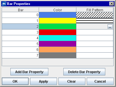
|
Field Name |
Description |
|
Bar |
There is one entry for each bar that is currently displaying data in the bar graph. The Color and Fill Pattern columns list the current settings for each bar. |
|
Color |
Select the |
|
Fill Pattern |
Select the Note: Fill patterns in your bar graph are ignored unless the barGradientStyle property is set to None. |
|
Add Bar Property |
Click to add a Bar Property entry. This does not add a bar to your graph, it allows you to set properties for bars that will display data that is not yet available. This is useful if the data attachment is not available when you setup your bar graph, or if the number of rows or columns returned by your data attachment varies. |
|
Delete Bar Property |
Removes the last bar property entry from the Bar Properties dialog. |
The following describes the Bar Properties dialog commands:
|
Command |
Description |
|
OK |
Applies values and closes the dialog. |
|
Apply |
Applies values without closing the dialog. |
|
Reset |
Resets all fields to last values applied. |
|
Clear |
Clears all fields. Detaches object from data source (once Apply or OK is selected). |
|
Cancel |
Closes the dialog with last values applied. |
The pie graph (class name: obj_fxpie) is useful for comparing values from a single column or a single row of the tabular data element returned by your data attachment.
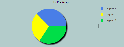
Using Data and Data Label Properties
Attach your data to the valueTable property. If you include a label column in your data attachment for valueTable, it can be used to label the legend if the rowSeriesFlag is selected. The rowSeriesFlag controls whether row or column data populates the graph:
When the rowSeriesFlag check box is not selected, the first numeric column from your data attachment will be used to populate the wedges in the pie. Each wedge will correspond to a row in that column and will display that row's relative value. If your data attachment has a label column, data from that column will be used in the legend.
If the rowSeriesFlag check box is selected, the first numeric row from your data attachment will be used to populate the wedges in the pie. Each wedge will correspond to a column in that row and will display that column's relative value. Column names will be used in the legend.
If your data attachment has no label column, select rowNameVisFlag to use row names in the legend when the rowSeriesFlag is not selected. By default, the label column is the first non-numeric text column in your data. Specify a column name in the labelColumnName property to set the label column to a specific column.
Using Interaction Properties
Commands
To assign a command to your graph, right-click in the Property Value field of the command property and select Define Command. Commands can be set up to execute when you click on an object or automatically execute the command when the value of an object reaches a specified threshold. See “Define/Execute Command” for information on how to set up commands.
Drill Down Displays
To specify a drill down display, double click on the drillDownTarget Property Name. Any display (.rtv) file can be targeted as a drill down. Based on your data attachment, substitutions are created that will be passed into drill down displays. To customize which substitutions will be passed into drill down displays, double-click on drillDownColumnSubs in the Object Properties window to open the “Drill Down Column Substitutions Dialog”. Once a drill down target has been set, double-click on the pie wedge to activate the drill down. Drill down displays can be activated in the same window that contains the graph or open in a separate window. This allows you to build a customizable hierarchy of displays.
Use drillDownSelectMode to control how a drill down display is activated. Set to Anywhere to activate a drill down display by double-clicking anywhere on the graph. Set to Element Only to enable a drill down display only when you double-click on a wedge in the pie graph. See “Substitutions” and “Drill Down Substitutions” for more information.
Tool Tips
Select the mouseOverFlag to enable tool tips for your pie graph. To display a tool tip, select the graph and point to a pie wedge with your mouse. The tool tip will contain information from your data attachment about that pie wedge.
Background Properties
Specify how the background is displayed in your pie graph.
|
Property Name |
Description |
|
bg3dFlag |
Select to display a 3D edge on the background rectangle. |
|
bgColor |
Select the Note: Color properties are treated differently on Fx graphs than on other objects, see the “Fx Graph Colors” section below for more information. |
|
bgGradientFlag |
Select to display a gradient in the background rectangle. |
Data Properties
|
Property Name |
Description |
|
rowSeriesFlag |
Controls how row and column data populate the graph. If rowSeriesFlag is selected, the first numeric row from your data attachment will be used to populate the wedges in the pie. Each wedge will correspond to a column in that row and will display that column's relative value. Column names will be used in the legend. If rowSeriesFlag is not selected, the first numeric column from your data attachment will be used to populate the wedges in the pie. Each wedge will correspond to a row in that column and will display that row's relative value. If your data attachment has a label column, data from that column will be used in the legend. |
|
valueTable |
Attach your data to the valueTable property. It is possible to graph multiple columns or rows of numeric data. If you include a label column in data attached to valueTable, it can be used to label either the x-axis or the legend, depending on whether the rowSeriesFlag is selected or deselected. |
|
|
Note: By default, the label column is the first non-numeric text column in your data attachment. Enter a column name in the labelColumnName property to set a specific label column. |
Data Format Properties
Specify the format to display values in your pie graph.
|
Property Name |
Description |
|
labelColumnFormat |
Select or enter the format of numeric or date labels displayed in the legend and in tool tips. To enter a format, use syntax from the Java DecimalFormat class for numeric labels and syntax from the Java SimpleDateFormat class for date labels. To enable tool tips, select the mouseOverFlag. |
|
valueFormat |
Select or enter the numeric format of wedge values displayed on wedges, in the legend and in tool tips. To enter a format, use syntax from the Java DecimalFormat class. To enable tool tips, select the mouseOverFlag. |
Data Label Properties
|
Property Name |
Description |
|
columnDisplayNames |
Set alternate display names for column names in your pie graph's data (see “Column Display Names” for more information). Column names are displayed either along the x-axis or in the legend, depending on whether or not rowSeriesFlag is selected. |
|
labelColumnName |
Specify the name of a label column in your data attachment. If a labelColumnName is not specified, then by default the first non-numeric text column in your data attachment will be used as the label column. |
|
rowLabelVisFlag |
If selected, then data from the label column are displayed either along the x-axis or in the legend, depending on whether or not rowSeriesFlag is selected. Enter a column name in the labelColumnName property to specify a label column in your data attachment. |
|
rowNameVisFlag |
If your data attachment does not contain a label column (i.e. a non-numeric text column) select the rowNameVisFlag check box to use row names along the x-axis or in the legend, depending on whether or not rowSeriesFlag is selected. |
Historian Properties
|
Property Name |
Description |
|
historyTableName |
Specify name of table in your history database in which to store tabular data. See History Tables>Tabular Data (“Cache Definition File Configuration”) for information. |
|
historyTableRowNameFlag |
If selected, data from the row name field will be stored in the first column of the table specified in historyTableName. |
Interaction Properties
|
Property Name |
Description |
|
command |
Assign a command to your pie graph. See “Define/Execute Command” for information. |
|
commandCloseWindowOnSuccess |
If selected, the window that initiates a system command will automatically close when the system command is executed successfully. This property only applies to system commands. With data source commands, the window is closed whether or not the command is executed successfully. For multiple commands, this property is applied to each command individually. Therefore if the first command in the multiple command sequence succeeds, the window will close before the rest of the commands are executed. Note: The commandCloseWindowOnSuccess property is not supported in the Display Server. |
|
commandConfirm |
If selected, the command confirmation dialog is enabled. Use the commandConfirmText property to write your own text for the confirmation dialog, otherwise text from the command property will be used. For multiple commands, if you Confirm the execution then all individual commands will be executed in sequence with no further confirmation. If the you Cancel the execution, none of the commands in the sequence will executed. |
|
commandConfirmText |
Enter command confirmation text directly in the Property Value field or select the |
|
drillDownColumnSubs |
Select the |
|
drillDownSelectMode |
Control how a drill down display is activated. Select one of the following options: Anywhere - Activate a drill down display by double-clicking anywhere on the graph. Element Only - Enable a drill down display only when you double-click on a wedge in the pie graph. |
|
drillDownTarget |
Name of display (.rtv) file targeted as a drill down. See “Drill Down Displays” for information. |
|
mouseOverFlag |
Select to enable tool tips for your pie graph. To display a tool tip, select the graph and point to a pie wedge with your mouse. The tool tip will contain information from your data attachment about that pie wedge. |
Label Properties
|
Property Name |
Description |
|
label |
Edit label text directly in the Property Value field or select the |
|
labelTextAlignX |
Select x-axis position of label text from the drop down menu. |
|
labelTextColor |
Select the Note: Color properties are treated differently on Fx graphs than on other objects. See the “Fx Graph Colors” section for more information. |
|
labelTextFont |
Select font style of label text from the drop down menu. |
|
labelTextSize |
Set the height of the label text in pixels. |
Legend Properties
Specify the way the legend is displayed in your pie graph.
|
Property Name |
Description |
|
legendBgColor |
Select the Note: Color properties are treated differently on Fx graphs than on other objects. See the “Fx Graph Colors” section below for more information. |
|
legendBgGradientFlag |
Select to display a gradient in the legend background. |
|
legendPercentVisFlag |
Select to display the value percentages of your data in the legend. |
|
legendPosition |
Select Top, Bottom, Left, or Right to position the legend relative to the plot area. |
|
legendTextColor |
Select the Note: Color properties are treated differently on Fx graphs than on other objects. See the “Fx Graph Colors” section for more information. |
|
legendTextFont |
Set the font to use for the legend text. Note: Bold fonts are not supported. |
|
legendTextSize |
Set the font size for the legend text. |
|
legendValueVisFlag |
Select to display the numerical values of your data in the legend. |
|
legendVisFlag |
Select to display the legend. |
|
legendWidthPercent |
Set the percent of the total width of the object used for the legend. |
Object Properties
|
Property Name |
Description |
|
anchor |
Specify where to anchor an object in the display. Note: If an object has the dock property set, the anchor property will be ignored. The anchor property is only applied when the dimensions of the display are modified, either by editing Background Properties or resizing the window in Layout mode Select None, or one or more the following options: None - Object not anchored. This is the default. Top - Anchor top of object at top of display. Left - Anchor left side of object at left of display. Bottom - Anchor bottom of object at bottom of display. Right - Anchor right side of object at right of display. When a display is resized, the number of pixels between an anchored object and the specified location remain constant. If an object is anchored on opposite sides (i.e. Top and Bottom or Left and Right), the object will be stretched to fill the available space. |
|
dock |
Specify the docking location of an object in the display. Select from the following options: None - Object is not docked. This is the default. Top - Dock object at top of display. Left - Dock object at left of display. Bottom - Dock object at bottom of display. Right - Dock object at right of display. Fill - Dock object in available space remaining in the display after all docked objects are positioned. |
|
|
If the dimensions of the display are modified, either by editing “Background Properties” or resizing the window in Layout mode, the properties (objX, objY, objWidth, and objHeight) of docked objects will automatically adapt to match the new size of the display. When multiple objects are docked to the same side of the display, the first object is docked against the side of the display, the next object is docked against the edge of the first object, and so on. |
|
|
When objects are docked to multiple sides of the display, the order in which objects were added to the display controls docking position. For example, let's say the first object added to the display is docked at the Top and the second object is docked at the Left. Consequently, the first object will fill the entire width of the display and the second object will fill the left side of the display from the bottom of the first object to the bottom of the display. Objects in a display have the dock property set to Fill, are laid out across a grid in the available space remaining after all docked objects are positioned. By default, the grid has one row and as many columns as there are objects in the display. You can modify the grid in the “Background Properties” dialog. Once an object is docked, there are some limitations on how that object can be modified. § Docked objects cannot be dragged or repositioned using objX and objY properties. § Docked objects cannot be resized using the objWidth or objHeight properties. To resize you must drag on the resize handle. § Docked objects can only be resized toward the center of the display (e.g. If an object is docked at the Top, only its height can be increased by dragging down toward the center of the display). § Docked objects set to Fill cannot be resized at all. § Docked objects cannot be moved using Align. Non-docked objects can be aligned against a docked object, but a docked object will not move to align against another object. § Docked objects are ignored by Distribute. |
|
objHeight |
Sets the height (in pixels) of the object. |
|
objName |
Name given to facilitate object management via the Object List dialog. Select Tools>Object List. |
|
objWidth |
Sets the width (in pixels) of the object. |
|
objX |
Plot x-axis position of object. |
|
objY |
Plot y-axis position of object. |
|
styleClass |
Enter the style class name for this object as defined in your style sheet. If not specified, the object class name is used. See “Creating Style Sheets” for more information. Note: The value entered must not contain spaces and cannot start with rtv-. |
|
visFlag |
Control visibility of the object. |
Transition Properties
|
Property Name |
Description |
|
entranceDuration |
Specify the length of time (in milliseconds) that the transition animation will take to display incoming data. Note: Duration is a significant value in the overall effect of the animation. The correct duration value depends upon the entranceType selected. |
|
entranceTrigger |
Choose whether to display the entrance transition on each data update or only once. Default is Once. |
|
entranceType |
Select the type of entrance transition from the drop down menu: Interpolate, Slide Left, Slide Right, Slide Up, Slide Down, Wipe Left, Wipe Right, Wipe Up, Wipe Down, Zoom Chart, and Zoom Series. |
|
exitDuration |
Specify the length of time (in milliseconds) that the transition animation will take to hide data prior to new data being displayed. Note: Duration is a significant value in the overall effect of the animation. The correct duration value depends upon the exitType selected. |
|
exitTrigger |
Choose whether to display the exit transition on each data update or only once. Default is Once. |
|
exitType |
Select the type of exit transition from the drop down menu: Slide Left, Slide Right, Slide Up, Slide Down, Wipe Left, Wipe Right, Wipe Up, Wipe Down, Zoom Chart, and Zoom Series. |
Wedge Properties
Specify the way wedges are displayed in your pie graph. Click on any wedge to explode that wedge. Click on the exploded wedge again to collapse it.
|
Property Name |
Description |
|
wedgeExplodeRadiusPercent |
Specify the percentage of the total radius that wedges will appear exploded from the center. |
|
wedgeLabelPosition |
Select from the following to add wedge labels that display information about each data point. Wedge labels differ from tool tips in that they are always visible and do not react to mouse movement. Callout - Place labels in two vertical stacks on either side of the pie. Shrink the pie area if necessary to make room for the labels. Draw key lines from each label to the associated wedge. Shrinks labels as necessary to fit the space provided. Inside - Place labels inside the pie. Shrink labels to ensure that they do not overlap each other. Any label that cannot fit, as specified using the wedgeLabelTextSize property, is hidden from view. Inside with Callout - Place labels inside the pie. If labels are shrink below a legible size, they are converted to callout labels. Outside - Place labels around the boundary of the pie. |
|
wedgeLabelTextColor |
Select the Note: Color properties are treated differently on Fx graphs than on other objects, see the “Fx Graph Colors” section for more information. |
|
wedgeLabelTextFont |
Set the font to use for the wedge label text. Bold fonts are not supported. |
|
wedgeLabelTextSize |
Set the font size for the wedge label text. |
|
wedgeProperties |
Specify the color of wedges in the pie graph. Note: Color properties are treated differently on Fx graphs than on other objects, see the “Fx Graph Colors” section for more information. |
Color properties are treated differently on Fx graphs than on other objects. In the Display Builder, the Fx graphs color chooser dialog has five tabs:
Standard Colors - Traditional palette of 252 indexed colors
Custom Colors - To define custom colors, select Tools>Options and click on the Custom Colors tab.
Swatches - Standard Java color palette
HSB - Color selection by hue, saturation, and brightness
RGB - Color selection by red, green, and blue intensity
The color chooser also has a button for selecting a properties Default color, which is described separately for each color property above.
Internally, all color properties on Fx graphs are stored as a 24-bit integer RGB value in the range of zero (black) to 16,777,215 (white). Therefore if a color property on an Fx graph is attached to data, you must provide an integer value in that range (not a color index between 0 and 252 as with other objects). A value of -1 indicates the default property color.
Note that the Default color and colors selected from the Swatches, HSB, and RGB tabs are only supported on Fx graphs. If a color is selected from one of those tabs and then copied and pasted to a color property on any other object, white will be used instead.
Thin Client Deployment - Additional Interactivity
The following additional interactivity is supported in a Thin Client deployment:
Wedge Selection
§ Click on a wedge to highlight by isolating it from the rest of the pie.
Data Tips
§ Text boxes with data info popup when the mouse is over a data point.
Legend
§ Position above, below, right, or left of trace area.
§ Resize interactively.
In many objects that display tabular data, it is possible to change the name that is displayed for a column in your data. In the Object Properties window, double-click on columnDisplayNames in the Property Name field to bring up the Column Display Name Properties dialog.
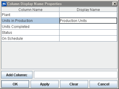
|
Field Name |
Description |
|
Column Name |
This list is populated based on the table's data attachment. If you have not yet attached the table to data, this list will be empty. |
|
Display Name |
Enter the name to be displayed in the column header and press <Enter>. |
|
Add Column |
Enter the name of the column and click the Add Column button to insert a column into the table. |
|
Clear |
Click the Clear button to remove all Display Names listed. |
The Object Palette features several types of graph objects -- trend, bar, pie, radar, and XY graphs-- that are useful for comparing data. Trend graphs are used to display a single variable per trace over time. Bar, pie, radar, and XY graphs are designed to display information returned by a tabular element in your data attachment. Based on your data attachment, substitutions are created that will be passed into drill down displays. See “Drill Down Substitutions” for more information.
Note: Some graph objects (e.g.: the bar graph legend, pie wedges and legend) cache their colors and therefore do not update when a custom color definition changes (see “Custom Colors Tab” for more information). You will need to either to restart RTView or reload the display to see the color change for these objects.
|
Trend graphs (class name: obj_trendgraph02) are useful for plotting a single value per trace over time and for displaying historical data stored by the “Historian”. |
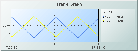
|
|
Bar graphs (class name: obj_bargraph) are useful for comparing columns or rows of numeric data from a tabular data element returned by your data attachment. |
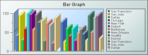
|
|
Pie graphs (class name: obj_pie) are useful for comparing values from a single column or a single row of the tabular data element returned by your data attachment. |

|
|
Radar graphs (class name: obj_radar) are useful for comparing columns or rows of numeric data from a tabular data element returned by your data attachment. |

|
|
XY graphs (class name: obj_xygraph) are useful for comparing pairs of values from a tabular data element returned by your data attachment. |

|
|
Stock charts (class name: obj_stockchart) are useful for displaying live and archived stock data. |

|
|
This object (class name: obj_legend) is useful for displaying a legend that is too lengthy for the built-in legends of the graph objects. The legend is easily resizable and can be used in conjunction with any object on the Graphs tab, excluding the Heatmap. |

|
|
Heatmaps (class name: obj_heatmap) display indexed hierarchical data as a set of nested rectangles. A rectangle exists for each index and, when attached to data, each is filled with smaller rectangles representing sub-indexes, known as nodes. |

|
|
Sparkline graphs (class name: obj_sparkline) are generally used to present trends and variations in a simple and condensed way. |
|
|
Status History charts (class name: obj_statushistory) show discrete status values as horizontal bars drawn against a horizontal time axis. A label appears at the right edge of each bar along with a circular indicator displaying that bar's most recent status. |

|
|
The map object (class name: obj_gmap) is useful for showing a Google map with dynamically populated objects, navigation and drilldowns for the Thin Client. |
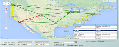
|
Trend graphs (class name: obj_trendgraph02) are generally used for tracing two types of data in one trend graph: real-time, or live data, and archived data. Displaying these two types of traces in conjunction is useful for comparing data trends. The trend graph supports up to ten traces, set the traceCount to control the number of traces.

Using Trace* Properties - Trend Graphs
The Display Builder automatically creates a set of trace* properties according to the number you specify using the traceCount object property. Attach your data to trace*Value or trace*ValueTable, where * is the trace number. For example if you set the traceCount to three (3), you will have three traces in your graph (Trace01, Trace02 and Trace03) and a corresponding trace*Value (trace1Value, trace2Value and trace3Value) for each.
All traces in the trend graph have the option to display historical and/or current data:
|
Historical Data |
Current Data |
Historical and Current Data |
|
To display historical data, attach to trace*ValueTable, where * is the trace number, and include two columns in your attachment. The first column must be the time value and the second column the value to plot. Optionally, include a third (string) column in your attachment if you want to display a data label for each corresponding data value. See the Attach to Data section specific to your data source for details on how to use the Select Columns dialog. Note: In order to attach historical data to the trace*ValueTable property, the trace*ValueHistoryFlag must be deselected. |
To display current data, attach to trace*Value, where * is the trace number. When you attach data to the trace*Value property, the time displayed on the trend graph is automatically updated each time data is received. Your data attachment can contain either a single point of data or two columns of data. See the Attach to Data section specific to your data source for details on how to use the Select Columns dialog. If your attachment contains a single point of data, RTView assigns a time stamp when the graph receives the data. If your attachment contains two columns of data, the first column must be the time value and the second column the value to plot. Optionally, include a third (string) column in your attachment if you want to display a data label for each corresponding data value. |
To display both historical and current data in a single trace, attach your current data to trace*Value and select one of the following options for your historical data: § Select the trace*ValueHistoryFlag so that initial data is loaded from the Historian database § Attach your historical data to trace*ValueTable. Note: The trace*ValueHistoryFlag must be deselected. |
Supported formats for the time value column are: mm/dd/yyyy hh:mm:ss (e.g., 01/16/2004 12:30:03), yyyy-mm-dd hh:mm:ss (e.g., 2004-01-16 12:30:03), and the number of milliseconds since midnight, January 1, 1970 UTC. In order to view all available data, you must set the properties timeRange to -1 and timeShift to a negative value. This negative value will be used to round the start and end times for the y-axis. For example, if you specify -15 for the timeShift property, the start and end times for the y-axis will be rounded to the nearest 15 seconds.
Data labels will be displayed (enclosed in parentheses) in the fixed legend and in the popup legend, between the trace value and the trace label. If the cursorFlag property is selected, then the data label in the popup legend is for the data value that is directly under or to the left of the cursor.
Alert Properties
To set trace marker colors and styles based on a threshold value, select the corresponding value alarm or value warning flags.
|
Property Name |
Description |
|
|
valueHighAlarmEnabledFlag |
Select to enable the high alarm threshold and the following related properties: |
|
|
|
valueHighAlarm |
Set the value of the high alarm threshold. |
|
|
valueHighAlarmLineVisFlag |
Select to display a dotted line at the high alarm threshold. The color of the line is set to the valueHighAlarmMarkColor. |
|
|
valueHighAlarmMarkColor/ valueHighAlarmMarkStyle |
When a trace marker's value is greater than or equal to the valueHighAlarm property, the marker will change to the valueHighAlarmMarkColor and valueHighAlarmMarkStyle. |
|
|
valueHighAlarmTraceColor/ valueHighAlarmTraceStyle |
When the value of any segment of a trace line is greater than or equal to the valueHighAlarm property, that segment of the trace line will change to the valueHighAlarmTraceColor and valueHighAlarmTraceStyle. Note: If valueHighAlarmTraceStyle is set to No Line, then valueHighAlarmTraceColor will not change. |
|
valueHighWarningEnabledFlag |
Select to enable the high warning threshold and the following related properties: |
|
|
|
valueHighWarning |
Set the value of the high warning threshold. |
|
|
valueHighWarningLineVisFlag |
Select to display a dotted line at the high warning threshold. The color of the line is set to the valueHighWarningMarkColor. |
|
|
valueHighWarningMarkColor/ valueHighWarningMarkStyle |
When a trace marker's value is greater than or equal to the valueHighWarning property but less than the valueHighAlarm property, the marker will change to the valueHighWarningMarkColor and valueHighWarningMarkStyle. |
|
|
valueHighWarningTraceColor/ valueHighWarningTraceStyle |
When the value of any segment of a trace line is greater than or equal to the valueHighWarning property but less than the valueHighAlarm property, that segment of the trace line will change to the valueHighWarningTraceColor and valueHighWarningTraceStyle. |
|
valueLowAlarmEnabledFlag |
Select to enable the low alarm threshold and the following related properties: |
|
|
|
valueLowAlarm |
Set the value of the low alarm threshold. |
|
|
valueLowAlarmLineVisFlag |
Select to display a dotted line at the low alarm threshold. The color of the line is set to the valueLowAlarmMarkColor. |
|
|
valueLowAlarmMarkColor/ valueLowAlarmMarkStyle |
When the trace marker's value is less than or equal to the valueLowAlarm property, the marker will change to the valueLowAlarmMarkColor and valueLowAlarmMarkStyle. |
|
|
valueLowAlarmTraceColor/ valueLowAlarmTraceStyle |
When the value of any segment of a trace line is less than or equal to the valueLowAlarm property, that segment of the trace line will change to the valueLowAlarmTraceColor and valueLowAlarmTraceStyle. |
|
valueLowWarningEnabledFlag |
Select to enable the low warning threshold and the following related properties: |
|
|
|
valueLowWarning |
Set the value of the low warning threshold. |
|
|
valueLowWarningLineVisFlag |
Select to display a dotted line at the low warning threshold. The color of the line is set to the valueLowWarningMarkColor. |
|
|
valueLowWarningMarkColor/ valueLowWarningMarkStyle |
When the trace marker's value is less than or equal to the valueLowWarning property, but greater than the valueLowAlarm property, the marker will change to the valueLowWarningMarkColor and valueLowWarningMarkStyle. |
|
|
valueLowWarningTraceColor/ valueLowWarningTraceStyle |
When the value of any segment of a trace line is less than or equal to the valueLowWarning property, but greater than the valueLowAlarm property, that segment of the trace line will change to the valueLowWarningTraceColor and valueLowWarningTraceStyle. |
Background Properties
Specify how the background is displayed in your trend graph.
|
Property Name |
Description |
|
bgBorderColor |
Select the |
|
bgBorderFlag |
If selected, a border is drawn around the background rectangle. |
|
bgColor |
Select the |
|
bgEdgeWidth |
Set the width of the 3D edge on the background rectangle. This property is only available if the bgStyle selected is 3D Rectangle. |
|
bgGradientColor2 |
Select the Note: The bgColor property sets the first color in the gradient. |
|
bgGradientMode |
Display a gradient in the background rectangle. Select from the following options: None - No gradient Diagonal Edge - Gradient is drawn at a 45 degree angle from the top left to the bottom right corner of the object. Diagonal Center - Gradient is drawn at a 45 degree angle from the center to the top left and the bottom right corners of the object. Horizontal Edge - Gradient is drawn horizontally from the top to the bottom of the object. Horizontal Center - Gradient is drawn horizontally from the center to the top and bottom of the object. Vertical Edge - Gradient is drawn vertically from the left to the right of the object. Vertical Center - Gradient is drawn vertically from the center to the left and right of the object. |
|
bgRaisedFlag |
Reverses the direction of the gradient, as well as that of the 3D edge if the bgStyle selected is 3D Rectangle. |
|
bgRoundness |
Set the arc length of the rounded corners. This property is only available if the bgStyle selected is Round Rectangle. Note: The value of bgRoundness cannot exceed half the value of the objWidth or the objHeight. If bgRoundness does exceed that value, then half (of the smaller of the two values) of objWidth or objHeight will be used instead. For example, if objWidth is 100 and objHeight is 50, then the value of bgRoundness cannot exceed 25. If it does, then half the value of objHeight (25) will be used instead. |
|
bgShadowFlag |
Select to display a drop shadow on the background rectangle. |
|
bgStyle |
Choose one of the following three options from the drop down menu: Rectangle - Select to display a background rectangle. 3D Rectangle - Select to display a 3D edge on the background rectangle. If selected, use bgEdgeWidth to set the width of the 3D edge. Round Rectangle - Select to display a background rectangle with rounded edges. If selected, use bgRoundness to set the arc length of the rounded corners. |
|
bgVisFlag |
Select to display the background rectangle. |
|
borderPixels |
Set the amount of space (in pixels) between the graph and the border. |
Data Properties
Specify how data is displayed in your graph.
|
Property Name |
Description |
|
historyOnlyFlag |
If selected, the graph will plot only data that is applied to the trace*ValueTable properties and will ignore the timeShift property and any data that is applied to the trace*Value properties. This is useful when same graph is used to view Historical data or Historical and Current data by setting substitutions on the display. |
|
maxPointsPerTrace |
The default is set to 1000. The maximum value for this property is 30000. |
|
yValueMax yValueMin |
The yValueMin and yValueMax properties control the range of the y-axis for this trace if the yAxisAutoScaleMode is set to Off. Select On for the yAxisAutoScaleMode to calculate y-axis range according to data values being plotted. To calculate the y-axis range including yValueMin and yValueMax, select On - Include Min/Max. If yAxisMultiRangeMode is set to Multiple Axis or Strip Chart, then use the trace*YAxisAutoScaleMode, trace*YAxisValueMin, and trace*YAxisValueMax properties to control the range of the y-axis. |
Data Format Properties
Specify data format in your graph.
|
Property Name |
Description |
|
yValueFormat |
Select or enter the numeric format of values displayed in the legend and popup legend. To enter a format, use syntax from the Java DecimalFormat class. |
Historian Properties
|
Property Name |
Description |
|
historyTableName |
Specify name of table in your history database in which to store tabular data. See “Configuring the Historian” for information. |
|
historyTableRowNameFlag |
If selected, data from the row name field will be stored in the first column of the table specified in historyTableName. |
Interaction Properties
|
Property Name |
Description |
|
command |
Assign a command to your trend graph. See “Define/Execute Command” for information. |
|
commandCloseWindowOnSuccess |
If selected, the window that initiates a system command will automatically close when the system command is executed successfully. This property only applies to system commands. With data source commands, the window is closed whether or not the command is executed successfully. For multiple commands, this property is applied to each command individually. Therefore if the first command in the multiple command sequence succeeds, the window will close before the rest of the commands are executed. Note: The commandCloseWindowOnSuccess property is not supported in the Display Server. |
|
commandConfirm |
If selected, the command confirmation dialog is enabled. Use the commandConfirmText property to write your own text for the confirmation dialog, otherwise text from the command property will be used. For multiple commands, if you Confirm the execution then all individual commands will be executed in sequence with no further confirmation. If the you Cancel the execution, none of the commands in the sequence will executed. |
|
commandConfirmText |
Enter command confirmation text directly in the Property Value field or select the |
|
cursorColor |
Select the Note: This property is only available if cursorFlag is selected. |
|
cursorFlag |
Select to enable the cursor. When the cursor is enabled, point to a location on a trace to see a cursor line at that location and display the time and values of all traces at the cursor line on the legend. Hold down the control key to snap the cursor to the closest data point. Select the legendPopupFlag to display the legend along the cursor. |
|
drillDownTarget |
Name of display (.rtv) file targeted as a drill down. See “Drill Down Displays” for information. When you double-click on a trace in the graph, the following predefined substitutions will be set on the specified drillDownTarget: § $traceNumber - number of the trace (1 to 10) that contains the selected point § $traceLabel - label of selected trace § $pointValue - data value of point § $pointTimestamp - timestamp of point § $pointLabel - data label (if any) of point § $pointIndex - position of point in trace data (0 to maxPointsPerTrace) Note: When drillDownSelectMode is set to Anywhere double-clicking anywhere on the graph will activate the specified drillDownTarget, however you must double-click on a trace in the graph to set the substitutions listed above. |
|
drillDownSelectMode |
Control how a drill down display is activated. Select one of the following options: Anywhere - Activate a drill down display by double-clicking anywhere on the graph. Element Only - Enable a drill down display only when you double-click on a trace in the graph. |
|
legendPopupFlag |
Select to display the legend along the cursor. Note: This property is only available if cursorFlag is selected. |
|
scrollbarMode |
Select Never, As Needed, or Always from the scrollbarMode property to set the behavior of the scroll bar in the graph. Never is the default setting. Select Always to display a scroll bar at all times or As Needed to display the scroll bar when necessitated by zooming in the trace area or when you have more data loaded into the graph than you are displaying in the time range. For example, if timeRangeOfHistory is greater than timeRange, setting scrollbarMode to As Needed will enable a scroll bar to view all historical data loaded into the graph. |
|
scrollbarSize |
Specify the height of the horizontal scroll bar and the width of the vertical scroll bar, in pixels. The default value is -1, which sets the size to the system default. |
|
zoomEnabledFlag |
Select to enable zooming within the graph. Click in the graph's trace area and drag the cursor until a desired range is selected. While dragging, a rectangle is drawn to show the zoom area. The rectangle's default color is yellow (this can be changed in the cursorColor property). After the zoom is performed, the graph stores up to four zoom operations in queue. To zoom out, press the shift key and click in the graph's trace area. Note: The graph is paused after a zoom is performed and returns to updating with live data when the graph is zoomed back out to 100%. |
Label Properties
|
Property Name |
Description |
|
label |
Edit label text directly in the Property Value field or select the |
|
labelMinTabWidth |
Specify minimum width of the label tab. This property is only applies if labelTextAlignY is set to TabTop. |
|
labelTextAlignX |
Select x-axis position of label text from the drop down menu. |
|
labelTextAlignY |
Select y-axis position of label text from the drop down menu. Outside Top - Position label well above the background rectangle. Top - Position label just above the background rectangle. Title Top - Position label along the top line of the background rectangle. Tab Top - Position label tab just above the background rectangle. Height and width of the tab is dependent on the height and width of the text. Use the labelMinTabWidth property to specify a minimum tab width. Inside Top - Position label inside the top of the background rectangle. |
|
labelTextColor |
Select the |
|
labelTextFont |
Select font style of label text from the drop down menu. |
|
labelTextHeight |
Set the height of the label text in pixels. |
Legend Properties
Specify the way the legend is displayed in your trend graph. Click and press a trace's entry in the legend to temporarily hide all other traces in the graph.
|
Property Name |
Description |
|
legendBgColor |
Select the |
|
legendBgGradientColor2 |
Select the Note: The legendBgColor property sets the first color in the gradient. |
|
legendBgGradientMode |
Display a gradient in the legend background. Select from the following options: None - No gradient Diagonal Edge - Gradient is drawn at a 45 degree angle from the top left to the bottom right corner of the object. Diagonal Center - Gradient is drawn at a 45 degree angle from the center to the top left and the bottom right corners of the object. Horizontal Edge - Gradient is drawn horizontally from the top to the bottom of the object. Horizontal Center - Gradient is drawn horizontally from the center to the top and bottom of the object. Vertical Edge - Gradient is drawn vertically from the left to the right of the object. Vertical Center - Gradient is drawn vertically from the center to the left and right of the object. |
|
legendTimeFormat |
Set the format for the time displayed in the legend using syntax from the Java SimpleDateFormat class. For example, MMMM dd, yyyy hh:mm:ss a would result in the form August 30, 2003 05:32:12 PM. If no format is given, the timeFormat will be used. |
|
legendValueMinSpace |
Specify the minimum distance between values and labels in the legend. |
|
legendVisFlag |
Select to display the legend. |
|
legendWidthPercent |
Set the percent of the total width of the object used for the legend. |
|
outlineColor |
Select the |
Marker Properties
Specify the way markers are displayed in your trend graph.
|
Property Name |
Description |
|
markDefaultSize |
Set markDefaultSize to specify the size of the markers in pixels. |
|
markScaleMode |
Set markScaleMode to scale markers according to the order of the data in your data attachment, e.g., the marker for the first data in the attachment is the smallest and the marker for the last data is the largest. Select one of the following from the drop down menu to set the scale mode: No Scale, Scale by Trace, or Scale Within Trace. |
Object Properties
|
Property Name |
Description |
|
anchor |
Specify where to anchor an object in the display. Note: If an object has the dock property set, the anchor property will be ignored. The anchor property is only applied when the dimensions of the display are modified, either by editing “Background Properties” or resizing the window in Layout mode Select None, or one or more the following options: None - Object not anchored. This is the default. Top - Anchor top of object at top of display. Left - Anchor left side of object at left of display. Bottom - Anchor bottom of object at bottom of display. Right - Anchor right side of object at right of display. When a display is resized, the number of pixels between an anchored object and the specified location remain constant. If an object is anchored on opposite sides (i.e. Top and Bottom or Left and Right), the object will be stretched to fill the available space. |
|
dock |
Specify the docking location of an object in the display. Select from the following options: None - Object is not docked. This is the default. Top - Dock object at top of display. Left - Dock object at left of display. Bottom - Dock object at bottom of display. Right - Dock object at right of display. Fill - Dock object in available space remaining in the display after all docked objects are positioned. |
|
|
If the dimensions of the display are modified, either by editing “Background Properties” or resizing the window in Layout mode, the properties (objX, objY, objWidth, and objHeight) of docked objects will automatically adapt to match the new size of the display. When multiple objects are docked to the same side of the display, the first object is docked against the side of the display, the next object is docked against the edge of the first object, and so on. When objects are docked to multiple sides of the display, the order in which objects were added to the display controls docking position. For example, let's say the first object added to the display is docked at the Top and the second object is docked at the Left. Consequently, the first object will fill the entire width of the display and the second object will fill the left side of the display from the bottom of the first object to the bottom of the display. |
|
|
Objects in a display have the dock property set to Fill, are laid out across a grid in the available space remaining after all docked objects are positioned. By default, the grid has one row and as many columns as there are objects in the display. You can modify the grid in the “Background Properties” dialog. Once an object is docked, there are some limitations on how that object can be modified. § Docked objects cannot be dragged or repositioned using objX and objY properties. § Docked objects cannot be resized using the objWidth or objHeight properties. To resize you must drag on the resize handle. § Docked objects can only be resized toward the center of the display (e.g. If an object is docked at the Top, only its height can be increased by dragging down toward the center of the display). § Docked objects set to Fill cannot be resized at all. § Docked objects cannot be moved using Align. Non-docked objects can be aligned against a docked object, but a docked object will not move to align against another object. § Docked objects are ignored by Distribute. |
|
objHeight |
Sets the height (in pixels) of the object. |
|
objName |
Name given to facilitate object management via the Object List dialog. Select Tools>Object List. |
|
objWidth |
Sets the width (in pixels) of the object. |
|
objX |
Plot x-axis position of object. |
|
objY |
Plot y-axis position of object. |
|
styleClass |
Enter the style class name for this object as defined in your style sheet. If not specified, the object class name is used. Note: The value entered must not contain spaces and cannot start with rtv-. |
|
transparencyPercent |
Set transparency of the object. Enter a value between 0 and 100. A value of 0, the default, sets the object to be completely opaque. A value of 100 will render the object completely transparent. |
|
visFlag |
Control visibility of the object. |
Plot Area Properties
Specify the way the plot area is displayed in your trend graph.
|
Property Name |
Description |
|
gridColor |
Select the |
|
traceBgColor |
Select the |
|
traceBgGradientColor2 |
Select the Note: The traceBgColor property sets the first color in the gradient. |
|
traceBgGradientMode |
Display a gradient in the plot background. Select from the following options: None - No gradient Diagonal Edge - Gradient is drawn at a 45 degree angle from the top left to the bottom right corner of the object. Diagonal Center - Gradient is drawn at a 45 degree angle from the center to the top left and the bottom right corners of the object. Horizontal Edge - Gradient is drawn horizontally from the top to the bottom of the object. Horizontal Center - Gradient is drawn horizontally from the center to the top and bottom of the object. Vertical Edge - Gradient is drawn vertically from the left to the right of the object. Vertical Center - Gradient is drawn vertically from the center to the left and right of the object. |
|
traceBgImage |
Select an image to display in the plot background of your graph. If necessary, the image will be stretched to fit the plot area. |
Trace Groups
Specify trace groups displayed in your trend graph. The Display Builder automatically creates a set of traceGroup* properties (where * is the trace group number) according to the number of trace groups specified in the traceGroupCount property. A trace group is a collection of two or more traces. Trace groups are useful for identifying multiple traces sharing the same vertical axis (when yAxisMultiRangeMode is set to Strip Chart or Multi-Axis) or for identifying three traces combined as a banded trace.
|
Property Name |
Description |
|
traceGroupCount |
Specify the number of traces in your trace group. The maximum is 5. |
|
traceGroup*TraceNumbers |
According to the number of traces specified in the traceCount property, enter a comma-separated list of the traces to include in this group (i.e. 1,3,5,6). Note: If traceGroup*BandedFlag is selected, then the number of traces listed should be 3. If the yAxisMultiRangeMode selected is Strip Chart or Multi-Axis, all the traces in the group will share the same strip/axis. If the yAxisMultiRangeMode selected is Multi-Axis, the color of the axis for a trace group is determined by the specified trace*LineColor of the first visible trace in the group. Note: In Multi-Axis mode it is recommended that you assign the same trace*LineColor/trace*LineStyle and trace*MarkColor/trace*MarkStyle to all traces included within a group. Once a trace is included in a group, the following properties are no longer available: trace*YAxisAutoScaleMode, trace*YAxisValueMax, trace*YAxisValueMin. To scale the y-axis range of your trace group, use the yAxisAutoScaleMode, yValueMax, and yValueMin properties. Note: All traces included in a group must have the trace*YAxisVisFlag, traceVisFlag, and trace*YAxisGridVisFlag properties selected, otherwise the y-axis and/or the y-axis grid will not be visible. |
|
traceGroup*BandedFlag |
If selected, the plot area beneath the first trace (the low band trace) and the area above the third trace (the high band trace) will be filled. The second trace (the value trace) will not be filled. |
Trace Properties
Specify how traces are displayed in your trend graph.
|
Property Name |
Description |
|
|
multiTraceTableFlag |
Select to plot multiple traces from a single data table. |
|
|
|
multiTraceCurrentValueTable |
Attach your current data. The first column in the attachment must contain a time value. The remaining columns can either contain numeric or string data. The first numeric value is used as the data point, the first string value is used as the first data point's data label. Within the attachment, columns can be arranged in any order (e.g.: numeric1, numeric2, string1, string2, numeric3, string3, string4, numeric4). Unless a trace*Label is already specified, the attached trace* column names will be used as trace labels. Note: If multiTraceHistoryValueTable is also attached to data, it must contain the same number and type of columns as the specified multiTraceCurrentValueTable. |
|
|
multiTraceHistoryValueTable |
Attach your historical data. The first column in the attachment must contain a time value. The remaining columns can either contain numeric or string data. The first numeric value is used as the data point, the first string value is used as the first data point's data label. Within the attachment, columns can be arranged in any order (e.g.: numeric1, numeric2, string1, string2, numeric3, string3, string4, numeric4). Unless a trace*Label is already specified, the attached trace* column names will be used as trace labels. Typically, the attached data table contains initial data points to be plotted (i.e. from a SQL attachment with Update Mode set to On Demand, or from a Cache attachment with Update Once selected.) Note: If multiTraceCurrentValueTable is also attached to data, it must contain the same number and type of columns as the specified multiTraceHistoryValueTable. |
|
|
Note: Once multiTraceTableFlag is selected, all trace data is expected to be provided via multiTraceCurrentValueTable or multiTraceHistoryValueTable. Therefore, the trace*Value and trace*ValueTable properties will no longer be available. |
|
|
traceCount |
Specify the number of traces in your graph. The maximum is 10. RTView automatically creates a set of properties (see Trace* Properties below) for each trace. |
|
|
traceFillStyle |
Set traceFillStyle to Solid, Transparent, Gradient, or Transparent Gradient to fill the area under the trace. Set to None to disable this feature. None is the default. |
|
Trace* Properties
The Display Builder automatically creates a set of trace* properties (where * is the trace number) according to the number of traces specified in the traceCount property. Attach your data to trace*Value or trace*ValueTable, see the “Using Trace* Properties - Trend Graphs” section for details.
|
Property Name |
Description |
|
trace*Label |
Set a label for your trace. |
|
trace*LineColor |
Select the |
|
trace*LineStyle |
Select the style of the trace from the drop down menu: No Line, Solid, Dotted, Dashed, or Dot Dashed. |
|
trace*LineThickness |
Select the thickness of the trace from the drop down menu: Thin, Medium, or Thick. |
|
trace*MarkColor |
Select the |
|
trace*MarkStyle |
Select the style of the marker used on the trace from the drop down menu: No Marker, Dot, +, *, o, x, Filled Circle, Filled Diamond, Filled Triangle, Filled Square, or Filled Star. |
|
trace*Type |
Select the type of trace from the drop down menu: Line, Bar, or Event. Line - Line connecting each data point. Bar - Vertical bar for each data point, from zero to the data point's value. Use the trace*LineThickness property to control the width of the bar. Note: If trace*MarkStyle is set to any value other than No Marker, the mark will be drawn at the end of the Bar trace. Event - Small rectangle containing the first character of the corresponding data label for each data point. If no data label exists, then the first character of the specified trace*Label is used. Each Event trace is positioned vertically according to the data value for the corresponding data point. The trace*LineColor property sets the color of rectangle's edges and the enclosed text character. The trace*MarkColor property sets the fill color of the rectangle. If trace*LineColor and trace*MarkColor are set to the same color, then traceBgColor is used to set the fill color of the rectangle. Note: If the attached data contains data labels but no data values, then an Event trace will be plotted regardless of the specified trace*Type setting and Event trace rectangles will be drawn near the bottom of the trace area. |
|
trace*Value |
Attach your current data, either containing a single point of data or two columns of data. If your attachment contains a single point of data, RTView will assign a time stamp when the graph receives the data. If your attachment contains two columns of data, the first column must be the time value and the second column the value to plot. Optionally, include a third (string) column in your attachment to display a data label for each corresponding data value. The data label will be displayed (enclosed in parentheses) in the fixed legend and in the popup legend, between the trace value and the trace label. If the cursorFlag property is selected, then the data label in the popup legend is for the data value that is directly under or to the left of the cursor. |
|
trace*ValueAlarmStatus |
Use if your trace is being driven by trace*Value. To apply an alarm status to a trace, enter an alarm status index which will be applied to any new points plotted. Valid indexes are: 0 = use normal marker color and style, 1 = use low alarm marker color and style, 2 = use low warning marker color and style, 3 = use high warning marker color and style, 4 = use high alarm marker color and style, -1 = determine marker color and style by comparing the value to the enabled alarm thresholds. |
|
trace*ValueAlarmStatusTable |
Use if your trace is being driven by trace*ValueTable. Attach an alarm table containing status indexes to trace*ValueAlarmStatusTable to enable rule based alarm statuses for trace markers. This table must have a time column (formatted like the time value in the trace*ValueTable) and a value column where the value column contains alarm status values 0-4. The table must also have the same number of rows as the corresponding trace*ValueTable. For each data element in trace*ValueTable, the status index at the corresponding position in trace*valueAlarmStatusTable will be used to set the alarm status of the marker. Valid indexes are: 0 = use normal marker color and style, 1 = use low alarm marker color and style, 2 = use low warning marker color and style, 3 = use high warning marker color and style, 4 = use high alarm marker color and style, -1 = determine marker color and style by comparing the value to the enabled alarm thresholds. If no data is attached to trace*ValueAlarmStatusTable, then the alarm status for a trace marker is determined by comparing the marker's value to the enabled thresholds. |
|
trace*ValueDivisor |
Enter a number. All traces will be divided by this value. |
|
trace*ValueHistoryFlag |
If selected, RTView will attempt to load initial data from the Historian database for the corresponding trace. Note: Only data within the specified timeRange will be loaded and the graph will update as live data becomes available. See “Building a Display Using History Data” for more information. |
|
trace*ValueTable |
Attach your historical data containing two columns: the first column must be the time value and the second column the value to plot. Note: In order to attach historical data to the trace*ValueTable property, the trace*ValueHistoryFlag must be deselected. Optionally, include a third (string) column in your attachment to display a data label for each corresponding data value. The data label will be displayed (enclosed in parentheses) in the fixed legend and in the popup legend, between the trace value and the trace label. If the cursorFlag property is selected, then the data label in the popup legend is for the data value that is directly under or to the left of the cursor. |
|
trace*VisFlag |
Select to control trace visibility. Click and hold on a trace's entry in the legend to temporarily hide all other traces in the graph. |
Web Chart Properties
|
Property Name |
Description |
|
webChartFlag |
Select to enable the html5 trend chart. When the display is opened in the Display Server, in an HTML5 compatible browser, the html5 trend chart will appear in place of the trend graph. |
|
webChartNavigatorTrace |
Specify the number of traces (between 1 and the value of the traceCount property). By default, this property is disabled with a value of 0. The navigator will be displayed at the bottom of the html5 chart, just below the x-axis, and highlight the time range currently visible in the chart. The highlighted section can be resized or dragged to zoom/pan to the time range of interest. The color of the navigator trace will reflect the color of the corresponding trace as specified by the trace*LineColor property. |
X-Axis Properties
Specify the way the x axis is displayed in your trend graph.
|
Property Name |
Description |
|
timeFormat |
Set the format for the time displayed in the x-axis using syntax from the Java SimpleDateFormat class. For example, MMMM dd, yyyy hh:mm:ss a would result in the form August 30, 2003 05:32:12 PM. If no format is given, the date and time will not be displayed on the x-axis. Include a new line character ('\n') to display multiple line text in the time axis labels. For example, MM\dd'\n'hh:mm:ss would result in the form 08\30 05:32:12. |
|
timeRange |
Control the total amount of time, in seconds, plotted on the graph. If you attach data to trace*ValueTable, set timeRange to -1 so the time range of the graph is driven by the time range in the data attachment. Note: timeRange is ignored if both timeRangeBegin and timeRangeEnd are set. |
|
timeRangeBegin |
Set the start time value of the data to be plotted on the graph. Supported formats are: mm/dd/yyyy hh:mm:ss (e.g., 01/16/2004 12:30:03), yyyy-mm-dd hh:mm:ss (e.g., 2004-01-16 12:30:03), and the number of milliseconds since midnight, January 1, 1970 UTC. Note: If only the time is specified, then today's date will be used. |
|
timeRangeEnd |
Set the end time value of the data to be plotted on the graph. Supported formats are: mm/dd/yyyy hh:mm:ss (e.g., 01/16/2004 12:30:03), yyyy-mm-dd hh:mm:ss (e.g., 2004-01-16 12:30:03), and the number of milliseconds since midnight, January 1, 1970 UTC. Note: If only the time is specified, then today's date will be used. |
|
timeRangeOfHistory |
Specify how much historical data is loaded into the graph, in seconds. If timeRangeOfHistory is set to zero or less (default is -1), or if it is less than the value of timeRange, then the timeRange property determines the amount of historical data to be loaded into the graph. |
|
timeShift |
Control the amount of time, in seconds, the graph will shift to the left when the trace has filled the graph and controls the rounding of the start and end times. For example, if the timeShift is 15, the start and end times on the graph will be rounded to the nearest 15 second interval. By default, the end of the plot area corresponds with the current time. To only shift the graph when new data is received, set timeShift to a negative value and the end of the graph will display the most current data plotted. If you attach data to trace*ValueTable, you must set timeShift to a negative value. Note: The timeShift property is ignored if either timeRangeBegin or timeRangeEnd is set. |
|
xAxisFlag |
Select to display the x-axis. |
|
xAxisGridVisFlag |
Select to display a grid line for each major division along the x-axis. |
|
xAxisLabelTextHeight |
Specify the height in pixels of the x-axis labels. |
|
xAxisMajorDivisions |
Specify the number of major divisions on the x-axis. |
|
xAxisMinorDivisions |
Specify the number of minor divisions on the x-axis. |
Y-Axis Properties
Specify the way the y axis is displayed in your trend graph.
|
Property Name |
Description |
|
yAxisAutoScaleMode |
The yValueMin and yValueMax properties control the range of the y-axis for this trace if the yAxisAutoScaleMode is set to Off. Select On for the yAxisAutoScaleMode to calculate y-axis range according to data values being plotted. To calculate the y-axis range including yValueMin and yValueMax, select On - Include Min/Max. If yAxisMultiRangeMode is set to Multiple Axis or Strip Chart, then use the trace*YAxisAutoScaleMode, trace*YAxisValueMin, and trace*YAxisValueMax properties to control the range of the y-axis. |
|
yAxisAutoScaleVisDataOnlyFlag |
Select to compute the y-axis scale according to the min & max y values of the visible data points only. This means that the y-axis scale may change as the user changes the visible time range by scrolling or zooming. By default, this property is not selected and the y axis is scaled according to the y values of all of data points, visible or not. This property is only available if webChartFlag is selected. |
|
yAxisAutoScaleVisTracesOnlyFlag |
Select to include only visible traces when calculating the y-axis range. By default all traces in the traceCount are used in the auto-scale calculation, including those that are invisible or unattached to data. |
|
yAxisFlag |
Select to display the y-axis. |
|
yAxisFormat |
Select or enter the numeric format of values displayed on the y-axis. To enter a format, use syntax from the Java DecimalFormat class. |
|
yAxisGridVisFlag |
Select to display a grid line for each major division along the y-axis if yAxisMultiRangeMode is set to Off or Classic. If yAxisMultiRangeMode is set to Multiple Axis or Strip Chart, grid visibility is set by selecting the trace*YAxisGridVisFlag. |
|
yAxisLabelTextHeight |
Specify the height in pixels of the y-axis labels. |
|
yAxisMajorDivisions |
Specify the number of major divisions on the y-axis. This is ignored if yAxisValueLabels is set. |
|
yAxisMinLabelWidth |
Specify the minimum width in pixels for the y-axis labels. If yAxisMultiRangeMode is set to Multiple Axis or Strip Chart, minimum width is set by trace*YAxisMinLabelWidth. |
|
yAxisMinorDivisions |
Specify the number of minor divisions on the y-axis. This is ignored if yAxisValueLabels is set. |
|
yAxisMultiRangeMode |
Select one of the following modes: Off - All traces are plotted against a single y-axis. Classic - One axis per trace, with each trace having its own range. The 1st trace is drawn on the outer left of the graph. The remaining traces are drawn on the inner left of the trace area. Multiple Axis - One axis per trace, with each trace having its own range. Use the trace*YAxisAutoScaleMode, trace*YAxisValueMin, and trace*YAxisValueMax properties to control the range of the y-axis. Strip Chart - The trace area is divided into strips, one for each trace. Each trace has its own y-axis but all traces share the same x-axis. Use the trace*YAxisAutoScaleMode, trace*YAxisValueMin, and trace*YAxisValueMax properties to control the range of the y-axis. Stacked - The y-axis values for multiple traces displayed are "stacked". That is, the value of each successive data point is accumulated and the sum from lower numbered traces are plotted in the highest numbered trace. Note: Actual (unstacked) values for each individual trace are shown in the legend. Values for lower numbered traces are not included in the sum if a trace is invisible, has no data, all of its data points are older or newer than the x-axis value, or the y-axis value at the x-axis value is not a number (NaN). If a lower numbered trace has no y-axis value at a particular x-axis data point, but has x-axis values before and after that data point, the y-axis value for the sum in that trace will be interpolated. |
|
yAxisPosition |
Select one of the following to set the position of the y-axis on the graph. Note: The yAxisPosition setting is ignored if yAxisMultiRangeMode is set to Classic. Outer Left - Draw axis to the left of the trace area. Outer Right - Draw axis to the right of the trace area. Outer Mixed - Draw axis to the left of the trace area for odd numbered traces and to the right for even numbered traces. Inner Left - Draw axis on the inside left of the trace area. Inner Right - Draw axis on the inside right of the trace area. Inner Mixed - Draw axis on the inside left of the trace area for odd numbered traces and on the inside right of the trace area for even numbered traces. |
|
yAxisValueLabels |
Set to display a text label or tick mark on the y-axis in place of a numerical value. Include a value with no label to display a tick mark without a label. Use this format: value1=label1,value2,value3=label2 (e.g., 0=Off,1,2=On) If yAxisMultiRangeMode is set to Multiple Axis or Strip Chart mode, the y-axis labels are set using the trace*YAxisValueLabels property. |
Bar graphs (class name: obj_bargraph) are useful for comparing columns or rows of numeric data from a tabular data element returned by your data attachment.

Using Data and Data Label Properties
To attach data to your graph, right-click in the Property Value field of the valueTable property and select Attach to Data. It is possible to graph multiple columns or rows of numeric data. If you include a label column in your data attachment for valueTable, it can be used to label either the x-axis or the legend, depending on whether the rowSeriesFlag is selected or deselected.
The rowSeriesFlag controls how row and column data populate the graph:
If the rowSeriesFlag check box is selected, one group of bars will be shown for each numeric column in your data attachment. Within the group for each numeric column, there will be a bar for each row in that column. Column names will be used for the x-axis labels. If your data attachment has a label column and the rowLabelVisFlag is selected, data from this column will be used in the legend. If your data attachment does not have a label column, select the rowNameVisFlag check box to use row names in the legend. By default, the label column is the first non-numeric text column in your data. Specify a column name in the labelColumnName property to set the label column to a specific column.
If the rowSeriesFlag check box is not selected, one group of bars will be shown for each row in your data attachment. Within the group for each row, there will be a bar for each column in that row. Column names will appear in the legend. If your data attachment has a label column and the rowLabelVisFlag is selected, data from this column will appear on the x-axis. If your data attachment does not have a label column, select the rowNameVisFlag check box to use row names on the x-axis. By default, the label column is the first non-numeric text column in your data. Specify a column name in the labelColumnName property to set the label column to a specific column.
To add one or more traces to your bar graph, right-click in the Property Value field of the traceValueTable property and select Attach to Data. If you include a label column in your data attachment for traceValueTable, this is used to label either the x-axis or the legend (depending on the rowSeriesFlag) if no label is available from the valueTable data attachment. By default, the label column is the first non-numeric text column in your data. Specify a column name in the traceLabelColumnName property to set the label column to a specific column.
Using Interaction Properties
Commands
To assign a command to your graph, right-click in the Property Value field of the command property and select Define Command. Commands can be set up to execute when you click on an object or automatically execute the command when the value of an object reaches a specified threshold. See “Define/Execute Command” for information on how to set up commands.
Drill Down Displays
To specify a drill down display, double click on the drillDownTarget property. Any display (.rtv) file can be targeted as a drill down. Based on your data attachment, substitutions are created that will be passed into drill down displays (see “Drill Down Substitutions” for more information). To customize which substitutions will be passed into drill down displays, double-click on drillDownColumnSubs in the Object Properties window to open the “Drill Down Column Substitutions Dialog”. Once a drill down target has been set, double-click on the bar or trace marker in the graph to activate the drill down. Drill down displays can be activated in the same window that contains the graph or open in a separate window. This allows you to build a customizable hierarchy of displays.
Use drillDownSelectMode to control how a drill down display is activated. Set to Anywhere to activate a drill down display by double-clicking anywhere on the graph. Set to Element Only to enable a drill down display only when you double-click on a bar in the graph.
Tool Tips
Select the mouseOverFlag to enable tool tips for your bar graph. To display a tool tip, point to a bar or marker with your mouse. The tool tip will contain information from your data attachment about that bar or marker. Select the mouseOverHighlightFlag to enable bar highlighting.
Alert Properties
To set bar colors, trace marker colors and trace marker styles based on a threshold value, select the corresponding value alarm or value warning flags.
|
Property Name |
Description |
|
|
traceValueAlarmStatusTable |
Attach an alarm table containing status indexes to valueAlarmStatusTable to enable rule based alarm statuses for trace markers. The table attached to valueAlarmStatusTable must have the same number of rows and columns as traceValueTable. For each data element in traceValueTable, the status index at the corresponding position in valueAlarmStatusTable will be used to set the alarm status of the marker. Valid indexes are: 0 = use normal marker color and style 1 = use low alarm marker color and style 2 = use low warning marker color and style 3 = use high warning marker color and style 4 = use high alarm marker color and style -1 = determine marker color and style by comparing the value to the enabled alarm thresholds If no data is attached to valueAlarmStatusTable, then the alarm status for a trace marker is determined by comparing the marker's value to the enabled thresholds. |
|
|
valueHighAlarmEnabledFlag |
Select to enable the high alarm threshold and the following related properties: |
|
|
|
valueHighAlarm |
Set the value of the high alarm threshold. |
|
|
valueHighAlarmColor |
When a bar's value is greater than or equal to the valueHighAlarm property, the color of the bar will change to the valueHighAlarmColor. |
|
|
valueHighAlarmLineVisFlag |
Select to display a dotted line at the high alarm threshold. The color of the line is set to the valueHighAlarmMarkColor. |
|
|
valueHighAlarmMarkColor/ valueHighAlarmMarkStyle |
When a trace marker's value is greater than or equal to the valueHighAlarm property, the marker will change to the valueHighAlarmMarkColor and valueHighAlarmMarkStyle. |
|
valueHighWarningEnabledFlag |
Select to enable the high warning threshold and the following related properties: |
|
|
|
valueHighWarning |
Set the value of the high warning threshold. |
|
|
valueHighWarningColor |
When a bar's value is greater than or equal to the valueHighWarning, but less than the valueHighAlarm, the color of the bar will change to the valueHighWarningColor. |
|
|
valueHighWarningLineVisFlag |
Select to display a dotted line at the high warning threshold. The color of the line is set to the valueHighWarningMarkColor. |
|
|
valueHighWarningMarkColor/ valueHighWarningMarkStyle |
When a trace marker's value is greater than or equal to the valueHighWarning property but less than the valueHighAlarm property, the marker will change to the valueHighWarningMarkColor and valueHighWarningMarkStyle. |
|
valueLowAlarmEnabledFlag |
Select to enable the low alarm threshold and the following related properties: |
|
|
|
valueLowAlarm |
Set the value of the low alarm threshold. |
|
|
valueLowAlarmColor |
When a bar's value is less than or equal to the valueLowAlarm property, the color of the bar will change to the valueLowAlarmColor. |
|
|
valueLowAlarmLineVisFlag |
Select to display a dotted line at the low alarm threshold. The color of the line is set to the valueLowAlarmMarkColor. |
|
|
valueLowAlarmMarkColor/ valueLowAlarmMarkStyle |
When the trace marker's value is less than or equal to the valueLowAlarm property, the marker will change to the valueLowAlarmMarkColor and valueLowAlarmMarkStyle. |
|
valueLowWarningEnabledFlag |
Select to enable the low warning threshold and the following related properties: |
|
|
|
valueLowWarning |
Set the value of the low warning threshold. |
|
|
valueLowWarningColor |
When a bar's value is less than the valueLowWarning property, but greater than the valueLowAlarm property, the bar will change to the valueLowWarningColor. |
|
|
valueLowWarningLineVisFlag |
Select to display a dotted line at the low warning threshold. The color of the line is set to the valueLowWarningMarkColor. |
|
|
valueLowWarningMarkColor/ valueLowWarningMarkStyle |
When the trace marker's value is less than or equal to the valueLowWarning property, but greater than the valueLowAlarm property, the marker will change to the valueLowWarningMarkColor and valueLowWarningMarkStyle. |
Background Properties
Specify how the background is displayed in your bar graph.
|
Property Name |
Description |
|
bgBorderColor |
Select the |
|
bgBorderFlag |
If selected, a border is drawn around the background rectangle |
|
bgColor |
Select the |
|
bgEdgeWidth |
Set the width of the 3D edge on the background rectangle. This property is only available if the bgStyle selected is 3D Rectangle. |
|
bgGradientColor2 |
Select the Note: The bgColor property sets the first color in the gradient. |
|
bgGradientMode |
Display a gradient in the background rectangle. Select from the following options: None - No gradient Diagonal Edge - Gradient is drawn at a 45 degree angle from the top left to the bottom right corner of the object. Diagonal Center - Gradient is drawn at a 45 degree angle from the center to the top left and the bottom right corners of the object. Horizontal Edge - Gradient is drawn horizontally from the top to the bottom of the object. Horizontal Center - Gradient is drawn horizontally from the center to the top and bottom of the object. Vertical Edge - Gradient is drawn vertically from the left to the right of the object. Vertical Center - Gradient is drawn vertically from the center to the left and right of the object. |
|
bgRaisedFlag |
Reverses the direction of the gradient, as well as that of the 3D edge if the bgStyle selected is 3D Rectangle. |
|
bgRoundness |
Set the arc length of the rounded corners. This property is only available if the bgStyle selected is Round Rectangle. Note: The value of bgRoundness cannot exceed half the value of the objWidth or the objHeight. If bgRoundness does exceed that value, then half (of the smaller of the two values) of objWidth or objHeight will be used instead. For example, if objWidth is 100 and objHeight is 50, then the value of bgRoundness cannot exceed 25. If it does, then half the value of objHeight (25) will be used instead. |
|
bgShadowFlag |
Select to display a drop shadow on the background rectangle. |
|
bgStyle |
Choose one of the following three options from the drop down menu: Rectangle - Select to display a background rectangle. 3D Rectangle - Select to display a 3D edge on the background rectangle. If selected, use bgEdgeWidth to set the width of the 3D edge. Round Rectangle - Select to display a background rectangle with rounded edges. If selected, use bgRoundness to set the arc length of the rounded corners. |
|
bgVisFlag |
Select to display the background rectangle. |
|
borderPixels |
Set the amount of space (in pixels) between the graph and the border. |
Bar Properties
Specify the way the bars are displayed in your graph.
|
Property Name |
Description |
|
barGradientStyle |
Select None, Shaded, or Rounded to set the gradient style of the bars. None is the default setting. Select Shaded to display bars with a flat gradient or Rounded to display bars with a rounded gradient. |
|
barImage |
Type the name of the image to display in the bars or, select the § Current Directory - Contains images in the current directory and one level of subdirectories. § Custom Image Library - If you have specified a custom image library, this directory contains those images (.gif, .jpg or .png). See Creating a Custom Image Library (below) for details. § Symbol Library - Contains symbolic images (for example, symbols for various types of hardware, shapes, lights, arrows, etc.). Navigate to the image you want to use and select it. A preview of the image appears in the pane to the right. Click OK or Apply to set the image on your object. If an image is not listed, enter the name of the file, including the relative path. Note: If necessary, the image will be stretched to fit the bar size. |
|
|
Creating a Custom Image Library The custom image library enables you to make your own images available in the Select Image dialog. To add your own image library, perform the following steps. 1. Place your images .jar file and add it to the “RTV_USERPATH” environment variable. The images must be in a directory (not in the top level of the jar). They can be organized into subdirectories of one top level directory. 2. In the Display Builder, select Tools/Builder Options and, in the Custom Image Library Path field, set the path to the directory containing your images .jar file. For example, if you have a jar with this directory structure: com/mycompany/Images com/mycompany/Images/Blue Images com/mycompany/Images/Red Images com/mycompany/Images/Green Images you would enter com/mycompany/Images. This adds a directory named Images to the tree in the Select Image dialog. The Images directory will have three subdirectories: Blue Images, Red Images, and Green Images. Only directories containing images are added to the Select Image dialog. To access the images, you can edit any property that allows you to set an image on an object (for example, the image, barImage and filterProperties properties), or edit the File>Background Properties>Image Name field. See “Background Properties” for more information. |
|
barProperties |
Double-click on barProperties to open the “Bar Properties” dialog and specify the color and fill pattern to be used to display each bar in the graph. Note: Fill Patterns set in the Bar Properties dialog will be ignored unless the barGradientStyle property is set to None. |
|
barValueVisFlag |
Select to display a label containing the value for each bar. |
Column Properties
Specify which columns are displayed in your bar graph.
|
Property Name |
Description |
|
columnsToHide |
Specify columns from the data attachment to exclude from being used for plotted data or labels. Data from the labelColumnName column will be used for labels even if that column name is also specified in the columnsToHide property. Columns specified in the columnsToHide property can still be used in the drillDownColumnSubs property. |
Data Properties
|
Property Name |
Description |
|
rowSeriesFlag |
Controls how row and column data populate the graph. If rowSeriesFlag is selected, one group of bars will be shown for each numeric column in your data attachment. Within the group for each numeric column, there will be a bar for each row in that column. Column names will be used for the x-axis labels. If your data attachment has a label column and the rowLabelVisFlag is selected, data from this column will be used in the legend. If your data attachment does not have a label column, select the rowNameVisFlag check box to use row names in the legend. By default, the label column is the first non-numeric text column in your data. Specify a column name in the labelColumnName property to set the label column to a specific column. If rowSeriesFlag is not selected, one group of bars will be shown for each row in your data attachment. Within the group for each row, there will be a bar for each column in that row. Column names will appear in the legend. If your data attachment has a label column and the rowLabelVisFlag is selected, data from this column will appear on the x-axis. If your data attachment does not have a label column, select the rowNameVisFlag check box to use row names on the x-axis. By default, the label column is the first non-numeric text column in your data. Specify a column name in the labelColumnName property to set the label column to a specific column. |
|
traceValueDivisor |
Divides trace values by the number entered. |
|
traceValueTable |
Attach your data to the traceValueTable property to add one or more traces to your bar graph. If you include a label column in data attached to traceValueTable, it can be used to label either the x-axis or the legend (depending on the rowSeriesFlag) if no label is available from the valueTable data attachment. Note: By default, the label column is the first non-numeric text column in your data attachment. Enter a column name in the traceLabelColumnName property to set a specific label column. |
|
traceYAxisValueMax traceYAxisValueMin |
Select the traceYAxisFlag to plot the traces against a separate y-axis than the bars. Note: The traceYAxisFlag property is unavailable if the drawHorizontalFlag property is selected. The trace y-axis will be drawn to the right of the plot area. When the traceYAxisFlag is selected, the traceYAxisValueMin and traceYAxisValueMax properties are used to control the range of the trace y-axis if yAxisAutoScaleMode is set to Off or On-include Min/Max. Select or enter the numeric format of trace values displayed on the y-axis with the traceYAxisFormat property. To enter a format, use syntax from the Java DecimalFormat class. |
|
valueDivisor |
Divides bar and y-axis values by the number entered. |
|
valueTable |
Attach your data to the valueTable property. It is possible to graph multiple columns or rows of numeric data. If you include a label column in data attached to valueTable, it can be used to label either the x-axis or the legend, depending on whether the rowSeriesFlag is selected or deselected. Note: By default, the label column is the first non-numeric text column in your data attachment. Enter a column name in the labelColumnName property to set a specific label column. |
|
yValueMax yValueMin |
Controls the range of y-axis if the yAxisAutoScaleMode is set to Off. Select On for the yAxisAutoScaleMode to calculate the y-axis range according to data values being plotted. To calculate the y-axis range including yValueMin and yValueMax, select On - Include Min/Max. |
Data Format Properties
Specify the data format for your bar graph.
|
Property Name |
Description |
|
labelColumnFormat |
Select or enter the format of numeric or date labels displayed on the x-axis, in the legend and in tool tips. To enter a format, use syntax from the Java DecimalFormat class for numeric labels and syntax from the Java SimpleDateFormat class for date labels. To enable tool tips, select the mouseOverFlag. |
|
traceYValueFormat |
Select or enter the numeric format of bar values displayed in the legend and in tool tips. To enter a format, use syntax from the Java DecimalFormat class. To enable tool tips, select the mouseOverFlag. |
|
yValueFormat |
Select or enter the numeric format of bar values displayed on bars, in the legend and in tool tips To enter a format, use syntax from the Java DecimalFormat class. To enable tool tips, select the mouseOverFlag. |
Data Label Properties
|
Property Name |
Description |
|
columnDisplayNames |
Set alternate display names for column names in your bar graph's data. Column names are displayed either along the x-axis or in the legend, depending on whether or not rowSeriesFlag is selected. |
|
labelColumnName |
Specify the name of a label column in your data attachment. If a labelColumnName is not specified, then by default the first non-numeric text column in your data attachment will be used as the label column. |
|
rowLabelVisFlag |
If selected, then data from the label column are displayed either along the x-axis or in the legend, depending on whether or not rowSeriesFlag is selected. Enter a column name in the labelColumnName property to specify a label column in your data attachment. |
|
rowNameVisFlag |
If your data attachment does not contain a label column (i.e. a non-numeric text column) select the rowNameVisFlag check box to use row names along the x-axis or in the legend, depending on whether or not rowSeriesFlag is selected. |
|
traceLabelColumnName |
Specify name of label column in your data attachment. If a traceLabelColumnName is not specified, then by default the first non-numeric text column in your data attachment will be used as the label column. |
Historian Properties
|
Property Name |
Description |
|
historyTableName |
Specify name of table in your history database in which to store tabular data. See “Configuring the Historian” for information. |
|
historyTableRowNameFlag |
If selected, data from the row name field will be stored in the first column of the table specified in historyTableName. |
Interaction Properties
|
Property Name |
Description |
|
command |
Assign a command to your bar graph. See “Define/Execute Command” for information. |
|
commandCloseWindowOnSuccess |
If selected, the window that initiates a system command will automatically close when the system command is executed successfully. This property only applies to system commands. With data source commands, the window is closed whether or not the command is executed successfully. For multiple commands, this property is applied to each command individually. Therefore if the first command in the multiple command sequence succeeds, the window will close before the rest of the commands are executed. Note: The commandCloseWindowOnSuccess property is not supported in the Display Server. |
|
commandConfirm |
If selected, the command confirmation dialog is enabled. Use the commandConfirmText property to write your own text for the confirmation dialog, otherwise text from the command property will be used. For multiple commands, if you Confirm the execution then all individual commands will be executed in sequence with no further confirmation. If the you Cancel the execution, none of the commands in the sequence will executed. |
|
commandConfirmText |
Enter command confirmation text directly in the Property Value field or select the |
|
drillDownColumnSubs |
Select the |
|
drillDownSelectMode |
Control how a drill down display is activated. Select one of the following options: Anywhere - Activate a drill down display by double-clicking anywhere on the graph. Element Only - Enable a drill down display only when you double-click on a bar in the graph. |
|
drillDownTarget |
Name of display (.rtv) file targeted as a drill down. See “Drill Down Displays” for information. |
|
mouseOverFlag |
Select to enable tool tips for your bar graph. To display a tool tip, point to a bar or marker with your mouse. The tool tip will contain information from your data attachment about that bar or marker. |
|
mouseOverHighlightFlag |
Select to enable bar highlighting. Once highlighting is enabled, point to a bar with your mouse to highlight that bar. |
|
scrollbarMode |
Select Never, As Needed, or Always from the scrollbarMode property to set the behavior of the x-axis scroll bar in the graph. Note: If drawHorizontalFlag is selected, the x-axis is vertical. Never is the default setting. If set to Never, some bars may get clipped. Select Always to display a scroll bar at all times. Set to As Needed to display the scroll bar when there is not enough space to display all of the bars in the plot area. Each bar uses at least minSpacePerBar pixels along the x-axis. |
|
scrollbarSize |
Specify the height of the horizontal scroll bar and the width of the vertical scroll bar, in pixels. The default value is -1, which sets the size to the system default. |
Label Properties
|
Property Name |
Description |
|
label |
Edit label text directly in the Property Value field or select the |
|
labelMinTabWidth |
Specify minimum width of the label tab. This property is only applies if labelTextAlignY is set to Tab Top. |
|
labelTextAlignX |
Select x-axis position of label text from the drop down menu. |
|
labelTextAlignY |
Select y-axis position of label text from the drop down menu. Outside Top - Position label well above the background rectangle. Top - Position label just above the background rectangle. Title Top - Position label along the top line of the background rectangle. Tab Top - Position label tab just above the background rectangle. Height and width of the tab is dependent on the height and width of the text. Use the labelMinTabWidth property to specify a minimum tab width. Inside Top - Position label inside the top of the background rectangle. |
|
labelTextColor |
Select the |
|
labelTextFont |
Select font style of label text from the drop down menu. |
|
labelTextHeight |
Set the height of the label text in pixels. |
Layout Properties
Specify how the background is displayed in your bar graph.
|
Property Name |
Description |
|
barCenterFlag |
Select to center the bars in the plot area. If not selected, the bars will be left or top aligned, depending on the drawHorizontalFlag. The barCenterFlag property is only applicable if barFitFlag is not selected. |
|
barFitFlag |
Select to stretch the bars to fit the available space in the plot area. If deselected, the minSpacePerBar property is used to determine bar width. |
|
draw3dDepth |
Specify width (in pixels) for the shadow of the bars. |
|
draw3dFlag |
Select to change the display of the bars from 2D to 3D. |
|
drawHorizontalFlag |
Select to have the bars in your graph displayed horizontally. |
|
drawStackedFlag |
Select to stack each bar group in your graph. |
|
drawWaterfallFlag |
Select to stack each bar group in your graph with an offset between bar sections. |
|
horizAxisLabelRotationAngle |
Set the amount of rotation of labels on the horizontal axis. Values range from 0 to 90 degrees. A value of 0 causes the bar graph to automatically pick the optimum angle of rotation. |
|
horizAxisMinLabelHeight |
Set the minimum amount of space to reserve for labels on the horizontal axis. If axis labels vary over time, this property may be used to reserve a consistent amount of space to prevent overlapping. |
|
minSpaceBetweenBars |
Set the minimum amount of space (in pixels) between adjacent bars in the same group. |
|
minSpaceBetweenGroups |
Set the minimum amount of space (in pixels) between the last bar in one group and the first bar in the next group. |
|
minSpacePerBar |
Set the minimum width (in pixels) for each bar. Default is 1. Note: If drawHorizontalFlag is selected, minSpacePerBar will set the minimum height (in pixels) for each bar. |
|
vertAxisMinLabelWidth |
Specify the minimum width in pixels for the vertical axis labels. |
Legend Properties
Specify the way the legend is displayed in your bar graph.
|
Property Name |
Description |
|
legendBgColor |
Select the |
|
legendBgGradientColor2 |
Select the Note: The legendBgColor property sets the first color in the gradient. |
|
legendBgGradientMode |
Display a gradient in the legend background. Select from the following options: None - No gradient Diagonal Edge - Gradient is drawn at a 45 degree angle from the top left to the bottom right corner of the object. Diagonal Center - Gradient is drawn at a 45 degree angle from the center to the top left and the bottom right corners of the object. Horizontal Edge - Gradient is drawn horizontally from the top to the bottom of the object. Horizontal Center - Gradient is drawn horizontally from the center to the top and bottom of the object. Vertical Edge - Gradient is drawn vertically from the left to the right of the object. Vertical Center - Gradient is drawn vertically from the center to the left and right of the object. |
|
legendValueVisFlag |
Select to display the numerical values of your data in the legend. |
|
legendVisFlag |
Select to display the legend. |
|
legendWidthPercent |
Set the percent of the total width of the object used for the legend. |
|
outlineColor |
Select the |
Marker Properties
|
Property Name |
Description |
|
markDefaultSize |
Set to specify the size of the markers in pixels. |
|
markScaleMode |
Set to scale markers according to the order of the data in your data attachment. For example, the marker for the first data in the attachment is the smallest and the marker for the last data is the largest. Select one of the following options from the drop down menu: No Scale, Scale by Trace, or Scale Within Trace. |
Object Properties
|
Property Name |
Description |
|
anchor |
Specify where to anchor an object in the display. Note: If an object has the dock property set, the anchor property will be ignored. The anchor property is only applied when the dimensions of the display are modified, either by editing “Background Properties” or resizing the window in Layout mode Select None, or one or more the following options: None - Object not anchored. This is the default. Top - Anchor top of object at top of display. Left - Anchor left side of object at left of display. Bottom - Anchor bottom of object at bottom of display. Right - Anchor right side of object at right of display. When a display is resized, the number of pixels between an anchored object and the specified location remain constant. If an object is anchored on opposite sides (i.e. Top and Bottom or Left and Right), the object will be stretched to fill the available space. |
|
dock |
Specify the docking location of an object in the display. Select from the following options: None - Object is not docked. This is the default. Top - Dock object at top of display. Left - Dock object at left of display. Bottom - Dock object at bottom of display. Right - Dock object at right of display. Fill - Dock object in available space remaining in the display after all docked objects are positioned. |
|
|
If the dimensions of the display are modified, either by editing “Background Properties” or resizing the window in Layout mode, the properties (objX, objY, objWidth, and objHeight) of docked objects will automatically adapt to match the new size of the display. When multiple objects are docked to the same side of the display, the first object is docked against the side of the display, the next object is docked against the edge of the first object, and so on. When objects are docked to multiple sides of the display, the order in which objects were added to the display controls docking position. For example, let's say the first object added to the display is docked at the Top and the second object is docked at the Left. Consequently, the first object will fill the entire width of the display and the second object will fill the left side of the display from the bottom of the first object to the bottom of the display. Objects in a display have the dock property set to Fill, are laid out across a grid in the available space remaining after all docked objects are positioned. By default, the grid has one row and as many columns as there are objects in the display. You can modify the grid in the Background Properties dialog. Once an object is docked, there are some limitations on how that object can be modified. § Docked objects cannot be dragged or repositioned using objX and objY properties. § Docked objects cannot be resized using the objWidth or objHeight properties. To resize you must drag on the resize handle. § Docked objects can only be resized toward the center of the display (e.g. If an object is docked at the Top, only its height can be increased by dragging down toward the center of the display). § Docked objects set to Fill cannot be resized at all. § Docked objects cannot be moved using Align. Non-docked objects can be aligned against a docked object, but a docked object will not move to align against another object. § Docked objects are ignored by Distribute. |
|
objHeight |
Sets the height (in pixels) of the object. |
|
objName |
Name given to facilitate object management via the Object List dialog. Select Tools>Object List. |
|
objWidth |
Sets the width (in pixels) of the object. |
|
objX |
Plot x-axis position of object. |
|
objY |
Plot y-axis position of object. |
|
styleClass |
Enter the style class name for this object as defined in your style sheet. If not specified, the object class name is used. See “Creating Style Sheets” for more information. Note: The value entered must not contain spaces and cannot start with rtv-. |
|
transparencyPercent |
Set transparency of the object. Enter a value between 0 and 100. A value of 0, the default, sets the object to be completely opaque. A value of 100 will render the object completely transparent. |
|
visFlag |
Control visibility of the object. |
Plot Area Properties
|
Property Name |
Description |
|
gridBgColor |
Select the |
|
gridBgGradientColor2 |
Select the Note: The gridBgColor property sets the first color in the gradient. |
|
gridBgGradientMode |
Display a gradient in the grid background. Select from the following options: None - No gradient Diagonal Edge - Gradient is drawn at a 45 degree angle from the top left to the bottom right corner of the object. Diagonal Center - Gradient is drawn at a 45 degree angle from the center to the top left and the bottom right corners of the object. Horizontal Edge - Gradient is drawn horizontally from the top to the bottom of the object. Horizontal Center - Gradient is drawn horizontally from the center to the top and bottom of the object. Vertical Edge - Gradient is drawn vertically from the left to the right of the object. Vertical Center - Gradient is drawn vertically from the center to the left and right of the object. |
|
gridBgImage |
Select an image to display in the grid background of your graph. Note: If necessary, the image will be stretched to fit the grid. |
|
gridColor |
Select the |
Trace Properties
Specify the appearance of plotting traces in your bar graph. See “Using Data and Data Label Properties” for information on how to add traces to your bar graph.
|
Property Name |
Description |
|
traceFillStyle |
Set traceFillStyle to Solid, Transparent, Gradient, or Transparent Gradient to fill the area under the trace. Set to None to disable this feature. None is the default. |
|
traceProperties |
Specify the line color, line style, line width, marker color and marker style of all traces. |
|
traceShadowFlag |
Select to enable trace shadows. |
X-Axis Properties
Specify how the x-axis is displayed in your bar graph.
|
Property Name |
Description |
|
xAxisFlag |
Select to display the x-axis. |
Y-Axis Properties
Specify how the y-axis is displayed in your bar graph.
|
Property Name |
Description |
|
traceYAxisFlag |
Select the traceYAxisFlag to plot the traces against a separate y-axis than the bars. Note: The traceYAxisFlag property is unavailable if the drawHorizontalFlag property is selected. The trace y-axis will be drawn to the right of the plot area. When the traceYAxisFlag is selected, the traceYAxisValueMin and traceYAxisValueMax properties are used to control the range of the trace y-axis if yAxisAutoScaleMode is set to Off or On-include Min/Max. |
|
traceYAxisFormat |
Select or enter the numeric format of trace values displayed on the y-axis. To enter a format, use syntax from the Java DecimalFormat class. |
|
traceYAxisMajorDivisions |
Specify the number of major divisions on the trace y-axis. This option only applies if the traceYAxisFlag is on. |
|
traceYAxisMinorDivisions |
Specify the number of minor divisions on the trace y-axis. This option only applies if the traceYAxisFlag is on. |
|
yAxisAutoScaleMode |
The yValueMin and yValueMax properties control the range of y-axis if the yAxisAutoScaleMode is set to Off. Select On for the yAxisAutoScaleMode to calculate the y-axis range according to data values being plotted. To calculate the y-axis range including yValueMin and yValueMax, select On - Include Min/Max. |
|
yAxisFlag |
Select to display the y-axis. |
|
yAxisFormat |
Select or enter the numeric format of values displayed on the y-axis. To enter a format, use syntax from the Java DecimalFormat class. |
|
yAxisGridMode |
Controls the alignment of grid lines drawn to the left and right of the bar graph. By default, yAxisGridMode is set to Bar Axis which aligns grid lines with the left y-axis. Select Trace Axis to align with the right y-axis. Select Bar and Trace Axis to draw two sets of grid lines, one aligned with the left y-axis and the other with the right y-axis. |
|
yAxisMajorDivisions |
Specify the number of major divisions on the y-axis. |
|
yAxisMinorDivisions |
Specify the number of minor divisions on the y-axis. |
The pie graph (class name: obj_pie) is useful for comparing values from a single column or a single row of the tabular data element returned by your data attachment.
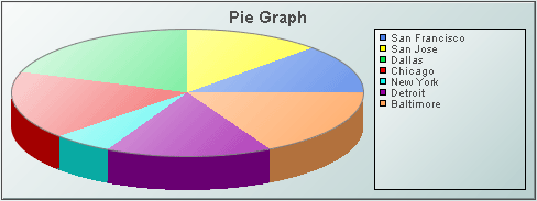
Using Data and Data Label Properties
Attach your data to the valueTable property. If you include a label column in your data attachment for valueTable, it can be used to label the legend if the rowSeriesFlag is selected. The rowSeriesFlag controls whether row or column data populates the graph:
When the rowSeriesFlag check box is not selected, the first numeric column from your data attachment will be used to populate the wedges in the pie. Each wedge will correspond to a row in that column and will display that row's relative value. If your data attachment has a label column, data from that column will be used in the legend.
If the rowSeriesFlag check box is selected, the first numeric row from your data attachment will be used to populate the wedges in the pie. Each wedge will correspond to a column in that row and will display that column's relative value. Column names will be used in the legend.
If your data attachment has no label column, select rowNameVisFlag to use row names in the legend when the rowSeriesFlag is not selected. By default, the label column is the first non-numeric text column in your data. Specify a column name in the labelColumnName property to set the label column to a specific column.
Using Interaction Properties
Commands
To assign a command to your graph, right-click in the Property Value field of the command property and select Define Command. Commands can be set up to execute when you click on an object or automatically execute the command when the value of an object reaches a specified threshold. See “Define/Execute Command” for information on how to set up commands.
Drill Down Displays
To specify a drill down display, double click on the drillDownTarget Property Name. Any display (.rtv) file can be targeted as a drill down. Based on your data attachment, substitutions are created that will be passed into drill down displays. To customize which substitutions will be passed into drill down displays, double-click on drillDownColumnSubs in the Object Properties window to open the “Drill Down Column Substitutions Dialog”. Once a drill down target has been set, double-click on the pie wedge to activate the drill down. Drill down displays can be activated in the same window that contains the graph or open in a separate window. This allows you to build a customizable hierarchy of displays. See “Drill Down Displays” for more information.
Use drillDownSelectMode to control how a drill down display is activated. Set to Anywhere to activate a drill down display by double-clicking anywhere on the graph. Set to Element Only to enable a drill down display only when you double-click on a wedge in the pie graph.
Tool Tips
Select the mouseOverFlag to enable tool tips for your pie graph. To display a tool tip, point to a pie wedge with your mouse. The tool tip will contain information from your data attachment about that pie wedge.
Background Properties
Specify how the background is displayed in your pie graph.
|
Property Name |
Description |
|
bgBorderColor |
Select the |
|
bgBorderFlag |
If selected, a border is drawn around the background rectangle. |
|
bgColor |
Select the |
|
bgEdgeWidth |
Set the width of the 3D edge on the background rectangle. This property is only available if the bgStyle selected is 3D Rectangle. |
|
bgGradientColor2 |
Select the Note: The bgColor property sets the first color in the gradient. |
|
bgGradientMode |
Display a gradient in the background rectangle. Select from the following options: None - No gradient Diagonal Edge - Gradient is drawn at a 45 degree angle from the top left to the bottom right corner of the object. Diagonal Center - Gradient is drawn at a 45 degree angle from the center to the top left and the bottom right corners of the object. Horizontal Edge - Gradient is drawn horizontally from the top to the bottom of the object. Horizontal Center - Gradient is drawn horizontally from the center to the top and bottom of the object. Vertical Edge - Gradient is drawn vertically from the left to the right of the object. Vertical Center - Gradient is drawn vertically from the center to the left and right of the object. |
|
bgRaisedFlag |
Reverses the direction of the gradient, as well as that of the 3D edge if the bgStyle selected is 3D Rectangle. |
|
bgRoundness |
Set the arc length of the rounded corners. This property is only available if the bgStyle selected is Round Rectangle. Note: The value of bgRoundness cannot exceed half the value of the objWidth or the objHeight. If bgRoundness does exceed that value, then half (of the smaller of the two values) of objWidth or objHeight will be used instead. For example if objWidth is 100 and objHeight is 50, then the value of bgRoundness cannot exceed 25. If it does, then half the value of objHeight (25) will be used instead. |
|
bgShadowFlag |
Select to display a drop shadow on the background rectangle. |
|
bgStyle |
Choose one of the following three options from the drop down menu: Rectangle - Select to display a background rectangle. 3D Rectangle - Select to display a 3D edge on the background rectangle. If selected, use bgEdgeWidth to set the width of the 3D edge. Round Rectangle - Select to display a background rectangle with rounded edges. If selected, use bgRoundness to set the arc length of the rounded corners. |
|
bgVisFlag |
Select to display the background rectangle. |
|
borderPixels |
Set the amount of space (in pixels) between the graph and the border. |
Column Properties
Specify which columns are displayed in your pie graph.
|
Property Name |
Description |
|
columnsToHide |
Specify columns from the data attachment to exclude from being used for plotted data or labels. Data from the labelColumnName column will be used for labels even if that column name is also specified in the columnsToHide property. Columns specified in the columnsToHide property can still be used in the drillDownColumnSubs property. |
Data Properties
|
Property Name |
Description |
|
rowSeriesFlag |
Controls how row and column data populate the graph. If rowSeriesFlag is selected, the first numeric row from your data attachment will be used to populate the wedges in the pie. Each wedge will correspond to a column in that row and will display that column's relative value. Column names will be used in the legend. If rowSeriesFlag is not selected, the first numeric column from your data attachment will be used to populate the wedges in the pie. Each wedge will correspond to a row in that column and will display that row's relative value. If your data attachment has a label column, data from that column will be used in the legend. |
|
valueTable |
Attach your data to the valueTable property. It is possible to graph multiple columns or rows of numeric data. If you include a label column in data attached to valueTable, it can be used to label either the x-axis or the legend, depending on whether the rowSeriesFlag is selected or deselected. By default, the label column is the first non-numeric text column in your data attachment. Enter a column name in the labelColumnName property to set a specific label column. |
Data Format Properties
Specify the format to display values in your pie graph.
|
Property Name |
Description |
|
labelColumnFormat |
Select or enter the format of numeric or date labels displayed in the legend and in tool tips. To enter a format, use syntax from the Java DecimalFormat class for numeric labels and syntax from the Java SimpleDateFormat class for date labels. To enable tool tips, select the mouseOverFlag. |
|
valueFormat |
Select or enter the numeric format of wedge values displayed on wedges, in the legend and in tool tips. To enter a format, use syntax from the Java DecimalFormat class. To enable tool tips, select the mouseOverFlag. |
Data Label Properties
|
Property Name |
Description |
|
columnDisplayNames |
Set alternate display names for column names in your pie graph's data. Column names are displayed either along the x-axis or in the legend, depending on whether or not rowSeriesFlag is selected. |
|
labelColumnName |
Specify the name of a label column in your data attachment. If a labelColumnName is not specified, then by default the first non-numeric text column in your data attachment will be used as the label column. |
|
rowLabelVisFlag |
If selected, then data from the label column are displayed either along the x-axis or in the legend, depending on whether or not rowSeriesFlag is selected. Enter a column name in the labelColumnName property to specify a label column in your data attachment. |
|
rowNameVisFlag |
If your data attachment does not contain a label column (i.e. a non-numeric text column) select the rowNameVisFlag check box to use row names along the x-axis or in the legend, depending on whether or not rowSeriesFlag is selected. |
Historian Properties
|
Property Name |
Description |
|
historyTableName |
Specify name of table in your history database in which to store tabular data. See “Configuring the Historian” for information. |
|
historyTableRowNameFlag |
If selected, data from the row name field will be stored in the first column of the table specified in historyTableName. |
Interaction Properties
|
Property Name |
Description |
|
command |
Assign a command to your pie graph. See “Define/Execute Command” for information. |
|
commandCloseWindowOnSuccess |
If selected, the window that initiates a system command will automatically close when the system command is executed successfully. This property only applies to system commands. With data source commands, the window is closed whether or not the command is executed successfully. For multiple commands, this property is applied to each command individually. Therefore if the first command in the multiple command sequence succeeds, the window will close before the rest of the commands are executed. Note: The commandCloseWindowOnSuccess property is not supported in the Display Server. |
|
commandConfirm |
If selected, the command confirmation dialog is enabled. Use the commandConfirmText property to write your own text for the confirmation dialog, otherwise text from the command property will be used. For multiple commands, if you Confirm the execution then all individual commands will be executed in sequence with no further confirmation. If the you Cancel the execution, none of the commands in the sequence will executed. |
|
commandConfirmText |
Enter command confirmation text directly in the Property Value field or select the |
|
drillDownColumnSubs |
Select the |
|
drillDownSelectMode |
Control how a drill down display is activated. Select one of the following options: Anywhere - Activate a drill down display by double-clicking anywhere on the graph. Element Only - Enable a drill down display only when you double-click on a wedge in the pie graph. |
|
drillDownTarget |
Name of display (.rtv) file targeted as a drill down. See “Drill Down Displays” for information. |
|
mouseOverFlag |
Select to enable tool tips for your pie graph. To display a tool tip, point to a pie wedge with your mouse. The tool tip will contain information from your data attachment about that pie wedge. |
Label Properties
|
Property Name |
Description |
|
label |
Edit label text directly in the Property Value field or select the |
|
labelMinTabWidth |
Specify minimum width of the label tab. This property is only applies if labelTextAlignY is set to TabTop. |
|
labelTextAlignX |
Select x-axis position of label text from the drop down menu. |
|
labelTextAlignY |
Select y-axis position of label text from the drop down menu. Outside Top - Position label well above the background rectangle. Top - Position label just above the background rectangle. Title - Top Position label along the top line of the background rectangle. Tab Top - Position label tab just above the background rectangle. Height and width of the tab is dependent on the height and width of the text. Use the labelMinTabWidth property to specify a minimum tab width. Inside Top - Position label inside the top of the background rectangle. |
|
labelTextColor |
Select the |
|
labelTextFont |
Select font style of label text from the drop down menu. |
|
labelTextHeight |
Set the height of the label text in pixels. |
Legend Properties
Specify the way the legend is displayed in your pie graph.
|
Property Name |
Description |
|
legendBgColor |
Select the |
|
legendBgGradientColor2 |
Select the Note: The legendBgColor property sets the first color in the gradient. |
|
legendBgGradientMode |
Display a gradient in the legend background. Select from the following options: None - No gradient Diagonal Edge - Gradient is drawn at a 45 degree angle from the top left to the bottom right corner of the object. Diagonal Center - Gradient is drawn at a 45 degree angle from the center to the top left and the bottom right corners of the object. Horizontal Edge - Gradient is drawn horizontally from the top to the bottom of the object. Horizontal Center - Gradient is drawn horizontally from the center to the top and bottom of the object. Vertical Edge - Gradient is drawn vertically from the left to the right of the object. Vertical Center - Gradient is drawn vertically from the center to the left and right of the object. |
|
legendPercentVisFlag |
Select to display the value percentages of your data in the legend. |
|
legendValueVisFlag |
Select to display the numerical values of your data in the legend. |
|
legendVisFlag |
Select to display the legend. |
|
legendWidthPercent |
Set the percent of the total width of the object used for the legend. |
|
outlineColor |
Select the |
Object Properties
|
Property Name |
Description |
|
anchor |
Specify where to anchor an object in the display. Note: If an object has the dock property set, the anchor property will be ignored. The anchor property is only applied when the dimensions of the display are modified, either by editing “Background Properties” or resizing the window in Layout mode Select None, or one or more the following options: None - Object not anchored. This is the default. Top - Anchor top of object at top of display. Left - Anchor left side of object at left of display. Bottom - Anchor bottom of object at bottom of display. Right - Anchor right side of object at right of display. When a display is resized, the number of pixels between an anchored object and the specified location remain constant. If an object is anchored on opposite sides (i.e. Top and Bottom or Left and Right), the object will be stretched to fill the available space. |
|
dock |
Specify the docking location of an object in the display. Select from the following options: None - Object is not docked. This is the default. Top - Dock object at top of display. Left - Dock object at left of display. Bottom - Dock object at bottom of display. Right - Dock object at right of display. Fill - Dock object in available space remaining in the display after all docked objects are positioned. If the dimensions of the display are modified, either by editing “Background Properties” or resizing the window in Layout mode, the properties (objX, objY, objWidth, and objHeight) of docked objects will automatically adapt to match the new size of the display. When multiple objects are docked to the same side of the display, the first object is docked against the side of the display, the next object is docked against the edge of the first object, and so on. When objects are docked to multiple sides of the display, the order in which objects were added to the display controls docking position. For example, let's say the first object added to the display is docked at the Top and the second object is docked at the Left. Consequently, the first object will fill the entire width of the display and the second object will fill the left side of the display from the bottom of the first object to the bottom of the display. Objects in a display have the dock property set to Fill, are laid out across a grid in the available space remaining after all docked objects are positioned. By default, the grid has one row and as many columns as there are objects in the display. You can modify the grid in the Background Properties dialog. |
|
|
Once an object is docked, there are some limitations on how that object can be modified. § Docked objects cannot be dragged or repositioned using objX and objY properties. § Docked objects cannot be resized using the objWidth or objHeight properties. To resize you must drag on the resize handle. § Docked objects can only be resized toward the center of the display (e.g. If an object is docked at the Top, only its height can be increased by dragging down toward the center of the display). § Docked objects set to Fill cannot be resized at all. § Docked objects cannot be moved using Align. Non-docked objects can be aligned against a docked object, but a docked object will not move to align against another object. § Docked objects are ignored by Distribute. |
|
objHeight |
Sets the height (in pixels) of the object. |
|
objName |
Name given to facilitate object management via the Object List dialog. Select Tools>Object List. |
|
objWidth |
Sets the width (in pixels) of the object. |
|
objX |
Plot x-axis position of object. |
|
objY |
Plot y-axis position of object. |
|
styleClass |
Enter the style class name for this object as defined in your style sheet. If not specified, the object class name is used. Note: The value entered must not contain spaces and cannot start with rtv-. |
|
transparencyPercent |
Set transparency of the object. Enter a value between 0 and 100. A value of 0, the default, sets the object to be completely opaque. A value of 100 will render the object completely transparent. |
|
visFlag |
Control visibility of the object. |
Wedge Properties
Specify the way wedges are displayed in your pie graph.
|
Property Name |
Description |
|
pieThickness |
|
|
wedgeGradientFlag |
Select the box to enable the gradient effect. All wedges in the pie are affected by the wedgeGradientFlag property. |
|
wedgeProperties |
Specify the color of wedges in the pie graph. See “Wedge Properties Dialog” for more information. |
In the Object Properties window, double-click on wedgeProperties in the Property Name field to bring up the Wedge Properties dialog. You can use the Wedge Properties dialog to assign the color to each wedge in a pie graph.
Note: Before assigning attributes to wedges in your pie graph, it is recommended that you first attach the pie graph to data.
|
Field Name |
Description |
|
Wedge |
Each wedge from the pie graph is listed. The Color column lists the current settings for the wedges. |
|
Color |
Select the ellipsis |
|
Add Wedge Property |
Click to add a wedge entry field. The data for the wedge does not have to be available yet. You may consider adding and assigning attributes to more wedges than your data currently needs for when you have more data to show. Note: Before assigning attributes to wedges in your pie graph, it is recommended that you first attach the pie graph to data. |
|
Delete Wedge Property |
Removes the last wedge entry field from the Wedge Properties dialog. |
The following describes the Wedge Properties dialog commands:
|
Command |
Description |
|
OK |
Applies values and closes the dialog. |
|
Apply |
Applies values without closing the dialog. |
|
Reset |
Resets all fields to last values applied. |
|
Clear |
Clears all fields. Detaches object from data source (once Apply or OK is selected). |
|
Cancel |
Closes the dialog with last values applied. |
Trace Properties
In the Object Properties window, double-click on traceProperties in the Property Name field to bring up the Trace Properties dialog. In the Trace Properties dialog you can assign attributes to each plotting trace in your graph.
Note: Before assigning attributes to traces, it is recommended that you attach the graph to data.
|
Field Name |
Description |
|
Trace |
One field for each trace that is currently in the graph. Current settings for each trace are shown. |
|
Line Color |
Select the ellipsis |
|
Line Style |
Select the ellipsis |
|
Line Width |
Select the ellipsis |
|
Marker Color |
Select the ellipsis |
|
Marker Style |
Select the ellipsis |
|
Add Trace Property |
Click to add a trace property field. The data for the trace does not have to be available yet. You may consider adding and assigning attributes to more traces than your data currently needs for when you have more data to show. It is not necessary to set properties for each trace you currently or subsequently have. This is optional and can be done after additional data is displayed in a subsequent new trace. |
|
Delete Trace Property |
Removes the last trace property field from the Trace Properties dialog. |
The following describes the Trace Properties dialog commands:
|
Command |
Description |
|
OK |
Applies values and closes the dialog. |
|
Apply |
Applies values without closing the dialog. |
|
Reset |
Resets all fields to last values applied. |
|
Clear |
Clears all fields. Detaches object from data source (once Apply or OK is selected). |
|
Cancel |
Closes the dialog with last values applied. |
Radar graphs (class name: obj_radar) are useful for comparing columns or rows of numeric data from a tabular data element returned by your data attachment. The radar graph contains a value axis and a radial axis. The value axis is the vertical axis that displays the maximum and minimum values for the graph. The value axis grid lines are all of the rings except for the outer ring, which is the radial axis.
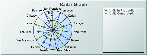
Using Data and Data Label Properties
To attach data to your graph, right-click in the Property Value field of the valueTable property and select Attach to Data. If you include a label column in your data attachment, this can be used to label either the radial axis or the legend depending on whether the rowSeriesFlag check box is selected or deselected.
The rowSeriesFlag controls how data populate the graph:
If the rowSeriesFlag is selected, the graph will display one trace per row of data and one radial axis per numeric column of data.
If you included a label column in your data attachment, select rowLabelVisFlag and the values from that column will be used as legend labels. By default, the label column is the first non-numeric text column in your data. To set the label column to a specific column, specify a column name using the labelColumnName property.
If your data attachment does not have a label column, select the rowNameVisFlag to use row names in the legend.
If the rowSeriesFlag is not selected, the graph will display one radial axis per row of data and one trace per column of numeric data.
If you included a label column in your data attachment, select rowLabelVisFlag and the values from that column will be used as radial axis labels. By default, the label column is the first non-numeric text column in your data. To set the label column to a specific column, specify a column name using the labelColumnName property.
If your data attachment does not have a label column, select the rowNameVisFlag to use row names on the radial axis.
Using Interaction Properties
Commands
To assign a command to your graph, right-click in the Property Value field of the command property and select Define Command. Commands can be set up to execute when you click on an object or automatically execute the command when the value of an object reaches a specified threshold. See “Define/Execute Command” for information on how to set up commands.
Drill Down Displays
To specify a drill down display, double click on the drillDownTarget property. Any display (.rtv) file can be targeted as a drill down. Based on your data attachment, substitutions are created that will be passed into drill down displays. To customize which substitutions will be passed into drill down displays, double-click on drillDownColumnSubs in the Object Properties window to open the “Drill Down Column Substitutions Dialog”. Once a drill down target has been set, double-click on the trace marker in the graph to activate the drill down. Drill down displays can be activated in the same window that contains the graph or open in a separate window. This allows you to build a customizable hierarchy of displays. See “Drill Down Substitutions” for more information.
Use drillDownSelectMode to control how a drill down display is activated. Set to Anywhere to activate a drill down display by double-clicking anywhere on the graph. Set to Element Only to enable a drill down display only when you double-click on a marker in the graph.
Tool Tips
Select the mouseOverFlag to enable tool tips for your graph. To display a tool tip, point to a trace marker with your mouse. The tool tip will contain information from your data attachment about that marker.
Alert Properties
To set trace marker colors and styles based on a threshold value, select the corresponding value alarm or value warning flags.
|
Property Name |
Description |
|
valueAlarmStatusTable |
Attach an alarm table containing status indexes to valueAlarmStatusTable to enable rule based alarm statuses for trace markers. The table attached to valueAlarmStatusTable must have the same number of rows and columns as valueTable. For each data element in valueTable, the status index at the corresponding position in valueAlarmStatusTable will be used to set the alarm status of the marker. Valid indexes are: 0 = use normal marker color and style, 1 = use low alarm marker color and style, 2 = use low warning marker color and style, 3 = use high warning marker color and style, 4 = use high alarm marker color and style, -1 = determine marker color and style by comparing the value to the enabled alarm thresholds. If no data is attached to valueAlarmStatusTable, then the alarm status for a trace marker is determined by comparing the marker's value to the enabled thresholds. |
|
valueHighAlarmEnabledFlag |
Select to enable the high alarm threshold. |
|
valueHighAlarmLineVisFlag |
Select to display a dotted line at the high alarm threshold. The color of the line is set to the valueHighAlarmMarkColor. |
|
valueHighAlarmMarkColor/ valueHighAlarmMarkStyle |
When a trace marker's value is greater than or equal to the valueHighAlarm property, the marker will change to the valueHighAlarmMarkColor and valueHighAlarmMarkStyle. |
|
valueHighWarningEnabledFlag |
Select to enable the high warning threshold. |
|
valueHighWarningLineVisFlag |
Select to display a dotted line at the high warning threshold. The color of the line is set to the valueHighWarningMarkColor. |
|
valueHighWarningMarkColor/ valueHighWarningMarkStyle |
When a trace marker's value is greater than or equal to the valueHighWarning property but less than the valueHighAlarm property, the marker will change to the valueHighWarningMarkColor and valueHighWarningMarkStyle. |
|
valueLowAlarmEnabledFlag |
Select to enable the low alarm threshold. |
|
valueLowAlarmLineVisFlag |
Select to display a dotted line at the low alarm threshold. The color of the line is set to the valueLowAlarmMarkColor. |
|
valueLowAlarmMarkColor/ valueLowAlarmMarkStyle |
When the trace marker's value is less than or equal to the valueLowAlarm property, the marker will change to the valueLowAlarmMarkColor and valueLowAlarmMarkStyle. |
|
valueLowWarningEnabledFlag |
Select to enable the low warning threshold. |
|
valueLowWarningLineVisFlag |
Select to display a dotted line at the low warning threshold. The color of the line is set to the valueLowWarningMarkColor. |
|
valueLowWarningMarkColor/ valueLowWarningMarkStyle |
When the trace marker's value is less than or equal to the valueLowWarning property, but greater than the valueLowAlarm property, the marker will change to the valueLowWarningMarkColor and valueLowWarningMarkStyle. |
Background Properties
Specify how the background is displayed in your radar graph.
|
Property Name |
Description |
|
bgBorderColor |
Select the |
|
bgBorderFlag |
If selected, a border is drawn around the background rectangle. |
|
bgColor |
Select the |
|
bgEdgeWidth |
Set the width of the 3D edge on the background rectangle. This property is only available if the bgStyle selected is 3D Rectangle. |
|
bgGradientColor2 |
Select the Note: The bgColor property sets the first color in the gradient. |
|
bgGradientMode |
Display a gradient in the background rectangle. Select from the following options: None - No gradient Diagonal Edge - Gradient is drawn at a 45 degree angle from the top left to the bottom right corner of the object. Diagonal Center - Gradient is drawn at a 45 degree angle from the center to the top left and the bottom right corners of the object. Horizontal Edge - Gradient is drawn horizontally from the top to the bottom of the object. Horizontal Center - Gradient is drawn horizontally from the center to the top and bottom of the object. Vertical Edge - Gradient is drawn vertically from the left to the right of the object. Vertical Center - Gradient is drawn vertically from the center to the left and right of the object. |
|
bgRaisedFlag |
Reverses the direction of the gradient, as well as that of the 3D edge if the bgStyle selected is 3D Rectangle. |
|
bgRoundness |
Set the arc length of the rounded corners. This property is only available if the bgStyle selected is Round Rectangle. Note: The value of bgRoundness cannot exceed half the value of the objWidth or the objHeight. If bgRoundness does exceed that value, then half (of the smaller of the two values) of objWidth or objHeight will be used instead. For example, if objWidth is 100 and objHeight is 50, then the value of bgRoundness cannot exceed 25. If it does, then half the value of objHeight (25) will be used instead. |
|
bgShadowFlag |
Select to display a drop shadow on the background rectangle. |
|
bgStyle |
Choose one of the following three options from the drop down menu: Rectangle - Select to display a background rectangle. 3D Rectangle - Select to display a 3D edge on the background rectangle. If selected, use bgEdgeWidth to set the width of the 3D edge. Round Rectangle - Select to display a background rectangle with rounded edges. If selected, use bgRoundness to set the arc length of the rounded corners. |
|
bgVisFlag |
Select to display the background rectangle. |
|
borderPixels |
Set the amount of space (in pixels) between the graph and the border. |
Column Properties
Specify which columns are displayed in your radar graph.
|
Property Name |
Description |
|
columnsToHide |
Specify columns from the data attachment to exclude from being used for plotted data or labels. Data from the labelColumnName column will be used for labels even if that column name is also specified in the columnsToHide property. Columns specified in the columnsToHide property can still be used in the drillDownColumnSubs property. |
Data Properties
|
Property Name |
Description |
|
rowSeriesFlag |
Controls how data populate the graph: If the rowSeriesFlag is selected, the graph will display one trace per row of data and one radial axis per numeric column of data. If you included a label column in your data attachment, select rowLabelVisFlag and the values from that column will be used as legend labels. By default, the label column is the first non-numeric text column in your data. To set the label column to a specific column, specify a column name using the labelColumnName property. |
|
|
If your data attachment does not have a label column, select the rowNameVisFlag to use row names in the legend. If the rowSeriesFlag is not selected, the graph will display one radial axis per row of data and one trace per column of numeric data. If you included a label column in your data attachment, select rowLabelVisFlag and the values from that column will be used as radial axis labels. By default, the label column is the first non-numeric text column in your data. To set the label column to a specific column, specify a column name using the labelColumnName property. If your data attachment does not have a label column, select the rowNameVisFlag to use row names on the radial axis. |
|
valueDivisor |
Divides values by the number entered. |
|
valueMin valueMax |
The valueMin and valueMax properties control the range of the value axis if the valueAxisAutoScaleMode is set to Off. Select On for the valueAxisAutoScaleMode to calculate the value axis range according to data values being plotted. To calculate the value axis range including valueMin and valueMax, select On - Include Min/Max. |
|
valueTable |
Attach your tabular data. If you include a label column in your data attachment, this can be used to label either the radial axis or the legend depending on whether rowSeriesFlag is selected or deselected. |
Data Format Properties
|
Property Name |
Description |
|
labelColumnFormat |
Select or enter the format of numeric or date labels displayed on the radial axis, in the legend and in tool tips. To enter a format, use syntax from the Java DecimalFormat class for numeric labels and syntax from the Java SimpleDateFormat class for date labels. To enable tool tips, select the mouseOverFlag. |
|
valueFormat |
Select or enter the numeric format of trace values displayed in tool tips. To enter a format, use syntax from the Java DecimalFormat class. To enable tool tips, select the mouseOverFlag. |
Data Label Properties
|
Property Name |
Description |
|
columnDisplayNames |
Set alternate display names for column names in your radar graph's data. Column names are displayed either along the x-axis or in the legend, depending on whether or not the rowSeriesFlag is selected. |
|
labelColumnName |
Specify a column in your data attachment to be the label column. If left blank, the first non-numeric text column in your data will be used. Note: If you include a label column in your data attachment, this can be used to label the legend depending on whether rowSeriesFlag is selected or deselected. |
|
rowLabelVisFlag |
Control the visibility of labels that appear in the legend or on the radial axis, depending on whether rowSeriesFlag is selected or deselected. |
|
rowNameVisFlag |
Select to use row names from your data attachment to label either the radial axis or the legend, depending on whether rowSeriesFlag is selected or deselected. Note: This is useful if your data attachment does not have a label column. |
Historian Properties
|
Property Name |
Description |
|
historyTableName |
Specify name of table in your history database in which to store tabular data. See “Configuring the Historian” for information. |
|
historyTableRowNameFlag |
If selected, data from the row name field will be stored in the first column of the table specified in historyTableName. |
Interaction Properties
|
Property Name |
Description |
|
command |
Assign a command to your graph. See “Define/Execute Command” for information. |
|
commandCloseWindowOnSuccess |
If selected, the window that initiates a system command will automatically close when the system command is executed successfully. This property only applies to system commands. With data source commands, the window is closed whether or not the command is executed successfully. For multiple commands, this property is applied to each command individually. Therefore if the first command in the multiple command sequence succeeds, the window will close before the rest of the commands are executed. Note: The commandCloseWindowOnSuccess property is not supported in the Display Server. |
|
commandConfirm |
If selected, the command confirmation dialog is enabled. Use the commandConfirmText property to write your own text for the confirmation dialog, otherwise text from the command property will be used. For multiple commands, if you Confirm the execution then all individual commands will be executed in sequence with no further confirmation. If the you Cancel the execution, none of the commands in the sequence will executed. |
|
commandConfirmText |
Enter command confirmation text directly in the Property Value field or select the |
|
drillDownColumnSubs |
Select the |
|
drillDownSelectMode |
Control how a drill down display is activated. Select one of the following options: Anywhere - Activate a drill down display by double-clicking anywhere on the graph. Element Only - Enable a drill down display only when you double-click on a marker in the graph. |
|
drillDownTarget |
Name of display (.rtv) file targeted as a drill down. See “Drill Down Displays” for information. |
|
mouseOverFlag |
Select to enable tool tips for your radar graph. To display a tool tip, point to a trace marker with your mouse. The tool tip will contain information from your data attachment about that marker. |
Label Properties
|
Property Name |
Description |
|
label |
Edit label text directly in the Property Value field or select the |
|
labelMinTabWidth |
Specify minimum width of the label tab. This property is only applies if labelTextAlignY is set to Tab Top. |
|
labelTextAlignX |
Select x-axis position of label text from the drop down menu. |
|
labelTextAlignY |
Select y-axis position of label text from the drop down menu. Outside Top - Position label well above the background rectangle. Top - Position label just above the background rectangle. Title Top - Position label along the top line of the background rectangle. Tab Top - Position label tab just above the background rectangle. Height and width of the tab is dependent on the height and width of the text. Use the labelMinTabWidth property to specify a minimum tab width. Inside Top - Position label inside the top of the background rectangle. |
|
labelTextColor |
Select the |
|
labelTextFont |
Select font style of label text from the drop down menu. |
|
labelTextHeight |
Set the height of the label text in pixels. |
Legend Properties
Specify the way the legend is displayed in your radar graph.
|
Property Name |
Description |
|
legendBgColor |
Select the |
|
legendBgGradientColor2 |
Select the Note: The legendBgColor property sets the first color in the gradient. |
|
legendBgGradientMode |
Display a gradient in the legend background. Select from the following options: None - No gradient Diagonal Edge - Gradient is drawn at a 45 degree angle from the top left to the bottom right corner of the object. Diagonal Center - Gradient is drawn at a 45 degree angle from the center to the top left and the bottom right corners of the object. Horizontal Edge - Gradient is drawn horizontally from the top to the bottom of the object. Horizontal Center - Gradient is drawn horizontally from the center to the top and bottom of the object. Vertical Edge - Gradient is drawn vertically from the left to the right of the object. Vertical Center - Gradient is drawn vertically from the center to the left and right of the object. |
|
legendVisFlag |
Select to display the legend. |
|
legendWidthPercent |
Set the percent of the total width of the object used for the legend. |
|
outlineColor |
Select the |
Marker Properties
|
Property Name |
Description |
|
markDefaultSize |
Specify (in pixels) the size of the markers. |
|
markScaleMode |
Scale markers according to the order of the data in your data attachment (i.e. The marker for the first data in the attachment is the smallest and the marker for the last data is the largest.) Select from the following options: No Scale, Scale by Trace, Scale Within Trace. |
Object Properties
|
Property Name |
Description |
|
anchor |
Specify where to anchor an object in the display. Note: If an object has the dock property set, the anchor property will be ignored. The anchor property is only applied when the dimensions of the display are modified, either by editing “Background Properties” or resizing the window in Layout mode Select None, or one or more the following options: None - Object not anchored. This is the default. Top - Anchor top of object at top of display. Left - Anchor left side of object at left of display. Bottom - Anchor bottom of object at bottom of display. Right - Anchor right side of object at right of display. When a display is resized, the number of pixels between an anchored object and the specified location remain constant. If an object is anchored on opposite sides (i.e. Top and Bottom or Left and Right), the object will be stretched to fill the available space. |
|
dock |
Specify the docking location of an object in the display. Select from the following options: None - Object is not docked. This is the default. Top - Dock object at top of display. Left - Dock object at left of display. Bottom - Dock object at bottom of display. Right - Dock object at right of display. Fill - Dock object in available space remaining in the display after all docked objects are positioned. If the dimensions of the display are modified, either by editing “Background Properties” or resizing the window in Layout mode, the properties (objX, objY, objWidth, and objHeight) of docked objects will automatically adapt to match the new size of the display. |
|
|
When multiple objects are docked to the same side of the display, the first object is docked against the side of the display, the next object is docked against the edge of the first object, and so on. When objects are docked to multiple sides of the display, the order in which objects were added to the display controls docking position. For example, let's say the first object added to the display is docked at the Top and the second object is docked at the Left. Consequently, the first object will fill the entire width of the display and the second object will fill the left side of the display from the bottom of the first object to the bottom of the display. Objects in a display have the dock property set to Fill, are laid out across a grid in the available space remaining after all docked objects are positioned. By default, the grid has one row and as many columns as there are objects in the display. You can modify the grid in the “Background Properties” dialog. |
|
|
Once an object is docked, there are some limitations on how that object can be modified: § Docked objects cannot be dragged or repositioned using objX and objY properties. § Docked objects cannot be resized using the objWidth or objHeight properties. To resize you must drag on the resize handle. § Docked objects can only be resized toward the center of the display (e.g. If an object is docked at the Top, only its height can be increased by dragging down toward the center of the display). § Docked objects set to Fill cannot be resized at all. § Docked objects cannot be moved using Align. Non-docked objects can be aligned against a docked object, but a docked object will not move to align against another object. § Docked objects are ignored by Distribute. |
|
objHeight |
Sets the height (in pixels) of the object. |
|
objName |
Name given to facilitate object management via the Object List dialog. Select Tools>Object List. |
|
objWidth |
Sets the width (in pixels) of the object. |
|
objX |
Plot x-axis position of object. |
|
objY |
Plot y-axis position of object. |
|
styleClass |
Enter the style class name for this object as defined in your style sheet. If not specified, the object class name is used. Note: The value entered must not contain spaces and cannot start with rtv-. |
|
transparencyPercent |
Set transparency of the object. Enter a value between 0 and 100. A value of 0, the default, sets the object to be completely opaque. A value of 100 will render the object completely transparent. |
|
visFlag |
Control visibility of the object. |
Plot Area Properties
Specify how the plot area is displayed in your radar graph.
|
Property Name |
Description |
|
gridColor |
Select the |
|
plotBgColor |
Select the |
|
plotBgGradientColor2 |
Select the Note: The plotBgColor property sets the first color in the gradient. |
|
plotBgGradientMode |
Display a gradient in the plot background. Select from the following options: None - No gradient Diagonal Edge - Gradient is drawn at a 45 degree angle from the top left to the bottom right corner of the object. Diagonal Center - Gradient is drawn at a 45 degree angle from the center to the top left and the bottom right corners of the object. Horizontal Edge - Gradient is drawn horizontally from the top to the bottom of the object. Horizontal Center - Gradient is drawn horizontally from the center to the top and bottom of the object. Vertical Edge - Gradient is drawn vertically from the left to the right of the object. Vertical Center - Gradient is drawn vertically from the center to the left and right of the object. |
|
plotBgImage |
Select an image to display in the plot background of your graph. If necessary, the image will be stretched to fit the plot area. |
Radial Axis Properties
Specify how the radial axis is displayed in your radar graph. The radar graph contains a value axis and a radial axis. The value axis is the vertical axis that displays the maximum and minimum values for the graph. The value axis grid lines are all of the rings except for the outer ring, which is the radial axis. The radial axis grid lines are the spokes.
|
Property Name |
Description |
|
radialAxisColor |
Select the |
|
radialAxisLabelVisFlag |
Select to display the radial axis labels. |
|
radialAxisLineStyle |
Select the line style of the radial axis from the drop down menu: No Line, Solid, Dotted, Dashed, or Dot Dashed. |
|
radialAxisMinLabelWidth |
Specify the minimum width in pixels for the radial axis labels. |
|
radialAxisVisFlag |
Select to display the radial axis. |
|
radialGridLineStyle |
Select the line style of the radial grid lines from the drop down menu: No Line, Solid, Dotted, Dashed, or Dot Dashed. |
|
radialGridVisFlag |
Select to display the radial grid lines. |
Trace Properties
Specify how traces are displayed in your radar graph.
|
Property Name |
Description |
|
traceFillStyle |
Specify the style to fill the area under the trace. Select from the following options: Solid, Transparent, Gradient, or Transparent Gradient. Default is None. |
|
traceProperties |
Specify the line color, line style, line width, marker color, marker style, and fill style of all traces. |
Value Axis Properties
Specify how the value axis is displayed in your radar graph. The radar graph contains a value axis and a radial axis. The value axis is the vertical axis that displays the maximum and minimum values for the graph. The value axis grid lines are all of the rings except for the outer ring, which is the radial axis. The radial axis grid lines are the spokes.
|
Property Name |
Description |
|
valueAxisAutoScaleMode |
The valueMin and valueMax properties control the range of the value axis if the valueAxisAutoScaleMode is set to Off. Select On for the valueAxisAutoScaleMode to calculate the value axis range according to data values being plotted. To calculate the value axis range including valueMin and valueMax, select On - Include Min/Max. |
|
valueAxisColor |
Select the |
|
valueAxisFlag |
Select to display the value axis. |
|
valueAxisFormat |
Select or enter the numeric format of trace values displayed on the value axis. To enter a format, use syntax from the Java DecimalFormat class. |
|
valueAxisLineStyle |
Select the line style of the value axis from the drop down menu: No Line, Solid, Dotted, Dashed, or Dot Dashed. |
|
valueAxisMajorDivisions |
Specify the number of major divisions on the value axis. |
|
valueAxisMinorDivisions |
Specify the number of minor divisions on the value axis. |
|
valueGridLineStyle |
Select the line style of the grid line from the drop down menu: No Line, Solid, Dotted, Dashed, or Dot Dashed. |
|
valueGridVisFlag |
Select to display the grid lines. |
XY graphs (obj_xygraph) are useful for comparing pairs of values from a tabular data element returned by your data attachment. XY graphs plot quantitative data on both axes.
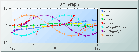
Using Data and Data Label Properties
To attach data to your graph, right-click in the Property Value field of the valueTable property and select Attach to Data. Your data attachment must contain numeric data for both the x and y axes. If you include a label column in your data attachment, this can be used to label the legend depending on whether the rowSeriesFlag check box is selected or deselected.
The rowSeriesFlag controls how data populate the graph:
If the rowSeriesFlag check box is selected, your first row of data is used for the x-axis. The remainder will be plotted on the y-axis, with one trace per row of data containing one point for each column.
If you included a label column in your data attachment, select rowLabelVisFlag and values from that column will be used as legend labels. By default, the label column is the first non-numeric text column in your data. To set the label column to a specific column, specify a column name using the labelColumnName property.
If your data attachment does not have a label column, select the rowNameVisFlag check box to use row names in the legend.
If the rowSeriesFlag check box is not selected, your first column of data is used for the x-axis. The remainder will be plotted on the y-axis, with one trace per column of data containing one point per row.
If you included a label column in your data attachment, select rowLabelVisFlag and values from that column will be used as x-axis labels. Column names will appear in the legend.
Using Interaction Properties
Commands
To assign a command to your graph, right-click in the Property Value field of the command property and select Define Command. Commands can be set up to execute when you click on an object or automatically execute the command when the value of an object reaches a specified threshold. See “Define/Execute Command” for information on how to set up commands.
Drill Down Displays
To specify a drill down display, double click on the drillDownTarget property. Any display (.rtv) file can be targeted as a drill down. Based on your data attachment, substitutions are created that will be passed into drill down displays. To customize which substitutions will be passed into drill down displays, double-click on drillDownColumnSubs in the Object Properties window to open the “Drill Down Column Substitutions Dialog”. Once a drill down target has been set, double-click on the trace marker to activate the drill down. Drill down displays can be activated in the same window that contains the graph or open in a separate window. This allows you to build a customizable hierarchy of displays. See “Drill Down Displays” for more information.
Use drillDownSelectMode to control how a drill down display is activated. Set to Anywhere to activate a drill down display by double-clicking anywhere on the graph. Set to Element Only to enable a drill down display only when you double-click on a marker in the graph.
Tool Tips
Select the mouseOverFlag to enable tool tips for your XY graph. To display a tool tip, point to a trace marker with your mouse. The tool tip will contain information from your data attachment about that trace marker.
Alert Properties
To set trace marker colors and styles based on a threshold value, select the corresponding value alarm or value warning flags.
|
Property Name |
Description |
|
valueAlarmStatusTable |
Attach an alarm table containing status indexes to valueAlarmStatusTable to enable rule based alarm statuses for trace markers. The table attached to valueAlarmStatusTable must have the same number of rows and columns as valueTable. For each data element in valueTable, the status index at the corresponding position in valueAlarmStatusTable is used to set the alarm status of the marker. Valid indexes are: 0 = use normal marker color and style, 1 = use low alarm marker color and style, 2 = use low warning marker color and style, 3 = use high warning marker color and style, 4 = use high alarm marker color and style, -1 = determine marker color and style by comparing the value to the enabled alarm thresholds. If no data is attached to valueAlarmStatusTable, the alarm status for a trace marker is determined by comparing the marker's value to the enabled thresholds. |
|
valueHighAlarmEnabledFlag |
Select to enable the high alarm threshold. |
|
valueHighAlarmLineVisFlag |
Select to display a dotted line at the high alarm threshold. The color of the line is set to the valueHighAlarmMarkColor. |
|
valueHighAlarmMarkColor/ valueHighAlarmMarkStyle |
When a trace marker's value is greater than or equal to the valueHighAlarm property, the marker will change to the valueHighAlarmMarkColor and valueHighAlarmMarkStyle. |
|
valueHighAlarmTraceColor/ valueHighAlarmTraceStyle |
When the value of any segment of a trace line is greater than or equal to the valueHighAlarm property, that segment of the trace line will change to the valueHighAlarmTraceColor and valueHighAlarmTraceStyle. Note: If valueHighAlarmTraceStyle is set to No Line, then valueHighAlarmTraceColor will not change. |
|
valueHighWarningEnabledFlag |
Select to enable the high warning threshold. |
|
valueHighWarningLineVisFlag |
Select to display a dotted line at the high warning threshold. The color of the line is set to the valueHighWarningMarkColor. |
|
valueHighWarningMarkColor/ valueHighWarningMarkStyle |
When a trace marker's value is greater than or equal to the valueHighWarning property but less than the valueHighAlarm property, the marker will change to the valueHighWarningMarkColor and valueHighWarningMarkStyle. |
|
valueHighWarningTraceColor/ valueHighWarningTraceStyle |
When the value of any segment of a trace line is greater than or equal to the valueHighWarning property but less than the valueHighAlarm property, that segment of the trace line will change to the valueHighWarningTraceColor and valueHighWarningTraceStyle. |
|
valueLowAlarmEnabledFlag |
Select to enable the low alarm threshold. |
|
valueLowAlarmLineVisFlag |
Select to display a dotted line at the low alarm threshold. The color of the line is set to the valueLowAlarmMarkColor. |
|
valueLowAlarmMarkColor/ valueLowAlarmMarkStyle |
When the trace marker's value is less than or equal to the valueLowAlarm property, the marker will change to the valueLowAlarmMarkColor and valueLowAlarmMarkStyle. |
|
valueLowAlarmTraceColor/ valueLowAlarmTraceStyle |
When the value of any segment of a trace line is less than or equal to the valueLowAlarm property, that segment of the trace line will change to the valueLowAlarmTraceColor and valueLowAlarmTraceStyle. |
|
valueLowWarningEnabledFlag |
Select to enable the low warning threshold. |
|
valueLowWarningLineVisFlag |
Select to display a dotted line at the low warning threshold. The color of the line is set to the valueLowWarningMarkColor. |
|
valueLowWarningMarkColor/ valueLowWarningMarkStyle |
When the trace marker's value is less than or equal to the valueLowWarning property, but greater than the valueLowAlarm property, the marker will change to the valueLowWarningMarkColor and valueLowWarningMarkStyle. |
|
valueLowWarningTraceColor/ valueLowWarningTraceStyle |
When the value of any segment of a trace line is less than or equal to the valueLowWarning property, but greater than the valueLowAlarm property, that segment of the trace line will change to the valueLowWarningTraceColor and valueLowWarningTraceStyle. |
Background Properties
Specify how the background is displayed in your XY graph.
|
Property Name |
Description |
|
bgBorderColor |
Select the |
|
bgBorderFlag |
If selected, a border is drawn around the background rectangle. |
|
bgColor |
Select the |
|
bgEdgeWidth |
Set the width of the 3D edge on the background rectangle. This property is only available if the bgStyle selected is 3D Rectangle. |
|
bgGradientColor2 |
Select the Note: The bgColor property sets the first color in the gradient. |
|
bgGradientMode |
Display a gradient in the background rectangle. Select from the following options: None - No gradient Diagonal Edge - Gradient is drawn at a 45 degree angle from the top left to the bottom right corner of the object. Diagonal Center - Gradient is drawn at a 45 degree angle from the center to the top left and the bottom right corners of the object. Horizontal Edge - Gradient is drawn horizontally from the top to the bottom of the object. Horizontal Center - Gradient is drawn horizontally from the center to the top and bottom of the object. Vertical Edge - Gradient is drawn vertically from the left to the right of the object. Vertical Center - Gradient is drawn vertically from the center to the left and right of the object. |
|
bgRaisedFlag |
Reverses the direction of the gradient, as well as that of the 3D edge if the bgStyle selected is 3D Rectangle. |
|
bgRoundness |
Set the arc length of the rounded corners. This property is only available if the bgStyle selected is Round Rectangle. Note: The value of bgRoundness cannot exceed half the value of the objWidth or the objHeight. If bgRoundness does exceed that value, then half (of the smaller of the two values) of objWidth or objHeight will be used instead. For example, if objWidth is 100 and objHeight is 50, then the value of bgRoundness cannot exceed 25. If it does, then half the value of objHeight (25) will be used instead. |
|
bgShadowFlag |
Select to display a drop shadow on the background rectangle. |
|
bgStyle |
Choose one of the following three options from the drop down menu: Rectangle - Select to display a background rectangle. 3D Rectangle - Select to display a 3D edge on the background rectangle. If selected, use bgEdgeWidth to set the width of the 3D edge. Round Rectangle - Select to display a background rectangle with rounded edges. If selected, use bgRoundness to set the arc length of the rounded corners. |
|
bgVisFlag |
Select to display the background rectangle. |
|
borderPixels |
Set the amount of space (in pixels) between the graph and the border. |
Column Properties
Specify which columns are displayed in your XY graph.
|
Property Name |
Description |
|
columnsToHide |
Specify columns from the data attachment to exclude from being used for plotted data or labels. Data from the labelColumnName column will be used for labels even if that column name is also specified in the columnsToHide property. Columns specified in the columnsToHide property can still be used in the drillDownColumnSubs property. |
Data Properties
|
Property Name |
Description |
|
rowSeriesFlag |
Controls how data populate the graph: § If the rowSeriesFlag check box is selected, your first row of data is used for the x-axis. The remainder will be plotted on the y-axis, with one trace per row of data containing one point for each column. § If you included a label column in your data attachment, select rowLabelVisFlag and values from that column will be used as legend labels. By default, the label column is the first non-numeric text column in your data. To set the label column to a specific column, specify a column name using the labelColumnName property. § If your data attachment does not have a label column, select the rowNameVisFlag check box to use row names in the legend. § If the rowSeriesFlag check box is not selected, your first column of data is used for the x-axis. The remainder will be plotted on the y-axis, with one trace per column of data containing one point per row. § If you included a label column in your data attachment, select rowLabelVisFlag and values from that column will be used as x-axis labels. Column names will appear in the legend. |
|
valueTable |
Attach your tabular data. Your data attachment must contain numeric data for both the x and y axes. If you include a label column in your data attachment, this can be used to label the legend depending on whether rowSeriesFlag is selected or deselected. |
|
xValueDivisor |
The x-axis values are divided by the value entered. |
|
xValueMin xValueMax |
The xValueMin and xValueMax properties control the range of x-axis if the xAxisAutoScaleMode is set to Off. Select On for the xAxisAutoScaleMode to calculate x-axis range according to data values being plotted. To calculate the x-axis range including xValueMin and xValueMax, select On - Include Min/Max. |
|
yValueDivisor |
The y-axis values are divided by the value entered. |
|
yValueMin yValueMax |
The yValueMin and yValueMax properties control the range of y-axis if the yAxisAutoScaleMode is set to Off. Select On for the yAxisAutoScaleMode to calculate y-axis range according to data values being plotted. To calculate the y-axis range including yValueMin and yValueMax, select On - Include Min/Max. |
Data Format Properties
|
Property Name |
Description |
|
labelColumnFormat |
Select or enter the format of numeric or date labels displayed in the legend and popup legend. To enter a format, use syntax from the Java DecimalFormat class for numeric labels and syntax from the Java SimpleDateFormat class for date labels. |
|
xValueFormat yValueFormat |
Select or enter the numeric format of trace values displayed in the legend and popup legend. To enter a format, use syntax from the Java DecimalFormat class. |
Data Label Properties
|
Property Name |
Description |
|
columnDisplayNames |
Set alternate display names for column names in your XY graph's data. Column names are displayed either along the x-axis or in the legend, depending on whether or not the rowSeriesFlag is selected. |
|
labelColumnName |
Specify a column in your data attachment to be the label column. If left blank, the first non-numeric text column in your data will be used. If you include a label column in your data attachment, this can be used to label the x-axis or the legend depending on whether rowSeriesFlag is selected or deselected. |
Historian Properties
|
Property Name |
Description |
|
historyTableName |
Specify name of table in your history database in which to store tabular data. See Configuring the Historian for information. |
|
historyTableRowNameFlag |
If selected, data from the row name field will be stored in the first column of the table specified in historyTableName. |
Interaction Properties
|
Property Name |
Description |
|
command |
Assign a command to your graph. See “Define/Execute Command” for information. |
|
commandCloseWindowOnSuccess |
If selected, the window that initiates a system command will automatically close when the system command is executed successfully. This property only applies to system commands. With data source commands, the window is closed whether or not the command is executed successfully. For multiple commands, this property is applied to each command individually. Therefore if the first command in the multiple command sequence succeeds, the window will close before the rest of the commands are executed. Note: The commandCloseWindowOnSuccess property is not supported in the Display Server. |
|
commandConfirm |
If selected, the Command Confirmation dialog is enabled. Use the commandConfirmText property to write your own text for the confirmation dialog, otherwise text from the command property will be used. For multiple commands, if you Confirm the execution then all individual commands will be executed in sequence with no further confirmation. If the you Cancel the execution, none of the commands in the sequence will executed. |
|
commandConfirmText |
Enter command confirmation text directly in the Property Value field or select the |
|
cursorColor |
Select the Note: This property is only available if cursorFlag is selected. |
|
cursorFlag |
Select to enable the cursor. When the cursor is enabled, point to a location on a trace to see a cursor line at that location and display the time and values of all traces at the cursor line on the legend. Hold down the Control key to snap the cursor to the closest data point. Select the legendPopupFlag to display the legend along the cursor. |
|
drillDownColumnSubs |
Select the |
|
drillDownSelectMode |
Control how a drill down display is activated. Select one of the following options: Anywhere - Activate a drill down display by double-clicking anywhere on the graph. Element Only - Enable a drill down display only when you double-click on a trace marker in the graph. |
|
drillDownTarget |
Name of display (.rtv) file targeted as a drill down. See “Drill Down Displays” for information. |
|
legendPopupFlag |
Select to display the legend along the cursor. Note: This property is only available if cursorFlag is selected. |
|
mouseOverFlag |
Select to enable tool tips for your graph. To display a tool tip, point to a trace marker with your mouse. The tool tip will contain information from your data attachment about that trace marker. |
|
outlineColor |
Select the |
|
scrollbarMode |
Set whether and when the scroll bar appears in the graph. There are three options: Never - This is the default. Always - Displays a scroll bar at all times. As Needed - Displays the scroll bar when necessitated by zooming in the trace area, or when you have x or y values that are outside of the min/max range. |
|
scrollbarSize |
Specify (in pixels) the height of the horizontal scroll bar and the width of the vertical scroll bar. The default value is -1, which sets the size to the system default. |
|
zoomEnabledFlag |
Select to enable zooming within the graph. Click in the graph's trace area and drag the cursor until a desired range is selected. While dragging, a yellow rectangle is drawn to show the zoom area. After the zoom is performed, the graph stores up to four zoom operations in queue. To zoom out, hold the Shift key and click in the graph's trace area. |
Label Properties
|
Property Name |
Description |
|
label |
Edit label text directly in the Property Value field or select the |
|
labelMinTabWidth |
Specify minimum width of the label tab. This property is only applies if labelTextAlignY is set to Tab Top. |
|
labelTextAlignX |
Select x-axis position of label text from the drop down menu. |
|
labelTextAlignY |
Select y-axis position of label text from the drop down menu. Outside Top - Position label well above the background rectangle. Top - Position label just above the background rectangle. Title Top - Position label along the top line of the background rectangle. Tab Top - Position label tab just above the background rectangle. Height and width of the tab is dependent on the height and width of the text. Use the labelMinTabWidth property to specify a minimum tab width. Inside Top - Position label inside the top of the background rectangle. |
|
labelTextColor |
Select the |
|
labelTextFont |
Select font style of label text from the drop down menu. |
|
labelTextHeight |
Set the height of the label text in pixels. |
Legend Properties
|
Property Name |
Description |
|
legendBgColor |
Select the |
|
legendBgGradientColor2 |
Select the Note: The legendBgColor property sets the first color in the gradient. |
|
legendBgGradientMode |
Display a gradient in the legend background. Select from the following options: None - No gradient Diagonal Edge - Gradient is drawn at a 45 degree angle from the top left to the bottom right corner of the object. Diagonal Center - Gradient is drawn at a 45 degree angle from the center to the top left and the bottom right corners of the object. Horizontal Edge - Gradient is drawn horizontally from the top to the bottom of the object. Horizontal Center - Gradient is drawn horizontally from the center to the top and bottom of the object. Vertical Edge - Gradient is drawn vertically from the left to the right of the object. Vertical Center - Gradient is drawn vertically from the center to the left and right of the object. |
|
legendValueMinSpace |
Specify the minimum distance between values and labels in the legend. |
|
legendVisFlag |
Select to display the legend. |
|
legendValueVisFlag |
Select to display the numerical values of your data in the legend. |
|
legendWidthPercent |
Set the percent of the total width of the object used for the legend. |
Marker Properties
|
Property Name |
Description |
|
markDefaultSize |
Specify (in pixels) the size of the markers. |
|
markScaleMode |
Scale markers according to the order of the data in your data attachment (i.e. The marker for the first data in the attachment is the smallest and the marker for the last data is the largest.) Select from the following options: No Scale, Scale by Trace, or Scale Within Trace. |
Object Properties
|
Property Name |
Description |
|
anchor |
Specify where to anchor an object in the display. If an object has the dock property set, the anchor property will be ignored. The anchor property is only applied when the dimensions of the display are modified, either by editing Background Properties or resizing the window in Layout mode Select None, or one or more the following options: None - Object not anchored. This is the default. Top - Anchor top of object at top of display. Left - Anchor left side of object at left of display. Bottom - Anchor bottom of object at bottom of display. Right - Anchor right side of object at right of display. When a display is resized, the number of pixels between an anchored object and the specified location remain constant. If an object is anchored on opposite sides (i.e. Top and Bottom or Left and Right), the object will be stretched to fill the available space. |
|
dock |
Specify the docking location of an object in the display. Select from the following options: None - Object is not docked. This is the default. Top - Dock object at top of display. Left - Dock object at left of display. Bottom - Dock object at bottom of display. Right - Dock object at right of display. Fill - Dock object in available space remaining in the display after all docked objects are positioned. If the dimensions of the display are modified, either by editing Background Properties or resizing the window in Layout mode, the properties (objX, objY, objWidth, and objHeight) of docked objects will automatically adapt to match the new size of the display. |
|
|
When multiple objects are docked to the same side of the display, the first object is docked against the side of the display, the next object is docked against the edge of the first object, and so on. When objects are docked to multiple sides of the display, the order in which objects were added to the display controls docking position. For example, let's say the first object added to the display is docked at the Top and the second object is docked at the Left. Consequently, the first object will fill the entire width of the display and the second object will fill the left side of the display from the bottom of the first object to the bottom of the display. Objects in a display have the dock property set to Fill, are laid out across a grid in the available space remaining after all docked objects are positioned. By default, the grid has one row and as many columns as there are objects in the display. You can modify the grid in the “Background Properties” dialog. |
|
|
Once an object is docked, there are some limitations on how that object can be modified: § Docked objects cannot be dragged or repositioned using objX and objY properties. § Docked objects cannot be resized using the objWidth or objHeight properties. To resize you must drag on the resize handle. § Docked objects can only be resized toward the center of the display (e.g. If an object is docked at the Top, only its height can be increased by dragging down toward the center of the display). § Docked objects set to Fill cannot be resized at all. § Docked objects cannot be moved using Align. Non-docked objects can be aligned against a docked object, but a docked object will not move to align against another object. § Docked objects are ignored by Distribute. |
|
objHeight |
Sets the height (in pixels) of the object. |
|
objName |
Name given to facilitate object management via the Object List dialog. Select Tools>Object List. |
|
objWidth |
Sets the width (in pixels) of the object. |
|
objX |
Plot x-axis position of object. |
|
objY |
Plot y-axis position of object. |
|
styleClass |
Enter the style class name for this object as defined in your style sheet. If not specified, the object class name is used. Note: The value entered must not contain spaces and cannot start with rtv-. |
|
transparencyPercent |
Set transparency of the object. Enter a value between 0 and 100. A value of 0, the default, sets the object to be completely opaque. A value of 100 will render the object completely transparent. |
|
visFlag |
Control visibility of the object. |
Plot Area Properties
|
Property Name |
Description |
|
gridBgColor |
Select the |
|
gridBgGradientColor2 |
Select the Note: The gridBgColor property sets the first color in the gradient. |
|
gridBgGradientMode |
Display a gradient in the grid background. Select from the following options: None - No gradient Diagonal Edge - Gradient is drawn at a 45 degree angle from the top left to the bottom right corner of the object. Diagonal Center - Gradient is drawn at a 45 degree angle from the center to the top left and the bottom right corners of the object. Horizontal Edge - Gradient is drawn horizontally from the top to the bottom of the object. Horizontal Center - Gradient is drawn horizontally from the center to the top and bottom of the object. Vertical Edge - Gradient is drawn vertically from the left to the right of the object. Vertical Center - Gradient is drawn vertically from the center to the left and right of the object. |
|
gridBgImage |
Select an image to display in the grid background of your graph. Note: If necessary, the image will be stretched to fit the grid. |
|
gridColor |
Select the |
Trace Properties
|
Property Name |
Description |
|
traceFillStyle |
Specify the style to fill the area under the trace. Select from the following options: Solid, Transparent, Gradient, or Transparent Gradient. Default is None. |
|
traceProperties |
Specify the line color, line style, line width, marker color, marker style and fill style of all traces. |
X-Axis Properties
Specify how the x axis is displayed on your XY graph.
|
Property Name |
Description |
|
xAxisAutoScaleMode |
The xValueMin and xValueMax properties control the range of x-axis if the xAxisAutoScaleMode is set to Off. Select On for the xAxisAutoScaleMode to calculate x-axis range according to data values being plotted. To calculate the x-axis range including xValueMin and xValueMax, select On - Include Min/Max. |
|
xAxisAutoScaleRoundFlag |
Select the xAxisAutoScaleRoundFlag to round values on the x-axis. |
|
xAxisFlag |
Select to display the x-axis. |
|
xAxisFormat |
Select or enter the numeric format of values displayed on the x-axis. To enter a format, use syntax from the Java DecimalFormat class. |
|
xAxisLabel |
Specify the x-axis label. |
|
xAxisLabelTextHeight |
Specify the height in pixels of the x-axis labels. |
|
xAxisMajorDivisions |
Specify the number of major divisions on the x-axis. |
|
xAxisMinorDivisions |
Specify the number of minor divisions on the x- axis. |
|
xAxisReverseFlag |
Select to reverse the order of the x-axis values and plot values decreasing from left to right. |
|
xValueSortFlag |
Select to sort data from lowest to highest x values. |
Y-Axis Properties
Specify how the y axis is displayed on your XY graph.
|
Property Name |
Description |
|
yAxisAutoScaleMode |
The yValueMin and yValueMax properties control the range of y-axis if the yAxisAutoScaleMode is set to Off. Select On for the yAxisAutoScaleMode to calculate y-axis range according to data values being plotted. To calculate the y-axis range including yValueMin and yValueMax, select On - Include Min/Max. |
|
yAxisFormat |
Select or enter the numeric format of values displayed on the y-axis. To enter a format, use syntax from the Java DecimalFormat class. |
|
yAxisFlag |
Select to display the y-axis. |
|
yAxisLabel |
Specify the y-axis label. |
|
yAxisLabelTextHeight |
Specify the height in pixels of the y-axis labels. |
|
yAxisMajorDivisions |
Specify the number of major divisions on the y-axis. |
|
yAxisMinLabelWidth |
Specify the minimum width in pixels for the y-axis labels. |
|
yAxisMinorDivisions |
Specify the number of minor divisions on the y-axis. |
|
yAxisMultiRangeFlag |
Select to enable one axis per trace with each trace having its own range. |
Stock charts (class name: obj_stockchart) are useful for displaying live and archived stock data. Overlays can be used to compare this data against other stock, overall activity on the stock index, or to show periodic events such as stock splits and earnings announcements. The chart supports up to nineteen overlays.
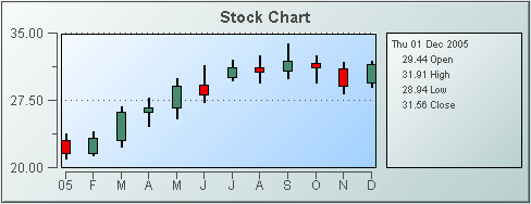
To attach tabular data to your chart, right-click in the Property Value field of the priceTraceCurrentTable property or the priceTraceHistoryTable property and select Attach to Data.
|
Historical Data |
Current Data |
|
To display historical data, attach to priceTraceHistoryTable. The attached historical data table must contain the following five columns (as described in the table below) in this specific order: Date, Open, High, Low, Close. Note: See the Attach to Data section specific to your data source for details on how to use the Select Columns dialog. The priceTraceHistoryTable property is used for viewing and analyzing archived data (data generated before the current moment). The table in your data attachment should contain multiple rows, each corresponding to a point on the graph. |
To display current data, attach to priceTraceCurrentTable. The attached data table must contain the following five columns (as described in the table below) in this specific order: Date, Open, High, Low, Close. Note: See the Attach to Data section specific to your data source for details on how to use the Select Columns dialog. The priceTraceCurrentTable property is used for viewing live data and would most likely be used in conjunction with the priceTraceHistoryTable. The table in your data attachment should contain a single row that corresponds to and continually updates the last point on the graph. |
|
Column Name |
Description |
|
Date |
Supported formats for time column are: mm/dd/yyyy hh:mm:ss (01/16/2004 12:30:03) yyyy-mm-dd hh:mm:ss (2004-01-16 12:30:03) The number of milliseconds since midnight, January 1, 1970 UTC |
|
Open |
Value of stock price at first market open for defined time period. |
|
High |
High value of stock price for defined time period. |
|
Low |
Low value of stock price for defined time period. |
|
Close |
Value of stock price at last market close for defined time period. |
The Display Builder automatically creates a set of overlay* properties according to the number you specify using the overlayCount object property. For example if you set the overlayCount to three (3), you will have three overlay traces in your graph (Trace 01, Trace 02 and Trace 03) and a corresponding set of overlay* properties for each.
The overlay*CurrentTable and overlay*HistoryTable properties are used in conjunction with the priceTraceHistoryTable or priceTraceCurrentTable properties to compare data (e.g. to compare the activity of several stocks). Tabular data attached to overlay*Table properties must have the following two columns: a Date column (as described in the table above) and a Value column (numeric). The overlay*HistoryTable property should contain multiple rows, each corresponding to a point on the graph.
Using Interaction Properties
Commands
To assign a command to your graph, right-click in the Property Value field of the command property and select Define Command. Commands can be set up to execute when you click on an object or automatically execute the command when the value of an object reaches a specified threshold. See “Define/Execute Command” for information on how to set up commands.
Drill Down Displays
To specify a drill down display, double click on the drillDownTarget property. Any display (.rtv) file can be targeted as a drill down. Based on your data attachment, substitutions are created that will be passed into drill down displays. To customize which substitutions will be passed into drill down displays, double-click on drillDownColumnSubs in the Object Properties window to open the “Drill Down Column Substitutions Dialog”. Once a drill down target has been set, double-click on the bar or trace marker in the chart to activate the drill down. Drill down displays can be activated in the same window that contains the chart or open in a separate window. This allows you to build a customizable hierarchy of displays.
Use drillDownSelectMode to control how a drill down display is activated. Set to Anywhere to activate a drill down display by double-clicking anywhere on the chart. Set to Element Only to enable a drill down display only when you double-click on a bar in the chart.
Tool Tips
Select the mouseOverFlag to enable tool tips for your stock chart. To display a tool tip, point to a bar or marker with the mouse. The tool tip will contain information from your data attachment about that bar or marker.
Background Properties
Specify how the background is displayed in the stock chart.
|
Property Name |
Description |
|
bgBorderColor |
Select the |
|
bgBorderFlag |
If selected, a border is drawn around the background rectangle. |
|
bgColor |
Select the |
|
bgEdgeWidth |
Set the width of the 3D edge on the background rectangle. This property is only available if the bgStyle selected is 3D Rectangle. |
|
bgGradientColor2 |
Select the Note: The bgColor property sets the first color in the gradient. |
|
bgGradientMode |
Display a gradient in the background rectangle. Select from the following options: None - No gradient Diagonal Edge - Gradient is drawn at a 45 degree angle from the top left to the bottom right corner of the object. Diagonal Center - Gradient is drawn at a 45 degree angle from the center to the top left and the bottom right corners of the object. Horizontal Edge - Gradient is drawn horizontally from the top to the bottom of the object. Horizontal Center - Gradient is drawn horizontally from the center to the top and bottom of the object. Vertical Edge - Gradient is drawn vertically from the left to the right of the object. Vertical Center Gradient is drawn vertically from the center to the left and right of the object. |
|
bgRaisedFlag |
Reverses the direction of the gradient, as well as that of the 3D edge if the bgStyle selected is 3D Rectangle. |
|
bgRoundness |
Set the arc length of the rounded corners. This property is only available if the bgStyle selected is Round Rectangle. Note: The value of bgRoundness cannot exceed half the value of the objWidth or the objHeight. If bgRoundness does exceed that value, then half (of the smaller of the two values) of objWidth or objHeight will be used instead. For example, if objWidth is 100 and objHeight is 50, then the value of bgRoundness cannot exceed 25. If it does, then half the value of objHeight (25) will be used instead. |
|
bgShadowFlag |
Select to display a drop shadow on the background rectangle. |
|
bgStyle |
Choose one of the following three options from the drop down menu: Rectangle - Select to display a background rectangle. 3D Rectangle - Select to display a 3D edge on the background rectangle. If selected, use bgEdgeWidth to set the width of the 3D edge. Round Rectangle - Select to display a background rectangle with rounded edges. If selected, use bgRoundness to set the arc length of the rounded corners. |
|
bgVisFlag |
Select to display the background rectangle. |
|
borderPixels |
Set the amount of space (in pixels) between the chart and the border. |
Data Properties
|
Property Name |
Description |
|
yValueMax yValueMin |
Controls the range of y-axis if the yAxisAutoScaleMode is set to Off. Select On for the yAxisAutoScaleMode to calculate the y-axis range according to data values being plotted. To calculate the y-axis range including yValueMin and yValueMax, select On - Include Min/Max. |
Data Format Properties
Specify data format in your stock chart.
|
Property Name |
Description |
|
yValueFormat |
Select or enter the numeric format of values displayed in the legend and popup legend. To enter a format, use syntax from the Java DecimalFormat class. |
Historian Properties
|
Property Name |
Description |
|
historyTableName |
Specify name of table in your history database in which to store tabular data. See “Configuring the Historian” for information. |
|
historyTableRowNameFlag |
If selected, data from the row name field will be stored in the first column of the table specified in historyTableName. |
Interaction Properties
|
Property Name |
Description |
|
command |
Assign a command to your graph. See “Define/Execute Command” for information. |
|
commandCloseWindowOnSuccess |
If selected, the window that initiates a system command will automatically close when the system command is executed successfully. This property only applies to system commands. With data source commands, the window is closed whether or not the command is executed successfully. For multiple commands, this property is applied to each command individually. Therefore if the first command in the multiple command sequence succeeds, the window will close before the rest of the commands are executed. Note: The commandCloseWindowOnSuccess property is not supported in the Display Server. |
|
commandConfirm |
If selected, the command confirmation dialog is enabled. Use the commandConfirmText property to write your own text for the confirmation dialog, otherwise text from the command property will be used. For multiple commands, if you Confirm the execution then all individual commands will be executed in sequence with no further confirmation. If the you Cancel the execution, none of the commands in the sequence will executed. |
|
commandConfirmText |
Enter command confirmation text directly in the Property Value field or select the |
|
cursorColor |
Select the Note: This property is only available if cursorFlag is selected. |
|
cursorFlag |
Select to enable the cursor. When the cursor is enabled, select the chart and point to a location on a trace to see a cursor line at that location and display the time and values of all traces at the cursor line on the legend. Select the legendPopupFlag to display the legend along the cursor. |
|
drillDownColumnSubs |
Select the |
|
drillDownSelectMode |
Control how a drill down display is activated. Select one of the following options: Anywhere - Activate a drill down display by double-clicking anywhere on the graph. Element Only - Enable a drill down display only when you double-click on a bar in the graph. |
|
drillDownTarget |
Name of display (.rtv) file targeted as a drill down. See “Drill Down Displays” for information. |
|
legendPopupFlag |
Select to display the legend along the cursor. Note: This property is only applicable if cursorFlag is selected. |
|
mouseOverFlag |
Select to enable tool tips for your stock chart. To display a tool tip, select the chart and point to a bar or marker with the mouse. The tool tip will contain information from your data attachment about that bar or marker. |
|
scrollbarMode |
Set whether and when the scroll bar appears in the chart. There are three options: Never - This is the default. Always - Displays a scroll bar at all times. As Needed - Displays the scroll bar when necessitated by zooming in the trace area, or when more data is loaded into the chart than is displayed in the time range. For example, if the time range of the data in your data attachment is greater than timeRange, setting scrollbarMode to As Needed will enable a scroll bar to view all data loaded into the chart. |
|
scrollbarSize |
Specify (in pixels) the height of the horizontal scroll bar and the width of the vertical scroll bar. The default value is -1, which sets the size to the system default. |
|
zoomEnabledFlag |
Select to enable zooming within the chart. Click in the chart's trace area and drag the cursor until a desired range is selected. While dragging, a yellow rectangle is drawn to show the zoom area. After the zoom is performed, the chart stores up to four zoom operations in queue. To zoom out, hold the Shift key and click in the chart's trace area. |
Label Properties
|
Property Name |
Description |
|
label |
Edit label text directly in the Property Value field or select the |
|
labelMinTabWidth |
Specify minimum width of the label tab. This property is only applies if labelTextAlignY is set to Tab Top. |
|
labelTextAlignX |
Select x-axis position of label text from the drop down menu. |
|
labelTextAlignY |
Select y-axis position of label text from the drop down menu. Outside Top - Position label well above the background rectangle. Top - Position label just above the background rectangle. Title Top - Position label along the top line of the background rectangle. Tab Top - Position label tab just above the background rectangle. Height and width of the tab is dependent on the height and width of the text. Use the labelMinTabWidth property to specify a minimum tab width. Inside Top - Position label inside the top of the background rectangle. |
|
labelTextColor |
Select the |
|
labelTextFont |
Select font style of label text from the drop down menu. |
|
labelTextHeight |
Set the height of the label text in pixels. |
Legend Properties
Specify the way the legend is displayed in the stock chart.
|
Property Name |
Description |
|
legendBgColor |
Select the |
|
legendBgGradientColor2 |
Select the Note: The legendBgColor property sets the first color in the gradient. |
|
legendBgGradientMode |
Display a gradient in the legend background. Select from the following options: None - No gradient Diagonal Edge - Gradient is drawn at a 45 degree angle from the top left to the bottom right corner of the object. Diagonal Center - Gradient is drawn at a 45 degree angle from the center to the top left and the bottom right corners of the object. Horizontal Edge - Gradient is drawn horizontally from the top to the bottom of the object. Horizontal Center - Gradient is drawn horizontally from the center to the top and bottom of the object. Vertical Edge - Gradient is drawn vertically from the left to the right of the object. Vertical Center - Gradient is drawn vertically from the center to the left and right of the object. |
|
legendValueMinSpace |
Specify the minimum distance between values and labels in the legend. |
|
legendValueVisFlag |
Select to display the numerical values of your data in the legend. If the cursorFlag is enabled, the numerical values are always shown in the legend. |
|
legendVisFlag |
Select to display the legend. |
|
legendWidthPercent |
Set the percent of the total width of the object used for the legend. |
|
outlineColor |
Select the |
Object Properties
|
Property Name |
Description |
|
anchor |
Specify where to anchor an object in the display. Note: If an object has the dock property set, the anchor property will be ignored. The anchor property is only applied when the dimensions of the display are modified, either by editing Background Properties or resizing the window in Layout mode Select None, or one or more the following options: None - Object not anchored. This is the default. Top - Anchor top of object at top of display. Left - Anchor left side of object at left of display. Bottom - Anchor bottom of object at bottom of display. Right - Anchor right side of object at right of display. When a display is resized, the number of pixels between an anchored object and the specified location remain constant. If an object is anchored on opposite sides (i.e. Top and Bottom or Left and Right), the object will be stretched to fill the available space. |
|
dock |
Specify the docking location of an object in the display. Select from the following options: None - Object is not docked. This is the default. Top - Dock object at top of display. Left - Dock object at left of display. Bottom - Dock object at bottom of display. Right - Dock object at right of display. Fill - Dock object in available space remaining in the display after all docked objects are positioned. If the dimensions of the display are modified, either by editing Background Properties or resizing the window in Layout mode, the properties (objX, objY, objWidth, and objHeight) of docked objects will automatically adapt to match the new size of the display. |
|
|
When multiple objects are docked to the same side of the display, the first object is docked against the side of the display, the next object is docked against the edge of the first object, and so on. When objects are docked to multiple sides of the display, the order in which objects were added to the display controls docking position. For example, let's say the first object added to the display is docked at the Top and the second object is docked at the Left. Consequently, the first object will fill the entire width of the display and the second object will fill the left side of the display from the bottom of the first object to the bottom of the display. Objects in a display have the dock property set to Fill, are laid out across a grid in the available space remaining after all docked objects are positioned. By default, the grid has one row and as many columns as there are objects in the display. You can modify the grid in the “Background Properties” dialog. |
|
|
Once an object is docked, there are some limitations on how that object can be modified: § Docked objects cannot be dragged or repositioned using objX and objY properties. § Docked objects cannot be resized using the objWidth or objHeight properties. To resize you must drag on the resize handle. § Docked objects can only be resized toward the center of the display (e.g. If an object is docked at the Top, only its height can be increased by dragging down toward the center of the display). § Docked objects set to Fill cannot be resized at all. § Docked objects cannot be moved using Align. Non-docked objects can be aligned against a docked object, but a docked object will not move to align against another object. § Docked objects are ignored by Distribute. |
|
objHeight |
Sets the height (in pixels) of the object. |
|
objName |
Name given to facilitate object management via the Object List dialog. Select Tools>Object List. |
|
objWidth |
Sets the width (in pixels) of the object. |
|
objX |
Plot x-axis position of object. |
|
objY |
Plot y-axis position of object. |
|
styleClass |
Enter the style class name for this object as defined in your style sheet. If not specified, the object class name is used. Note: The value entered must not contain spaces and cannot start with rtv-. |
|
transparencyPercent |
Set transparency of the object. Enter a value between 0 and 100. A value of 0, the default, sets the object to be completely opaque. A value of 100 will render the object completely transparent. |
|
visFlag |
Control visibility of the object. |
Plot Area Properties
Specify how the plot area is displayed in your stock chart.
|
Property Name |
Description |
|
gridBgColor |
Select the |
|
gridBgGradientColor2 |
Select the Note: The gridBgColor property sets the first color in the gradient. |
|
gridBgGradientMode |
Display a gradient in the plot background. Select from the following options: None - No gradient Diagonal Edge - Gradient is drawn at a 45 degree angle from the top left to the bottom right corner of the object. Diagonal Center - Gradient is drawn at a 45 degree angle from the center to the top left and the bottom right corners of the object. Horizontal Edge - Gradient is drawn horizontally from the top to the bottom of the object. Horizontal Center - Gradient is drawn horizontally from the center to the top and bottom of the object. Vertical Edge - Gradient is drawn vertically from the left to the right of the object. Vertical Center - Gradient is drawn vertically from the center to the left and right of the object. |
|
gridBgImage |
Select an image to display in the plot background of your graph. If necessary, the image will be stretched to fit the plot area. |
|
gridColor |
Select the |
Price Trace Properties
|
Property Name |
Description |
|
priceTraceBarGainColor |
Set the color to indicate that a stock price value at market close is greater than value at market open. Select the Note: This property does not apply if the selected priceTraceType is Line. |
|
priceTraceBarLossColor |
Set the color to indicate that a stock price value at market close is less than value at market open. Select the Note: This property does not apply if the selected priceTraceType is Line. |
|
priceTraceCurrentTable |
Attach your tabular data. The attached data table must contain the following five columns (Date, Open, High, Low, Close) as described in the “Using Price Trace Properties” section. Note: The priceTraceCurrentTable is used for viewing live data and would most likely be used in conjunction with the priceTraceHistoryTable. |
|
priceTraceFillStyle |
Select the appearance of the price trace from the drop down menu: Solid, Transparent, Gradient, or Transparent Gradient. Set to None, the default, to disable. The effects change based on the selected priceTraceType: Line - Fills from the line to the bottom of the graph with the color and effect you choose. Bar - Has no effect. OHLC - Has no effect. Candlestick - Fills the Candlestick icon with the color and effect you choose. |
|
priceTraceHistoryTable |
Attach your historical tabular data. The attached data table must contain the following five columns (Date, Open, High, Low, Close) as described in the “Using Price Trace Properties” section. |
|
priceTraceLabel |
Enter a label for the price trace line. Appears in legend and tool tip enabled by mouseOverFlag. |
|
priceTraceLineColor |
Select the Note: This property does not apply if the selected priceTraceType is OHLC or Bar. |
|
priceTraceLineStyle |
Select the style of the price trace line from the drop down menu: No Line, Solid, Dotted, Dashed, or Dot Dashed. Note: This property does not apply if the selected priceTraceType is OHLC or Bar. |
|
priceTraceLineThickness |
Select the thickness of the price trace line from the drop down menu: Thin, Medium, or Thick. Note: This property does not apply if the selected priceTraceType is OHLC or Bar. |
|
priceTraceType |
Select the appearance of the price trace: Line - A line graph showing closing price values. Bar - A bar graph showing closing price values. OHLC - Candlestick - |
|
priceTraceVisFlag |
Select to control price trace visibility. |
Trace Properties
|
Property Name |
Description |
|
overlayCount |
Set the number of overlay traces you want to display. Maximum is 19. RTView automatically creates a set of properties (see “Trace * Properties”) for each overlay. |
|
overlayFillStyle |
Select the fill style of the price trace from the drop down menu. Sets the appearance of the overlay*Type. Set to Solid, Transparent, Gradient, or Transparent Gradient. Set to None, the default, to disable. The effects change based on the overlay*Type: Line - Fills from the line to the bottom of the graph with the color and effect you choose. Bar - Has no effect. Event- Has no effect. |
Number of overlay traces displayed depend on the specified overlayCount.
|
Property Name |
Description |
|
overlay*CurrentTable |
Attach your tabular data. The attached data table must have a Date column (as described in the “Using Trace* Properties” section) and a Value (numeric) column. |
|
overlay*HistoryTable |
Attach your historical tabular data. The attached data table must have a Date column (as described in the “Using Trace* Properties” section) and a Value (numeric) column. |
|
overlay*Label |
Enter a label for the overlay line. Appears in legend and tool tip enabled by mouseOverFlag. |
|
overlay*LineColor |
Select the |
|
overlay*LineStyle |
Select the style of the overlay line: No Line Solid Dotted Dashed Dot Dashed Note: This property does not apply if the selected overlay*Type is Bar or Event. |
|
overlay*LineThickness |
Select the thickness of the overlay line: No Line Solid, Dotted, Dashed Dot Dashed. Note: This property does not apply if the selected overlay*Type is Bar or Event. |
|
overlay*Type |
Select the appearance of the overlay trace from the drop down menu: Line - A line graph. Bar - A bar graph. Event - A series of markers representing company events such as stock splits, company merges, etc. The first letter of the overlay*Label is the letter that appears in each event marker. |
|
overlay*VisFlag |
Select to control overlay trace visibility. |
X-Axis Properties
Specify the way the x axis is displayed and set time values to control how much data is plotted in the stock chart.
|
Property Name |
Description |
|
timeFormat |
Set the format for the time displayed in the x-axis using syntax from the Java SimpleDateFormat class. For example, MMMM dd, yyyy hh:mm:ss a would result in the form August 30, 2003 05:32:12 PM. If no format is given, the date and time will not be displayed on the x-axis. Include a new line character ('\n') to display multiple line text in the time axis labels. For example, MM\dd'\n'hh:mm:ss would result in the form 08\30 05:32:12. If left blank, the axis is labeled with a default format based on the range. Note: This property is only used when the timeRangeMode is Continuous. |
|
timeRange |
Sets the total amount of time, in seconds, plotted on the chart. If timeRange is set to -1, the time range is determined by the first and last timestamp found in the priceTraceHistoryTable and priceTraceCurrentTable. If both tables are empty, the chart uses the first and last timestamp of the first overlay trace that has a non-empty overlay*HistoryTable and/or overlay*CurrentTable. Note: timeRange is ignored if both timeRangeBegin and timeRangeEnd are set. |
|
timeRangeBegin |
Set the start time value of the data to be plotted on the chart. Supported formats are: mm/dd/yyyy hh:mm:ss (e.g., 01/16/2004 12:30:03) yyyy-mm-dd hh:mm:ss (e.g., 2004-01-16 12:30:03) The number of milliseconds since midnight, January 1, 1970 UTC Note: If only the time is specified, then today's date will be used. |
|
timeRangeEnd |
Set the end time value of the data to be plotted on the chart. Supported formats are: mm/dd/yyyy hh:mm:ss (e.g., 01/16/2004 12:30:03) yyyy-mm-dd hh:mm:ss (e.g., 2004-01-16 12:30:03) The number of milliseconds since midnight, January 1, 1970 UTC Note: If only the time is specified, then today's date will be used. |
|
timeRangeMode |
Select the timeRangeMode from the drop down menu. Sets the interval between trace data points. timeRangeMode also determines the type of label to be used in a graph. For example, the label used on the x-axis could be the date or the time depending on the time interval specified for the data to be displayed. There are eight modes: Auto - Selects the setting that best matches the time intervals in the price trace data table. Intra-Day - Time intervals are less than one day: hourly, every 15 minutes, etc. Daily - Time intervals are days. Weekly - Time intervals are weeks. Monthly - Time intervals are months. Quarterly - Time intervals are quarters. Yearly - Time intervals are annual. Continuous - Plots each point using the corresponding timestamp from the data table. This data can vary in time intervals. Note: If the price trace data is more granular than the time interval specified in your data attachment, the price trace data will be aggregated to match the timeRangeMode. |
|
xAxisFlag |
Select to display the x-axis. |
|
xAxisLabel |
Specify label to display below the x-axis. |
|
xAxisLabelTextHeight |
Specify the height in pixels of the x-axis labels. |
|
xAxisMajorDivisions |
Specify the number of major divisions on the x-axis. |
|
xAxisMinorDivisions |
Specify the number of minor divisions on the x-axis. Note: This property applies when the timeRangeMode property is set to Continuous. |
Y-Axis Properties
Specify the way the x and y axes are displayed in the stock chart.
|
Property Name |
Description |
|
tradeDayBegin |
Defines the daily start time of the trading day. This property is only used with intraday data (time intervals less than one day: hourly, every 15 minutes, etc.). The default value is 09:30. |
|
tradeDayEnd |
Defines the daily end time of the trading day. This property is only used with intraday data (time intervals less than one day: hourly, every 15 minutes, etc.). The default value is 16:00. |
|
tradeDayEndLabelFlag |
Select to show the last data point of a day and the first data point of the next day (which are equal values) with a unique point on the chart. Otherwise, they are shown together at one point on the chart. This property is only used with intraday data. The default is disabled. |
|
yAxisAutoScaleMode |
Select how the y-axis range is calculated from the drop down menu: Off - The yValueMin and yValueMax properties control the range of y-axis. On - The yAxisAutoScaleMode calculates the y-axis range according to data values being plotted. On - Include Min/Max - The yAxisAutoScaleMode calculates the y-axis range including yValueMin and yValueMax. |
|
yAxisFlag |
Select to display the y-axis. |
|
yAxisFormat |
Select or enter the numeric format of values displayed on the y-axis. To enter a format, use syntax from the Java DecimalFormat class. |
|
yAxisLabel |
Specify label to display to the left of the y-axis. |
|
yAxisLabelTextHeight |
Specify the height of the y-axis labels in pixels. |
|
yAxisMajorDivisions |
Specify the number of major divisions on the y-axis. |
|
yAxisMinLabelWidth |
Specify the minimum width of the y-axis labels in pixels. |
|
yAxisMinorDivisions |
Specify the number of minor divisions on the y-axis. |
|
yAxisMultiRangeFlag |
Select to have one axis per trace, with each trace having its own range. The first trace is drawn on the outer left of the graph. The remaining traces are drawn on the inner left of the trace area. Otherwise, all traces are plotted against a single y-axis. The default is enabled. |
|
yAxisPercentFlag |
Select to show the percent changed from the first data point instead of values for the y-axis. |
The Legend object (class name: obj_legend) is useful for displaying a legend that is too lengthy for the built-in legends of graph objects. The Legend can be used in conjunction with any object on the Graphs tab, excluding the Heatmap, by entering the objName property of the graph object in the Legend's graphName property. The Legend reflects information from the graph object to which it is connected. All formatting should be setup using the properties of the connected graph object.
Using Interaction Properties
Commands
To assign a command, right-click in the Property Value field of the command property and select Define Command. Commands can be set up to execute when you click on an object or automatically execute the command when the value of an object reaches a specified threshold. See “Define/Execute Command” for information on how to set up commands.
Drill Down Displays
To specify a drill down display, double click on the drillDownTarget property. Any display (.rtv) file can be targeted as a drill down. Based on your data attachment, substitutions are created that will be passed into drill down displays. Once a drill down target has been set, double-click to activate the drill down. Drill down displays can be activated in the same window that contains the legend or open in a separate window. This allows you to build a customizable hierarchy of displays. See “Drill Down Displays” for more information.
Background Properties
Specify how the background is displayed in your legend.
|
Property Name |
Description |
|
bgBorderColor |
Select the |
|
bgBorderFlag |
If selected, a border is drawn around the background rectangle. |
|
bgColor |
Select the |
|
bgEdgeWidth |
Set the width of the 3D edge on the background rectangle. This property is only available if the bgStyle selected is 3D Rectangle. |
|
bgGradientColor2 |
Select the Note: The bgColor property sets the first color in the gradient. |
|
bgGradientMode |
Display a gradient in the background rectangle. Select from the following options: None - No gradient Diagonal Edge - Gradient is drawn at a 45 degree angle from the top left to the bottom right corner of the object. Diagonal Center - Gradient is drawn at a 45 degree angle from the center to the top left and the bottom right corners of the object. Horizontal Edge - Gradient is drawn horizontally from the top to the bottom of the object. Horizontal Center - Gradient is drawn horizontally from the center to the top and bottom of the object. Vertical Edge - Gradient is drawn vertically from the left to the right of the object. Vertical Center - Gradient is drawn vertically from the center to the left and right of the object. |
|
bgRaisedFlag |
Reverses the direction of the gradient, as well as that of the 3D edge if the bgStyle selected is 3D Rectangle. |
|
bgRoundness |
Set the arc length of the rounded corners. This property is only available if the bgStyle selected is Round Rectangle. Note: The value of bgRoundness cannot exceed half the value of the objWidth or the objHeight. If bgRoundness does exceed that value, then half (of the smaller of the two values) of objWidth or objHeight will be used instead. For example if objWidth is 100 and objHeight is 50, then the value of bgRoundness cannot exceed 25. If it does, then half the value of objHeight (25) will be used instead. |
|
bgShadowFlag |
Select to display a drop shadow on the background rectangle. |
|
bgStyle |
Choose one of the following three options from the drop down menu: Rectangle Select to display a background rectangle. 3D Rectangle Select to display a 3D edge on the background rectangle. If selected, use bgEdgeWidth to set the width of the 3D edge. Round Rectangle Select to display a background rectangle with rounded edges. If selected, use bgRoundness to set the arc length of the rounded corners. |
|
bgVisFlag |
Select to display the background rectangle. |
|
borderPixels |
Set the amount of space (in pixels) between the legend and the border. |
Data Properties
|
Property Name |
Description |
|
graphName |
Enter the objName property of the graph object to which you want to attach a legend. |
Historian Properties
|
Property Name |
Description |
|
historyTableName |
Specify name of table in your history database in which to store tabular data. See “Configuring the Historian” for information. |
|
historyTableRowNameFlag |
If selected, data from the row name field will be stored in the first column of the table specified in historyTableName. |
Interaction Properties
|
Property Name |
Description |
|
command |
Assign a command to your legend. See “Define/Execute Command” for information. |
|
commandCloseWindowOnSuccess |
If selected, the window that initiates a system command will automatically close when the system command is executed successfully. This property only applies to system commands. With data source commands, the window is closed whether or not the command is executed successfully. For multiple commands, this property is applied to each command individually. Therefore if the first command in the multiple command sequence succeeds, the window will close before the rest of the commands are executed. Note: The commandCloseWindowOnSuccess property is not supported in the Display Server. |
|
commandConfirm |
If selected, the command confirmation dialog is enabled. Use the commandConfirmText property to write your own text for the confirmation dialog, otherwise text from the command property will be used. For multiple commands, if you Confirm the execution then all individual commands will be executed in sequence with no further confirmation. If the you Cancel the execution, none of the commands in the sequence will executed. |
|
commandConfirmText |
Enter command confirmation text directly in the Property Value field or select the |
|
drillDownTarget |
Name of display (.rtv) file targeted as a drill down. See “Drill Down Displays” for information. |
Label Properties
|
Property Name |
Description |
|
label |
Edit label text directly in the Property Value field or select the |
|
labelMinTabWidth |
Specify minimum width of the label tab.This property is only applies if labelTextAlignY is set to Tab Top. |
|
labelTextAlignX |
Select x-axis position of label text from the drop down menu. |
|
labelTextAlignY |
Select y-axis position of label text from the drop down menu. Outside Top - Position label well above the background rectangle. Top - Position label just above the background rectangle. Title Top - Position label along the top line of the background rectangle. Tab Top - Position label tab just above the background rectangle. Height and width of the tab is dependent on the height and width of the text. Use the labelMinTabWidth property to specify a minimum tab width. Inside Top - Position label inside the top of the background rectangle. |
|
labelTextColor |
Select the |
|
labelTextFont |
Select font style of label text from the drop down menu. |
|
labelTextHeight |
Set the height of the label text in pixels. |
Legend Properties
|
Property Name |
Description |
|
legendBgColor |
Select the |
|
legendBgGradientColor2 |
Select the Note: The legendBgColor property sets the first color in the gradient. |
|
legendBgGradientMode |
Display a gradient in the legend background. Select from the following options: None - No gradient Diagonal Edge - Gradient is drawn at a 45 degree angle from the top left to the bottom right corner of the object. Diagonal Center - Gradient is drawn at a 45 degree angle from the center to the top left and the bottom right corners of the object. Horizontal Edge - Gradient is drawn horizontally from the top to the bottom of the object. Horizontal Center - Gradient is drawn horizontally from the center to the top and bottom of the object. Vertical Edge - Gradient is drawn vertically from the left to the right of the object. Vertical Center - Gradient is drawn vertically from the center to the left and right of the object. |
|
legendTextColor |
Select the |
|
legendTextFont |
Select font style of legend text from the drop down menu. |
|
legendTextHeight |
Set the height (in pixels) of the legend text. |
|
legendValueMinSpace |
Specify the minimum distance between values and labels in the legend. |
|
legendValueVisFlag |
Select to display the numerical values of your data in the legend. |
|
outlineColor |
Select the |
Object Properties
|
Property Name |
Description |
|
anchor |
Specify where to anchor an object in the display. Note: If an object has the dock property set, the anchor property will be ignored. The anchor property is only applied when the dimensions of the display are modified, either by editing Background Properties or resizing the window in Layout mode Select None, or one or more the following options: None - Object not anchored. This is the default. Top - Anchor top of object at top of display. Left - Anchor left side of object at left of display. Bottom - Anchor bottom of object at bottom of display. Right - Anchor right side of object at right of display. When a display is resized, the number of pixels between an anchored object and the specified location remain constant. If an object is anchored on opposite sides (i.e. Top and Bottom or Left and Right), the object will be stretched to fill the available space. |
|
dock |
Specify the docking location of an object in the display. Select from the following options: None - Object is not docked. This is the default. Top - Dock object at top of display. Left - Dock object at left of display. Bottom - Dock object at bottom of display. Right - Dock object at right of display. Fill - Dock object in available space remaining in the display after all docked objects are positioned. If the dimensions of the display are modified, either by editing “Background Properties” or resizing the window in Layout mode, the properties (objX, objY, objWidth, and objHeight) of docked objects will automatically adapt to match the new size of the display. When multiple objects are docked to the same side of the display, the first object is docked against the side of the display, the next object is docked against the edge of the first object, and so on. |
|
|
When objects are docked to multiple sides of the display, the order in which objects were added to the display controls docking position. For example, let's say the first object added to the display is docked at the Top and the second object is docked at the Left. Consequently, the first object will fill the entire width of the display and the second object will fill the left side of the display from the bottom of the first object to the bottom of the display. Objects in a display have the dock property set to Fill, are laid out across a grid in the available space remaining after all docked objects are positioned. By default, the grid has one row and as many columns as there are objects in the display. You can modify the grid in the Background Properties dialog. Once an object is docked, there are some limitations on how that object can be modified: § Docked objects cannot be dragged or repositioned using objX and objY properties. § Docked objects cannot be resized using the objWidth or objHeight properties. To resize you must drag on the resize handle. § Docked objects can only be resized toward the center of the display (e.g. If an object is docked at the Top, only its height can be increased by dragging down toward the center of the display). § Docked objects set to Fill cannot be resized at all. § Docked objects cannot be moved using Align. Non-docked objects can be aligned against a docked object, but a docked object will not move to align against another object. § Docked objects are ignored by Distribute. |
|
objHeight |
Sets the height (in pixels) of the object. |
|
objName |
Name given to facilitate object management via the Object List dialog. Select Tools>Object List. |
|
objWidth |
Sets the width (in pixels) of the object. |
|
objX |
Plot x-axis position of object. |
|
objY |
Plot y-axis position of object. |
|
styleClass |
Enter the style class name for this object as defined in your style sheet. If not specified, the object class name is used. Note: The value entered must not contain spaces and cannot start with rtv-. |
|
transparencyPercent |
Set transparency of the object. Enter a value between 0 and 100. A value of 0, the default, sets the object to be completely opaque. A value of 100 will render the object completely transparent. |
|
visFlag |
Control visibility of the object. |
Heat maps (class name: obj_heatmap) display indexed hierarchical data as a set of nested rectangles. A rectangle exists for each index and, when attached to data, each is filled with smaller rectangles representing sub-indexes, known as nodes. The size and color of a node's rectangle reflects its value, relative to the total of all values for that index. Heat maps are useful because the color and size of the nodes allow you to see patterns that would be difficult to spot in other ways. They also make efficient use of space and therefore can legibly display a large amount of data.
Using Data Properties
To attach data to the heat map, right-click in the Property Value field of the valueTable property and select Attach to Data. Tabular data attached to the valueTable property must contain one or more index columns and at least one data column. The heat map will display one level of nodes for each index column specified. Use the nodeIndexColumnNames property to specify column names. The first non-index numeric data column is used to control the size of the node. The second non-index numeric data column is used to control the color of the node. If only one data column is specified, it will control both node size and color.
Data attached to valueTable are aggregated by unique index value.
Note: Negative aggregated values are treated as 0. By default, both size and color data is subtotaled. Alternately, you can specify aggregation types using the colorValueGroupType and sizeValueGroupType properties.
Using Interaction Properties
Commands
To assign a command, right-click in the Property Value field of the command property and select Define Command. See “Define/Execute Command” for information on how to set up commands.
Drill Down Displays
Since data in a heat map is aggregated, the value shown in a node might not be the same as the value passed down to a drill down display. For example, suppose your heat map is attached to a table where the index column is Plant and the size column is Units Completed. If you have two rows where the Plant is San Francisco, then the node size is based on the total of the Units Completed values for both rows. However when you drill down, the drill down value for Units Completed will be the value in the first row in the table where the Plant is San Francisco.
To specify a drill down display, double click on the drillDownTarget property. Any display (.rtv) file can be targeted as a drill down. Based on your data attachment, substitutions are created that are passed into drill down displays. To customize which substitutions are passed into drill down displays, double-click on drillDownColumnSubs in the Object Properties window to open the “Drill Down Column Substitutions Dialog”. Once a drill down target has been set, double-click to activate the drill down. Drill down displays can be activated in the same window that contains the heat map or open in a separate window; this allows you to build a customizable hierarchy of displays.
Use drillDownSelectMode to control how a drill down display is activated. Set to Anywhere to activate a drill down display by double-clicking anywhere on the map. Set to Element Only to enable a drill down display only when you double-click on a node in map. See “Drill Down Displays” for more information.
Tool Tips
Select the mouseOverFlag to enable tool tips for your heat map. To display a tool tip, point to a node with your mouse. The tool tip will contain information from your data attachment about that node.
Use the mouseOverAdditionalColumns property to select which columns to include in tool tips and, optionally, specify a date format (or other numeric format) and value divisor (for numeric columns) for each column displayed. In the tool tip, the name and value for each selected column is displayed. If the mouseOverDefaultColumnsFlag is selected, then columns you include are inserted following the default columns in the tool tip. If specified, columnDisplayNames are applied to the columns you selected to include.
Background Properties
Specify how the background is displayed in your heat map.
|
Property Name |
Description |
|
bgBorderColor |
Select the |
|
bgBorderFlag |
If selected, a border is drawn around the background rectangle. |
|
bgColor |
Select the |
|
bgEdgeWidth |
Set the width of the 3D edge on the background rectangle. This property is only available if the bgStyle selected is 3D Rectangle. |
|
bgGradientColor2 |
Select the Note: The bgColor property sets the first color in the gradient. |
|
bgGradientMode |
Display a gradient in the background rectangle. Select from the following options: None - No gradient Diagonal Edge - Gradient is drawn at a 45 degree angle from the top left to the bottom right corner of the object. Diagonal Center - Gradient is drawn at a 45 degree angle from the center to the top left and the bottom right corners of the object. Horizontal Edge - Gradient is drawn horizontally from the top to the bottom of the object. Horizontal Center - Gradient is drawn horizontally from the center to the top and bottom of the object. Vertical Edge - Gradient is drawn vertically from the left to the right of the object. Vertical Center - Gradient is drawn vertically from the center to the left and right of the object. |
|
bgRaisedFlag |
Reverses the direction of the gradient, as well as that of the 3D edge if the bgStyle selected is 3D Rectangle. |
|
bgRoundness |
Set the arc length of the rounded corners. This property is only available if the bgStyle selected is Round Rectangle. Note: The value of bgRoundness cannot exceed half the value of the objWidth or the objHeight. If bgRoundness does exceed that value, then half (of the smaller of the two values) of objWidth or objHeight will be used instead. For example, if objWidth is 100 and objHeight is 50, then the value of bgRoundness cannot exceed 25. If it does, then half the value of objHeight (25) will be used instead. |
|
bgShadowFlag |
Select to display a drop shadow on the background rectangle. |
|
bgStyle |
Choose one of the following three options from the drop down menu: Rectangle - Select to display a background rectangle. 3D Rectangle - Select to display a 3D edge on the background rectangle. If selected, use bgEdgeWidth to set the width of the 3D edge. Round Rectangle - Select to display a background rectangle with rounded edges. If selected, use bgRoundness to set the arc length of the rounded corners. |
|
bgVisFlag |
Select to display the background rectangle. |
|
borderPixels |
Set the amount of space (in pixels) between the graph and the border. |
Data Properties
|
Property Name |
Description |
|
colorValueAutoScaleMode |
Nodes are colored according to the value in the color column of the valueTable data attachment. The colors range from minColor to maxColor (around the color wheel) according to their relative value. If colorValueAutoScaleMode is On the color range will auto-scale according to the values in the data. If Off, use colorValueMin and colorValueMax to control the color range. If On - Include Min/Max, include both colorValueMin and colorValueMax along with the values from the data to control the color range. Note: If the linearColorMappingFlag is selected, then nodes will display a gradient from minColor to maxColor. |
|
colorValueDivisor |
Divides color value by the number entered. Note: If colorValueDivisor is specified, it will also be applied to the colorValueMin and colorValueMax properties. |
|
colorValueGroupType |
Select the group type to use for color data. Valid choices are: sum, average, count, min, and max. |
|
colorValueMax |
Set the maximum value for the color data. This value is not applicable if colorValueAutoScaleMode is On. |
|
colorValueMin |
Set the minimum value for the color data. This value is not applicable if colorValueAutoScaleMode is On. |
|
nodeIndexColumnNames |
Specify a semicolon (;) delimited list of index column names. If not specified, the first text column in the table attached to valueTable is used as the index column and the first two numeric columns are used as data columns. |
|
sizeValueDivisor |
Divides color value by the size entered. |
|
sizeValueGroupType |
Select the group type to use for size data. Valid choices are: sum, average, count, min, and max. |
|
valueTable |
Tabular data attached to the valueTable property must contain one or more index columns and at least one data column. The heat map will display one level of nodes for each index column specified. Use the nodeIndexColumnNames property to specify column names. The first non-index numeric data column is used to control the size of the node. The second non-index numeric data column is used to control the color of the node. If only one data column is specified, it will control both node size and the color. Data attached to valueTable are aggregated by unique index value. Note: Negative aggregated values are treated as 0. By default, both size and color data is subtotaled. Alternately, you can specify aggregation types using the colorValueGroupType and sizeValueGroupType properties. |
Data Format Properties
Specify the data format for your heat map.
|
Property Name |
Description |
|
colorValueFormat |
Select or enter the numeric format of the color value displayed in tool tips. To enter a format, use syntax from the Java DecimalFormat class. To enable tool tips, select the mouseOverFlag. |
|
linearColorMappingFlag |
If selected, the color of nodes will display a gradient from minColor to maxColor. If deselected, the color of nodes will range from minColor and maxColor around the color wheel. |
|
maxColor |
Select the Note: Use the linearColorMappingFlag to display a gradient from minColor to maxColor. |
|
minColor |
Select the Note: Use the linearColorMappingFlag to display a gradient from minColor to maxColor. |
|
sizeValueFormat |
Select or enter the numeric format of the size value displayed in tool tips. To enter a format, use syntax from the Java DecimalFormat class. To enable tool tips, select the mouseOverFlag. |
Data Label Properties
|
Property Name |
Description |
|
columnDisplayNames |
Set alternate display names for column names in your heatmap data. Column names are displayed in tool tips. |
Historian Properties
|
Property Name |
Description |
|
historyTableName |
Specify name of table in your history database in which to store tabular data. See “Configuring the Historian”for information. |
|
historyTableRowNameFlag |
Select to store data from the row name field in the first column of the table specified in historyTableName. |
Interaction Properties
|
Property Name |
Description |
|
command |
Assign a command to your heat map. See “Define/Execute Command” for information. |
|
commandCloseWindowOnSuccess |
If selected, the window that initiates a system command will automatically close when the system command is executed successfully. This property only applies to system commands. With data source commands, the window is closed whether or not the command is executed successfully. For multiple commands, this property is applied to each command individually. Therefore if the first command in the multiple command sequence succeeds, the window will close before the rest of the commands are executed. Note: The commandCloseWindowOnSuccess property is not supported in the Display Server. |
|
commandConfirm |
If selected, the command confirmation dialog is enabled. Use the commandConfirmText property to write your own text for the confirmation dialog, otherwise text from the command property will be used. For multiple commands, if you Confirm the execution then all individual commands will be executed in sequence with no further confirmation. If the you Cancel the execution, none of the commands in the sequence will executed. |
|
commandConfirmText |
Enter command confirmation text directly in the Property Value field or select the |
|
drillDownColumnSubs |
Select the |
|
drillDownSelectMode |
Control how a drill down display is activated. Select one of the following options: Anywhere - Activate a drill down display by double-clicking anywhere on the map. Element Only - Enable a drill down display only when you double-click on a node in the map. |
|
drillDownTarget |
Name of display (.rtv) file targeted as a drill down. See “Drill Down Displays” for information. Note: Heat maps containing large data sets may run slowly on the Display Server if a drillDownTarget is specified. |
|
menuItemGroup |
Use the menuItemGroup property to extend RTView context menu items. For details, see “Extending the Context Menu”. |
|
mouseOverAdditionalColumns |
Select the |
|
mouseOverDefaultColumnsFlag |
Select to include column names and values from valueTable (for index column(s) and data columns) in tool tips. If columnDisplayNames are specified, they will be applied to all column names. |
|
mouseOverFlag |
Select to enable tool tips for your heat map. To display a tool tip, point to a node with your mouse. The tool tip will contain information from your data attachment about that node. Note: Heat maps containing large data sets may run slowly on the Display Server if mouseOverFlag is selected. |
|
rightClickActionFlag |
Use the rightClickActionFlag property to extend RTView context menu items. For details, see “Extending the Context Menu”. |
Label Properties
|
Property Name |
Description |
|
label |
Edit label text directly in the Property Value field or select the |
|
labelMinTabWidth |
Specify minimum width of the label tab. This property is only applies if labelTextAlignY is set to Tab Top. |
|
labelTextAlignX |
Select x-axis position of label text from the drop down menu. |
|
labelTextAlignY |
Select y-axis position of label text from the drop down menu. Outside Top - Position label well above the background rectangle. Top - Position label just above the background rectangle. Title Top - Position label along the top line of the background rectangle. Tab Top - Position label tab just above the background rectangle. Height and width of the tab is dependent on the height and width of the text. Use the labelMinTabWidth property to specify a minimum tab width. Inside Top - Position label inside the top of the background rectangle. |
|
labelTextColor |
Select the |
|
labelTextFont |
Select font style of label text from the drop down menu. |
|
labelTextHeight |
Set the height of the label text in pixels. |
Layout Properties
Specify how the background is displayed in your heat map.
|
Property Name |
Description |
|
adjustSizeForLabelFlag |
Select to compress the ratio between the smaller nodes and larger nodes so that the size of smaller nodes is increased to accommodate labels. This property only applies to nodes that display labels. |
|
layoutStyle |
Select from the following layout styles: Squarified - Nodes are more square in shape and ordered according to the size of the value from the top-left to the bottom-right. Strip - Nodes are more square in shape and ordered according to the order of the rows in the valueTable. Slice Horizontal - Nodes are short and wide and ordered according to the order of the rows in the valueTable. Slice Vertical - Nodes are tall and narrow and ordered according to the order of the rows in the valueTable. Slice Best - Nodes are laid out either like Slice Horizontal or Slice Vertical based on what fits best in the available space. |
|
|
Slice Alternate Horizontal - The layout alternates between Slice Horizontal and Slice Vertical based on the node depth. The top level nodes use Slice Horizontal. Slice Alternate Vertical - The layout alternates between Slice Horizontal and Slice Vertical based on the node depth. The top level nodes use Slice Vertical. |
Node Properties
|
Property Name |
Description |
|
nodeBgBorderHighlightMode |
Select from the following options: None - No highlight. Thin - Single pixel highlight. Thick - Two pixel thick highlight with the inner pixel a shade lighter than the outer pixel. Note: This property is ignored if nodeBgBorderSize is set to 0 or 1. |
|
nodeBgBorderNestDepth |
Specify the number of nest levels to display node borders. If set to 0, then no borders are displayed. If set to -1, then borders are displayed on all levels. |
|
nodeBgBorderSize |
Specify (in pixels) the size of the border between nodes. If set to -1, the deepest nested level of nodes has a one pixel border and the border increases by two pixels for each level of nesting. |
|
nodeBgColor |
Select the |
|
nodeLabelNestDepth |
Specify the number of nest levels to display node labels. If set to 0, then no labels are displayed. |
|
nodeLabelTextColor |
Select the |
|
nodeLabelTextFont |
Select the font to use for the node labels. |
|
nodeLabelTextHeight |
Specify the text height for the node labels. |
|
nodeLabelVisFlag |
Select to display labels on the nodes. Note: This property is ignored if the nodeLabelNestDepth is set to 0. |
|
nodeLabelVisIfEmtpyFlag |
Select to display the background for empty node labels. |
Object Properties
|
Property Name |
Description |
|
anchor |
Specify where to anchor an object in the display. Note: If an object has the dock property set, the anchor property will be ignored. The anchor property is only applied when the dimensions of the display are modified, either by editing “Background Properties”or resizing the window in Layout mode Select None, or one or more the following options: None - Object not anchored. This is the default. Top - Anchor top of object at top of display. Left - Anchor left side of object at left of display. Bottom - Anchor bottom of object at bottom of display. Right - Anchor right side of object at right of display. When a display is resized, the number of pixels between an anchored object and the specified location remain constant. If an object is anchored on opposite sides (i.e. Top and Bottom or Left and Right), the object will be stretched to fill the available space. |
|
dock |
Specify the docking location of an object in the display. Select from the following options: None - Object is not docked. This is the default. Top - Dock object at top of display. Left - Dock object at left of display. Bottom - Dock object at bottom of display. Right - Dock object at right of display. Fill - Dock object in available space remaining in the display after all docked objects are positioned. If the dimensions of the display are modified, either by editing “Background Properties” or resizing the window in Layout mode, the properties (objX, objY, objWidth, and objHeight) of docked objects will automatically adapt to match the new size of the display. When multiple objects are docked to the same side of the display, the first object is docked against the side of the display, the next object is docked against the edge of the first object, and so on. When objects are docked to multiple sides of the display, the order in which objects were added to the display controls docking position. For example, let's say the first object added to the display is docked at the Top and the second object is docked at the Left. Consequently, the first object will fill the entire width of the display and the second object will fill the left side of the display from the bottom of the first object to the bottom of the display. Objects in a display have the dock property set to Fill, are laid out across a grid in the available space remaining after all docked objects are positioned. By default, the grid has one row and as many columns as there are objects in the display. You can modify the grid in the Background Properties dialog. |
|
|
Once an object is docked, there are some limitations on how that object can be modified: § Docked objects cannot be dragged or repositioned using objX and objY properties. § Docked objects cannot be resized using the objWidth or objHeight properties. To resize you must drag on the resize handle. § Docked objects can only be resized toward the center of the display (e.g. If an object is docked at the Top, only its height can be increased by dragging down toward the center of the display). § Docked objects set to Fill cannot be resized at all. § Docked objects cannot be moved using Align. Non-docked objects can be aligned against a docked object, but a docked object will not move to align against another object. § Docked objects are ignored by Distribute. |
|
objHeight |
Sets the height (in pixels) of the object. |
|
objName |
Name given to facilitate object management via the Object List dialog. Select Tools>Object List. |
|
objWidth |
Sets the width (in pixels) of the object. |
|
objX |
Set the x position of the object. |
|
objY |
Set the y position of the object. |
|
styleClass |
Enter the style class name for this object as defined in your style sheet. If not specified, the object class name is used. Note: The value entered must not contain spaces and cannot start with rtv-. |
|
transparencyPercent |
Sets the transparency of the object. This property only applies to the background of the composite object. |
|
visFlag |
Set the visibility of the object. |
Quality Properties
|
Property Name |
Description |
|
valueQuality |
Specify a value to compare to settings for the valueQualityLostData and valueQualityNoData properties. If the specified valueQuality matches, the selected corresponding valueDataQuality*Color will be applied to all nodes in the heat map. Note: The valueQuality property is ignored if the valueQualityEnabledFlag is deselected. |
|
valueQualityColumnName |
Specify a column in the valueTable to compare, per row, to settings for the valueQualityLostData and valueQualityNoData properties. If values in the specified valueQualityColumnName matches, the selected corresponding valueQuality*Color will be selectively applied to each node in the heat map. If the valueTable contains multiple rows for a single index, the highest data quality value is used. Note: The valueQualityColumnName property is ignored if the valueQualityEnabledFlag is deselected. |
|
valueQualityEnabledFlag |
If selected, nodes are colored based on data quality. |
|
valueQualityLostData |
Enter the lost data value. |
|
valueQualityLostDataColor |
Select the |
|
valueQualityNoData |
Enter the no data value. |
|
valueQualityNoDataColor |
Select the |
Sparkline charts (class name: obj_sparkline) are generally used to present trends and variations in a simple and condensed way. As the name implies there is a line associated with data, but no background or axis. It is possible to add labels at the beginning and ending points of the line, which then can be toggled on and off.

Using Data Properties
To attach data to your sparkline chart, right-click in the Property Value field of the value or valueTable property and select Attach to Data. Attach scalar data to the value property and tabular data to the valueTable property. Tabular data attached to the valueTable property should have two columns: the first must contain numeric values or time stamps (x-axis values) and the second column should contain the corresponding (y-axis) numeric values.
Alert Properties
To set marker colors and styles based on a threshold value, select the corresponding value alarm flags.
|
Property Name |
Description |
|
|
valueHighAlarmEnabledFlag |
Select to enable the high alarm threshold and the following related properties: |
|
|
|
valueHighAlarm |
Set the value of the high alarm threshold. |
|
|
valueHighAlarmLineVisFlag |
Select to display a dotted line at the high alarm threshold. The color of the line is set to the valueHighAlarmMarkColor. |
|
|
valueHighAlarmMarkColor/ valueHighAlarmMarkStyle |
When a trace marker's value is greater than or equal to the valueHighAlarm property, the marker will change to the valueHighAlarmMarkColor and valueHighAlarmMarkStyle. |
|
|
valueHighAlarmTraceColor/ valueHighAlarmTraceStyle |
When the value of any segment of a trace line is greater than or equal to the valueHighAlarm property, that segment of the trace line will change to the valueHighAlarmTraceColor and valueHighAlarmTraceStyle. Note: If valueHighAlarmTraceStyle is set to No Line, then valueHighAlarmTraceColor will not change. |
|
valueLowAlarmEnabledFlag |
Select to enable the low alarm threshold and the following related properties: |
|
|
|
valueLowAlarm |
Set the value of the low alarm threshold. |
|
|
valueLowAlarmLineVisFlag |
Select to display a dotted line at the low alarm threshold. The color of the line is set to the valueLowAlarmMarkColor. |
|
|
valueLowAlarmMarkColor/ valueLowAlarmMarkStyle |
When the trace marker's value is less than or equal to the valueLowAlarm property, the marker will change to the valueLowAlarmMarkColor and valueLowAlarmMarkStyle. |
|
|
valueLowAlarmTraceColor/ valueLowAlarmTraceStyle |
When the value of any segment of a trace line is less than or equal to the valueLowAlarm property, that segment of the trace line will change to the valueLowAlarmTraceColor and valueLowAlarmTraceStyle. |
Background Properties
Specify how the background is displayed in your chart.
|
Property Name |
Description |
|
bgBorderColor |
Select the |
|
bgBorderFlag |
If selected, a border is drawn around the background rectangle. |
|
bgColor |
Select the |
|
bgEdgeWidth |
Set the width of the 3D edge on the background rectangle. This property is only available if the bgStyle selected is 3D Rectangle. |
|
bgGradientColor2 |
Select the Note: The bgColor property sets the first color in the gradient. |
|
bgGradientMode |
Display a gradient in the background rectangle. Select from the following options: None - No gradient Diagonal Edge - Gradient is drawn at a 45 degree angle from the top left to the bottom right corner of the object. Diagonal Center - Gradient is drawn at a 45 degree angle from the center to the top left and the bottom right corners of the object. Horizontal Edge - Gradient is drawn horizontally from the top to the bottom of the object. Horizontal Center - Gradient is drawn horizontally from the center to the top and bottom of the object. Vertical Edge - Gradient is drawn vertically from the left to the right of the object. Vertical Center - Gradient is drawn vertically from the center to the left and right of the object. |
|
bgRaisedFlag |
Reverses the direction of the gradient, as well as that of the 3D edge if the bgStyle selected is 3D Rectangle. |
|
bgRoundness |
Set the arc length of the rounded corners. This property is only available if the bgStyle selected is Round Rectangle. Note: The value of bgRoundness cannot exceed half the value of the objWidth or the objHeight. If bgRoundness does exceed that value, then half (of the smaller of the two values) of objWidth or objHeight will be used instead. For example, if objWidth is 100 and objHeight is 50, then the value of bgRoundness cannot exceed 25. If it does, then half the value of objHeight (25) will be used instead. |
|
bgShadowFlag |
Select to display a drop shadow on the background rectangle. |
|
bgStyle |
Choose one of the following three options from the drop down menu: Rectangle - Select to display a background rectangle. 3D Rectangle - Select to display a 3D edge on the background rectangle. If selected, use bgEdgeWidth to set the width of the 3D edge. Round Rectangle - Select to display a background rectangle with rounded edges. If selected, use bgRoundness to set the arc length of the rounded corners. |
|
bgVisFlag |
Select to display the background rectangle. |
|
borderPixels |
Set the amount of space (in pixels) between the chart and the border. |
Data Properties
Specify how data is displayed in your chart.
|
Property Name |
Description |
|
maxPointsPerTrace |
The default is set to 1000. The maximum value for this property is 30000. |
|
value |
Attach your scalar data to the value property. |
|
valueDivisor |
Divides y-axis values by the number entered. |
|
valueTable |
Attach your tabular data to the valueTable property. Tabular data attached must have two columns: the first must contain numeric values or time stamps (x-axis values) and the second column should contain the corresponding (y-axis) numeric values. |
|
yValueMax yValueMin |
Controls the range of y-axis if the yAxisAutoScaleMode is set to Off. Select On for the yAxisAutoScaleMode to calculate the y-axis range according to data values being plotted. To calculate the y-axis range including yValueMin and yValueMax, select On - Include Min/Max. |
Data Format Properties
Specify data format in your chart.
|
Property Name |
Description |
|
yValueFormat |
Select or enter the numeric format of values displayed in the legend and popup legend. To enter a format, use syntax from the Java DecimalFormat class. |
Historian Properties
|
Property Name |
Description |
|
historyTableName |
Specify name of table in your history database in which to store tabular data. See “Configuring the Historian” for information. |
|
historyTableRowNameFlag |
If selected, data from the row name field will be stored in the first column of the table specified in historyTableName. |
Interaction Properties
|
Property Name |
Description |
|
command |
Assign a command to your chart. See “Define/Execute Command” for information. |
|
commandCloseWindowOnSuccess |
If selected, the window that initiates a system command will automatically close when the system command is executed successfully. This property only applies to system commands. With data source commands, the window is closed whether or not the command is executed successfully. For multiple commands, this property is applied to each command individually. Therefore if the first command in the multiple command sequence succeeds, the window will close before the rest of the commands are executed. Note: The commandCloseWindowOnSuccess property is not supported in the Display Server. |
|
commandConfirm |
If selected, the command confirmation dialog is enabled. Use the commandConfirmText property to write your own text for the confirmation dialog, otherwise text from the command property will be used. For multiple commands, if you Confirm the execution then all individual commands will be executed in sequence with no further confirmation. If the you Cancel the execution, none of the commands in the sequence will executed. |
|
commandConfirmText |
Enter command confirmation text directly in the Property Value field or select the |
|
cursorColor |
Select the Note: This property is only available if cursorFlag is selected. |
|
cursorFlag |
Select to enable the cursor. When the cursor is enabled, point to a location on a trace to see a cursor line at that location and display the time and values of all traces at the cursor line on the legend. Hold down the control key to snap the cursor to the closest data point. Select the legendPopupFlag to display the legend along the cursor. |
|
drillDownTarget |
Name of display (.rtv) file targeted as a drill down. See “Drill Down Displays” for information. |
|
legendPopupFlag |
Select to display the legend along the cursor. Note: This property is only available if cursorFlag is selected. |
Label Properties
|
Property Name |
Description |
|
label |
Edit label text directly in the Property Value field or select the |
|
labelMinTabWidth |
Specify minimum width of the label tab. This property is only applies if labelTextAlignY is set to Tab Top. |
|
labelTextAlignX |
Select x-axis position of label text from the drop down menu. |
|
labelTextAlignY |
Select y-axis position of label text from the drop down menu. Outside Top - Position label well above the background rectangle. Top - Position label just above the background rectangle. Title Top - Position label along the top line of the background rectangle. Tab Top - Position label tab just above the background rectangle. Height and width of the tab is dependent on the height and width of the text. Use the labelMinTabWidth property to specify a minimum tab width. Inside Top - Position label inside the top of the background rectangle. |
|
labelTextColor |
Select the |
|
labelTextFont |
Select font style of label text from the drop down menu. |
|
labelTextHeight |
Set the height of the label text in pixels. |
Legend Properties
Specify the way the legend is displayed in your chart.
|
Property Name |
Description |
|
legendBgColor |
Select the |
|
legendBgGradientColor2 |
Select the Note: The legendBgColor property sets the first color in the gradient. |
|
legendBgGradientMode |
Display a gradient in the legend background. Select from the following options: None - No gradient Diagonal Edge - Gradient is drawn at a 45 degree angle from the top left to the bottom right corner of the object. Diagonal Center - Gradient is drawn at a 45 degree angle from the center to the top left and the bottom right corners of the object. Horizontal Edge - Gradient is drawn horizontally from the top to the bottom of the object. Horizontal Center - Gradient is drawn horizontally from the center to the top and bottom of the object. Vertical Edge - Gradient is drawn vertically from the left to the right of the object. Vertical Center - Gradient is drawn vertically from the center to the left and right of the object. |
|
legendTimeFormat |
Set the format for the time displayed in the legend using syntax from the Java SimpleDateFormat class. For example, MMMM dd, yyyy hh:mm:ss a would result in the form August 30, 2003 05:32:12 PM. If no format is given, the timeFormat will be used. |
|
legendValueMinSpace |
Specify the minimum distance between values and labels in the legend. |
|
legendVisFlag |
Select to display the legend. |
|
legendWidthPercent |
Set the percent of the total width of the object used for the legend. |
Marker Properties
Specify the way markers are displayed in your chart.
|
Property Name |
Description |
|
markDefaultSize |
Set markDefaultSize to specify the size of the markers in pixels. |
Object Properties
|
Property Name |
Description |
|
anchor |
Specify where to anchor an object in the display. If an object has the dock property set, the anchor property will be ignored. The anchor property is only applied when the dimensions of the display are modified, either by editing “Background Properties” or resizing the window in Layout mode Select None, or one or more the following options: None - Object not anchored. This is the default. Top - Anchor top of object at top of display. Left - Anchor left side of object at left of display. Bottom - Anchor bottom of object at bottom of display. Right - Anchor right side of object at right of display. When a display is resized, the number of pixels between an anchored object and the specified location remain constant. If an object is anchored on opposite sides (i.e. Top and Bottom or Left and Right), the object will be stretched to fill the available space. |
|
dock |
Specify the docking location of an object in the display. Select from the following options: None - Object is not docked. This is the default. Top - Dock object at top of display. Left - Dock object at left of display. Bottom - Dock object at bottom of display. Right - Dock object at right of display. Fill - Dock object in available space remaining in the display after all docked objects are positioned. If the dimensions of the display are modified, either by editing “Background Properties” or resizing the window in Layout mode, the properties (objX, objY, objWidth, and objHeight) of docked objects will automatically adapt to match the new size of the display. When multiple objects are docked to the same side of the display, the first object is docked against the side of the display, the next object is docked against the edge of the first object, and so on. When objects are docked to multiple sides of the display, the order in which objects were added to the display controls docking position. For example, let's say the first object added to the display is docked at the Top and the second object is docked at the Left. Consequently, the first object will fill the entire width of the display and the second object will fill the left side of the display from the bottom of the first object to the bottom of the display. Objects in a display have the dock property set to Fill, are laid out across a grid in the available space remaining after all docked objects are positioned. By default, the grid has one row and as many columns as there are objects in the display. You can modify the grid in the Background Properties dialog. |
|
|
Once an object is docked, there are some limitations on how that object can be modified: § Docked objects cannot be dragged or repositioned using objX and objY properties. § Docked objects cannot be resized using the objWidth or objHeight properties. To resize you must drag on the resize handle. § Docked objects can only be resized toward the center of the display (e.g. If an object is docked at the Top, only its height can be increased by dragging down toward the center of the display). § Docked objects set to Fill cannot be resized at all. § Docked objects cannot be moved using Align. Non-docked objects can be aligned against a docked object, but a docked object will not move to align against another object. § Docked objects are ignored by Distribute. |
|
objHeight |
Sets the height (in pixels) of the object. |
|
objName |
Name given to facilitate object management via the Object List dialog. Select Tools>Object List. |
|
objWidth |
Sets the width (in pixels) of the object. |
|
objX |
Plot x-axis position of object. |
|
objY |
Plot y-axis position of object. |
|
styleClass |
Enter the style class name for this object as defined in your style sheet. If not specified, the object class name is used. Note: The value entered must not contain spaces and cannot start with rtv-. |
|
transparencyPercent |
Set transparency of the object. Enter a value between 0 and 100. A value of 0, the default, sets the object to be completely opaque. A value of 100 will render the object completely transparent. |
|
visFlag |
Control visibility of the object. |
Plot Area Properties
Specify the way the plot area is displayed in your chart.
|
Property Name |
Description |
|
traceBgColor |
Select the |
Trace Properties
Specify how traces are displayed in your chart.
|
Property Name |
Description |
|
traceLabel |
Set a label for your trace. |
|
traceLineColor |
Select the |
|
traceLineStyle |
Select the style of the line used to display the trace from the drop down menu: No Line, Solid, Dotted, Dashed, or Dot Dashed. |
|
traceLineThickness |
Select the thickness of the line used to display the trace from the drop down menu: Thin, Medium, or Thick. |
|
traceMarkColor |
Select the |
|
traceMarkStyle |
Select the style of the marker used on the trace from the drop down menu: No Marker, Dot, +, *, o, x, Filled Circle, Filled Diamond, Filled Triangle, Filled Square, or Filled Star. |
|
valueHistoryFlag |
If you enable this property, RTView will attempt to load initial data from the Historian database for the corresponding trace. Note: Only data within the specified timeRange will be loaded and the chart will update as live data becomes available. |
X-Axis Properties
Specify the way the x axis is displayed in your chart.
|
Property Name |
Description |
|
timeRange |
Control the total amount of time, in seconds, plotted on the chart. If you attach data to trace*ValueTable, set timeRange to -1 so the time range of the chart is driven by the time range in the data attachment. Note: timeRange is ignored if both timeRangeBegin and timeRangeEnd are set. |
|
timeRangeBegin |
Set the start time value of the data to be plotted on the chart. Supported formats are: mm/dd/yyyy hh:mm:ss (e.g., 01/16/2004 12:30:03), yyyy-mm-dd hh:mm:ss (e.g., 2004-01-16 12:30:03), and the number of milliseconds since midnight, January 1, 1970 UTC. Note: If only the time is specified, then today's date will be used. |
|
timeRangeEnd |
Set the end time value of the data to be plotted on the chart. Supported formats are: mm/dd/yyyy hh:mm:ss (e.g., 01/16/2004 12:30:03), yyyy-mm-dd hh:mm:ss (e.g., 2004-01-16 12:30:03), and the number of milliseconds since midnight, January 1, 1970 UTC. Note: If only the time is specified, then today's date will be used. |
|
timeRangeOfHistory |
Specify how much historical data is loaded into the chart, in seconds. If timeRangeOfHistory is set to zero or less (default is -1), or if it is less than the value of timeRange, then the timeRange property determines the amount of historical data to be loaded into the chart. |
Y-Axis Properties
Specify the way the y axis is displayed in your chart.
|
Property Name |
Description |
|
yAxisAutoScaleMode |
The yValueMin and yValueMax properties control the range of the y-axis for this trace if the yAxisAutoScaleMode is set to Off. Select On for the yAxisAutoScaleMode to calculate y-axis range according to data values being plotted. To calculate the y-axis range including yValueMin and yValueMax, select On - Include Min/Max. If yAxisMultiRangeMode is set to Multiple Axis or Strip Chart, then use the trace*YAxisAutoScaleMode, trace*YAxisValueMin, and trace*YAxisValueMax properties to control the range of the y-axis. |
Status History charts (class name: obj_statushistory) show discrete status values as horizontal bars drawn against a horizontal time axis. A label appears at the right edge of each bar along with a circular indicator displaying that bar's most recent status. If there are more horizontal bars of data than can be drawn in the allocated area, vertical scroll bars will appear to the right. If there is more data than can be displayed in the current time frame, a horizontal scroll bar will appear at the bottom of the chart.
To attach tabular data to your chart, right-click in the Property Value field of the valueCurrentTable property or the valueHistoryTable property and select Attach to Data.
|
Historical Data |
Current Data |
|
To display historical data, attach to valueHistoryTable. The attached historical data table should contain a timestamp column, a status (value) column and one or more index columns. The timestamp column should be the first column in the data table. A horizontal bar is displayed in the chart for each unique combination of index column values. The value of the status column is used to determine the color and fill pattern of the bar segment at the corresponding time interval. When data is attached to valueHistoryTable, any previously plotted data is removed and the entire chart is replotted. Typically valueHistoryTable is attached to the history table of a Cache object. See “Caches” for more information. |
To display current data, attach to valueCurrentTable. The attached data table should contain at least two columns: a status (value) column and one or more index columns. If it does not contain a timestamp column, then the current time will be assumed for each row in the table. A horizontal bar is displayed for each unique combination of index column values. The value of the status column is used to determine the color and fill pattern of the bar segment at the corresponding time interval. Data attached to valueCurrentTable is assumed to be the most recent data and other previously plotted data is appended to it. Typically valueCurrentTable is attached to the current table of a Cache object. See “Caches” for more information. |
For example, consider a data table that holds time-based status information for two nodes on a network. It has three columns: time_stamp, node_name, and status. The time_stamp column contains the timestamp for the row. The node_name string is unique for each node so it is used as the index column for the table. The status column contains either up, down, or unknown.
Here is a portion of the contents of that data table:
12:00, Node01, up
12:00, Node02, up
12:01, Node01, up
12:01, Node02, down
12:02, Node01, up
12:02, Node02, up
This table could be attached to the valueHistoryTable property. The barProperties property would be configured to assign a color and fill pattern that corresponds to the status column (e.g. up = solid green and down = crosshatch red. The chart would display two horizontal bars, one for Node01 and another for Node02, and each bar would contain a segment for each time interval. For example if the chart was observed at 12:03, each bar would contain two segments: one for the 12:00 - 12:01 interval and another for the 12:01 - 12:02 interval. The color and fill pattern of the segment would correspond to the status at the start of that interval, as determined by the barProperties settings. Note that no segment would be displayed for the interval starting at 12:02, since there is no end point for that interval in the data table. Instead, the status value for the last data value is always used to control the color and fill pattern of the circular indicator that appears at the right end of each bar.
Note: : Supported formats for the timestamp column are: mm/dd/yyyy hh:mm:ss (e.g., 01/16/2004 12:30:03), yyyy-mm-dd hh:mm:ss (e.g., 2004-01-16 12:30:03), and the number of milliseconds since midnight, January 1, 1970 UTC. In order to view all available data, you must set the properties timeRange to -1 and timeShift to a negative value. This negative value will be used to round the start and end times for the y-axis. For example, if you specify -15 for the timeShift property, the start and end times for the y-axis will be rounded to the nearest 15 seconds.
Commands
To assign a command to your chart, right-click in the Property Value field of the command property and select Define Command. Commands can be set up to execute when you click on an object or automatically execute the command when the value of an object reaches a specified threshold. See “Define/Execute Command” for information on how to set up commands.
Drill Down Displays
To specify a drill down display, double click on the drillDownTarget property. Any display (.rtv) file can be targeted as a drill down. Based on your data attachment, substitutions are created that will be passed into drill down displays. To customize which substitutions will be passed into drill down displays, double-click on drillDownColumnSubs in the Object Properties window to open the “Drill Down Column Substitutions Dialog”. Once a drill down target has been set, double-click on a bar segment or a bar label in the chart to activate the drill down. If a bar segment is clicked, substitutions will be set to match the data row that corresponds to the left edge of the segment. If a bar label is clicked, the substitutions will be set to match the most recent data row for that bar.
Drill down displays can be activated in the same window that contains the chart or open in a separate window. This allows you to build a customizable hierarchy of displays. See “Drill Down Displays” for more information.
Right-Click Options
Select the rightClickActionFlag property so that a right-click by the user executes actions (a drill down or execute command) normally performed only with a left-click, before the right-click popup menu is shown. This is useful when you have a command string configured to set substitutions in the current window, and the drill down target is configured to drill down using those substitutions. In that case, the command is executed when you left-click and when you right-click so the substitutions are guaranteed to be set before you select Drill Down from the popup menu. This option should not be used if the left click is configured to drill down to another display.
Note: This property is ignored in the Thin Client on iOS Safari (iPad/iPhone).
Use the menuItemGroup and rightClickActionFlag properties to extend RTView context menu items. For details, see “Extending the Context Menu”.
Tool Tips
Select the mouseOverFlag to enable tool tips for your chart. To display a tool tip, point to a bar segment or bar label with your mouse. When you point to a bar segment, the tool tip will show information about the data row that corresponds to the left edge of the segment. When you point to a bar label, the tool tip will show information about the most recent data row for that bar.
Note: Use the descriptionColumnName property to identify a column in the attached value*Table that contains additional tool tip information for each row.
Background Properties
Specify how the background is displayed in your chart.
|
Property Name |
Description |
|
bgBorderColor |
Select the |
|
bgBorderFlag |
If selected, a border is drawn around the background rectangle. |
|
bgColor |
Select the |
|
bgEdgeWidth |
Set the width of the 3D edge on the background rectangle. This property is only available if the bgStyle selected is 3D Rectangle. |
|
bgGradientColor2 |
Select the Note: The bgColor property sets the first color in the gradient. |
|
bgGradientMode |
Display a gradient in the background rectangle. Select from the following options: None - No gradient Diagonal Edge - Gradient is drawn at a 45 degree angle from the top left to the bottom right corner of the object. Diagonal Center - Gradient is drawn at a 45 degree angle from the center to the top left and the bottom right corners of the object. Horizontal Edge - Gradient is drawn horizontally from the top to the bottom of the object. Horizontal Center - Gradient is drawn horizontally from the center to the top and bottom of the object. Vertical Edge - Gradient is drawn vertically from the left to the right of the object. Vertical Center - Gradient is drawn vertically from the center to the left and right of the object. |
|
bgRaisedFlag |
Reverses the direction of the gradient, as well as that of the 3D edge if the bgStyle selected is 3D Rectangle. |
|
bgRoundness |
Set the arc length of the rounded corners. This property is only available if the bgStyle selected is Round Rectangle. Note: The value of bgRoundness cannot exceed half the value of the objWidth or the objHeight. If bgRoundness does exceed that value, then half (of the smaller of the two values) of objWidth or objHeight will be used instead. For example, if objWidth is 100 and objHeight is 50, then the value of bgRoundness cannot exceed 25. If it does, then half the value of objHeight (25) will be used instead. |
|
bgShadowFlag |
Select to display a drop shadow on the background rectangle. bgStyle - Choose one of the following three options from the drop down menu: Rectangle - Select to display a background rectangle. 3D Rectangle - Select to display a 3D edge on the background rectangle. If selected, use bgEdgeWidth to set the width of the 3D edge. Round Rectangle - Select to display a background rectangle with rounded edges. If selected, use bgRoundness to set the arc length of the rounded corners. |
|
bgVisFlag |
Select to display the background rectangle. |
|
borderPixels |
Set the amount of space (in pixels) between the chart and the border. |
Bar Properties
Specify the way the bars are displayed in your chart.
|
Property Name |
Description |
|
barCellBorderFlag |
If selected, vertical lines are drawn between each segment of each bar corresponding to the location of data points that mark the start and end of each segment. Depending on whether data is updated at regular intervals, these lines may or may not be evenly spaced. Note: Use the gridColor property to set the color of these lines. |
|
barGradientStyle |
Set the type of gradient to display when filling a bar. Select from the following options: Shaded - Display bars with a flat gradient Rounded - Display bars with a rounded gradient None - No gradient displayed. Note: The barGradientStyle property is ignored for bars with Fill Patterns patterns specified using barProperties. |
|
barHeightFitFlag |
If selected, each bar will be stretched vertically to fill additional space if the chart's plot area is taller than necessary to accommodate minimum height of each bar as determined by the larger of two properties: barHeightMin and barLabelTextHeight. |
|
barHeightMin |
Set the height of the bar in pixels. Note: Minimum height of each bar is determined by the larger of two properties: barHeightMin and barLabelTextHeight. If the chart's plot area is not tall enough to display each bar at its minimum height, then a vertical scrollbar will appear to show remaining bars. If the chart's plot area is taller than needed and if the barFitFlag property is checked, then each bar will be stretched vertically to fill the additional space. |
|
barHeightSpacing |
Set the vertical space, in pixels, between the bottom of each bar and the top of the bar below it. Note: The value must be an even number, greater than or equal to 2. |
|
barLabelBgColor |
Select the |
|
barLabelBgColor2 |
Select the |
|
barLabelMaxLength |
Maximum length, in pixels, for each bar label. If the label is longer than the specified length it will be clipped. Enter a value of 0 to indicate no maximum length. Note: If a value is specified for both barLabelMaxLength and barLabelMaxLengthPct, then the smaller of the two values will be used. |
|
barLabelMaxLengthPct |
Maximum length for each bar label, specified as a percentage of the plot area width. If the label is longer than the specified length it will be clipped. Default is 0 to indicate no maximum length. Note: If a value is specified for both barLabelMaxLength and barLabelMaxLengthPct, then the smaller of the two values will be used. |
|
barLabelTextColor |
Select the |
|
barLabelTextFont |
Select font style of bar label text from the drop down menu. |
|
barLabelTextHeight |
Set the height of the bar label text in pixels. Note: Minimum height of each bar is determined by the larger of two properties: barLabelTextHeight and barHeightMin. If the chart's plot area is not tall enough to display each bar at its minimum height, then a vertical scrollbar will appear to show remaining bars. If the chart's plot area is taller than needed and if the barFitFlag property is checked, then each bar will be stretched vertically to fill the additional space. |
|
barOutlineFlag |
If selected, each bar will be outlined in the specified gridColor. |
|
barProperties |
Double-click on barProperties to specify the color and fill pattern to correspond with each value in the chart. See “Bar Properties - Status History” for more information. |
Data Properties
|
Property Name |
Description |
|
descriptionColumnName |
Name of the column in the attached value*Table that contains additional tool tip information for each row. Within the specified column, use \n to denote a new line. Note: The mouseOverFlag must be selected to enable tool tips. |
|
indexColumnNames |
Enter a semicolon (;) separated list of column names from the attached value*Table to be used as index columns. This list will be used to uniquely identify which rows should be plotted on the same horizontal bar. If left blank, the second column in your data attachment will be used. |
|
labelColumnName |
Name of the column in the attached value*Table that contains labels for each bar. If left blank, the first non-numeric text column in your data attachment will be used. |
|
maxNumberofRows |
Maximum number of rows (historical plus current data) that the chart will maintain. Older rows will be discarded as necessary, which may cause bar segments to be removed from the left edge of the chart. |
|
timestampColumnName |
Enter name of the column in the attached value*Table that contains the timestamp for each row. If left blank, RTView will look for a column named time_stamp in your data attachment. If no column named time_stamp is found and the first column in your data attachment contains timestamp data then it will be used. Note: If no timestamp column can be located, then the current time will be used. |
|
valueColumnName |
Enter name of the column in the attached value*Table containing the status value used to determine the color and fill pattern of each bar segment. This column can contain a string, number or boolean value. If left is blank, the third column (if any) in the your data attachment will be used. Note: This column will be compared to the barProperties to find the corresponding color and fill pattern. See “Bar Properties - Status History” for more information. |
|
valueCurrentTable |
Right-click in the Property Value field and select Attach to Data. The attached data table should contain a status (value) column and one or more index columns. Refer to the “Using Data Properties” section for more information. Typically, valueCurrentTable will be attached to the current table of a Cache object. Note: By default, the label column is the first non-numeric text column in your data attachment. Enter a column name in the labelColumnName property to set a specific label column. |
|
valueHistoryTable |
Attach historical data table containing a timestamp column, one or more index columns, and a status (value) column. Refer to the “Using Data Properties” section for more information. |
|
valueQualityBadValuesList |
Sets a color and pattern for plotting when data quality is bad. Use this property in conjunction with valueQualityColumnName. The valueQualityBadValuesList property can be set to a string containing value,label pairs with each pair separated by semicolons. This is used to assign a label to a numeric bad quality value, for example "-1,no data;0,stale data". The default value for valueQualityBadValuesList is blank, which means that the feature is disabled. |
|
valueQualityColumnName |
Sets a color and pattern for plotting when data quality is bad. Use this property in conjunction with valueQualityBadValuesList. The valueQualityColumnName property can be set to the name of the table column that contains a value indicating the data quality for each row. The column can contain string, integer, or boolean values. The default value for valueQualityColumnName is blank, which means that the feature is disabled. In this mode, the color and pattern for each bar is determined by getting the value for that row from the column specified by valueColumnName and looking up that value in the chart's barProperties. (This is the behavior in all Core releases prior to 6.6). If valueQualityColumnName is not blank, then for each row (R), the row's value to be plotted is determined as follows: § let Q = value of quality column for row R, and V = value of value column for row R § if Q is blank, then the quality is considered good and V is used at the row value, as normal. § else if the valueQualityBadValuesList property is blank, then Q is used as the row value. § else if valueQualityBadValuesList contains an entry "Q,X" then X is used as the row value. § else the quality is considered good (since no match was found in valueQualityBadValuesList) and V is used at the row value. Then the row value is looked up in barProperties, as usual, to determine the color and fill pattern. That value is also shown in the mouseover text. For example, consider the following data table: Plant Status Quality ----- ------ ------- A online 1 B offline 1 C online -1 D offline 0 ... where 1 = data OK, -1 = no data, and 0 = stale data. |
|
|
Next, consider a status history chart with these properties: indexColumnNames = Plant valueColumnName = Status valueQualityColumnName = Quality valueQualityBadValuesList = -1,no Data;0,stale data barProperties = online : green offline : blue no data : red stale data : orange Note that valueQualityBadValuesList has no entry for quality = 1, because that is the "good" quality value. |
|
|
With that configuration, when the data table shown above is applied to the chart, it will plot a segment for each Plant as follows: A green (since Status = online and Quality = 1 / OK) B blue (since Status = online and Quality = 1 / OK) C red (since Quality = -1 / no data) |
Historian Properties
|
Property Name |
Description |
|
historyTableName |
Specify name of table in your history database in which to store tabular data. See History Tables>Tabular Data (“Configuring the Historian”) for information. |
|
historyTableRowNameFlag |
If selected, data from the row name field will be stored in the first column of the table specified in historyTableName. |
Interaction Properties
|
Property Name |
Description |
|
command |
Assign a command to your chart. See “Define/Execute Command” for information. |
|
commandCloseWindowOnSuccess |
If selected, the window that initiates a system command will automatically close when the system command is executed successfully. This property only applies to system commands. With data source commands, the window is closed whether or not the command is executed successfully. For multiple commands, this property is applied to each command individually. Therefore if the first command in the multiple command sequence succeeds, the window will close before the rest of the commands are executed. Note: The commandCloseWindowOnSuccess property is not supported in the Display Server. |
|
commandConfirm |
If selected, the command confirmation dialog is enabled. Use the commandConfirmText property to write your own text for the confirmation dialog, otherwise text from the command property will be used. For multiple commands, if you Confirm the execution then all individual commands will be executed in sequence with no further confirmation. If the you Cancel the execution, none of the commands in the sequence will executed. |
|
commandConfirmText |
Enter command confirmation text directly in the Property Value field or select the |
|
drillDownColumnSubs |
Select the |
|
drillDownTarget |
Name of display (.rtv) file targeted as a drill down. See “Drill Down Displays” for information. |
|
menuItemGroup |
Use the menuItemGroup and rightClickActionFlag properties to extend RTView context menu items. For details, see “Extending the Context Menu”. |
|
mouseOverFlag |
Select to enable tool tips for your chart. To display a tool tip, point to a bar or bar label with your mouse. When you point to a bar, the tool tip will show information about the data row that corresponds to the left edge of the segment. When you point to a bar label, the tool tip will show information about the most recent data row for that bar. Note: Use the descriptionColumnName property to identify a column in the attached value*Table that contains additional tool tip information for each row. |
|
rightClickActionFlag |
Select to enable right-click actions (e.g.: drill down or execute command) normally performed with a left-click. For details, see “Using Interaction Properties”. Note: This option should not be used if the left click is configured to drill down to another display. |
Label Properties
|
Property Name |
Description |
|
label |
Edit label text directly in the Property Value field or select the |
|
labelMinTabWidth |
Specify minimum width of the label tab. This property is only applies if labelTextAlignY is set to Tab Top. |
|
labelTextAlignX |
Select x-axis position of label text from the drop down menu. |
|
labelTextAlignY |
Select y-axis position of label text from the drop down menu. Outside Top - Position label well above the background rectangle. Top - Position label just above the background rectangle. Title Top - Position label along the top line of the background rectangle. Tab Top - Position label tab just above the background rectangle. Height and width of the tab is dependent on the height and width of the text. Use the labelMinTabWidth property to specify a minimum tab width. Inside Top - Position label inside the top of the background rectangle. |
|
labelTextColor |
Select the |
|
labelTextFont |
Select font style of label text from the drop down menu. |
|
labelTextHeight |
Set the height of the label text in pixels. |
Legend Properties
Specify the way the legend is displayed in your chart.
|
Property Name |
Description |
|
legendTextFont |
Select font style of legend text from the drop down menu. |
|
legendTextHeight |
Set the height of the legend text in pixels. |
|
legendVisFlag |
Select to display the legend. |
Object Properties
|
Property Name |
Description |
|
anchor |
Specify where to anchor an object in the display. Note: If an object has the dock property set, the anchor property will be ignored. The anchor property is only applied when the dimensions of the display are modified, either by editing “Background Properties” or resizing the window in Layout mode Select None, or one or more the following options: None - Object not anchored. This is the default. Top - Anchor top of object at top of display. Left - Anchor left side of object at left of display. Bottom - Anchor bottom of object at bottom of display. Right - Anchor right side of object at right of display. When a display is resized, the number of pixels between an anchored object and the specified location remain constant. If an object is anchored on opposite sides (i.e. Top and Bottom or Left and Right), the object will be stretched to fill the available space. |
|
dock |
Specify the docking location of an object in the display. Select from the following options: None - Object is not docked. This is the default. Top - Dock object at top of display. Left - Dock object at left of display. Bottom - Dock object at bottom of display. Right - Dock object at right of display. Fill - Dock object in available space remaining in the display after all docked objects are positioned. |
|
|
If the dimensions of the display are modified, either by editing Background Properties or resizing the window in Layout mode, the properties (objX, objY, objWidth, and objHeight) of docked objects will automatically adapt to match the new size of the display. When multiple objects are docked to the same side of the display, the first object is docked against the side of the display, the next object is docked against the edge of the first object, and so on. When objects are docked to multiple sides of the display, the order in which objects were added to the display controls docking position. For example, let's say the first object added to the display is docked at the Top and the second object is docked at the Left. Consequently, the first object will fill the entire width of the display and the second object will fill the left side of the display from the bottom of the first object to the bottom of the display. |
|
|
Objects in a display have the dock property set to Fill, are laid out across a grid in the available space remaining after all docked objects are positioned. By default, the grid has one row and as many columns as there are objects in the display. You can modify the grid in the “Background Properties” dialog. Once an object is docked, there are some limitations on how that object can be modified: § Docked objects cannot be dragged or repositioned using objX and objY properties. § Docked objects cannot be resized using the objWidth or objHeight properties. To resize you must drag on the resize handle. § Docked objects can only be resized toward the center of the display (e.g. If an object is docked at the Top, only its height can be increased by dragging down toward the center of the display). § Docked objects set to Fill cannot be resized at all. § Docked objects cannot be moved using Align. Non-docked objects can be aligned against a docked object, but a docked object will not move to align against another object. § Docked objects are ignored by Distribute. |
|
objHeight |
Sets the height (in pixels) of the object. |
|
objName |
Name given to facilitate object management via the Object List dialog. Select Tools>Object List. |
|
objWidth |
Sets the width (in pixels) of the object. |
|
objX |
Plot x-axis position of object. |
|
objY |
Plot y-axis position of object. |
|
styleClass |
Enter the style class name for this object as defined in your style sheet. If not specified, the object class name is used. Note: The value entered must not contain spaces and cannot start with rtv-. |
|
transparencyPercent |
Set transparency of the object. Enter a value between 0 and 100. A value of 0, the default, sets the object to be completely opaque. A value of 100 will render the object completely transparent. |
|
visFlag |
Control visibility of the object. |
Plot Area Properties
|
Property Name |
Description |
|
gridBgColor |
Select the |
|
gridColor |
Select the |
|
gridFlag |
Select to display the grid. |
|
gridStripedFlag |
If selected, then the alternating background color of each label (as determined by barLabelBgColor and barLabelBgColor2) is extended into the plot area background. Otherwise, the plot area background color is determined by gridBgColor. |
Sort Properties
|
Property Name |
Description |
|
sortAscendingFlag |
If selected, bars are sorted alphabetically. Otherwise, bars are sorted in reverse alphabetical order. |
|
sortByLabelsFlag |
Deselect to sort bars by a column name from the data attachment. Otherwise, if selected, bars are sorted by label. |
|
sortColumnName |
Enter the name of a column in the attached value*Table. Bars are sorted by comparing the last (most recent) row from the specified sortColumnName for each bar. If left blank, bars are left in their natural (unsorted) order. The natural order of the bars is the order in which the first row for each bar was encountered in the attached value*Table. Note: If sortColumnName if left blank, the sortAscendingFlag property has no effect. |
X-Axis Properties
Specify how the x-axis is displayed in your chart.
|
Property Name |
Description |
|
timeFormat |
Set the format for the time displayed in the x-axis using syntax from the Java SimpleDateFormat class. For example, MMMM dd, yyyy hh:mm:ss a would result in the form August 30, 2003 05:32:12 PM. If no format is given, the date and time will not be displayed on the x-axis. Include a new line character ('\n') to display multiple line text in the time axis labels. For example, MM\dd'\n'hh:mm:ss would result in the form 08\30 05:32:12. |
|
timeRange |
Control the total amount of time, in seconds, plotted on the graph. If you attach data to valueCurrentTable, set timeRange to -1 so the time range of the chart is driven by the time range in the data attachment. |
|
timeShift |
Control the amount of time, in seconds, the graph will shift to the left when the trace has filled the graph and controls the rounding of the start and end times. For example, if the timeShift is 15, the start and end times on the graph will be rounded to the nearest 15 second interval. By default, the end of the plot area corresponds with the current time. To only shift the graph when new data is received, set timeShift to a negative value and the end of the graph will display the most current data plotted. If you attach data to currentValueTable, you must set timeShift to a negative value. |
|
xAxisColor |
Select the |
|
xAxisFlag |
Select to display the x-axis. |
|
xAxisRotationAngle |
Angle by which the x-axis label text will be rotated. |
|
xAxisLabelTextFont |
Select font style of x-axis label text from the drop down menu. |
|
xAxisLabelTextHeight |
Set the height of the x-axis label text in pixels. |
|
xAxisMajorDivisions |
Specify the number of major divisions on the x-axis. |
Bar Properties - Status History
In the Object Properties window, double-click on barProperties in the Property Name field to bring up the Bar Properties dialog to assign a Color and Fill Pattern to each value in your status history chart.
Note: Before assigning attributes to values in your status history chart, it is recommended that you first attach the chart to data.
|
Field Name |
Description |
|
Value |
There is one entry for each value that is currently displaying data in the status history chart. The Color and Fill Pattern columns list the current settings for each value. |
|
Color |
Select the |
|
Fill Pattern |
Select the |
|
New |
Click to add a new Value. A value of * can be entered to specify a default Color and Fill Pattern for any rows in your data attachment that don't have a matching value. Note: This does not add a value to your data attachment, it allows you to set properties for values that will display data that is not yet available. This is useful if the data attachment is not available when you setup your chart or if values returned by your data attachment vary. |
|
Remove |
Removes selected Value entry from the Bar Properties dialog. |
The following describes the Bar Properties dialog commands:
|
Command |
Description |
|
OK |
Applies values and closes the dialog. |
|
Apply |
Applies values without closing the dialog. |
|
Clear |
Clears all fields. Detaches object from data source (once Apply or OK is selected). |
|
Cancel |
Closes the dialog with last values applied. |
The map object (class name: obj_gmap) displays an embedded Google map in Thin Client displays.
In the Builder, an obj_gmap instance appears as a gray rectangle which you use to set the size and position of the map object on your display, and also configure the latitude, longitude, zoom level and other map object properties via the Builder's property sheet. The Google map is only rendered when the display is opened in the Thin Client.
In the Builder and Viewer, an obj_gmap instance appears as an empty gray rectangle (as shown in the following illustration). The Viewer does not support the map object.
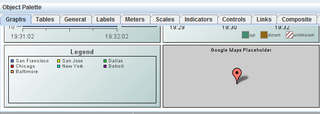
Using the map object properties and RTView data attachments, the map object can be populated with marker objects at specific latitude/longitude positions, and also links between the markers. RTView drilldown and command operations can be triggered by clicks on the map object, as well as on its markers and links. Double-click, right-click and drillDownColumn substitutions are supported as on other RTView table-driven objects. Operations such as zoom, pan and marker selection can be tied to RTView variables.
The Thin Client must have internet access in order to download the Google Maps JavaScript API and map data. The Thin Client supports Google Maps in Internet Explorer version 9 or newer, and any other RTView-supported browsers (Firefox, Chrome, iOS Safari).
The Thin Client loads the Google Maps Javascript API to render and manipulate the map. In most cases a key or license must be obtained from Google for business use of the Google Maps Javascript API. For details, see the “Licensing” section.
Using Data Properties
To attach data to the map object, right-click in the Property Value field of the valueTable property and select Attach to Data. The valueTable property can be used to place markers (icons) on the map, at specific locations. The property must be attached to a table that contains one row for each marker. The column names are unimportant, but the column order and type must be as follows. The first three columns are required, the others are optional.
column 1 (string): The name.
column 2 (number): The latitude.
column 3 (number): The longitude.
column 4 (string): The icon name/path.
column 5 (integer): The icon height in pixels.
The marker name must be unique as it is used in drilldowns to indicate the selected ("clicked") marker, and can also be used to select a marker.
If column 4 (icon name) is omitted or empty, the default Google Maps marker is used. If column 5 (icon height) exists and its value is > 0, the value is used to center the icon on the marker's latitude/longitude position, otherwise the 0,0 pixel of the icon will be placed on the marker's latitude/longitude position.
Use the valueTableForLinks property to draw links between markers on the map. The property must be attached to a table that contains one row for each link, with the columns shown below. The column names are unimportant, but the column order and type must be as follows. The first 2 columns are required, the others are optional.
column 1 (string): The name of marker at start of link.
column 2 (string): The name of marker at end of link.
column 3 (string): The link line color, as a css color name or #rrggbb hex value.
column 4 (integer): The link line width.
column 5 (integer): The arrow mode.
The first two columns specify the names of the markers at the start and end of the link. These must correspond to the names of markers in the valueTable. If column 3 is omitted the link color is black. If column 4 is omitted the link width is 2 pixels. The arrow mode values are 1 (one arrow, pointing to start marker), 2 (one arrow, pointing to end marker) and 3 (two markers, at each end of link). If column 5 is omitted the default mode of 3 is used.
Using Interaction Properties
Use the command property to invoke behavior when the user clicks on the map, a marker, or a link.
The drillDownColumnSubs property is treated the same as for other table-driven objects. If a marker is clicked, the drillDownColumnSubs are set using values from the valueTable row that corresponds to that marker. If a link is clicked, the drillDownColumnSubs are set using values from the valueTableForLinks row that corresponds to that link. In addition, the following predefined substitutions are also set when a drilldown is executed:
§ $mapSelLat: The latitude of the map location or marker clicked.
§ $mapSelLng: The longitude of the map location or marker clicked.
§ $mapLat: The latitude of the map's current center location.
§ $mapLng: The longitude of the map's current center location.
§ $mapZoom: The current zoom level of the map, a value between 0 and 21.
The drillDownSelectMode property can be set to the following values:
§ Anywhere: A click anywhere on the map triggers the object's command or drilldown.
§ Markers: Only a click on a marker triggers the command or drilldown.
§ Links: Only a click on a link triggers the command or drilldown.
§ Markers & Links: Only a click on a marker or a link triggers the command or drilldown.
Using Map Properties
If the labelsZoomThreshold property is set to a value > 0 a label balloon appears next to each marker when the zoom level is greater than or equal to that value. The label text in the balloon is the name assigned to the marker, by the first column in the valueTable. A label can be closed by clicking its "x" button. The label reappears if the display is closed and reopened or if the zoom threshold is crossed again later. The default value of labelsZoomThreshold is zero which disables the labels.
The latitude property specifies the latitude of the point on which the map is to be centered. The longitude property specifies the longitude of the point on which the map is to be centered. The selectedMarker property specifies the name of the marker to select. The zoom property specifies the zoom level of the map, between 0 and 21.
The other properties supported by the map object but not listed here are common to all display objects, and have the same purpose and behavior as on the other display objects.
Business use of the Google Maps Javascript API typically requires a key or license from Google. For more information, see the following: https://developers.google.com/maps/licensing
SL does not provide a key or license for the Google Maps Javascript API. However, the Thin Client can be configured to download the API using a custom URL that contains specific key or license information obtained from Google. The custom URL is defined by modifying the rtv_custom.js file contained in rtvdisplay.war. Refer to the “Customization” section for details about modifying rtvdisplay.war.
To specify a custom URL to download the Google Maps Javascript API, add the following line to rtv_custom.js:
rtv.customGoogleMapsApiBaseURL = 'url';
For example, to specify a URL containing a Google API key:
rtv.customGoogleMapsApiBaseURL = "https://maps.googleapis.com/maps/api/js?key=YOUR_GOOGLE_API_KEY";
Or, to specify a "Google Maps API for Work" client ID and release version 3.20:
rtv.customGoogleMapsApiBaseURL = "https://maps.googleapis.com/maps/api/js?client=YOUR_GOOGLE_CLIENT_ID&v=3.20";
If no rtv.customGoogleMapsApiBaseURL value is specified, the Thin Client uses the following public URL to download the latest "experimental" version of the API with no key or license information: https://maps.googleapis.com/maps/api/js.
Data Properties
Specify how data is displayed in the map object.
|
Property Name |
Description |
|
valueTable |
Attach data to the map object using this property. The valueTable property can be used to place markers (icons) on the map, at specific locations. The property must be attached to a table that contains one row for each marker. The column names are unimportant, but the column order and type must be as follows. The first three columns are required, the others are optional. column 1 (string): The name. column 2 (number): The latitude. column 3 (number): The longitude. column 4 (string): The icon name/path. column 5 (integer): The icon height in pixels. |
|
|
The marker name must be unique as it is used in drilldowns to indicate the selected ("clicked") marker, and can also be used to select a marker. If column 4 (icon name) is omitted or empty, the default Google Maps marker is used. If column 5 (icon height) exists and its value is > 0, the value is used to center the icon on the marker's latitude/longitude position, otherwise the 0,0 pixel of the icon will be placed on the marker's latitude/longitude position. |
|
valueTableForLinks |
This property can be used to draw links between markers on the map. The property must be attached to a table that contains one row for each link, with the columns shown below. The column names are unimportant, but the column order and type must be as follows. The first 2 columns are required, the others are optional. column 1 (string): The name of marker at start of link. column 2 (string): The name of marker at end of link. column 3 (string): The link line color, as a css color name or #rrggbb hex value. column 4 (integer): The link line width. column 5 (integer): The arrow mode. |
|
|
The first two columns specify the names of the markers at the start and end of the link. These must correspond to the names of markers in the valueTable. If column 3 is omitted the link color is black. If column 4 is omitted the link width is 2 pixels. The arrow mode values are 1 (one arrow, pointing to start marker), 2 (one arrow, pointing to end marker) and 3 (two markers, at each end of link). If column 5 is omitted the default mode of 3 is used. |
Interaction Properties
Specify interactions in the map object.
|
Property Name |
Description |
|
command |
Assign a command to your map object. See “Define/Execute Command” for information. |
|
commandCloseWindowOnSuccess |
If selected, the window that initiates a system command will automatically close when the system command is executed successfully. This property only applies to system commands. With data source commands, the window is closed whether or not the command is executed successfully. For multiple commands, this property is applied to each command individually. Therefore if the first command in the multiple command sequence succeeds, the window will close before the rest of the commands are executed. Note: The commandCloseWindowOnSuccess property is not supported in the Display Server. |
|
commandConfirm |
If selected, the command confirmation dialog is enabled. Use the commandConfirmText property to write your own text for the confirmation dialog, otherwise text from the command property will be used. For multiple commands, if you Confirm the execution then all individual commands will be executed in sequence with no further confirmation. If the you Cancel the execution, none of the commands in the sequence will executed. |
|
commandConfirmText |
Enter command confirmation text directly in the Property Value field or select the |
|
drillDownColumnSubs |
Select the |
|
drillDownSelectMode |
Control how a drill down display is activated. Select one of the following options: § Anywhere: A click anywhere on the map triggers the object's command or drilldown. § Markers: Only a click on a marker triggers the command or drilldown. § Links: Only a click on a link triggers the command or drilldown. § Markers & Links: Only a click on a marker or a link triggers the command or drilldown. |
|
drillDownTarget |
Name of display (.rtv) file targeted as a drill down. See “Drill Down Displays” for information. |
|
menuItemGroup |
Use the menuItemGroup property to extend RTView context menu items. For details, see “Extending the Context Menu”. |
Label Properties
Specify the label in the map object.
|
Property Name |
Description |
|
label |
Specifies the label string for the map placeholder object. This is visible only in the Builder. Edit label text directly in the Property Value field or select the |
Map Properties
Specify the position, zoom level and label behavior in the map object.
|
Property Name |
Description |
|
labelsZoomThreshold |
If the labelsZoomThreshold property is set to a value > 0 a label balloon appears next to each marker when the zoom level is greater than or equal to that value. The label text in the balloon is the name assigned to the marker, by the first column in the valueTable. A label can be closed by clicking its "x" button. The label reappears if the display is closed and reopened or if the zoom threshold is crossed again later. The default value of labelsZoomThreshold is zero which disables the labels. |
|
latitude |
The latitude of the point on which the map is to be centered. |
|
longitude |
The longitude of the point on which the map is to be centered. |
|
selectedMarker |
The name of the marker to select. |
|
zoom |
The zoom level of the map, between 0 and 21. |
Object Properties
Specify the layout in the map object.
|
Property Name |
Description |
|
anchor |
Specify where to anchor an object in the display. Note: If an object has the dock property set, the anchor property will be ignored. The anchor property is only applied when the dimensions of the display are modified, either by editing “Background Properties” or resizing the window in Layout mode Select None, or one or more the following options: None - Object not anchored. This is the default. Top - Anchor top of object at top of display. Left - Anchor left side of object at left of display. Bottom - Anchor bottom of object at bottom of display. Right - Anchor right side of object at right of display. When a display is resized, the number of pixels between an anchored object and the specified location remain constant. If an object is anchored on opposite sides (i.e. Top and Bottom or Left and Right), the object will be stretched to fill the available space. |
|
dock |
Specify the docking location of an object in the display. Select from the following options: None - Object is not docked. This is the default. Top - Dock object at top of display. Left - Dock object at left of display. Bottom - Dock object at bottom of display. Right - Dock object at right of display. Fill - Dock object in available space remaining in the display after all docked objects are positioned. |
|
|
If the dimensions of the display are modified, either by editing “Background Properties” or resizing the window in Layout mode, the properties (objX, objY, objWidth, and objHeight) of docked objects will automatically adapt to match the new size of the display. |
|
|
When multiple objects are docked to the same side of the display, the first object is docked against the side of the display, the next object is docked against the edge of the first object, and so on. |
|
|
When objects are docked to multiple sides of the display, the order in which objects were added to the display controls docking position. For example, let's say the first object added to the display is docked at the Top and the second object is docked at the Left. Consequently, the first object will fill the entire width of the display and the second object will fill the left side of the display from the bottom of the first object to the bottom of the display. |
|
|
Objects in a display have the dock property set to Fill, are laid out across a grid in the available space remaining after all docked objects are positioned. By default, the grid has one row and as many columns as there are objects in the display. You can modify the grid in the “Background Properties” dialog. |
|
|
Once an object is docked, there are some limitations on how that object can be modified: § Docked objects cannot be dragged or repositioned using objX and objY properties. § Docked objects cannot be resized using the objWidth or objHeight properties. To resize you must drag on the resize handle. § Docked objects can only be resized toward the center of the display (e.g. If an object is docked at the Top, only its height can be increased by dragging down toward the center of the display). § Docked objects set to Fill cannot be resized at all. § Docked objects cannot be moved using Align. Non-docked objects can be aligned against a docked object, but a docked object will not move to align against another object. § Docked objects are ignored by Distribute. |
|
objHeight |
Sets the height (in pixels) of the object. |
|
objName |
Name given to facilitate object management via the Object List dialog. Select Tools>Object List. |
|
objWidth |
Sets the width (in pixels) of the object. |
|
objX |
Set the x-axis position of object. |
|
objY |
Set the y-axis position of object. |
|
styleClass |
Enter the style class name for this object as defined in your style sheet. If not specified, the object class name is used. Note: The value entered must not contain spaces and cannot start with rtv-. |
|
visFlag |
Controls visibility of the object. |
The Object Palette features four types of indicators:
|
“Indicator Objects - Discrete” Supports 3 discrete comparisons. |
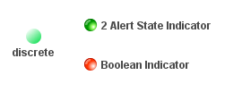
|
|
Supports 2 high and 2 low thresholds. |
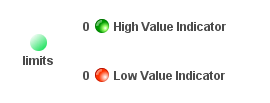
|
|
Supports an unlimited number of comparison values. For each comparison, you can specify whether the value property must be equal, not equal, greater than or less than the comparison value. |
|
|
Panel of 2 or 3 indicator lights. Each indicator light supports a discrete comparison. |

|
Image Property
Labels objects that feature the image property can be customized to display your image (.gif, .jpg, or .png) file. Click in the image Property Value field and type the name of the image. Or, select the  button to open the Select Image dialog containing up to three directories:
• Current Directory - Contains images in the current directory and one level of subdirectories.
• Custom Image Library - If you have specified a custom image library, this directory contains those images. See Creating a Custom Image Library for details.
• Symbol Library - Contains symbolic images (for example, symbols for various types of hardware, shapes, lights, arrows, etc.).
Navigate to the image you want to use and select it. A preview of the image appears in the pane to the right. Click OK or Apply to set the image on your object. If an image is not listed, enter the name of the file, including the relative path.
To scale your image to the size of the object, check the imageScaleFlag. The visFlag property controls the visibility of the object. The transparencyPercent property controls the transparency of the object.
Note: The sample display file general_objects.rtv (located in demos/tutorials) features information on working with objects from the General tab.
Creating a Custom Image Library
The custom image library enables you to make your own images available in the Select Image dialog. To add your own image library, perform the following steps.
1. Place your images .jar file and add it to the RTV_USERPATH environment variable. The images must be in a directory (not in the top level of the jar). They can be organized into subdirectories of one top level directory.
2. In the Display Builder, select Tools/Builder Options and, in the Custom Image Library Path field, set the path to the directory containing your images .jar file.
For example, if you have a jar with this directory structure:
com/mycompany/Images
com/mycompany/Images/Blue Images
com/mycompany/Images/Red Images
com/mycompany/Images/Green Images
With this directory structure, you would enter com/mycompany/Images. This adds a directory named Images to the tree in the Select Image dialog. The Images directory will have three subdirectories: Blue Images, Red Images, and Green Images. Only directories containing images are added to the Select Image dialog.
To access the images, you can edit any property that allows you to set an image on an object (for example, the image, barImage, and filterProperties properties), or edit the File>Background Properties>Image Name field.
The Object Palette features three types of discrete indicators:

|
obj_ind_discrete |
This is an indicator that allows you to set up to three comparison values (valueLowAlert, valueMediumAlert, and valueHighAlert). When the value equals one of the enabled comparisons, the color of the background and the background image will change to the color and image specified for that comparison. |
|
2 Alert State Indicator |
This is obj_ind_discrete configured to indicate two discrete alert states: valueHighAlert = 2 and valueLowAlert = 1. The valueQualityEnabledFlag is selected with valueQualityNoData = 1 and valueQualityLostData = 2. This object uses the image property instead of background colors. The label is positioned to the right of the indicator. |
|
Boolean Indicator |
This is obj_ind_discrete configured to show one discrete alert state: valueHighAlert = 0. The valueQualityEnabledFlag is selected with valueQualityNoData = 1 and valueQualityLostData = 2. This object uses the image property instead of background colors. The label is shown to the right of the indicator. |
Using Interaction Properties
Commands
To assign a command to your indicator, right-click in the Property Value field of the command property and select Define Command. Commands can be set up to execute when you click on an object or automatically execute the command when the value of an object reaches a specified threshold. See “Define/Execute Command” for information on how to set up commands.
Drill Down Displays
To specify a drill down display, double click on the drillDownTarget property. Any display (.rtv) file can be targeted as a drill down. Once a drill down target has been set, double-click on the indicator to activate the drill down. Drill down displays can be activated in the same window that contains the indicator or open in a separate window. This allows you to build a customizable hierarchy of displays. See “Drill Down Displays” for more information.
Tool Tips
Select the mouseOverFlag to enable tool tips for your indicator. To display a tool tip, point to the indicator with your mouse. The tool tip will contain information from your data attachment.
Note: The property iconVisFlag must be selected in order to display tool tips.
Alert Properties
|
Property Name |
Description |
|
|
valueHighAlertEnabledFlag |
Select to enable the valueHighAlert properties. |
|
|
|
valueHighAlert |
Enter the value that the value property must equal for the valueHighAlert properties to be applied. This may be a number or text. |
|
|
valueHighAlertColor |
Select the |
|
|
valueHighAlertGradientColor2 |
Select the |
|
|
valueHighAlertImage |
Select the image to display if value equals valueHighAlert. |
|
valueLowAlertEnabledFlag |
Select to enable the valueLowAlert properties. |
|
|
|
valueLowAlert |
Enter the value that the value property must equal for the valueLowAlert properties to be applied. This may be a number or text. |
|
|
valueLowAlertColor |
Select the |
|
|
valueLowAlertGradientColor2 |
Select the |
|
|
valueLowAlertImage |
Select the image to display if value equals valueLowAlert. |
|
valueMediumAlertEnabledFlag |
Select to enable the valueMediumAlert properties. |
|
|
|
valueMediumAlert |
Enter the value that the value property must equal for the valueMediumAlert properties to be applied. This may be a number or text. |
|
|
valueMediumAlertColor |
Select the |
|
|
valueMediumAlertGradientColor2 |
Select the |
|
|
valueMediumAlertImage |
Select the image to display if value equals valueMediumAlert. |
Background Properties
|
Property Name |
Description |
|
bgBorderColor |
Select the |
|
bgBorderFlag |
If selected, a border is drawn around the background rectangle. |
|
bgClipTextFlag |
If selected, then the label and/or its valueString (whichever is drawn within the background rectangle) will be clipped by the object’s background rectangle. You might use this option if you have a very long label or valueString and do not want to have the label/valuestring extend past the edges of the rectangle. Note: You must enable bgVisFlag for this option to work. For example, with bgClipTextFlag disabled and bgVisFlag enabled (and labelTextPosX set to Inside Left), your object and long text would look like this: 
With both bgClipTextFlag and bgVisFlag enabled (and labelTextPosX set to Inside Left), the same object and long text would look like this: 
If you want to view the full text/valueString, you can copy the full text/valueString into the Interaction> mouseOverText field to display the full string when hovering over the object. For example: 
Note: By default, this flag is unchecked and is only applicable when bgStyle is set to 0 (rectangle), 1 (3D Rectangle), or 2 (Round Rectangle). |
|
bgColor |
Select the |
|
bgEdgeWidth |
Set the width of the 3D edge on the background rectangle. This property is only available if the bgStyle selected is 3D Rectangle. |
|
bgGradientColor2 |
Select the Note: This property will be ignored if bgGradientMode is set to None. |
|
bgGradientMode |
Display a gradient in the background rectangle. Select from the following options: None - No gradient Diagonal Edge - Gradient is drawn at a 45 degree angle from the top left to the bottom right corner of the object. Diagonal Center - Gradient is drawn at a 45 degree angle from the center to the top left and the bottom right corners of the object. Horizontal Edge - Gradient is drawn horizontally from the top to the bottom of the object. Horizontal Center - Gradient is drawn horizontally from the center to the top and bottom of the object. Vertical Edge - Gradient is drawn vertically from the left to the right of the object. Vertical Center - Gradient is drawn vertically from the center to the left and right of the object. |
|
bgRaisedFlag |
Reverses the direction of the gradient, as well as that of the 3D edge if the bgStyle selected is 3D Rectangle. |
|
bgRoundness |
Set the arc length of the rounded corners. This property is only available if the bgStyle selected is Round Rectangle. Note: The value of bgRoundness cannot exceed half the value of the objWidth or the objHeight. If bgRoundness does exceed that value, then half (of the smaller of the two values) of objWidth or objHeight will be used instead. For example, if objWidth is 100 and objHeight is 50, then the value of bgRoundness cannot exceed 25. If it does, then half the value of objHeight (25) will be used instead. |
|
bgShadowFlag |
Select to display a drop shadow on the background rectangle. |
|
bgStyle |
Choose one of the following three options from the drop down menu: Rectangle - Select to display a background rectangle. 3D Rectangle - Select to display a 3D edge on the background rectangle. If selected, use bgEdgeWidth to set the width of the 3D edge. Round Rectangle - Select to display a background rectangle with rounded edges. If selected, use bgRoundness to set the arc length of the rounded corners. Circle - Select to display a background circle. Diamond - Select to display a background diamond. |
|
bgVisFlag |
Select to display the background. |
Data Properties
|
Property Name |
Description |
|
value |
Attach your data. This value is compared to the enabled alert comparisons. This can be a number or a string. |
|
valueDivisor |
If specified and the value is a number, this divisor is applied to the value. |
Data Format Properties
|
Property Name |
Description |
|
valueFormat |
Select or enter the numeric format of value displayed in the value label. To enter a format, use syntax from the Java DecimalFormat class. This is only used if value is a number. |
|
valueTextColor |
Select the |
|
valueTextFont |
Select the font to use for the value label. |
|
valueTextHeight |
Specify the height for the value label. |
|
valueTextPosX |
Set x-axis position of value label. Select from the following options: § Left - Position outside the left side of the background. § Inside Left - Position inside the left side of the background. § Center - Position in the center of the background. § Inside Right - Position inside the right side of the background. § Right - Position outside the right side of the background. |
|
valueTextPosY |
Set y-axis position of value label. Select from the following options: § Outside Top - Position well above the background. § Top - Position just above the background. § Inside Top - Position inside the top of the background. § Center - Position in the center of the background. § Inside Bottom - Position inside the bottom of the background. § Bottom - Position just below the background. § Outside Bottom - Position well below the background. |
|
valueVisFlag |
Control visibility of the value label and related properties. |
Image Properties
|
Property Name |
Description |
|
image |
Specify an image to use in the background. This image will be used unless a comparison with an image is active. In that case, the comparison's image will be used instead. |
|
imageAnimatedFlag |
When selected, this property allows animated .gif images in the indicator object. If the object’s label string overlaps the animated image, you can modify the labelTextPosY and/or labelTextPosX properties to reposition the label. Note: This feature is only supported in the Thin Client. In the builder/viewer, the animation will only update once every two seconds or after a mouse event. |
|
imageScaleFlag |
If selected, scale the image to the size of the background. Otherwise, the image is drawn at its original size. |
Interaction Properties
|
Property Name |
Description |
|
command |
Assign a command to your indicator. See “Define/Execute Command” for information. |
|
commandCloseWindowOnSuccess |
If selected, the window that initiates a system command will automatically close when the system command is executed successfully. This property only applies to system commands. With data source commands, the window is closed whether or not the command is executed successfully. For multiple commands, this property is applied to each command individually. Therefore if the first command in the multiple command sequence succeeds, the window will close before the rest of the commands are executed. Note: The commandCloseWindowOnSuccess property is not supported in the Display Server. |
|
commandConfirm |
If selected, the command confirmation dialog is enabled. Use the commandConfirmText property to write your own text for the confirmation dialog, otherwise text from the command property will be used. For multiple commands, if you Confirm the execution then all individual commands will be executed in sequence with no further confirmation. If the you Cancel the execution, none of the commands in the sequence will executed. |
|
commandConfirmText |
Enter command confirmation text directly in the Property Value field or select the |
|
drillDownTarget |
Name of display (.rtv) file targeted as a drill down. See “Drill Down Displays” for information. Note: When drillDownSelectMode is set to Anywhere, double-clicking anywhere on the scale will activate the specified drillDownTarget; however, you must double-click on a trace in the scale to set the substitutions listed above. |
|
mouseOverText |
Enter a tool tip for this indicator. To display the tool tip, move your mouse over the object. To enter a multi-line tool tip, use \n to delimit the lines (e.g. my\nscale). Note: The object must be visible (i.e. visFlag property is selected), in order for the tool tip to be visible. |
Label Properties
|
Property Name |
Description |
|
label |
Edit label text directly in the Property Value field or select the |
|
labelTextColor |
Select the |
|
labelTextFont |
Select the font style of the label text from drop down menu. |
|
labelTextHeight |
Set the height (in pixels) of the label text. |
|
labelTextPosX |
Set x-axis position of label text. Select from the following options: § Left - Position outside the left side of the background rectangle. § Inside Left - Position inside the left side of the background rectangle. § Center - Position in the center of the background rectangle. § Inside Right - Position inside the right side of the background rectangle. § Right - Position outside the right side of the background rectangle. |
|
labelTextPosY |
Set y-axis position of label text. Select from the following options: § Outside Top - Position well above the background rectangle. § Top - Position just above the background rectangle. § Inside Top - Position inside the top of the background rectangle. § Center - Position in the center of the background rectangle. § Inside Bottom - Position inside the bottom of the background rectangle. § Bottom - Position just below the background rectangle. § Outside Bottom - Position well below the background rectangle. |
|
labelVisFlag |
Control visibility of the label and related properties. |
Object Properties
|
Property Name |
Description |
|
anchor |
Specify where to anchor an object in the display. Note: If an object has the dock property set, the anchor property will be ignored. The anchor property is only applied when the dimensions of the display are modified, either by editing “Background Properties” or resizing the window in Layout mode Select None, or one or more the following options: None - Object not anchored. This is the default. Top - Anchor top of object at top of display. Left - Anchor left side of object at left of display. Bottom - Anchor bottom of object at bottom of display. Right - Anchor right side of object at right of display. When a display is resized, the number of pixels between an anchored object and the specified location remain constant. If an object is anchored on opposite sides (i.e. Top and Bottom or Left and Right), the object will be stretched to fill the available space. |
|
dock |
Specify the docking location of an object in the display. Select from the following options: None - Object is not docked. This is the default. Top - Dock object at top of display. Left - Dock object at left of display. Bottom - Dock object at bottom of display. Right - Dock object at right of display. Fill- Dock object in available space remaining in the display after all docked objects are positioned. |
|
|
If the dimensions of the display are modified, either by editing “Background Properties” or resizing the window in Layout mode, the properties (objX, objY, objWidth, and objHeight) of docked objects will automatically adapt to match the new size of the display. When multiple objects are docked to the same side of the display, the first object is docked against the side of the display, the next object is docked against the edge of the first object, and so on. When objects are docked to multiple sides of the display, the order in which objects were added to the display controls docking position. For example, let's say the first object added to the display is docked at the Top and the second object is docked at the Left. Consequently, the first object will fill the entire width of the display and the second object will fill the left side of the display from the bottom of the first object to the bottom of the display. |
|
|
Objects in a display have the dock property set to Fill, are laid out across a grid in the available space remaining after all docked objects are positioned. By default, the grid has one row and as many columns as there are objects in the display. You can modify the grid in the Background Properties dialog. Once an object is docked, there are some limitations on how that object can be modified: § Docked objects cannot be dragged or repositioned using objX and objY properties. § Docked objects cannot be resized using the objWidth or objHeight properties. To resize you must drag on the resize handle. § Docked objects can only be resized toward the center of the display (e.g. If an object is docked at the Top, only its height can be increased by dragging down toward the center of the display). § Docked objects set to Fill cannot be resized at all. § Docked objects cannot be moved using Align. Non-docked objects can be aligned against a docked object, but a docked object will not move to align against another object. § Docked objects are ignored by Distribute. |
|
objHeight |
Sets the height (in pixels) of the object. |
|
objName |
Name given to facilitate object management via the Object List dialog. Select Tools>Object List. |
|
objWidth |
Sets the width (in pixels) of the object. |
|
objX |
Set the x position of the object. |
|
objY |
Set the y position of the object. |
|
styleClass |
Enter the style class name for this object as defined in your style sheet. If not specified, the object class name is used. Note: The value entered must not contain spaces and cannot start with rtv-. |
|
transparencyPercent |
Set transparency of the object. Enter a value between 0 and 100. A value of 0, the default, sets the object to be completely opaque. A value of 100 will render the object completely transparent. |
|
visFlag |
Control visibility of the object. |
Value Quality Properties
|
Property Name |
Description |
|
|
valueQualityEnabledFlag |
Select to enable the valueQuality properties: |
|
|
|
valueQuality |
Attach this value to data that indicates the quality of the data attached to value. This value must be a number. |
|
|
valueQualityLostData |
Enter a number that valueQuality will equal if the data has been lost. |
|
|
valueQualityLostDataColor |
Select the |
|
|
valueQualityLostDataGradientColor2 |
Select the |
|
|
valueQualityLostDataImage |
Select the image to display if valueQuality equals valueQualityLostData. |
|
|
valueQualityNoData |
Enter a number that valueQuality will equal if no data is available. |
|
|
valueQualityNoDataColor |
Select the |
|
|
valueQualityNoDataGradientColor2 |
Select the |
|
|
valueQualityNoDataImage |
Select the image to display if valueQuality equals valueQualityLostData. |
The Object Palette features three types of limits indicators:

|
obj_ind_limits |
This is an indicator that allows you to set up to 4 comparison thresholds. When the value is greater than one of the high thresholds or less than one of the low thresholds, the color of the background and the background image will change to the color and image specified for that threshold. |
|
High Value Indicator |
This is obj_ind_limits configured to show two high thresholds (valueHighAlarm = 95, valueHighWarning = 75). The valueQualityEnabledFlag is selected with valueQualityNoData = 1 and valueQualityLostData = 2. This object uses images instead of background colors. The label is shown to the right of the indicator, and the value is shown to the left. |
|
Low Value Indicator |
This is obj_ind_limits configured to show two low thresholds (valueLowAlarm = 5, valueLowWarning = 15. The valueQualityEnabledFlag is selected with valueQualityNoData = 1 and valueQualityLostData = 2. This object uses images instead of background colors. The label is shown to the right of the indicator and the value is shown to the left. |
Using Interaction Properties
Commands
To assign a command to your indicator, right-click in the Property Value field of the command property and select Define Command. Commands can be set up to execute when you click on an object or automatically execute the command when the value of an object reaches a specified threshold. See “Define/Execute Command” for information on how to set up commands.
Drill Down Displays
To specify a drill down display, double click on the drillDownTarget property. Any display (.rtv) file can be targeted as a drill down. Once a drill down target has been set, double-click on the indicator to activate the drill down. Drill down displays can be activated in the same window that contains the indicator or open in a separate window. This allows you to build a customizable hierarchy of displays. See “Drill Down Displays” for more information.
Tool Tips
Select the mouseOverFlag to enable tool tips for your indicator. To display a tool tip, point to the indicator with your mouse. The tool tip will contain information from your data attachment.
Note: The property iconVisFlag must be selected in order to display tool tips.
Alert Properties
|
Property Name |
Description |
|
|
valueHighAlarmEnabledFlag |
Select to enable valueHighAlarm and related properties: |
|
|
|
valueHighAlarm |
Enter the value that the value property must be greater than for the valueHighAlarm properties to be applied. This must be a number. |
|
|
valueHighAlarmColor |
Select the |
|
|
valueHighAlertGradientColor2 |
Select the |
|
|
valueHighAlarmImage |
Select the image to display if value is greater than valueHighAlarm. |
|
valueHighWarningEnabledFlag |
Select to enable valueHighWarning and related properties: |
|
|
|
valueHighWarning |
Enter the value that the value property must be greater than for the valueHighWarning properties to be applied. This must be a number. |
|
|
valueHighWarningColor |
Select the |
|
|
valueHighWarningGradientColor2 |
Select the |
|
|
valueHighWarningImage |
Select the image to display if value is greater than valueHighWarning. |
|
valueLowAlarmEnabledFlag |
Select to enable valueLowAlarm and related properties: |
|
|
|
valueLowAlarm |
Enter the value that the value property must be less than for the valueLowAlarm properties to be applied. This must be a number. |
|
|
valueLowAlarmColor |
Select the |
|
|
valueLowAlarmGradientColor2 |
Select the |
|
|
valueLowAlarmImage |
Select the image to display if value is less than valueLowAlarm. |
|
valueLowWarningEnabledFlag |
Select to enable valueLowWarning and related properties: |
|
|
|
valueLowWarning |
Enter the value that the value property must be less than for the valueLowWarning properties to be applied. This must be a number. |
|
|
valueLowWarningColor |
Select the |
|
|
valueLowWarningGradientColor2 |
Select the |
|
|
valueLowWarningImage |
Select the image to display if value is less than valueLowWarning. |
Background Properties
|
Property Name |
Description |
|
bgBorderColor |
Select the |
|
bgBorderFlag |
If selected, a border is drawn around the background rectangle. |
|
bgClipTextFlag |
If selected, then the label and/or its valueString (whichever is drawn within the background rectangle) will be clipped by the object’s background rectangle. You might use this option if you have a very long label or valueString and do not want to have the label/valuestring extend past the edges of the rectangle. Note: You must enable bgVisFlag for this option to work. For example, with bgClipTextFlag disabled and bgVisFlag enabled (and labelTextPosX set to Inside Left), your object and long text would look like this: 
With both bgClipTextFlag and bgVisFlag enabled (and labelTextPosX set to Inside Left), the same object and long text would look like this: 
If you want to view the full text/valueString, you can copy the full text/valueString into the Interaction> mouseOverText field to display the full string when hovering over the object. For example: 
Note: By default, this flag is unchecked and is only applicable when bgStyle is set to 0 (rectangle), 1 (3D Rectangle), or 2 (Round Rectangle). |
|
bgColor |
Select the |
|
bgEdgeWidth |
Set the width of the 3D edge on the background rectangle. This property is only available if the bgStyle selected is 3D Rectangle. |
|
bgGradientColor2 |
Select the Note: This property will be ignored if bgGradientMode is set to None. |
|
bgGradientMode |
Display a gradient in the background rectangle. Select from the following options: None - No gradient Diagonal Edge - Gradient is drawn at a 45 degree angle from the top left to the bottom right corner of the object. Diagonal Center - Gradient is drawn at a 45 degree angle from the center to the top left and the bottom right corners of the object. Horizontal Edge - Gradient is drawn horizontally from the top to the bottom of the object. Horizontal Center - Gradient is drawn horizontally from the center to the top and bottom of the object. Vertical Edge - Gradient is drawn vertically from the left to the right of the object. Vertical Center - Gradient is drawn vertically from the center to the left and right of the object. |
|
bgRaisedFlag |
Reverses the direction of the gradient, as well as that of the 3D edge if the bgStyle selected is 3D Rectangle. |
|
bgRoundness |
Set the arc length of the rounded corners. This property is only available if the bgStyle selected is Round Rectangle. Note: The value of bgRoundness cannot exceed half the value of the objWidth or the objHeight. If bgRoundness does exceed that value, then half (of the smaller of the two values) of objWidth or objHeight will be used instead. For example, if objWidth is 100 and objHeight is 50, then the value of bgRoundness cannot exceed 25. If it does, then half the value of objHeight (25) will be used instead. |
|
bgShadowFlag |
Select to display a drop shadow on the background rectangle. |
|
bgStyle |
Choose one of the following three options from the drop down menu: Rectangle - Select to display a background rectangle. 3D Rectangle - Select to display a 3D edge on the background rectangle. If selected, use bgEdgeWidth to set the width of the 3D edge. Round Rectangle - Select to display a background rectangle with rounded edges. If selected, use bgRoundness to set the arc length of the rounded corners. Circle - Select to display a background circle. Diamond - Select to display a background diamond. |
|
bgVisFlag |
Select to display the background. |
Data Properties
|
Property Name |
Description |
|
value |
Attach your data. This value is compared to the enabled alert thresholds. This must be a number. |
|
valueDivisor |
If specified, this divisor is applied to the value. |
|
valueEqualTriggersThresholdFlag |
If selected, the indicator changes color (or image) when the value is greater than or equal to the high thresholds (valueHighAlarm or valueHighWarning) or less than or equal to the low thresholds (valueLowAlarm or valueLowWarning). If deselected, the indicator only changes when the value is greater than the high thresholds or less than the low thresholds. |
Data Format Properties
|
Property Name |
Description |
|
valueFormat |
Select or enter the numeric format of value displayed in the value label. To enter a format, use syntax from the Java DecimalFormat class. |
|
valueTextColor |
Select the |
|
valueTextFont |
Select the font to use for the value label. |
|
valueTextHeight |
Specify the height for the value label. |
|
valueTextPosX |
Set x-axis position of value label. Select from the following options: § Left - Position outside the left side of the background. § Inside Left - Position inside the left side of the background. § Center - Position in the center of the background. § Inside Right - Position inside the right side of the background. § Right - Position outside the right side of the background. |
|
valueTextPosY |
Set y-axis position of value label. Select from the following options: § Outside Top - Position well above the background. § Top - Position just above the background. § Inside Top - Position inside the top of the background. § Center - Position in the center of the background. § Inside Bottom - Position inside the bottom of the background. § Bottom - Position just below the background. § Outside Bottom - Position well below the background. |
|
valueVisFlag |
Control visibility of the value label and related properties. |
Image Properties
|
Property Name |
Description |
|
image |
Specify an image to use in the background. This image will be used unless a comparison with an image is active. In that case, the comparison's image will be used instead. |
|
imageAnimatedFlag |
When selected, this property allows animated .gif images in the indicator object. If the object’s label string overlaps the animated image, you can modify the labelTextPosY and/or labelTextPosX properties to reposition the label. Note: This feature is only supported in the Thin Client. In the builder/viewer, the animation will only update once every two seconds or after a mouse event. |
|
imageScaleFlag |
If selected, scale the image to the size of the background. Otherwise, the image is drawn at its original size. |
Interaction Properties
|
Property Name |
Description |
|
command |
Assign a command to your indicator. See “Define/Execute Command” for information. |
|
commandCloseWindowOnSuccess |
If selected, the window that initiates a system command will automatically close when the system command is executed successfully. This property only applies to system commands. With data source commands, the window is closed whether or not the command is executed successfully. For multiple commands, this property is applied to each command individually. Therefore if the first command in the multiple command sequence succeeds, the window will close before the rest of the commands are executed. Note: The commandCloseWindowOnSuccess property is not supported in the Display Server. |
|
commandConfirm |
If selected, the command confirmation dialog is enabled. Use the commandConfirmText property to write your own text for the confirmation dialog, otherwise text from the command property will be used. For multiple commands, if you Confirm the execution then all individual commands will be executed in sequence with no further confirmation. If the you Cancel the execution, none of the commands in the sequence will executed. |
|
commandConfirmText |
Enter command confirmation text directly in the Property Value field or select the |
|
drillDownTarget |
Name of display (.rtv) file targeted as a drill down. See “Drill Down Displays”for information. Note: When drillDownSelectMode is set to Anywhere double-clicking anywhere on the scale will activate the specified drillDownTarget, however you must double-click on a trace in the scale to set the substitutions listed above. |
|
mouseOverText |
Enter a tool tip for this indicator. To display the tool tip, move your mouse over the object. To enter a multi-line tool tip, use \n to delimit the lines (e.g. my\nscale). Note: The object must be visible (i.e. visFlag property is selected), in order for the tool tip to be visible. |
Label Properties
|
Property Name |
Description |
|
label |
Edit label text directly in the Property Value field or select the |
|
labelTextColor |
Select the |
|
labelTextFont |
Select the font style of the label text from drop down menu. |
|
labelTextHeight |
Set the height (in pixels) of the label text. |
|
labelTextPosX |
Set x-axis position of label text. Select from the following options: § Left - Position outside the left side of the background rectangle. § Inside Left - Position inside the left side of the background rectangle. § Center - Position in the center of the background rectangle. § Inside Right - Position inside the right side of the background rectangle. § Right - Position outside the right side of the background rectangle. |
|
labelTextPosY |
Set y-axis position of label text. Select from the following options: § Outside Top - Position well above the background rectangle. § Top - Position just above the background rectangle. § Inside Top - Position inside the top of the background rectangle. § Center - Position in the center of the background rectangle. § Inside Bottom - Position inside the bottom of the background rectangle. § Bottom - Position just below the background rectangle. § Outside Bottom - Position well below the background rectangle. |
|
labelVisFlag |
Control visibility of the label and related properties. |
Object Properties
|
Property Name |
Description |
|
anchor |
Specify where to anchor an object in the display. Note: If an object has the dock property set, the anchor property will be ignored. The anchor property is only applied when the dimensions of the display are modified, either by editing “Background Properties”or resizing the window in Layout mode |
|
|
Select None, or one or more the following options: None - Object not anchored. This is the default. Top - Anchor top of object at top of display. Left - Anchor left side of object at left of display. Bottom - Anchor bottom of object at bottom of display. Right - Anchor right side of object at right of display. When a display is resized, the number of pixels between an anchored object and the specified location remain constant. If an object is anchored on opposite sides (i.e. Top and Bottom or Left and Right), the object will be stretched to fill the available space. |
|
dock |
Specify the docking location of an object in the display. Select from the following options: None - Object is not docked. This is the default. Top - Dock object at top of display. Left - Dock object at left of display. Bottom - Dock object at bottom of display. Right - Dock object at right of display. Fill - Dock object in available space remaining in the display after all docked objects are positioned. |
|
|
If the dimensions of the display are modified, either by editing “Background Properties” or resizing the window in Layout mode, the properties (objX, objY, objWidth, and objHeight) of docked objects will automatically adapt to match the new size of the display. When multiple objects are docked to the same side of the display, the first object is docked against the side of the display, the next object is docked against the edge of the first object, and so on. |
|
|
When objects are docked to multiple sides of the display, the order in which objects were added to the display controls docking position. For example, let's say the first object added to the display is docked at the Top and the second object is docked at the Left. Consequently, the first object will fill the entire width of the display and the second object will fill the left side of the display from the bottom of the first object to the bottom of the display. Objects in a display have the dock property set to Fill, are laid out across a grid in the available space remaining after all docked objects are positioned. By default, the grid has one row and as many columns as there are objects in the display. You can modify the grid in the Background Properties dialog. |
|
|
Once an object is docked, there are some limitations on how that object can be modified: § Docked objects cannot be dragged or repositioned using objX and objY properties. § Docked objects cannot be resized using the objWidth or objHeight properties. To resize you must drag on the resize handle. § Docked objects can only be resized toward the center of the display (e.g. If an object is docked at the Top, only its height can be increased by dragging down toward the center of the display). § Docked objects set to Fill cannot be resized at all. § Docked objects cannot be moved using Align. Non-docked objects can be aligned against a docked object, but a docked object will not move to align against another object. § Docked objects are ignored by Distribute. |
|
objHeight |
Sets the height (in pixels) of the object. |
|
objName |
Name given to facilitate object management via the Object List dialog. Select Tools>Object List. |
|
objWidth |
Sets the width (in pixels) of the object. |
|
objX |
Set the x position of the object. |
|
objY |
Set the y position of the object. |
|
styleClass |
Enter the style class name for this object as defined in your style sheet. If not specified, the object class name is used. Note: The value entered must not contain spaces and cannot start with rtv-. |
|
transparencyPercent |
Set transparency of the object. Enter a value between 0 and 100. A value of 0, the default, sets the object to be completely opaque. A value of 100 will render the object completely transparent. |
|
visFlag |
Control visibility of the object. |
Value Quality Properties
|
Property Name |
Description |
|
|
valueQualityEnabledFlag |
Select to enable the valueQuality properties: |
|
|
|
valueQuality |
Attach this value to data that indicates the quality of the data attached to value. This value must be a number. |
|
|
valueQualityLostData |
Enter a number that valueQuality will equal if the data has been lost. |
|
|
valueQualityLostDataColor |
Select the |
|
|
valueQualityLostDataGradientColor2 |
Select the |
|
|
valueQualityLostDataImage |
Select the image to display if valueQuality equals valueQualityLostData. |
|
|
valueQualityNoData |
Enter a number that valueQuality will equal if no data is available. |
|
|
valueQualityNoDataColor |
Select the |
|
|
valueQualityNoDataGradientColor2 |
Select the |
|
|
valueQualityNoDataImage |
Select the image to display if valueQuality equals valueQualityLostData. |
The object obj_ind_multi is an indicator that allows you to enable an unlimited number of comparison values (Alert State 01, Alert State 02, etc.). When the value property meets one of the enabled Alert State conditions, then the background color and background image will change to the specified alertState* color and image.

Note: When the value meets the conditions of more than one Alert State, then the properties of the highest Alert State are used (e.g. AlertState 02 is higher than AlertState 01).
Using Interaction Properties
Commands
To assign a command to your indicator, right-click in the Property Value field of the command property and select Define Command. Commands can be set up to execute when you click on an object or automatically execute the command when the value of an object reaches a specified threshold. See “Define/Execute Command” for information on how to set up commands.
Drill Down Displays
To specify a drill down display, double click on the drillDownTarget property. Any display (.rtv) file can be targeted as a drill down. Once a drill down target has been set, double-click on the indicator to activate the drill down. Drill down displays can be activated in the same window that contains the indicator or open in a separate window. This allows you to build a customizable hierarchy of displays. See “Drill Down Displays” for more information.
Tool Tips
Select the mouseOverFlag to enable tool tips for your indicator. To display a tool tip, point to the indicator with your mouse. The tool tip will contain information from your data attachment.
Note: The property iconVisFlag must be selected in order to display tool tips.
Alert Properties
|
Property Name |
Description |
|
|
numAlertStates |
Specify the number of Alert State comparisons to enable (Alert State 01, Alert State 02, etc.). The following alertState properties will be listed for each: |
|
|
|
alertStateN |
Enter a value (numeric or text) to compare to the value property for the alertStateN properties to be applied. |
|
|
alertStateNColor |
Select the |
|
|
alertStateNCondition |
Comparison condition to use for this alert state. Select from the following: Equal - The value must equal alertStateN for alertStateN properties to be applied Not Equal - The value must not equal alertStateN for alertStateN properties to be applied Greater Than - The value must be greater than alertStateN for alertStateN properties to be applied. Note: This option is only supported if value and alertStateN are both numeric values. Less Than - The value must be less than alertStateN for alertStateN properties to be applied. Note: This option is only supported if value and alertStateN are both numeric values. Greater Than or Equal To - The value must be greater than or equal to alertStateN for alertStateN properties to be applied. Note: This option is only supported if value and alertStateN are both numeric values. Less Than or Equal To - The value must be less than or equal to alertStateN for alertStateN properties to be applied. Note: This option is only supported if value and alertStateN are both numeric values. |
|
|
alertStateNGradientColor2 |
Select the |
|
|
alertStateNImage |
Select the image to display if value and alertStateN meet alertStateNCondition. |
Background Properties
|
Property Name |
Description |
|
bgBorderColor |
Select the |
|
bgBorderFlag |
If selected, a border is drawn around the background rectangle. |
|
bgClipTextFlag |
If selected, then the label and/or its valueString (whichever is drawn within the background rectangle) will be clipped by the object’s background rectangle. You might use this option if you have a very long label or valueString and do not want to have the label/valuestring extend past the edges of the rectangle. Note: You must enable bgVisFlag for this option to work. For example, with bgClipTextFlag disabled and bgVisFlag enabled (and labelTextPosX set to Inside Left), your object and long text would look like this: 
With both bgClipTextFlag and bgVisFlag enabled (and labelTextPosX set to Inside Left), the same object and long text would look like this: 
If you want to view the full text/valueString, you can copy the full text/valueString into the Interaction> mouseOverText field to display the full string when hovering over the object. For example: 
Note: By default, this flag is unchecked and is only applicable when bgStyle is set to 0 (rectangle), 1 (3D Rectangle), or 2 (Round Rectangle). |
|
bgColor |
Select the |
|
bgEdgeWidth |
Set the width of the 3D edge on the background rectangle. This property is only available if the bgStyle selected is 3D Rectangle. |
|
bgGradientColor2 |
Select the Note: This property will be ignored if bgGradientMode is set to None. |
|
bgGradientMode |
Display a gradient in the background rectangle. Select from the following options: None - No gradient Diagonal Edge - Gradient is drawn at a 45 degree angle from the top left to the bottom right corner of the object. Diagonal Center - Gradient is drawn at a 45 degree angle from the center to the top left and the bottom right corners of the object. Horizontal Edge - Gradient is drawn horizontally from the top to the bottom of the object. Horizontal Center - Gradient is drawn horizontally from the center to the top and bottom of the object. Vertical Edge - Gradient is drawn vertically from the left to the right of the object. Vertical Center - Gradient is drawn vertically from the center to the left and right of the object. |
|
bgRaisedFlag |
Reverses the direction of the gradient, as well as that of the 3D edge if the bgStyle selected is 3D Rectangle. |
|
bgRoundness |
Set the arc length of the rounded corners. This property is only available if the bgStyle selected is Round Rectangle. Note: The value of bgRoundness cannot exceed half the value of the objWidth or the objHeight. If bgRoundness does exceed that value, then half (of the smaller of the two values) of objWidth or objHeight will be used instead. For example, if objWidth is 100 and objHeight is 50, then the value of bgRoundness cannot exceed 25. If it does, then half the value of objHeight (25) will be used instead. |
|
bgShadowFlag |
Select to display a drop shadow on the background rectangle. |
|
bgStyle |
Choose one of the following three options from the drop down menu: Rectangle - Select to display a background rectangle. 3D Rectangle - Select to display a 3D edge on the background rectangle. If selected, use bgEdgeWidth to set the width of the 3D edge. Round Rectangle - Select to display a background rectangle with rounded edges. If selected, use bgRoundness to set the arc length of the rounded corners. Circle - Select to display a background circle. Diamond - Select to display a background diamond. |
|
bgVisFlag |
Select to display the background and related properties. |
Data Properties
|
Property Name |
Description |
|
value |
Attach your data (numeric or string). This data is compared to all specified alertState* values. |
|
valueDivisor |
If the specified value is numeric, then this divisor is applied. |
Data Format Properties
|
Property Name |
Description |
|
valueFormat |
Select or enter the numeric format of value displayed in the value label. To enter a format, use syntax from the Java DecimalFormat class. This is only used if value is a number. |
|
valueTextColor |
Select the |
|
valueTextFont |
Select the font to use for the value label. |
|
valueTextHeight |
Specify the height for the value label. |
|
valueTextPosX |
Set x-axis position of value label. Select from the following options: § Left - Position outside the left side of the background. § Inside Left - Position inside the left side of the background. § Center - Position in the center of the background. § Inside Right - Position inside the right side of the background. § Right - Position outside the right side of the background. |
|
valueTextPosY |
Set y-axis position of value label. Select from the following options: § Outside Top - Position well above the background. § Top - Position just above the background. § Inside Top - Position inside the top of the background. § Center - Position in the center of the background. § Inside Bottom - Position inside the bottom of the background. § Bottom - Position just below the background. § Outside Bottom - Position well below the background. |
|
valueVisFlag |
Control visibility of the value label and related properties. |
Image Properties
|
Property Name |
Description |
|
image |
Specify an image to use in the background. This image will be used unless a comparison with an image is active. In that case, the comparison's image will be used instead. |
|
imageAnimatedFlag |
When selected, this property allows animated .gif images in the indicator object. If the object’s label string overlaps the animated image, you can modify the labelTextPosY and/or labelTextPosX properties to reposition the label. Note: This feature is only supported in the Thin Client. In the builder/viewer, the animation will only update once every two seconds or after a mouse event. |
|
imageScaleFlag |
If selected, scale the image to the size of the background. Otherwise, the image is drawn at its original size. |
Interaction Properties
|
Property Name |
Description |
|
command |
Assign a command to your indicator. See “Define/Execute Command” for information. |
|
commandCloseWindowOnSuccess |
If selected, the window that initiates a system command will automatically close when the system command is executed successfully. This property only applies to system commands. With data source commands, the window is closed whether or not the command is executed successfully. For multiple commands, this property is applied to each command individually. Therefore if the first command in the multiple command sequence succeeds, the window will close before the rest of the commands are executed. Note: The commandCloseWindowOnSuccess property is not supported in the Display Server. |
|
commandConfirm |
If selected, the command confirmation dialog is enabled. Use the commandConfirmText property to write your own text for the confirmation dialog, otherwise text from the command property will be used. For multiple commands, if you Confirm the execution then all individual commands will be executed in sequence with no further confirmation. If the you Cancel the execution, none of the commands in the sequence will executed. |
|
commandConfirmText |
Enter command confirmation text directly in the Property Value field or select the |
|
drillDownTarget |
Name of display (.rtv) file targeted as a drill down. See “Drill Down Displays” for information. Note: When drillDownSelectMode is set to Anywhere double-clicking anywhere on the scale will activate the specified drillDownTarget, however you must double-click on a trace in the scale to set the substitutions listed above. |
|
mouseOverText |
Enter a tool tip for this indicator. To display the tool tip, move your mouse over the object. To enter a multi-line tool tip, use \n to delimit the lines (e.g. my\nscale). Note: The object must be visible (i.e. visFlag property is selected), in order for the tool tip to be visible. |
Label Properties
|
Property Name |
Description |
|
label |
Edit label text directly in the Property Value field or select the |
|
labelTextColor |
Select the |
|
labelTextFont |
Select the font style of the label text from drop down menu. |
|
labelTextHeight |
Set the height (in pixels) of the label text. |
|
labelTextPosX |
Set x-axis position of label text. Select from the following options: § Left - Position outside the left side of the background rectangle. § Inside Left - Position inside the left side of the background rectangle. § Center - Position in the center of the background rectangle. § Inside Right - Position inside the right side of the background rectangle. § Right - Position outside the right side of the background rectangle. |
|
labelTextPosY |
Set y-axis position of label text. Select from the following options: § Outside Top - Position well above the background rectangle. § Top - Position just above the background rectangle. § Inside Top - Position inside the top of the background rectangle. § Center - Position in the center of the background rectangle. § Inside Bottom - Position inside the bottom of the background rectangle. § Bottom - Position just below the background rectangle. § Outside Bottom - Position well below the background rectangle. |
|
labelVisFlag |
Control visibility of the label and related properties. |
Object Properties
|
Property Name |
Description |
|
anchor |
Specify where to anchor an object in the display. Note: If an object has the dock property set, the anchor property will be ignored. The anchor property is only applied when the dimensions of the display are modified, either by editing “Background Properties” or resizing the window in Layout mode Select None, or one or more the following options: None - Object not anchored. This is the default. Top - Anchor top of object at top of display. Left - Anchor left side of object at left of display. Bottom - Anchor bottom of object at bottom of display. Right - Anchor right side of object at right of display. When a display is resized, the number of pixels between an anchored object and the specified location remain constant. If an object is anchored on opposite sides (i.e. Top and Bottom or Left and Right), the object will be stretched to fill the available space. |
|
dock |
Specify the docking location of an object in the display. Select from the following options: None - Object is not docked. This is the default. Top - Dock object at top of display. Left - Dock object at left of display. Bottom - Dock object at bottom of display. Right - Dock object at right of display. Fill - Dock object in available space remaining in the display after all docked objects are positioned. |
|
|
If the dimensions of the display are modified, either by editing Background Properties or resizing the window in Layout mode, the properties (objX, objY, objWidth, and objHeight) of docked objects will automatically adapt to match the new size of the display. When multiple objects are docked to the same side of the display, the first object is docked against the side of the display, the next object is docked against the edge of the first object, and so on. When objects are docked to multiple sides of the display, the order in which objects were added to the display controls docking position. For example, let's say the first object added to the display is docked at the Top and the second object is docked at the Left. Consequently, the first object will fill the entire width of the display and the second object will fill the left side of the display from the bottom of the first object to the bottom of the display. Objects in a display have the dock property set to Fill, are laid out across a grid in the available space remaining after all docked objects are positioned. By default, the grid has one row and as many columns as there are objects in the display. You can modify the grid in the Background Properties dialog. |
|
|
Once an object is docked, there are some limitations on how that object can be modified: § Docked objects cannot be dragged or repositioned using objX and objY properties. § Docked objects cannot be resized using the objWidth or objHeight properties. To resize you must drag on the resize handle. § Docked objects can only be resized toward the center of the display (e.g. If an object is docked at the Top, only its height can be increased by dragging down toward the center of the display). § Docked objects set to Fill cannot be resized at all. § Docked objects cannot be moved using Align. Non-docked objects can be aligned against a docked object, but a docked object will not move to align against another object. § Docked objects are ignored by Distribute. |
|
objHeight |
Sets the height (in pixels) of the object. |
|
objName |
Name given to facilitate object management via the Object List dialog. Select Tools>Object List. |
|
objWidth |
Sets the width (in pixels) of the object. |
|
objX |
Set the x position of the object. |
|
objY |
Set the y position of the object. |
|
styleClass |
Enter the style class name for this object as defined in your style sheet. If not specified, the object class name is used. Note: The value entered must not contain spaces and cannot start with rtv-. |
|
transparencyPercent |
Set transparency of the object. Enter a value between 0 and 100. A value of 0, the default, sets the object to be completely opaque. A value of 100 will render the object completely transparent. |
|
visFlag |
Control visibility of the object. |
Value Quality Properties
|
Property Name |
Description |
|
|
valueQualityEnabledFlag |
Select to enable the valueQuality properties: |
|
|
|
valueQuality |
Attach this value to data that indicates the quality of the data attached to value. This value must be a number. |
|
|
valueQualityLostData |
Enter a number that valueQuality will equal if the data has been lost. |
|
|
valueQualityLostDataColor |
Select the |
|
|
valueQualityLostDataGradientColor2 |
Select the |
|
|
valueQualityLostDataImage |
Select the image to display if valueQuality equals valueQualityLostData. |
|
|
valueQualityNoData |
Enter a number that valueQuality will equal if no data is available. |
|
|
valueQualityNoDataColor |
Select the |
|
|
valueQualityNoDataGradientColor2 |
Select the |
|
|
valueQualityNoDataImage |
Select the image to display if valueQuality equals valueQualityLostData. |
The Object Palette features two panel indicators:
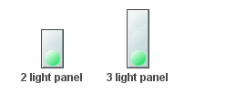
|
obj_ind_panel |
This is an indicator that allows you to set up to 3 comparison values (indicator1, indicator2 and indicator3). When the value equals one of the enabled comparisons, the color of the corresponding indicator in the panel will change to the color and image specified for that comparison. |
Using Interaction Properties
Commands
To assign a command to your indicator, right-click in the Property Value field of the command property and select Define Command. Commands can be set up to execute when you click on an object or automatically execute the command when the value of an object reaches a specified threshold. See “Define/Execute Command” for information on how to set up commands.
Drill Down Displays
To specify a drill down display, double click on the drillDownTarget property. Any display (.rtv) file can be targeted as a drill down. Once a drill down target has been set, double-click on the indicator to activate the drill down. Drill down displays can be activated in the same window that contains the indicator or open in a separate window. This allows you to build a customizable hierarchy of displays. See “Drill Down Displays” for more information.
Tool Tips
Select the mouseOverFlag to enable tool tips for your indicator. To display a tool tip, point to the indicator with your mouse. The tool tip will contain information from your data attachment.
Note: The property iconVisFlag must be selected in order to display tool tips.
Alert Properties
|
Property Name |
Description |
|
indicator1 |
Enter the value that the value property must equal for the indicator1 properties to be applied. This may be a number or text. |
|
indicator1Color |
Select the |
|
indicator1GradientColor2 |
Select the |
|
indicator1VisFlag |
Controls visibility of indicator1 and related object properties. |
|
indicator2 |
Enter the value that the value property must equal for the indicator2 properties to be applied. This may be a number or text. |
|
indicator2Color |
Select the |
|
indicator2GradientColor2 |
Select the |
|
indicator2VisFlag |
Controls visibility of indicator2 and related object properties. |
|
indicator3 |
Enter the value that the value property must equal for the indicator3 properties to be applied. This may be a number or text. |
|
indicator3Color |
Select the |
|
indicator3GradientColor2 |
Select the |
|
indicator3VisFlag |
Controls visibility of indicator3 and related object properties. |
Background Properties
|
Property Name |
Description |
|
bgBorderColor |
Select the |
|
bgBorderFlag |
If selected, a border is drawn around the background rectangle. |
|
bgColor |
Select the |
|
bgEdgeWidth |
Set the width of the 3D edge on the background rectangle. This property is only available if the bgStyle selected is 3D Rectangle. |
|
bgGradientColor2 |
Select the Note: This property will be ignored if bgGradientMode is set to None. |
|
bgGradientMode |
Display a gradient in the background rectangle. Select from the following options: None - No gradient Diagonal Edge - Gradient is drawn at a 45 degree angle from the top left to the bottom right corner of the object. Diagonal Center - Gradient is drawn at a 45 degree angle from the center to the top left and the bottom right corners of the object. Horizontal Edge - Gradient is drawn horizontally from the top to the bottom of the object. Horizontal Center - Gradient is drawn horizontally from the center to the top and bottom of the object. Vertical Edge - Gradient is drawn vertically from the left to the right of the object. Vertical Center - Gradient is drawn vertically from the center to the left and right of the object. |
|
bgRaisedFlag |
Reverses the direction of the gradient, as well as that of the 3D edge if the bgStyle selected is 3D Rectangle. |
|
bgRoundness |
Set the arc length of the rounded corners. This property is only available if the bgStyle selected is Round Rectangle. Note: The value of bgRoundness cannot exceed half the value of the objWidth or the objHeight. If bgRoundness does exceed that value, then half (of the smaller of the two values) of objWidth or objHeight will be used instead. For example, if objWidth is 100 and objHeight is 50, then the value of bgRoundness cannot exceed 25. If it does, then half the value of objHeight (25) will be used instead. |
|
bgShadowFlag |
Select to display a drop shadow on the background rectangle. |
|
bgStyle |
Choose one of the following three options from the drop down menu: Rectangle - Select to display a background rectangle. 3D Rectangle - Select to display a 3D edge on the background rectangle. If selected, use bgEdgeWidth to set the width of the 3D edge. Round Rectangle - Select to display a background rectangle with rounded edges. If selected, use bgRoundness to set the arc length of the rounded corners. |
|
bgVisFlag |
Select to display the background. |
|
borderPixels |
The number of pixels between the edge of the background and the indicators. |
Data Properties
|
Property Name |
Description |
|
value |
Attach your data. This value is compared to the enabled indicators. This can be a number or a string. |
|
valueDivisor |
If specified and the value is a number, this divisor is applied to the value. |
Interaction Properties
|
Property Name |
Description |
|
command |
Assign a command to your indicator. See “Define/Execute Command” for information. |
|
commandCloseWindowOnSuccess |
If selected, the window that initiates a system command will automatically close when the system command is executed successfully. This property only applies to system commands. With data source commands, the window is closed whether or not the command is executed successfully. For multiple commands, this property is applied to each command individually. Therefore if the first command in the multiple command sequence succeeds, the window will close before the rest of the commands are executed. Note: The commandCloseWindowOnSuccess property is not supported in the Display Server. |
|
commandConfirm |
If selected, the command confirmation dialog is enabled. Use the commandConfirmText property to write your own text for the confirmation dialog, otherwise text from the command property will be used. For multiple commands, if you Confirm the execution then all individual commands will be executed in sequence with no further confirmation. If the you Cancel the execution, none of the commands in the sequence will executed. |
|
commandConfirmText |
Enter command confirmation text directly in the Property Value field or select the |
|
drillDownTarget |
Name of display (.rtv) file targeted as a drill down. See “Drill Down Displays” for information. Note: When drillDownSelectMode is set to Anywhere double-clicking anywhere on the scale will activate the specified drillDownTarget, however you must double-click on a trace in the scale to set the substitutions listed above. |
|
mouseOverText |
Enter a tool tip for this indicator. To display the tool tip, move your mouse over the object. To enter a multi-line tool tip, use \n to delimit the lines (e.g. my\nscale). Note: The object must be visible (i.e. visFlag property is selected), in order for the tool tip to be visible. |
Label Properties
|
Property Name |
Description |
|
label |
Edit label text directly in the Property Value field or select the |
|
labelTextColor |
Select the |
|
labelTextFont |
Select the font style of the label text from drop down menu. |
|
labelTextHeight |
Set the height (in pixels) of the label text. |
|
labelTextPosX |
Set x-axis position of label text. Select from the following options: § Left - Position outside the left side of the background rectangle. § Inside Left - Position inside the left side of the background rectangle. § Center - Position in the center of the background rectangle. § Inside Right - Position inside the right side of the background rectangle. § Right - Position outside the right side of the background rectangle. |
|
labelTextPosY |
Set y-axis position of label text. Select from the following options: § Outside Top - Position well above the background rectangle. § Top - Position just above the background rectangle. § Inside Top - Position inside the top of the background rectangle. § Center - Position in the center of the background rectangle. § Inside Bottom - Position inside the bottom of the background rectangle. § Bottom - Position just below the background rectangle. § Outside Bottom - Position well below the background rectangle. |
|
labelVisFlag |
Control visibility of the label. |
Object Properties
|
Property Name |
Description |
|
anchor |
Specify where to anchor an object in the display. Note: If an object has the dock property set, the anchor property will be ignored. The anchor property is only applied when the dimensions of the display are modified, either by editing “Background Properties” or resizing the window in Layout mode Select None, or one or more the following options: None - Object not anchored. This is the default. Top - Anchor top of object at top of display. Left - Anchor left side of object at left of display. Bottom - Anchor bottom of object at bottom of display. Right - Anchor right side of object at right of display. |
|
|
When a display is resized, the number of pixels between an anchored object and the specified location remain constant. If an object is anchored on opposite sides (i.e. Top and Bottom or Left and Right), the object will be stretched to fill the available space. |
|
dock |
Specify the docking location of an object in the display. Select from the following options: None - Object is not docked. This is the default. Top - Dock object at top of display. Left - Dock object at left of display. Bottom - Dock object at bottom of display. Right - Dock object at right of display. Fill - Dock object in available space remaining in the display after all docked objects are positioned. |
|
|
If the dimensions of the display are modified, either by editing “Background Properties” or resizing the window in Layout mode, the properties (objX, objY, objWidth, and objHeight) of docked objects will automatically adapt to match the new size of the display. When multiple objects are docked to the same side of the display, the first object is docked against the side of the display, the next object is docked against the edge of the first object, and so on. When objects are docked to multiple sides of the display, the order in which objects were added to the display controls docking position. For example, let's say the first object added to the display is docked at the Top and the second object is docked at the Left. Consequently, the first object will fill the entire width of the display and the second object will fill the left side of the display from the bottom of the first object to the bottom of the display. Objects in a display have the dock property set to Fill, are laid out across a grid in the available space remaining after all docked objects are positioned. By default, the grid has one row and as many columns as there are objects in the display. You can modify the grid in the Background Properties dialog. |
|
|
Once an object is docked, there are some limitations on how that object can be modified: § Docked objects cannot be dragged or repositioned using objX and objY properties. § Docked objects cannot be resized using the objWidth or objHeight properties. To resize you must drag on the resize handle. § Docked objects can only be resized toward the center of the display (e.g. If an object is docked at the Top, only its height can be increased by dragging down toward the center of the display). § Docked objects set to Fill cannot be resized at all. § Docked objects cannot be moved using Align. Non-docked objects can be aligned against a docked object, but a docked object will not move to align against another object. § Docked objects are ignored by Distribute. |
|
objHeight |
Sets the height (in pixels) of the object. |
|
objName |
Name given to facilitate object management via the Object List dialog. Select Tools>Object List. |
|
objWidth |
Sets the width (in pixels) of the object. |
|
objX |
Set the x position of the object. |
|
objY |
Set the y position of the object. |
|
styleClass |
Enter the style class name for this object as defined in your style sheet. If not specified, the object class name is used. Note: The value entered must not contain spaces and cannot start with rtv-. |
|
transparencyPercent |
Set transparency of the object. Enter a value between 0 and 100. A value of 0, the default, sets the object to be completely opaque. A value of 100 will render the object completely transparent. |
|
visFlag |
Control visibility of the object. |
Value Quality Properties
|
Property Name |
Description |
|
|
valueQualityEnabledFlag |
Select to enable the valueQuality properties: |
|
|
|
valueQuality |
Attach this value to data that indicates the quality of the data attached to value. This value must be a number. |
|
|
valueQualityLostData |
Enter a number that valueQuality will equal if the data has been lost. |
|
|
valueQualityLostDataColor |
Select the |
|
|
valueQualityLostDataGradientColor2 |
Select the |
|
|
valueQualityNoData |
Enter a number that valueQuality will equal if no data is available. |
|
|
valueQualityNoDataColor |
Select the |
|
|
valueQualityNoDataGradientColor2 |
Select the |
|
The value and label properties are used, respectively, to display numeric and text data, either from a data attachment or static values. Value Labels that feature Alert properties can be designed to change color according to numeric values from your data attachment. |
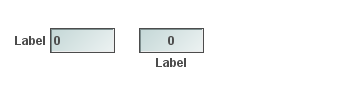

|
|
Similar to Value Labels, Vu Labels contain the value and label properties as well as featuring vu meters to display numeric values from your data attachment. |
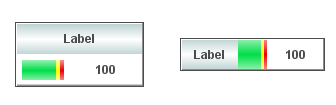
|
|
The valueString and label properties are both used to display text data, either from a data attachment or static values. |
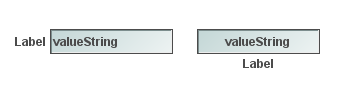

|
|
“Text Only Label” / “ValueString Only Label” The Text Only Label can be rotated at any angle and is limited to a static value. The ValueString Only Label can display text data, either from a data attachment or a static value. |
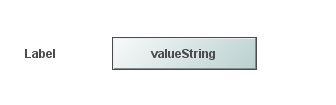
|
Image Property
Labels objects that feature the image property can be customized to display your image (.gif, .jpg, or .png) file. Click in the image Property Value field and type the name of the image. Or, select the  button to open the Select Image dialog containing up to three directories:
• Current Directory - Contains images in the current directory and one level of subdirectories.
• Custom Image Library - If you have specified a custom image library, this directory contains those images. See Creating a Custom Image Library for details.
• Symbol Library - Contains symbolic images (for example, symbols for various types of hardware, shapes, lights, arrows, etc.).
Navigate to the image you want to use and select it. A preview of the image appears in the pane to the right. Click OK or Apply to set the image on your object. If an image is not listed, enter the name of the file, including the relative path.
To scale your image to the size of the object, check the imageScaleFlag. The visFlag property controls the visibility of the object. The transparencyPercent property controls the transparency of the object.
Note: The sample display file general_objects.rtv (located in demos/tutorials) features information on working with objects from the General tab.
Creating a Custom Image Library
The custom image library enables you to make your own images available in the Select Image dialog. To add your own image library, perform the following steps.
1. Place your images .jar file and add it to the RTV_USERPATH environment variable. The images must be in a directory (not in the top level of the jar). They can be organized into subdirectories of one top level directory.
2. In the Display Builder, select Tools/Builder Options and, in the Custom Image Library Path field, set the path to the directory containing your images .jar file.
For example, if you have a jar with this directory structure:
com/mycompany/Images
com/mycompany/Images/Blue Images
com/mycompany/Images/Red Images
com/mycompany/Images/Green Images
With this directory structure, you would enter com/mycompany/Images. This adds a directory named Images to the tree in the Select Image dialog. The Images directory will have three subdirectories: Blue Images, Red Images, and Green Images. Only directories containing images are added to the Select Image dialog.
To access the images, you can edit any property that allows you to set an image on an object (for example, the image, barImage, and filterProperties properties), or edit the File>Background Properties>Image Name field.

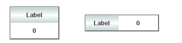
Using Interaction Properties
Commands
To assign a command to your label, right-click in the Property Value field of the command property and select Define Command. Commands can be set up to execute when you click on an object or automatically execute the command when the value of an object reaches a specified threshold. See “Define/Execute Command” for information on how to set up commands.
Drill Down Displays
To specify a drill down display, double click on the drillDownTarget property. Any display (.rtv) file can be targeted as a drill down. Once a drill down target has been set, double-click on the label to activate the drill down. Drill down displays can be activated in the same window that contains the label or open in a separate window. This allows you to build a customizable hierarchy of displays. See “Drill Down Displays” for more information.
Tool Tips
Select the mouseOverFlag to enable tool tips for your label. To display a tool tip, point to the label with your mouse. The tool tip will contain information from your data attachment.
Alert Properties
Note: Not all Value Labels feature Alert Properties.
|
Property Name |
Description |
|
|
valueHighAlarmEnabledFlag |
Select to enable the high alarm and set the following related properties: |
|
|
|
valueHighAlarm |
Specify the minimum value for the High Alarm. |
|
|
valueHighAlarmColor |
Select the |
|
valueHighWarningEnabledFlag |
Select to enable the high alarm and set the following related properties: |
|
|
|
valueHighWarning |
Specify the minimum value for the High Warning. |
|
|
valueHighWarningColor |
Select the |
Background Properties
|
Property Name |
Description |
|
bgBorderColor |
Select the Note: This property is only applicable if bgBorderFlag is selected. |
|
bgBorderFlag |
If selected, a border is drawn around the background rectangle. |
|
bgClipTextFlag |
If selected, then the label and/or its valueString (whichever is drawn within the background rectangle) will be clipped by the object’s background rectangle. You might use this option if you have a very long label or valueString and do not want to have the label/valuestring extend past the edges of the rectangle. Note: You must enable bgVisFlag for this option to work. For example, with bgClipTextFlag disabled and bgVisFlag enabled (and labelTextPosX set to Inside Left), your object and long text would look like this: 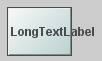
With both bgClipTextFlag and bgVisFlag enabled (and labelTextPosX set to Inside Left), the same object and long text would look like this: 
If you want to view the full text/valueString, you can copy the full text/valueString into the Interaction> mouseOverText field to display the full string when hovering over the object. For example: 
Note: By default, this flag is unchecked and is only applicable for obj_rect_il, obj_rect_ilv, and obj_rect_ilvs. |
|
bgColor |
Select the |
|
bgEdgeWidth |
Set the width of the 3D edge on the background rectangle. Note: This property is only available if the bgStyle selected is 3D Rectangle. |
|
bgGradientColor2 |
Select the Note: This property will be ignored if bgGradientMode is set to None. |
|
bgGradientMode |
Display a gradient in the background rectangle. Select from the following options: None - No gradient Diagonal Edge - Gradient is drawn at a 45 degree angle from the top left to the bottom right corner of the object. Diagonal Center - Gradient is drawn at a 45 degree angle from the center to the top left and the bottom right corners of the object. Horizontal Edge - Gradient is drawn horizontally from the top to the bottom of the object. Horizontal Center - Gradient is drawn horizontally from the center to the top and bottom of the object. Vertical Edge - Gradient is drawn vertically from the left to the right of the object. Vertical Center - Gradient is drawn vertically from the center to the left and right of the object. |
|
bgRaisedFlag |
Reverses the direction of the gradient, as well as that of the 3D edge if the bgStyle selected is 3D Rectangle. |
|
bgRoundness |
Set the arc length of the rounded corners. Note: This property is only available if the bgStyle selected is Round Rectangle. Note: The value of bgRoundness cannot exceed half the value of the objWidth or the objHeight. If bgRoundness does exceed that value, then half (of the smaller of the two values) of objWidth or objHeight will be used instead. For example, if objWidth is 100 and objHeight is 50, then the value of bgRoundness cannot exceed 25. If it does, then half the value of objHeight (25) will be used instead. |
|
bgShadowFlag |
Select to display a drop shadow on the background rectangle. |
|
bgStyle |
Choose one of the following three options from the drop down menu: Rectangle - Select to display a background rectangle. 3D Rectangle - Select to display a 3D edge on the background rectangle. If selected, use bgEdgeWidth to set the width of the 3D edge. Round Rectangle - Select to display a background rectangle with rounded edges. If selected, use bgRoundness to set the arc length of the rounded corners. |
|
bgVisFlag |
Controls visibility of background. Note: This property only applies to obj_rect_ilv. |
Data Properties
|
Property Name |
Description |
|
value |
Attach your data. |
|
valueDivisor |
If specified, this divisor is applied to the value. |
Data Format Properties
Note: Not all Data Format Properties apply to all Value Labels.
|
Property Name |
Description |
|
valueFormat |
Select or enter the numeric format of value displayed in the value text. To enter a format, use syntax from the Java Decimal Format class. |
|
valueTextAlignX |
Set the position of value text on the x-axis. Select from the following options: § Left § Center § Right |
|
valueTextAlignY |
Set the position of value text on the y-axis. Select from the following options: § Inside Top § Center § Inside Bottom |
|
valueTextColor |
Select the |
|
valueTextFont |
Select the font to use for the value text. |
|
valueTextHeight |
Specify (in pixels) the height for the value text. |
|
valueTextPosX |
Set x-axis position of value text. Select from the following options: § Left - Position outside the left side of the background rectangle. § Inside Left - Position inside the left side of the background rectangle. § Center - Position in the center of the background rectangle. § Inside Right - Position inside the right side of the background rectangle. § Right - Position outside the right side of the background rectangle. |
|
valueTextPosY |
Set y-axis position of value text. Select from the following options: § Outside Top - Position well above the background rectangle. § Top - Position just above the background rectangle. § Inside Top - Position inside the top of the background rectangle. § Center - Position in the center of the background rectangle. § Inside Bottom - Position inside the bottom of the background rectangle. § Bottom - Position just below the background rectangle. § Outside Bottom - Position well below the background rectangle. |
|
valueVisFlag |
Control visibility of the value. |
Image Properties
|
Property Name |
Description |
|
image |
Enter the name of an image or click on the Note: This property only applies to obj_rect_ilv. |
|
imageAnimatedFlag |
When selected, this property allows animated .gif images in the label object. If the object’s label string overlaps the animated image, you can modify the labelTextPosY and/or labelTextPosX properties to reposition the label. Note: This property only applies to the Thin Client and only applies to obj_rect_il. In the builder/viewer, the animation will only update once every two seconds or after a mouse event. |
|
imageScaleFlag |
Select to scale your image to the size of the object. Note: This property only applies to obj_rect_ilv. |
Interaction Properties
|
Property Name |
Description |
|
command |
Assign a command to your vu label. See “Define/Execute Command” for information. |
|
commandCloseWindowOnSuccess |
If selected, the window that initiates a system command will automatically close when the system command is executed successfully. This property only applies to system commands. With data source commands, the window is closed whether or not the command is executed successfully. For multiple commands, this property is applied to each command individually. Therefore if the first command in the multiple command sequence succeeds, the window will close before the rest of the commands are executed. Note: The commandCloseWindowOnSuccess property is not supported in the Display Server. |
|
commandConfirm |
If selected, the command confirmation dialog is enabled. Use the commandConfirmText property to write your own text for the confirmation dialog, otherwise text from the command property will be used. For multiple commands, if you Confirm the execution then all individual commands will be executed in sequence with no further confirmation. If the you Cancel the execution, none of the commands in the sequence will executed. |
|
commandConfirmText |
Enter command confirmation text directly in the Property Value field or select the |
|
drillDownTarget |
Name of display (.rtv) file targeted as a drill down. See “Drill Down Displays” for information. |
|
mouseOverText |
Enter a tool tip for this label. To display the tool tip, move your mouse over the object. To enter a multi-line tool tip, use \n to delimit the lines (e.g. my\nlabel). Note: The object must be visible (i.e. visFlag property is selected), in order for the tool tip to be visible. |
Label Properties
Note: Not all Label Properties apply to all Value Labels.
|
Property Name |
Description |
|
label |
Edit label text directly in the Property Value field or select the |
|
labelBgColor |
Select the |
|
labelBgGradientColor2 |
Select the Note: This property will be ignored if bgGradientMode is set to None. |
|
labelBgGradientMode |
Display a gradient in the background rectangle. Select from the following options: None - No gradient Diagonal Edge - Gradient is drawn at a 45 degree angle from the top left to the bottom right corner of the object. Diagonal Center - Gradient is drawn at a 45 degree angle from the center to the top left and the bottom right corners of the object. Horizontal Edge - Gradient is drawn horizontally from the top to the bottom of the object. Horizontal Center - Gradient is drawn horizontally from the center to the top and bottom of the object. Vertical Edge - Gradient is drawn vertically from the left to the right of the object. Vertical Center - Gradient is drawn vertically from the center to the left and right of the object. |
|
labelMinTabWidth |
Specify minimum width of the label tab. Note: This property only applies if labelTextPosY is set to Tab Top. |
|
labelTextAlignX |
Set the position of label text on the x-axis. Select from the following options: § Left § Center § Right |
|
labelTextAlignY |
Set the position of label text on the y-axis. Select from the following options: § Inside Top § Center § Inside Bottom |
|
labelTextColor |
Select the |
|
labelTextFont |
Select the font style of the label text from drop down menu. |
|
labelTextHeight |
Set the height (in pixels) of the label text. |
|
labelTextPosX |
Set x-axis position of label text. Select from the following options: § Left - Position outside the left side of the background rectangle. § Inside Left - Position inside the left side of the background rectangle. § Center - Position in the center of the background rectangle. § Inside Right - Position inside the right side of the background rectangle. § Right - Position outside the right side of the background rectangle. |
|
labelTextPosY |
Set y-axis position of label text. Select from the following options: § Outside Top - Position well above the background rectangle. § Top - Position just above the background rectangle. § Tab Top - Position tab just above the background rectangle. Note: Height and width of the label tab is dependent on the height and width of the text. Use the labelMinTabWidth property to specify a minimum tab width. § Title Top - Position along the top line of the background rectangle. § Inside Top - Position inside the top of the background rectangle. § Center - Position in the center of the background rectangle. § Inside Bottom - Position inside the bottom of the background rectangle. § Bottom - Position just below the background rectangle. § Outside Bottom - Position well below the background rectangle. |
|
labelVisFlag |
Control visibility of the label. |
|
labelWidth |
Set the width (in pixels) of the background area of the label text. Note: This property only applies to obj_label11. |
|
labelWordWrapMode |
Text will be wrapped to fit the width of the object depending on the mode selected. Default is None. Space - Whenever possible, only add line breaks at whitespaces. If a single word is longer than the object is wide, the line break will be added to the word so that the text fits within the width of the object. Space and Punctuation - Whenever possible, only add line breaks at whitespaces and punctuation characters. Supported punctuation characters are: comma(,), period(.), semi-colon(;), colon (:), hyphen(-), question mark(?), asterisk(*), ampersand(&), greater than(<), less than(>), backslash(\), forward slash(/), pipe(|), plus(+), exclamation point(!), and at(@). If a single word is longer than the object is wide and none of these characters is in the word, the line break will be added to the word so that the text fits within the width of the object. Note: The labelWordWrapMode property is ignored, and text will not be wrapped, if: § labelTextPosX is set to Outside Right or Outside Left § labelTextPosY is set to Tab Top or Title Top. |
Object Properties
|
Property Name |
Description |
|
anchor |
Specify where to anchor an object in the display. Note: If an object has the dock property set, the anchor property will be ignored. The anchor property is only applied when the dimensions of the display are modified, either by editing “Background Properties” or resizing the window in Layout mode Select None, or one or more the following options: None - Object not anchored. This is the default. Top - Anchor top of object at top of display. Left - Anchor left side of object at left of display. Bottom - Anchor bottom of object at bottom of display. Right - Anchor right side of object at right of display. When a display is resized, the number of pixels between an anchored object and the specified location remain constant. If an object is anchored on opposite sides (i.e. Top and Bottom or Left and Right), the object will be stretched to fill the available space. |
|
dock |
Specify the docking location of an object in the display. Select from the following options: None - Object is not docked. This is the default. Top - Dock object at top of display. Left - Dock object at left of display. Bottom - Dock object at bottom of display. Right - Dock object at right of display. Fill - Dock object in available space remaining in the display after all docked objects are positioned. If the dimensions of the display are modified, either by editing “Background Properties” or resizing the window in Layout mode, the properties (objX, objY, objWidth, and objHeight) of docked objects will automatically adapt to match the new size of the display. |
|
|
When multiple objects are docked to the same side of the display, the first object is docked against the side of the display, the next object is docked against the edge of the first object, and so on. When objects are docked to multiple sides of the display, the order in which objects were added to the display controls docking position. For example, let's say the first object added to the display is docked at the Top and the second object is docked at the Left. Consequently, the first object will fill the entire width of the display and the second object will fill the left side of the display from the bottom of the first object to the bottom of the display. |
|
|
Objects in a display have the dock property set to Fill, are laid out across a grid in the available space remaining after all docked objects are positioned. By default, the grid has one row and as many columns as there are objects in the display. You can modify the grid in the Background Properties dialog. Once an object is docked, there are some limitations on how that object can be modified: § Docked objects cannot be dragged or repositioned using objX and objY properties. § Docked objects cannot be resized using the objWidth or objHeight properties. To resize you must drag on the resize handle. § Docked objects can only be resized toward the center of the display (e.g. If an object is docked at the Top, only its height can be increased by dragging down toward the center of the display). § Docked objects set to Fill cannot be resized at all. § Docked objects cannot be moved using Align. Non-docked objects can be aligned against a docked object, but a docked object will not move to align against another object. § Docked objects are ignored by Distribute. |
|
objHeight |
Sets the height (in pixels) of the object. |
|
objName |
Name given to facilitate object management via the Object List dialog. Select Tools>Object List. |
|
objWidth |
Sets the width (in pixels) of the object. |
|
objX |
Set the x position of the object. |
|
objY |
Set the y position of the object. |
|
styleClass |
Enter the style class name for this object as defined in your style sheet. If not specified, the object class name is used. Note: The value entered must not contain spaces and cannot start with rtv-. |
|
transparencyPercent |
Set transparency of the object. Enter a value between 0 and 100. A value of 0, the default, sets the object to be completely opaque. A value of 100 will render the object completely transparent. |
|
visFlag |
Control visibility of the object. |

Using Interaction Properties
Commands
To assign a command to your label, right-click in the Property Value field of the command property and select Define Command. Commands can be set up to execute when you click on an object or automatically execute the command when the value of an object reaches a specified threshold. See “Define/Execute Command” for information on how to set up commands.
Drill Down Displays
To specify a drill down display, double click on the drillDownTarget property. Any display (.rtv) file can be targeted as a drill down. Once a drill down target has been set, double-click on the label to activate the drill down. Drill down displays can be activated in the same window that contains the label or open in a separate window. This allows you to build a customizable hierarchy of displays. See “Drill Down Displays” for more information.
Tool Tips
Select the mouseOverFlag to enable tool tips for your label. To display a tool tip, point to the label with your mouse. The tool tip will contain information from your data attachment.
Alert Properties
|
Property Name |
Description |
|
valueHighAlarm |
Specify the minimum value for the High Alarm range. |
|
valueHighAlarmColor |
Select the |
|
valueHighWarning |
Specify the minimum value for the High Warning range. |
|
valueHighWarningColor |
Select the |
|
valueNoAlarmColor |
Select the |
Background Properties
|
Property Name |
Description |
|
bgBorderColor |
Select the Note: This property is only applicable if bgBorderFlag is selected. |
|
bgBorderFlag |
If selected, a border is drawn around the background rectangle. |
|
bgColor |
Select the |
|
bgEdgeWidth |
Set the width of the 3D edge on the background rectangle. Note: This property is only available if the bgStyle selected is 3D Rectangle. |
|
bgGradientColor2 |
Select the Note: This property will be ignored if bgGradientMode is set to None. |
|
bgGradientMode |
Display a gradient in the background rectangle. Select from the following options: None - No gradient Diagonal Edge - Gradient is drawn at a 45 degree angle from the top left to the bottom right corner of the object. Diagonal Center - Gradient is drawn at a 45 degree angle from the center to the top left and the bottom right corners of the object. Horizontal Edge - Gradient is drawn horizontally from the top to the bottom of the object. Horizontal Center - Gradient is drawn horizontally from the center to the top and bottom of the object. Vertical Edge - Gradient is drawn vertically from the left to the right of the object. Vertical Center - Gradient is drawn vertically from the center to the left and right of the object. |
|
bgRaisedFlag |
Reverses the direction of the gradient, as well as that of the 3D edge if the bgStyle selected is 3D Rectangle. |
|
bgRoundness |
Set the arc length of the rounded corners. Note: This property is only available if the bgStyle selected is Round Rectangle. Note: The value of bgRoundness cannot exceed half the value of the objWidth or the objHeight. If bgRoundness does exceed that value, then half (of the smaller of the two values) of objWidth or objHeight will be used instead. For example if objWidth is 100 and objHeight is 50, then the value of bgRoundness cannot exceed 25. If it does, then half the value of objHeight (25) will be used instead. |
|
bgShadowFlag |
Select to display a drop shadow on the background rectangle. |
|
bgStyle |
Choose one of the following three options from the drop down menu: Rectangle - Select to display a background rectangle. 3D Rectangle - Select to display a 3D edge on the background rectangle. If selected, use bgEdgeWidth to set the width of the 3D edge. Round Rectangle - Select to display a background rectangle with rounded edges. If selected, use bgRoundness to set the arc length of the rounded corners. |
Data Properties
|
Property Name |
Description |
|
value |
Attach your data. |
|
valueDivisor |
If specified, this divisor is applied to the value, valueMin, and valueMax. |
|
valueMax |
Set the maximum range for the label. This value must be larger than valueMin. |
|
valueMin |
Set the minimum range for the label. This value must be smaller than valueMax. |
Data Format Properties
|
Property Name |
Description |
|
valueFormat |
Select or enter the numeric format of value displayed in the value text. To enter a format, use syntax from the Java DecimalFormat class. |
|
valueTextAlignX |
Set the position of value text on the x-axis. Select from the following options: § Left § Center § Right |
|
valueTextAlignY |
Set the position of value text on the y-axis. Select from the following options: § Inside Top § Center § Inside Bottom |
|
valueTextColor |
Select the |
|
valueTextFont |
Select the font to use for the value text. |
|
valueTextHeight |
Specify (in pixels) the height for the value text. |
|
vuMeterMinWidth |
Set (in pixels) the minimum width of the vu meter. |
Interaction Properties
|
Property Name |
Description |
|
command |
Assign a command to your vu label. See Building Displays>“Define/Execute Command” for information. |
|
commandCloseWindowOnSuccess |
If selected, the window that initiates a system command will automatically close when the system command is executed successfully. This property only applies to system commands. With data source commands, the window is closed whether or not the command is executed successfully. For multiple commands, this property is applied to each command individually. Therefore if the first command in the multiple command sequence succeeds, the window will close before the rest of the commands are executed. Note: The commandCloseWindowOnSuccess property is not supported in the Display Server. |
|
commandConfirm |
If selected, the command confirmation dialog is enabled. Use the commandConfirmText property to write your own text for the confirmation dialog, otherwise text from the command property will be used. For multiple commands, if you Confirm the execution then all individual commands will be executed in sequence with no further confirmation. If the you Cancel the execution, none of the commands in the sequence will executed. |
|
commandConfirmText |
Enter command confirmation text directly in the Property Value field or select the |
|
drillDownTarget |
Name of display (.rtv) file targeted as a drill down. See “Drill Down Displays” for information. |
|
mouseOverText |
Enter a tool tip for this label. To display the tool tip, move your mouse over the object. To enter a multi-line tool tip, use \n to delimit the lines (e.g. my\nlabel). Note: The object must be visible (i.e. visFlag property is selected), in order for the tool tip to be visible. |
Label Properties
|
Property Name |
Description |
|
label |
Edit label text directly in the Property Value field or select the |
|
labelBgColor |
Select the |
|
labelBgGradientColor2 |
Select the Note: This property will be ignored if bgGradientMode is set to None. |
|
labelBgGradientMode |
Display a gradient in the background rectangle. Select from the following options: None - No gradient Diagonal Edge - Gradient is drawn at a 45 degree angle from the top left to the bottom right corner of the object. Diagonal Center - Gradient is drawn at a 45 degree angle from the center to the top left and the bottom right corners of the object. Horizontal Edge - Gradient is drawn horizontally from the top to the bottom of the object. Horizontal Center - Gradient is drawn horizontally from the center to the top and bottom of the object. Vertical Edge - Gradient is drawn vertically from the left to the right of the object. Vertical Center - Gradient is drawn vertically from the center to the left and right of the object. |
|
labelTextAlignX |
Set the position of label text on the x-axis. Select from the following options: § Left § Center § Right |
|
labelTextAlignY |
Set the position of label text on the y-axis. Select from the following options: § Inside Top § Center § Inside Bottom |
|
labelTextColor |
Select the |
|
labelTextFont |
Select the font style of the label text from drop down menu. |
|
labelTextHeight |
Set the height (in pixels) of the label text. |
|
labelWidth |
Set the width (in pixels) of the background area of the label text. Note: This property only applies to obj_vulabel02. |
Object Properties
|
Property Name |
Description |
|
anchor |
Specify where to anchor an object in the display. Note: If an object has the dock property set, the anchor property will be ignored. The anchor property is only applied when the dimensions of the display are modified, either by editing “Background Properties” or resizing the window in Layout mode Select None, or one or more the following options: None - Object not anchored. This is the default. Top - Anchor top of object at top of display. Left - Anchor left side of object at left of display. Bottom - Anchor bottom of object at bottom of display. Right - Anchor right side of object at right of display. When a display is resized, the number of pixels between an anchored object and the specified location remain constant. If an object is anchored on opposite sides (i.e. Top and Bottom or Left and Right), the object will be stretched to fill the available space. |
|
dock |
Specify the docking location of an object in the display. Select from the following options: None - Object is not docked. This is the default. Top - Dock object at top of display. Left - Dock object at left of display. Bottom - Dock object at bottom of display. Right - Dock object at right of display. Fill - Dock object in available space remaining in the display after all docked objects are positioned. If the dimensions of the display are modified, either by editing “Background Properties” or resizing the window in Layout mode, the properties (objX, objY, objWidth, and objHeight) of docked objects will automatically adapt to match the new size of the display. |
|
|
When multiple objects are docked to the same side of the display, the first object is docked against the side of the display, the next object is docked against the edge of the first object, and so on. When objects are docked to multiple sides of the display, the order in which objects were added to the display controls docking position. For example, let's say the first object added to the display is docked at the Top and the second object is docked at the Left. Consequently, the first object will fill the entire width of the display and the second object will fill the left side of the display from the bottom of the first object to the bottom of the display. Objects in a display have the dock property set to Fill, are laid out across a grid in the available space remaining after all docked objects are positioned. By default, the grid has one row and as many columns as there are objects in the display. You can modify the grid in the Background Properties dialog. |
|
|
Once an object is docked, there are some limitations on how that object can be modified: § Docked objects cannot be dragged or repositioned using objX and objY properties. § Docked objects cannot be resized using the objWidth or objHeight properties. To resize you must drag on the resize handle. § Docked objects can only be resized toward the center of the display (e.g. If an object is docked at the Top, only its height can be increased by dragging down toward the center of the display). § Docked objects set to Fill cannot be resized at all. § Docked objects cannot be moved using Align. Non-docked objects can be aligned against a docked object, but a docked object will not move to align against another object. § Docked objects are ignored by Distribute. |
|
objHeight |
Sets the height (in pixels) of the object. |
|
objName |
Name given to facilitate object management via the Object List dialog. Select Tools>Object List. |
|
objWidth |
Sets the width (in pixels) of the object. |
|
objX |
Set the x position of the object. |
|
objY |
Set the y position of the object. |
|
styleClass |
Enter the style class name for this object as defined in your style sheet. If not specified, the object class name is used. Note: The value entered must not contain spaces and cannot start with rtv-. |
|
transparencyPercent |
Set transparency of the object. Enter a value between 0 and 100. A value of 0, the default, sets the object to be completely opaque. A value of 100 will render the object completely transparent. |
|
visFlag |
Control visibility of the object. |

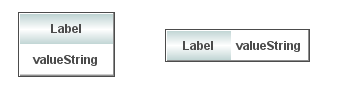
Using Interaction Properties
Commands
To assign a command to your label, right-click in the Property Value field of the command property and select Define Command. Commands can be set up to execute when you click on an object or automatically execute the command when the value of an object reaches a specified threshold. See “Define/Execute Command” for information on how to set up commands.
Drill Down Displays
To specify a drill down display, double click on the drillDownTarget property. Any display (.rtv) file can be targeted as a drill down. Once a drill down target has been set, double-click on the label to activate the drill down. Drill down displays can be activated in the same window that contains the label or open in a separate window. This allows you to build a customizable hierarchy of displays. See “Drill Down Displays” for more information.
Tool Tips
Select the mouseOverFlag to enable tool tips for your label. To display a tool tip, point to the label with your mouse. The tool tip will contain information from your data attachment.
Background Properties
|
Property Name |
Description |
|
bgBorderColor |
Select the Note: This property is only applicable if bgBorderFlag is selected. |
|
bgBorderFlag |
If selected, a border is drawn around the background rectangle. |
|
bgClipTextFlag |
If selected, then the label and/or its valueString (whichever is drawn within the background rectangle) will be clipped by the object’s background rectangle. You might use this option if you have a very long label or valueString and do not want to have the label/valuestring extend past the edges of the rectangle. Note: You must enable bgVisFlag for this option to work. For example, with bgClipTextFlag disabled and bgVisFlag enabled (and labelTextPosX set to Inside Left), your object and long text would look like this: 
With both bgClipTextFlag and bgVisFlag enabled (and labelTextPosX set to Inside Left), the same object and long text would look like this: 
If you want to view the full text/valueString, you can copy the full text/valueString into the Interaction> mouseOverText field to display the full string when hovering over the object. For example: 
Note: By default, this flag is unchecked and is only applicable for obj_rect_il, obj_rect_ilv, and obj_rect_ilvs. |
|
bgColor |
Select the |
|
bgEdgeWidth |
Set the width of the 3D edge on the background rectangle. Note: This property is only available if the bgStyle selected is 3D Rectangle. |
|
bgGradientColor2 |
Select the Note: This property will be ignored if bgGradientMode is set to None. |
|
bgGradientMode |
Display a gradient in the background rectangle. Select from the following options: None - No gradient Diagonal Edge - Gradient is drawn at a 45 degree angle from the top left to the bottom right corner of the object. Diagonal Center - Gradient is drawn at a 45 degree angle from the center to the top left and the bottom right corners of the object. Horizontal Edge - Gradient is drawn horizontally from the top to the bottom of the object. Horizontal Center - Gradient is drawn horizontally from the center to the top and bottom of the object. Vertical Edge - Gradient is drawn vertically from the left to the right of the object. Vertical Center - Gradient is drawn vertically from the center to the left and right of the object. |
|
bgRaisedFlag |
Reverses the direction of the gradient, as well as that of the 3D edge if the bgStyle selected is 3D Rectangle. |
|
bgRoundness |
Set the arc length of the rounded corners. Note: This property is only available if the bgStyle selected is Round Rectangle. Note: The value of bgRoundness cannot exceed half the value of the objWidth or the objHeight. If bgRoundness does exceed that value, then half (of the smaller of the two values) of objWidth or objHeight will be used instead. For example, if objWidth is 100 and objHeight is 50, then the value of bgRoundness cannot exceed 25. If it does, then half the value of objHeight (25) will be used instead. |
|
bgShadowFlag |
Select to display a drop shadow on the background rectangle. |
|
bgStyle |
Choose one of the following three options from the drop down menu: Rectangle - Select to display a background rectangle. 3D Rectangle - Select to display a 3D edge on the background rectangle. If selected, use bgEdgeWidth to set the width of the 3D edge. Round Rectangle - Select to display a background rectangle with rounded edges. If selected, use bgRoundness to set the arc length of the rounded corners. |
|
bgVisFlag |
Controls visibility of background. Note: This property only applies to obj_rect_ilvs. |
Data Properties
|
Property Name |
Description |
|
valueString |
Attach your data. |
Data Format Properties
Note: Not all Data Format Properties apply to all Value String Labels.
|
Property Name |
Description |
|
valueFormat |
Select or enter the numeric format of value displayed in the value text. To enter a format, use syntax from the Java DecimalFormat class. Note: This property only applies to obj_rect_ilvs. |
|
valueTextAlignX |
Set the position of value text on the x-axis. Select from the following options: § Left § Center § Right |
|
valueTextAlignY |
Set the position of value text on the y-axis. Select from the following options: § Inside Top § Center § Inside Bottom |
|
valueTextColor |
Select the |
|
valueTextFont |
Select the font to use for the value text. |
|
valueTextHeight |
Specify (in pixels) the height for the value text. |
|
valueTextPosX |
Set x-axis position of value text. Select from the following options: § Left - Position outside the left side of the background rectangle. § Inside Left - Position inside the left side of the background rectangle. § Center - Position in the center of the background rectangle. § Inside Right - Position inside the right side of the background rectangle. § Right - Position outside the right side of the background rectangle. |
|
valueTextPosY |
Set y-axis position of value text. Select from the following options: § Outside Top - Position well above the background rectangle. § Top - Position just above the background rectangle. § Inside Top - Position inside the top of the background rectangle. § Center - Position in the center of the background rectangle. § Inside Bottom - Position inside the bottom of the background rectangle. § Bottom - Position just below the background rectangle. § Outside Bottom - Position well below the background rectangle. |
|
valueVisFlag |
Control visibility of the value text. |
|
valueWordWrapMode |
Value text will be wrapped to fit the width of the object depending on the mode selected. Default is None. Space - Whenever possible, only add line breaks at whitespaces. If a single word is longer than the object is wide, the line break will be added to the word so that the text fits within the width of the object. Space and Punctuation - Whenever possible, only add line breaks at whitespaces and punctuation characters. Supported punctuation characters are: comma(,), period(.), semi-colon(;), colon (:), hyphen(-), question mark(?), asterisk(*), ampersand(&), greater than(<), less than(>), backslash(\), forward slash(/), pipe(|), plus(+), exclamation point(!), and at(@). If a single word is longer than the object is wide and none of these characters is in the word, the line break will be added to the word so that the text fits within the width of the object. Note: The valueWordWrapMode property is ignored, and text will not be wrapped, if valueTextPosX is set to Left or Right. |
Image Properties
|
Property Name |
Description |
|
image |
Enter the name of an image or click on the Note: This property only applies to obj_rect_ilvs. |
|
imageScaleFlag |
Select to scale your image to the size of the object. Note: This property only applies to obj_rect_ilvs. |
Interaction Properties
|
Property Name |
Description |
|
command |
Assign a command to your vu label. See “Define/Execute Command” for information. |
|
commandCloseWindowOnSuccess |
If selected, the window that initiates a system command will automatically close when the system command is executed successfully. This property only applies to system commands. With data source commands, the window is closed whether or not the command is executed successfully. For multiple commands, this property is applied to each command individually. Therefore if the first command in the multiple command sequence succeeds, the window will close before the rest of the commands are executed. Note: The commandCloseWindowOnSuccess property is not supported in the Display Server. |
|
commandConfirm |
If selected, the command confirmation dialog is enabled. Use the commandConfirmText property to write your own text for the confirmation dialog, otherwise text from the command property will be used. For multiple commands, if you Confirm the execution then all individual commands will be executed in sequence with no further confirmation. If the you Cancel the execution, none of the commands in the sequence will executed. |
|
commandConfirmText |
Enter command confirmation text directly in the Property Value field or select the |
|
drillDownTarget |
Name of display (.rtv) file targeted as a drill down. See “Drill Down Displays” for information. |
|
mouseOverText |
Enter a tool tip for this label. To display the tool tip, move your mouse over the object. To enter a multi-line tool tip, use \n to delimit the lines (e.g. my\nlabel). Note: The object must be visible (i.e. visFlag property is selected), in order for the tool tip to be visible. |
Label Properties
Note: Not all Label Properties apply to all Value String Labels.
|
Property Name |
Description |
|
label |
Edit label text directly in the Property Value field or select the |
|
labelBgColor |
Select the |
|
labelBgGradientColor2 |
Select the Note: This property will be ignored if bgGradientMode is set to None. |
|
labelBgGradientMode |
Display a gradient in the background rectangle. Select from the following options: None - No gradient Diagonal Edge - Gradient is drawn at a 45 degree angle from the top left to the bottom right corner of the object. Diagonal Center - Gradient is drawn at a 45 degree angle from the center to the top left and the bottom right corners of the object. Horizontal Edge - Gradient is drawn horizontally from the top to the bottom of the object. Horizontal Center - Gradient is drawn horizontally from the center to the top and bottom of the object. Vertical Edge - Gradient is drawn vertically from the left to the right of the object. Vertical Center - Gradient is drawn vertically from the center to the left and right of the object. |
|
labelMinTabWidth |
Specify minimum width of the label tab. Note: This property only applies if labelTextPosY is set to Tab Top. |
|
labelTextAlignX |
Set the position of label text on the x-axis. Select from the following options: § Left § Center § Right |
|
labelTextAlignY |
Set the position of label text on the y-axis. Select from the following options: § Inside Top § Center § Inside Bottom |
|
labelTextColor |
Select the |
|
labelTextFont |
Select the font style of the label text from drop down menu. |
|
labelTextHeight |
Set the height (in pixels) of the label text. |
|
labelTextPosX |
Set x-axis position of label text. Select from the following options: § Left - Position outside the left side of the background rectangle. § Inside Left - Position inside the left side of the background rectangle. § Center - Position in the center of the background rectangle. § Inside Right - Position inside the right side of the background rectangle. § Right - Position outside the right side of the background rectangle. |
|
labelTextPosY |
Set y-axis position of label text. Select from the following options: § Outside Top - Position well above the background rectangle. § Top - Position just above the background rectangle. § Tab Top - Position tab just above the background rectangle. Note: Height and width of the label tab is dependent on the height and width of the text. Use the labelMinTabWidth property to specify a minimum tab width. § Title Top - Position along the top line of the background rectangle. § Inside Top - Position inside the top of the background rectangle. § Center - Position in the center of the background rectangle. § Inside Bottom - Position inside the bottom of the background rectangle. § Bottom - Position just below the background rectangle. § Outside Bottom - Position well below the background rectangle. |
|
labelVisFlag |
Control visibility of the label. |
|
labelWidth |
Set the width (in pixels) of the background area of the label text. Note: This property only applies to obj_label11s. |
|
labelWordWrapMode |
Text will be wrapped to fit the width of the object depending on the mode selected. Default is None. Space - Whenever possible, only add line breaks at whitespaces. If a single word is longer than the object is wide, the line break will be added to the word so that the text fits within the width of the object. Space and Punctuation - Whenever possible, only add line breaks at whitespaces and punctuation characters. Supported punctuation characters are: comma(,), period(.), semi-colon(;), colon (:), hyphen(-), question mark(?), asterisk(*), ampersand(&), greater than(<), less than(>), backslash(\), forward slash(/), pipe(|), plus(+), exclamation point(!), and at(@). If a single word is longer than the object is wide and none of these characters is in the word, the line break will be added to the word so that the text fits within the width of the object. Note: The labelWordWrapMode property is ignored, and text will not be wrapped, if: § labelTextPosX is set to Outside Right or Outside Left § labelTextPosY is set to Tab or Title. |
Object Properties
|
Property Name |
Description |
|
anchor |
Specify where to anchor an object in the display. Note: If an object has the dock property set, the anchor property will be ignored. The anchor property is only applied when the dimensions of the display are modified, either by editing “Background Properties” or resizing the window in Layout mode |
|
|
Select None, or one or more the following options: None - Object not anchored. This is the default. Top - Anchor top of object at top of display. Left - Anchor left side of object at left of display. Bottom - Anchor bottom of object at bottom of display. Right - Anchor right side of object at right of display. When a display is resized, the number of pixels between an anchored object and the specified location remain constant. If an object is anchored on opposite sides (i.e. Top and Bottom or Left and Right), the object will be stretched to fill the available space. |
|
dock |
Specify the docking location of an object in the display. Select from the following options: None - Object is not docked. This is the default. Top - Dock object at top of display. Left - Dock object at left of display. Bottom - Dock object at bottom of display. Right - Dock object at right of display. Fill - Dock object in available space remaining in the display after all docked objects are positioned. |
|
|
If the dimensions of the display are modified, either by editing “Background Properties” or resizing the window in Layout mode, the properties (objX, objY, objWidth, and objHeight) of docked objects will automatically adapt to match the new size of the display. When multiple objects are docked to the same side of the display, the first object is docked against the side of the display, the next object is docked against the edge of the first object, and so on. When objects are docked to multiple sides of the display, the order in which objects were added to the display controls docking position. For example, let's say the first object added to the display is docked at the Top and the second object is docked at the Left. Consequently, the first object will fill the entire width of the display and the second object will fill the left side of the display from the bottom of the first object to the bottom of the display. Objects in a display have the dock property set to Fill, are laid out across a grid in the available space remaining after all docked objects are positioned. By default, the grid has one row and as many columns as there are objects in the display. You can modify the grid in the Background Properties dialog. |
|
|
Once an object is docked, there are some limitations on how that object can be modified: § Docked objects cannot be dragged or repositioned using objX and objY properties. § Docked objects cannot be resized using the objWidth or objHeight properties. To resize you must drag on the resize handle. § Docked objects can only be resized toward the center of the display (e.g. If an object is docked at the Top, only its height can be increased by dragging down toward the center of the display). § Docked objects set to Fill cannot be resized at all. § Docked objects cannot be moved using Align. Non-docked objects can be aligned against a docked object, but a docked object will not move to align against another object. § Docked objects are ignored by Distribute. |
|
objHeight |
Sets the height (in pixels) of the object. |
|
objName |
Name given to facilitate object management via the Object List dialog. Select Tools>Object List. |
|
objWidth |
Sets the width (in pixels) of the object. |
|
objX |
Set the x position of the object. |
|
objY |
Set the y position of the object. |
|
styleClass |
Enter the style class name for this object as defined in your style sheet. If not specified, the object class name is used. Note: The value entered must not contain spaces and cannot start with rtv-. |
|
transparencyPercent |
Set transparency of the object. Enter a value between 0 and 100. A value of 0, the default, sets the object to be completely opaque. A value of 100 will render the object completely transparent. |
|
visFlag |
Control visibility of the object. |
Using Interaction Properties
Commands
To assign a command to your label, right-click in the Property Value field of the command property and select Define Command. Commands can be set up to execute when you click on an object or automatically execute the command when the value of an object reaches a specified threshold. See “Define/Execute Command” for information on how to set up commands.
Drill Down Displays
To specify a drill down display, double click on the drillDownTarget property. Any display (.rtv) file can be targeted as a drill down. Once a drill down target has been set, double-click on the label to activate the drill down. Drill down displays can be activated in the same window that contains the label or open in a separate window. This allows you to build a customizable hierarchy of displays. See “Drill Down Displays” for more information.
Interaction Properties
|
Property Name |
Description |
|
command |
Assign a command to your vu label. See “Define/Execute Command” for information. |
|
commandCloseWindowOnSuccess |
If selected, the window that initiates a system command will automatically close when the system command is executed successfully. This property only applies to system commands. With data source commands, the window is closed whether or not the command is executed successfully. For multiple commands, this property is applied to each command individually. Therefore if the first command in the multiple command sequence succeeds, the window will close before the rest of the commands are executed. Note: The commandCloseWindowOnSuccess property is not supported in the Display Server. |
|
commandConfirm |
If selected, the command confirmation dialog is enabled. Use the commandConfirmText property to write your own text for the confirmation dialog, otherwise text from the command property will be used. For multiple commands, if you Confirm the execution then all individual commands will be executed in sequence with no further confirmation. If the you Cancel the execution, none of the commands in the sequence will executed. |
|
commandConfirmText |
Enter command confirmation text directly in the Property Value field or select the |
|
drillDownTarget |
Name of display (.rtv) file targeted as a drill down. See “Drill Down Displays”for information. |
Label Properties
|
Property Name |
Description |
|
label |
Edit label text directly in the Property Value field or select the |
|
labelTextAlignX |
Set the position of label text on the x-axis. Select from the following options: § Left § Center § Right |
|
labelTextAlignY |
Set the position of label text on the y-axis. Select from the following options: § Inside Top § Center § Inside Bottom |
|
labelTextColor |
Select the |
|
labelTextFont |
Select the font style of the label text from drop down menu. |
|
labelTextHeight |
Set the height (in pixels) of the label text. |
|
rotationAngle |
Set the angle at which the label text will be rotated. |
Object Properties
|
Property Name |
Description |
|
anchor |
Specify where to anchor an object in the display. Note: If an object has the dock property set, the anchor property will be ignored. The anchor property is only applied when the dimensions of the display are modified, either by editing “Background Properties” or resizing the window in Layout mode Select None, or one or more the following options: None - Object not anchored. This is the default. Top - Anchor top of object at top of display. Left - Anchor left side of object at left of display. Bottom - Anchor bottom of object at bottom of display. Right - Anchor right side of object at right of display. When a display is resized, the number of pixels between an anchored object and the specified location remain constant. If an object is anchored on opposite sides (i.e. Top and Bottom or Left and Right), the object will be stretched to fill the available space. |
|
objName |
Name given to facilitate object management via the Object List dialog. Select Tools>Object List. |
|
objX |
Set the x position of the object. |
|
objY |
Set the y position of the object. |
|
styleClass |
Enter the style class name for this object as defined in your style sheet. If not specified, the object class name is used. See “Style Sheets” for more information. Note: The value entered must not contain spaces and cannot start with rtv-. |
|
transparencyPercent |
Set transparency of the object. Enter a value between 0 and 100. A value of 0, the default, sets the object to be completely opaque. A value of 100 will render the object completely transparent. |
|
visFlag |
Control visibility of the object. |
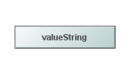
Using Interaction Properties
Commands
To assign a command to your label, right-click in the Property Value field of the command property and select Define Command. Commands can be set up to execute when you click on an object or automatically execute the command when the value of an object reaches a specified threshold. See “Define/Execute Command” for information on how to set up commands.
Drill Down Displays
To specify a drill down display, double click on the drillDownTarget property. Any display (.rtv) file can be targeted as a drill down. Once a drill down target has been set, double-click on the label to activate the drill down. Drill down displays can be activated in the same window that contains the label or open in a separate window. This allows you to build a customizable hierarchy of displays. See “Drill Down Displays” for more information.
Tool Tips
Select the mouseOverFlag to enable tool tips for your label. To display a tool tip, point to the label with your mouse. The tool tip will contain information from your data attachment.
Background Properties
|
Property Name |
Description |
|
bgBorderColor |
Select the Note: This property is only applicable if bgBorderFlag is selected. |
|
bgBorderFlag |
If selected, a border is drawn around the background rectangle. |
|
bgClipTextFlag |
If selected, then the label and/or its valueString (whichever is drawn within the background rectangle) will be clipped by the object’s background rectangle. You might use this option if you have a very long label or valueString and do not want to have the label/valuestring extend past the edges of the rectangle. Note: You must enable bgVisFlag for this option to work. For example, with bgClipTextFlag disabled and bgVisFlag enabled (and labelTextPosX set to Inside Left), your object and long text would look like this: 
With both bgClipTextFlag and bgVisFlag enabled (and labelTextPosX set to Inside Left), the same object and long text would look like this: 
If you want to view the full text/valueString, you can copy the full text/valueString into the Interaction> mouseOverText field to display the full string when hovering over the object. For example: 
Note: This property is only applicable for obj_rect_ilvs. |
|
bgColor |
Select the |
|
bgEdgeWidth |
Set the width of the 3D edge on the background rectangle. Note: This property is only available if the bgStyle selected is 3D Rectangle. |
|
bgGradientColor2 |
Select the Note: This property will be ignored if bgGradientMode is set to None. |
|
bgGradientMode |
Display a gradient in the background rectangle. Select from the following options: None - No gradient Diagonal Edge - Gradient is drawn at a 45 degree angle from the top left to the bottom right corner of the object. Diagonal Center - Gradient is drawn at a 45 degree angle from the center to the top left and the bottom right corners of the object. Horizontal Edge - Gradient is drawn horizontally from the top to the bottom of the object. Horizontal Center - Gradient is drawn horizontally from the center to the top and bottom of the object. Vertical Edge - Gradient is drawn vertically from the left to the right of the object. Vertical Center - Gradient is drawn vertically from the center to the left and right of the object. |
|
bgRaisedFlag |
Reverses the direction of the gradient, as well as that of the 3D edge if the bgStyle selected is 3D Rectangle. |
|
bgRoundness |
Set the arc length of the rounded corners. Note: This property is only available if the bgStyle selected is Round Rectangle. Note: The value of bgRoundness cannot exceed half the value of the objWidth or the objHeight. If bgRoundness does exceed that value, then half (of the smaller of the two values) of objWidth or objHeight will be used instead. For example, if objWidth is 100 and objHeight is 50, then the value of bgRoundness cannot exceed 25. If it does, then half the value of objHeight (25) will be used instead. |
|
bgShadowFlag |
Select to display a drop shadow on the background rectangle. |
|
bgStyle |
Choose one of the following three options from the drop down menu: Rectangle - Select to display a background rectangle. 3D Rectangle - Select to display a 3D edge on the background rectangle. If selected, use bgEdgeWidth to set the width of the 3D edge. Round Rectangle - Select to display a background rectangle with rounded edges. If selected, use bgRoundness to set the arc length of the rounded corners. |
|
bgVisFlag |
Controls visibility of background. |
Image Properties
|
Property Name |
Description |
|
image |
Enter the name of an image or click on the |
|
imageScaleFlag |
Select to scale your image to the size of the object. |
Interaction Properties
|
Property Name |
Description |
|
command |
Assign a command to your vu label. See “Define/Execute Command” for information. |
|
commandCloseWindowOnSuccess |
If selected, the window that initiates a system command will automatically close when the system command is executed successfully. This property only applies to system commands. With data source commands, the window is closed whether or not the command is executed successfully. For multiple commands, this property is applied to each command individually. Therefore if the first command in the multiple command sequence succeeds, the window will close before the rest of the commands are executed. Note: The commandCloseWindowOnSuccess property is not supported in the Display Server. |
|
commandConfirm |
If selected, the command confirmation dialog is enabled. Use the commandConfirmText property to write your own text for the confirmation dialog, otherwise text from the command property will be used. For multiple commands, if you Confirm the execution then all individual commands will be executed in sequence with no further confirmation. If the you Cancel the execution, none of the commands in the sequence will executed. |
|
commandConfirmText |
Enter command confirmation text directly in the Property Value field or select the |
|
drillDownTarget |
Name of display (.rtv) file targeted as a drill down. See “Drill Down Displays” for information. |
|
mouseOverText |
Enter a tool tip for this label. To display the tool tip, move your mouse over the object. To enter a multi-line tool tip, use \n to delimit the lines (e.g. my\nlabel). Note: The object must be visible (i.e. visFlag property is selected), in order for the tool tip to be visible. |
Label Properties
|
Property Name |
Description |
|
label |
Edit label text directly in the Property Value field or select the |
|
labelMinTabWidth |
Specify minimum width of the label tab. Note: This property only applies if labelTextPosY is set to Tab Top. |
|
labelTextColor |
Select the |
|
labelTextFont |
Select the font style of the label text from drop down menu. |
|
labelTextHeight |
Set the height (in pixels) of the label text. |
|
labelTextPosX |
Set x-axis position of label text. Select from the following options: § Left - Position outside the left side of the background rectangle. § Inside Left - Position inside the left side of the background rectangle. § Center - Position in the center of the background rectangle. § Inside Right - Position inside the right side of the background rectangle. § Right - Position outside the right side of the background rectangle. |
|
labelTextPosY |
Set y-axis position of label text. Select from the following options: § Outside Top - Position well above the background rectangle. § Top - Position just above the background rectangle. § Tab Top - Position tab just above the background rectangle. Note: Height and width of the label tab is dependent on the height and width of the text. Use the labelMinTabWidth property to specify a minimum tab width. § Title Top - Position along the top line of the background rectangle. § Inside Top - Position inside the top of the background rectangle. § Center - Position in the center of the background rectangle. § Inside Bottom - Position inside the bottom of the background rectangle. § Bottom - Position just below the background rectangle. § Outside Bottom - Position well below the background rectangle. |
|
labelVisFlag |
Control visibility of the label. |
|
labelWordWrapMode |
Text will be wrapped to fit the width of the object depending on the mode selected. Default is None. Space - Whenever possible, only add line breaks at whitespaces. If a single word is longer than the object is wide, the line break will be added to the word so that the text fits within the width of the object. Space and Punctuation - Whenever possible, only add line breaks at whitespaces and punctuation characters. Supported punctuation characters are: comma(,), period(.), semi-colon(;), colon (:), hyphen(-), question mark(?), asterisk(*), ampersand(&), greater than(<), less than(>), backslash(\), forward slash(/), pipe(|), plus(+), exclamation point(!), and at(@). If a single word is longer than the object is wide and none of these characters is in the word, the line break will be added to the word so that the text fits within the width of the object. Note: The labelWordWrapMode property is ignored, and text will not be wrapped, if: § labelTextPosX is set to Outside Right or Outside Left § labelTextPosY is set to Tab Top or Title Top. |
Object Properties
|
Property Name |
Description |
|
anchor |
Specify where to anchor an object in the display. Note: If an object has the dock property set, the anchor property will be ignored. The anchor property is only applied when the dimensions of the display are modified, either by editing “Background Properties”or resizing the window in Layout mode Select None, or one or more the following options: None - Object not anchored. This is the default. Top - Anchor top of object at top of display. Left - Anchor left side of object at left of display. Bottom - Anchor bottom of object at bottom of display. Right - Anchor right side of object at right of display. When a display is resized, the number of pixels between an anchored object and the specified location remain constant. If an object is anchored on opposite sides (i.e. Top and Bottom or Left and Right), the object will be stretched to fill the available space. |
|
dock |
Specify the docking location of an object in the display. Select from the following options: None - Object is not docked. This is the default. Top - Dock object at top of display. Left - Dock object at left of display. Bottom - Dock object at bottom of display. Right - Dock object at right of display. Fill - Dock object in available space remaining in the display after all docked objects are positioned. If the dimensions of the display are modified, either by editing “Background Properties” or resizing the window in Layout mode, the properties (objX, objY, objWidth, and objHeight) of docked objects will automatically adapt to match the new size of the display. When multiple objects are docked to the same side of the display, the first object is docked against the side of the display, the next object is docked against the edge of the first object, and so on. When objects are docked to multiple sides of the display, the order in which objects were added to the display controls docking position. For example, let's say the first object added to the display is docked at the Top and the second object is docked at the Left. Consequently, the first object will fill the entire width of the display and the second object will fill the left side of the display from the bottom of the first object to the bottom of the display. Objects in a display have the dock property set to Fill, are laid out across a grid in the available space remaining after all docked objects are positioned. By default, the grid has one row and as many columns as there are objects in the display. You can modify the grid in the Background Properties dialog. |
|
|
Once an object is docked, there are some limitations on how that object can be modified: § Docked objects cannot be dragged or repositioned using objX and objY properties. § Docked objects cannot be resized using the objWidth or objHeight properties. To resize you must drag on the resize handle. § Docked objects can only be resized toward the center of the display (e.g. If an object is docked at the Top, only its height can be increased by dragging down toward the center of the display). § Docked objects set to Fill cannot be resized at all. § Docked objects cannot be moved using Align. Non-docked objects can be aligned against a docked object, but a docked object will not move to align against another object. § Docked objects are ignored by Distribute. |
|
objHeight |
Sets the height (in pixels) of the object. |
|
objName |
Name given to facilitate object management via the Object List dialog. Select Tools>Object List. |
|
objWidth |
Sets the width (in pixels) of the object. |
|
objX |
Set the x position of the object. |
|
objY |
Set the y position of the object. |
|
styleClass |
Enter the style class name for this object as defined in your style sheet. If not specified, the object class name is used. Note: The value entered must not contain spaces and cannot start with rtv-. |
|
transparencyPercent |
Set transparency of the object. Enter a value between 0 and 100. A value of 0, the default, sets the object to be completely opaque. A value of 100 will render the object completely transparent. |
|
visFlag |
Control visibility of the object. |
The Object Palette features three links, each offers a different way to display the connection between two linked objects. These three links share the same class name (link_basic) and their properties are identical. Once two objects are linked in a display, you may switch between these three link types by modifying the linkPathType property.
|
Direct Draws a straight line between the objects it connects. |
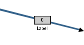
|
|
Direct Offset Attaches to the object at a right angle, but draws a diagonal line for the remainder of the link. |
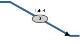
|
|
Orthogonal Draws a line at right angles between the objects it connects. |
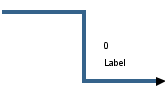
|
Using Interaction Properties
Commands
To assign a command to your link, right-click in the Property Value field of the command property and select Define Command. Commands can be set up to execute when you click on an object or automatically execute the command when the value of an object reaches a specified threshold. See “Define/Execute Command” for information on how to set up commands.
Drill Down Displays
To specify a drill down display, double click on the drillDownTarget property. Any display (.rtv) file can be targeted as a drill down. Once a drill down target has been set, double-click on the link to activate the drill down. Drill down displays can be activated in the same window that contains the link or open in a separate window. This allows you to build a customizable hierarchy of displays. See “Drill Down Displays” for more information.
Tool Tips
Select the mouseOverFlag to enable tool tips for your link. To display a tool tip, point to the link with your mouse. The tool tip will contain information from your data attachment.
Note: The property iconVisFlag must be selected in order to display tool tips.
Alert Properties
|
Property Name |
Description |
|
|
valueAlertMode |
Discrete Alerts Color of the link will change when the value property equals the specified value*Alert. |
|
|
|
|
|
|
|
valueHighAlert -- Specify the value that the input value must be equal to for the high alert to execute. valueHighAlertColor -- Select the valueLowAlert -- Specify the value that the input value must be equal to for the low alert to execute. valueLowAlertColor -- Select the valueMediumAlert -- Specify the value that the input value must be equal to for the medium alert to execute. valueMediumAlertColor -- Select the valueNoAlert -- Specify the value that the input value must be equal to for the no alert to execute. valueNoAlertColor -- Select the |
|
|
Range Alerts Color of the link will change when the value property is greater than the valueHighAlarm or valueHighWarning or less than the valueLowAlarm or valueLowWarning. |
||
|
|
valueHighAlarm -- Specify the value that the input value must exceed to activate the high alarm. valueHighAlarmColor -- Select the valueHighWarning -- Specify the value that the input value must exceed to activate the high warning. valueHighWarningColor -- Select the valueLowAlarm -- Specify the value that the input value must go below to activate the low alarm. valueLowAlarmColor -- Select the valueLowWarning Specify the value that the input value must go below to activate the low warning. valueLowWarningColor -- Select the |
|
|
|
No Alerts Disable all alert and alarm properties. |
|
Arrow Properties
|
Property Name |
Description |
|
arrow1Color |
Select the |
|
arrow1VisFlag |
Controls the visibility of the source arrow. |
|
arrow2Color |
Select the |
|
arrow2VisFlag |
Controls the visibility of the target arrow. |
Data Properties
|
Property Name |
Description |
|
value |
Data value used to display the value text and to evaluate any alert definitions. |
|
valueDivisor |
If specified, this divisor is applied to the value. |
Data Format Properties
|
Property Name |
Description |
|
valueFormat |
Select or enter the numeric format of values displayed on the link and in tool tips. To enter a format, use syntax from the Java DecimalFormat class. Note: To enable tool tips, select the mouseOverFlag. |
|
valueTextColor |
Select the |
|
valueTextFont |
Select the font to use for the value text. |
|
valueTextHeight |
Specify the height for the value text. |
|
valueTextPosX |
Set x-axis position of value text. Select from the following options: § Left - Position outside the left side of the background rectangle. § Inside Left - Position inside the left side of the background rectangle. § Center - Position in the center of the background rectangle. § Inside Right - Position inside the right side of the background rectangle. § Right - Position outside the right side of the background rectangle. |
|
valueTextPosY |
Set the y-axis position of value text . Select from the following options: § Outside Top - Position well above the background rectangle. § Top - Position just above the background rectangle. § Inside Top - Position inside the top of the background rectangle. § Center - Position in the center of the background rectangle. § Inside Bottom - Position inside the bottom of the background rectangle. § Bottom - Position just below the background rectangle. § Outside Bottom - Position well below the background rectangle. |
|
valueVisFlag |
Control visibility of the value text. Note: This property is only applicable if iconVisFlag is selected. |
Icon Properties
|
Property Name |
Description |
|
iconBgBorderColor |
Select the |
|
iconBgBorderFlag |
If selected, a border is drawn around the background rectangle. |
|
iconBgColor |
Select the |
|
iconBgEdgeWidth |
Set the width of the 3D edge on the background rectangle. This property is only available if the iconBgStyle selected is 3D Rectangle. |
|
iconBgGradientColor2 |
Select the Note: The iconBgColor property sets the first color in the gradient. |
|
iconBgGradientMode |
Display a gradient in the background rectangle. Select from the following options: None -- No gradient Diagonal Edge -- Gradient is drawn at a 45 degree angle from the top left to the bottom right corner of the object. Diagonal Center -- Gradient is drawn at a 45 degree angle from the center to the top left and the bottom right corners of the object. Horizontal Edge -- Gradient is drawn horizontally from the top to the bottom of the object. Horizontal Center -- Gradient is drawn horizontally from the center to the top and bottom of the object. Vertical Edge -- Gradient is drawn vertically from the left to the right of the object. Vertical Center -- Gradient is drawn vertically from the center to the left and right of the object. |
|
iconBgRaisedFlag |
Reverses the direction of the gradient, as well as that of the 3D edge if the iconBgStyle selected is 3D Rectangle. |
|
iconBgRoundness |
Set the arc length of the rounded corners. This property is only available if the iconBgStyle selected is Round Rectangle. Note: The value of iconBgRoundness cannot exceed half the value of the iconWidth or the iconHeight. If iconBgRoundness does exceed that value, then half (of the smaller of the two values) of iconWidth or iconHeight will be used instead. For example if iconWidth is 100 and iconHeight is 50, then the value of iconBgRoundness cannot exceed 25. If it does, then half the value of iconHeight (25) will be used instead. |
|
iconBgShadowFlag |
Select to display a drop shadow on the background rectangle. |
|
iconBgStyle |
Select from the following options: Rectangle -- Select to display a background rectangle. 3D Rectangle -- Select to display a 3D edge on the background rectangle. If selected, use iconBgEdgeWidth to set the width of the 3D edge. Round Rectangle -- Select to display a background rectangle with rounded edges. If selected, use iconBgRoundness to set the arc length of the rounded corners. Circle -- Select to display a background circle. |
|
iconBgVisFlag |
Select to display a background rectangle. Note: This property is only applicable if iconVisFlag is selected. |
|
iconConstantSizeFlag |
If selected, when the display is zoomed the icon size will remain constant. |
|
iconHeight |
Set height of the icon in pixels. |
|
iconVisFlag |
Control the visibility of an icon displaying the value of the link. |
|
iconWidth |
Set width of the object in pixels. |
Interaction Properties
|
Property Name |
Description |
|
command |
Assign a command to your link. See “Define/Execute Command” for information. |
|
commandCloseWindowOnSuccess |
If selected, the window that initiates a system command will automatically close when the system command is executed successfully. This property only applies to system commands. With data source commands, the window is closed whether or not the command is executed successfully. For multiple commands, this property is applied to each command individually. Therefore if the first command in the multiple command sequence succeeds, the window will close before the rest of the commands are executed. Note: The commandCloseWindowOnSuccess property is not supported in the Display Server. |
|
commandConfirm |
If selected, the command confirmation dialog is enabled. Use the commandConfirmText property to write your own text for the confirmation dialog, otherwise text from the command property will be used. For multiple commands, if you Confirm the execution then all individual commands will be executed in sequence with no further confirmation. If the you Cancel the execution, none of the commands in the sequence will executed. |
|
commandConfirmText |
Enter command confirmation text directly in the Property Value field or select the |
|
connectEdgeFlag |
If the specified linkPathType is Direct, then select the connectEdgeFlag to attach the link to the center of the side of the target object that is closest to the source object (instead of connecting to the center of the target object). Note: Orthogonal and Direct Offset links always attach to the center of the side closest to the source object. |
|
drillDownTarget |
Name of display (.rtv) file targeted as a drill down. See “Drill Down Displays” for information. |
|
mouseOverFlag |
Enter a tool tip for this link. To display the tool tip, move your mouse over the object. To enter a multi-line tool tip, use \n to delimit the lines (e.g. my\nlink). Note: The property iconVisFlag must be selected in order to display tool tips. |
Label Properties
|
Property Name |
Description |
|
label |
Edit label text directly in the Property Value field or select the |
|
labelMinTabWidth |
Specify minimum width of the label tab. Note: This property is only applies if labelTextPosY is set to TabTop. |
|
labelTextColor |
Select the |
|
labelTextFont |
Select the font to use for the label text. |
|
labelTextHeight |
Specify the height for the label text. |
|
labelTextPosX |
Set x-axis position of label text. Select from the following options: § Left - Position outside the left side of the background rectangle. § Inside Left - Position inside the left side of the background rectangle. § Center - Position in the center of the background rectangle. § Inside Right - Position inside the right side of the background rectangle. § Right - Position outside the right side of the background rectangle. |
|
labelTextPosY |
Set y-axis position of label text. Select from the following options: § Outside Top - Position well above the background rectangle. § Top - Position just above the background rectangle. § Title Top - Position along the top line of the background rectangle. § Tab Top - Position tab just above the background rectangle. Note: Height and width of the label tab is dependent on the height and width of the text. Use the labelMinTabWidth property to specify a minimum tab width. § Inside Top - Position inside the top of the background rectangle. § Center - Position in the center of the background rectangle. § Inside Bottom - Position inside the bottom of the background rectangle. § Bottom - Position just below the background rectangle. § Outside Bottom - Position well below the background rectangle. |
|
labelVisFlag |
Control visibility of the label. Note: This property is only applicable if iconVisFlag is selected. |
Link Line Properties
|
Property Name |
Description |
|
linkColor |
Select the |
|
linkPathType |
Select from the following options: § Direct - Draws a straight line between the objects it connects. § Direct Offset - Attaches to objects at a right angle, but draws a diagonal line for the remainder of the link. § Orthogonal - Draws a line at right angles between the objects it connects. |
|
linkSize |
Set (in pixels) the thickness of the link line. |
Object Properties
|
Property Name |
Description |
|
objName |
Name given to facilitate object management via the Object List dialog. Select Tools>Object List. |
|
styleClass |
Enter the style class name for this object as defined in your style sheet. If not specified, the object class name is used. See “Style Sheets” for more information. The value entered must not contain spaces and cannot start with rtv-. |
|
transparencyPercent |
Set transparency of the link. Enter a value between 0 and 100. A value of 0, the default, sets the link to be completely opaque. A value of 100 will render the link completely transparent. |
|
visFlag |
Control visibility of the link line. |
The Object Palette features several types of scales: bar, indicator, vu, pie, and bullet.
|
Bar scales (class name: obj_barscale) display the value using the fill percent of the bar. |

|
|
Indicator scales (class name: obj_indscale) display the value using the position of the indicator against an axis. |
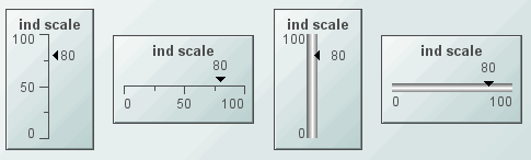
|
|
Vu scales (class name: obj_vuscale) display the value using the fill percent of the bar. The bar is drawn striped instead of solid. |

|
|
Pie scales (class name: obj_piescale) display the value using the fill percent of the pie. |

|
|
Bullet scales (class name: obj_bulletscale) display the value using the fill percent of the bar. (The bar look and functionality are based on Steven Few's bullet graph). |

|
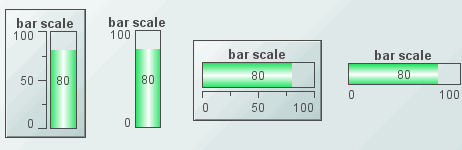
Alert Properties
|
Property Name |
Description |
|
thresholdColorBarFlag |
If selected, the portion of the bar that exceeds a threshold will be painted in the threshold color. This property is only used if either the valueHighAlarmEnabledFlag or the valueHighWarningEnabledFlag is selected. |
|
thresholdLineThickness |
Select Thin, Medium, or Thick to set the thickness of the threshold lines. This property is only used if the thresholdLineVisFlag is selected. |
|
thresholdLineVisFlag |
Select to draw a line across the bar at the level of each enabled threshold. This line will be the same color as the threshold color. This property is only used if the valueHighAlarmEnabledFlag or valueHighWarningEnabledFlag is selected. |
|
valueHighAlarmEnabledFlag |
Select to enable the high alarm range and the following related properties: valueHighAlarm - Specify the minimum value for the high alarm range. This value must be equal to or greater than valueMin and equal to or less than valueMax. Note: If the valueHighWarningEnabledFlag is selected, this value must also be greater than valueHighWarning. If the valueHighAlarm is greater than valueMax or less than valueMin, the valueHighAlarm will be disabled and the scale will draw without that threshold. An error will print to the console. valueHighAlarmColor - Specify the color for the high alarm range. |
|
valueHighWarningEnabledFlag |
Select to enable the high warning range and the following related properties: valueHighWarning - Specify the minimum value for the high warning range. This value must be equal to or greater than valueMin and equal to or less than valueMax. Note: If the valueHighAlarmEnabledFlag is selected, this value must also be less than valueHighAlarm. If the valueHighWarning is greater than valueMax or less than valueMin, the valueHighWarning will be disabled and the scale will draw without that threshold. An error will print to the console. valueHighWarningColor - Specify the color for the high warning range. |
Axis Properties
|
Property Name |
Description |
|
axisColor |
Select the |
|
axisDirection |
Select the direction of the axis: § Bottom to Top - Vertical axis with valueMin at the bottom and valueMax at the top. § Left to Right - Horizontal axis with valueMin at the left and valueMax at the right. § Top to Bottom - Vertical axis with valueMax at the bottom and valueMin at the top. § Right to Left - Horizontal axis with valueMin at the right and valueMax at the left |
|
axisMinLabelWidth |
Specify the minimum width (in pixels) for the axis labels. |
|
axisFormat |
Select or enter the numeric format of values displayed on the axis. Note: To enter a format, use syntax from the Java DecimalFormat class. |
|
axisLineThickness |
Select Thin, Medium, or Thick to specify the thickness of the axis line and tick marks. Note: This property only applies if the specified axisStyle is any of the Classic styles or Ticks and Labels. |
|
axisMajorDivisions |
Specify the number of major divisions on the axis. |
|
axisMinorDivisions |
Specify the number of minor divisions on the axis. |
|
axisOnTopOrRightFlag |
If selected, a horizontal axis will be positioned above the scale or a vertical axis will be positioned to the right of the scale. |
|
axisStyle |
Select the axis style from the drop down menu: § Classic with Labels - Classic style axis with an axis line, tick marks and labels at the major divisions. § Classic without Labels - Classic style axis with an axis line and tick marks but without labels. § Classic with End Labels - Classic style axis with an axis line and tick mark. Maximum and minimum value labels will be positioned at the ends of the scale. § Ticks and Labels - Axis with only tick marks and labels. § Bar with Labels - Axis with labels at the major divisions. § Bar without Labels - Bar style axis without labels. § Bar with End Labels - Bar style axis with maximum and minimum value labels at the ends of the scale. § Labels Only - Show labels at the major divisions, but show no axis lines or tick marks. § End Labels Only - Show minimum and maximum value labels at the ends of the scale. |
|
axisTextColor |
Select the |
|
axisTextFont |
Select a font to use the for the axis labels. |
|
axisTextHeight |
Specify a size for the axis labels. |
|
axisVisFlag |
Control visibility of the axis. |
|
centerMinMaxAxisLabelsFlag |
If selected, minimum and maximum value labels are centered on the axis tick marks. If not selected, these axis labels will be justified so they don't extend past the end of the axis. Note: This property only applies if the specified axisStyle displays labels next to tick marks. |
Background Properties
|
Property Name |
Description |
|
bgBorderColor |
Select the |
|
bgBorderFlag |
If selected, a border is drawn around the background rectangle. |
|
bgColor |
Select the |
|
bgEdgeWidth |
Set the width of the 3D edge on the background rectangle. This property is only available if the bgStyle selected is 3D Rectangle. |
|
bgGradientColor2 |
Select the Note: This property will be ignored if bgGradientMode is set to None. |
|
bgGradientMode |
Display a gradient in the background rectangle. Select from the following options: None - No gradient Diagonal Edge - Gradient is drawn at a 45 degree angle from the top left to the bottom right corner of the object. Diagonal Center - Gradient is drawn at a 45 degree angle from the center to the top left and the bottom right corners of the object. Horizontal Edge - Gradient is drawn horizontally from the top to the bottom of the object. Horizontal Center - Gradient is drawn horizontally from the center to the top and bottom of the object. Vertical Edge - Gradient is drawn vertically from the left to the right of the object. Vertical Center - Gradient is drawn vertically from the center to the left and right of the object. |
|
bgRaisedFlag |
Reverses the direction of the gradient, as well as that of the 3D edge if the bgStyle selected is 3D Rectangle. |
|
bgRoundness |
Set the arc length of the rounded corners. This property is only available if the bgStyle selected is Round Rectangle. Note: The value of bgRoundness cannot exceed half the value of the objWidth or the objHeight. If bgRoundness does exceed that value, then half (of the smaller of the two values) of objWidth or objHeight will be used instead. For example, if objWidth is 100 and objHeight is 50, then the value of bgRoundness cannot exceed 25. If it does, then half the value of objHeight (25) will be used instead. |
|
bgShadowFlag |
Select to display a drop shadow on the background rectangle. |
|
bgStyle |
Choose one of the following three options from the drop down menu: Rectangle - Select to display a background rectangle. 3D Rectangle - Select to display a 3D edge on the background rectangle. If selected, use bgEdgeWidth to set the width of the 3D edge. Round Rectangle - Select to display a background rectangle with rounded edges. If selected, use bgRoundness to set the arc length of the rounded corners. |
|
bgVisFlag |
Select to display the background rectangle. |
|
borderPixels |
Set the amount of space (in pixels) between the scale and the border. |
Bar Properties
|
Property Name |
Description |
|
barBgColor |
Select the Note: This property only used applies if barBgOpaqueFlag is selected. |
|
barBgOpaqueFlag |
If selected, the bar background is filled in. Otherwise, it is transparent. |
|
barBorderColor |
Select the Note: This property only applies if barBgBorderFlag is selected. |
|
barBorderFlag |
If selected, a border is displayed around the bar. |
|
barColor |
Select the |
|
barGradientColor2 |
Select the Note: This property will be ignored if barGradientMode is set to None. |
|
barGradientMode |
Display a gradient in the bar background. Select from the following options: § None - No gradient. § Diagonal Edge - Gradient is drawn at a 45 degree angle from the top left to the bottom right corner. § Diagonal Center - Gradient is drawn at a 45 degree angle from the center to the top left and the bottom right corners. § Horizontal Edge - Gradient is drawn horizontally from the top to the bottom. § Horizontal Center - Gradient is drawn horizontally from the center to the top and bottom. § Vertical Edge - Gradient is drawn vertically from the left to the right. § Vertical Center - Gradient is drawn vertically from the center to the left and right. |
|
barRaisedFlag |
Reverses the direction of the gradient, as well as that of the 3D edge if the selected barStyle is 3D Rectangle. |
|
barRoundness |
Set the arc length of the rounded corners. Note: This property is only applies if the selected barStyle is Round Rectangle. |
|
barStyle |
Choose one of the following three options from the drop down menu: § Rectangle - Display the bar as a rectangle. § 3D Rectangle - Display a 3D edge on the bar. § Round Rectangle - Display the bar with rounded edges. If selected, use the bgRoundness property to set the arc length of the rounded corners. |
Data Properties
|
Property Name |
Description |
|
value |
Attach your data. |
|
valueDivisor |
If specified, this divisor is applied to the value, valueMin, and valueMax. |
|
valueMax |
Set the maximum range for the scale. This value must be larger than valueMin. |
|
valueMin |
Set the minimum range for the scale. This value must be smaller than valueMax. |
Data Format Properties
|
Property Name |
Description |
|
valueFormat |
Select or enter the numeric format of value displayed in the value label. To enter a format, use syntax from the Java DecimalFormat class. |
|
valueTextColor |
Select the |
|
valueTextFont |
Select the font to use for the value label. |
|
valueTextHeight |
Specify the height for the value label. |
|
valueTextPosition |
Set the position of value label. Select from the following options: § Outside Max - Position outside the maximum value. § Inside Max - Position inside the maximum value. § Outside Current - Position outside the current value. § Inside Current - Position inside the current value. § Center - Position at the center of the scale. § Inside Min - Position inside the minimum value. § Outside Min - Position outside the minimum value. |
|
valueVisFlag |
Control visibility of the value label. |
Interaction Properties
|
Property Name |
Description |
|
command |
Assign a command to your bar scale. See “Define/Execute Command” for information. |
|
commandCloseWindowOnSuccess |
If selected, the window that initiates a system command will automatically close when the system command is executed successfully. This property only applies to system commands. With data source commands, the window is closed whether or not the command is executed successfully. For multiple commands, this property is applied to each command individually. Therefore if the first command in the multiple command sequence succeeds, the window will close before the rest of the commands are executed. Note: The commandCloseWindowOnSuccess property is not supported in the Display Server. |
|
commandConfirm |
If selected, the command confirmation dialog is enabled. Use the commandConfirmText property to write your own text for the confirmation dialog, otherwise text from the command property will be used. For multiple commands, if you Confirm the execution then all individual commands will be executed in sequence with no further confirmation. If the you Cancel the execution, none of the commands in the sequence will executed. |
|
commandConfirmText |
Enter command confirmation text directly in the Property Value field or select the |
|
drillDownTarget |
Name of display (.rtv) file targeted as a drill down. See “Drill Down Displays” for information. When you double-click on a trace in the scale, the following predefined substitutions will be set on the specified drillDownTarget: § $traceNumber - number of the trace (1 to 10) that contains the selected point § $traceLabel - label of selected trace § $pointValue - data value of point § $pointTimestamp - timestamp of point § $pointLabel - data label (if any) of point § $pointIndex - position of point in trace data (0 to maxPointsPerTrace) Note: When drillDownSelectMode is set to Anywhere, double-clicking anywhere on the scale will activate the specified drillDownTarget; however, you must double-click on a trace in the scale to set the substitutions listed above. |
|
mouseOverText |
Enter a tool tip for this scale. To display the tool tip, move your mouse over the object. To enter a multi-line tool tip, use \n to delimit the lines (e.g. my\nscale). Note: The object must be visible (i.e. visFlag property is selected), in order for the tool tip to be visible. |
Label Properties
|
Property Name |
Description |
|
label |
Edit label text directly in the Property Value field or select the |
|
labelMinTabWidth |
Specify minimum width of the label tab. Note: This property is only applies if labelTextPosY is set to Tab Top. |
|
labelTextColor |
Select the |
|
labelTextFont |
Select the font style of the label text from drop down menu. |
|
labelTextHeight |
Set the height (in pixels) of the label text. |
|
labelTextPosX |
Set x-axis position of label text. Select from the following options: § Left - Position outside the left side of the background rectangle. § Inside Left - Position inside the left side of the background rectangle. § Center - Position in the center of the background rectangle. § Inside Right - Position inside the right side of the background rectangle. § Right - Position outside the right side of the background rectangle. |
|
labelTextPosY |
Set y-axis position of label text. Select from the following options: § Outside Top - Position well above the background rectangle. § Top - Position just above the background rectangle. § Title Top - Position along the top line of the background rectangle. § Tab Top - Position tab just above the background rectangle. Note: Height and width of the label tab is dependent on the height and width of the text. Use the labelMinTabWidth property to specify a minimum tab width. § Inside Top - Position inside the top of the background rectangle. § Center - Position in the center of the background rectangle. § Inside Bottom - Position inside the bottom of the background rectangle. § Bottom - Position just below the background rectangle. § Outside Bottom - Position well below the background rectangle. |
|
labelVisFlag |
Control visibility of the label. |
Object Properties
|
Property Name |
Description |
|
anchor |
Specify where to anchor an object in the display. Note: If an object has the dock property set, the anchor property will be ignored. The anchor property is only applied when the dimensions of the display are modified, either by editing “Background Properties” or resizing the window in Layout mode Select None, or one or more the following options: None - Object not anchored. This is the default. Top - Anchor top of object at top of display. Left - Anchor left side of object at left of display. Bottom - Anchor bottom of object at bottom of display. Right - Anchor right side of object at right of display. When a display is resized, the number of pixels between an anchored object and the specified location remain constant. If an object is anchored on opposite sides (i.e. Top and Bottom or Left and Right), the object will be stretched to fill the available space. |
|
dock |
Specify the docking location of an object in the display. Select from the following options: None - Object is not docked. This is the default. Top - Dock object at top of display. Left - Dock object at left of display. Bottom - Dock object at bottom of display. Right - Dock object at right of display. Fill - Dock object in available space remaining in the display after all docked objects are positioned. |
|
|
If the dimensions of the display are modified, either by editing “Background Properties” or resizing the window in Layout mode, the properties (objX, objY, objWidth, and objHeight) of docked objects will automatically adapt to match the new size of the display. When multiple objects are docked to the same side of the display, the first object is docked against the side of the display, the next object is docked against the edge of the first object, and so on. When objects are docked to multiple sides of the display, the order in which objects were added to the display controls docking position. For example, let's say the first object added to the display is docked at the Top and the second object is docked at the Left. Consequently, the first object will fill the entire width of the display and the second object will fill the left side of the display from the bottom of the first object to the bottom of the display. |
|
|
Objects in a display have the dock property set to Fill, are laid out across a grid in the available space remaining after all docked objects are positioned. By default, the grid has one row and as many columns as there are objects in the display. You can modify the grid in the Background Properties dialog. Once an object is docked, there are some limitations on how that object can be modified: § Docked objects cannot be dragged or repositioned using objX and objY properties. § Docked objects cannot be resized using the objWidth or objHeight properties. To resize you must drag on the resize handle. § Docked objects can only be resized toward the center of the display (e.g. If an object is docked at the Top, only its height can be increased by dragging down toward the center of the display). § Docked objects set to Fill cannot be resized at all. § Docked objects cannot be moved using Align. Non-docked objects can be aligned against a docked object, but a docked object will not move to align against another object. § Docked objects are ignored by Distribute. |
|
objHeight |
Sets the height (in pixels) of the object. |
|
objName |
Name given to facilitate object management via the Object List dialog. Select Tools>Object List. |
|
objWidth |
Sets the width (in pixels) of the object. |
|
objX |
Set the x position of the object. |
|
objY |
Set the y position of the object. |
|
styleClass |
Enter the style class name for this object as defined in your style sheet. If not specified, the object class name is used. Note: The value entered must not contain spaces and cannot start with rtv-. |
|
transparencyPercent |
Set transparency of the object. Enter a value between 0 and 100. A value of 0, the default, sets the object to be completely opaque. A value of 100 will render the object completely transparent. |
|
visFlag |
Control visibility of the object. |

Alert Properties
|
Property Name |
Description |
|
thresholdColorIndicatorFlag |
If selected, the indicator will display the threshold color when it exceeds that threshold. This property only applies if either the valueHighAlarmEnabledFlag or the valueHighWarningEnabledFlag is selected. |
|
thresholdLineThickness |
Select Thin, Medium, or Thick to set the thickness of the threshold lines. This property is only used if the thresholdLineVisFlag is selected. |
|
thresholdLineVisFlag |
Select to draw a line across the bar at the level of each enabled threshold. This line will be the same color as the threshold color. This property is only used if the valueHighAlarmEnabledFlag or valueHighWarningEnabledFlag is selected. |
|
valueHighAlarmEnabledFlag |
Select to enable the high alarm range and the following related properties: valueHighAlarm -Specify the minimum value for the high alarm range. This value must be equal to or greater than valueMin and equal to or less than valueMax. Note: If the valueHighWarningEnabledFlag is selected, this value must also be greater than valueHighWarning. If the valueHighAlarm is greater than valueMax or less than valueMin, the valueHighAlarm will be disabled and the scale will draw without that threshold. An error will print to the console. valueHighAlarmColor - Specify the color for the high alarm range. |
|
valueHighWarningEnabledFlag |
Select to enable the high warning range and the following related properties: valueHighWarning - Specify the minimum value for the high warning range. This value must be equal to or greater than valueMin and equal to or less than valueMax. Note: If the valueHighAlarmEnabledFlag is selected, this value must also be less than valueHighAlarm. If the valueHighWarning is greater than valueMax or less than valueMin, the valueHighWarning will be disabled and the scale will draw without that threshold. An error will print to the console. valueHighWarningColor - Specify the color for the high warning range. |
Axis Properties
|
Property Name |
Description |
|
axisColor |
Select the |
|
axisDirection |
Select the direction of the axis: § Bottom to Top - Vertical axis with valueMin at the bottom and valueMax at the top. § Left to Right - Horizontal axis with valueMin at the left and valueMax at the right. § Top to Bottom - Vertical axis with valueMax at the bottom and valueMin at the top. § Right to Left - Horizontal axis with valueMin at the right and valueMax at the left |
|
axisMinLabelWidth |
Specify the minimum width (in pixels) for the axis labels. |
|
axisFormat |
Select or enter the numeric format of values displayed on the axis. Note: To enter a format, use syntax from the Java DecimalFormat class. |
|
axisLineThickness |
Select Thin, Medium, or Thick to specify the thickness of the axis line and tick marks. Note: This property only applies if the specified axisStyle is any of the Classic styles or Ticks and Labels. |
|
axisMajorDivisions |
Specify the number of major divisions on the axis. |
|
axisMinorDivisions |
Specify the number of minor divisions on the axis. |
|
axisOnTopOrRightFlag |
If selected, a horizontal axis will be positioned above the scale or a vertical axis will be positioned to the right of the scale. |
|
axisStyle |
Select the axis style from the drop down menu: § Classic with Labels - Classic style axis with an axis line, tick marks and labels at the major divisions. § Classic without Labels - Classic style axis with an axis line and tick marks but without labels. § Classic with End Labels - Classic style axis with an axis line and tick mark. Maximum and minimum value labels will be positioned at the ends of the scale. § Ticks and Labels - Axis with only tick marks and labels. § Bar with Labels - Axis with labels at the major divisions. § Bar without Labels - Bar style axis without labels. § Bar with End Labels - Bar style axis with maximum and minimum value labels at the ends of the scale. § Labels Only - Show labels at the major divisions, but show no axis lines or tick marks. § End Labels Only - Show minimum and maximum value labels at the ends of the scale. |
|
axisTextColor |
Select the |
|
axisTextFont |
Select a font to use the for the axis labels. |
|
axisTextHeight |
Specify a size for the axis labels. |
|
axisVisFlag |
Control visibility of the axis. |
|
centerMinMaxAxisLabelsFlag |
If selected, minimum and maximum value labels are centered on the axis tick marks. If not selected, these axis labels will be justified so they don't extend past the end of the axis. Note: This property only applies if the specified axisStyle displays labels next to tick marks. |
Background Properties
|
Property Name |
Description |
|
bgBorderColor |
Select the |
|
bgBorderFlag |
If selected, a border is drawn around the background rectangle. |
|
bgColor |
Select the |
|
bgEdgeWidth |
Set the width of the 3D edge on the background rectangle. This property is only available if the bgStyle selected is 3D Rectangle. |
|
bgGradientColor2 |
Select the Note: This property will be ignored if bgGradientMode is set to None. |
|
bgGradientMode |
Display a gradient in the background rectangle. Select from the following options: None - No gradient Diagonal Edge - Gradient is drawn at a 45 degree angle from the top left to the bottom right corner of the object. Diagonal Center - Gradient is drawn at a 45 degree angle from the center to the top left and the bottom right corners of the object. Horizontal Edge - Gradient is drawn horizontally from the top to the bottom of the object. Horizontal Center - Gradient is drawn horizontally from the center to the top and bottom of the object. Vertical Edge - Gradient is drawn vertically from the left to the right of the object. Vertical Center - Gradient is drawn vertically from the center to the left and right of the object. |
|
bgRaisedFlag |
Reverses the direction of the gradient, as well as that of the 3D edge if the bgStyle selected is 3D Rectangle. |
|
bgRoundness |
Set the arc length of the rounded corners. This property is only available if the bgStyle selected is Round Rectangle. Note: The value of bgRoundness cannot exceed half the value of the objWidth or the objHeight. If bgRoundness does exceed that value, then half (of the smaller of the two values) of objWidth or objHeight will be used instead. For example, if objWidth is 100 and objHeight is 50, then the value of bgRoundness cannot exceed 25. If it does, then half the value of objHeight (25) will be used instead. |
|
bgShadowFlag |
Select to display a drop shadow on the background rectangle. |
|
bgStyle |
Choose one of the following three options from the drop down menu: Rectangle - Select to display a background rectangle. 3D Rectangle - Select to display a 3D edge on the background rectangle. If selected, use bgEdgeWidth to set the width of the 3D edge. Round Rectangle - Select to display a background rectangle with rounded edges. If selected, use bgRoundness to set the arc length of the rounded corners. |
|
bgVisFlag |
Select to display the background rectangle. |
|
borderPixels |
Set the amount of space (in pixels) between the scale and the border. |
Data Properties
|
Property Name |
Description |
|
value |
Attach your data. |
|
valueDivisor |
If specified, this divisor is applied to the value, valueMin, and valueMax. |
|
valueMax |
Set the maximum range for the scale. This value must be larger than valueMin. |
|
valueMin |
Set the minimum range for the scale. This value must be smaller than valueMax. |
Data Format Properties
|
Property Name |
Description |
|
valueFormat |
Select or enter the numeric format of value displayed in the value label. To enter a format, use syntax from the Java DecimalFormat class. |
|
valueTextColor |
Select the |
|
valueTextFont |
Select the font to use for the value label. |
|
valueTextHeight |
Specify the height for the value label. |
|
valueTextPosition |
Set the position of value label. Select from the following options: § Outside Max - Position outside the maximum value on the axis. § Center - Position to the side of the indicator. § Outside Min - Position outside the minimum value on the axis. |
|
valueVisFlag |
Control visibility of the value label. |
Indicator Properties
|
Property Name |
Description |
|
indicatorColor |
Select the |
|
indicatorOnAxisFlag |
If selected, draw the indicator on the axis. Otherwise, it is drawn to the side of the axis. |
|
indicatorSize |
Set the size of the indicator: Small, Medium, or Large. |
|
indicatorStyle |
Set the style of the indicator: Triangle, Circle, or Line. |
Interaction Properties
|
Property Name |
Description |
|
command |
Assign a command to your indicator scale. See “Define/Execute Command” for information. |
|
commandCloseWindowOnSuccess |
If selected, the window that initiates a system command will automatically close when the system command is executed successfully. This property only applies to system commands. With data source commands, the window is closed whether or not the command is executed successfully. For multiple commands, this property is applied to each command individually. Therefore if the first command in the multiple command sequence succeeds, the window will close before the rest of the commands are executed. Note: The commandCloseWindowOnSuccess property is not supported in the Display Server. |
|
commandConfirm |
If selected, the command confirmation dialog is enabled. Use the commandConfirmText property to write your own text for the confirmation dialog, otherwise text from the command property will be used. For multiple commands, if you Confirm the execution then all individual commands will be executed in sequence with no further confirmation. If the you Cancel the execution, none of the commands in the sequence will executed. |
|
commandConfirmText |
Enter command confirmation text directly in the Property Value field or select the |
|
drillDownTarget |
Name of display (.rtv) file targeted as a drill down. See “Drill Down Displays” for information. When you double-click on a trace in the scale, the following predefined substitutions will be set on the specified drillDownTarget: § $traceNumber - number of the trace (1 to 10) that contains the selected point § $traceLabel - label of selected trace § $pointValue - data value of point § $pointTimestamp - timestamp of point § $pointLabel - data label (if any) of point § $pointIndex - position of point in trace data (0 to maxPointsPerTrace) Note: When drillDownSelectMode is set to Anywhere double-clicking anywhere on the scale will activate the specified drillDownTarget, however you must double-click on a trace in the scale to set the substitutions listed above. |
|
mouseOverText |
Enter a tool tip for this scale. To display the tool tip, move your mouse over the object. To enter a multi-line tool tip, use \n to delimit the lines (e.g. my\nscale). Note: The object must be visible (i.e. visFlag property is selected), in order for the tool tip to be visible. |
Label Properties
|
Property Name |
Description |
|
label |
Edit label text directly in the Property Value field or select the |
|
labelMinTabWidth |
Specify minimum width of the label tab. Note: This property is only applies if labelTextPosY is set to Tab Top. |
|
labelTextColor |
Select the |
|
labelTextFont |
Select the font style of the label text from drop down menu. |
|
labelTextHeight |
Set the height (in pixels) of the label text. |
|
labelTextPosX |
Set x-axis position of label text. Select from the following options: § Left - Position outside the left side of the background rectangle. § Inside Left - Position inside the left side of the background rectangle. § Center - Position in the center of the background rectangle. § Inside Right - Position inside the right side of the background rectangle. § Right - Position outside the right side of the background rectangle. |
|
labelTextPosY |
Set y-axis position of label text. Select from the following options: § Outside Top - Position well above the background rectangle. § Top - Position just above the background rectangle. § Title Top - Position along the top line of the background rectangle. § Tab Top - Position tab just above the background rectangle. Note: Height and width of the label tab is dependent on the height and width of the text. Use the labelMinTabWidth property to specify a minimum tab width. § Inside Top - Position inside the top of the background rectangle. § Center - Position in the center of the background rectangle. § Inside Bottom - Position inside the bottom of the background rectangle. § Bottom - Position just below the background rectangle.\ § Outside Bottom - Position well below the background rectangle. |
|
labelVisFlag |
Control visibility of the label. |
Object Properties
|
Property Name |
Description |
|
anchor |
Specify where to anchor an object in the display. Note: If an object has the dock property set, the anchor property will be ignored. The anchor property is only applied when the dimensions of the display are modified, either by editing “Background Properties” or resizing the window in Layout mode Select None, or one or more the following options: None - Object not anchored. This is the default. Top - Anchor top of object at top of display. Left - Anchor left side of object at left of display. Bottom - Anchor bottom of object at bottom of display. Right - Anchor right side of object at right of display. When a display is resized, the number of pixels between an anchored object and the specified location remain constant. If an object is anchored on opposite sides (i.e. Top and Bottom or Left and Right), the object will be stretched to fill the available space. |
|
dock |
Specify the docking location of an object in the display. Select from the following options: None - Object is not docked. This is the default. Top - Dock object at top of display. Left - Dock object at left of display. Bottom - Dock object at bottom of display. Right - Dock object at right of display. Fill - Dock object in available space remaining in the display after all docked objects are positioned. |
|
|
If the dimensions of the display are modified, either by editing “Background Properties” or resizing the window in Layout mode, the properties (objX, objY, objWidth, and objHeight) of docked objects will automatically adapt to match the new size of the display. When multiple objects are docked to the same side of the display, the first object is docked against the side of the display, the next object is docked against the edge of the first object, and so on. When objects are docked to multiple sides of the display, the order in which objects were added to the display controls docking position. For example, let's say the first object added to the display is docked at the Top and the second object is docked at the Left. Consequently, the first object will fill the entire width of the display and the second object will fill the left side of the display from the bottom of the first object to the bottom of the display. |
|
|
Objects in a display have the dock property set to Fill, are laid out across a grid in the available space remaining after all docked objects are positioned. By default, the grid has one row and as many columns as there are objects in the display. You can modify the grid in the Background Properties dialog. Once an object is docked, there are some limitations on how that object can be modified: § Docked objects cannot be dragged or repositioned using objX and objY properties. § Docked objects cannot be resized using the objWidth or objHeight properties. To resize you must drag on the resize handle. § Docked objects can only be resized toward the center of the display (e.g. If an object is docked at the Top, only its height can be increased by dragging down toward the center of the display). § Docked objects set to Fill cannot be resized at all. § Docked objects cannot be moved using Align. Non-docked objects can be aligned against a docked object, but a docked object will not move to align against another object. § Docked objects are ignored by Distribute. |
|
objHeight |
Sets the height (in pixels) of the object. |
|
objName |
Name given to facilitate object management via the Object List dialog. Select Tools>Object List. |
|
objWidth |
Sets the width (in pixels) of the object. |
|
objX |
Set the x position of the object. |
|
objY |
Set the y position of the object. |
|
styleClass |
Enter the style class name for this object as defined in your style sheet. If not specified, the object class name is used. Note: The value entered must not contain spaces and cannot start with rtv-. |
|
transparencyPercent |
Set transparency of the object. Enter a value between 0 and 100. A value of 0, the default, sets the object to be completely opaque. A value of 100 will render the object completely transparent. |
|
visFlag |
Control visibility of the object. |
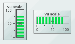
Alert Properties
|
Property Name |
Description |
|
thresholdColorBarFlag |
If selected, the portion of the bar that exceeds a threshold will be painted in the threshold color. This property is only used if either the valueHighAlarmEnabledFlag or the valueHighWarningEnabledFlag is selected. |
|
thresholdLineVisFlag |
Select to draw thresholds behind the active bar in paler versions of the threshold colors. |
|
valueHighAlarmEnabledFlag |
Select to enable the high alarm range and the following related properties: valueHighAlarm - Specify the minimum value for the high alarm range. This value must be equal to or greater than valueMin and equal to or less than valueMax. Note: If the valueHighWarningEnabledFlag is selected, this value must also be greater than valueHighWarning. If the valueHighAlarm is greater than valueMax or less than valueMin, the valueHighAlarm will be disabled and the scale will draw without that threshold. An error will print to the console. valueHighAlarmColor - Specify the color for the high alarm range. |
|
valueHighWarningEnabledFlag |
Select to enable the high warning range and the following related properties: valueHighWarning - Specify the minimum value for the high warning range. This value must be equal to or greater than valueMin and equal to or less than valueMax. Note: If the valueHighAlarmEnabledFlag is selected, this value must also be less than valueHighAlarm. If the valueHighWarning is greater than valueMax or less than valueMin, the valueHighWarning will be disabled and the scale will draw without that threshold. An error will print to the console. valueHighWarningColor - Specify the color for the high warning range. |
Axis Properties
|
Property Name |
Description |
|
axisColor |
Select the |
|
axisDirection |
Select the direction of the axis: § Bottom to Top - Vertical axis with valueMin at the bottom and valueMax at the top. § Left to Right - Horizontal axis with valueMin at the left and valueMax at the right. § Top to Bottom - Vertical axis with valueMax at the bottom and valueMin at the top. § Right to Left - Horizontal axis with valueMin at the right and valueMax at the left |
|
axisMinLabelWidth |
Specify the minimum width (in pixels) for the axis labels. |
|
axisFormat |
Select or enter the numeric format of values displayed on the axis. Note: To enter a format, use syntax from the Java DecimalFormat class. |
|
axisLineThickness |
Select Thin, Medium, or Thick to specify the thickness of the axis line and tick marks. Note: This property only applies if the specified axisStyle is any of the Classic styles or Ticks and Labels. |
|
axisMajorDivisions |
Specify the number of major divisions on the axis. |
|
axisMinorDivisions |
Specify the number of minor divisions on the axis. |
|
axisOnTopOrRightFlag |
If selected, a horizontal axis will be positioned above the scale or a vertical axis will be positioned to the right of the scale. |
|
axisStyle |
Select the axis style from the drop down menu: § Classic with Labels - Classic style axis with an axis line, tick marks and labels at the major divisions. § Classic without Labels - Classic style axis with an axis line and tick marks but without labels. § Classic with End Labels - Classic style axis with an axis line and tick mark. Maximum and minimum value labels will be positioned at the ends of the scale. § Ticks and Labels - Axis with only tick marks and labels. § Bar with Labels - Axis with labels at the major divisions. § Bar without Labels - Bar style axis without labels. § Bar with End Labels - Bar style axis with maximum and minimum value labels at the ends of the scale. § Labels Only - Show labels at the major divisions, but show no axis lines or tick marks. § End Labels Only - Show minimum and maximum value labels at the ends of the scale. |
|
axisTextColor |
Select the |
|
axisTextFont |
Select a font to use the for the axis labels. |
|
axisTextHeight |
Specify a size for the axis labels. |
|
axisVisFlag |
Control visibility of the axis. |
|
centerMinMaxAxisLabelsFlag |
If selected, minimum and maximum value labels are centered on the axis tick marks. If not selected, these axis labels will be justified so they don't extend past the end of the axis. Note: This property only applies if the specified axisStyle displays labels next to tick marks. |
Background Properties
|
Property Name |
Description |
|
bgBorderColor |
Select the |
|
bgBorderFlag |
If selected, a border is drawn around the background rectangle. |
|
bgColor |
Select the |
|
bgEdgeWidth |
Set the width of the 3D edge on the background rectangle. This property is only available if the bgStyle selected is 3D Rectangle. |
|
bgGradientColor2 |
Select the Note: This property will be ignored if bgGradientMode is set to None. |
|
bgGradientMode |
Display a gradient in the background rectangle. Select from the following options: None - No gradient Diagonal Edge - Gradient is drawn at a 45 degree angle from the top left to the bottom right corner of the object. Diagonal Center - Gradient is drawn at a 45 degree angle from the center to the top left and the bottom right corners of the object. Horizontal Edge - Gradient is drawn horizontally from the top to the bottom of the object. Horizontal Center - Gradient is drawn horizontally from the center to the top and bottom of the object. Vertical Edge - Gradient is drawn vertically from the left to the right of the object. Vertical Center - Gradient is drawn vertically from the center to the left and right of the object. |
|
bgRaisedFlag |
Reverses the direction of the gradient, as well as that of the 3D edge if the bgStyle selected is 3D Rectangle. |
|
bgRoundness |
Set the arc length of the rounded corners. This property is only available if the bgStyle selected is Round Rectangle. Note: The value of bgRoundness cannot exceed half the value of the objWidth or the objHeight. If bgRoundness does exceed that value, then half (of the smaller of the two values) of objWidth or objHeight will be used instead. For example, if objWidth is 100 and objHeight is 50, then the value of bgRoundness cannot exceed 25. If it does, then half the value of objHeight (25) will be used instead. |
|
bgShadowFlag |
Select to display a drop shadow on the background rectangle. |
|
bgStyle |
Choose one of the following three options from the drop down menu: Rectangle - Select to display a background rectangle. 3D Rectangle - Select to display a 3D edge on the background rectangle. If selected, use bgEdgeWidth to set the width of the 3D edge. Round Rectangle - Select to display a background rectangle with rounded edges. If selected, use bgRoundness to set the arc length of the rounded corners. |
|
bgVisFlag |
Select to display the background rectangle. |
|
borderPixels |
Set the amount of space (in pixels) between the scale and the border. |
Bar Properties
|
Property Name |
Description |
|
barBgColor |
Select the Note: This property only used applies if barBgOpaqueFlag is selected. |
|
barBgOpaqueFlag |
If selected, the bar background is filled in. Otherwise, it is transparent. |
|
barBorderColor |
Select the Note: This property only applies if barBgBorderFlag is selected. |
|
barBorderFlag |
If selected, a border is displayed around the bar. |
|
barColor |
Select the |
|
barInsets |
Specify the insets (in pixels) between the edge of the bar and the bar lines. |
Data Properties
|
Property Name |
Description |
|
value |
Attach your data. |
|
valueDivisor |
If specified, this divisor is applied to the value, valueMin and valueMax. |
|
valueMax |
Set the maximum range for the scale. This value must be larger than valueMin. |
|
valueMin |
Set the minimum range for the scale. This value must be smaller than valueMax. |
Data Format Properties
|
Property Name |
Description |
|
valueFormat |
Select or enter the numeric format of value displayed in the value label. To enter a format, use syntax from the Java DecimalFormat class. |
|
valueTextColor |
Select the |
|
valueTextFont |
Select the font to use for the value label. |
|
valueTextHeight |
Specify the height for the value label. |
|
valueTextPosition |
Set the position of value label. Select from the following options: § Outside Max - Position outside the maximum value. § Inside Max - Position inside the maximum value. § Outside Current - Position outside the current value. § Inside Current - Position inside the current value. § Center - Position at the center of the scale. § Inside Min - Position inside the minimum value. § Outside Min - Position outside the minimum value. |
|
valueVisFlag |
Control visibility of the value label. |
Interaction Properties
|
Property Name |
Description |
|
command |
Assign a command to your vu scale. See “Define/Execute Command” for information. |
|
commandCloseWindowOnSuccess |
If selected, the window that initiates a system command will automatically close when the system command is executed successfully. This property only applies to system commands. With data source commands, the window is closed whether or not the command is executed successfully. For multiple commands, this property is applied to each command individually. Therefore if the first command in the multiple command sequence succeeds, the window will close before the rest of the commands are executed. Note: The commandCloseWindowOnSuccess property is not supported in the Display Server. |
|
commandConfirm |
If selected, the command confirmation dialog is enabled. Use the commandConfirmText property to write your own text for the confirmation dialog, otherwise text from the command property will be used. For multiple commands, if you Confirm the execution then all individual commands will be executed in sequence with no further confirmation. If the you Cancel the execution, none of the commands in the sequence will executed. |
|
commandConfirmText |
Enter command confirmation text directly in the Property Value field or select the |
|
drillDownTarget |
Name of display (.rtv) file targeted as a drill down. See “Drill Down Displays” for information. When you double-click on a trace in the scale, the following predefined substitutions will be set on the specified drillDownTarget: § $traceNumber - number of the trace (1 to 10) that contains the selected point § $traceLabel - label of selected trace § $pointValue - data value of point § $pointTimestamp - timestamp of point § $pointLabel - data label (if any) of point § $pointIndex - position of point in trace data (0 to maxPointsPerTrace) Note: When drillDownSelectMode is set to Anywhere double-clicking anywhere on the scale will activate the specified drillDownTarget, however you must double-click on a trace in the scale to set the substitutions listed above. |
|
mouseOverText |
Enter a tool tip for this scale. To display the tool tip, move your mouse over the object. To enter a multi-line tool tip, use \n to delimit the lines (e.g. my\nscale). Note: The object must be visible (i.e. visFlag property is selected), in order for the tool tip to be visible. |
Label Properties
|
Property Name |
Description |
|
label |
Edit label text directly in the Property Value field or select the |
|
labelMinTabWidth |
Specify minimum width of the label tab. Note: This property is only applies if labelTextPosY is set to Tab Top. |
|
labelTextColor |
Select the |
|
labelTextFont |
Select the font style of the label text from drop down menu. |
|
labelTextHeight |
Set the height (in pixels) of the label text. |
|
labelTextPosX |
Set x-axis position of label text. Select from the following options: § Left - Position outside the left side of the background rectangle. § Inside Left - Position inside the left side of the background rectangle. § Center - Position in the center of the background rectangle. § Inside Right - Position inside the right side of the background rectangle. § Right - Position outside the right side of the background rectangle. |
|
labelTextPosY |
Set y-axis position of label text. Select from the following options: § Outside Top - Position well above the background rectangle. § Top - Position just above the background rectangle. § Title Top - Position along the top line of the background rectangle. § Tab Top - Position tab just above the background rectangle. Note: Height and width of the label tab is dependent on the height and width of the text. Use the labelMinTabWidth property to specify a minimum tab width. § Inside Top - Position inside the top of the background rectangle. § Center - Position in the center of the background rectangle. § Inside Bottom - Position inside the bottom of the background rectangle. § Bottom - Position just below the background rectangle. § Outside Bottom - Position well below the background rectangle. |
|
labelVisFlag |
Control visibility of the label. |
Object Properties
|
Property Name |
Description |
|
anchor |
Specify where to anchor an object in the display. Note: If an object has the dock property set, the anchor property will be ignored. The anchor property is only applied when the dimensions of the display are modified, either by editing “Background Properties” or resizing the window in Layout mode Select None, or one or more the following options: None - Object not anchored. This is the default. Top - Anchor top of object at top of display. Left - Anchor left side of object at left of display. Bottom - Anchor bottom of object at bottom of display. Right - Anchor right side of object at right of display. When a display is resized, the number of pixels between an anchored object and the specified location remain constant. If an object is anchored on opposite sides (i.e. Top and Bottom or Left and Right), the object will be stretched to fill the available space. |
|
dock |
Specify the docking location of an object in the display. Select from the following options: None - Object is not docked. This is the default. Top - Dock object at top of display. Left - Dock object at left of display. Bottom - Dock object at bottom of display. Right - Dock object at right of display. Fill - Dock object in available space remaining in the display after all docked objects are positioned. |
|
|
If the dimensions of the display are modified, either by editing “Background Properties” or resizing the window in Layout mode, the properties (objX, objY, objWidth, and objHeight) of docked objects will automatically adapt to match the new size of the display. When multiple objects are docked to the same side of the display, the first object is docked against the side of the display, the next object is docked against the edge of the first object, and so on. When objects are docked to multiple sides of the display, the order in which objects were added to the display controls docking position. For example, let's say the first object added to the display is docked at the Top and the second object is docked at the Left. Consequently, the first object will fill the entire width of the display and the second object will fill the left side of the display from the bottom of the first object to the bottom of the display. |
|
|
Objects in a display have the dock property set to Fill, are laid out across a grid in the available space remaining after all docked objects are positioned. By default, the grid has one row and as many columns as there are objects in the display. You can modify the grid in the Background Properties dialog. Once an object is docked, there are some limitations on how that object can be modified: § Docked objects cannot be dragged or repositioned using objX and objY properties. § Docked objects cannot be resized using the objWidth or objHeight properties. To resize you must drag on the resize handle. § Docked objects can only be resized toward the center of the display (e.g. If an object is docked at the Top, only its height can be increased by dragging down toward the center of the display). § Docked objects set to Fill cannot be resized at all. § Docked objects cannot be moved using Align. Non-docked objects can be aligned against a docked object, but a docked object will not move to align against another object. § Docked objects are ignored by Distribute. |
|
objHeight |
Sets the height (in pixels) of the object. |
|
objName |
Name given to facilitate object management via the Object List dialog. Select Tools>Object List. |
|
objWidth |
Sets the width (in pixels) of the object. |
|
objX |
Set the x position of the object. |
|
objY |
Set the y position of the object. |
|
styleClass |
Enter the style class name for this object as defined in your style sheet. If not specified, the object class name is used. Note: The value entered must not contain spaces and cannot start with rtv-. |
|
transparencyPercent |
Set transparency of the object. Enter a value between 0 and 100. A value of 0, the default, sets the object to be completely opaque. A value of 100 will render the object completely transparent. |
|
visFlag |
Control visibility of the object. |
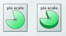
Alert Properties
|
Property Name |
Description |
|
thresholdColorPieFlag |
If selected, a portion of the pie will display the threshold color when it exceeds that threshold. This property only applies if either the valueHighAlarmEnabledFlag or the valueHighWarningEnabledFlag is selected. |
|
thresholdLineThickness |
Select Thin, Medium, or Thick to set the thickness of the threshold lines. This property is only used if the thresholdLineVisFlag is selected. |
|
thresholdLineVisFlag |
Select to draw a line across the bar at the level of each enabled threshold. This line will be the same color as the threshold color. This property is only used if the valueHighAlarmEnabledFlag or valueHighWarningEnabledFlag is selected. |
|
valueHighAlarmEnabledFlag |
Select to enable the high alarm range and the following related properties: valueHighAlarm - Specify the minimum value for the high alarm range. This value must be equal to or greater than valueMin and equal to or less than valueMax. Note: If the valueHighWarningEnabledFlag is selected, this value must also be greater than valueHighWarning. If the valueHighAlarm is greater than valueMax or less than valueMin, the valueHighAlarm will be disabled and the scale will draw without that threshold. An error will print to the console. valueHighAlarmColor - Specify the color for the high alarm range. |
|
valueHighWarningEnabledFlag |
Select to enable the high warning range and the following related properties: valueHighWarning - Specify the minimum value for the high warning range. This value must be equal to or greater than valueMin and equal to or less than valueMax. Note: If the valueHighAlarmEnabledFlag is selected, this value must also be less than valueHighAlarm. If the valueHighWarning is greater than valueMax or less than valueMin, the valueHighWarning will be disabled and the scale will draw without that threshold. An error will print to the console. valueHighWarningColor - Specify the color for the high warning range. |
Background Properties
|
Property Name |
Description |
|
bgBorderColor |
Select the |
|
bgBorderFlag |
If selected, a border is drawn around the background rectangle. |
|
bgColor |
Select the |
|
bgEdgeWidth |
Set the width of the 3D edge on the background rectangle. This property is only available if the bgStyle selected is 3D Rectangle. |
|
bgGradientColor2 |
Select the Note: This property will be ignored if bgGradientMode is set to None. |
|
bgGradientMode |
Display a gradient in the background rectangle. Select from the following options: None - No gradient Diagonal Edge - Gradient is drawn at a 45 degree angle from the top left to the bottom right corner of the object. Diagonal Center - Gradient is drawn at a 45 degree angle from the center to the top left and the bottom right corners of the object. Horizontal Edge - Gradient is drawn horizontally from the top to the bottom of the object. Horizontal Center - Gradient is drawn horizontally from the center to the top and bottom of the object. Vertical Edge - Gradient is drawn vertically from the left to the right of the object. Vertical Center - Gradient is drawn vertically from the center to the left and right of the object. |
|
bgRaisedFlag |
Reverses the direction of the gradient, as well as that of the 3D edge if the bgStyle selected is 3D Rectangle. |
|
bgRoundness |
Set the arc length of the rounded corners. This property is only available if the bgStyle selected is Round Rectangle. The value of bgRoundness cannot exceed half the value of the objWidth or the objHeight. If bgRoundness does exceed that value, then half (of the smaller of the two values) of objWidth or objHeight will be used instead. For example, if objWidth is 100 and objHeight is 50, then the value of bgRoundness cannot exceed 25. If it does, then half the value of objHeight (25) will be used instead. |
|
bgShadowFlag |
Select to display a drop shadow on the background rectangle. |
|
bgStyle |
Choose one of the following three options from the drop down menu: Rectangle - Select to display a background rectangle. 3D Rectangle - Select to display a 3D edge on the background rectangle. If selected, use bgEdgeWidth to set the width of the 3D edge. Round Rectangle - Select to display a background rectangle with rounded edges. If selected, use bgRoundness to set the arc length of the rounded corners. |
|
bgVisFlag |
Select to display the background rectangle. |
|
borderPixels |
Set the amount of space (in pixels) between the scale and the border. |
Data Properties
|
Property Name |
Description |
|
value |
Attach your data. |
|
valueDivisor |
If specified, this divisor is applied to the value, valueMin, and valueMax. |
|
valueMax |
Set the maximum range for the scale. This value must be larger than valueMin. |
|
valueMin |
Set the minimum range for the scale. This value must be smaller than valueMax. |
Data Format Properties
|
Property Name |
Description |
|
valueFormat |
Select or enter the numeric format of value displayed in the value label. To enter a format, use syntax from the Java DecimalFormat class. |
|
valueTextColor |
Select the |
|
valueTextFont |
Select the font to use for the value label. |
|
valueTextHeight |
Specify the height for the value label. |
|
valueTextPosition |
Set the position of value label. Select from the following options: § Outside Max - Position outside the maximum value. § Inside Max - Position inside the maximum value. § Outside Current - Position outside the current value. § Inside Current - Position inside the current value. § Center - Position at the center of the scale. § Inside Min - Position inside the minimum value. § Outside Min - Position outside the minimum value. |
|
valueVisFlag |
Control visibility of the value label. |
Interaction Properties
|
Property Name |
Description |
|
command |
Assign a command to your pie scale. See “Define/Execute Command” for information. |
|
commandCloseWindowOnSuccess |
If selected, the window that initiates a system command will automatically close when the system command is executed successfully. This property only applies to system commands. With data source commands, the window is closed whether or not the command is executed successfully. |
|
|
For multiple commands, this property is applied to each command individually. Therefore if the first command in the multiple command sequence succeeds, the window will close before the rest of the commands are executed. Note: The commandCloseWindowOnSuccess property is not supported in the Display Server. |
|
commandConfirm |
If selected, the command confirmation dialog is enabled. Use the commandConfirmText property to write your own text for the confirmation dialog, otherwise text from the command property will be used. For multiple commands, if you Confirm the execution then all individual commands will be executed in sequence with no further confirmation. If the you Cancel the execution, none of the commands in the sequence will executed. |
|
commandConfirmText |
Enter command confirmation text directly in the Property Value field or select the |
|
drillDownTarget |
Name of display (.rtv) file targeted as a drill down. See “Drill Down Displays” for information. When you double-click on a trace in the scale, the following predefined substitutions will be set on the specified drillDownTarget: § $traceNumber - number of the trace (1 to 10) that contains the selected point § $traceLabel - label of selected trace § $pointValue - data value of point § $pointTimestamp - timestamp of point § $pointLabel - data label (if any) of point § $pointIndex - position of point in trace data (0 to maxPointsPerTrace) Note: When drillDownSelectMode is set to Anywhere double-clicking anywhere on the scale will activate the specified drillDownTarget, however you must double-click on a trace in the scale to set the substitutions listed above. |
|
mouseOverText |
Enter a tool tip for this scale. To display the tool tip, move your mouse over the object. To enter a multi-line tool tip, use \n to delimit the lines (e.g. my\nscale). Note: The object must be visible (i.e. visFlag property is selected), in order for the tool tip to be visible. |
Label Properties
|
Property Name |
Description |
|
label |
Edit label text directly in the Property Value field or select the |
|
labelMinTabWidth |
Specify minimum width of the label tab. Note: This property is only applies if labelTextPosY is set to Tab Top. |
|
labelTextColor |
Select the |
|
labelTextFont |
Select the font style of the label text from drop down menu. |
|
labelTextHeight |
Set the height (in pixels) of the label text. |
|
labelTextPosX |
Set x-axis position of label text. Select from the following options: § Left - Position outside the left side of the background rectangle. § Inside Left - Position inside the left side of the background rectangle. § Center - Position in the center of the background rectangle. § Inside Right - Position inside the right side of the background rectangle. § Right - Position outside the right side of the background rectangle. |
|
labelTextPosY |
Set y-axis position of label text. Select from the following options: § Outside Top - Position well above the background rectangle. § Top - Position just above the background rectangle. § Title Top - Position along the top line of the background rectangle. § Tab Top - Position tab just above the background rectangle. Note: Height and width of the label tab is dependent on the height and width of the text. Use the labelMinTabWidth property to specify a minimum tab width. § Inside Top - Position inside the top of the background rectangle. § Center - Position in the center of the background rectangle. § Inside Bottom - Position inside the bottom of the background rectangle. § Bottom - Position just below the background rectangle. § Outside Bottom - Position well below the background rectangle. |
|
labelVisFlag |
Control visibility of the label. |
Object Properties
|
Property Name |
Description |
|
anchor |
Specify where to anchor an object in the display. Note: If an object has the dock property set, the anchor property will be ignored. The anchor property is only applied when the dimensions of the display are modified, either by editing “Background Properties” or resizing the window in Layout mode |
|
|
Select None, or one or more the following options: None - Object not anchored. This is the default. Top - Anchor top of object at top of display. Left - Anchor left side of object at left of display. Bottom - Anchor bottom of object at bottom of display. Right - Anchor right side of object at right of display. |
|
|
When a display is resized, the number of pixels between an anchored object and the specified location remain constant. If an object is anchored on opposite sides (i.e. Top and Bottom or Left and Right), the object will be stretched to fill the available space. |
|
dock |
Specify the docking location of an object in the display. Select from the following options: None - Object is not docked. This is the default. Top - Dock object at top of display. Left - Dock object at left of display. Bottom - Dock object at bottom of display. Right - Dock object at right of display. Fill - Dock object in available space remaining in the display after all docked objects are positioned. |
|
|
If the dimensions of the display are modified, either by editing “Background Properties”or resizing the window in Layout mode, the properties (objX, objY, objWidth, and objHeight) of docked objects will automatically adapt to match the new size of the display. When multiple objects are docked to the same side of the display, the first object is docked against the side of the display, the next object is docked against the edge of the first object, and so on. |
|
|
When objects are docked to multiple sides of the display, the order in which objects were added to the display controls docking position. For example, let's say the first object added to the display is docked at the Top and the second object is docked at the Left. Consequently, the first object will fill the entire width of the display and the second object will fill the left side of the display from the bottom of the first object to the bottom of the display. Objects in a display have the dock property set to Fill, are laid out across a grid in the available space remaining after all docked objects are positioned. By default, the grid has one row and as many columns as there are objects in the display. You can modify the grid in the Background Properties dialog. |
|
|
Once an object is docked, there are some limitations on how that object can be modified: § Docked objects cannot be dragged or repositioned using objX and objY properties. § Docked objects cannot be resized using the objWidth or objHeight properties. To resize you must drag on the resize handle. § Docked objects can only be resized toward the center of the display (e.g. If an object is docked at the Top, only its height can be increased by dragging down toward the center of the display). § Docked objects set to Fill cannot be resized at all. § Docked objects cannot be moved using Align. Non-docked objects can be aligned against a docked object, but a docked object will not move to align against another object. § Docked objects are ignored by Distribute. |
|
objHeight |
Sets the height (in pixels) of the object. |
|
objName |
Name given to facilitate object management via the Object List dialog. Select Tools>Object List. |
|
objWidth |
Sets the width (in pixels) of the object. |
|
objX |
Set the x position of the object. |
|
objY |
Set the y position of the object. |
|
styleClass |
Enter the style class name for this object as defined in your style sheet. If not specified, the object class name is used. Note: The value entered must not contain spaces and cannot start with rtv-. |
|
transparencyPercent |
Set transparency of the object. Enter a value between 0 and 100. A value of 0, the default, sets the object to be completely opaque. A value of 100 will render the object completely transparent. |
|
visFlag |
Control visibility of the object. |
Pie Properties
|
Property Name |
Description |
|
clockWiseFlag |
If selected, the pie is drawn from the start angle in a clockwise direction. Otherwise, it is drawn counter-clockwise. |
|
pie3dThickness |
Specify the thickness of the 3D edge of the pie. If the value is 0, the pie will be drawn 2D. |
|
pieBgColor |
Select the Note: This property only applies if pieBgOpaqueFlag is selected. |
|
pieBgOpaqueFlag |
If selected, the pie background is filled in. Otherwise, it is transparent. |
|
pieBorderColor |
Select the border color for the pie. Note: This property only applies if pieBorderFlag is selected. |
|
pieBorderFlag |
If selected, a border is displayed around the edge of the pie. |
|
pieColor |
Select the |
|
pieGradientColor2 |
Select the Note: This property will be ignored if pieGradientMode is set to None. |
|
pieGradientMode |
Display a gradient in the pie. Select from the following options: § None - No gradient. § Diagonal Edge - Gradient is drawn at a 45 degree angle from the top left to the bottom right corner. § Diagonal Center - Gradient is drawn at a 45 degree angle from the center to the top left and the bottom right corners. § Horizontal Edge - Gradient is drawn horizontally from the top to the bottom. § Horizontal Center - Gradient is drawn horizontally from the center to the top and bottom. § Vertical Edge - Gradient is drawn vertically from the left to the right. § Vertical Center - Gradient is drawn vertically from the center to the left and right. |
|
pieRaisedFlag |
Reverses the direction of the gradient. |
|
startAngle |
Set the start angle of the pie. Start angles range from 0 to 360, with 0 pointing straight to the right and increasing clockwise around the circle. Default is 180 (pointing straight to the left). |
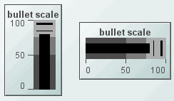
Alert Properties
|
Property Name |
Description |
|
compValue1 |
Set the value of the first comparison line. This value must be equal to or greater than valueMin and equal to or less than valueMax. If compValue1 is greater than valueMax or less than valueMin, that threshold will be disabled and the scale will draw without that threshold. An error will print to the console. This property is only used if the compValue1EnabledFlag is selected. |
|
compValue1EnabledFlag |
Enable the first comparison line. |
|
compValue1LineColor |
Set the color of the first comparison line. |
|
compValue1LineThickness |
Select Thin, Medium, or Thick to set the thickness of the first comparison line. |
|
compValue2 |
Set the value of the second comparison line. This value must be equal to or greater than valueMin and equal to or less than valueMax. If compValue2 is greater than valueMax or less than valueMin, that threshold will be disabled and the scale will draw without that threshold. An error will print to the console. This property is only used if the compValue2EnabledFlag is selected. |
|
compValue2EnabledFlag |
Enable the second comparison line. |
|
compValue2LineColor |
Set the color of the second comparison line. |
|
compValue2LineThickness |
Select Thin, Medium, or Thick to set the thickness of the second comparison line. |
|
valueHighAlarmEnabledFlag |
Select to enable the high alarm range and the following related properties: valueHighAlarm - Specify the minimum value for the high alarm range. This value must be equal to or greater than valueMin and equal to or less than valueMax. Note: If the valueHighWarningEnabledFlag is selected, this value must also be greater than valueHighWarning. If the valueHighAlarm is greater than valueMax or less than valueMin, the valueHighAlarm will be disabled and the scale will draw without that threshold. An error will print to the console. valueHighAlarmColor - Specify the color for the high alarm range. |
|
valueHighWarningEnabledFlag |
Select to enable the high warning range and the following related properties: valueHighWarning - Specify the minimum value for the high warning range. This value must be equal to or greater than valueMin and equal to or less than valueMax. Note: If the valueHighAlarmEnabledFlag is selected, this value must also be less than valueHighAlarm. If the valueHighWarning is greater than valueMax or less than valueMin, the valueHighWarning will be disabled and the scale will draw without that threshold. An error will print to the console. valueHighWarningColor - Specify the color for the high warning range. |
|
valueNoAlarmColor |
Specify the color for the no alarm range. |
Axis Properties
|
Property Name |
Description |
|
axisColor |
Select the |
|
axisDirection |
Select the direction of the axis: § Bottom to Top - Vertical axis with valueMin at the bottom and valueMax at the top. § Left to Right - Horizontal axis with valueMin at the left and valueMax at the right. § Top to Bottom - Vertical axis with valueMax at the bottom and valueMin at the top. § Right to Left - Horizontal axis with valueMin at the right and valueMax at the left |
|
axisMinLabelWidth |
Specify the minimum width (in pixels) for the axis labels. |
|
axisFormat |
Select or enter the numeric format of values displayed on the axis. Note: To enter a format, use syntax from the Java DecimalFormat class. |
|
axisLineThickness |
Select Thin, Medium, or Thick to specify the thickness of the axis line and tick marks. Note: This property only applies if the specified axisStyle is any of the Classic styles or Ticks and Labels. |
|
axisMajorDivisions |
Specify the number of major divisions on the axis. |
|
axisMinorDivisions |
Specify the number of minor divisions on the axis. |
|
axisOnTopOrRightFlag |
If selected, a horizontal axis will be positioned above the scale or a vertical axis will be positioned to the right of the scale. |
|
axisStyle |
Select the axis style from the drop down menu: § Classic with Labels - Classic style axis with an axis line, tick marks and labels at the major divisions. § Classic without Labels - Classic style axis with an axis line and tick marks but without labels. § Classic with End Labels - Classic style axis with an axis line and tick mark. Maximum and minimum value labels will be positioned at the ends of the scale. § Ticks and Labels - Axis with only tick marks and labels. § Bar with Labels - Axis with labels at the major divisions. § Bar without Labels - Bar style axis without labels. § Bar with End Labels - Bar style axis with maximum and minimum value labels at the ends of the scale. § Labels Only - Show labels at the major divisions, but show no axis lines or tick marks. § End Labels Only - Show minimum and maximum value labels at the ends of the scale. |
|
axisTextColor |
Select the |
|
axisTextFont |
Select a font to use the for the axis labels. |
|
axisTextHeight |
Specify a size for the axis labels. |
|
axisVisFlag |
Control visibility of the axis. |
|
centerMinMaxAxisLabelsFlag |
If selected, minimum and maximum value labels are centered on the axis tick marks. If not selected, these axis labels will be justified so they don't extend past the end of the axis. Note: This property only applies if the specified axisStyle displays labels next to tick marks. |
Background Properties
Specify how the background is displayed in your bullet scale.
|
Property Name |
Description |
|
bgBorderColor |
Select the |
|
bgBorderFlag |
If selected, a border is drawn around the background rectangle. |
|
bgColor |
Select the |
|
bgEdgeWidth |
Set the width of the 3D edge on the background rectangle. This property is only available if the bgStyle selected is 3D Rectangle. |
|
bgGradientColor2 |
Select the Note: This property will be ignored if bgGradientMode is set to None. |
|
bgGradientMode |
Display a separate gradient in each of the three ranges of the background rectangle. Select from the following options: None - No gradient Diagonal Edge - Gradient is drawn at a 45 degree angle from the top left to the bottom right corner of the object. Diagonal Center - Gradient is drawn at a 45 degree angle from the center to the top left and the bottom right corners of the object. Horizontal Edge - Gradient is drawn horizontally from the top to the bottom of the object. Horizontal Center - Gradient is drawn horizontally from the center to the top and bottom of the object. Vertical Edge - Gradient is drawn vertically from the left to the right of the object. Vertical Center - Gradient is drawn vertically from the center to the left and right of the object. |
|
bgRaisedFlag |
Reverses the direction of the gradient, as well as that of the 3D edge if the bgStyle selected is 3D Rectangle. |
|
bgRoundness |
Set the arc length of the rounded corners. This property is only available if the bgStyle selected is Round Rectangle. Note: The value of bgRoundness cannot exceed half the value of the objWidth or the objHeight. If bgRoundness does exceed that value, then half (of the smaller of the two values) of objWidth or objHeight will be used instead. For example, if objWidth is 100 and objHeight is 50, then the value of bgRoundness cannot exceed 25. If it does, then half the value of objHeight (25) will be used instead. |
|
bgShadowFlag |
Select to display a drop shadow on the background rectangle. |
|
bgStyle |
Choose one of the following three options from the drop down menu: Rectangle - Select to display a background rectangle. 3D Rectangle - Select to display a 3D edge on the background rectangle. If selected, use bgEdgeWidth to set the width of the 3D edge. Round Rectangle - Select to display a background rectangle with rounded edges. If selected, use bgRoundness to set the arc length of the rounded corners. |
|
bgVisFlag |
Select to display the background rectangle. |
|
borderPixels |
Set the amount of space (in pixels) between the scale and the border. |
Bar Properties
|
Property Name |
Description |
|
barBgBorderColor |
Select the Note: This property only applies if barBgBorderFlag is selected. |
|
barBgBorderFlag |
If selected, border is displayed around the bar background. |
|
barBgGradientColor2 |
Select the Note: This property will be ignored if barBgGradientMode is set to None. |
|
barBgGradientMode |
Display a gradient in the bar background. Select from the following options: § None - No gradient. § Diagonal Edge - Gradient is drawn at a 45 degree angle from the top left to the bottom right corner. § Diagonal Center - Gradient is drawn at a 45 degree angle from the center to the top left and the bottom right corners. § Horizontal Edge - Gradient is drawn horizontally from the top to the bottom. § Horizontal Center - Gradient is drawn horizontally from the center to the top and bottom. § Vertical Edge - Gradient is drawn vertically from the left to the right. § Vertical Center - Gradient is drawn vertically from the center to the left and right. |
|
barBgRaisedFlag |
Reverses the direction of the gradient, as well as that of the 3D edge if the selected barStyle is 3D Rectangle. |
|
barColor |
Select the |
|
barRoundness |
Set the arc length of the rounded corners. Note: This property is only applies if the selected barStyle is Round Rectangle. |
|
barStyle |
Choose one of the following three options from the drop down menu: § Rectangle - Display the bar as a rectangle. § 3D Rectangle - Display a 3D edge on the bar. § Round Rectangle - Display the bar with rounded edges. If selected, use the bgRoundness property to set the arc length of the rounded corners. |
|
barInsets |
Specify the insets (in pixels) between the edge of the bar and the bar lines. |
Data Properties
Specify how data is displayed in your scale.
|
Property Name |
Description |
|
value |
Attach your data. |
|
valueDivisor |
If specified, this divisor is applied to the value, valueMin and valueMax. |
|
valueMax |
Set the maximum range for the scale. This value must be larger than valueMin. |
|
valueMin |
Set the minimum range for the scale. This value must be smaller than valueMax. |
Data Format Properties
Specify data format in your scale.
|
Property Name |
Description |
|
valueFormat |
Select or enter the numeric format of value displayed in the value label. To enter a format, use syntax from the Java DecimalFormat class. |
|
valueTextColor |
Select the |
|
valueTextFont |
Select the font to use for the value label. |
|
valueTextHeight |
Specify the height for the value label. |
|
valueTextPosition |
Set the position of value label. Select from the following options: § Outside Max - Position outside the maximum value. § Inside Max - Position inside the maximum value. § Outside Current - Position outside the current value. § Inside Current - Position inside the current value. § Center - Position at the center of the scale. § Inside Min - Position inside the minimum value. § Outside Min - Position outside the minimum value. |
|
valueVisFlag |
Control visibility of the value label. |
Interaction Properties
|
Property Name |
Description |
|
command |
Assign a command to your bullet scale. See “Define/Execute Command” for information. |
|
commandCloseWindowOnSuccess |
If selected, the window that initiates a system command will automatically close when the system command is executed successfully. This property only applies to system commands. With data source commands, the window is closed whether or not the command is executed successfully. For multiple commands, this property is applied to each command individually. Therefore if the first command in the multiple command sequence succeeds, the window will close before the rest of the commands are executed. Note: The commandCloseWindowOnSuccess property is not supported in the Display Server. |
|
commandConfirm |
If selected, the command confirmation dialog is enabled. Use the commandConfirmText property to write your own text for the confirmation dialog, otherwise text from the command property will be used. For multiple commands, if you Confirm the execution then all individual commands will be executed in sequence with no further confirmation. If the you Cancel the execution, none of the commands in the sequence will executed. |
|
commandConfirmText |
Enter command confirmation text directly in the Property Value field or select the |
|
drillDownTarget |
Name of display (.rtv) file targeted as a drill down. See Building Displays>Drill Down Displays for information. When you double-click on a trace in the scale, the following predefined substitutions will be set on the specified drillDownTarget: § $traceNumber - number of the trace (1 to 10) that contains the selected point § $traceLabel - label of selected trace § $pointValue - data value of point § $pointTimestamp - timestamp of point § $pointLabel - data label (if any) of point § $pointIndex - position of point in trace data (0 to maxPointsPerTrace) Note: When drillDownSelectMode is set to Anywhere double-clicking anywhere on the scale will activate the specified drillDownTarget, however you must double-click on a trace in the scale to set the substitutions listed above. |
|
mouseOverText |
Enter a tool tip for this scale. To display the tool tip, move your mouse over the object. To enter a multi-line tool tip, use \n to delimit the lines (e.g. my\nscale). Note: The object must be visible (i.e. visFlag property is selected), in order for the tool tip to be visible. |
Label Properties
|
Property Name |
Description |
|
label |
Edit label text directly in the Property Value field or select the |
|
labelMinTabWidth |
Specify minimum width of the label tab. Note: This property is only applies if labelTextPosY is set to Tab Top. |
|
labelTextColor |
Select the |
|
labelTextFont |
Select the font style of the label text from drop down menu. |
|
labelTextHeight |
Set the height (in pixels) of the label text. |
|
labelTextPosX |
Set x-axis position of label text. Select from the following options: § Left - Position outside the left side of the background rectangle. § Inside Left - Position inside the left side of the background rectangle. § Center - Position in the center of the background rectangle. § Inside Right - Position inside the right side of the background rectangle. § Right - Position outside the right side of the background rectangle. |
|
labelTextPosY |
Set y-axis position of label text. Select from the following options: § Outside Top - Position well above the background rectangle. § Top - Position just above the background rectangle. § Title Top - Position along the top line of the background rectangle. § Tab Top - Position tab just above the background rectangle. Note: Height and width of the label tab is dependent on the height and width of the text. Use the labelMinTabWidth property to specify a minimum tab width. § Inside Top - Position inside the top of the background rectangle. § Center - Position in the center of the background rectangle. § Inside Bottom - Position inside the bottom of the background rectangle. § Bottom - Position just below the background rectangle. § Outside Bottom - Position well below the background rectangle. |
|
labelVisFlag |
Control visibility of the label. |
Object Properties
|
Property Name |
Description |
|
anchor |
Specify where to anchor an object in the display. Note: If an object has the dock property set, the anchor property will be ignored. The anchor property is only applied when the dimensions of the display are modified, either by editing “Background Properties” or resizing the window in Layout mode |
|
|
Select None, or one or more the following options: None - Object not anchored. This is the default. Top - Anchor top of object at top of display. Left - Anchor left side of object at left of display. Bottom - Anchor bottom of object at bottom of display. Right - Anchor right side of object at right of display. When a display is resized, the number of pixels between an anchored object and the specified location remain constant. If an object is anchored on opposite sides (i.e. Top and Bottom or Left and Right), the object will be stretched to fill the available space. |
|
dock |
Specify the docking location of an object in the display. Select from the following options: None - Object is not docked. This is the default. Top - Dock object at top of display. Left - Dock object at left of display. Bottom - Dock object at bottom of display. Right - Dock object at right of display. Fill - Dock object in available space remaining in the display after all docked objects are positioned. |
|
|
If the dimensions of the display are modified, either by editing “Background Properties” or resizing the window in Layout mode, the properties (objX, objY, objWidth, and objHeight) of docked objects will automatically adapt to match the new size of the display. When multiple objects are docked to the same side of the display, the first object is docked against the side of the display, the next object is docked against the edge of the first object, and so on. When objects are docked to multiple sides of the display, the order in which objects were added to the display controls docking position. For example, let's say the first object added to the display is docked at the Top and the second object is docked at the Left. Consequently, the first object will fill the entire width of the display and the second object will fill the left side of the display from the bottom of the first object to the bottom of the display. Objects in a display have the dock property set to Fill, are laid out across a grid in the available space remaining after all docked objects are positioned. By default, the grid has one row and as many columns as there are objects in the display. You can modify the grid in the Background Properties dialog. |
|
|
Once an object is docked, there are some limitations on how that object can be modified: § Docked objects cannot be dragged or repositioned using objX and objY properties. § Docked objects cannot be resized using the objWidth or objHeight properties. To resize you must drag on the resize handle. § Docked objects can only be resized toward the center of the display (e.g. If an object is docked at the Top, only its height can be increased by dragging down toward the center of the display). § Docked objects set to Fill cannot be resized at all. § Docked objects cannot be moved using Align. Non-docked objects can be aligned against a docked object, but a docked object will not move to align against another object. § Docked objects are ignored by Distribute. |
|
objHeight |
Sets the height (in pixels) of the object. |
|
objName |
Name given to facilitate object management via the Object List dialog. Select Tools>Object List. |
|
objWidth |
Sets the width (in pixels) of the object. |
|
objX |
Set the x position of the object. |
|
objY |
Set the y position of the object. |
|
styleClass |
Enter the style class name for this object as defined in your style sheet. If not specified, the object class name is used. Note: The value entered must not contain spaces and cannot start with rtv-. |
|
transparencyPercent |
Set transparency of the object. Enter a value between 0 and 100. A value of 0, the default, sets the object to be completely opaque. A value of 100 will render the object completely transparent. |
|
visFlag |
Control visibility of the object. |
The Object Palette features three types of table objects--standard table, rotated table and object grid--that offer the ability to display large amounts of data. While most objects are driven by a single variable, table objects are driven by one or two dimensional arrays of data. Table objects are designed to display all the information returned by a tabular element in your data attachment. The necessary number of columns and rows are automatically created. Preset substitutions are created based on your data attachment as well, which are passed into drill down displays. See “Drill Down Substitutions” for more information.
|
In a standard table (class name: obj_table02), data returned is displayed in a series of rows and columns. Row names and column headers depend on your data attachment. If the table is not large enough to display all of the data, scroll bars are automatically added. The web grid is an advanced HTML implementation of obj_table02 which provides enhanced filtering (for the Thin Client only). |
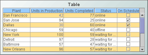
|
|
The rotated table (class name: obj_table03) is a standard table in which the rows and columns have been flipped. Row names are assigned the name of the column displayed in that row. |

|
|
The object grid (class name: obj_objectgrid) displays returned data as multiple objects, called icon objects, in a scrollable grid. Each icon object in the grid is analogous to a row of data in the standard table. Icon objects display the data using graphic attributes (e.g., color, dimension, orientation, etc.). |
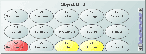
|
Display your data in a standard table (class name: obj_table02) by attaching it to the valueTable property. In a standard table, data returned is displayed in a series of rows and columns. Row names and column headers depend on your data attachment. If the table is not large enough to display all of the data, scroll bars are automatically added.
To add or remove rows and columns, or edit the value of existing cells to easily update data throughout the enterprise, see the “Table Edits” section for information.
Using the Thin Client in Internet Explorer, you can copy data to the system clipboard for pasting into another application. In the standard table, right-click and select Copy Cell Value. If the selected cell contains multi-line text, each new line is converted to a tab. If the selected cell displays an image, the underlying text value is copied. Also, the security option "Scripting: Allow programmatic clipboard access" must be enabled in the security level that applies to the Thin Client's URL (otherwise, the copy will fail). The IE security level is configured on the Security tab of Internet Explorer's Internet Options dialog.

Alert Properties
Use the value of individual columns, rows and cells to set font color, background color, row visibility or replace a cell value with an image. In the Object Properties window double-click on filterProperties in the Property Name field, or select the  button to open the Filter Properties dialog. See “Table Filters” for more information.
Background Properties
Specify how the background is displayed in a table.
|
Property Name |
Description |
|
bgBorderColor |
Select the |
|
bgBorderFlag |
If selected, a border is drawn around the background rectangle. |
|
bgColor |
Select the |
|
bgEdgeWidth |
Set the width of the 3D edge on the background rectangle. This property is only available if the bgStyle selected is 3D Rectangle. |
|
bgGradientColor2 |
Select the Note: The bgColor property sets the first color in the gradient. |
|
bgGradientMode |
Display a gradient in the background rectangle. Select from the following options: None - No gradient Diagonal Edge - Gradient is drawn at a 45 degree angle from the top left to the bottom right corner of the object. Diagonal Center - Gradient is drawn at a 45 degree angle from the center to the top left and the bottom right corners of the object. Horizontal Edge - Gradient is drawn horizontally from the top to the bottom of the object. Horizontal Center - Gradient is drawn horizontally from the center to the top and bottom of the object. Vertical Edge - Gradient is drawn vertically from the left to the right of the object. Vertical Center - Gradient is drawn vertically from the center to the left and right of the object. |
|
bgRaisedFlag |
Reverses the direction of the gradient, as well as that of the 3D edge if the bgStyle selected is 3D Rectangle. |
|
bgRoundness |
Set the arc length of the rounded corners. This property is only available if the bgStyle selected is Round Rectangle. Note: The value of bgRoundness cannot exceed half the value of the objWidth or the objHeight. If bgRoundness does exceed that value, then half (of the smaller of the two values) of objWidth or objHeight will be used instead. For example, if objWidth is 100 and objHeight is 50, then the value of bgRoundness cannot exceed 25. If it does, then half the value of objHeight (25) will be used instead. |
|
bgShadowFlag |
Select to display a drop shadow on the background rectangle. |
|
bgStyle |
Choose one of the following three options from the drop down menu: Rectangle - Select to display a background rectangle. 3D Rectangle - Select to display a 3D edge on the background rectangle. If selected, use bgEdgeWidth to set the width of the 3D edge. Round Rectangle - Select to display a background rectangle with rounded edges. If selected, use bgRoundness to set the arc length of the rounded corners. |
|
bgVisFlag |
Select to display the background rectangle. |
|
borderPixels |
Set the amount of space (in pixels) between the table and the border. |
|
tableBgColor |
Select the |
Cell Properties
|
Property Name |
Description |
|
cellBgColor |
Select the |
|
cellBgStripeContrast |
Set the contrast level for alternating row colors. Note: This property is only applicable if cellBgStripedFlag is selected. |
|
cellBgStripedFlag |
Select to display alternating row colors. |
|
cellTextColor |
Select the |
|
cellTextFont |
Select a font for the cell text. |
|
cellTextSize |
Specify (in pixels) the size of the cell text or enter -1 to use the default size. |
Column Properties
To specify the alignment of a column, select the ellipsis button  in the columnAlignment property. Select the alignment from the drop down menu in the Alignment column: Default, Left, Center, or Right. The default setting depends on the type of column. To hide a column, select the ellipsis button
  in the columnsToHide property and select the check box under Hide Column.
To specify numerical or date formats for columns, select the ellipsis button  in the columnFormat property (see “Column Format Properties”). Select the format from the drop down menu in the Column Format column. Use the columnFormatDate property to specify the format for all time and date columns in the table that do not have the columnFormat property specified. For example, if a table instance contains a date column named X, and the columnFormat property contains a valid date/time format for column X, then the columnFormat property is applied to column X. If the columnFormat property does not contain a valid date/time format for column X, and the columnFormatDate property does, then the columnFormatDate property format is applied to column X. If neither property contains a valid date/time format the default date/time format for the current locale, as returned by java.text.DateFormat.getDateTimeInstance(), is applied to column X. As with any object property, an rtview stylesheet entry can be used to set columnFormatDate globally on all obj_table02 instances. For example:
obj_table02 {
columnFormatDate: "yyyy-MMM-dd HH:mm:ss"
}
By default the columnFormatDate property's value is blank.
If the columnResizeEnabledFlag is selected, table columns can be resized by dragging the vertical separators between the column headers. The columnResizeEnabledFlag cannot be toggled in the Display Server.
Use the indexColumns property to maintain the highlight of selected rows after data updates or table sorts are executed. Specify the name of one or more columns that contain data to uniquely identify a row. Selected rows then remain highlighted even if the order or number of rows in the table changes.
Data Format Properties
Use the removeLineBreaksFlag property to remove line breaks within text in table cells. This option does not remove line breaks from drill-down values. For example, if your drillDownColumnSubs property targets a substitution from a cell that contains a line break, the drill-down value will contain the line break regardless of the removeLineBreaksFlag property setting.
Note: In the Thin Client, the drill-down value will contain the line break regardless of the removeLineBreaksFlag property setting.
Interaction Properties
Select Never, As Needed, or Always from the scrollbarMode property to set the behavior of the scroll bar in the table.
To specify a drill down target for the table, double-click on the drillDownTarget property in the Object Properties window. Based on your data attachment, preset substitutions are created automatically and passed into your drill down display. To customize which substitutions will be passed into drill down displays, in the Object Properties window double-click on drillDownColumnSubs in the Property Name field. See “Drill Down Column Substitutions Dialog” and “Drill Down Displays” for more information.
Use drillDownSelectMode to control how a drill down display is activated. The standard table (class name: obj_table02) supports three modes for drillDownSelectMode:
§ Set to Anywhere (0) to activate a drill down display by double-clicking anywhere on the table.
§ Set to Element Only (1) to enable a drill down display only when you double-click on a cell in a table. Note that when set to Element Only, a drill down display can not be activated by double-clicking in the row label column, since this column does not correspond to an actual data column in the tabular data.
§ Set to Element Only + Auto Update (2) to enable a drill down display (Element Only mode) and execute its command automatically, without a user click, when the row selection changes after a data update. This mode requires that the table's command property be configured to perform a drill down to the current display in the current window, and the table's indexColumns property be set to a non-empty string. This mode is useful in cases where the substitutions set by the table's drill down command need to be updated if some of the selected rows in the table are removed by a subsequent data update.
Use the multiSelectFlag property to enable the selection of multiple rows. When the user selects multiple rows and drills down, the drill down substitution values contain a semi colon delimited list of values, one value for each row that can be used with most data sources in the Filter Value field of the Attach To Data dialog.
The tabIndex property allows you to define the order in which table and control objects will receive focus when navigated from your keyboard. Initial focus is given to the object with the smallest tabIndex value, from there the tabbing order proceeds in ascending order. If multiple objects share the same tabIndex value, then initial focus and tabbing order are determined by the alpha-numeric order of the table names. Tables with a tabIndex value of 0 are last in the tabbing order.
Note: The tabIndex property does not apply to tables in the Display Server or to objects that are disabled, invisible, or have a value of less than 0.
Use the rightClickActionFlag property so that a right-click by the user executes actions (a drill down or execute command) normally performed only with a left-click, before the right-click popup menu is shown. This is useful when you have a command string configured to set substitutions in the current window, and the drill down target is configured to drill down using those substitutions. In that case, the command is executed when you left-click and when you right-click so the substitutions are guaranteed to be set before you select Drill Down from the popup menu. This option should not be used if the left click is configured to drill down to another display.
Note: This property is ignored in the Thin Client on iOS Safari (iPad/iPhone).
Use the menuItemGroup and rightClickActionFlag properties to extend RTView context menu items. For details, see “Extending the Context Menu”.
Use the clearSelection property to enable a user to clear multiple selected rows in a table. Typically, the table's clearSelection property is attached to a local variable and the local variable is set by a control object on the same display. For example, to add a "Clear Selection" button to a display containing a table that supports multiple row selection you could configure as follows:
1. Add a local variable named $clearSelection with an initial value of 0.
2. Create a button object, with these property values:
label : "Clear Selection"
valueToSet : 1
varToSet : <attached to the $clearSelection variable>
3. Set the table object's properties:
clearSelection : <attached to the $clearSelection variable>
4. If the table object has a drilldown command or a drillDownTarget configured, add this to its Drill Down Substitutions:
$clearSelection : 0
(This step is required to reset value of the $clearSelection variable to zero when the user selects a row in the table.)
When the property is set to a value of 1, all rows in the table are deselected. When the property is set to a value of 2, all rows are deselected and either the table's action or its drillDownTarget is invoked.
Object Properties
|
Property Name |
Description |
|
anchor |
Specify where to anchor an object in the display. Note: If an object has the dock property set, the anchor property will be ignored. The anchor property is only applied when the dimensions of the display are modified, either by editing “Background Properties” or resizing the window in Layout mode Select None, or one or more the following options: None - Object not anchored. This is the default. Top - Anchor top of object at top of display. Left - Anchor left side of object at left of display. Bottom - Anchor bottom of object at bottom of display. Right - Anchor right side of object at right of display. When a display is resized, the number of pixels between an anchored object and the specified location remain constant. If an object is anchored on opposite sides (i.e. Top and Bottom or Left and Right), the object will be stretched to fill the available space. |
|
dock |
Specify the docking location of an object in the display. Select from the following options: None - Object is not docked. This is the default. Top - Dock object at top of display. Left - Dock object at left of display. Bottom - Dock object at bottom of display. Right - Dock object at right of display. Fill - Dock object in available space remaining in the display after all docked objects are positioned. |
|
|
If the dimensions of the display are modified, either by editing “Background Properties” or resizing the window in Layout mode, the properties (objX, objY, objWidth, and objHeight) of docked objects will automatically adapt to match the new size of the display. When multiple objects are docked to the same side of the display, the first object is docked against the side of the display, the next object is docked against the edge of the first object, and so on. |
|
|
When objects are docked to multiple sides of the display, the order in which objects were added to the display controls docking position. For example, let's say the first object added to the display is docked at the Top and the second object is docked at the Left. Consequently, the first object will fill the entire width of the display and the second object will fill the left side of the display from the bottom of the first object to the bottom of the display. Objects in a display have the dock property set to Fill, are laid out across a grid in the available space remaining after all docked objects are positioned. By default, the grid has one row and as many columns as there are objects in the display. You can modify the grid in the Background Properties dialog. Once an object is docked, there are some limitations on how that object can be modified: § Docked objects cannot be dragged or repositioned using objX and objY properties. § Docked objects cannot be resized using the objWidth or objHeight properties. To resize you must drag on the resize handle. § Docked objects can only be resized toward the center of the display (e.g. If an object is docked at the Top, only its height can be increased by dragging down toward the center of the display). § Docked objects set to Fill cannot be resized at all. § Docked objects cannot be moved using Align. Non-docked objects can be aligned against a docked object, but a docked object will not move to align against another object. § Docked objects are ignored by Distribute. |
|
objHeight |
Sets the height (in pixels) of the object. |
|
objName |
Name given to facilitate object management via the Object List dialog. Select Tools>Object List. |
|
objWidth |
Sets the width (in pixels) of the object. |
|
objX |
Set the x position of the object. |
|
objY |
Set the y position of the object. |
|
styleClass |
Enter the style class name for this object as defined in your style sheet. If not specified, the object class name is used. Note: The value entered must not contain spaces and cannot start with rtv-. |
|
visFlag |
Control visibility of the object. |
|
webGridFlag |
Set the table for HTML implementation. The web grid is available in the Thin Client only. For details, see “Web Grid”. |
Row Header Properties
To lock the first column in a table, select the rowHeaderEnabledFlag property. The rowHeaderEnabledFlag cannot be toggled in the Display Server. When enabled, you can set the appearance of the row header column using the rowHeaderBgColor, rowHeaderTextColor, rowHeaderTextFont, and rowHeaderTextSize properties. The rowHeaderFilterColorsEnabledFlag property sets whether the row filter colors are applied to the row header. Row visibility filters are applied to the row header regardless of the rowHeaderFilterColorsEnabledFlag setting. Resize the row header column by selecting the ellipsis button  in the columnProperties property. The row header column cannot be hidden using the columnsToHide property and a warning message is displayed if this is attempted.
Sort Properties
Select the showSortIconFlag check box to enable column sorting. To sort a table by a specific column, click on the column header.  To reverse the sort order, click on the column header again.
  To clear the sort, click on the empty column header at the top left of the table or delete the Property Value of sortColumnName in the Object Properties window.
Note: Sorting is disabled if the sort icon is not visible in the column header.
In the Standard Table (class name: obj_table02), it is possible to add or remove rows and columns or edit the value of existing cells. To utilize table editing features, a Custom Message Handler must be implemented. Once the Custom Message Handler has been created, anyone can use RTView to easily update data throughout the enterprise. See “Table Edits - Custom Message Handler” for more information.
Enable Editing
To enable editing, you must set a variable and attach the table to data.
The editDataEnabledFlag allows you to control whether a table can be edited. In the Object Properties window when you select the editDataEnabledFlag, the editDataLocalVarName property will appear. In the Property Value field of editDataLocalVarName enter the name of the variable you would like to update with changes made to the editable table. This will allow you to identify the table in the Custom Message Handler as well as attach other objects in this display to your edited data.
Note: The property editDataLocalVarName cannot be changed while the table is in Edit mode.
Attach data to the valueTable property to populate the table with initial data in order to enable editing. The table will not display data updates while in Edit mode, however once you save or cancel table edits current data for the valueTable attachment will be displayed.
Edit Table
To put the table in Edit mode, right-click on the table and select Edit Table from the popup menu. If the Edit Table option is not listed, the editDataAllowFlag has not been selected. If Edit Table is listed in the menu but is not active, the valueTable property is not attached to data.
To indicate your table is in Edit mode, the background rectangle of the table as well as the column headers will switch foreground and background colors.
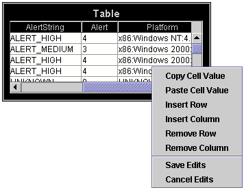
To edit an existing cell value, double-click within a cell and enter a new value. When you are finished editing within a cell, you must press <Enter> or click on another cell before saving your edits. If the data entered is not the correct type (int, double, etc.) for that cell, the cell border will turn red and you will not be able to continue editing until the correct type of value is entered.
Right-click to access the following menu options:
|
Copy Cell Value |
Select a cell and right-click to Copy Cell Value. |
|
Paste Cell Value |
Select a cell and right-click to Paste Cell Value. |
|
Insert Row |
Select a cell in the row that is immediately above or below where you want to insert a new row and right-click to Insert Row. A dialog will appear asking you to enter a row name and specify whether to insert the new row above or below the selected row. Click OK to exit the dialog and add the new row. Note: If the Property Value of rowLabelMode is 0, row names will not appear in the table. |
|
Insert Column |
Select a cell in the column that is immediately to the right or left of where you want to insert a new column and right-click to Insert Column. A dialog will appear asking you to enter a column name, column type, and specify whether to insert the new column to the right or left of the selected column. Click OK to exit the dialog and add the new column. |
|
Remove Row(s) |
Select one or more cells and right-click to Remove Row(s) containing the selected cell(s). |
|
Remove Column(s) |
Select one or more cells and right-click to Remove Column(s) containing the selected cell(s). Note: The column that contains row names cannot be deleted. The table will only contain a column with row names if the Property Value of rowLabelMode is greater than 0. |
|
Save/Cancel Edits |
Right-click on the table to Save or Cancel Edits. |
Save or Cancel Edits
If you exit a display while tables are in Edit mode without saving or canceling changes, a dialog will appear (for each table with unsaved changes) asking if you would like to save your table edits.
Once you save or cancel your changes, the table will display current values for the valueTable data attachment and return to its original color scheme to indicate you are out of Edit mode.
If you edit a table within an applet and do not save your changes, you will not be prompted to save when exiting.
Table Edits - Custom Message Handler
Note: This section assumes you have a working knowledge of writing, compiling and deploying Java classes.
The Custom Message Handler is a Java class that allows you to extend the functionality of RTView by implementing code to update your system when the table is edited. Once the Custom Message Handler has been created, it can be deployed with your displays so that end users who are editing tables do not need to be familiar with the systems they are updating.
To implement a Custom Message Handler, you must create a Java class named MyMessageHandler.java that extends GmsRtViewCustomMessageHandler.
Note: If you will be using the Custom Message Handler with the Display Viewer Applet, pack the Java class you create into one of the applet .jar files before deploying.
Define the following method in MyMessageHandler.java:
public boolean invokeMessage (String messageString, Object value)
The invokeMessage method will get called while the table is being edited. The messageString argument will contain one of the messages listed below. The value argument will be a 4 element Object array. The first two arguments in the Object array are constant, the rest vary based on the corresponding message.
The invokeMessage method must return true when it receives any of the following messages, otherwise it must return false.
Note: The MessageHandler will receive other messages, but the method should not return true or implement code when receiving anything other than the messages listed below.
The following lists messages and corresponding value arguments:
|
Message |
Description |
Object Array Values |
||
|
table_edit_start |
The invokeMessage method will get called with this message when Edit Table is selected from the popup menu. |
Argument |
Definition |
Type |
|
value[0] |
Table object being edited. |
GmsAppObject |
||
|
value[1] |
Name of the variable assigned to editDataLocalVarName. |
String |
||
|
value[2] |
Initial table data prior to editing. |
GmsTabularData |
||
|
value[3] |
Null |
Null |
||
|
table_edit_save |
The invokeMessage method will get called with this message when Save Edits is selected from the popup menu or when Yes is selected if prompted to save while exiting. |
value[0] |
Table object being edited. |
GmsAppObject |
|
value[1] |
Name of variable assigned to editDataLocalVarName. |
String |
||
|
value[2] |
Table data containing table edits. |
GmsTabularData |
||
|
value[3] |
Null |
Null |
||
|
table_edit_cancel |
The invokeMessage method will get called with this message when Cancel Edits is selected from the popup menu or when No is selected if prompted to save while exiting. |
value[0] |
Table object being edited. |
GmsAppObject |
|
value[1] |
Name of variable assigned to editDataLocalVarName. |
String |
||
|
value[2] |
Table data containing the current value of valueTable. If data for the valueTable attachment was updated during editing, this may not be the same as data sent with the table_edit_start message. This message does not contain table edits. |
GmsTabularData |
||
|
value[3] |
Null |
Null |
||
|
table_edit_remove_row |
This message is sent when Remove Row or Remove Rows is selected from the popup menu. |
value[0] |
Table object being edited. |
GmsAppObject |
|
value[1] |
Name of variable assigned to editDataLocalVarName. |
String |
||
|
value[2] |
GmsTabularData object with one or more data rows that were deleted. |
GmsTabularData |
||
|
value[3] |
Each entry is the index of a deleted row. |
int[] |
||
|
table_edit_insert_row |
This message is sent when Insert Row is selected from the popup menu. |
value[0] |
Table object being edited. |
GmsAppObject |
|
value[1] |
Name of variable assigned to editDataLocalVarName. |
String |
||
|
value[2] |
GmsTabularData object with one row that contains the row data that was inserted. |
GmsTabularData |
||
|
value[3] |
Value is the index of the inserted row. |
Integer |
||
|
table_edit_update_row |
This message is sent when a cell from the table is edited. |
value[0] |
Table object being edited. |
GmsAppObject |
|
value[1] |
Name of variable assigned to editDataLocalVarName. |
String |
||
|
value[2] |
GmsTabularData object with two rows. Row[0] contains row data before the cell was edited, Row[1] contains row data after the cell was edited. |
GmsTabularData |
||
|
value[3] |
Element[0] is the row number of the cell. Element[1] is the column number of the cell or the value -1 for the row label column. |
int[] |
||
|
table_edit_remove_column |
This message is sent when Remove Column or Remove Columns is selected from the popup menu. |
value[0] |
Table object being edited. |
GmsAppObject |
|
value[1] |
Name of variable assigned to editDataLocalVarName. |
String |
||
|
value[2] |
GmsTabularData object with columns that existed before the column was removed and no rows. |
GmsTabularData |
||
|
value[3] |
Each entry is the index of a deleted column. |
int[] |
||
|
table_edit_insert_column |
This message is sent when Insert Column is selected from the popup menu. |
value[0] |
Table object being edited. |
GmsAppObject |
|
value[1] |
Name of variable assigned to editDataLocalVarName. |
String |
||
|
value[2] |
GmsTabularData object with columns that existed after the column was inserted and no rows. |
GmsTabularData |
||
|
value[3] |
Value is the index of the inserted column. |
Integer |
||
In the Standard Table (class name: obj_table02), it is possible to set font color, background color, row visibility and replace a cell value with an image based on the value of individual columns, rows and cells.
Note: It is recommended that you attach the table to data before attempting to define filters.
In the Object Properties window, double-click on filterProperties in the Property Name field to bring up the Filter Properties dialog. To create a filter, click on the Add button. Double-click on an existing filter to edit. Click the Remove button to delete a filter. Click Clear to remove all filters. Use the Move Up and Move Down buttons to control in what order filters will be applied to the table.
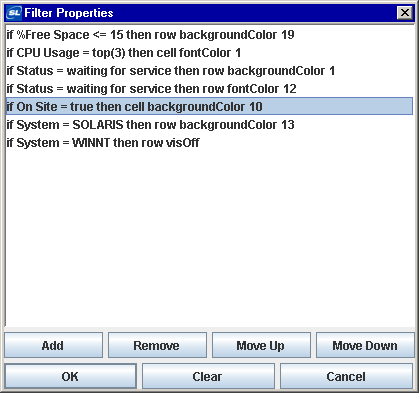
Filters are applied to the table in the order they are listed in the Filter Properties dialog. For example, in the table below, cells that are marked On Site are set to display a background color of green. However, table rows that are marked On Site and contain the SOLARIS system have a background color of gray throughout the entire row. The setting for the SOLARIS row background color overrides the setting for the On Site cell background color because the filters are being applied in the order they are listed above.
Create a Filter
In the Object Properties dialog, double-click in the Property Name field to open the Filter Properties dialog, then click Add. The Edit Filter dialog opens. Each filter is composed of three elements: Condition, Action, and Target:
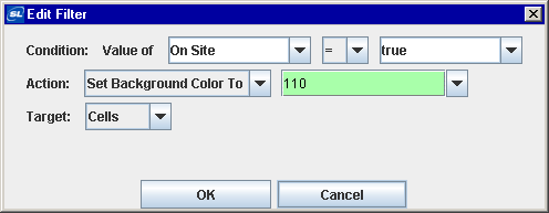
Condition
Define the condition a cell must meet for the filter to be applied. Select a comparison field from the first drop down menu. The comparison field is typically the name of a column (e.g.: On Site) that contains the value (e.g.: true) to which you would like to apply a filter. The comparison field menu is populated with column names based on the table's data attachment, along with the options Row Name and Column Header. You may enter the name of a substitution or variable to use as the value of this field. Select Row Name to filter based on the value of a row name. Select Column Header to filter based on the value of a column header.
Note: If you have not attached the table to data, the only values listed in this menu will be Row Name and Column Header.
In the second drop down menu, select an operator (e.g.: =, >, <, etc.) for the comparison.
In the third drop down menu, select what value the comparison field must correspond to in order for the cell to meet the condition. The comparison value menu is populated with values from the table's data attachment, based on the selected comparison field, along with the options top(5) and bottom(5). Select top (5) to apply the filter to rows or cells that contain the five highest values in the selected comparison field. Select bottom(5) to apply the filter to rows or cells that contain the five lowest values in the selected comparison field. Once a selection is made from the comparison value menu, it is possible to edit the number of rows you would like to filter. You may enter the name of a substitution or variable to use as the value of this field.
Note: If you have not attached the table to data, the only values listed in this menu will be top(5) and bottom(5).
Action
Define the action that will be applied to cells, columns, or rows that meet the condition. Select one of four actions from the first drop down menu. Select Set Background Color to control the color of cells. Select Set Font Color to control the color of text. Select Hide Rows to control the visibility of rows. Select Display Image to replace a cell value with an image.
Note: The Hide Rows action only targets rows.
The second drop down menu is populated with options based on which action is chosen in the first drop down menu. Depending on the action you select; choose which color to apply to the background or font, enter the name of a variable or substitution to use as the value of this field, or select an image from the Select Image dialog. The Select Image dialog contains up to three directories:
§ Current Directory - Contains images in the current directory and one level of subdirectories.
§ Custom Image Library - If you have specified a custom image library, this directory contains those images (.gif, .jpg or .png). See Creating a Custom Image Library (below) for details.
§ Symbol Library - Contains symbolic images (for example, symbols for various types of hardware, shapes, lights, arrows, etc.).
Navigate to the image you want to use and select it. A preview of the image appears in the pane to the right. Click OK or Apply to set the image on your object. If an image is not listed, enter the name of the file, including the relative path.
Target
Control how the filter is applied. There are three targets available. Select Rows to apply the filter to the entire row, if the cell from the comparison field in that row meets the condition. Select Cells to apply the filter to individual cells from the comparison field that meet the condition. Select Columns to apply the filter to the entire comparison field column, if any cell in that column meets the condition.
Note: The target does not apply if you chose Hide Rows as an action.
Creating a Custom Image Library
The custom image library enables you to make your own images available in the Select Image dialog. To add your own image library, perform the following steps.
1. Place your images .jar file and add it to the “RTV_USERPATH” environment variable. The images must be in a directory (not in the top level of the jar). They can be organized into subdirectories of one top level directory.
2. In the Display Builder, select Tools/Builder Options and, in the Custom Image Library Path field, set the path to the directory containing your images .jar file.
For example, if you have a jar with this directory structure:
com/mycompany/Images
com/mycompany/Images/Blue Images
com/mycompany/Images/Red Images
com/mycompany/Images/Green Images
you would enter com/mycompany/Images. This adds a directory named Images to the tree in the Select Image dialog. The Images directory will have three subdirectories: Blue Images, Red Images, and Green Images. Only directories containing images are added to the Select Image dialog.
To access the images, you can edit any property that allows you to set an image on an object (for example, the image, barImage, and filterProperties properties), or edit the File>Background Properties>Image Name field.
Note: You can use animated .gif files in Standard Tables, but only in the Thin Client. In the builder/viewer, the animation will only update once every two seconds or after a mouse event.
In the Object Properties window, double-click on columnFormat in the Property Name field to display the Column Format Properties dialog. In the Column Format Properties dialog you can assign numerical and date formats to columns.
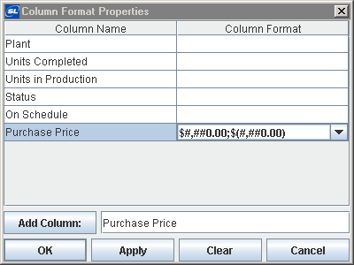
|
Field Name |
Description |
|
Column Name |
This list is populated based on the table's data attachment. If you have not yet attached the table to data, this list will be empty. |
|
Column Format |
Enter or select a format from the drop down menu and press <Enter>. Specify numerical formats using the Java format specification, or with the following shorthand: $ for US dollar money values, $$ for US dollar money values with additional formatting, () for non-money values, formatted similar to money, or # for positive or negative whole values. Specify date formats using the Java date specification. |
|
Add Column |
Enter the name of the column and click the Add Column button to insert a column into the table. |
|
Clear |
Click the Clear button to remove all Column Formats listed. |
Note: Text columns containing data where all the values represent numbers are treated as if they are numeric columns, so number formats can be applied.
The web grid is an advanced HTML implementation of obj_table02 which provides enhanced filtering. The web grid is available in the Thin Client only.
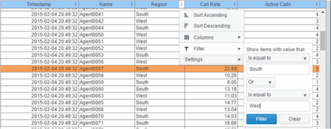
To display your data in a web grid, select the obj_table02 instance in the Builder and check its webGridFlag property in the property sheet. By default, the webGridFlag property is unchecked, which specifies use of the "classic" HTML grid in the Thin Client.
Alternatively, the web grid can be enabled on all obj_table02 instances by adding the following rule to an rtview stylesheet (.rts) file loaded by the Display Server:
obj_table02 {
webGridFlag : 1
}
Requirements
If webGridFlag is true the web grid appears in the Thin Client in any modern version of a supported browser. No plugin is required. For Internet Explorer users, version 9 or newer is required and version 11 is recommended for best performance. In IE8 or older, the web grid is not supported so the classic grid is used regardless of the webGridFlag setting. In this release the web grid is not supported on iPad but might be supported in the future.
Features
The web grid supports advanced, interactive table features in the Thin Client: sorting on multiple columns, filtering on multiple columns, column resizing, column reordering, and hiding columns. In addition, you can unsort a previously selected sort column and, in a grid with rowHeaderEnabledFlag = true, additional columns can be locked into the row header. You can save all of those column settings permanently so that they are restored when you return to the display later. Many of these features are accessed from the column menu, shown in the screen shot above, opened by clicking on the menu icon in each column's header.
Also, for improved performance and usability, if a data table contains more than 200 rows the web grid displays it in pages of 200 rows, using a page control that appears at the bottom of the grid:
Column Sorting
You can click on a column header to sort the table by that column. On the first click, the column is sorted in ascending order (smallest value at the top), on the second click the sort is in descending order, and on the third click, the column is returned to its original unsorted state. A sort on a string column is case-insensitive.
You can select multiple sort columns. In that case, the sorting is performed in the order that the column headers were clicked. Multiple column sorting is a very useful feature, but can also cause confusion if you intend to sort on a single column, but forget to "unsort" any previously selected sort columns first. You should check for the up/down sort icon in other column headers if a sort gives unexpected results.
Column sorting is reflected in an export to HTML and Excel.
Column Visibility
You can hide or show columns in the table by clicking on any column's menu icon, and choosing Columns from the menu. This opens a submenu with a check box for each column that toggles the visibility of the column. All columns in the data table appear in the Columns menu, even those that are initially hidden by the obj_table02 property columnsToHide.
If the grid has the rowHeaderEnabledFlag property checked then the leftmost column (the row header column) cannot be hidden.
Column visibility changes are NOT reflected in an export to HTML and Excel.
Column Filtering
You can create a filter on any column. If filters are created on multiple columns, then only the rows that pass all of the filters are displayed. That is, if there are multiple filters they are logically "ANDed" together to produce the final result.
The background of a column's menu icon changes to white to indicate that a filter is defined on that column. This is intended to remind you which columns are filtered.
You can configure a filter on any column by clicking on the column's menu icon and choosing Filter from the menu. This opens the Column Filter dialog:
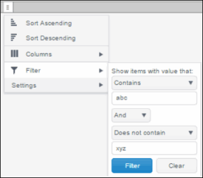
Options in the Column Filter dialog vary according to the data type of the selected column:
§ String columns: You can enter a filter string such as "abc" and, from the dropdown list, select the operator (equal to, not equal to, starts with, contains, etc) to be used when comparing the filter string to each string in the column. All of the filter comparisons on strings are case-insensitive. You can optionally enter a second filter string (e.g. "xyz") and specify if an AND or OR combination should be used to combine the first and second filter results on the column.
§ Numeric columns: You can enter numeric filter values and select arithmetic comparison operators, (=, !=, >, >=, <, <=). You can optionally enter a second filter value and comparison operator, and specify if an AND or OR combination should be used to combine the first and second filter results.
§ Boolean columns: You simply select whether matching items should be true or false.
The numeric and boolean filter dialogs are shown below.
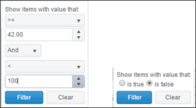
§ Date columns: You can select a date and time and choose whether matching items should have a timestamp that is the same as, before, or after the filter time. The date is selected by clicking on the calendar icon and picking a date from a calendar dialog. The time is selected by clicking on the time icon and picking a time from a dropdown list:
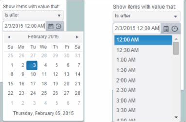
Alternatively, a date and time can be typed into the edit box. See the “Unsupported obj_table02 Features” section for a note on time filtering when the client and server are located in different time zones.
Data updates to the grid are suspended while the filter menu is opened. The updates are applied when the menu is closed.
Column filtering is reflected in an export to HTML and Excel.
Column Locking
This feature is available only if the obj_table02 instance has the row header feature enabled (rowHeaderEnabledFlag is checked). If so, the leftmost column is "locked" in position, meaning that it does not scroll horizontally with the other columns in the table. If the row header is enabled, then two items labeled Lock and Unlock appear in the column menu. These can be used to add or remove additional columns from the non-scrolling row header area.
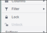
If the row header is enabled, at least one column must remain locked.
Column locking is NOT reflected in an export to HTML and Excel.
Column Reordering
You can reorder the grid columns by dragging and dropping a column's header into another position. If the grid has rowHeaderEnabledFlag checked, then dragging a column into or out of the row header area (the leftmost columns) is equivalent to locking or unlocking the column.
Column reordering is NOT reflected in an export to HTML and Excel.
Paging
If the data table contains more than one page of rows, the page controls are displayed at the bottom of the grid. The default page size is 200 but can be set on each obj_table02 instance via the new property named webGridRowsPerPage. The default value of that property is zero, which indicates that the default size (200) should be used. If the height of the grid is less than about 64 pixels, there is insufficient space to display the page controls so only the rows on the first page is viewable.
Row Mouseover
A new property named webGridHoverColor is available on obj_table02. It is visible only if webGridFlag = true. The default value of webGridHoverColor is checked. If it is set to any other color index value, then that color is used to highlight the row that is under the mouse cursor. But if the obj_table02 filterProperties feature is used to color rows, that color takes precedence, so the webGridHoverColor may not be useful in those cases. Also, if the row header is enabled, the row header column and the other columns are highlighted separately, according to which section of the grid the mouse is over.
Saving Settings
You can permanently save all of the custom settings made to the grid, including filtering, sorting, column size (width), column order, column visibility, and column locking. This is done by opening any column menu, clicking Settings, and then clicking Save All:
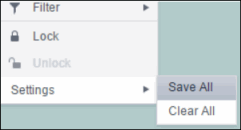
The grid's settings are written as an item in the browser's local storage. The item's value is a string containing the grid's settings. The item uses a unique key comprised of the URL path name, the display name, and the obj_table02 instance's RTView object name. If the Thin Client's login feature is enabled, the key will also include the username and role, so different settings can be saved for each user and role for a grid on any given display, in the same browser and host.
If the user saves the grid settings and navigates away from the display or closes the browser, then the next time the user returns to the display in the same browser the settings are retrieved from the browser's local storage and applied to the grid. The browser's local storage items are persistent, so the grid settings are preserved if the browser is closed and reopened or if the host system is restarted.
If the obj_table02 has autoResizeFlag = true then the column widths are not restored from the saved settings, and the values computed by the auto-resize feature is used instead. This is by design.
You can delete the grid's item from local storage by clicking Settings> Clear All in any column menu. This permanently deletes the saved settings for the grid and returns the grid to the state defined in the display file.
Note that each browser has its own local storage on each host. The local storage items are not shared between browsers on the same host or on different hosts. So, if a user logs in as Joe with role = admin, in Internet Explorer on host H1, and saves grid settings for display X, then those grid settings are restored each time a user logs in as Joe, role admin, on host H1 and opens display X in Internet Explorer. But if all the same is true except that the browser is Chrome, then the settings saved in Internet Explorer are not applied. Or if the user is Joe and role is admin and the browser is IE and the display is X, but the host system is H2 not H1, then the grid settings saved on H1 are not applied.
Support for Large Tables
The web grid can support data tables with many rows and columns. However, for best performance the display server's cellsperpage property should be specified so that the server sends large tables to the client in pages, rather than sending all of the rows. In this server paging mode, large tables are also filtered and sorted in the Display Server, to improve performance and decrease data traffic. The cellsperpage option is not new or specific to the web grid, it has been available for several years. See the RTView documentation for a description of the cellsperpage property, and the related cellsperexport and cellsperreport properties. A typical value for cellsperpage is 20000.
Unsupported obj_table02 Features
The following are existing features of obj_table02 that are not supported by the web grid.
§ The rowHeaderEnabledFlag property is supported, but rowHeaderBgColor, rowHeaderTextColor, rowHeaderTextFont, rowHeaderTextSize are ignored. Instead the row header column is rendered like all other columns.
§ The columnResizeEnabledFlag is ignored if it is false, the web grid always allows column resizing.
§ The editDataEnabledFlag is ignored, the table editing feature using custom commands is currently not supported.
Other limitations, and differences between the new and classic grids:
§ Time zones: The strings shown in a date column are formatted by the display server using its time zone. But if a filter is specified on a date column, the date and time for the filter are computed using the client system's time zone. This can be confusing if the display server and client are in different time zones.
§ Selected rows: The grid's row selection is cleared if the sort is changed or if columns are resized or reordered.
§ Scrollbars: In general the grid only displays scrollbars when they are needed. However, the web grid and the classic grid use different algorithms for deciding when to show or hide scrollbars, and do not use identical row heights and column widths. So the web grid may sometimes display scrollbars when the classic grid does not, for a grid instance with a given width and height.
§ Keyboard traversal: In the classic grid, selecting a row and then using the up/down arrow keys changes the selection to the previous/next row. In the web grid, the arrow keys moves the keyboard focus to another row, as indicated by a highlight border around the focused table cell, but the user must press the space bar to select the row that contains the highlighted (focused) cell.
§ Column widths: On a web grid with no locked columns (rowHeaderEnabledFlag = false), columns expand to fill any unused width in the table, even if autoResizeFlag = false. That is, if the total width of the columns is less than the grid width (i.e. the columns don't use all of the available width) then each column is expanded proportionally to fill the table. In contrast, the classic and Swing (Viewer) grids just leave unused space at the right edge of the grid. If the grid has locked columns (rowHeaderEnabledFlag = true), then the web grid behaves the same as the classic and Swing grids.
§ Export: The export to HTML and Export to excel features are supported on the web grid, and behave much the same as on the classic grid. The exported table respects the grid's filter and sort settings but ignores any column reordering, sizing, or hiding changes made by the user.
§ Data updates to the grid are suspended while the filter menu is opened. The updates are applied when the menu is closed.
Implementation Note for Custom Web Page Developers
The RTView Thin Client now uses two versions of the jQuery JavaScript library:
§ jQuery 1.3.2, to support the jQuery UI components used for panels, layout, and (some) navigation controls.
§ jQuery 1.9.1, to support the web grid.
Version 1.3.2 is bundled into the Thin Client js file named rtvNav1.js, while version 1.9.1 is loaded as a separate js file. To prevent conflicts between the two libraries, the jQuery $ alias is no longer used by RTView and is intentionally removed. Instead the jQuery 1.3.2 library is referenced by the alias rtv.jqNav as needed, and the jQuery 1.9.1 library is referenced by the alias rtv.jq as needed.
This could affect existing custom JavaScript code that users have written. For example, the following is a snippet of JavaScript from a custom html page that uses jQuery UI tabs for navigation
<script src="rtvNav1.js"></script>
<script>
$(document).ready(function () {
var outerLayout = $('body').layout({
north__size:64, north__spacing_open: 0,
});
$('#tabs').tabs();
...
The code above uses the jQuery $ alias, which it assumes is defined in the rtvNav1.js file. But that is no longer true, so the custom code should be rewritten to use the rtv.jqNav alias for jQuery in place of the $ alias, as follows:
<script src="rtvNav1.js"></script>
<script>
rtv.jqNav(document).ready(function () {
var outerLayout = rtv.jqNav('body').layout({
north__size:64, north__spacing_open: 0,
});
rtv.jqNav('#tabs').tabs();
...
Display your data in a rotated table (class name: obj_table03) by attaching it to the valueTable property. The rotated table is a standard table in which the rows and columns have been flipped. Row names are assigned the name of the column displayed in that row.
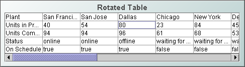
Background Properties
Specify how the background is displayed in a table.
|
Property Name |
Description |
|
bgBorderColor |
Select the |
|
bgBorderFlag |
If selected, a border is drawn around the background rectangle. |
|
bgColor |
Select the |
|
bgEdgeWidth |
Set the width of the 3D edge on the background rectangle. This property is only available if the bgStyle selected is 3D Rectangle. |
|
bgGradientColor2 |
Select the Note: The bgColor property sets the first color in the gradient. |
|
bgGradientMode |
Display a gradient in the background rectangle. Select from the following options: None - No gradient Diagonal Edge - Gradient is drawn at a 45 degree angle from the top left to the bottom right corner of the object. Diagonal Center - Gradient is drawn at a 45 degree angle from the center to the top left and the bottom right corners of the object. Horizontal Edge - Gradient is drawn horizontally from the top to the bottom of the object. Horizontal Center - Gradient is drawn horizontally from the center to the top and bottom of the object. Vertical Edge - Gradient is drawn vertically from the left to the right of the object. Vertical Center - Gradient is drawn vertically from the center to the left and right of the object. |
|
bgRaisedFlag |
Reverses the direction of the gradient, as well as that of the 3D edge if the bgStyle selected is 3D Rectangle. |
|
bgRoundness |
Set the arc length of the rounded corners. This property is only available if the bgStyle selected is Round Rectangle. Note: The value of bgRoundness cannot exceed half the value of the objWidth or the objHeight. If bgRoundness does exceed that value, then half (of the smaller of the two values) of objWidth or objHeight will be used instead. For example, if objWidth is 100 and objHeight is 50, then the value of bgRoundness cannot exceed 25. If it does, then half the value of objHeight (25) will be used instead. |
|
bgShadowFlag |
Select to display a drop shadow on the background rectangle. |
|
bgStyle |
Choose one of the following three options from the drop down menu: Rectangle - Select to display a background rectangle. 3D Rectangle - Select to display a 3D edge on the background rectangle. If selected, use bgEdgeWidth to set the width of the 3D edge. Round Rectangle - Select to display a background rectangle with rounded edges. If selected, use bgRoundness to set the arc length of the rounded corners. |
|
bgVisFlag |
Select to display the background rectangle. |
|
borderPixels |
Set the amount of space (in pixels) between the table and the border. |
|
tableBgColor |
Select the |
Cell Properties
|
Property Name |
Description |
|
cellBgColor |
Select the |
|
cellBgStripeContrast |
Set the contrast level for alternating row colors. Note: This property is only applicable if cellBgStripedFlag is selected. |
|
cellBgStripedFlag |
Select to display alternating row colors. |
|
cellTextColor |
Select the |
|
cellTextFont |
Select a font for the cell text. |
|
cellTextSize |
Specify (in pixels) the size of the cell text or enter -1 to use the default size. |
Column Properties
To resize a column in a rotated table, you must specify the size of each column. Select the ellipsis button  in the columnProperties property and enter a width for each column.
Interaction Properties
To specify a drill down target for the table, double-click on the drillDownTarget property in the Object Properties window. Based on your data attachment, preset substitutions are created automatically and passed into your drill down display. To customize which substitutions will be passed into drill down displays, in the Object Properties window double-click on drillDownColumnSubs in the Property Name field. See “Drill Down Properties” and “Drill Down Column Substitutions Dialog” for more information.
Use drillDownSelectMode to control how a drill down display is activated. Set to Anywhere to activate a drill down display by double-clicking anywhere on the table. Set to Element Only to enable a drill down display only when you double-click on a cell in a table.
Object Properties
|
Property Name |
Description |
|
anchor |
Specify where to anchor an object in the display. Note: If an object has the dock property set, the anchor property will be ignored. The anchor property is only applied when the dimensions of the display are modified, either by editing “Background Properties” or resizing the window in Layout mode Select None, or one or more the following options: None - Object not anchored. This is the default. Top - Anchor top of object at top of display. Left - Anchor left side of object at left of display. Bottom - Anchor bottom of object at bottom of display. Right - Anchor right side of object at right of display. When a display is resized, the number of pixels between an anchored object and the specified location remain constant. If an object is anchored on opposite sides (i.e. Top and Bottom or Left and Right), the object will be stretched to fill the available space. |
|
dock |
Specify the docking location of an object in the display. Select from the following options: None - Object is not docked. This is the default. Top - Dock object at top of display. Left - Dock object at left of display. Bottom - Dock object at bottom of display. Right - Dock object at right of display. Fill - Dock object in available space remaining in the display after all docked objects are positioned. |
|
|
If the dimensions of the display are modified, either by editing “Background Properties” or resizing the window in Layout mode, the properties (objX, objY, objWidth, and objHeight) of docked objects will automatically adapt to match the new size of the display. When multiple objects are docked to the same side of the display, the first object is docked against the side of the display, the next object is docked against the edge of the first object, and so on. |
|
|
When objects are docked to multiple sides of the display, the order in which objects were added to the display controls docking position. For example, let's say the first object added to the display is docked at the Top and the second object is docked at the Left. Consequently, the first object will fill the entire width of the display and the second object will fill the left side of the display from the bottom of the first object to the bottom of the display. Objects in a display have the dock property set to Fill, are laid out across a grid in the available space remaining after all docked objects are positioned. By default, the grid has one row and as many columns as there are objects in the display. You can modify the grid in the Background Properties dialog. Once an object is docked, there are some limitations on how that object can be modified: § Docked objects cannot be dragged or repositioned using objX and objY properties. § Docked objects cannot be resized using the objWidth or objHeight properties. To resize you must drag on the resize handle. § Docked objects can only be resized toward the center of the display (e.g. If an object is docked at the Top, only its height can be increased by dragging down toward the center of the display). § Docked objects set to Fill cannot be resized at all. § Docked objects cannot be moved using Align. Non-docked objects can be aligned against a docked object, but a docked object will not move to align against another object. § Docked objects are ignored by Distribute. |
|
objHeight |
Sets the height (in pixels) of the object. |
|
objName |
Name given to facilitate object management via the Object List dialog. Select Tools>Object List. |
|
objWidth |
Sets the width (in pixels) of the object. |
|
objX |
Set the x position of the object. |
|
objY |
Set the y position of the object. |
|
styleClass |
Enter the style class name for this object as defined in your style sheet. If not specified, the object class name is used. Note: The value entered must not contain spaces and cannot start with rtv-. |
|
visFlag |
Control visibility of the object. |
Display your data in an object grid (obj_objectgrid) by attaching it to the valueTable property. An object grid displays returned data as multiple objects, called icon objects, in a scrollable grid. Each icon object in the grid is analogous to a row of data in the standard table. Icon objects display the data using graphic attributes (e.g., color, dimension, orientation, etc.). The default icon object displayed in the object grid is obj_circ2d_ilvx_ra4 (shown below).

Any object that appears in the Object Palette (with the exception of tables and graphs) can be used as an icon object. To specify which object to use in the object grid, in the Object Properties window, double-click on iconProperties in the Icon category. See “Icon Properties” for more information.
Background Properties
Specify how the background is displayed in the object grid.
|
Property Name |
Description |
|
bgBorderColor |
Select the |
|
bgBorderFlag |
If selected, a border is drawn around the background rectangle. |
|
bgColor |
Select the |
|
bgEdgeWidth |
Set the width of the 3D edge on the background rectangle. This property is only available if the bgStyle selected is 3D Rectangle. |
|
bgGradientColor2 |
Select the Note: The bgColor property sets the first color in the gradient. |
|
bgGradientMode |
Display a gradient in the background rectangle. Select from the following options: None - No gradient Diagonal Edge - Gradient is drawn at a 45 degree angle from the top left to the bottom right corner of the object. Diagonal Center - Gradient is drawn at a 45 degree angle from the center to the top left and the bottom right corners of the object. Horizontal Edge - Gradient is drawn horizontally from the top to the bottom of the object. Horizontal Center - Gradient is drawn horizontally from the center to the top and bottom of the object. Vertical Edge - Gradient is drawn vertically from the left to the right of the object. Vertical Center - Gradient is drawn vertically from the center to the left and right of the object. |
|
bgRaisedFlag |
Reverses the direction of the gradient, as well as that of the 3D edge if the bgStyle selected is 3D Rectangle. |
|
bgRoundness |
Set the arc length of the rounded corners. This property is only available if the bgStyle selected is Round Rectangle. Note: The value of bgRoundness cannot exceed half the value of the objWidth or the objHeight. If bgRoundness does exceed that value, then half (of the smaller of the two values) of objWidth or objHeight will be used instead. For example, if objWidth is 100 and objHeight is 50, then the value of bgRoundness cannot exceed 25. If it does, then half the value of objHeight (25) will be used instead. |
|
bgShadowFlag |
Select to display a drop shadow on the background rectangle. |
|
bgStyle |
Choose one of the following three options from the drop down menu: Rectangle - Select to display a background rectangle. 3D Rectangle - Select to display a 3D edge on the background rectangle. If selected, use bgEdgeWidth to set the width of the 3D edge. Round Rectangle - Select to display a background rectangle with rounded edges. If selected, use bgRoundness to set the arc length of the rounded corners. |
|
bgVisFlag |
Select to display the background rectangle. |
|
borderPixels |
Set the amount of space (in pixels) between the table and the border. |
Foreground Properties
|
Property Name |
Description |
|
fgColor |
Set the color of the space between the objects. Select the |
|
fgGradientColor2 |
Select the Note: The fgColor property sets the first color in the gradient. |
|
fgGradientMode |
Display a gradient in the space between the objects. Select from the following options: None - No gradient Diagonal Edge - Gradient is drawn at a 45 degree angle from the top left to the bottom right corner of the object. Diagonal Center - Gradient is drawn at a 45 degree angle from the center to the top left and the bottom right corners of the object. Horizontal Edge - Gradient is drawn horizontally from the top to the bottom of the object. Horizontal Top - Gradient is drawn horizontally from the center to the top and bottom of the object. Vertical Edge - Gradient is drawn vertically from the left to the right of the object. Vertical Center - Gradient is drawn vertically from the center to the left and right of the object. |
Interaction Properties
To specify a drill down target for the table, double-click on the drillDownTarget property in the Object Properties window. Based on your data attachment, preset substitutions are created automatically and passed into your drill down display. To customize which substitutions will be passed into drill down displays, in the Object Properties window double-click on drillDownColumnSubs in the Property Name field. See “Drill Down Displays” and “Drill Down Column Substitutions Dialog” for more information.
Use drillDownSelectMode to control how a drill down display is activated. Set to Anywhere to activate a drill down display by double-clicking anywhere on the object grid. Set to Element Only to enable a drill down display only when you double-click on an object in the grid.
Use the menuItemGroup and rightClickActionFlag properties to extend RTView context menu items. For details, see “Extending the Context Menu”.
Object Properties
|
Property Name |
Description |
|
anchor |
Specify where to anchor an object in the display. Note: If an object has the dock property set, the anchor property will be ignored. The anchor property is only applied when the dimensions of the display are modified, either by editing “Background Properties” or resizing the window in Layout mode Select None, or one or more the following options: None - Object not anchored. This is the default. Top - Anchor top of object at top of display. Left - Anchor left side of object at left of display. Bottom - Anchor bottom of object at bottom of display. Right - Anchor right side of object at right of display. When a display is resized, the number of pixels between an anchored object and the specified location remain constant. If an object is anchored on opposite sides (i.e. Top and Bottom or Left and Right), the object will be stretched to fill the available space. |
|
dock |
Specify the docking location of an object in the display. Select from the following options: None - Object is not docked. This is the default. Top - Dock object at top of display. Left - Dock object at left of display. Bottom - Dock object at bottom of display. Right - Dock object at right of display. Fill - Dock object in available space remaining in the display after all docked objects are positioned. If the dimensions of the display are modified, either by editing “Background Properties” or resizing the window in Layout mode, the properties (objX, objY, objWidth, and objHeight) of docked objects will automatically adapt to match the new size of the display. |
|
|
When multiple objects are docked to the same side of the display, the first object is docked against the side of the display, the next object is docked against the edge of the first object, and so on. When objects are docked to multiple sides of the display, the order in which objects were added to the display controls docking position. For example, let's say the first object added to the display is docked at the Top and the second object is docked at the Left. Consequently, the first object will fill the entire width of the display and the second object will fill the left side of the display from the bottom of the first object to the bottom of the display. Objects in a display have the dock property set to Fill, are laid out across a grid in the available space remaining after all docked objects are positioned. By default, the grid has one row and as many columns as there are objects in the display. You can modify the grid in the Background Properties dialog. |
|
|
Once an object is docked, there are some limitations on how that object can be modified: § Docked objects cannot be dragged or repositioned using objX and objY properties. § Docked objects cannot be resized using the objWidth or objHeight properties. To resize you must drag on the resize handle. § Docked objects can only be resized toward the center of the display (e.g. If an object is docked at the Top, only its height can be increased by dragging down toward the center of the display). § Docked objects set to Fill cannot be resized at all. § Docked objects cannot be moved using Align. Non-docked objects can be aligned against a docked object, but a docked object will not move to align against another object. § Docked objects are ignored by Distribute. |
|
objHeight |
Sets the height (in pixels) of the object. |
|
objName |
Name given to facilitate object management via the Object List dialog. Select Tools>Object List. |
|
objWidth |
Sets the width (in pixels) of the object. |
|
objX |
Set the x position of the object. |
|
objY |
Set the y position of the object. |
|
styleClass |
Enter the style class name for this object as defined in your style sheet. If not specified, the object class name is used. Note: The value entered must not contain spaces and cannot start with rtv-. |
|
transparencyPercent |
Set transparency of the object. Enter a value between 0 and 100. A value of 0, the default, sets the object to be completely opaque. A value of 100 will render the object completely transparent. |
|
visFlag |
Control visibility of the object. |
Sort Properties
To sort the object grid by a column from the data attachment, enter the name of that column as the Property Value for sortColumnName in the Object Properties window. The column used to sort the object grid must be also be entered as a Property Value for iconProperties (e.g., PERCENTCOMPLETED). See “Icon Properties” (next) for more information.
In the Object Properties window, double-click on iconProperties in the Property Name field to bring up the Icon Properties dialog. Icon objects in the Object Grid display data using graphic attributes (e.g., color, dimension, orientation, etc.). In the Icon Properties dialog you can assign the icon object(s) you want to use in an Object Grid, and the attributes for each icon object.
Before assigning attributes to icon objects, it is recommended that you attach the Object Grid to data and determine which object(s) you want to use. Objects can be seen in the Object Palette of the Display Builder. All objects in the Object Palette, with the exception of tables and graphs, can be used as an icon object.
Note: If you use a Composite object as the icon, then the bgOpaqueFlag property must be selected on the Object Grid.
Object class names appear in the status bar at the bottom of the window when an object is selected. For custom objects that are not in the standard palette, type in the class name. The object class name is what you need to specify the icon object.

|
Property Name |
Description |
|
Icon Class Name |
Select an object from the drop down menu. The default icon object displayed in the Object Grids obj_circ2d_ilvx_ra4. For custom objects that are not in our standard palette, type in the class name. |
|
Property Names |
Property Names are populated based on the icon object you choose from the Icon Class Name drop down list. Properties appear in the Property Names column that are associated with the icon object selected from the Icon Class Name drop down list. |
|
Map |
Select one of three Map column options: Default - Select to use the default value for this property. In this case, you do not need to set the Property Value. If the default value for this property changes in future releases of RTView, your icon object will reflect the new default value. Value - Select to specify a value. In this case, you need to set the value in Property Value. Column - Select to specify a column in the data source attached to the Object Grid's valueTable property. In this case, you need to select a column in Property Value. |
|
Property Value |
Select a value for the property from the drop down list. Options are populated based on the selections you make for Property Name and Map. For instance, when Map is set to Column, the Property Value drop down lists all columns from the table in valueTable as options to map to. |
|
Allow multiple icon types |
Check the box to enable. The Add Icon button appears. This allows you to use different graphic objects to represent different cells of data from each single row of data. |
|
Add Icon |
Click Add Icon, select an icon object from the Add Icon dialog drop down menu and click OK. The icon object is added to the list of available icon objects for the Object Grid. |
|
Delete Icon |
Removes the icon object from the list available to the Object Grid. If there are multiple icon objects in the list, properties of the selected icon is shown. |
See the “Examples” section for an example of how to create an Object Grid with multiple icon objects.
The following describes the Icon Properties dialog commands:
|
Command |
Description |
|
OK |
Applies values and closes the dialog. |
|
Apply |
Applies values without closing the dialog. |
|
Reset |
Resets all fields to last values applied. |
|
Clear |
Clears all fields. Detaches object from data source (once Apply or OK is selected). |
|
Cancel |
Closes the dialog with last values applied. |
iconProperties
Objective: Create an object grid table using multiple icon objects

In this example, the object grid table will contain two icon objects. One icon object will display two columns of data from the data source: the Units Completed column and Plant name column. The other icon object will display data from the On Schedule column. The object grid table will look like this:
The data attachment for this exercise contains the following:
|
Plant |
Units Completed |
On Schedule |
|
San Francisco |
95 |
true |
|
San Jose |
51 |
false |
|
Dallas |
66 |
true |
|
Chicago |
55 |
false |
|
New York |
64 |
true |
|
Detroit |
7 |
true |
To create the object grid table:
1. Attach an object grid table to the valueTable property.
2. Double-click on iconProperties (category: Icon). In the Icon Properties dialog:
value - Select Column from the Map drop down menu. Select Units Completed from the Property Value drop down menu.
label - Select Column from the Map drop down menu. Select Plant from the Property Value drop down menu.
Click OK.
We get the following results.
Notice that information from the On Schedule column is not displayed. We have not mapped it to an icon object. Also, notice that the numeric values have changed. This is because we are attaching to live data.
3. To add another icon object, double click on iconProperties (category: Icon).
4. In the Icon Properties dialog:
Check the Allow multiple icon types box and click Add Icon.
Select an icon object from the Icon Class Name drop down menu (in this example, obj_indstatus_light) and click OK. The icon object appears in the list of available icon objects for this object grid table.
With the icon object you just added selected in the list of available icon objects, edit the following properties:
label - Select Column from the Map drop down menu. Select On Schedule from the Property Value drop down menu.
status - Select Column from the Map drop down menu. Select On Schedule from the Property Value drop down menu.
Click OK.
We get the following results.
The display now shows three columns of data: the Plant and Units Completed columns are shown in the first icon object and the On Schedule column is shown in the second icon object.
 button and choose a color from the palette to set the color of the edge on the background rectangle. This property is only applicable if bgBorderFlag is selected.
  button and choose a color from the palette to set the background color.
  button and choose a color for the second color in the gradient. Default is white.
  button to open the
  button to open the
  button and choose a color from the palette to set the label text color.
  button and choose a color from the palette to set the background color of the tree control.
 button to open the
  button to open the
  button and choose a color from the palette to set the label text color.
  button to open the Node Properties dialog and map images to values, and set the status priority order for propagation up the tree.
 button to open the
  button and choose a color from the palette to set the background color of the accordion control.
 button to open the
  button to open the
  button and choose a color from the palette to set the label text color.
 button to open the
  button and choose from the palette to set the background color. The Default color is grey. Color properties are treated differently on Fx trend graph than on other objects, see the
  button to open the
  button and choose from the palette to set the color of the cursor. The Default color is black. Color properties are treated differently on Fx trend graph than on other objects, see the
  button to open the Edit Label dialog.
 button and choose from the palette to set the label text color.
  button and choose from the palette to set the background color of the legend. The Default color is grey.
  button and choose from the palette to set the color of the grid.
 button and choose from the palette to set the background color of your graph. The Default color is grey.
  button and choose from the palette to set the trace color. The default color is yellow. Color properties are treated differently on Fx trend graph than on other objects, see the
  button and choose from the palette to set the trace marker color. Color properties are treated differently on Fx trend graph than on other objects, see the
  button and choose from the palette to set the x-axis color.
  button and choose from the palette to set the y-axis color.
  button and choose from the palette to set the background color.
  button to open the
  button and choose from the palette to set text color inside the bars if
  button to open the
  button to open the
 button to open the
  button and choose from the palette to set the label text color.
 button and choose from the palette to set the background color of the legend.
 button and choose from the palette to set the color of the legend text.
 button and choose from the palette to set one of the alternating row colors in the grid background. The color you specify for
  button and choose from the palette to set the color of the grid background. Default is transparent.
  button and choose from the palette to set the color of the grid lines. Default is
  button and choose from the palette to set the color of the x-axis.
 button and choose from the palette to set the color of the y-axis.
 button in the
  button in the
  button and choose a color from the palette to set the background color. The Default color is
  button to open the
  button to open the
 button to open the
  button and choose a color from the palette to set the label text color.
 button and choose a color from the palette to set the background color of the legend. The Default color is
  button and choose a color from the palette to set the text color of the legend
 button and choose a color from the palette to set the text color of the wedge label.
  button and choose a color from the palette to set the color of the edge on the background rectangle. This property is only applicable if
  button and choose a color from the palette to set the background color.
 button and choose a color for the second color in the gradient. Default is white.
 button to open the
  button and choose a color from the palette to set the color of the cursor.
 button to open the
  button and choose a color from the palette to set the label text color.
 button and choose a color from the palette to set the background color of the legend.
  button and choose a color for the second color in the gradient. Default is white.
  button and choose a color from the palette to set the color of the one-pixel outline around the legend area, around each color swatch within the legend, and around the plot area. The default value is black (color 7).
 button and choose a color from the palette to set the color of the grid.
 button and choose a color from the palette to set the background color of your graph.
 button and choose a color for the second color in the gradient. Default is white.
 button and choose a color from the palette to set the trace color.
 button and choose a color from the palette to set the trace marker color.
 button and choose a color from the palette to set the color of the edge on the background rectangle. This property is only applicable if
  button and choose a color from the palette to set the background color.
 button and choose a color for the second color in the gradient. Default is white.
  button to open the
  button to open the Edit
  button to open the
  button to open the
  button and choose a color from the palette to set the label text color.
 button and choose a color from the palette to set the background color of the legend.
 button and choose a color for the second color in the gradient. Default is white.
  button and choose a color from the palette to set the color of the one-pixel outline around the legend area, around each color swatch within the legend, around the plot area and each bar in the graph. The default value is
  button and choose a color from the palette to set the color of the grid background.
 button and choose a color for the second color in the gradient. Default is
  button and choose a color from the palette to set the color of the grid lines. Default is
  button and choose a color from the palette to set the color of the edge on the background rectangle. This property is only applicable if
  button and choose a color from the palette to set the background color.
 button and choose a color for the second color in the gradient. Default is white.
 button to open the Edit
  button to open the
 button to open the
  button and choose a color from the palette to set the label text color.
  button and choose a background color for the legend.
 button and choose a color for the second color in the gradient. Default is
  button and choose a color from the palette to set the color of the one-pixel outline around the legend area and around each color swatch within the legend. The default value is
  button in the
  button in the
  button in the
  button in the
  button in the
  button in the
  button and choose from the palette to set the color of the edge on the background rectangle. This property is only applicable if
  button and choose from the palette to set the background color.
 button and choose a color for the second color in the gradient. Default is
  button to open the
  button to open the
 button to open the
  button and choose from the palette to set the label text color.
 button and choose from the palette to set the background color of the legend.
 button and choose a color for the second color in the gradient. Default is
  button and choose a color from the palette to set the color of the one-pixel outline around the legend area and around each color swatch within the legend. The default value is
  button and choose from the palette to set the color of the grid lines.
 button and choose from the palette to set the background color of the plot area.
 button and choose the second color in the gradient. Default is
  button and choose from the palette to set the color of the radial axis and radial axis labels.
 button and choose from the palette to set the color of the value axis and value axis labels.
 button and choose a color from the palette to set the color of the edge on the background rectangle. This property is only applicable if
  button and choose a color from the palette to set the background color.
 button and choose a color for the second color in the gradient. Default is
  button to open the
  button and choose a color from the palette. The default is
  button to open the
 button and choose a color from the palette to set the color of the one-pixel outline around the legend area, around each color swatch within the legend, and around the plot area. The default value is
  button to open the
  button and choose a color from the palette to set the label text color.
 button and choose a color from the palette to set the background color of the legend.
 button and choose a color for the second color in the gradient. Default is
  button and choose a color from the palette to set the color of the grid background.
 button and choose a color for the second color in the gradient. Default is
  button and choose from the palette to set the color of the grid lines. Default is
  button and choose from the palette to set the color of the edge on the background rectangle. This property is only applicable if
  button and choose from the palette to set the background color.
 button and choose from the palette to set the second color in the gradient. Default is
  button to open the
  button and choose from the palette. The default is
  button to open the
 button to open the
  button and choose from the palette to set the label text color.
 button and choose from the palette to set the background color of the legend.
 button and choose a color for the second color in the gradient. Default is
  button and choose a color from the palette to set the color of the one-pixel outline around the legend area, around each color swatch within the legend, and around the plot area. The default value is
  button and choose from the palette to set the background color of the plot area.
 button and choose a color for the second color in the gradient. Default is
  button and choose from the palette to set the color of the grid line.
 button and choose from the palette. The default is
  button and choose from the palette. Default is
  button and choose from the palette to set the price trace line color.
 - A bar extending from the low to high price data points. A left flange indicates the opening price and the right flange indicates the closing price. The
 button and choose from the palette to set the overlay line color.
 button and choose a color from the palette to set the color of the edge on the background rectangle. This property is only applicable if
  button and choose a color from the palette to set the background color.
 button and choose a color for the second color in the gradient. Default is
  button to open the
  button to open the
  button and choose a color from the palette to set the label text color.
 button and choose a background color for the legend.
 button and choose a color for the second color in the gradient. Default is
  button and choose from the palette to set the legend text color.
 button and choose a color from the palette to set the color of the one-pixel outline around the legend area and around each color swatch within the legend. The default value is black (color 7).
 button and choose from the palette to set the color of the edge on the background rectangle. This property is only applicable if
  button and choose from the palette to set the background color.
 button and choose a color for the second color in the gradient. Default is
  button and choose from the palette to set the maximum color value. Node colors will range from the
  button and choose from the palette to set the minimum color value. Node colors will range from the
  button to open the
  button to open the
 button to open a dialog to select which columns to include in tool tips and, optionally, specify a date format (or other numeric format) and value divisor (for numeric columns) for each column displayed. In the tool tip, the name and value for each selected column is displayed. If the
  button to open the
  button and choose from the palette to set the label text color.
 button and choose from the palette to set the background color for the nodes.
 button and choose from the palette to set the text color for the node labels.
 button and choose from the palette to set the node color if the value matches the specified
  button and choose from the palette to set the node color if the value matches the specified
  button and choose a color from the palette to set the color of the edge on the background rectangle. This property is only applicable if
  button and choose a color from the palette to set the background color.
 button and choose a color for the second color in the gradient. Default is
  button to open the
  button and choose a color from the palette to set the color of the cursor.
  button to open the
  button and choose a color from the palette to set the label text color.
 button and choose a color from the palette to set the background color of the legend.
 button and choose a color for the second color in the gradient. Default is
  button and choose a color from the palette to set the background color of your chart.
 button and choose a color from the palette to set the trace line color.
 button and choose a color from the palette to set the trace marker color.
 button and choose from the palette to set the color of the edge on the background rectangle. This property is only applicable if
  button and choose from the palette to set the background color.
 button and choose a color for the second color in the gradient. Default is
  button and choose from the palette to set the background color of the label for the top (first) bar and every other bar below it.
 button and choose from the palette to set the background color of the label for the second bar from the top and every other bar below it.
 button and choose from the palette to set the bar label text color.
 button to open the
  button to open the
 button to open the
  button and choose from the palette to set the label text color.
 button and choose from the palette to set the color of the grid background.
 button and choose from the palette to set the color of the grid lines. Default is
  button and choose from the palette to set the color of the x-axis. Default is
  button in the
  button in the
  button to open the
  button to open the
  button to open the
  button and choose a color from the palette to use for the background if value equals
  button and choose a color from the palette to use for the second gradient color of the background if value equals
  button and choose a color from the palette to use for the background if value equals
  button and choose a color from the palette to use for the second gradient color of the background if value equals
  button and choose a color from the palette to use for the background if value equals
  button and choose a color from the palette to use for the second gradient color of the background if value equals
  button and choose from the palette to set the color of the edge on the background. This property is only applicable if
  button and choose from the palette to set the background color.
 button and choose from the palette to set the second color in the gradient. The
  button and choose from the palette to set the color of the value label.
 button to open the
  button to open the
  button and choose from the palette to set the color of the label text.
 button and choose a color from the palette to use for the background if
  button and choose a color from the palette to use for the second color of the background gradient if
  button and choose a color from the palette to use for the background if
  button and choose a color from the palette to use for the second color of the background gradient if
  button and choose a color from the palette to use for the background if value is greater than
  button and choose a color from the palette to use for the second gradient color of the background if value is greater than
  button and choose a color from the palette to use for the background if value is greater than
  button and choose a color from the palette to use for the second gradient color of the background if value is greater than
  button and choose a color from the palette to use for the background if value is less than
  button and choose a color from the palette to use for the second gradient color of the background if value is less than
  button and choose a color from the palette to use for the background if value is less than
  button and choose a color from the palette to use for the second gradient color of the background if value is less than
  button and choose from the palette to set the color of the edge on the background. This property is only applicable if
  button and choose from the palette to set the background color.
 button and choose from the palette to set the second color in the gradient. The
  button and choose from the palette to set the color of the value label.
 button to open the
  button to open the
  button and choose from the palette to set the color of the label text.
 button and choose a color from the palette to use for the background if
  button and choose a color from the palette to use for the second color of the background gradient if
  button and choose a color from the palette to use for the background if
  button and choose a color from the palette to use for the second color of the background gradient if
  button and choose a color from the palette to use for the background if value and
  button and choose a color from the palette to use for the second gradient color of the background if value and
  button and choose from the palette to set the color of the edge on the background. This property is only applicable if
  button and choose from the palette to set the background color.
 button and choose from the palette to set the second color in the gradient. The
  button and choose from the palette to set the color of the value label.
 button to open the
  button to open the
  button and choose from the palette to set the color of the label text.
 button and choose a color from the palette to use for the background if
  button and choose a color from the palette to use for the second color of the background gradient if
  button and choose a color from the palette to use for the background if
  button and choose a color from the palette to use for the second color of the background gradient if
  button and choose a color from the palette to use for the indicator if value equals
  button and choose a color from the palette to use for the second gradient color of the indicator if value equals
  button and choose a color from the palette to use for the indicator if value equals
  button and choose a color from the palette to use for the second gradient color of the indicator if value equals
  button and choose a color from the palette to use for the indicator if value equals
  button and choose a color from the palette to use for the second gradient color of the indicator if value equals
  button and choose from the palette to set the color of the edge on the background. This property is only applicable if
  button and choose from the palette to set the background color.
 button and choose from the palette to set the second color in the gradient. The
  button to open the
  button to open the
  button and choose from the palette to set the color of the label text.
 button and choose a color from the palette to use for the background if
  button and choose a color from the palette to use for the second color of the background gradient if
  button and choose a color from the palette to use for the background if
  button and choose a color from the palette to use for the second color of the background gradient if
  button and choose from the palette to set the color of the High Alarm.
 button and choose from the palette to set the color of High Warning.
 button and choose a color from the palette to set the color of the edge on the background rectangle.
  button and choose a color from the palette to set the background color.
 button and choose from the palette to set the second color in the gradient. The
  button and choose from the palette to set the color of the value text.
 button to open the
  button to open the
  button to open the
  button and choose a color from the palette to set the background color.
 button and choose from the palette to set the second color in the gradient. The
  button and choose from the palette to set the color of the label text.
 button and choose from the palette to set the color of the High Alarm.
 button and choose from the palette to set the color of High Warning.
 button and choose from the palette to set the color of the No Alarm.
 button and choose a color from the palette to set the color of the edge on the background rectangle.
 button and choose a color from the palette to set the background color.
 button and choose from the palette to set the second color in the gradient. The bgColor property sets the first color in the gradient.
  button and choose from the palette to set the color of the value text.
 button to open the
  button to open the
  button and choose a color from the palette to set the background color.
 button and choose from the palette to set the second color in the gradient. The
  button and choose from the palette to set the color of the label text.
 button and choose a color from the palette to set the color of the edge on the background rectangle.
 button and choose a color from the palette to set the background color.
 button and choose from the palette to set the second color in the gradient. The
  button and choose from the palette to set the color of the value text.
 button to open the
  button to open the
  button to open the
  button and choose a color from the palette to set the background color.
 button and choose from the palette to set the second color in the gradient. The
  button and choose from the palette to set the color of the label text.
 button to open the
  button to open the
  button and choose from the palette to set the color of the label text.
 button and choose a color from the palette to set the color of the edge on the background rectangle.
  button and choose a color from the palette to set the background color.
 button and choose from the palette to set the second color in the gradient. The
  button to open the
  button to open the
  button to open the
  button and choose from the palette to set the color of the label text.
 button and choose a color for the high alert.
 button and choose a color for the low alert.
 button and choose a color for the medium alert.
  button and choose a color for no alert.
  button and choose a color for the high alarm.
  button and choose a color for the high warning.
  button and choose a color for the low alarm.
  button and choose a color for the low warning.
 button and choose a color for the source arrow.
 button and choose a color for the target arrow.
  button and choose the color of the value text.
  button and choose a color for the border of the background rectangle. This property is only applicable if
  button and choose a fill color for the background rectangle.
 button and choose a color for the second color in the gradient. Default is white.
  button to open the
  button to open the
  button and choose the color of the label text.
 button and choose a color for the link line.
  button and choose from the palette to set the color of the axis line and tick marks.
 button and choose from the palette to set the color of the axis labels.
 button and choose from the palette to set the color of the edge on the background rectangle. This property is only applicable if
  button and choose from the palette to set the background color.
 button and choose from the palette to set the second color in the gradient. The
  button and choose from the palette to set the color of the bar background.
 button and choose from the palette to set the color of the border of the bar.
 button and choose from the palette to set the color of the bar.
 button and choose from the palette to set the second color in the gradient. The
  button and choose from the palette to set the color of the value label.
 button to open the
  button to open the
  button and choose from the palette to set the color of the label text.
 button and choose from the palette to set the color of the axis line and tick marks.
 button and choose from the palette to set the color of the axis labels.
 button and choose a color from the palette to set the color of the edge on the background rectangle. This property is only applicable if
  button and choose a color from the palette to set the background color.
 button and choose from the palette to set the second color in the gradient. The
  button and choose from the palette to set the color of the value label.
 button and choose from the palette to set the color of the indicator.
 button to open the
  button to open the
  button and choose from the palette to set the color of the label text.
 button and choose from the palette to set the color of the axis line and tick marks.
 button and choose from the palette to set the color of the axis labels.
 button and choose a color from the palette to set the color of the edge on the background rectangle. This property is only applicable if
  button and choose a color from the palette to set the background color.
 button and choose from the palette to set the second color in the gradient. The
  button and choose from the palette to set the color of the bar background.
 button and choose from the palette to set the color of the border of the bar.
  button and choose from the palette to set the color of the bar.
 button and choose from the palette to set the color of the value label.
 button to open the
  button to open the
  button and choose from the palette to set the color of the label text.
 button and choose a color from the palette to set the color of the edge on the background rectangle. This property is only applicable if
  button and choose a color from the palette to set the background color.
 button and choose from the palette to set the second color in the gradient. The
  button and choose from the palette to set the color of the value label.
 button to open the
  button to open the
  button and choose from the palette to set the color of the label text.
 button and choose from the palette to set the color of the background color of the pie.
  button and choose from the palette to set the color of the pie.
 button and choose from the palette to set the second color in the gradient. The
  button and choose from the palette to set the color of the axis line and tick marks.
 button and choose from the palette to set the color of the axis labels.
 button and choose a color from the palette to set the color of the edge on the background rectangle. This property is only applicable if
  button and choose a color from the palette to set the background color.
 button and choose from the palette to set the second color in the gradient. The first color in each gradient is determined by
  button and choose from the palette to set the color of the bar background.
 button and choose from the palette to set the second color in the gradient. The
  button and choose from the palette to set the color of the bar.
  button and choose from the palette to set the color of the value label.
 button to open the
  button to open the
  button and choose from the palette to set the color of the label text.
 button and choose from the palette to set the color of the edge on the background rectangle. This property is only applicable if
  button and choose from the palette to set the background color of the table.
 button and choose a color for the second color in the gradient. Default is
  button and choose from the palette to set the color of empty space in the table area.
 button and choose from the palette to set the background color of the cells.
 button and choose from the palette to set the color of the cell text.
 button and choose a color from the palette to set the color of the edge on the background rectangle. This property is only applicable if
  button and choose a color from the palette to set the background color of the table.
 button and choose a color for the second color in the gradient. Default is
  button and choose a color from the palette.
  button and choose a color for the second color in the gradient. Default is