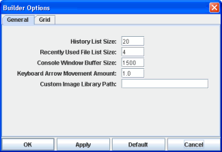
You can manage settings for the Display Builder in the Builder Options dialog. Settings shown below are default settings. The values set in this dialog are automatically restored on application startup and saved on application exit.
Select Tools>Builder Options to modify the following settings:
|
Field Name |
Description |
|
History List Size |
Specify number of consecutive actions (from 0 to 1000) to store in the History Undo and Redo lists. Default is 20. |
|
Recently Used File List Size |
Specify number of recently viewed files (from 0 to 9) to list in the File menu. Default is 4. |
|
Console Window Buffer Size |
Specify number of lines of text (from 0 to 5000) to display in the Console window. Default is 1500. |
|
Keyboard Arrow Movement Amount |
Specify number of pixels (from 1.0 to 100.0) to move an object when using the keyboard arrows. Default is 1.0. |
|
Custom Image Library Path |
Specify the location of your image files to create a custom image library. The custom image library enables you to make your own images available in the Select Image dialog. Before entering the path in the Custom Image Library Path field, you must place your images in a .jar file and add it to the RTV_USERPATH environment variable. Note: The images must be in a directory and not at the top level of the .jar file. They can be organized into subdirectories of one top level directory. |
|
|
After you have prepared the .jar file as described above, specify the location of the directory containing your images in the Custom Image Library Path field. For example, suppose you have a .jar file with the following directory structure: com/mycompany/Images com/mycompany/Images/Blue Images com/mycompany/Images/Red Images com/mycompany/Images/Green Images In the Custom Image Library Path field you would enter com/mycompany/Images to add a directory named Images to the tree in the Select Image dialog. The Images directory will have three subdirectories: Blue Images, Red Images, and Green Images. Note: Only directories containing images will be added to the Select Image dialog. |
|
|
To access your custom image library, edit any property that allows you to set an image on an object (e.g. image, barImage and filterProperties properties) or select File>Background Properties and edit the Image Name field. |
|
Field Name |
Description |
|
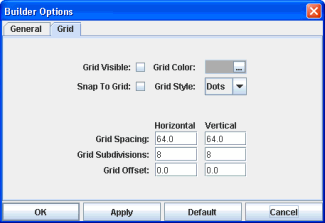
Grid Visible |
Select to display the grid. |
|
Snap To Grid |
Select to snap objects to the grid, this controls alignment when moving or resizing an object. It is not necessary for the grid to be visible to utilize this setting. |
|
Grid Color |
Select grid color. Click on the ellipses button |
|
Grid Style |
Select grid style: Dots or Lines. Default is Dots. |
|
Grid Spacing (Horizontal and Vertical) |
Specify number of pixels between major divisions in the grid. Valid values are positive numbers. Default is 64.0. |
|
Grid Subdivisions (Horizontal and Vertical) |
Specify number of subdivisions between each major division. Valid values are positive integers. Default value is 8. |
|
Grid Offset (Horizontal and Vertical) |
Specify number of pixels to offset grid lines. Values may be negative. Default is 0.0. |
The following describes the Builder Options dialog commands:
|
Command |
Description |
|
OK |
Applies values and closes the dialog. |
|
Apply |
Applies values without closing the dialog. |
|
Default |
Resets all fields to default values (once Apply or OK is selected). |
|
Cancel |
Closes the dialog with last values applied. |
 and choose a color from the palette.