Object
Descriptions
RTView objects
are categorized in the Object Palette according to the appearance and behavior
of each type of object. This section describes how to work with each type
of object and assumes you have already reviewed the following: Add/Edit
Objects,
Object Properties and the
Attach
To Data section for your data source.
To
view sample displays with tutorials, product features, and data source
specific examples go to the demos directory, run the data simulators
that apply to your RTView data
sources and start the Display Builder. Open the file alldisplays.rtv
and double-click on your selection. NOTE: To learn how to start
the Display Builder and run the data simulators refer to the Quick
Start Example.
|
 |
|
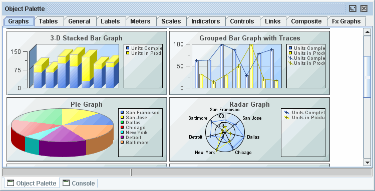
Graphs |
Graphs are useful for comparing data. Trend graphs are used to display a
single variable per trace over time. Bar, pie, radar, and XY graphs are
designed to display information returned by a tabular element in your data
attachment. See the Graphs
page for details.
|
|
Tables
|
Tables offer the ability to display large amounts of data.
See the Tables
page for details. |
| General
|
The General tab contains
flexible objects that can be used to display data and images in addition
to executing commands either manually or based on thresholds. To display
values on these objects, attach the value property to numeric data or the
valueString property to text data,
and the label property to text data.
General objects that feature
the image property can be customized to display your image (.gif,
.jpg or .png) file.
The styleClass property allows you to enter the style class name for this object as
defined in your style sheet.
If not specified, the object class name is used. NOTE: The value entered
must not contain spaces and cannot start with rtv-.
Threshold Objects
Objects labeled Range
Dynamic and Discrete Dynamic on the General Tab support threshold
functionality, allowing you to change the image and color of the object
as well as execute a threshold command
from the object based on the current value of the value property.
Both the range dynamic and the discrete dynamic objects have the thresholding
functionality turned off by default. In the descriptions below, the object's
value is the current value of the value property.
| Range Dynamic |
Range dynamic objects allow
you to setup your threshold so that if the object's value is within a range
of numbers, the threshold functionality executes. To enable the high alarm
threshold, check the valueHighAlarmEnabledFlag. This will enable
several related properties. When the object's value is greater than or
equal to the valueHighAlarm property, the background of the object
will change to the valueHighAlarmColor, the bitmap on the image
will change to the valueHighAlarmImage and the valueHighAlarmCommand
will be executed. To enable the high warning threshold, check the
valueHighWarningEnabledFlag.
When the object's value is greater than or equal to the valueHighWarning,
but less than the valueHighAlarm, the background of the object will
change to the valueHighWarningColor, the bitmap on the image will
change to the valueHighWarningImage and the valueHighWarningCommand
will be executed. The low alarm and low warning threshold properties work
the same way, but activate when the object's value is less than or equal
to the valueLowAlarm or valueLowWarning properties.
For both the discrete dynamic
and range dynamic objects, threshold commands will only execute if the
number of seconds specified in the valueCommandTimeout has elapsed
since the previous threshold command was executed and the value has changed
to another threshold. For example, if the high warning threshold
range is between 40 and 50, when object's value enters this range, the
valueHighWarningCommand
will be executed. The valueHighWarningCommand will not be executed
again until the object's value leaves the high warning threshold range
and then re-enters it. If this occurs in less time than is specified in
the valueCommandTimeout property, it will not be executed until
that time elapses. If the valueCommandTimeout is set to 0, the internal
default, 5 seconds, is used. |
| Discrete
Dynamic |
Discrete dynamic objects
are similar to range dynamic objects, except that the threshold functionality
is executed when the object's value equals the threshold value instead
of when it is within the range of threshold values. To enable the high
alert threshold, check the valueHighAlertEnabledFlag. When the value
property equals the valueHighAlert, the background of the object
will change to the valueHighAlertColor, the bitmap on the image
will change to the valueHighAlertImage and the valueHighAlertCommand
will be executed. To enable the medium alert threshold, check the valueMediumAlertEnabledFlag.
When the value property equals the valueMediumAlert, the background
of the object will change to the valueMediumAlertColor, the bitmap
on the image will change to the valueMediumAlertImage and the valueMediumAlertCommand
will be executed. The low alert threshold property works the same way,
but activates when the object's value is less than or equal to the valueLowAlert
property.
For both the discrete dynamic
and range dynamic objects, threshold commands will only execute if the
number of seconds specified in the valueCommandTimeout has elapsed
since the previous threshold command was executed and the value has changed
to another threshold. For example, if the high warning threshold
range is between 40 and 50, when object's value enters this range, the
valueHighWarningCommand
will be executed. The valueHighWarningCommand will not be executed
again until the object's value leaves the high warning threshold range
and then re-enters it. If this occurs in less time than is specified in
the valueCommandTimeout property, it will not be executed until
that time elapses. If the valueCommandTimeout is set to 0, the internal
default, 5 seconds, is used.
|
|
|
Labels
|
The Labels tab includes
several types of labels. All of the labels have at least one of the following
properties: value, valueString and label. The value
property used to display numeric data, either from a data attachment or
static values. Some labels can be designed to change color according to
value property or feature vu meters to dynamically display that data.
The
valueString and label properties are both used to display
text data, either from a data attachment or static values.
|
| Meters
|
Meters are useful for displaying data that falls within a
known range. You can control the range of data displayed in the meter by
setting the valueMax and valueMin properties. Attach your data to
the
value
property.
The styleClass property allows you to enter the style class name for this object as
defined in your style sheet.
If not specified, the object class name is used. NOTE: The value entered
must not contain spaces and cannot start with rtv-.
|
|
Scales |
Scales are useful for displaying data that falls within
a known range. You can control the range of data displayed in the scale
by setting the valueMax and valueMin properties. Attach your data
to the
value
property. All of the scales, except the pie scale, support a
variety of axis styles and can be oriented vertically or horizontally.
See the Scales
page for details. |
|
Indicators
|
The Object Palette features four types of indicators:
- Discrete - Supports
3 discrete comparisons.
- Limits - Supports
2 high and 2 low thresholds.
- Multi -
Supports an unlimited number of comparison
values.
- Panel - Panel of
2 or 3 indicator lights, each supports a discrete
comparison.
For all indicators, attach your data to the
value property and setup comparisons using the properties in the
Alert category. Indicators that feature the
image property,
can be customized to display your image (.gif,
.jpg or .png) file.
NOTE: Objects previously featured on the
Indicators tab will continue to function in existing displays, but are
no longer available in the Object Palette.
|
|
Controls
|
Controls allow you to issue
action
commands and update variables
that may be used to control other objects in the display. The visFlag
property controls the visibility of the object. See the Controls
page for details.
|
|
Links |
The Links tab features three
objects. The Direct link draws a straight line between the objects
it connects. The Direct Offset link attaches
to objects at a right angle, but draws a diagonal line for the remainder
of the link. The Orthogonal link draws a line at right angles between the
objects it connects. See the Links
page for details.
|
|
Composite |
The Composite tab features pre-configured composite
objects. The composite object allows you to show a display (.rtv) file within an
object. This is useful for creating groups of objects that you want to use
multiple times, either directly in your display, or in an object grid. See the Composite
page for details.
|
|
Fx
Graphs
|
Our Adobe®
Flash graphs have been designed specifically for use in a Thin Client
deployment. These graphs are similar to objects featured on the Graphs
tab, but
support additional interactivity. See the Fx
Graphs page for details. |
Image
Property
Click in the image Property Value field and type the
name of the image or select
the  button to open the
Select Image dialog containing up to three
directories:
button to open the
Select Image dialog containing up to three
directories:
- Current Directory - Contains images in the current directory and one
level of subdirectories.
- Custom Image Library - If you have specified a custom image library,
this directory contains those images. See the
Creating a Custom Image Library
section
for details.
- Symbol Library - Contains symbolic images (for example, symbols for
various types of hardware, shapes, lights, arrows, etc.).
Navigate to the image you want to use and select it. A preview of the image
appears in the pane to the right. Click OK or Apply to set the
image on your object. If an
image is not listed, enter the name of the file, including the relative path.
To scale your image to the size of the object, check the imageScaleFlag.
The visFlag property controls the visibility of the object. The
transparencyPercent
property controls the transparency of the object.
The sample display file general_objects.rtv
(located in demos/tutorials) features information on working
with objects from the General tab.
Creating a
Custom Image Library
The custom
image library enables you to make your own images available in the Select
Image dialog. To add your own image library, perform the following steps.
1. Place your images in a .jar file and add
it to the RTV_USERPATH environment
variable. NOTE: The images must be in a directory and not at the top level
of the .jar file. They can be organized into subdirectories of one top level
directory.
2. In the Display Builder, select Tools>Builder Options and, in the
Custom Image Library Path field, set the path to the directory
containing your .jar file.
For example, suppose you have a .jar file with the
following directory
structure:
com/mycompany/Images
com/mycompany/Images/Blue Images
com/mycompany/Images/Red Images
com/mycompany/Images/Green Images
In the
Custom Image Library Path field you would enter com/mycompany/Images
to add a directory named Images to the tree in the Select Image dialog. The
Images directory
will have three subdirectories: Blue Images, Red Images and Green
Images. NOTE: Only directories containing images will be added to the Select Image
dialog.
To access your custom image library, edit any
property that allows you to set an image on an object (e.g. image, barImage and
filterProperties properties) or select File>Background Properties
and edit the
Image Name
field.
|