Link
Objects
The Object Palette features
three links, each offers a different way to display the connection between two
linked objects. These three links share the same class name (link_basic) and
their properties are identical. Once two objects are linked in a display, you may switch between these
three link types by modifying the linkPathType property.
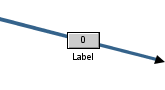
Direct
Draws a straight line between the
objects it connects. |
 |
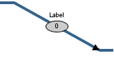
Direct Offset
Attaches to the object at a right
angle, but draws a diagonal line for the remainder of the link.
|
 |
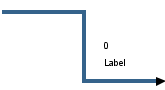
Orthogonal
Draws a line at right angles between
the objects it connects.
|
 |
Using Interaction Properties
Commands
To assign a command to your link, right-click in the Property
Value field of the command property and select Define Command.
Commands can be set up to
execute when you click on an object or
automatically execute the command when the value of an object reaches a
specified threshold.
See Building
Displays>Define/Execute Command for information on how to set up
commands. Drill Down Displays
To specify a drill
down display, double click on the drillDownTarget property. Any display (.rtv)
file can be targeted as a drill down. Once a drill down target has been set, double-click on the
link to activate the drill down. Drill down displays can
be activated in the same window that contains the link or open in a separate
window. This allows you to build a customizable hierarchy of displays.
Tool Tips
Select the mouseOverFlag
to enable tool tips for your link. To display a tool tip, point to the link with
your mouse. The tool tip will contain information from your data attachment.
NOTE: The property iconVisFlag must be
selected in order to display tool tips.
Alert Properties
| Property
Name |
Description |
| valueAlertMode |
Discrete Alerts |
Color of the
link will change when the value property equals the specified
value*Alert. |
| valueHighAlert |
Specify the value that
the input value must be equal to for the high alert to execute. |
| valueHighAlertColor |
Select the  button and choose a color for the high alert.
 |
| valueLowAlert |
Specify the value that
the input value must be equal to for the low alert to execute. |
| valueLowAlertColor |
Select the
button and choose a color for the low alert. |
| valueMediumAlert |
Specify the value that
the input value must be equal to for the medium alert to execute. |
| valueMediumAlertColor |
Select the
button and choose a color for the medium alert. |
| valueNoAlert |
Specify the value that
the input value must be equal to for the no alert to execute. |
| valueNoAlertColor |
Select the
button and choose a color for no alert. |
| Range Alerts |
Color of the link will change when the
value property is greater than the
valueHighAlarm
or valueHighWarning or less than the valueLowAlarm
or valueLowWarning. |
| valueHighAlarm |
Specify the value that
the input value must exceed to activate the high alarm. |
| valueHighAlarmColor |
Select the
button and choose a color for the high alarm. |
| valueHighWarning |
Specify the value that
the input value must exceed to activate the high warning. |
| valueHighWarningColor |
Select the
button and choose a color for the high warning. |
| valueLowAlarm |
Specify the
value that
the input value must go below to activate the low alarm. |
| valueLowAlarmColor |
Select the
button and choose a color for the low alarm. |
| valueLowWarning |
Specify the
value that
the input value must go below to activate the low warning. |
| valueLowWarningColor |
Select the
button and choose a color for the low warning. |
|
No Alerts |
Disable all alert and alarm properties. |
Arrow Properties
| Property
Name |
Description |
| arrow1Color |
Select the
button and choose a color for the source arrow.. |
| arrow1VisFlag |
Controls the visibility of the source
arrow. |
| arrow2Color |
Select the
button and choose a color for the target
arrow. |
| arrow2VisFlag |
Controls the visibility of the target arrow. |
Data Properties
| Property
Name |
Description |
|
value |
Data value used to display the value text and to
evaluate any alert definitions. |
| valueDivisor |
If
specified, this divisor is applied to the value. |
Data Format Properties
| Property
Name |
Description |
| valueFormat |
Select or enter the numeric format of
values displayed on the link and in tool tips. To enter a format, use syntax
from the Java DecimalFormat class.
To enable tool tips, select the mouseOverFlag. |
|
valueTextColor |
Select the
button and choose the color of the value
text. |
|
valueTextFont |
Select
the font to use for the value text. |
|
valueTextHeight |
Specify
the height for the value text. |
|
valueTextPosX |
Set x-axis position of value text. Select from the
following options:
- Left
- Position outside the left side of the background rectangle.
- Inside
Left - Position inside the left side of the background rectangle.
- Center
- Position in the center of the background rectangle.
- Inside Right
- Position inside the right side of the background rectangle.
- Right
- Position outside the right side of the background rectangle.
|
|
valueTextPosY |
Set the y-axis position of value text . Select from the following options:
- Outside Top -
Position well above the background rectangle.
- Top -
Position just above the background rectangle.
- Inside Top
- Position inside the top of the background rectangle.
- Center
- Position in the center of the background rectangle.
- Inside Bottom
- Position inside the bottom of the background rectangle.
- Bottom
- Position just below the background rectangle.
- Outside Bottom
- Position well below the background rectangle.
|
|
valueVisFlag |
Control visibility of the value text.
NOTE: This property is only applicable if iconVisFlag
is selected. |
Icon Properties
Interaction Properties
| Property
Name |
Description |
| command |
Assign a command to
your link. See Building
Displays>Define/Execute Command for information. |
|
commandCloseWindowOnSuccess |
If selected, the
window that initiates a system command will automatically close when the system
command is executed successfully. This
property only applies to system commands.
With data source commands, the window is closed
whether or not the command is executed successfully.
For multiple commands, this property is applied
to each command individually. Therefore if the first command in the multiple
command sequence succeeds, the window will close before the rest of the commands
are executed.
NOTE: The commandCloseWindowOnSuccess
property is not supported in the Display Server. |
|
commandConfirm |
If selected, the
command confirmation dialog is enabled. Use the commandConfirmText
property to write your own text for the confirmation dialog, otherwise text from
the command property will be used. For
multiple commands, if you Confirm the execution then all individual commands
will be executed in sequence with no further confirmation. If the you Cancel the
execution, none of the commands in the sequence will executed. |
|
commandConfirmText |
Enter command
confirmation text directly in the Property Value field or select the
button to open the Edit commandConfirmText dialog. If
commandConfirmText is not specified, then
text from the command property will be used. |
|
connectEdgeFlag |
If the
specified linkPathType is Direct, then select the connectEdgeFlag
to attach the link to the center of the side of the target object that is closest to the
source object
(instead of connecting to the center of the target object).
NOTE: Orthogonal and Direct Offset links
always attach to
the center of the side closest to the source object.
|
| drillDownTarget |
Name of display (.rtv)
file targeted as a drill down. See Building
Displays>Drill Down Displays for information. |
| mouseOverFlag |
Enter a tool tip for
this link. To
display the tool tip, move your mouse over the object. To enter a multi-line
tool tip, use \n to delimit the lines (e.g. my\nlink). NOTE: The property iconVisFlag
must be selected in order to display tool tips. |
Label Properties
| Property
Name |
Description |
| label |
Edit label text directly in the Property Value
field or select the
button to open the Edit Label dialog. |
| labelMinTabWidth |
Specify minimum width
of the label tab. NOTE: This property is
only applies if labelTextPosY
is set to TabTop. |
|
labelTextColor |
Select the
button and choose the color of the label
text. |
|
labelTextFont |
Select
the font to use for the label text. |
|
labelTextHeight |
Specify
the height for the label text. |
|
labelTextPosX |
Set x-axis position of label text. Select from the
following options:
- Left
- Position outside the left side of the background rectangle.
- Inside
Left - Position inside the left side of the background rectangle.
- Center
- Position in the center of the background rectangle.
- Inside Right
- Position inside the right side of the background rectangle.
- Right
- Position outside the right side of the background rectangle.
|
|
labelTextPosY |
Set y-axis position of label text. Select from the
following options:
- Outside Top -
Position well above the background rectangle.
- Top -
Position just above the background rectangle.
- Title Top
- Position along the top line of the background rectangle.
- Tab Top
- Position tab just above the background rectangle. NOTE: Height and width
of the label tab is dependent on the height and width of the text. Use the
labelMinTabWidth property to specify a minimum tab width.
- Inside Top
- Position inside the top of the background rectangle.
- Center
- Position in the center of the background rectangle.
- Inside Bottom
- Position inside the bottom of the background rectangle.
- Bottom
- Position just below the background rectangle.
- Outside Bottom
- Position well below the background rectangle.
|
|
labelVisFlag |
Control visibility of the label.
NOTE: This property is only applicable if iconVisFlag
is selected. |
Link Line Properties
| Property
Name |
Description |
| linkColor |
Select the
button and choose a color for the link line. |
| linkPathType |
Select from the following options:
Direct -
Draws a straight line between the
objects it connects.
Direct Offset
-
Attaches to objects at a right
angle, but draws a diagonal line for the remainder of the link.
Orthogonal
-
Draws a line at right angles between
the objects it connects.
|
| linkSize |
Set (in pixels) the thickness of the link line. |
Object Properties
| Property
Name |
Description |
| objName |
Name given to facilitate object management via
the Object List dialog. Select Tools>Object List. |
| styleClass |
Enter the style class name for this object as
defined in your style sheet.
If not specified, the object class name is used. NOTE: The value entered
must not contain spaces and cannot start with rtv-. |
| transparencyPercent |
Set transparency of the link. Enter a value
between 0 and 100. A value of 0, the default, sets the link to be completely
opaque. A value of 100 will render the link completely transparent. |
| visFlag |
Control visibility of the link line. |
|