Background
Options
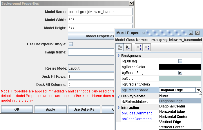
Select File>Background Properties
to modify the following settings.
|
| Model
Name |
Current background
model. Default model is com.sl.gmsjrtview.m_basemodel.
NOTE: SL-GMS J/Developer and J/Net customers may import subclasses of GmsModelCode
and access renamed variables via the Model Properties dialog. |
| Model Width |
Model width and height
in pixels. If you set the model height to a size larger than the display
area, a dialog will appear to confirm whether to add space to the top or
bottom of the display area. If you decrease the size of the model height,
a dialog will appear asking you whether to take space from the top or the
bottom of the display area. In addition, if you decrease the model size
and the objects no longer fit within the display area, you will be asked
to confirm this in a separate dialog.
NOTE: Model Width/Height options are
disabled if you are not using the default model com.sl.gmsjrtview.m_basemodel. |
| Model Height |
| Model Properties |
Select to open the Model Properties dialog, which lists
attributes of the background model and enables you to edit property
values. Model properties are applied immediately
and cannot be cancelled or reverted to defaults. If the Model Name does
not match the model in the display, the Model Properties dialog is not
accessible. To access Model Properties directly, select Edit>Model Properties. NOTE: See the Object
Properties section for details on editing property values.
If you are using the default
model com.sl.gmsjrtview.m_basemodel the Model Properties are:
|
Background |
|
bg3dFlag |
Control visibility
of bevel on background. |
|
bgBorderColor |
Select the  button and choose a color from the
palette to set the color of the background outline. This property is only
applicable if bgBorderFlag
is selected.
button and choose a color from the
palette to set the color of the background outline. This property is only
applicable if bgBorderFlag
is selected. |
|
bgBorderFlag |
Control
visibility of outline on background. |
|
bgColor |
Select the
button and choose a background color from the palette. |
| bgGradientColor2
|
Select the
button and choose a
second color for
background gradient. Default is white. NOTE: The
bgColor property sets
the first color in the gradient. |
|
bgGradientMode |
Control
style of gradient
fill on background. Select from the following options:
|
Diagonal Edge |
Gradient is drawn
at a 45 degree angle from the top left to the bottom right corner of the
object. |
|
Diagonal Center |
Gradient is drawn
at a 45 degree angle from the center to the top left and the bottom right
corners of the object. |
|
Horizontal Edge |
Gradient is drawn
horizontally from the top to the bottom of the object. |
|
Horizontal Center |
Gradient is drawn
horizontally from the center to the top and bottom of the object. |
|
Vertical Edge |
Gradient is drawn
vertically from the left to the right of the object. |
|
Vertical Center |
Gradient is drawn
vertically from the center to the left and right of the object. |
|
| Display Server |
rtvRefreshInterval |
Specify the interval (in seconds) to refresh a display in the client
browser. Minimum interval is 5 seconds. If left blank, the interval defined
in the rtvdisplay.properties
file will be
used. Set to 0 if you do not want displays automatically refreshed. It is
also possible to enter a substitution or attach rtvRefreshInterval
to data. NOTE: The refresh rate specified in the
URL
or DIV tag used to
open a display will override the rtvRefreshInterval property.
|
| Interaction
|
onCloseCommand |
Select
Define
Command and choose
SYSTEM, ALERT,
MULTIPLE or your data source.
The specified command will be
activated when this display (.rtv) file is opened/loaded.
NOTE:
When
this property is defined by a
SYSTEM drill down command, this functionality is
not supported in the Display Server. |
| onOpenCommand |
Select
Define
Command and choose
SYSTEM, ALERT,
MULTIPLE or your data source.
The specified command will be
activated when this display (.rtv) file is closed/replaced.
NOTE:
When
this property is defined by a
SYSTEM drill down command, this functionality is
not supported in the Display Server. |
|
resizeHeightMin resizeWidthMin |
Specify (in pixels) the minimum height and width of a display. Default value
for each property is 0, which means the display has no minimum size.
In the Display Viewer Application, a panel
cannot be resized smaller than the minimum size of the display in that
panel.
In the Thin Client, a panel can be resized
smaller than the minimum size of the display in that panel, but (since the
default Resize Mode is Crop) scrollbars will be added.
To set the minimum size for multiple
displays, resizeWidthMin and resizeHeightMin could be specified
in a style sheet, as follows:
m_basemodel {resizeWidthMin:600;
resizeHeightMin:400}
NOTE: If resizeWidthMin or
resizeHeightMin are set to values larger than the specified Model
Width and Model Height, then no minimum size will be enforced on
the display. |
|
| Use Background Image |
Select this checkbox to specify a
model file or a bitmap image (.gif,
.jpg or .png) as the display background.
NOTE: If you select to use a background
image, all background model properties will be disabled. |
|
Image Name |
Use Background Image must be
selected in order to place an image
(.gif, .jpg or .png)
in the background of your display.
Enter the name
(including relative path) of the file or
select the
button to open the
Select Image dialog containing up to three
directories:
- Current Directory - Contains images in the current directory and one
level of subdirectories.
- Custom Image Library - If you have specified a custom image library, this
directory contains those images. See the Creating a
Custom Image Library section (below) for details.
- Symbol Library - Contains symbolic images (for example, symbols for
various types of hardware, shapes, lights, arrows, etc.).
Navigate to the image you want to use and select it. A preview of the image
appears in the pane to the right. Click OK or Apply to set the
image on your object. If an image
is not listed, enter the name of the file (including relative path).
Creating a
Custom Image Library
The custom
image library enables you to make your own images available in the Select
Image dialog. To add your own image library, perform the following steps.
1. Place your images in a .jar file and add
it to the RTV_USERPATH environment
variable. NOTE: The images must be in a directory and not at the top level
of the .jar file. They can be organized into subdirectories of one top level
directory.
2. In the Display Builder, select Tools>Builder Options and, in the
Custom Image Library Path field, set the path to the directory
containing your .jar file.
For example, suppose you have a .jar file with the
following directory
structure:
com/mycompany/Images
com/mycompany/Images/Blue Images
com/mycompany/Images/Red Images
com/mycompany/Images/Green Images
In the
Custom Image Library Path field you would enter com/mycompany/Images
to add a directory named Images to the tree in the Select Image dialog. The
Images directory
will have three subdirectories: Blue Images, Red Images and Green
Images. NOTE: Only directories containing images will be added to the Select Image
dialog.
NOTE: You can also access your custom image
library by editing any property that allows you to set an image on an object
(e.g. image, barImage and filterProperties properties). |
| Resize Mode |
Control object layout when a window
is resized in the current display (.rtv) file. It is also possible to globally
specify a Window Resize Mode, select
Tools>Options>General or set -resizemode on the command line.
In the Display Builder, the selected Resize Mode is
only applied to drill down windows. The main window of the Display Builder is
always in Crop mode.
Select from the
following options:
|
Default |
Use application
level default mode. Defaults are: Scale for for the Display Builder,
Display Viewer Application and Display Viewer Applet and Crop for the
Thin Client, |
|
Crop |
When the window is
resized, the display stays the same size. If the window is bigger than the
display, empty space will show around the display. If the window is smaller
than the display, scrollbars will be added. The window is not forced to
maintain its aspect ratio. This is the default for the Thin Client.
|
|
Scale |
When the window is
resized, the display and all of the objects in it are scaled to fit the
available space. The window is forced to maintain its aspect ratio. This is
the default for the Display Builder, Display Viewer Application and Display
Viewer Applet. |
|
Layout |
When the window is
resized, the display is resized to fit the available space. The objects in
the display are positioned according to their anchor and dock
properties. The window is not forced to maintain its aspect ratio.
Objects that are not docked or anchored will
move relative to their offset from the top left corner of the display. For
example, if the object is centered on the display, the object will move 50%
of the resize amount. If the object is centered at 3/4 of the display, it
will move 75% of the resize amount.
NOTE: To prevent objects from overlapping,
set resizeWidthMin and
resizeHeightMin. If a panel containing a display is resized, the display
will not reduce smaller than the specified minimum size. |
NOTE: All three resize modes support zooming the
display (right-click -> zoom). In both Scale and Layout modes if
the window is resized while the display is zoomed, then the resize will further
zoom the display. |
| Dock Fill Rows
|
Objects in a display that
have the dock property set to Fill are laid out across a grid in
the available space remaining in the display after all docked objects have been
positioned. By default, the grid has one row and as many columns as objects.
If Dock Fill Rows is set to 0 and the Doc
Fill Columns value is specified, then the number of rows will be calculated
based on the number of objects. If a value is specified for both Dock Fill
Rows and Doc Fill Columns, the row value will be used and the number
of columns will be calculated based on the number of objects. If both are set to
0, the default will be used.
Objects are positioned left to right, top to
bottom according to the order in which objects were added to the display. |
| Doc Fill Columns |
The following describes the Background
Properties dialog commands:
| Command |
Description |
| OK |
Applies values
and closes the dialog. |
| Apply |
Applies values
without closing the dialog. |
| Use
Defaults |
Resets all fields
to default values (once Apply or OK is selected). |
| Cancel |
Closes the dialog
with last values applied. |
|