Control
Objects
The Controls tab features
objects that allow you to issue
commands and update variables
that may be used to control other objects in the display. The sample display file controls.rtv
(located in demos/tutorials) features information on working
with objects from the Controls tab.
The value,
valueString
and selectedValue properties allow you to set the value for the
controls. The varToSet property allows you to update the attached
variable with the value from the control.
The actionCommand
property allows you to set up a command which will be executed from the
control. This actionCommand can reference the value from the
control by using the keyword $value.
To enable selecting, moving and
editing the controls without activating the associated action command, the
controls are not active in the main window of the Display Builder.
The tabIndex property allows you to define
the order in which table and control objects will receive focus when navigated
from your keyboard. Initial focus is given to the object with the smallest
tabIndex value, from there the tabbing order proceeds in ascending order. If
multiple objects share the same tabIndex value, then initial focus and
tabbing order are determined by the alpha-numeric order of the object names.
Objects with a tabIndex value of 0 are last in the tabbing order. NOTE:
The tabIndex property does not apply to Slider objects or objects that
are disabled, invisible, or have a value of less than 0.
To preview a control object in the
Display Builder, save your file and click the Preview button  in the toolbar. Your display opens
in a Preview Window that allows you to activate control objects. The Preview
button becomes disabled when you edit your display. Save your display again to
enable it.
in the toolbar. Your display opens
in a Preview Window that allows you to activate control objects. The Preview
button becomes disabled when you edit your display. Save your display again to
enable it.
Some control object properties cache their colors and therefore do not update
when a custom color definition
changes. You will need to either to restart RTView or reload the display to see the color change for these objects.
The Controls tab features the following objects:
|
Navigation Controls |
Navigation controls allow you to create a rich
and compact visual presentation of hierarchical data. Navigation controls are
most often used in a multi-panel application for display navigation. Typically,
the navigation control is shown in one panel and another panel contains the
displays which you drill-down to by selecting items in the navigation control. Navigation controls
can also be used in any application where hierarchical data is most
effectively displayed using expandable/collapsible nodes.
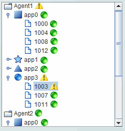
You can optionally configure status icons for
navigation controls, using images of your choice, to visually indicate whether
an element is in a critical state, and to also propagate the status of elements
to the top of the navigation control (see the tree control, for example, below).
|
| |
Tree Control |
With the tree control (class name: obj_c1tree),
multiple nodes can expand at at time. The tree control not only allows you to
configure status icons and to propagate the status up to parent nodes - you can
also configure type icons. Type icons are static images you assign to tree nodes
to visually indicate the element type (for example, Production or Sales)
or the node depth.
For details, see
Tree Control.
|
| |
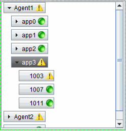
Accordion Control |
With the accordion control (class name: obj_c1accordion),
nodes appear as pushbuttons and a single node expands at a time. The accordion
control visually indicates whether an element in the accordion is closed or
open. As with the
tree control, the accordion control allows you to configure status icons and to
propagate the status up to parent nodes. The accordion control does not display type icons (as the tree control can).
For details, see
Accordion Control.
|
|
Text Entry Fields |
There are three text entry fields
to choose from:
- obj_c1textedit:
Allows you to enter numeric or text
information. Attach your data to valueString to update the value
shown in this text entry field from your data.
- obj_c1textedit_i:
Accepts only numbers without decimal
points.
- obj_c1textedit_d:
Allows numbers with decimal points.
Attach your data to value to update the
values shown in these text entry fields from your data.
NOTE: To get initial values from an internal
RTView variable and base those values on user interaction, you must attach
the value and varToSet properties to the same variable.
The actionCommand
is executed and the variable attached to varToSet is updated with the
data you typed into the text entry field when you press <Enter> and, if the
executeOnFocusLostFlag is selected, when the text entry field loses
focus. To disable text entry, deselect the editableFlag
checkbox. If the editableFlag is off and enabledFlag is on,
the mouse and arrow keys can still be used to move the cursor.
If the executeOnKeystrokeFlag checkbox
is selected, then each keystroke that modifies the text field will set the
varToSet variable and execute the actionCommand, if applicable,
using the modified text. NOTE: In a Thin Client deployment there may be a
delay between the keystroke and the response, depending on the speed of your
network and server.
The following properties support input
validation. Attach inputValidVarToSet to a local variable and this
variable will be updated when the control executes with a value of 1
if the input is valid or a value of 0 if the input is invalid. Attach
invalidInputMsgVarToSet to a local variable and this variable will be
updated when the control executes with an error message if the input is
invalid or an empty string if the input is valid. If validation fails, the
actionCommand will not be executed. By default, input validation
occurs whenever a control executes (i.e. when you press <Enter>). If
executeOnFocusLostFlag is selected, then the control will also execute
whenever the object loses focus. If executeOnKeyStrokeFlag is
selected, the control will also execute whenever a key is pressed while the
object has focus. For numeric validation, set valueMax and
valueMin to specify the maximum or minimum valid values. If left blank,
there will be no maximum or minimum value validation. Additionally, the
following properties apply for text string validation:
characterCase - Select from the
following options: Mixed Case, Upper Case, or Lower Case.
minCharacters - Specify minimum number of characters allowed in the
field. If left blank, there will be no validation of minimum number of
characters.
maxCharacters - Specify maximum number of characters allowed in the
field. If left blank, there will be no validation of maximum number of
characters.
To set the bgColor and fgColor
properties of a text entry field, click on the  button and choose a color from the palette. The bgColor property sets the
color of the object's object's background area and the fgColor property
sets the color of the text. When bgColor and fgColor properties
are set to
Default, then the text entry field will adopt default settings for
background and foreground colors. For example, in the Display Viewer the text
entry field in your display will adopt a standard Java appearance. When that
same display is viewed via Thin Client Browser, the text entry field will
conform to that browser's color preferences.
button and choose a color from the palette. The bgColor property sets the
color of the object's object's background area and the fgColor property
sets the color of the text. When bgColor and fgColor properties
are set to
Default, then the text entry field will adopt default settings for
background and foreground colors. For example, in the Display Viewer the text
entry field in your display will adopt a standard Java appearance. When that
same display is viewed via Thin Client Browser, the text entry field will
conform to that browser's color preferences.
Use the valueTextAlignX property to
set text alignment: Left, Center or Right. NOTE: The
selected alignment can only be applied if the length of the text is less than
the length of the text entry field. Use the
mouseOverText property to enter a tool
tip for this control. To display the tool tip, move your mouse over the
object. To enter a multi-line tool tip, use \n to delimit the lines
(e.g. control\nobject). NOTE: The object must be visible (i.e. visFlag
property is selected), in order for the tool tip to be visible.
The styleClass property allows you to
enter the style class name for this object as defined in your
style sheet. If not specified, the object class name is used. NOTE:
The value entered must not contain spaces and cannot start with rtv-.
The numeric text entry controls (obj_c1textedit_i
and obj_c1textedit_d) support a validation option for blank entries.
To enable this feature, select the validateBlankValuesFlag property.
If selected and a blank string is entered, the actionCommand will not
execute and invalidInputVarToSet and invalidInputMsgVarToSet
will indicate an invalid entry. |
| Text Area
Object
|
The text area control supports display and entry
of multi-line text with optional word wrap. Scrollbars will appear as needed.
Attach your data to valueString to update the value shown in this text
area from your data.
The actionCommand is executed and the
variable attached to varToSet is updated with the data you typed
into the text area control when the text area control loses focus. To disable
text entry, deselect the editableFlag checkbox. If the editableFlag
is off and enabledFlag is on, the mouse and arrow keys can still be used
to move the cursor.
If the executeOnKeystrokeFlag checkbox is
selected, then each keystroke that modifies the text area will set the
varToSet variable and execute the actionCommand, if applicable, using
the modified text. NOTE: In a Thin Client deployment there may be a delay
between the keystroke and the response, depending on the speed of your network
and server.
To set the bgColor and fgColor
properties of a text area object, click on the
button and choose a color from the palette. The bgColor property sets the
color of the object's background area and the fgColor property sets the
color of the text. When bgColor and fgColor properties are set to
Default, then the text area control will adopt default settings for background and foreground
colors. For example, in the Display Viewer the text area control in your display will adopt a standard Java appearance. When that same display is viewed via
Thin Client Browser, the text area control will conform to that browser's color preferences.
Use the mouseOverText property to enter
a tool tip for this control. To
display the tool tip, move your mouse over the object. To enter a multi-line
tool tip, use \n to delimit the lines (e.g. control\nobject). NOTE:
The object must be visible (i.e. visFlag property is selected), in
order for the tool tip to be visible.
The styleClass property allows you to enter the style class name for this object as
defined in your style sheet.
If not specified, the object class name is used. NOTE: The value entered
must not contain spaces and cannot start with rtv-. In the Display Viewer, pressing the <Tab> key
inside a text area control will inserts a tab character in the text. To move the
keyboard focus away from a text area control, either click outside of the
control or press <Ctrl-Tab>. In the Display
Viewer Applet, pressing the <Tab> key inside a text area will move the keyboard
focus. |
| Button |
The actionCommand
is executed and the variable attached to varToSet is updated
with the value from the valueToSet property when you click on the
button.
Use the hotKey property to enable keyboard
activation on a button. Assign an
alphanumeric value (A-Z or 0-9) to be used on the keyboard with the Alt key. The button is
activated when the panel it resides in has focus and the user holds down the Alt key
and simultaneously selects the assigned value on the keyboard. For example,
Alt+B, where B is the assigned key.
When keyboard activation is enabled and the
defaultButtonFlag is selected, a button can be activated by pressing the
<Enter> key. In the display, the activated button will be highlighted with
an extra border. While multiple objects in the display can have the
defaultButtonFlag selected, it will only apply to first one added to the
display. NOTE: The
defaultButtonFlag property does not apply to objects that are disabled or
invisible. If you are viewing the Display Server in Firefox, another
control object must have focus when the <Enter> key is pressed in order
for the button to be activated. To set the bgColor and fgColor
properties of a button, click on the
button and choose a color from the palette. The bgColor property sets the
color of the object's background area and the fgColor property sets the
color of the text. When bgColor and fgColor properties are set to
Default, then the button will adopt default settings for background and foreground
colors. For example, in the Display Viewer the button in your display will adopt a standard Java appearance. When that same display is viewed via
Thin Client Browser, the button will conform to that browser's color preferences.
Use the mouseOverText property to
enter a tool tip for this control. To
display the tool tip, move your mouse over the object. To enter a
multi-line tool tip, use \n to delimit the lines (e.g. control\nobject).
NOTE: The object must be visible (i.e. visFlag property is
selected), in order for the tool tip to be visible.
The styleClass property allows you to
enter the style class name for this object as
defined in your style sheet.
If not specified, the object class name is used. NOTE: The value entered
must not contain spaces and cannot start with rtv-.
Use the menuItemIndex,
menuItemGroup and menuItemSubmenu properties with the
obj_c1_button to extend the RTView context menu. For details, see
Extending the Context Menu. |
| Checkbox |
Attach your data to the
value
property to update the value displayed by the checkbox.
NOTE: To get initial values from an internal RTView variable and base
those values on user interaction, you must attach the value and
varToSet properties to the same variable.
If the value of your
data attachment equals the valueToSetChecked property, the checkbox will
be selected. Default values for valueToSetChecked is 1 (On) and for
valueToSetUnchecked is 0 (Off).
The
actionCommand is executed and the variable attached to varToSet is
updated when you click on the checkbox. If clicking on the checkbox selects it,
then varToSet will be updated with the value of valueToSetChecked.
If you click on the checkbox and it does not become selected, varToSet
will be updated with the value of valueToSetUnchecked.
Use the mouseOverText property
to enter a tool tip for this
control. To display the tool tip, move your mouse over the object. To
enter a multi-line tool tip, use \n to delimit the lines (e.g.
control\nobject). NOTE: The object must be visible (i.e. visFlag
property is selected), in order for the tool tip to be visible.
The styleClass property allows
you to enter the style class name for this object as
defined in your style sheet.
If not specified, the object class name is used. NOTE: The value entered
must not contain spaces and cannot start with rtv-.
|
| Radio Button Group |
Use the radioListValues
property to specify the labels and values for each radio button (e.g.,
Low,25;Medium,50;High,75), or make a data attachment to a two-column table.
When attaching to a table, the first column is used for the radio button
labels, the second column is used for radio button values. If only labels
are specified, they will also be used as values. Specify which radio button
is selected using the selectedValue property.
The orientationMode
property specifies how radio buttons are populated, horizontally (by row)
or vertically (by column). Specify the width, in pixels, of the space between
radio buttons using the horizontalGap and verticalGap properties.
The actionCommand
is executed and the variable attached to varToSet is updated
with the selected value when you select a previously unselected radio button
from the group.
Use the mouseOverText property
to enter a tool tip for this
control. To display the tool tip, move your mouse over the object.
To enter a multi-line tool tip, use \n to delimit the lines
(e.g. control\nobject). The object must be visible (i.e. visFlag
property is selected), in order for the tool tip to be visible.
NOTE: In a Thin Client deployment, multi-line and non-static tool
tips are not supported. The
styleClass property allows you to enter the style class name for this object as
defined in your style sheet.
If not specified, the object class name is used. NOTE: The value entered
must not contain spaces and cannot start with rtv-. |
| Slider |
The valueMin and
valueMax
properties control the range of values for the slider. Attach your
data to the value property to update the value displayed by the
slider from a data attachment.
NOTE: To get initial values from an internal RTView variable and
base those values on user interaction, you must attach the
value and varToSet properties to the same variable. The actionCommand
is executed and the variable attached to varToSet is updated
with the value from the slider when you release the slider thumb after
dragging it or when you click on the slider to advance the thumb one unit.
Select the updateWhileAdjustingFlag to receive updates while dragging
the slider thumb.
The fgColor property sets
the tick mark color. Click on the
button to select a color or select Default to use the best color
for your look and feel. The fgColor is only applied when
the Slider control is enabled, so tick marks on sliders in the
Display Builder's Working Area are not visible. Select
Tools>Preview Window to see the fgColor applied. NOTE:
In the Thin Client deployment, Slider controls do not have tick
marks and therefore the fgColor property does not apply. Use the mouseOverText
property to enter a tool tip for
this control. To display the tool tip, move your mouse over the
object. To enter a multi-line tool tip, use \n to delimit
the lines (e.g. control\nobject). NOTE: The object must be visible
(i.e. visFlag property is selected), in order for the tool
tip to be visible. The
styleClass property allows you to enter the style class name for this object as
defined in your style sheet.
If not specified, the object class name is used. NOTE: The value entered
must not contain spaces and cannot start with rtv-. The
axisDirection property allows you to set the axis direction of
the scale. Select from the following options:
| Bottom
to Top |
Vertical orientation
with min on bottom and max on top. |
| Left to
Right |
Horizontal orientation
with min on left and max on right. |
| Top to
Bottom |
Vertical orientation
with min on top and max on bottom. |
| Right to
Left |
Horizontal orientation
with min on right and max on left. |
|
| List Box
|
Use the listValues property
to:
- Specify the labels and values
for each radio button (e.g. Low,25;Medium,50;High,75),
- Make a data attachment to a
single cell table containing a semicolon (;) delimited list of
values, or
- Make a data attachment to a
two-column table, where the first column is used for the radio
button labels, the second column is used for radio button
values. NOTE: If only labels are specified, they will also be
used as values.
To set the selected list
item from a data attachment, attach your data to the
selectedValue property.
The actionCommand
is executed and the variable attached to varToSet is updated
with the selectedValue when you chose a previously unselected item from
the list box.
To set the bgColor and fgColor
properties of a list box, click on the
button and choose a color from the palette. The bgColor property sets the
color of the object's background area and the fgColor property sets the
color of the text. When bgColor and fgColor properties are set to
Default, then the list box will adopt default settings for background and foreground
colors. For example, in the Display Viewer the list box in your display will adopt a standard Java appearance. When that same display is viewed via
Thin Client Browser, the list box will conform to that browser's color preferences.
Use the mouseOverText
property to enter a tool tip
for this control. To display the tool tip, move your mouse over
the object. To enter a multi-line tool tip, use \n to
delimit the lines (e.g. control\nobject). NOTE: The object must
be visible (i.e. visFlag property is selected), in order
for the tool tip to be visible.
The styleClass property
allows you to enter the style class name for this object as
defined in your style sheet.
If not specified, the object class name is used. NOTE: The value entered
must not contain spaces and cannot start with rtv-. |
| Combo Box |
Use the listValues
property to:
- Specify the labels and
values for each radio button (e.g.
Low,25;Medium,50;High,75),
- Make a data attachment to a
single cell table containing a semicolon (;) delimited list
of values, or
- Make a data attachment to a two-column table,
where the first column is used for the radio button
labels, the second column is used for radio button values. NOTE: If only labels
are specified, they will also be used as values.
To set the selected menu
item from a data attachment, attach your data to the selectedValue property. Check the
textEditEnabledFlag to allow the user
to type a selection in addition to selecting from the drop down menu.
The actionCommand
is executed and the variable attached to varToSet is updated
with the selectedValue when you choose a previously unselected item from
the drop down menu or type a new item into the text entry area of the combo
box.
To set the bgColor and fgColor
properties of a combo box, click on the
button and choose a color from the palette. The bgColor property sets the
color of the object's background area and the fgColor property sets the
color of the text. When bgColor and fgColor properties are set to
Default, then the combo box will adopt default settings for background and foreground
colors. For example, in the Display Viewer the combo box in your display will adopt a standard Java appearance. When that same display is viewed via
Thin Client Browser, the combo box will conform to that browser's color preferences.
Use the mouseOverText
property to enter a tool tip
for this control. To display the tool tip, move your mouse
over the object. To enter a multi-line tool tip, use \n
to delimit the lines (e.g. control\nobject). NOTE: The object
must be visible (i.e. visFlag property is selected), in
order for the tool tip to be visible.
The styleClass property
allows you to enter the style class name for this object as
defined in your style sheet.
If not specified, the object class name is used. NOTE: The value entered
must not contain spaces and cannot start with rtv-. |
|
Date Chooser |
Use the selectedValue
property to specify an initial date value. The
maximumDate and minimumDate properties control
the selectable dates in the popup calendar. It is
recommended that initial date you specify is within the
maximumDate/minimumDate value range so that the
user will not have to navigate to a valid date.
The actionCommand
is executed and the variable attached to varToSet is updated
with the selectedValue when either the
user selects an date from the popup calendar or, if
the date is typed in, when the user presses <Enter> or
clicks out of the field.
The dateFormat
property controls both the input of a date typed into a
field, as well as the output to a local variable or action
command. If dateFormat is not specified, then a locale
dependent format will be used. When users mouse-over the
text entry field, a tooltip will display the specified
dateFormat so they will know which format to enter.
Since the dateFormat
controls both the input and the output of the Date chooser,
information not included in the dateFormat will be
lost. For example, if the date format is MMMM dd, yyyy (e.g.
January 01,2000), and the timeEntryEnabledFlag is
selected, even if you enter a time it will not be stored
since it was not included in the specified dateFormat.
Or, if the specified dateFormat does include the time
(e.g. MM/dd/yyyy hh:mm) and the time you entered was PM, it
would be stored in the AM since am/pm was not specified in
the dateFormat and AM is the default.
The dateFormat should
be specified using format specifiers from the
SimpleDateFormat class. The dateFormat property
does not support backslashes (\). In the Display
Viewer Applet, the text entry field validates the date
string as you enter it. It is very strict about allowing
only dates in the format specified. In the Display Server
the parsing is more flexible, but not guaranteed unless the
date entered is in the same format as the specified
dateFormat. NOTE: In the Display Server, the text entry
field is not validated and the following format specifiers
are not supported: G, w, W, D, F, E, k, K, S,
z, Z.
The timeEntryEnabledFlag
property controls the visibility of the Time field in the
popup calendar. Times entered into this field must be in the
following format: hh:mm:ss a. When timeEntryEnabledFlag
is selected, an OK and Cancel button are added to the popup
calendar, so you can select a date and enter a time before
closing the popup. If the timeEntryEnabledFlag is
deselected, the popup calendar closes as soon as you select
a date.
The validColor
property sets the font color to use while editing in the
text entry area if the entered value uses the correct
format. The default validColor is green. The
invalidColor property is the font color used during and
after editing in the text entry area if the entered value
does not use the correct format. The default invalidColor
is red. The fgColor property sets the color of the
text entry area. The default fgColor is black. NOTE:
The validColor and invalidColor properties are
not supported in the Thin Client deployment.
The styleClass
property allows you to enter the style class name for this object as
defined in your style sheet.
If not specified, the object class name is used. NOTE: The value entered
must not contain spaces and cannot start with rtv-.
Localization:
- The Time field, OK and
Cancel buttons are localized by SL, currently only English
and Japanese are available.
- In the Display Builder,
Display Viewer Application and Display Viewer Applet the
month and day names will use the language settings on the
client system.
- In the Display Server, the
month and day names can be localized by
replacing the date.js file in the Display Servlet
with a localized version.
NOTE: The Display Viewer Applet
uses JCalendar 1.3.2 which is distributed under Lesser GPL
and can be downloaded from
www.toedter.com/en/jcalendar. The Display Server uses
the
Datejs date library for parsing and formatting dates
and times. |
|
Password Field |
The Password Field control
object works just like
Text Entry Fields
except that instead of displaying entered text, it displays
asterisks (*).
|
|