User Guide
|
RTView®
User Guide |
|
Navigation Control Objects Display your data in navigation controls by attaching it to the valueTable property. The input of tabular data determines the content of the navigation control, as well as the appearance of each object in the navigation control. As with other controls, to configure a drill-down, set substitutions, or execute a command when a user clicks an navigation control node, use the actionCommand property. As with other table-driven objects, the drillDownColumnSubs property can be configured to set substitutions to column values from the row in the valueTable that corresponds to the selected navigation control node. If the navigation control is not large enough to display all of the data, scroll bars are automatically added. You can configure user access control for nodes in navigation controls based on user roles. For example, the specified displays are not visible (nor accessible) to users with the associated role. There are two types of navigation controls: the tree control (class name: obj_c1tree) and the accordion control (class name: obj_c1accordion). Both controls allow you to configure status icons and to propagate the status up to parent nodes.
The following sections describe configurations that are common to navigation controls, including:
Table Formats for Navigation Controls
The default table format is Row-Leaf. The following are examples of the Row-Leaf and Row-Node table formats which both produce the tree control on the right:
Creating a Row-Leaf Format
Table To illustrate how to create a navigation control using the Row-Leaf format, let us say we have a cache named Applications that has two index columns, App Name and PID, and the current table in that cache has the following rows:
We set the navigation control valueTable property to attach to the cache data, with the following fields specified in the Attach To Cache Data dialog:
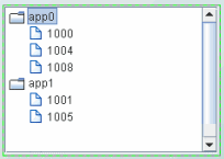
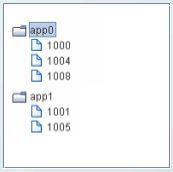
Specify Row-Leaf format for the valueTableFormat property, and App Name;PID for the nodeIndexColumnNames property. The following figure illustrates the structure of the navigation control. There are two nodes labeled App0 and App1. Node App0 has three child nodes labeled 1000, 1004, 1008. Node App1 has two child nodes, labeled 1001 and 1005.
We add another index column, AgentName, to the Applications cache, so that the current table now has the following rows:
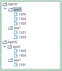
We also update the navigation control nodeIndexColumnNames property to AgentName;App Name;PID. The following figure illustrates the new structure of the navigation control: two top-level nodes labeled Agent1 and Agent2, each with two child nodes, app0 and app1.
As illustrated above, the label string for a node at depth N is taken from the Nth column in nodeIndexColumnNames property. Therefore, the labels for the top-level nodes come from the first column in the nodeIndexColumnNames property (AgentName), the labels for the second-level nodes come from the second column in nodeIndexColumnNames property (App Name), and so forth. To specify node labels from a different set of valueTable columns, use the nodeLabelColumnNames property. Enter a semicolon-separated list of column names in the nodeLabelColumnNames property, one for each level in the navigation control, where the Nth column name in the list contains the labels for navigation control nodes at depth N. Return to Creating a Tree Control. Return to Creating an Accordion Control.
Creating a Row-Node Format Table
NOTE: For a demo of an tree control that uses a data table in the row-node format, see the treecon.rtv display, located in the RTV_HOME/demos/features directory. The tree in that display is attached to an XML file (navtree_rownode.xml) that defines a navigation tree containing display titles and filenames in the row-node format. To view the demo: in an initialized command window, navigate to the RTV_HOME/demos/features directory, and type: run_viewer -panelconfig:PANELS_treecon.ini. There are two columns in the table that help define the navigation control structure:
To create the same navigation control as with our Row-Leaf format example, a table representation of the navigation control using the Row-Node format would be as follows:
The <blank> entries represent an empty string, which indicates that nodes app0 and app1 have no parent, making them top-level nodes in the navigation control. We set the navigation control:
We then have the following navigation control structure. There are two top-level nodes labeled App0 and App1. Node App0 has three child nodes labeled 1000, 1004, 1008. Node App1 has two child nodes, labeled 1001 and 1005.
To add another navigation control level for the AgentName, as we did with the Row-Leaf format example, we modify our table as follows:
We also uncheck the uniqueNodeIdFlag property to allow for node IDs that are not unique, such as the app0 and 1000 nodes in our example which are used in multiple navigation control levels. Because some of the rows are also identical, the order of the table rows is important. For example, this row appears twice in the table: 1000 app0. In each case the row comes after a unique parent row: first under app0 Agent1 and then under app0 Agent2. The navigation control uses this information to determine where to place the node for 1000 in each case. The following figure illustrates the new structure of the navigation control. The navigation control now has two top-level nodes labeled Agent1 and Agent2, each with two child nodes, app0 and app1.
By default, the node ID string is used as the node label in the navigation control. If a different column in the table must provide the label, specify the name of that column in the nodeLabelColumnName property. Note that in the Row-Node format each branch of the navigation control can have a different depth, while in the Row-Leaf format all branches typically have the same depth (the number of columns specified in the nodeIndexColumnNames property). Return to Creating a Tree Control. Return to Creating an Accordion Control. Status
Icons The status icon for a node is determined by the discrete value of a specified column in the valueTable. The values can be strings or numbers. The comparison is done for an exact match. If the current status value for a navigation control node does not match any of the values you specify in the nodeStatusProperties property, no status icon is displayed for that node. When a status icon is configured for the tree control, by default the status icon appears on the left of the node label. The value, Left or Right, is specified in the nodeStatusIconPos property. If a node has both a type icon and a status icon, the type icon always appears to the left of the status icon. By default, no status icons appear in the tree. When a status icon is configured for the accordion control, by default the status icon appears inside the node button, either to the left or right of the button label, according to the value of the nodeStatusIconPos property. Configuring Status Icons To configure the Status Icon
Select the
nodeStatusProperties property in the property sheet, then click the
To map an image to a node status Click the Click the For example, if we set the nodeStatusColumnName property to our Application Status table column of our valueTable, and define the mapping for the nodeStatusProperties as follows:
The values in the
Application Status column of each row in the valueTable
is compared to the two values listed in the Status Value column (blocked
and running).
If the
Application Status value in one of the rows is blocked, the
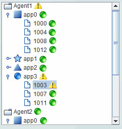
For example, in the following illustration the priority status of a single node, app3/1003, is propagated up to its parent, app3, and also to the top-level ancestor, Agent1.
For details about creating an application with multiple panels, see Multiple Display Panels. Attaching a
Status Icon
To Data NOTE: A static XML file is only read once each time you run RTView. If you specify (or modify) an XML source using the Application Options dialog, you may specify whether that XML source is static. For details, see Creating XML Sources.
|
||||||||||||||||||||||||||||||||||||||||||||||||||||||||||||||||||||||||||||||||||||||||||||||||||||||||||||||||||||||||||||||||||||||||||||||||||||||||||||
|
|
|
|
|
|
 button to open the Node Properties dialog.
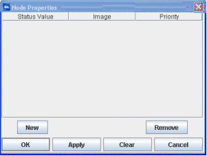