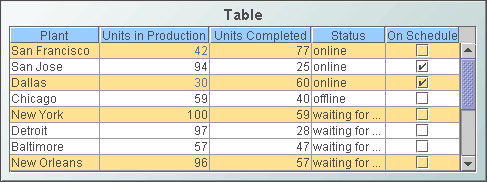
Standard Table
Display your data in a
standard table (class name: obj_table02)
by attaching it to the valueTable property. In a standard table, data
returned is displayed in a series of rows and columns. Row names and column
headers depend on your data attachment. If the table is not large enough
to display all of the data, scroll bars are automatically added.
To add or
remove rows and columns, or edit the value of existing cells to easily update
data throughout the enterprise, see the Table
Edits section for information.
Using the Thin Client in Internet Explorer, you
can copy data to the system clipboard for pasting into another application. In
the standard table, right-click and select
Copy Cell Value. If the selected cell
contains multiline text, each new line is converted to a tab. If the selected
cell displays an image, the underlying text value is copied. Also, the security
option "Scripting: Allow programmatic clipboard access" must be enabled in the
security level that applies to the Thin Client's URL (otherwise, the copy will
fail). The IE security level is configured on the Security tab of
Internet Explorer's
Internet Options dialog.
Alert Properties
Use the value of individual
columns, rows and cells to set font color, background color, row visibility
or replace a cell value with an image. In the
Object Properties window double-click on filterProperties
in the Property Name field, or select
the  button to open the Filter Properties dialog.
Background Properties
Specify how the background
is displayed in a table.
Cell Properties
| Property
Name |
Description |
| cellBgColor |
Select the
button and choose from the palette to set the background color of the cells. |
| cellBgStripeContrast |
Set the contrast level for alternating row
colors. NOTE: This property is only applicable if cellBgStripedFlag is
selected. |
| cellBgStripedFlag |
Select to display alternating row colors. |
| cellTextColor |
Select the
button and choose from the palette to set the color of the cell text. |
| cellTextFont |
Select a font for the cell text. |
| cellTextSize |
Specify (in pixels) the size of the cell text
or enter -1 to use the default size. |
Column Properties
To specify the alignment of a column,
select the ellipsis button
in the columnAlignment property. Select the alignment from
the drop down menu in the Alignment column: Default, Left,
Center
or Right. The default setting depends on the type of column.
To hide a column, select
the ellipsis button
in the columnsToHide
property and select the checkbox under Hide Column.
To specify numerical or date formats
for columns, select the ellipsis button
in the columnFormat property.
Select the format from the drop down menu in the Column Format column.
If the columnResizeEnabledFlag is
selected, table columns can be resized by dragging the vertical separators
between the column headers. The columnResizeEnabledFlag cannot be toggled
in the Display Server. Use the
indexColumns property to maintain
the highlight of selected rows after data updates or table sorts are executed.
Specify the name of one
or more columns that contain data to uniquely identify a row. Selected rows then remain highlighted even if the
order or number of rows in the table changes. Row Header Properties
To lock the first column
in a table, select the rowHeaderEnabledFlag property. The rowHeaderEnabledFlag
cannot
be toggled in the Display Server. When enabled, you can set the
appearance of the row header column using the rowHeaderBgColor,
rowHeaderTextColor,
rowHeaderTextFont,
and rowHeaderTextSize properties. The rowHeaderFilterColorsEnabledFlag
property sets whether the row filter colors are applied to the row header.
Row visibility filters are applied to the row header regardless of the
rowHeaderFilterColorsEnabledFlag
setting.
Resize the row header column by selecting the ellipsis button
in the columnProperties property.
The row header column cannot be hidden using the columnsToHide property
and a warning message is displayed if this is attempted.
Interaction Properties
Select Never, As Needed,
or Always from the scrollbarMode property to set the behavior
of the scroll bar in the table.
To specify a drill
down target for the table, double-click on the
drillDownTarget
property in the Object Properties window. Based on your data attachment, preset substitutions
are created automatically and passed into your drill down display. To customize
which substitutions will be passed into drill down displays, in the Object
Properties window double-click on drillDownColumnSubs
in the Property Name field.
Use drillDownSelectMode to control
how a drill down display is activated. Set to Anywhere to activate
a drill down display by double-clicking anywhere on the table. Set to Element
Only to enable a drill down display only when you double-click on a
cell in a table. NOTE: If drillDownSelectMode is set to Element
Only, a drill down display can not be activated by double-clicking
in the row label column, since this column does not correspond to an actual
data column in the tabular data.
Use the
multiSelectFlag property to enable
the selection of multiple rows. When the user selects
multiple rows and drills down, the drill down substitution values contain a semi colon delimited
list of values, one value for each row that can be
used with most data sources in the Filter Value field of the Attach To Data
dialog.
The tabIndex property allows you to
define the order in which table and control objects will receive focus when
navigated from your keyboard. Initial focus is given to the object with the
smallest tabIndex value, from there the tabbing order proceeds in
ascending order. If multiple objects share the same tabIndex value, then
initial focus and tabbing order are determined by the alpha-numeric order of the
table names. Tables with a tabIndex value of 0 are last in the tabbing
order. NOTE: The tabIndex property does not apply to tables in the
Display Server or to objects that are disabled, invisible, or have a value of
less than 0. Use the rightClickActionFlag
property so that a right-click by the user executes actions (a drill down or execute command)
normally performed only with a left-click, before the right-click popup menu is shown. This is useful when you have a command string
configured to set substitutions in the current window, and the drill down target
is
configured to drill down using those substitutions. In that case, the command is
executed when you left-click and when you right-click so the substitutions are
guaranteed to be set before you select Drill Down from the popup menu.
This option should not be used if the left click is configured to drill down to
another display. NOTE: This property is ignored in the Thin Client on iOS Safari
(iPad/iPhone). Use the menuItemGroup and
rightClickActionFlag properties to extend RTView context
menu items. For details, see
Extending the Context Menu. Object Properties
| Property
Name |
Description |
| anchor |
Specify where to
anchor an object in the display. NOTE: If an object has the dock property
set, the anchor property will be ignored.
The anchor property is only applied when the
dimensions of the display are modified, either by editing
Background Properties or resizing the window in
Layout mode
Select None, or one or more the following
options:
| None
|
Object
not anchored. This is the default. |
| Top |
Anchor
top of object at top of display. |
| Left |
Anchor
left side of object at left of display. |
| Bottom |
Anchor
bottom of object at bottom of display. |
| Right |
Anchor
right side of object at right of display. |
When a display is resized, the number of pixels
between an anchored object and the specified location remain constant. If an
object is anchored on opposite sides (i.e. Top and Bottom or
Left and Right), the object will be stretched to fill the available
space. |
| dock |
Specify the docking
location of an object in the display.
Select from the following options:
| None
|
Object
is not docked. This is the default. |
| Top |
Dock
object at top of display. |
| Left |
Dock
object at left of display. |
| Bottom |
Dock
object at bottom of display. |
| Right |
Dock
object at right of display. |
| Fill |
Dock
object in available space remaining in the display after all docked objects
are positioned. |
If the dimensions of the display are modified,
either by editing Background Properties or
resizing the window in Layout mode, the
properties (objX, objY, objWidth and objHeight) of
docked objects will automatically adapt to match the new size of the display.
When multiple objects are docked to the same side
of the display, the first object is docked against the side of the display, the
next object is docked against the edge of the first object, and so on.
When objects are docked to multiple sides of the
display, the order in which objects were added to the display controls docking
position. For example, let's say the first object added to the display is docked
at the Top and the second object is docked at the Left.
Consequently, the first object will fill the entire width of the display and the
second object will fill the left side of the display from the bottom of the
first object to the bottom of the display.
Objects in a display have the dock property set
to Fill, are laid out across a grid in the available space remaining
after all docked objects are positioned. By default, the grid has one row and as
many columns as there are objects in the display. You can modify the grid in the
Background Properties dialog.
Once an object is docked, there are some
limitations on how that object can be modified.
- Docked objects cannot be dragged or
repositioned using objX and objY properties.
- Docked objects cannot be resized using the
objWidth or objHeight properties. To resize you must drag on the
resize handle.
- Docked objects can only be resized toward the
center of the display (e.g. If an object is docked at the Top, only its
height can be increased by dragging down toward the center of the display).
- Docked objects set to Fill cannot be
resized at all.
- Docked objects cannot be moved using Align.
Non-docked objects can be aligned against a docked object, but a docked object
will not move to align against another object.
- Docked objects are ignored by Distribute.
|
| objHeight |
Set height of the object in pixels. |
| objName |
Name given to facilitate object management via
the Object List dialog. Select Tools>Object List. |
| objWidth |
Set width of the object in pixels. |
| objX |
Set the x position of the object. |
| objY |
Set the y position of the object. |
| styleClass |
Enter the style class name for this object as
defined in your style sheet.
If not specified, the object class name is used. NOTE: The value entered
must not contain spaces and cannot start with rtv-. |
| visFlag |
Control visibility of the object. |
Sort
Properties
Select the showSortIconFlag
checkbox to enable column sorting. To sort a table by a specific column,
click on the column header.  To reverse the sort order, click on the column header again.
  To clear the sort, click on the empty column header at the top left of
the table or delete the Property Value of sortColumnName
in the
Object Properties window. NOTE: Sorting is disabled if the sort icon is
not visible in the column header.
To clear the sort, click on the empty column header at the top left of
the table or delete the Property Value of sortColumnName
in the
Object Properties window. NOTE: Sorting is disabled if the sort icon is
not visible in the column header.
|