Table
Filters
In the Standard Table (class
name: obj_table02), it is possible to set font color, background color,
row visibility and replace a cell value with an image based on the value
of individual columns, rows and cells. NOTE: It is recommended that you
attach the table to data before attempting to define filters.
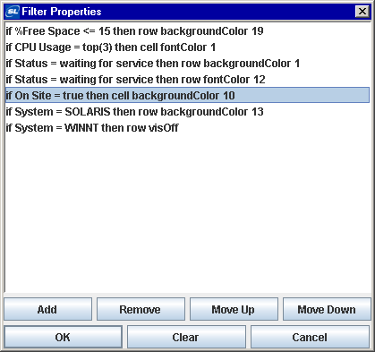
In the Object Properties
window, double-click on filterProperties in the Property Name field
to bring up the Filter Properties dialog. To create a
filter, click on the Add button. Double-click on an existing filter
to edit. Click the Remove button to delete a filter. Click Clear to remove
all filters. Use the Move Up and Move Down buttons to control in what order
filters will be applied to the table.
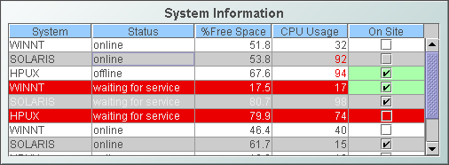
Filters are applied to the
table in the order they are listed in the Filter Properties dialog. For
example, in the table below, cells that are marked On Site are set to display
a background color of green. However, table rows that are marked On Site
and
contain the SOLARIS system have a background color of gray throughout the
entire row. The setting for the SOLARIS row background color overrides
the setting for the On Site cell background color because the filters are
being applied in the order they are listed above.
Create a Filter
In the Object Properties
dialog, double-click in the Property Name field to open the Filter Properties
dialog, then click Add. The Edit Filter dialog opens. Each filter
is composed of three elements: Condition, Action and Target:
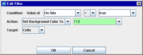
Condition
Define the condition a cell
must meet for the filter to be applied. Select a comparison field from
the first drop down menu. The comparison field is typically the name of
a column (e.g.: On Site) that contains the value (e.g.: true) to which
you would like to apply a filter. The comparison field menu is populated
with column names based on the table's data attachment, along with the
options Row Name and Column Header. You may enter the name of a
substitution or
variable to use as the value of this
field. Select Row Name to filter based on
the value of a row name. Select Column Header to filter based on the value
of a column header.
NOTE: If you have not attached the table to data, the
only values listed in this menu will be Row Name and Column Header.
In
the second drop down menu, select an operator (e.g.: =, >, <, etc.) for the comparison.
In the third drop down menu, select what value the comparison field must correspond
to in order for the cell to meet the condition. The comparison value menu
is populated with values from the table's data attachment, based on the
selected comparison field, along with the options top(5) and bottom(5).
Select top(5) to apply the filter to rows or cells that contain the five
highest values in the selected comparison field. Select bottom(5)
to apply the filter to rows or cells that contain the five lowest values
in the selected comparison field. Once a
selection is made
from the comparison value menu, it is possible to edit the number of rows
you would like to filter. You may enter the name of a
substitution or
variable to use as the value of this
field.
NOTE: If you have not attached the table to data,
the only values listed in this menu will be top(5) and bottom(5).
Action
Define the action that will
be applied to cells, columns or rows that meet the condition. Select one of four
actions from the first drop down menu. Select Set Background Color to control the color
of cells. Select Set Font Color to control the color of text. Select Hide
Rows to control the visibility of rows. Select Display Image to replace
a cell value with an image. NOTE: The Hide Rows action only targets rows.
The second drop down menu is populated
with options based on which action is chosen in the first drop down menu.
Depending on the action you select; choose which color to apply to the
background or font, enter the name of a
variable or
substitution to use as the value of this field,
or select an image from the Select Image dialog. The Select Image dialog contains up to
three directories:
- Current Directory - Contains images in the current directory and one
level of subdirectories.
- Custom Image Library - If you have specified a custom image library, this
directory contains those images (.gif,
.jpg or .png). See
Creating a Custom Image Library for details.
- Symbol Library - Contains symbolic images (for example, symbols for
various types of hardware, shapes, lights, arrows, etc.).
Navigate to the image you want to use and select it. A preview of the image
appears in the pane to the right. Click OK or Apply to set the
image on your object. If
an image is not listed, enter the name of the file, including the relative path.
Target
Control how the filter is
applied. There are three targets available. Select Rows to apply the filter
to the entire row, if the cell from the comparison field in that row meets
the condition. Select Cells to apply the filter to individual cells from
the comparison field that meet the condition. Select Columns to apply the
filter to the entire comparison field column, if any cell in that column
meets the condition.
NOTE: The target does not apply if you chosen Hide
Rows as an action.
Creating a Custom
Image Library
The custom image
library enables you to make your own images available in the Select Image
dialog. To add your own image library, perform the following steps.
1. Place your images .jar file and add
it to the RTV_USERPATH environment
variable. The images must be in a directory (not in the top level
of the jar). They can be organized into subdirectories of one top level
directory.
2. In the Display Builder, select Tools/Builder Options and, in the
Custom Image Library Path field, set the path to the directory containing
your images .jar file.
For example, if you have a jar with this directory
structure:
com/mycompany/Images
com/mycompany/Images/Blue Images
com/mycompany/Images/Red Images
com/mycompany/Images/Green Images
you would enter com/mycompany/Images. This adds a directory named
Images to the tree in the Select Image dialog. The Images directory
will have three subdirectories: Blue Images, Red Images and Green
Images. Only directories containing images are added to the Select Image
dialog.
To access the images, you can edit any property
that allows you to set an image on an object (for example, the image,
barImage and filterProperties properties), or edit the
File>Background Properties>Image Name
field.
|