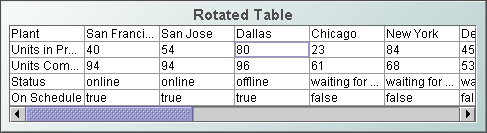
Rotated Table
Display your data in a
rotated table (class name: obj_table03)
by attaching it to the valueTable property. The rotated table is a standard
table in which the rows and columns have been flipped. Row names are assigned
the name of the column displayed in that row.
Background Properties
Specify how the background
is displayed in a table.
Cell Properties
| Property
Name |
Description |
| cellBgColor |
Select the  button and choose from the palette to set the background color of the cells.
 |
| cellBgStripeContrast |
Set the contrast level for alternating row
colors. NOTE: This property is only applicable if cellBgStripedFlag is
selected. |
| cellBgStripedFlag |
Select to display alternating row colors. |
| cellTextColor |
Select the
button and choose from the palette to set the color of the cell text. |
| cellTextFont |
Select a font for the cell text. |
| cellTextSize |
Specify (in pixels) the size of the cell text
or enter -1 to use the default size. |
Column Properties
To resize a column in a
rotated table, you must specify the size of each column. Select
the ellipsis button
in the columnProperties
property and enter a width for each column.
Interaction Properties
To specify a drill
down target for the table, double-click on the
drillDownTarget
property in the Object Properties window. Based on your data attachment, preset substitutions
are created automatically and passed into your drill down display.
To customize
which substitutions will be passed into drill down displays, in the Object
Properties window double-click on drillDownColumnSubs
in the Property Name field.
Use drillDownSelectMode to control
how a drill down display is activated. Set to Anywhere to activate
a drill down display by double-clicking anywhere on the table. Set to Element
Only to enable a drill down display only when you double-click on a
cell in a table.
Object Properties
| Property
Name |
Description |
| anchor |
Specify where to
anchor an object in the display. NOTE: If an object has the dock property
set, the anchor property will be ignored.
The anchor property is only applied when the
dimensions of the display are modified, either by editing
Background Properties or resizing the window in
Layout mode
Select None, or one or more the following
options:
| None
|
Object
not anchored. This is the default. |
| Top |
Anchor
top of object at top of display. |
| Left |
Anchor
left side of object at left of display. |
| Bottom |
Anchor
bottom of object at bottom of display. |
| Right |
Anchor
right side of object at right of display. |
When a display is resized, the number of pixels
between an anchored object and the specified location remain constant. If an
object is anchored on opposite sides (i.e. Top and Bottom or
Left and Right), the object will be stretched to fill the available
space. |
| dock |
Specify the docking
location of an object in the display.
Select from the following options:
| None
|
Object
is not docked. This is the default. |
| Top |
Dock
object at top of display. |
| Left |
Dock
object at left of display. |
| Bottom |
Dock
object at bottom of display. |
| Right |
Dock
object at right of display. |
| Fill |
Dock
object in available space remaining in the display after all docked objects
are positioned. |
If the dimensions of the display are modified,
either by editing Background Properties or
resizing the window in Layout mode, the
properties (objX, objY, objWidth and objHeight) of
docked objects will automatically adapt to match the new size of the display.
When multiple objects are docked to the same side
of the display, the first object is docked against the side of the display, the
next object is docked against the edge of the first object, and so on.
When objects are docked to multiple sides of the
display, the order in which objects were added to the display controls docking
position. For example, let's say the first object added to the display is docked
at the Top and the second object is docked at the Left.
Consequently, the first object will fill the entire width of the display and the
second object will fill the left side of the display from the bottom of the
first object to the bottom of the display.
Objects in a display have the dock property set
to Fill, are laid out across a grid in the available space remaining
after all docked objects are positioned. By default, the grid has one row and as
many columns as there are objects in the display. You can modify the grid in the
Background Properties dialog.
Once an object is docked, there are some
limitations on how that object can be modified.
- Docked objects cannot be dragged or
repositioned using objX and objY properties.
- Docked objects cannot be resized using the
objWidth or objHeight properties. To resize you must drag on the
resize handle.
- Docked objects can only be resized toward the
center of the display (e.g. If an object is docked at the Top, only its
height can be increased by dragging down toward the center of the display).
- Docked objects set to Fill cannot be
resized at all.
- Docked objects cannot be moved using Align.
Non-docked objects can be aligned against a docked object, but a docked object
will not move to align against another object.
- Docked objects are ignored by Distribute.
|
| objHeight |
Set height of the object in pixels. |
| objName |
Name given to facilitate object management via
the Object List dialog. Select Tools>Object List. |
| objWidth |
Set width of the object in pixels. |
| objX |
Set the x position of the object. |
| objY |
Set the y position of the object. |
| styleClass |
Enter the style class name for this object as
defined in your style sheet.
If not specified, the object class name is used. NOTE: The value entered
must not contain spaces and cannot start with rtv-. |
| visFlag |
Control visibility of the object. |
|