Object Grid
Display your data in an
object grid
(obj_objectgrid) by attaching it to the valueTable
property. An object grid displays returned data as multiple objects,
called icon objects, in a scrollable grid. Each icon object in the
grid is analogous to a row of data in the standard table. Icon objects display the data
using graphic attributes (e.g., color, dimension,
orientation, etc.).
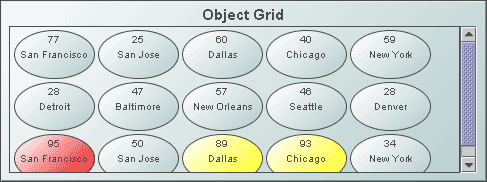
The default icon object displayed in the object grid is obj_circ2d_ilvx_ra4 (shown
below).
Any object that appears in the
Object Palette (with the exception of tables and graphs)
can be used as an icon object. To specify which object to use in the object grid, in the Object
Properties window, double-click on iconProperties
in the Icon category.
Background Properties
Specify how the background
is displayed in the object grid.
Foreground Properties
| Property
Name |
Description |
| fgColor |
Set the color of the space between the objects. Select the  button and choose a color from the
palette.
button and choose a color from the
palette. |
| fgGradientColor2 |
Select the
button and choose a color for the second
color in the gradient. Default is white. NOTE: The fgColor property sets
the first color in the gradient. |
| fgGradientMode |
Display a gradient
in the space between the objects. Select from the following options:
| |
None |
No gradient |
| |
Diagonal Edge |
Gradient is drawn
at a 45 degree angle from the top left to the bottom right corner of the
object. |
| |
Diagonal Center |
Gradient is drawn
at a 45 degree angle from the center to the top left and the bottom right
corners of the object. |
| |
Horizontal Edge |
Gradient is drawn
horizontally from the top to the bottom of the object. |
| |
Horizontal Top |
Gradient is drawn
horizontally from the center to the top and bottom of the object. |
| |
Vertical Edge |
Gradient is drawn
vertically from the left to the right of the object. |
| |
Vertical Center |
Gradient is drawn
vertically from the center to the left and right of the object. |
|
Interaction Properties
To specify a drill
down target for the table, double-click on the drillDownTarget
property in the Object Properties window. Based on your data attachment, preset substitutions
are created automatically and passed into your drill down display. To customize
which substitutions will be passed into drill down displays, in the Object
Properties window double-click on drillDownColumnSubs
in the Property Name field.
Use drillDownSelectMode to control
how a drill down display is activated. Set to Anywhere to activate
a drill down display by double-clicking anywhere on the object grid. Set
to Element Only to enable a drill down display only when you double-click
on an object in the grid.
Use the menuItemGroup and
rightClickActionFlag properties to extend RTView context
menu items. For details, see
Extending the Context Menu. Object Properties
| Property
Name |
Description |
| anchor |
Specify where to
anchor an object in the display. NOTE: If an object has the dock property
set, the anchor property will be ignored.
The anchor property is only applied when the
dimensions of the display are modified, either by editing
Background Properties or resizing the window in
Layout mode
Select None, or one or more the following
options:
| None
|
Object
not anchored. This is the default. |
| Top |
Anchor
top of object at top of display. |
| Left |
Anchor
left side of object at left of display. |
| Bottom |
Anchor
bottom of object at bottom of display. |
| Right |
Anchor
right side of object at right of display. |
When a display is resized, the number of pixels
between an anchored object and the specified location remain constant. If an
object is anchored on opposite sides (i.e. Top and Bottom or
Left and Right), the object will be stretched to fill the available
space. |
| dock |
Specify the docking
location of an object in the display.
Select from the following options:
| None
|
Object
is not docked. This is the default. |
| Top |
Dock
object at top of display. |
| Left |
Dock
object at left of display. |
| Bottom |
Dock
object at bottom of display. |
| Right |
Dock
object at right of display. |
| Fill |
Dock
object in available space remaining in the display after all docked objects
are positioned. |
If the dimensions of the display are modified,
either by editing Background Properties or
resizing the window in Layout mode, the
properties (objX, objY, objWidth and objHeight) of
docked objects will automatically adapt to match the new size of the display.
When multiple objects are docked to the same side
of the display, the first object is docked against the side of the display, the
next object is docked against the edge of the first object, and so on.
When objects are docked to multiple sides of the
display, the order in which objects were added to the display controls docking
position. For example, let's say the first object added to the display is docked
at the Top and the second object is docked at the Left.
Consequently, the first object will fill the entire width of the display and the
second object will fill the left side of the display from the bottom of the
first object to the bottom of the display.
Objects in a display have the dock property set
to Fill, are laid out across a grid in the available space remaining
after all docked objects are positioned. By default, the grid has one row and as
many columns as there are objects in the display. You can modify the grid in the
Background Properties dialog.
Once an object is docked, there are some
limitations on how that object can be modified.
- Docked objects cannot be dragged or
repositioned using objX and objY properties.
- Docked objects cannot be resized using the
objWidth or objHeight properties. To resize you must drag on the
resize handle.
- Docked objects can only be resized toward the
center of the display (e.g. If an object is docked at the Top, only its
height can be increased by dragging down toward the center of the display).
- Docked objects set to Fill cannot be
resized at all.
- Docked objects cannot be moved using Align.
Non-docked objects can be aligned against a docked object, but a docked object
will not move to align against another object.
- Docked objects are ignored by Distribute.
|
| objHeight |
Set height of the object in pixels. |
| objName |
Name given to facilitate object management via
the Object List dialog. Select Tools>Object List. |
| objWidth |
Set width of the object in pixels. |
| objX |
Set the x position of the object. |
| objY |
Set the y position of the object. |
| styleClass |
Enter the style class name for this object as
defined in your style sheet.
If not specified, the object class name is used. NOTE: The value entered
must not contain spaces and cannot start with rtv-. |
| transparencyPercent |
Set transparency of the object. Enter a value
between 0 and 100. A value of 0, the default, sets the object to be completely
opaque. A value of 100 will render the object completely transparent. |
| visFlag |
Control visibility of the object. |
Sort
Properties
To sort the object grid
by a column from the data attachment, enter the name of that column as
the Property Value for sortColumnName in the Object Properties window.
The column used to sort the object grid must be also be entered as a Property
Value for iconProperties (e.g., PERCENTCOMPLETED).
|