Stock
Chart
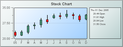
Stock charts (class
name: obj_stockchart) are useful for displaying live and archived
stock data. Overlays can be used to compare this data against other stock,
overall activity on the stock index, or to show periodic events such as
stock splits and earnings announcements. The chart
supports up to nineteen overlays.
Using Price Trace Properties
To attach tabular data to your chart, right-click in the Property
Value field of the
priceTraceCurrentTable
property or the
priceTraceHistoryTable
property and select Attach to Data.
|
Historical Data |
|
Current Data |
| To
display historical data, attach to
priceTraceHistoryTable
.
The attached historical data table
must contain the following five columns (as described
in the table below)
in this specific order: Date, Open, High, Low, Close.
NOTE: See the Attach to Data
section specific to your data source for details on how to use the Select
Columns dialog.
The priceTraceHistoryTable
property is used for viewing and analyzing archived data (data generated
before the current moment). The table in your data attachment should contain
multiple rows, each corresponding to a point on the graph.
|
To
display current data, attach to
priceTraceCurrentTable
.
The attached data table
must contain the following five columns (as described
in the table below)
in this specific order: Date, Open, High, Low, Close.
NOTE: See the Attach to
Data section specific to your data source for details on how to use
the Select Columns dialog.
The
priceTraceCurrentTable
property
is used for viewing live data and would most likely be used in conjunction
with the priceTraceHistoryTable. The table in your data attachment
should contain a single row that corresponds to and continually updates
the last point on the graph. |
| Column Name |
Description |
| Date |
Supported formats
for time column are:
mm/dd/yyyy hh:mm:ss
(01/16/2004 12:30:03)
yyyy-mm-dd hh:mm:ss
(2004-01-16 12:30:03)
The number of milliseconds
since midnight, January 1, 1970 UTC |
| Open |
Value of stock price at
first market open for defined time period. |
| High |
High value of stock price for defined
time period. |
| Low |
Low value of stock price
for defined time period. |
| Close |
Value of stock price at
last market close for defined time period. |
Using Trace* Properties
The Display Builder automatically creates a
set of overlay* properties
according to the number you specify using the
overlayCount object property. For
example if you set the overlayCount to three (3), you will have three
overlay traces in your graph
(Trace 01, Trace 02 and Trace 03) and a corresponding set of overlay*
properties for each. The overlay*CurrentTable
and overlay*HistoryTable properties are used in conjunction with
the priceTraceHistoryTable or priceTraceCurrentTable properties
to compare data (e.g. to compare the activity of several stocks). Tabular data
attached to overlay*Table properties must have the following two columns: a Date column
(as
described in the table above) and a Value column
(numeric). The overlay*HistoryTable property should contain multiple
rows, each corresponding to a point on the graph.
Using Interaction Properties
Commands
To assign a command to your graph, right-click in the Property
Value field of the command property and select Define Command.
Commands can be set up to
execute when you click on an object or
automatically execute the command when the value of an object reaches a
specified threshold.
See Building
Displays>Define/Execute Command for information on how to set up
commands. Drill Down Displays
To specify a drill
down display, double click on the drillDownTarget property. Any display (.rtv) file can be targeted as a drill down. Based on
your data attachment, substitutions are
created that will be passed into drill down displays. To customize which
substitutions will be passed into drill down displays, double-click
on drillDownColumnSubs in the
Object Properties window to open the Drill Down Column Substitutions dialog.
Once a drill down target has been set, double-click on the bar or trace
marker in the chart to activate the drill down. Drill down displays can
be activated in the same window that contains the chart or open in a separate
window. This allows you to build a customizable hierarchy of displays.
Use drillDownSelectMode to control
how a drill down display is activated. Set to Anywhere to activate
a drill down display by double-clicking anywhere on the chart. Set to Element
Only to enable a drill down display only when you double-click on a
bar in the chart.
Tool Tips
Select the mouseOverFlag
to enable tool tips for your stock chart. To
display a tool tip, point to a bar or marker with the
mouse. The tool tip will contain information from your data attachment about
that bar or marker.
Background Properties
Specify how the background is displayed
in the stock chart.
Data
| Property
Name |
Description |
yValueMax
yValueMin |
Controls the range of y-axis if the yAxisAutoScaleMode is set to
Off.
Select
On for the yAxisAutoScaleMode to calculate the y-axis
range according to data values being plotted. To calculate the y-axis range
including
yValueMin and yValueMax, select
On - Include
Min/Max. |
Data Format Properties
Specify data format in your
stock chart.
| Property
Name |
Description |
| yValueFormat |
Select or enter the numeric
format of values displayed in the legend and popup legend. To enter a format,
use syntax from the Java DecimalFormat class. |
Historian Properties
| Property
Name |
Description |
| historyTableName |
Specify
name of table in your history database in which to store tabular data.
See
Configuring the Historian for information. |
|
historyTableRowNameFlag |
If
selected, data from the row name field will be stored in the first column of the
table specified in historyTableName. |
Interaction Properties
| Property
Name |
Description |
| command |
Assign a command to
your graph. See Building
Displays>Define/Execute Command for information. |
|
commandCloseWindowOnSuccess |
If selected, the
window that initiates a system command will automatically close when the system
command is executed successfully. This
property only applies to system commands.
With data source commands, the window is closed
whether or not the command is executed successfully.
For multiple commands, this property is applied
to each command individually. Therefore if the first command in the multiple
command sequence succeeds, the window will close before the rest of the commands
are executed.
NOTE: The commandCloseWindowOnSuccess
property is not supported in the Display Server. |
|
commandConfirm |
If selected, the
command confirmation dialog is enabled. Use the commandConfirmText
property to write your own text for the confirmation dialog, otherwise text from
the command property will be used. For
multiple commands, if you Confirm the execution then all individual commands
will be executed in sequence with no further confirmation. If the you Cancel the
execution, none of the commands in the sequence will executed. |
|
commandConfirmText |
Enter command
confirmation text directly in the Property Value field or select the  button to open the Edit commandConfirmText dialog. If
commandConfirmText is not specified, then
text from the command property will be used.
button to open the Edit commandConfirmText dialog. If
commandConfirmText is not specified, then
text from the command property will be used. |
| cursorColor |
Select the
button and choose from the palette. The
default is yellow. NOTE: This property is only
available if cursorFlag
is selected, |
| cursorFlag |
Select to enable the cursor.
When the cursor is enabled, select the chart and point to a location on
a trace to see a cursor line at that location and display the time and
values of all traces at the cursor line on the legend.
Select the legendPopupFlag
to display the legend along the cursor. |
|
drillDownColumnSubs |
Select the
button to open the Drill Down
Column Substitutions dialog to customize which substitutions will be passed into
drill down displays. |
| drillDownSelectMode |
Control how a drill
down display is activated. Select one of the following options:
Anywhere - Activate a drill down
display by double-clicking anywhere on the graph.
Element
Only - Enable a drill down display only when you double-click on a
bar in the graph.
|
| drillDownTarget |
Name of display (.rtv)
file targeted as a drill down. See Building
Displays>Drill Down Displays for information. |
| legendPopupFlag |
Select to display the legend along the cursor.
NOTE: This property is only applicable if
cursorFlag is selected, |
| mouseOverFlag |
Select to enable tool tips for your stock chart. To
display a tool tip, select the chart and point to a bar or marker with the
mouse. The tool tip will contain information from your data attachment about
that bar or marker. |
| scrollbarMode |
Set whether and when the scroll bar
appears in the chart. There are three options:
Never - This is the default.
Always - Displays a scroll
bar at all times.
As Needed - Displays the scroll
bar when necessitated by zooming in the trace area, or when more data is
loaded into the chart than is displayed in the time range.
For example,
if the time range of the data in your data attachment is greater than timeRange,
setting scrollbarMode to As Needed will enable a scroll bar
to view all data loaded into the chart. |
| scrollbarSize |
Specify (in pixels) the height of the
horizontal scroll bar and the width of the vertical scroll bar.
The default value is -1, which sets the size to the system default. |
| zoomEnabledFlag |
Select to enable zooming
within the chart. Click in the chart's trace area and drag the cursor until
a desired range is selected. While dragging, a yellow rectangle is drawn to show
the zoom area. After the zoom is performed, the chart
stores up to four zoom operations in queue. To zoom out, hold the Shift
key and click in the chart's trace area. |
Label Properties
| Property
Name |
Description |
| label |
Edit label text directly in the Property Value
field or select the
button to open the Edit Label dialog. |
| labelMinTabWidth |
Specify minimum width of the label tab.
This property is only applies if labelTextAlignY is
set to TabTop. |
| labelTextAlignX |
Select x-axis position of label text from the
drop down menu. |
| labelTextAlignY |
Select y-axis position of label text from the
drop down menu.
| Outside Top
|
Position label well above the background rectangle. |
| Top
|
Position label just above the background rectangle. |
| Title Top |
Position label along the top line of the background rectangle. |
| Tab Top |
Position label tab just above the background rectangle. Height and width of
the tab is dependent on the height and width of the text. Use the
labelMinTabWidth property to specify a minimum tab width. |
| Inside Top |
Position label inside the top of the background rectangle. |
|
| labelTextColor |
Select the
button and choose from the palette to set the label text color. |
| labelTextFont |
Select font style of label text from the drop
down menu. |
| labelTextHeight |
Set the height of the label text in pixels. |
Legend Properties
Specify the way the legend
is displayed in the stock chart.
| Property
Name |
Description |
| legendBgColor |
Select the
button and choose from the palette to set the background color
of the legend. |
| legendBgGradientColor2 |
Select the
button and choose a color for the second
color in the gradient. Default is white. NOTE: The legendBgColor property sets
the first color in the gradient. |
| legendBgGradientMode |
Display a gradient
in the legend background. Select from the following options:
| |
None |
No gradient |
| |
Diagonal Edge |
Gradient is drawn
at a 45 degree angle from the top left to the bottom right corner of the
object. |
| |
Diagonal Center |
Gradient is drawn
at a 45 degree angle from the center to the top left and the bottom right
corners of the object. |
| |
Horizontal Edge |
Gradient is drawn
horizontally from the top to the bottom of the object. |
| |
Horizontal Center |
Gradient is drawn
horizontally from the center to the top and bottom of the object. |
| |
Vertical Edge |
Gradient is drawn
vertically from the left to the right of the object. |
| |
Vertical Center |
Gradient is drawn
vertically from the center to the left and right of the object. |
|
| legendValueMinSpace |
Specify the minimum distance
between values and labels in the legend. |
| legendValueVisFlag |
Select to display the numerical
values of your data in the legend. If the cursorFlag is enabled,
the numerical values are always shown in the legend. |
| legendVisFlag |
Select to display the legend. |
| legendWidthPercent |
Set the percent of the total
width of the object used for the legend. |
| outlineColor |
Select the
button and choose a color from the palette to set the color of the
one-pixel outline around the legend area, around
each color swatch within the legend, and around the plot area. The default value
is black (color 7). |
Object Properties
| Property
Name |
Description |
| anchor |
Specify where to
anchor an object in the display. NOTE: If an object has the dock property
set, the anchor property will be ignored.
The anchor property is only applied when the
dimensions of the display are modified, either by editing
Background Properties or resizing the window in
Layout mode
Select None, or one or more the following
options:
| None
|
Object
not anchored. This is the default. |
| Top |
Anchor
top of object at top of display. |
| Left |
Anchor
left side of object at left of display. |
| Bottom |
Anchor
bottom of object at bottom of display. |
| Right |
Anchor
right side of object at right of display. |
When a display is resized, the number of pixels
between an anchored object and the specified location remain constant. If an
object is anchored on opposite sides (i.e. Top and Bottom or
Left and Right), the object will be stretched to fill the available
space. |
| dock |
Specify the docking
location of an object in the display.
Select from the following options:
| None
|
Object
is not docked. This is the default. |
| Top |
Dock
object at top of display. |
| Left |
Dock
object at left of display. |
| Bottom |
Dock
object at bottom of display. |
| Right |
Dock
object at right of display. |
| Fill |
Dock
object in available space remaining in the display after all docked objects
are positioned. |
If the dimensions of the display are modified,
either by editing Background Properties or
resizing the window in Layout mode, the
properties (objX, objY, objWidth and objHeight) of
docked objects will automatically adapt to match the new size of the display.
When multiple objects are docked to the same side
of the display, the first object is docked against the side of the display, the
next object is docked against the edge of the first object, and so on.
When objects are docked to multiple sides of the
display, the order in which objects were added to the display controls docking
position. For example, let's say the first object added to the display is docked
at the Top and the second object is docked at the Left.
Consequently, the first object will fill the entire width of the display and the
second object will fill the left side of the display from the bottom of the
first object to the bottom of the display.
Objects in a display have the dock property set
to Fill, are laid out across a grid in the available space remaining
after all docked objects are positioned. By default, the grid has one row and as
many columns as there are objects in the display. You can modify the grid in the
Background Properties dialog.
Once an object is docked, there are some
limitations on how that object can be modified.
- Docked objects cannot be dragged or
repositioned using objX and objY properties.
- Docked objects cannot be resized using the
objWidth or objHeight properties. To resize you must drag on the
resize handle.
- Docked objects can only be resized toward the
center of the display (e.g. If an object is docked at the Top, only its
height can be increased by dragging down toward the center of the display).
- Docked objects set to Fill cannot be
resized at all.
- Docked objects cannot be moved using Align.
Non-docked objects can be aligned against a docked object, but a docked object
will not move to align against another object.
- Docked objects are ignored by Distribute.
|
| objHeight |
Set height of the object in pixels. |
| objName |
Name given to facilitate object management via
the Object List dialog. Select Tools>Object List. |
| objWidth |
Set width of the object in pixels. |
| objX |
Plot x-axis position of object. |
| objY |
Plot y-axis position of object. |
| styleClass |
Enter the style class name for this object as
defined in your style sheet.
If not specified, the object class name is used. NOTE: The value entered
must not contain spaces and cannot start with rtv-. |
| transparencyPercent |
Set transparency of the object. Enter a value
between 0 and 100. A value of 0, the default, sets the object to be completely
opaque. A value of 100 will render the object completely transparent. |
| visFlag |
Control visibility of the object. |
Plot Area Properties
Specify how the plot area is displayed
in your stock chart.
| Property
Name |
Description |
| gridBgColor |
Select the
button and choose from the palette to set the background color
of the plot area. |
| gridBgGradientColor2 |
Select the
button and choose a color for the second
color in the gradient. Default is white. NOTE: The gridBgColor property sets
the first color in the gradient. |
| gridBgGradientMode |
Display a gradient
in the plot background. Select from the following options:
| |
None |
No gradient |
| |
Diagonal Edge |
Gradient is drawn
at a 45 degree angle from the top left to the bottom right corner of the
object. |
| |
Diagonal Center |
Gradient is drawn
at a 45 degree angle from the center to the top left and the bottom right
corners of the object. |
| |
Horizontal Edge |
Gradient is drawn
horizontally from the top to the bottom of the object. |
| |
Horizontal Center |
Gradient is drawn
horizontally from the center to the top and bottom of the object. |
| |
Vertical Edge |
Gradient is drawn
vertically from the left to the right of the object. |
| |
Vertical Center |
Gradient is drawn
vertically from the center to the left and right of the object. |
|
| gridBgImage |
Select an image
to display in the plot background of your graph. If necessary, the image
will be stretched to fit the plot area. |
| gridColor |
Select the
button and choose from the palette to set the color of the grid line. |
Price Trace Properties
| Property
Name |
Description |
| priceTraceBarGainColor |
Set the color to indicate that a stock
price value at market close is greater than value at market open. Select
the
button and choose from the palette. The
default is green.
NOTE: This property does not apply
if the selected priceTraceType
is Line. |
| priceTraceBarLossColor |
Set the color to indicate that a stock
price value at market close is less than value at market open. Select the
button and choose from the palette. Default is red.
NOTE: This property does not apply
if the selected priceTraceType
is Line. |
| priceTraceCurrentTable |
Attach your tabular data.
The attached data table must contain the following five columns (Date, Open, High, Low, Close)
as described in the
Using Price Trace Properties
section. NOTE:
The
priceTraceCurrentTable
is used for viewing live data and would most likely be used in conjunction
with the priceTraceHistoryTable. |
| priceTraceFillStyle |
Select the appearance of the
price trace
from the drop down menu: Solid, Transparent,
Gradient,
or Transparent Gradient. Set to
None, the default, to disable.
The effects change based
on the selected priceTraceType:
Line - Fills from
the line to the bottom of the graph with the color and effect you choose.
Bar - Has no effect.
OHLC - Has no effect.
Candlestick - Fills
the Candlestick icon with the color and effect you choose.
|
| priceTraceHistoryTable |
Attach your historical tabular data.
The attached data table must contain the following five columns (Date, Open, High, Low, Close)
as described in the
Using Price Trace Properties
section. |
| priceTraceLabel |
Enter a label for the price
trace line. Appears in legend and tool tip enabled by mouseOverFlag. |
| priceTraceLineColor |
Select the
button and choose from the palette to set the price trace line
color.
NOTE: This property does not apply
if the selected priceTraceType is OHLC or Bar. |
| priceTraceLineStyle |
Select the style of the
price
trace
line from the drop down menu:
No Line, Solid, Dotted,
Dashed or Dot
Dashed.
NOTE: This property does not apply
if the selected priceTraceType is OHLC or Bar. |
| priceTraceLineThickness |
Select the thickness of
the price
trace line from the drop down menu: Thin, Medium
or Thick.
NOTE: This property does not apply
if the selected priceTraceType is OHLC or Bar. |
| priceTraceType |
Select the appearance of
the price trace:
Line - A line graph
showing closing price values.
Bar - A bar graph
showing closing price values.
OHLC -  - A bar extending from the low to high price data points. A left flange
indicates the opening price and the right flange indicates the closing
price. The
priceTraceBarLossColor and priceTraceBarGainColor
properties show whether the stock closed at a higher or lower price than
the opening price.
- A bar extending from the low to high price data points. A left flange
indicates the opening price and the right flange indicates the closing
price. The
priceTraceBarLossColor and priceTraceBarGainColor
properties show whether the stock closed at a higher or lower price than
the opening price.
Candlestick -  - A bar extending from the opening to closing price data points. The "wicks"
on either end show the high and low for the day. The
priceTraceBarLossColor
and priceTraceBarGainColor properties show whether the stock closed
at a higher or lower price than the opening price.
- A bar extending from the opening to closing price data points. The "wicks"
on either end show the high and low for the day. The
priceTraceBarLossColor
and priceTraceBarGainColor properties show whether the stock closed
at a higher or lower price than the opening price.
|
| priceTraceVisFlag |
Select to control price
trace visibility. |
Trace Properties
| Property
Name |
Description |
| overlayCount |
Set the number of overlay
traces you want to display. Maximum is
19. NOTE: RTView automatically
creates a set of properties (see Trace* Properties) for each overlay. |
| overlayFillStyle |
Select the fill style of
the price trace from the drop down menu. Sets the appearance of the
overlay*Type.
Set to Solid, Transparent,
Gradient, or Transparent
Gradient. Set to None, the default, to disable.
The effects change based
on the overlay*Type:
Line - Fills from
the line to the bottom of the graph with the color and effect you choose.
Bar - Has no effect.
Event- Has no effect.
|
Trace * Properties
Number of overlay
traces displayed depend on the specified overlayCount.
| Property
Name |
Description |
| overlay*CurrentTable |
Attach your tabular data. The attached data
table must have a Date column (as described in the
Using Trace* Properties section) and
a Value (numeric) column. |
| overlay*HistoryTable |
Attach your historical tabular data. The
attached data table must have a Date column (as described in the
Using Trace* Properties section) and
a Value (numeric) column. |
| overlay*Label |
Enter a label for the overlay
line. Appears in legend and tool tip enabled by mouseOverFlag. |
| overlay*LineColor |
Select the
button and choose from the palette to set the overlay line color. |
| overlay*LineStyle |
Select the style of the
overlay line:
No Line
Solid
Dotted
Dashed
Dot Dashed
NOTE: This property does
not apply if the selected overlay*Type
is Bar or Event. |
| overlay*LineThickness |
Select the thickness of the overlay
line:
No Line
Solid,
Dotted,
Dashed
Dot
Dashed.
NOTE: This property does
not apply if the selected overlay*Type
is Bar or Event. |
| overlay*Type |
Select the appearance of
the overlay trace from the
drop down menu:
Line - A line graph.
Bar - A bar graph.
Event - A series
of markers representing company events such as stock splits, company merges,
etc. The first letter of the overlay*Label is the letter that appears
in each event marker. |
| overlay*VisFlag |
Select to control overlay
trace visibility. |
X-Axis Properties
Specify the way the x axis
is displayed and set time values to control how much data is plotted in
the stock chart.
| Property
Name |
Description |
| timeFormat |
Set the format for the time
displayed in the x-axis using syntax from the Java SimpleDateFormat class.
For example, MMMM dd,
yyyy hh:mm:ss a would result in the form August 30, 2003 05:32:12
PM. If no format is given, the date and time will not be displayed
on the x-axis.
Include a new line character ('\n')
to display multiple line text in the time axis labels.
For example, MM\dd'\n'hh:mm:ss would
result in the form 08\30 05:32:12. If left blank, the axis is labeled
with a default format based on the range.
NOTE: This property is only used when
the timeRangeMode is Continuous. |
| timeRange |
Sets the total amount of
time, in seconds, plotted on the chart.
If timeRange is set
to
-1, the time range is determined by the first and last timestamp
found in the
priceTraceHistoryTable and priceTraceCurrentTable.
If both tables are empty, the chart uses the first and last timestamp of
the first overlay trace that has a non-empty overlay*HistoryTable
and/or overlay*CurrentTable.
NOTE: timeRange is
ignored if both timeRangeBegin and timeRangeEnd are set. |
| timeRangeBegin |
Set the start time value
of the data to be plotted on the chart. Supported formats are:
mm/dd/yyyy hh:mm:ss
(e.g., 01/16/2004 12:30:03)
yyyy-mm-dd hh:mm:ss
(e.g., 2004-01-16 12:30:03)
The number of milliseconds
since midnight, January 1, 1970 UTC
NOTE: If only the time is
specified, then today's date will be used. |
| timeRangeEnd |
Set the end time value of
the data to be plotted on the chart. Supported formats are:
mm/dd/yyyy hh:mm:ss
(e.g., 01/16/2004 12:30:03)
yyyy-mm-dd hh:mm:ss
(e.g., 2004-01-16 12:30:03)
The number of milliseconds
since midnight, January 1, 1970 UTC
NOTE: If only the time is
specified, then today's date will be used. |
| timeRangeMode |
Select the timeRangeMode from
the drop down menu. Sets the interval between
trace data points. timeRangeMode also determines the type of label
to be used in a graph. For example, the label used on the x-axis could
be the date or the time depending on the time interval specified for the
data to be displayed. There are eight modes:
Auto - Selects the
setting that best matches the time intervals in the price trace data table.
Intra-Day - Time
intervals are less than one day: hourly, every 15 minutes, etc.
Daily - Time intervals
are days.
Weekly - Time intervals
are weeks.
Monthly - Time intervals
are months.
Quarterly - Time
intervals are quarters.
Yearly - Time intervals
are annual.
Continuous - Plots
each point using the corresponding timestamp from the data table. This
data can vary in time intervals.
NOTE: If the price trace
data is more granular than the time interval specified in your data attachment,
the price trace data will be aggregated to match the timeRangeMode. |
| xAxisFlag |
Select to display the x-axis. |
| xAxisLabel |
Specify label to display
below the x-axis. |
| xAxisLabelTextHeight |
Specify the height in pixels
of the x-axis labels. |
| xAxisMajorDivisions |
Specify the number of major
divisions on the x-axis. |
| xAxisMinorDivisions |
Specify the number of minor
divisions on the x-axis.
NOTE: This property applies
when the timeRangeMode property is set to Continuous. |
Y-Axis Properties
Specify the way the x and
y axes are displayed in the stock chart.
| Property
Name |
Description |
| tradeDayBegin |
Defines the daily start
time of the trading day. This property is only used with intraday data
(time intervals less than one day: hourly, every 15 minutes, etc.). The
default value is 09:30. |
| tradeDayEnd |
Defines the daily end time
of the trading day. This property is only used with intraday data (time
intervals less than one day: hourly, every 15 minutes, etc.). The default
value is 16:00. |
| tradeDayEndLabelFlag |
Select to show the last
data point of a day and the first data point of the next day (which are
equal values) with a unique point on the chart.
Otherwise, they are shown
together at one point on the chart.
This property is only used
with intraday data.
The default is disabled. |
| yAxisAutoScaleMode |
Select how the
y-axis range is calculated from the drop down menu:
Off - The yValueMin
and yValueMax properties control the range of y-axis.
On - The
yAxisAutoScaleMode
calculates the y-axis range according
to data values being plotted.
On - Include Min/Max
- The yAxisAutoScaleMode calculates
the y-axis range including yValueMin and yValueMax. |
| yAxisFlag |
Select to display the y-axis. |
| yAxisFormat |
Select or enter the numeric
format of values displayed on the y-axis. To enter a format, use syntax
from the Java DecimalFormat class. |
| yAxisLabel |
Specify label to display
to the left of the y-axis. |
| yAxisLabelTextHeight |
Specify the height of the
y-axis labels in pixels. |
| yAxisMajorDivisions |
Specify the number of major
divisions on the y-axis. |
| yAxisMinLabelWidth |
Specify the minimum
width of the y-axis labels in pixels. |
| yAxisMinorDivisions |
Specify the number of minor
divisions on the y-axis. |
| yAxisMultiRangeFlag |
Select to have
one axis per trace, with each trace having its own range. The first trace
is drawn on the outer left of the graph. The remaining traces are drawn
on the inner left of the trace area.
Otherwise, all traces are
plotted against a single y-axis.
The default is enabled. |
| yAxisPercentFlag |
Select
to show the percent changed from the first data point instead of values
for the y-axis. |
|