Status History
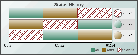
Status History charts (class name:
obj_statushistory) show discrete status values as horizontal bars drawn against
a horizontal time axis. A label appears at the right edge of each bar along with
a circular indicator displaying that bar's most recent status. If there are more
more horizontal bars of data than can be drawn in the allocated area, vertical
scroll bars will appear to the right. If there is more data than can be
displayed in the current time frame, a horizontal scroll bar will appear at the
bottom of the chart.
Using Data
Properties
To attach tabular data to your chart, right-click in the Property
Value field of the valueCurrentTable
property or the valueHistoryTable property and select Attach to Data.
|
Historical Data |
|
Current Data |
| To
display historical data, attach to
valueHistoryTable.
The attached historical data table should
contain a timestamp column, a status (value) column and one or more index
columns. The timestamp column should be
the first column in the data table.
A horizontal bar is displayed in the chart
for each unique combination of index column values. The value of the status
column is used to determine the color and fill pattern of the bar segment at
the corresponding time interval.
When data is attached to
valueHistoryTable,
any previously plotted data is removed and the entire chart is replotted.
Typically valueHistoryTable is
attached to the history table of a
Cache object.
|
To
display current data, attach to
valueCurrentTable.
The attached data table should contain at
least two columns: a status (value) column and one or more index columns. If
it does not contain a timestamp column, then the current time will be
assumed for each row in the table.
A horizontal bar is displayed for each
unique combination of index column values. The value of the status column is
used to determine the color and fill pattern of the bar segment at the
corresponding time interval.
Data attached to
valueCurrentTable
is assumed to be the most recent data and other previously plotted data is
appended to it.
Typically valueCurrentTable is
attached to the current table of a
Cache object. |
For example, consider a data table that holds
time-based status information for two nodes on a network. It has three columns:
time_stamp, node_name and status. The time_stamp
column contains the timestamp for the row. The node_name string is unique
for each node so it is used as the index column for the table. The status
column contains either up, down or unknown.
Here is a portion of the contents of that data
table:
12:00, Node01, up
12:00, Node02, up
12:01, Node01, up
12:01, Node02, down
12:02, Node01, up
12:02, Node02, up
This table could be attached to the
valueHistoryTable property. The barProperties property would be
configured to assign a color and fill pattern that corresponds to the status
column (e.g. up = solid green and down = crosshatch red. The chart
would display two horizontal bars, one for Node01 and another for Node02, and
each bar would contain a segment for each time interval. For example if the
chart was observed at 12:03, each bar would contain two segments: one for the
12:00 - 12:01 interval and another for the 12:01 - 12:02 interval. The color and
fill pattern of the segment would correspond to the status at the start of that
interval, as determined by the barProperties settings. Note that no
segment would be displayed for the interval starting at 12:02, since there is no
end point for that interval in the data table. Instead, the status value for the
last data value is always used to control the color and fill pattern of the
circular indicator that appears at the right end of each bar.
NOTE: Supported formats for the timestamp column are: mm/dd/yyyy hh:mm:ss
(e.g., 01/16/2004 12:30:03), yyyy-mm-dd hh:mm:ss (e.g., 2004-01-16
12:30:03), and the number of milliseconds since midnight, January 1, 1970 UTC. In order to view all available data, you must set the properties
timeRange to -1 and timeShift to a
negative value. This negative value will be used to round the start and end times for the
y-axis. For
example, if you specify -15 for the timeShift property, the start and end times for the
y-axis will be
rounded to the nearest 15 seconds.
Using Interaction Properties
Commands
To assign a command to your chart, right-click in the Property
Value field of the command property and select Define Command.
Commands can be set up to
execute when you click on an object or
automatically execute the command when the value of an object reaches a
specified threshold.
See Building
Displays>Define/Execute Command for information on how to set up
commands. Drill Down Displays
To specify a drill
down display, double click on the drillDownTarget property. Any display (.rtv) file can be targeted as a drill down. Based on
your data attachment, substitutions are
created that will be passed into drill down displays. To customize which
substitutions will be passed into drill down displays, double-click
on drillDownColumnSubs in the
Object Properties window to open the Drill Down Column Substitutions dialog.
Once a drill down target has been set, double-click on a bar segment or a bar
label in the chart to activate the drill down.
If a bar segment is clicked, substitutions will be
set to match the data row that corresponds to the left edge of the segment. If a
bar label is clicked, the substitutions will be set to match the most recent
data row for that bar.
Drill down displays can
be activated in the same window that contains the chart or open in a separate
window. This allows you to build a customizable hierarchy of displays.
Tool Tips
Select the mouseOverFlag
to enable tool tips for your chart. To display a tool tip, point to
a bar segment or bar label with your
mouse. When you point to a bar segment, the
tool tip will show information about the data row that corresponds to the left
edge of the segment. When you point to a bar label, the tool tip will show
information about the most recent data row for that bar.
NOTE: Use the descriptionColumnName property
to identify a column in the attached value*Table that contains additional
tool tip information for each row.
Background Properties
Specify how the background
is displayed in your chart.
Bar Properties
Specify the way the bars
are displayed in your chart.
| Property
Name |
Description |
| barCellBorderFlag |
If selected, vertical lines are drawn between
each segment of each bar corresponding to the location of data points that mark
the start and end of each segment. Depending on whether data is updated at
regular intervals, these lines may or may not be evenly spaced.
NOTE: Use the gridColor property to set
the color of these lines. |
| barGradientStyle |
Set the type of gradient to display when filling
a bar. Select from the following options:
Shaded - Display bars with a flat
gradient
Rounded - Display bars with a rounded gradient
None - No gradient displayed.
NOTE: The
barGradientStyle property is ignored for bars with Fill Patterns patterns
specified using barProperties. |
| barHeightFitFlag |
If selected, each bar will be stretched
vertically to fill additional space if the chart's plot area is taller than
necessary to accommodate minimum height of each bar as determined by the larger
of two properties: barHeightMin and barLabelTextHeight. |
| barHeightMin |
Set the height of the bar in pixels. NOTE:
Minimum height of each bar is determined by the
larger of two properties: barHeightMin and barLabelTextHeight.
If the chart's plot area is not tall enough to
display each bar at its minimum height, then a vertical scrollbar will appear to
show remaining bars. If the chart's plot area is taller than needed and if the
barFitFlag property is checked, then each bar will be stretched
vertically to fill the additional space. |
| barHeightSpacing |
Set the vertical space, in pixels, between the
bottom of each bar and the top of the bar below it. NOTE: The value must be an
even number, greater than or equal to 2. |
| barLabelBgColor |
Select the  button and choose from the palette to set the
background color of the label for the top (first)
bar and every other bar below it.
button and choose from the palette to set the
background color of the label for the top (first)
bar and every other bar below it. |
| barLabelBgColor2 |
Select the
button and choose from the palette to set the
background color of the label for the second bar
from the top and every other bar below it. |
| barLabelMaxLength |
Maximum length, in pixels, for each bar label.
If the label is longer that the specified length it will be clipped. Enter a
value of 0 to indicate no maximum length. |
| barLabelTextColor |
Select the
button and choose from the palette to set the bar label text color. |
| barLabelTextFont |
Select font style of bar label text from the drop
down menu. |
| barLabelTextHeight |
Set the height of the bar label text in pixels.
NOTE: Minimum height of each bar is
determined by the larger of two properties: barLabelTextHeight and
barHeightMin. If the chart's plot area
is not tall enough to display each bar at its minimum height, then a vertical
scrollbar will appear to show remaining bars. If the chart's plot area is taller
than needed and if the barFitFlag property is checked, then each bar will
be stretched vertically to fill the additional space. |
| barOutlineFlag |
If selected, each bar will be outlined in the
specified gridColor. |
|
barProperties |
Double-click on
barProperties
to specify the color and fill pattern to correspond with each value in
the chart. |
Data
Properties
| Property
Name |
Description |
| descriptionColumnName |
Name of the column in
the attached value*Table that contains additional tool tip information
for each row.
NOTE: The mouseOverFlag must be selected
to enable tool tips. |
| indexColumnNames |
Enter a semicolon (;) separated
list of column names from the attached value*Table to be used as index columns.
This list will be used to uniquely identify which rows should be plotted on the
same horizontal bar.
If left blank, the second column in your data
attachment will be used. |
| labelColumnName |
Name of the column in
the attached value*Table that contains label sfor each bar.
If left blank, the first
non-numeric text column in your data attachment
will be used. |
| maxNumberofRows |
Maximum number of rows
(historical plus current data) that the chart will maintain. Older rows will be
discarded as necessary, which may cause bar segments to be removed from the left
edge of the chart. |
| timestampColumnName |
Enter name of the
column in the attached value*Table that contains the timestamp for each
row.
If left blank, RTView will look for a column
named time_stamp in your data attachment. If no column named
time_stamp is found and the first column in your data attachment contains
timestamp data then it will be used.
NOTE: If no timestamp column can be located, then
the current time will be used. |
| valueColumnName |
Enter name of the
column in the attached value*Table containing the status value used to
determine the color and fill pattern of each bar segment. This column can
contain a string, number or boolean value.
If left is blank, the third column (if any) in
the your data attachment will be used.
NOTE: This column will be compared to the
barProperties to find the corresponding color and fill pattern. |
| valueCurrentTable |
Right-click in the
Property Value field and select Attach to Data.
The attached data table should contain a status
(value) column and one or more index columns. Refer to the
Using Data Properties section for more
information.
Typically valueCurrentTable will be
attached to the current table of a Cache object.
NOTE: By default, the label column is the first
non-numeric text column in your data attachment. Enter a column name in the
labelColumnName property to set a specific label column. |
| valueHistoryTable |
Attach historical data
table containing a timestamp column, one or more index columns, and a status
(value) column. Refer to the
Using Data Properties section for more
information. |
Historian Properties
| Property
Name |
Description |
| historyTableName |
Specify
name of table in your history database in which to store tabular data.
See
History Tables>Tabular Data for information. |
|
historyTableRowNameFlag |
If
selected, data from the row name field will be stored in the first column of the
table specified in historyTableName. |
Interaction Properties
| Property
Name |
Description |
| command |
Assign a command to
your chart. See Building
Displays>Define/Execute Command for information. |
|
commandCloseWindowOnSuccess |
If selected, the
window that initiates a system command will automatically close when the system
command is executed successfully. This
property only applies to system commands.
With data source commands, the window is closed
whether or not the command is executed successfully.
For multiple commands, this property is applied
to each command individually. Therefore if the first command in the multiple
command sequence succeeds, the window will close before the rest of the commands
are executed.
NOTE: The commandCloseWindowOnSuccess
property is not supported in the Display Server. |
|
commandConfirm |
If selected, the
command confirmation dialog is enabled. Use the commandConfirmText
property to write your own text for the confirmation dialog, otherwise text from
the command property will be used. For
multiple commands, if you Confirm the execution then all individual commands
will be executed in sequence with no further confirmation. If the you Cancel the
execution, none of the commands in the sequence will executed. |
|
commandConfirmText |
Enter command
confirmation text directly in the Property Value field or select the
button to open the Edit commandConfirmText dialog. If
commandConfirmText is not specified, then
text from the command property will be used. |
|
drillDownColumnSubs |
Select the
button to open the Drill Down
Column Substitutions dialog to customize which substitutions will be passed into
drill down displays. |
| drillDownTarget |
Name of display (.rtv)
file targeted as a drill down. See Building
Displays>Drill Down Displays for information. |
| mouseOverFlag |
Select to enable tool tips for your chart. To
display a tool tip, point to a bar or bar label with your
mouse. When you point to a bar, the tool tip
will show information about the data row that corresponds to the left edge of
the segment. When you point to a bar label, the tool tip will show information
about the most recent data row for that bar.
NOTE: Use the descriptionColumnName property
to identify a column in the attached value*Table that contains additional
tool tip information for each row. |
Label Properties
| Property
Name |
Description |
| label |
Edit label text directly in the Property Value
field or select the
button to open the Edit Label dialog. |
| labelMinTabWidth |
Specify minimum width of the label tab.
This property is only applies if labelTextAlignY is
set to TabTop. |
| labelTextAlignX |
Select x-axis position of label text from the
drop down menu. |
| labelTextAlignY |
Select y-axis position of label text from the
drop down menu.
| Outside Top
|
Position label well above the background rectangle. |
| Top
|
Position label just above the background rectangle. |
| Title Top |
Position label along the top line of the background rectangle. |
| Tab Top |
Position label tab just above the background rectangle. Height and width of
the tab is dependent on the height and width of the text. Use the
labelMinTabWidth property to specify a minimum tab width. |
| Inside Top |
Position label inside the top of the background rectangle. |
|
| labelTextColor |
Select the
button and choose from the palette to set the label text color. |
| labelTextFont |
Select font style of label text from the drop
down menu. |
| labelTextHeight |
Set the height of the label text in pixels. |
Legend Properties
Specify the way the legend
is displayed in your chart.
| Property
Name |
Description |
| legendTextFont |
Select font style of legend text from the drop
down menu. |
| legendTextHeight |
Set the height of the legend text in pixels. |
| legendVisFlag |
Select to display the legend. |
Object Properties
| Property
Name |
Description |
| anchor |
Specify where to
anchor an object in the display. NOTE: If an object has the dock property
set, the anchor property will be ignored.
The anchor property is only applied when the
dimensions of the display are modified, either by editing
Background Properties or resizing the window in
Layout mode
Select None, or one or more the following
options:
| None
|
Object
not anchored. This is the default. |
| Top |
Anchor
top of object at top of display. |
| Left |
Anchor
left side of object at left of display. |
| Bottom |
Anchor
bottom of object at bottom of display. |
| Right |
Anchor
right side of object at right of display. |
When a display is resized, the number of pixels
between an anchored object and the specified location remain constant. If an
object is anchored on opposite sides (i.e. Top and Bottom or
Left and Right), the object will be stretched to fill the available
space. |
| dock |
Specify the docking
location of an object in the display.
Select from the following options:
| None
|
Object
is not docked. This is the default. |
| Top |
Dock
object at top of display. |
| Left |
Dock
object at left of display. |
| Bottom |
Dock
object at bottom of display. |
| Right |
Dock
object at right of display. |
| Fill |
Dock
object in available space remaining in the display after all docked objects
are positioned. |
If the dimensions of the display are modified,
either by editing Background Properties or
resizing the window in Layout mode, the
properties (objX, objY, objWidth and objHeight) of
docked objects will automatically adapt to match the new size of the display.
When multiple objects are docked to the same side
of the display, the first object is docked against the side of the display, the
next object is docked against the edge of the first object, and so on.
When objects are docked to multiple sides of the
display, the order in which objects were added to the display controls docking
position. For example, let's say the first object added to the display is docked
at the Top and the second object is docked at the Left.
Consequently, the first object will fill the entire width of the display and the
second object will fill the left side of the display from the bottom of the
first object to the bottom of the display.
Objects in a display have the dock property set
to Fill, are laid out across a grid in the available space remaining
after all docked objects are positioned. By default, the grid has one row and as
many columns as there are objects in the display. You can modify the grid in the
Background Properties dialog.
Once an object is docked, there are some
limitations on how that object can be modified.
- Docked objects cannot be dragged or
repositioned using objX and objY properties.
- Docked objects cannot be resized using the
objWidth or objHeight properties. To resize you must drag on the
resize handle.
- Docked objects can only be resized toward the
center of the display (e.g. If an object is docked at the Top, only its
height can be increased by dragging down toward the center of the display).
- Docked objects set to Fill cannot be
resized at all.
- Docked objects cannot be moved using Align.
Non-docked objects can be aligned against a docked object, but a docked object
will not move to align against another object.
- Docked objects are ignored by Distribute.
|
| objHeight |
Set height of the object in pixels. |
| objName |
Name given to facilitate object management via
the Object List dialog. Select Tools>Object List. |
| objWidth |
Set width of the object in pixels. |
| objX |
Plot x-axis position of object. |
| objY |
Plot y-axis position of object. |
| styleClass |
Enter the style class name for this object as
defined in your style sheet.
If not specified, the object class name is used. NOTE: The value entered
must not contain spaces and cannot start with rtv-. |
| transparencyPercent |
Set transparency of the object. Enter a value
between 0 and 100. A value of 0, the default, sets the object to be completely
opaque. A value of 100 will render the object completely transparent. |
| visFlag |
Control visibility of the object. |
Plot Area Properties
| Property
Name |
Description |
| gridBgColor |
Select the
button and choose from the palette to set the color of the grid
background. |
| gridColor |
Select the
button and choose from the palette to set the color of the grid lines.
Default is white. |
| gridFlag |
Select to display the grid. |
| gridStripedFlag |
If selected, then the alternating background
color of each label (as determined by barLabelBgColor and
barLabelBgColor2) is extended into the plot area background. Otherwise, the
plot area background color is determined by gridBgColor. |
Sort Properties
| Property
Name |
Description |
| sortAscendingFlag |
If selected, bars are sorted alphabetically. Otherwise,
bars are sorted in reverse alphabetical order. |
| sortByLabelsFlag |
Deselect to sort bars by a column name
from the data attachment.
Otherwise, if selected, bars are sorted by label. |
| sortColumnName |
Enter the name of a
column in the attached value*Table. Bars are sorted by comparing the last
(most recent) row from the specified sortColumnName for each bar. If left
blank, bars are left in their natural (unsorted) order. The natural order of the
bars is the order in which the first row for each bar was encountered in the
attached value*Table.
NOTE: If sortColumnName if left blank, the
sortAscendingFlag property has no effect. |
X-Axis Properties
Specify how the x-axis is
displayed in your chart.
| Property
Name |
Description |
| timeFormat |
Set the format
for the time displayed in the x-axis using syntax from the Java SimpleDateFormat
class.
For example, MMMM dd,
yyyy hh:mm:ss a would result in the form August 30, 2003 05:32:12
PM. If no format is given, the date and time will not be displayed
on the x-axis. Include a new line character ('\n')
to display multiple line text in the time axis labels.
For example, MM\dd'\n'hh:mm:ss would
result in the form 08\30 05:32:12. |
| timeRange |
Control the total amount
of time, in seconds, plotted on the graph. If you attach data to valueCurrentTable,
set timeRange to
-1 so the time range of the chart is driven
by the time range in the data attachment. |
| timeShift |
Control the amount of time, in seconds, the graph will shift to the left when the trace has filled the graph and controls the rounding of the start and end times. For example, if the
timeShift is 15, the start and end times on the graph will be rounded to the nearest 15 second interval. By default, the end of the plot area corresponds with the current time. To only shift the graph when new data is received, set
timeShift to a negative value and the end of the graph will display the most current data plotted. If you attach data to
currentValueTable, you must set timeShift to a negative value. |
| xAxisColor |
Select the
button and choose from the palette to set the color of the x-axis.
Default is black. |
| xAxisFlag |
Select to display the x-axis. |
| xAxisRotationAngle |
Angle by which the x-axis label text will be
rotated. |
| xAxisLabelTextFont |
Select font style of x-axis label text from the drop
down menu. |
| xAxisLabelTextHeight |
Set the height of the x-axis label text in pixels. |
| xAxisMajorDivisions |
Specify the number of major
divisions on the x-axis. |
|