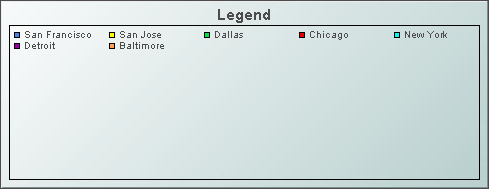
Legend
The Legend object (class name: obj_legend) is useful for
displaying a legend that is too lengthy
for the built-in legends of graph objects. The Legend can be used in conjunction
with any object on the Graphs tab, excluding the Heatmap, by entering the
objName property of the graph object in the
Legend's graphName property. The Legend reflects information from the graph object
to which it is connected. All formatting should be setup using the properties of
the connected graph object.
Using Interaction Properties
Commands
To assign a command, right-click in the Property
Value field of the command property and select Define Command.
Commands can be set up to
execute when you click on an object or
automatically execute the command when the value of an object reaches a
specified threshold.
See Building
Displays>Define/Execute Command for information on how to set up
commands. Drill Down Displays
To specify a drill
down display, double click on the drillDownTarget property. Any display (.rtv) file can be targeted as a drill down. Based on
your data attachment, substitutions are
created that will be passed into drill down displays. Once a drill down
target has been set, double-click to activate the drill down. Drill down displays can
be activated in the same window that contains the legend or open in a separate
window. This allows you to build a customizable hierarchy of displays.
Background Properties
Specify how the background
is displayed in your legend.
Data Properties
| Property
Name |
Description |
| graphName |
Enter the objName property
of the graph object to which you want to attach a legend. |
Historian Properties
| Property
Name |
Description |
| historyTableName |
Specify
name of table in your history database in which to store tabular data.
See
Configuring the Historian for information. |
|
historyTableRowNameFlag |
If
selected, data from the row name field will be stored in the first column of the
table specified in historyTableName. |
Interaction Properties
| Property
Name |
Description |
| command |
Assign a command to
your legend. See Building
Displays>Define/Execute Command for information. |
|
commandCloseWindowOnSuccess |
If selected, the
window that initiates a system command will automatically close when the system
command is executed successfully. This
property only applies to system commands.
With data source commands, the window is closed
whether or not the command is executed successfully.
For multiple commands, this property is applied
to each command individually. Therefore if the first command in the multiple
command sequence succeeds, the window will close before the rest of the commands
are executed.
NOTE: The commandCloseWindowOnSuccess
property is not supported in the Display Server. |
|
commandConfirm |
If selected, the
command confirmation dialog is enabled. Use the commandConfirmText
property to write your own text for the confirmation dialog, otherwise text from
the command property will be used. For
multiple commands, if you Confirm the execution then all individual commands
will be executed in sequence with no further confirmation. If the you Cancel the
execution, none of the commands in the sequence will executed. |
|
commandConfirmText |
Enter command
confirmation text directly in the Property Value field or select the  button to open the Edit commandConfirmText dialog. If
commandConfirmText is not specified, then
text from the command property will be used.
button to open the Edit commandConfirmText dialog. If
commandConfirmText is not specified, then
text from the command property will be used. |
| drillDownTarget |
Name of display (.rtv)
file targeted as a drill down. See Building
Displays>Drill Down Displays for information. |
Label Properties
| Property
Name |
Description |
| label |
Edit label text directly in the Property Value
field or select the
button to open the Edit Label dialog. |
| labelMinTabWidth |
Specify minimum width of the label tab.
This property is only applies if labelTextAlignY is
set to TabTop. |
| labelTextAlignX |
Select x-axis position of label text from the
drop down menu. |
| labelTextAlignY |
Select y-axis position of label text from the
drop down menu.
| Outside Top
|
Position label well above the background rectangle. |
| Top
|
Position label just above the background rectangle. |
| Title Top |
Position label along the top line of the background rectangle. |
| Tab Top |
Position label tab just above the background rectangle. Height and width of
the tab is dependent on the height and width of the text. Use the
labelMinTabWidth property to specify a minimum tab width. |
| Inside Top |
Position label inside the top of the background rectangle. |
|
| labelTextColor |
Select the
button and choose a color from the palette to set the label text color. |
| labelTextFont |
Select font style of label text from the drop
down menu. |
| labelTextHeight |
Set the height of the label text in pixels. |
Legend Properties
| Property
Name |
Description |
| legendBgColor |
Select the
button and choose a background color for the legend. |
| legendBgGradientColor2 |
Select the
button and choose a color for the second
color in the gradient. Default is white. NOTE: The legendBgColor property sets
the first color in the gradient. |
| legendBgGradientMode |
Display a gradient
in the legend background. Select from the following options:
| |
None |
No gradient |
| |
Diagonal Edge |
Gradient is drawn
at a 45 degree angle from the top left to the bottom right corner of the
object. |
| |
Diagonal Center |
Gradient is drawn
at a 45 degree angle from the center to the top left and the bottom right
corners of the object. |
| |
Horizontal Edge |
Gradient is drawn
horizontally from the top to the bottom of the object. |
| |
Horizontal Center |
Gradient is drawn
horizontally from the center to the top and bottom of the object. |
| |
Vertical Edge |
Gradient is drawn
vertically from the left to the right of the object. |
| |
Vertical Center |
Gradient is drawn
vertically from the center to the left and right of the object. |
|
| legendTextColor |
Select the
button and choose from the palette to set the legend text color. |
| legendTextFont |
Select font style of legend text from the drop
down menu. |
| legendTextHeight |
Set the height (in pixels) of the legend text. |
| legendValueMinSpace |
Specify the minimum distance
between values and labels in the legend. |
| legendValueVisFlag |
Select to display the numerical
values of your data in the legend. |
| outlineColor |
Select the  button and choose a color from the palette to set the color of the
one-pixel outline around the legend area and around
each color swatch within the legend. The default value is black (color 7).
button and choose a color from the palette to set the color of the
one-pixel outline around the legend area and around
each color swatch within the legend. The default value is black (color 7). |
Object Properties
| Property
Name |
Description |
| anchor |
Specify where to
anchor an object in the display. NOTE: If an object has the dock property
set, the anchor property will be ignored.
The anchor property is only applied when the
dimensions of the display are modified, either by editing
Background Properties or resizing the window in
Layout mode
Select None, or one or more the following
options:
| None
|
Object
not anchored. This is the default. |
| Top |
Anchor
top of object at top of display. |
| Left |
Anchor
left side of object at left of display. |
| Bottom |
Anchor
bottom of object at bottom of display. |
| Right |
Anchor
right side of object at right of display. |
When a display is resized, the number of pixels
between an anchored object and the specified location remain constant. If an
object is anchored on opposite sides (i.e. Top and Bottom or
Left and Right), the object will be stretched to fill the available
space. |
| dock |
Specify the docking
location of an object in the display.
Select from the following options:
| None
|
Object
is not docked. This is the default. |
| Top |
Dock
object at top of display. |
| Left |
Dock
object at left of display. |
| Bottom |
Dock
object at bottom of display. |
| Right |
Dock
object at right of display. |
| Fill |
Dock
object in available space remaining in the display after all docked objects
are positioned. |
If the dimensions of the display are modified,
either by editing Background Properties or
resizing the window in Layout mode, the
properties (objX, objY, objWidth and objHeight) of
docked objects will automatically adapt to match the new size of the display.
When multiple objects are docked to the same side
of the display, the first object is docked against the side of the display, the
next object is docked against the edge of the first object, and so on.
When objects are docked to multiple sides of the
display, the order in which objects were added to the display controls docking
position. For example, let's say the first object added to the display is docked
at the Top and the second object is docked at the Left.
Consequently, the first object will fill the entire width of the display and the
second object will fill the left side of the display from the bottom of the
first object to the bottom of the display.
Objects in a display have the dock property set
to Fill, are laid out across a grid in the available space remaining
after all docked objects are positioned. By default, the grid has one row and as
many columns as there are objects in the display. You can modify the grid in the
Background Properties dialog.
Once an object is docked, there are some
limitations on how that object can be modified.
- Docked objects cannot be dragged or
repositioned using objX and objY properties.
- Docked objects cannot be resized using the
objWidth or objHeight properties. To resize you must drag on the
resize handle.
- Docked objects can only be resized toward the
center of the display (e.g. If an object is docked at the Top, only its
height can be increased by dragging down toward the center of the display).
- Docked objects set to Fill cannot be
resized at all.
- Docked objects cannot be moved using Align.
Non-docked objects can be aligned against a docked object, but a docked object
will not move to align against another object.
- Docked objects are ignored by Distribute.
|
| objHeight |
Set height of the object in pixels. |
| objName |
Name given to facilitate object management via
the Object List dialog. Select Tools>Object List. |
| objWidth |
Set width of the object in pixels. |
| objX |
Plot x-axis position of object. |
| objY |
Plot y-axis position of object. |
| styleClass |
Enter the style class name for this object as
defined in your style sheet.
If not specified, the object class name is used. NOTE: The value entered
must not contain spaces and cannot start with rtv-. |
| transparencyPercent |
Set transparency of the object. Enter a value
between 0 and 100. A value of 0, the default, sets the object to be completely
opaque. A value of 100 will render the object completely transparent. |
| visFlag |
Control visibility of the object. |
|