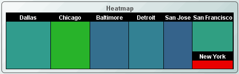
Heat Maps
Heat maps (class name:
obj_heatmap) display indexed hierarchical data as a set of nested rectangles. A
rectangle exists for each index and, when attached to data, each is filled with
smaller rectangles representing sub-indexes, known as nodes. The size and color
of a node's rectangle reflects its value, relative to the total of all values
for that index. Heat maps are useful because the color and size of the nodes
allow you to see patterns that would be difficult to spot in other ways. They
also make efficient use of space and therefore can legibly display a large
amount of data.
|
 |
Using Data Properties
To attach data to the heat map, right-click in the Property
Value field of the valueTable
property and select Attach to Data. Tabular data
attached to the valueTable property must contain one or more index
columns and at least one data column. The heat map will display one level of
nodes for each index column specified.
Use the nodeIndexColumnNames
property to specify column names.
The first non-index numeric data column is used to control the
size of the node. The second non-index numeric data column is used to
control the color of the node. If only one data column is specified, it will
control both node size and color.
Data attached to valueTable are
aggregated by unique index value. NOTE: Negative
aggregated values are treated as 0. By default, both size and color data is
subtotaled. Alternately, you can specify aggregation types using the
colorValueGroupType and sizeValueGroupType properties.
Using Interaction Properties
Commands
To assign a command, right-click in the Property
Value field of the command property and select Define Command.
See Building
Displays>Define/Execute Command for information on how to set up
commands. Drill Down Displays
Since data in a heat map is aggregated, the
value shown in a node might not be the same as the value passed down to a drill
down display. For example, suppose your heat map is attached to a table where
the index column is Plant and the size column is Units Completed. If you have
two rows where the Plant is San Francisco, then the node size is based on
the total of the Units Completed values for both rows. However when you drill
down, the drill down value for Units Completed will be the value in the first
row in the table where the Plant is San Francisco.
To specify a drill
down display, double click on the drillDownTarget property. Any display (.rtv) file can be targeted as a drill down. Based on
your data attachment, substitutions are
created that are passed into drill down displays. To customize which
substitutions are passed into drill down displays, double-click
on drillDownColumnSubs in the
Object Properties window to open the Drill Down Column Substitutions dialog.
Once a drill down target has been set, double-click to activate the drill down. Drill down displays can
be activated in the same window that contains the heat map or open in a separate
window; this allows you to build a customizable hierarchy of displays.
Use drillDownSelectMode to control
how a drill down display is activated. Set to Anywhere to activate
a drill down display by double-clicking anywhere on the map. Set to Element
Only to enable a drill down display only when you double-click on a
node in map.
Tool Tips
Select the mouseOverFlag
to enable tool tips for your heat map. To display a tool tip, point to a node with your mouse. The tool tip will contain
information from your data attachment about that node.
Use the mouseOverAdditionalColumns
property to select which columns to include
in tool tips and, optionally, specify a date format (or other numeric format) and
value divisor (for numeric columns) for each column displayed. In the tool tip,
the name and value for each selected column is displayed. If the mouseOverDefaultColumnsFlag
is selected, then columns you include are inserted following the default columns
in the tool tip. If specified, columnDisplayNames are applied to the
columns you selected to include.
Background Properties
Specify how the background
is displayed in your heat map.
Data
Properties
| Property
Name |
Description |
| colorValueAutoScaleMode |
Nodes are colored according to the value in the
color column of the valueTable data attachment. The colors range from
minColor
to maxColor (around the color wheel) according to their relative value.
If
colorValueAutoScaleMode is On the color range will auto-scale according to the values
in the data. If Off, use colorValueMin and colorValueMax to control the color range. If
On
- Include Min/Max, include both colorValueMin and colorValueMax along with the values from
the data to control the color range.
NOTE: If the linearColorMappingFlag is
selected, then nodes will display a gradient from minColor to maxColor. |
| colorValueDivisor |
Divides color value
by the number entered. NOTE: If
colorValueDivisor is specified, it will also be applied to the
colorValueMin and colorValueMax properties. |
| colorValueGroupType |
Select the group type to use for color data. Valid
choices are: sum, average, count, min, and max. |
| colorValueMax |
Set the maximum value
for the color data. This value is not
applicable if colorValueAutoScaleMode is On. |
| colorValueMin |
Set the minimum value for the color data. This
value is not applicable if colorValueAutoScaleMode is On. |
| nodeIndexColumnNames |
Specify a semicolon (;) delimited list of index column names.
If not specified, the first text column in the table attached to valueTable
is used as the index column and the first two numeric columns are used as data columns. |
| sizeValueDivisor |
Divides color value
by the size entered. |
| sizeValueGroupType |
Select the group type to use for
size data. Valid
choices are: sum, average, count, min, and max. |
| valueTable |
Tabular data
attached to the valueTable property must contain one or more index
columns and at least one data column. The heat map will display one level of
nodes for each index column specified. Use the nodeIndexColumnNames
property to specify column names. The first non-index numeric data column is used to control the
size of the node. The second non-index numeric data column is used to
control the color of the node. If only one data column is specified, it will
control both node size and the color.
Data attached to valueTable are aggregated
by unique index value. NOTE: Negative aggregated values are
treated as 0. By default, both size and color data is
subtotaled. Alternately, you can specify aggregation types using the
colorValueGroupType and sizeValueGroupType properties. |
Data Format Properties
Specify the data format
for your heat map.
| Property
Name |
Description |
| colorValueFormat |
Select or enter the numeric format of the color
value displayed in tool tips. To enter a format, use syntax from the Java DecimalFormat class.
To enable tool tips, select the mouseOverFlag. |
| linearColorMappingFlag |
If selected, the color of nodes will display a
gradient from minColor to maxColor. If deselected, the color of
nodes will range from minColor and maxColor around the
color wheel. |
| maxColor |
Select the  button and choose from the palette to set the maximum color value. Node colors will range
from the minColor to the maxColor according to their color values.
NOTE: Use the linearColorMappingFlag to display a gradient from
minColor to maxColor.
button and choose from the palette to set the maximum color value. Node colors will range
from the minColor to the maxColor according to their color values.
NOTE: Use the linearColorMappingFlag to display a gradient from
minColor to maxColor. |
| minColor |
Select the
button and choose from the palette to set the minimum color value. Node colors will range
from the minColor to the maxColor according to their color values.
NOTE: Use the linearColorMappingFlag to display a gradient from
minColor to maxColor. |
| sizeValueFormat |
Select or enter the numeric format of the size
value displayed in tool tips. To enter a format, use syntax
from the Java DecimalFormat class. To enable tool tips, select the mouseOverFlag. |
Data Label Properties
Historian Properties
| Property
Name |
Description |
| historyTableName |
Specify
name of table in your history database in which to store tabular data.
See
Configuring the Historian for information. |
|
historyTableRowNameFlag |
Select to
store data from the row name field in the first column of the
table specified in historyTableName. |
Interaction Properties
| Property
Name |
Description |
| command |
Assign a command to
your heat map. See Building
Displays>Define/Execute Command for information. |
|
commandCloseWindowOnSuccess |
If selected, the
window that initiates a system command will automatically close when the system
command is executed successfully. This
property only applies to system commands.
With data source commands, the window is closed
whether or not the command is executed successfully.
For multiple commands, this property is applied
to each command individually. Therefore if the first command in the multiple
command sequence succeeds, the window will close before the rest of the commands
are executed.
NOTE: The commandCloseWindowOnSuccess
property is not supported in the Display Server. |
|
commandConfirm |
If selected, the
command confirmation dialog is enabled. Use the commandConfirmText
property to write your own text for the confirmation dialog, otherwise text from
the command property will be used. For
multiple commands, if you Confirm the execution then all individual commands
will be executed in sequence with no further confirmation. If the you Cancel the
execution, none of the commands in the sequence will executed. |
|
commandConfirmText |
Enter command
confirmation text directly in the Property Value field or select the
button to open the Edit commandConfirmText dialog. If
commandConfirmText is not specified, then
text from the command property is used. |
|
drillDownColumnSubs |
Select the
button to open the Drill Down
Column Substitutions dialog to customize which substitutions are passed into
drill down displays. |
| drillDownSelectMode |
Control how a drill
down display is activated. Select one of the following options:
Anywhere - Activate a drill down
display by double-clicking anywhere on the map.
Element
Only - Enable a drill down display only when you double-click on a node in the
map.
|
| drillDownTarget |
Name of display (.rtv)
file targeted as a drill down. See Building
Displays>Drill Down Displays for information. NOTE: Heat maps
containing large data sets may run slowly on the Display Server if a
drillDownTarget is specified. |
| menuItemGroup |
Use the menuItemGroup property to extend
RTView context
menu items. For details, see
Extending the Context Menu. |
| mouseOverAdditionalColumns |
Select the
button to open a dialog to select which columns to include in tool tips and,
optionally, specify a date format (or other numeric format) and value divisor
(for numeric columns) for each column displayed. In the tool tip, the name and
value for each selected column is displayed. If the mouseOverDefaultColumnsFlag
is selected, then columns you include are inserted following the default columns
in the tool tip. If specified, columnDisplayNames are
applied to the columns you selected to include. |
| mouseOverDefaultColumnsFlag |
Select to include column names and values from valueTable
(for index column(s) and data columns) in tool tips. If columnDisplayNames are
specified, they will be applied to all column names. |
|
mouseOverFlag |
Select to enable tool tips for your heat map. To
display a tool tip, point to a node with your
mouse. The tool tip will contain information from your data attachment about
that node. NOTE:
Heat maps containing large data sets may run slowly on the Display Server if
mouseOverFlag is selected. |
|
rightClickActionFlag |
Use the rightClickActionFlag property to
extend RTView context
menu items. For details, see
Extending the Context Menu. |
Label Properties
| Property
Name |
Description |
| label |
Edit label text directly in the Property Value
field or select the
button to open the Edit Label dialog. |
| labelMinTabWidth |
Specify minimum width of the label tab.
This property is only applies if labelTextAlignY is
set to TabTop. |
| labelTextAlignX |
Select x-axis position of label text from the
drop down menu. |
| labelTextAlignY |
Select y-axis position of label text from the
drop down menu.
| Outside Top
|
Position label well above the background rectangle. |
| Top
|
Position label just above the background rectangle. |
| Title Top |
Position label along the top line of the background rectangle. |
| Tab Top |
Position label tab just above the background rectangle. Height and width of
the tab is dependent on the height and width of the text. Use the
labelMinTabWidth property to specify a minimum tab width. |
| Inside Top |
Position label inside the top of the background rectangle. |
|
| labelTextColor |
Select the
button and choose from the palette to set the label text color. |
| labelTextFont |
Select font style of label text from the drop
down menu. |
| labelTextHeight |
Set the height of the label text in pixels. |
Layout Properties
Specify how the background
is displayed in your heat map.
| Property
Name |
Description |
| adjustSizeForLabelFlag |
Select to compress the ratio between the smaller nodes and larger nodes so that the
size of smaller nodes is increased to accommodate labels. NOTE: This property
only applies to nodes that display labels. |
| layoutStyle |
Select from the following layout styles:
| Squarified
|
Nodes are more
square in shape and ordered according to the size of the value from the
top-left to the bottom-right. |
| Strip
|
Nodes are more
square in shape and ordered according to the order of the rows in the
valueTable. |
| Slice
Horizontal |
Nodes are short
and wide and ordered according to the order of the rows in the valueTable. |
| Slice Vertical
|
Nodes are tall and
narrow and ordered according to the order of the rows in the valueTable. |
| Slice Best |
Nodes are laid out
either like Slice Horizontal or Slice Vertical based on what fits best in
the available space. |
| Slice Alternate
Horizontal |
The layout
alternates between Slice Horizontal and Slice Vertical based on the node
depth. The top level nodes use Slice Horizontal. |
| Slice Alternate
Vertical |
The layout
alternates between Slice Horizontal and Slice Vertical based on the node
depth. The top level nodes use Slice Vertical. |
|
Node Properties
| Property
Name |
Description |
| nodeBgBorderHighlightMode |
Select from the following options:
| None |
No highlight. |
| Thin |
Single pixel highlight. |
| Thick |
Two pixel thick highlight with
the inner pixel a shade lighter than the outer pixel. |
NOTE: This property is ignored if nodeBgBorderSize is set to 0 or 1.
|
| nodeBgBorderNestDepth |
Specify the number of nest levels to display node
borders. If
set to 0, then
no borders are displayed. If set to -1, then borders are displayed on all
levels. |
| nodeBgBorderSize |
Specify (in pixels) the size of the border between nodes. If
set to -1,
the deepest nested level of nodes has a one pixel border and the border
increases by two pixels for each level of nesting. |
| nodeBgColor |
Select the
button and choose from the palette to set the background color for the
nodes. |
| nodeLabelNestDepth |
Specify the number of nest levels to display node labels. If
set to 0, then
no labels are displayed. |
| nodeLabelTextColor |
Select the
button and choose from the palette to set the text color for the
node labels. |
| nodeLabelTextFont |
Select the font to use for the node labels. |
| nodeLabelTextHeight |
Specify the text height for the node labels. |
| nodeLabelVisFlag |
Select to display labels on the nodes. NOTE:
This property is ignored if the nodeLabelNestDepth is set to 0. |
| nodeLabelVisIfEmtpyFlag |
Select to display the background for empty node
labels. |
Object Properties
| Property
Name |
Description |
| anchor |
Specify where to
anchor an object in the display. NOTE: If an object has the dock property
set, the anchor property will be ignored.
The anchor property is only applied when the
dimensions of the display are modified, either by editing
Background Properties or resizing the window in
Layout mode
Select None, or one or more the following
options:
| None
|
Object
not anchored. This is the default. |
| Top |
Anchor
top of object at top of display. |
| Left |
Anchor
left side of object at left of display. |
| Bottom |
Anchor
bottom of object at bottom of display. |
| Right |
Anchor
right side of object at right of display. |
When a display is resized, the number of pixels
between an anchored object and the specified location remain constant. If an
object is anchored on opposite sides (i.e. Top and Bottom or
Left and Right), the object will be stretched to fill the available
space. |
| dock |
Specify the docking
location of an object in the display.
Select from the following options:
| None
|
Object
is not docked. This is the default. |
| Top |
Dock
object at top of display. |
| Left |
Dock
object at left of display. |
| Bottom |
Dock
object at bottom of display. |
| Right |
Dock
object at right of display. |
| Fill |
Dock
object in available space remaining in the display after all docked objects
are positioned. |
If the dimensions of the display are modified,
either by editing Background Properties or
resizing the window in Layout mode, the
properties (objX, objY, objWidth and objHeight) of
docked objects will automatically adapt to match the new size of the display.
When multiple objects are docked to the same side
of the display, the first object is docked against the side of the display, the
next object is docked against the edge of the first object, and so on.
When objects are docked to multiple sides of the
display, the order in which objects were added to the display controls docking
position. For example, let's say the first object added to the display is docked
at the Top and the second object is docked at the Left.
Consequently, the first object will fill the entire width of the display and the
second object will fill the left side of the display from the bottom of the
first object to the bottom of the display.
Objects in a display have the dock property set
to Fill, are laid out across a grid in the available space remaining
after all docked objects are positioned. By default, the grid has one row and as
many columns as there are objects in the display. You can modify the grid in the
Background Properties dialog.
Once an object is docked, there are some
limitations on how that object can be modified.
- Docked objects cannot be dragged or
repositioned using objX and objY properties.
- Docked objects cannot be resized using the
objWidth or objHeight properties. To resize you must drag on the
resize handle.
- Docked objects can only be resized toward the
center of the display (e.g. If an object is docked at the Top, only its
height can be increased by dragging down toward the center of the display).
- Docked objects set to Fill cannot be
resized at all.
- Docked objects cannot be moved using Align.
Non-docked objects can be aligned against a docked object, but a docked object
will not move to align against another object.
- Docked objects are ignored by Distribute.
|
| objHeight |
Set height of the object in pixels. |
| objName |
Name given to facilitate object management via
the Object List dialog. Select Tools>Object List. |
| objWidth |
Set width of the object in pixels. |
| objX |
Set the x position of the object. |
| objY |
Set the y position of the object. |
| styleClass |
Enter the style class name for this object as
defined in your style sheet.
If not specified, the object class name is used. NOTE: The value entered
must not contain spaces and cannot start with rtv-. |
| transparencyPercent |
Sets the transparency of the object.
This property only applies to the background of the composite object. |
| visFlag |
Set the visibility of the object. |
Quality Properties
| Property
Name |
Description |
| valueQuality |
Specify a value to compare to settings for the
valueQualityLostData and valueQualityNoData properties. If the
specified valueQuality
matches, the selected corresponding
valueDataQuality*Color will be applied to all nodes in the heat map.
NOTE: The
valueQuality property is ignored if the
valueQualityEnabledFlag is deselected. |
| valueQualityColumnName |
Specify a column in the valueTable to
compare, per row, to settings for the valueQualityLostData and
valueQualityNoData properties. If values in the specified
valueQualityColumnName
matches, the selected corresponding valueQuality*Color will be
selectively applied to each node in the heat map. If the valueTable
contains multiple rows for a single index, the highest data quality value is
used.
NOTE: The
valueQualityColumnName property is
ignored if the valueQualityEnabledFlag is deselected. |
| valueQualityEnabledFlag |
If selected, nodes are colored based on data
quality. |
| valueQualityLostData |
Enter the lost data value. |
| valueQualityLostDataColor |
Select the
button and choose from the palette to set the
node color if the value matches the specified valueQualityLostData.
|
| valueQualityNoData |
Enter the no data value. |
| valueQualityNoDataColor |
Select the
button and choose from the palette to set the
node color if the value matches the specified valueQualityNoData. |
|