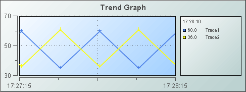
Trend
Graphs
Trend graphs (class
name: obj_trendgraph02) are generally used for tracing two types of data
in one trend graph: real-time, or live data, and archived data.
Displaying these two types of traces in conjunction is useful for comparing data
trends. The
trend graph supports up to ten traces, set the traceCount
to control the number of traces.
Using Trace* Properties
The Display Builder automatically creates a
set of trace* properties
according to the number you specify using the
traceCount object property.
Attach your data to
trace*Value
or trace*ValueTable, where * is the trace number. For
example if you set the traceCount to three (3), you will have three traces in your graph
(Trace01, Trace02 and Trace03) and a corresponding trace*Value
(trace1Value, trace2Value and trace3Value) for each.
All traces in the trend graph have the option
to display historical and/or current data:
|
Historical Data |
|
Current Data |
|
Historical and Current Data |
| To
display historical data, attach to
trace*ValueTable, where *
is the trace number, and include two columns in your attachment. The first column must be the time value and the second column the value
to plot.
Optionally, include a third
(string) column in your attachment if you want to display a data label for
each corresponding data value. See the Attach to Data section
specific to your data source for details on how to use the Select Columns
dialog.
NOTE: In order to attach historical data to
the trace*ValueTable
property, the trace*ValueHistoryFlag must be deselected. |
To display current data, attach to trace*Value,
where * is the trace number. When you attach data to the trace*Value
property, the time displayed on the trend graph is automatically updated
each time data is received. Your data attachment can contain either a single
point of data or two columns of data.
See the Attach to Data
section specific to your data source for details on how to use the Select
Columns dialog. If your attachment contains a single point of data, Enterprise
RTView assigns a time stamp when the graph receives the data.
If your attachment contains two columns of
data, the first column must be the
time value and the second
column the value to plot. Optionally, include
a third (string) column in your attachment if you want to display a data
label for each corresponding data value. |
To display both historical and current data in a single trace, attach your
current data to trace*Value and select one of the following options for
your historical data:
● Select the
trace*ValueHistoryFlag
so that initial data is loaded from the
Historian database
●
Attach your historical
data to trace*ValueTable.
NOTE: The trace*ValueHistoryFlag must be
deselected.
|
Supported formats for the time value column are: mm/dd/yyyy hh:mm:ss
(e.g., 01/16/2004 12:30:03), yyyy-mm-dd hh:mm:ss (e.g., 2004-01-16
12:30:03), and the number of milliseconds since midnight, January 1, 1970 UTC. In order to view all available data, you must set the properties
timeRange to -1 and timeShift to a
negative value. This negative value will be used to round the start and end times for the
y-axis. For
example, if you specify -15 for the timeShift property, the start and end times for the
y-axis will be
rounded to the nearest 15 seconds.
Data labels will be displayed
(enclosed in parentheses) in the fixed legend and in the popup legend, between
the trace value and the trace label. If the cursorFlag property is
selected, then the data label in the popup legend is for the data value that is
directly under or to the left of the cursor.
Alert Properties
To set trace marker colors
and styles based on a threshold value, select the corresponding value alarm
or value warning flags.
| Property
Name |
Description |
| valueHighAlarmEnabledFlag |
Select to enable the high
alarm threshold and the following related properties:
| valueHighAlarm |
Set the value of the high alarm
threshold.
|
| valueHighAlarmLineVisFlag |
Select to display a dotted
line at the high alarm threshold. The color of the line is set to the valueHighAlarmMarkColor. |
valueHighAlarmMarkColor/
valueHighAlarmMarkStyle |
When a trace
marker's value is greater than or equal to the valueHighAlarm property,
the marker will change to the valueHighAlarmMarkColor and valueHighAlarmMarkStyle. |
valueHighAlarmTraceColor/
valueHighAlarmTraceStyle |
When
the value of any segment of a trace line is greater than or equal to the
valueHighAlarm
property, that segment of the trace line will change to the valueHighAlarmTraceColor
and
valueHighAlarmTraceStyle.
NOTE: If valueHighAlarmTraceStyle is set to No Line, then valueHighAlarmTraceColor
will
not change. |
|
| valueHighWarningEnabledFlag |
Select to enable
the high warning threshold and the following related properties:
| valueHighWarning |
Set the value of the high warning
threshold.
|
| valueHighWarningLineVisFlag |
Select to display a dotted
line at the high warning threshold. The color of the line is set to the
valueHighWarningMarkColor. |
valueHighWarningMarkColor/
valueHighWarningMarkStyle |
When a trace marker's value
is greater than or equal to the valueHighWarning property but less
than the valueHighAlarm property, the marker will change to the
valueHighWarningMarkColorand
valueHighWarningMarkStyle. |
valueHighWarningTraceColor/
valueHighWarningTraceStyle |
When
the value of any segment of a trace line is greater than or equal to the
valueHighWarning
property but less than the valueHighAlarm property, that segment
of the trace line will change to the valueHighWarningTraceColor
and valueHighWarningTraceStyle. |
|
| valueLowAlarmEnabledFlag |
Select to enable the low
alarm threshold and the following related properties:
| valueLowAlarm |
Set the value of the low alarm
threshold.
|
| valueLowAlarmLineVisFlag |
Select to display a dotted
line at the low alarm threshold. The color of the line is set to the valueLowAlarmMarkColor. |
valueLowAlarmMarkColor/
valueLowAlarmMarkStyle |
When the trace
marker's value is less than or equal to the valueLowAlarm property,
the marker will change to the valueLowAlarmMarkColor and valueLowAlarmMarkStyle. |
valueLowAlarmTraceColor/
valueLowAlarmTraceStyle |
When
the value of any segment of a trace line is less than or equal to the valueLowAlarm
property, that segment of the trace line will change to the valueLowAlarmTraceColor
and
valueLowAlarmTraceStyle. |
|
| valueLowWarningEnabledFlag |
Select to enable
the low warning threshold and the following related properties:
| valueLowWarning |
Set the value of the low warning
threshold.
|
| valueLowWarningLineVisFlag |
Select to display a dotted
line at the low warning threshold. The color of the line is set to the
valueLowWarningMarkColor. |
valueLowWarningMarkColor/
valueLowWarningMarkStyle |
When the trace marker's
value is less than or equal to the valueLowWarning property, but
greater than the
valueLowAlarm property, the marker will change
to the valueLowWarningMarkColor and valueLowWarningMarkStyle. |
valueLowWarningTraceColor/
valueLowWarningTraceStyle |
When
the value of any segment of a trace line is less than or equal to the valueLowWarning
property, but greater than the valueLowAlarm property, that segment
of the trace line will change to the valueLowWarningTraceColor and
valueLowWarningTraceStyle. |
|
Background Properties
Specify how the background
is displayed in your trend graph.
Data Properties
Specify how data is displayed
in your graph.
| Property
Name |
Description |
| maxPointsPerTrace |
The default is set to 1000.
The maximum value for this property is 30000. |
yValueMax
yValueMin
|
The yValueMin and
yValueMax
properties control the range of the y-axis for this trace if the yAxisAutoScaleMode
is set to Off. Select On for the yAxisAutoScaleMode
to
calculate y-axis range according to data values being plotted. To calculate
the the y-axis range including yValueMin and yValueMax, select
On
- Include Min/Max.
If yAxisMultiRangeMode
is set to Multiple Axis or Strip Chart, then use the trace*YAxisAutoScaleMode,
trace*YAxisValueMin
and trace*YAxisValueMax properties to control the range of the y-axis. |
Data Format Properties
Specify data format in your
graph.
| Property
Name |
Description |
| yValueFormat |
Select or enter the numeric
format of values displayed in the legend and popup legend. To enter a format,
use syntax from the Java DecimalFormat class. |
Historian Properties
| Property
Name |
Description |
| historyTableName |
Specify
name of table in your history database in which to store tabular data.
See
History Tables>Tabular Data for information. |
|
historyTableRowNameFlag |
If
selected, data from the row name field will be stored in the first column of the
table specified in historyTableName. |
Interaction Properties
| Property
Name |
Description |
| command |
Assign a command to
your trend graph. See Building
Displays>Define/Execute Command for information. |
|
commandCloseWindowOnSuccess |
If selected, the
window that initiates a system command will automatically close when the system
command is executed successfully. This
property only applies to system commands.
With data source commands, the window is closed
whether or not the command is executed successfully.
For multiple commands, this property is applied
to each command individually. Therefore if the first command in the multiple
command sequence succeeds, the window will close before the rest of the commands
are executed.
NOTE: The commandCloseWindowOnSuccess
property is not supported in the Display Server. |
|
commandConfirm |
If selected, the
command confirmation dialog is enabled. Use the commandConfirmText
property to write your own text for the confirmation dialog, otherwise text from
the command property will be used. For
multiple commands, if you Confirm the execution then all individual commands
will be executed in sequence with no further confirmation. If the you Cancel the
execution, none of the commands in the sequence will executed. |
|
commandConfirmText |
Enter command
confirmation text directly in the Property Value field or select the  button to open the Edit commandConfirmText dialog. If
commandConfirmText is not specified, then
text from the command property will be used.
button to open the Edit commandConfirmText dialog. If
commandConfirmText is not specified, then
text from the command property will be used. |
| cursorColor |
Select the
button and choose a color from the palette to set the color of the cursor. |
| cursorFlag |
Select to enable the cursor.
When the cursor is enabled, select the graph and point to a location on
a trace to see a cursor line at that location and display the time and
values of all traces at the cursor line on the legend. Hold down the control
key to snap the cursor to the closest data point. Select the legendPopupFlag
to display the legend along the cursor. |
| drillDownTarget |
Name of display (.rtv)
file targeted as a drill down. See Building
Displays>Drill Down Displays for information.
When you double-click on a trace in the graph,
the following predefined substitutions will be set on the specified
drillDownTarget:
- $traceNumber - number of the trace (1 to 10)
that contains the selected point
- $traceLabel - label of selected trace
- $pointValue - data value of point
- $pointTimestamp - timestamp of point
- $pointLabel - data label (if any) of point
- $pointIndex - position of point in trace data
(0 to maxPointsPerTrace)
NOTE: When drillDownSelectMode is set to
Anywhere double-clicking anywhere on the graph will activate the
specified drillDownTarget, however you must double-click on a trace in
the graph to set the substitutions listed above. |
| drillDownSelectMode |
Control how a drill
down display is activated. Select one of the following options:
Anywhere - Activate a drill down
display by double-clicking anywhere on the graph.
Element
Only - Enable a drill down display only when you double-click on a
trace in the graph.
|
| legendPopupFlag |
Select to display the legend
along the cursor. Only enabled if the cursorFlag is selected. |
| scrollbarMode |
Select Never, As Needed,
or Always from the scrollbarMode property to set the behavior
of the scroll bar in the graph. Never is the default setting. Select
Always
to display a scroll bar at all times or As Needed to display the
scroll bar when necessitated by zooming in the trace area or when you have
more data loaded into the graph than you are displaying in the time range.
For example, if timeRangeOfHistory
is greater than timeRange, setting scrollbarMode to As
Needed will enable a scroll bar to view all historical data loaded
into the graph. |
| scrollbarSize |
Specify the height of the
horizontal scroll bar and the width of the vertical scroll bar, in pixels.
The default value is -1, which sets the size to the system default. |
| zoomEnabledFlag |
Select to enable zooming
within the graph. Click in the graph's trace area and drag the cursor until
a desired range is selected. While dragging, a rectangle is drawn to show
the zoom area. The rectangle's default color is yellow (this can be changed
in the cursorColor property). After the zoom is performed, the graph
stores up to four zoom operations in queue. To zoom out, press the shift
key and click in the graph's trace area.
NOTE: The graph is paused
after a zoom is performed and returns to updating with live data when the
graph is zoomed back out to 100%. |
Label Properties
| Property
Name |
Description |
| label |
Edit label text directly in the Property Value
field or select the
button to open the Edit Label dialog. |
| labelMinTabWidth |
Specify minimum width of the label tab.
This property is only applies if labelTextAlignY is
set to TabTop. |
| labelTextAlignX |
Select x-axis position of label text from the
drop down menu. |
| labelTextAlignY |
Select y-axis position of label text from the
drop down menu.
| Outside Top
|
Position label well above the background rectangle. |
| Top
|
Position label just above the background rectangle. |
| Title Top |
Position label along the top line of the background rectangle. |
| Tab Top |
Position label tab just above the background rectangle. Height and width of
the tab is dependent on the height and width of the text. Use the
labelMinTabWidth property to specify a minimum tab width. |
| Inside Top |
Position label inside the top of the background rectangle. |
|
| labelTextColor |
Select the
button and choose a color from the palette to set the label text color. |
| labelTextFont |
Select font style of label text from the drop
down menu. |
| labelTextHeight |
Set the height of the label text in pixels. |
Legend Properties
Specify the way the legend
is displayed in your trend graph. Click and press a trace's entry in the
legend to temporarily hide all other traces in the graph.
| Property
Name |
Description |
| legendBgColor |
Select the
button and choose a color from the palette to set the background color
of the legend. |
| legendBgGradientColor2 |
Select the
button and choose a color for the second
color in the gradient. Default is white. NOTE: The legendBgColor property sets
the first color in the gradient. |
| legendBgGradientMode |
Display a gradient
in the legend background. Select from the following options:
| |
None |
No gradient |
| |
Diagonal Edge |
Gradient is drawn
at a 45 degree angle from the top left to the bottom right corner of the
object. |
| |
Diagonal Center |
Gradient is drawn
at a 45 degree angle from the center to the top left and the bottom right
corners of the object. |
| |
Horizontal Edge |
Gradient is drawn
horizontally from the top to the bottom of the object. |
| |
Horizontal Center |
Gradient is drawn
horizontally from the center to the top and bottom of the object. |
| |
Vertical Edge |
Gradient is drawn
vertically from the left to the right of the object. |
| |
Vertical Center |
Gradient is drawn
vertically from the center to the left and right of the object. |
|
| legendTimeFormat |
Set the format for the time
displayed in the legend using syntax from the Java SimpleDateFormat class.
For example, MMMM dd,
yyyy hh:mm:ss a would result in the form August 30, 2003 05:32:12
PM. If no format is given, the timeFormat
will be used. |
| legendValueMinSpace |
Specify the minimum distance
between values and labels in the legend. |
| legendVisFlag |
Select to display the legend. |
| legendWidthPercent |
Set the percent of the total
width of the object used for the legend. |
Marker Properties
Specify the way markers
are displayed in your trend graph.
| Property
Name |
Description |
| markDefaultSize |
Set markDefaultSize
to specify the size of the markers in pixels. |
| markScaleMode |
Set markScaleMode
to
scale markers according to the order of the data in your data attachment,
e.g., the marker for the first data in the attachment is the smallest and
the marker for the last data is the largest. Select one of the following
from the drop down menu to set the scale mode: No Scale, Scale
by Trace, Scale Within Trace. |
Object Properties
| Property
Name |
Description |
| anchor |
Specify where to
anchor an object in the display. NOTE: If an object has the dock property
set, the anchor property will be ignored.
The anchor property is only applied when the
dimensions of the display are modified, either by editing
Background Properties or resizing the window in
Layout mode
Select None, or one or more the following
options:
| None
|
Object
not anchored. This is the default. |
| Top |
Anchor
top of object at top of display. |
| Left |
Anchor
left side of object at left of display. |
| Bottom |
Anchor
bottom of object at bottom of display. |
| Right |
Anchor
right side of object at right of display. |
When a display is resized, the number of pixels
between an anchored object and the specified location remain constant. If an
object is anchored on opposite sides (i.e. Top and Bottom or
Left and Right), the object will be stretched to fill the available
space. |
| dock |
Specify the docking
location of an object in the display.
Select from the following options:
| None
|
Object
is not docked. This is the default. |
| Top |
Dock
object at top of display. |
| Left |
Dock
object at left of display. |
| Bottom |
Dock
object at bottom of display. |
| Right |
Dock
object at right of display. |
| Fill |
Dock
object in available space remaining in the display after all docked objects
are positioned. |
If the dimensions of the display are modified,
either by editing Background Properties or
resizing the window in Layout mode, the
properties (objX, objY, objWidth and objHeight) of
docked objects will automatically adapt to match the new size of the display.
When multiple objects are docked to the same side
of the display, the first object is docked against the side of the display, the
next object is docked against the edge of the first object, and so on.
When objects are docked to multiple sides of the
display, the order in which objects were added to the display controls docking
position. For example, let's say the first object added to the display is docked
at the Top and the second object is docked at the Left.
Consequently, the first object will fill the entire width of the display and the
second object will fill the left side of the display from the bottom of the
first object to the bottom of the display.
Objects in a display have the dock property set
to Fill, are laid out across a grid in the available space remaining
after all docked objects are positioned. By default, the grid has one row and as
many columns as there are objects in the display. You can modify the grid in the
Background Properties dialog.
Once an object is docked, there are some
limitations on how that object can be modified.
- Docked objects cannot be dragged or
repositioned using objX and objY properties.
- Docked objects cannot be resized using the
objWidth or objHeight properties. To resize you must drag on the
resize handle.
- Docked objects can only be resized toward the
center of the display (e.g. If an object is docked at the Top, only its
height can be increased by dragging down toward the center of the display).
- Docked objects set to Fill cannot be
resized at all.
- Docked objects cannot be moved using Align.
Non-docked objects can be aligned against a docked object, but a docked object
will not move to align against another object.
- Docked objects are ignored by Distribute.
|
| objHeight |
Set height of the object in pixels. |
| objName |
Name given to facilitate object management via
the Object List dialog. Select Tools>Object List. |
| objWidth |
Set width of the object in pixels. |
| objX |
Plot x-axis position of object. |
| objY |
Plot y-axis position of object. |
| transparencyPercent |
Set transparency of the object. Enter a value
between 0 and 100. A value of 0, the default, sets the object to be completely
opaque. A value of 100 will render the object completely transparent. |
| visFlag |
Control visibility of the object. |
Plot Area Properties
Specify the way the plot
area is displayed in your trend graph.
| Property
Name |
Description |
| gridColor |
Select the
button and choose a color from the palette to set the color of the grid. |
| traceBgColor |
Select the
button and choose a color from the palette to set the background color
of your graph. |
| traceBgGradientColor2 |
Select the
button and choose a color for the second
color in the gradient. Default is white. NOTE: The traceBgColor property sets
the first color in the gradient. |
| traceBgGradientMode |
Display a gradient
in the plot background. Select from the following options:
| |
None |
No gradient |
| |
Diagonal Edge |
Gradient is drawn
at a 45 degree angle from the top left to the bottom right corner of the
object. |
| |
Diagonal Center |
Gradient is drawn
at a 45 degree angle from the center to the top left and the bottom right
corners of the object. |
| |
Horizontal Edge |
Gradient is drawn
horizontally from the top to the bottom of the object. |
| |
Horizontal Center |
Gradient is drawn
horizontally from the center to the top and bottom of the object. |
| |
Vertical Edge |
Gradient is drawn
vertically from the left to the right of the object. |
| |
Vertical Center |
Gradient is drawn
vertically from the center to the left and right of the object. |
|
| traceBgImage |
Select an image
to display in the plot background of your graph. If necessary, the image
will be stretched to fit the plot area. |
Trace Groups
Specify trace groups displayed
in your trend graph. The Display Builder automatically creates a
set of traceGroup* properties
(where * is the trace
group number) according to the number
of trace groups specified in the
traceGroupCount property. A trace group
is a collection of two or more traces. Trace groups are useful for identifying
multiple traces sharing the same vertical axis (when
yAxisMultiRangeMode is set to
Strip Chart or Multi-Axis) or for
identifying three traces combined as a banded trace.
| Property
Name |
Description |
| traceGroupCount |
Specify the number of traces
in your trace group. The maximum is 5. |
| traceGroup*TraceNumbers |
According to the number of traces
specified in the
traceCount property, enter a
comma-separated list of the traces to include in this group (i.e. 1,3,5,6).
NOTE: If
traceGroup*BandedFlag is selected, then
the number of traces listed should be 3. If
the yAxisMultiRangeMode selected
is Strip Chart or Multi-Axis, all the traces in the group will share the same
strip/axis. If the yAxisMultiRangeMode selected
is Multi-Axis, the color of the axis for a trace group is determined by the
specified trace*LineColor of the first visible trace in the group. NOTE:
In Multi-Axis mode it is recommended that you assign the same
trace*LineColor/trace*LineStyle
and trace*MarkColor/trace*MarkStyle
to all traces included within a group.
Once a trace is included in a group, the following properties are no longer
available: trace*YAxisAutoScaleMode, trace*YAxisValueMax,
trace*YAxisValueMin. To scale the y-axis range of your trace group, use the
yAxisAutoScaleMode, yValueMax, and yValueMin properties.
NOTE: All traces included in a group must have the trace*YAxisVisFlag,
traceVisFlag and trace*YAxisGridVisFlag properties selected,
otherwise the y-axis and/or the y-axis grid will not be visible. |
| traceGroup*BandedFlag |
If selected, the plot area beneath the first
trace (the low band trace) and the area above the third trace (the high band
trace) will be filled. The second trace (the value trace) will not be filled. |
Trace Properties
Specify how traces are displayed
in your trend graph.
| Property
Name |
Description |
| multiTraceTableFlag |
Select to plot multiple traces from a single data
table.
| multiTraceCurrentValueTable |
Attach your current data. The first
column in the attachment must
contain a time value.
The remaining columns can either contain numeric or string data. The first
numeric value is used as the data point, the first string value is used as the
first data point's data label. Within the attachment, columns can be arranged in
any order (e.g.: numeric1, numeric2, string1, string2, numeric3, string3,
string4, numeric4). Unless
a trace*Label is already specified, the attached trace* column
names will be used as trace labels.
NOTE: If multiTraceHistoryValueTable is
also attached to data, it must contain the same number and type of columns as
the specified multiTraceCurrentValueTable. |
|
multiTraceHistoryValueTable |
Attach your historical data. The first column in
the attachment must contain a time value.
The remaining columns can either contain numeric or string data. The first
numeric value is used as the data point, the first string value is used as the
first data point's data label. Within the attachment, columns can be arranged in
any order (e.g.: numeric1, numeric2, string1, string2, numeric3, string3,
string4, numeric4). Unless
a trace*Label is already specified, the attached trace* column
names will be used as trace labels.
Typically, the attached data table contains initial
data points to be plotted (i.e. from a SQL attachment with Update Mode
set to On Demand, or from a Cache attachment with Update Once
selected.)
NOTE: If multiTraceCurrentValueTable is
also attached to data, it must contain the same number and type of columns as
the specified multiTraceHistoryValueTable. |
NOTE: Once multiTraceTableFlag is selected,
all trace data is expected to be provided via multiTraceCurrentValueTable
or multiTraceHistoryValueTable. Therefore, the trace*Value
and trace*ValueTable properties will no longer be available. |
| traceCount |
Specify the number of traces
in your graph. The maximum is 10. Enterprise RTView automatically creates
a set of properties (see Trace* Properties) for each trace. |
| traceFillStyle |
Set traceFillStyle
to Solid, Transparent, Gradient, or Transparent
Gradient to fill the area under the trace. Set to None to disable
this feature. None is the default. |
Trace* Properties
The Display Builder automatically creates a
set of trace* properties
(where * is the trace number)
according to the number of traces specified in the
traceCount property.
Attach your data to
trace*Value
or trace*ValueTable, see
the Using Trace* Properties
section for details.
| Property
Name |
Description |
| trace*Label |
Set a label for your trace. |
| trace*LineColor |
Select the
button and choose a color from the palette to set the trace color. |
| trace*LineStyle |
Select the style of the trace from the drop down menu:
No Line, Solid, Dotted,
Dashed or Dot
Dashed. |
| trace*LineThickness |
Select the thickness of
the trace from the drop down menu: Thin, Medium
or Thick.
|
| trace*MarkColor |
Select the
button and choose a color from the palette to set the trace marker color. |
| trace*MarkStyle |
Select the style
of the marker used on the trace from the drop down menu:
No Marker, Dot, +,
*, o, x, Filled Circle, Filled Diamond,
Filled Triangle, Filled Square or Filled Star. |
| trace*Type |
Select the type of trace from the drop down
menu: Line, Bar or Event.
| Line
|
Line
connecting each data point. |
| Bar
|
Vertical bar for each data
point, from zero to the data point's value. Use the trace*LineThickness
property to control the width of the bar. NOTE: If trace*MarkStyle is set to any value other than No Marker, the mark will be drawn
at the end of the Bar trace. |
| Event
|
Small rectangle
containing the first character of the corresponding data label for each data
point. If no data label exists, then the first character of the specified
trace*Label is used. Each Event trace is positioned vertically according to
the data value for the corresponding data point.
The trace*LineColor property sets the
color of rectangle's edges and the enclosed text character. The
trace*MarkColor property sets the fill color of the rectangle. If
trace*LineColor and trace*MarkColor are set to the same color,
then traceBgColor is used to set the fill color of the rectangle.
NOTE: If the attached data contains
data labels but no data values, then an Event trace will be plotted regardless
of the specified trace*Type setting and Event trace rectangles will be
drawn near the bottom of the trace area. |
|
| trace*Value |
Attach your current data, either containing a
single point of data or two columns of data.
If your attachment contains a single point of
data, Enterprise RTView will assign a time stamp when the graph receives the
data.
If your attachment contains two columns of data,
the first column must be the
time value and the second column the value to
plot.
Optionally, include
a third (string) column in your attachment to display a data label for each
corresponding data value. The data label will be displayed (enclosed in
parentheses) in the fixed legend and in the popup legend, between the trace
value and the trace label. If the cursorFlag property is selected, then
the data label in the popup legend is for the data value that is directly under
or to the left of the cursor. |
| trace*ValueAlarmStatus |
Use if your trace is being driven by
trace*Value. To apply an alarm status to a trace, enter an alarm status
index which will be applied to any new points plotted.
Valid indexes are: 0 = use normal marker color and
style, 1 = use low alarm marker color and style, 2 = use low warning marker
color and style, 3 = use high warning marker color and style, 4 = use high alarm
marker color and style, -1 = determine marker color and style by comparing the
value to the enabled alarm thresholds. |
| trace*ValueAlarmStatusTable |
Use if your trace is being driven by trace*ValueTable.
Attach an alarm table containing status indexes to trace*ValueAlarmStatusTable
to enable rule based alarm statuses for trace markers. This table must have a
time column (formatted like the time value in the trace*ValueTable) and a
value column where the value column contains alarm status values 0-4. The table
must also have the same number of rows as the corresponding trace*ValueTable.
For each data element in trace*ValueTable, the status index at the
corresponding position in trace*valueAlarmStatusTable will be used to set
the alarm status of the marker.
Valid indexes are: 0 = use normal marker color and
style, 1 = use low alarm marker color and style, 2 = use low warning marker
color and style, 3 = use high warning marker color and style, 4 = use high alarm
marker color and style, -1 = determine marker color and style by comparing the
value to the enabled alarm thresholds. If no data is attached to
trace*ValueAlarmStatusTable, then the alarm status for a trace marker is
determined by comparing the marker's value to the enabled thresholds. |
| trace*ValueDivisor |
Enter a number. All traces will be divided by
this value. |
| trace*ValueHistoryFlag |
If selected,
Enterprise RTView will attempt to
load initial data from the Historian database
for the corresponding trace. NOTE: Only data within the specified timeRange
will be loaded and the graph will update as live data becomes available. |
|
trace*ValueTable |
Attach your historical data containing two
columns: the first column
must be the time value and the second column
the value to plot. NOTE: In order to attach
historical data to the trace*ValueTable
property, the trace*ValueHistoryFlag must be deselected.
Optionally, include
a third (string) column in your attachment to display a data label for each
corresponding data value. The data label will be displayed (enclosed in
parentheses) in the fixed legend and in the popup legend, between the trace
value and the trace label. If the cursorFlag property is selected, then
the data label in the popup legend is for the data value that is directly under
or to the left of the cursor. |
| trace*VisFlag |
Select to control trace visibility. Click and
hold on a trace's entry in the legend to temporarily hide all other traces in
the graph. |
X-Axis Properties
Specify the way the x axis
is displayed in your trend graph.
| Property
Name |
Description |
| timeFormat |
Set the format
for the time displayed in the x-axis using syntax from the Java SimpleDateFormat
class.
For example, MMMM dd,
yyyy hh:mm:ss a would result in the form August 30, 2003 05:32:12
PM. If no format is given, the date and time will not be displayed
on the x-axis. Include a new line character ('\n')
to display multiple line text in the time axis labels.
For example, MM\dd'\n'hh:mm:ss would
result in the form 08\30 05:32:12. |
| timeRange |
Control the total amount
of time, in seconds, plotted on the graph. If you attach data to trace*ValueTable,
set timeRange to
-1so the time range of the graph is driven
by the time range in the data attachment. NOTE: timeRange is ignored
if both timeRangeBegin and timeRangeEnd are set. |
| timeRangeBegin |
Set the start time value
of the data to be plotted on the graph.
Supported formats are:
mm/dd/yyyy
hh:mm:ss (e.g., 01/16/2004 12:30:03), yyyy-mm-dd hh:mm:ss (e.g.,
2004-01-16 12:30:03), and the number of milliseconds since midnight, January
1, 1970 UTC. NOTE: If only the time is specified, then today's date will
be used. |
| timeRangeEnd |
Set the end time value of
the data to be plotted on the graph.
Supported formats are:
mm/dd/yyyy
hh:mm:ss (e.g., 01/16/2004 12:30:03), yyyy-mm-dd hh:mm:ss (e.g.,
2004-01-16 12:30:03), and the number of milliseconds since midnight, January
1, 1970 UTC. NOTE: If only the time is specified, then today's date will
be used. |
| timeRangeOfHistory |
Specify how much historical
data is loaded into the graph, in seconds. If timeRangeOfHistory
is set to zero or less (default is -1), or if it is less than the value
of timeRange, then the timeRange property determines the
amount of historical data to be loaded into the graph. |
| timeShift |
Control the amount of time, in seconds, the graph will shift to the left when the trace has filled the graph and controls the rounding of the start and end times. For example, if the
timeShift is 15, the start and end times on the graph will be rounded to the nearest 15 second interval. By default, the end of the plot area corresponds with the current time. To only shift the graph when new data is received, set
timeShift to a negative value and the end of the graph will display the most current data plotted. If you attach data to
trace*ValueTable, you must set timeShift to a negative value. NOTE:
The timeShift property is ignored if either timeRangeBegin or timeRangeEnd is set. |
| xAxisFlag |
Select to display the x-axis. |
| xAxisGridVisFlag |
Select to display a grid
line for each major division along the x-axis. |
| xAxisLabelTextHeight |
Specify the height in pixels
of the x-axis labels. |
| xAxisMajorDivisions |
Specify the number of major
divisions on the x-axis. |
| xAxisMinorDivisions |
Specify the number of minor
divisions on the x-axis. |
Y-Axis Properties
Specify the way the y axis
is displayed in your trend graph.
| Property
Name |
Description |
| yAxisAutoScaleMode |
The yValueMin and
yValueMax
properties control the range of the y-axis for this trace if the yAxisAutoScaleMode
is set to Off. Select On for the yAxisAutoScaleMode
to
calculate y-axis range according to data values being plotted. To calculate
the the y-axis range including yValueMin and yValueMax, select
On
- Include Min/Max.
If yAxisMultiRangeMode
is set to Multiple Axis or Strip Chart, then use the trace*YAxisAutoScaleMode,
trace*YAxisValueMin
and trace*YAxisValueMax properties to control the range of the y-axis. |
| yAxisAutoScaleVisTracesOnlyFlag |
Select to include only visible
traces when calculating the y-axis range. By default all traces in the
traceCount are used in the auto-scale calculation, including those that are
invisible or unattached to data. |
| yAxisFlag |
Select to display the y-axis. |
| yAxisFormat |
Select or enter the numeric
format of values displayed on the y-axis. To enter a format, use syntax
from the Java DecimalFormat class. |
| yAxisGridVisFlag |
Select to display a grid
line for each major division along the y-axis if yAxisMultiRangeMode
is set to Off or Classic.
If yAxisMultiRangeMode
is set to Multiple Axis or Strip Chart, grid visibility is
set by selecting the trace*YAxisGridVisFlag. |
| yAxisLabelTextHeight |
Specify the height in pixels
of the y-axis labels. |
| yAxisMajorDivisions |
Specify the number of major
divisions on the y-axis. This is ignored if yAxisValueLabels is
set. |
| yAxisMinLabelWidth |
Specify the minimum
width in pixels for the y-axis labels. If yAxisMultiRangeMode is
set to Multiple Axis or Strip Chart, minimum width is set
by trace*YAxisMinLabelWidth. |
| yAxisMinorDivisions |
Specify the number of minor
divisions on the y-axis. This is ignored if yAxisValueLabels is
set. |
| yAxisMultiRangeMode |
Select one of the following modes:
Off
- All traces are plotted against a single y-axis.
Classic
- One axis per trace, with each trace having its own range. The 1st trace is
drawn on the outer left of the graph. The remaining traces are drawn on the
inner left of the trace area.
Multiple Axis
- One axis per trace, with each trace having its own range. Use the trace*YAxisAutoScaleMode,
trace*YAxisValueMin
and trace*YAxisValueMax properties to control the range of the y-axis.
Strip Chart
- The trace area is divided into strips, one for each trace. Each trace has its
own y-axis but all traces share the same x-axis. Use the trace*YAxisAutoScaleMode,
trace*YAxisValueMin
and trace*YAxisValueMax properties to control the range of the y-axis.
Stacked - The y-axis values for multiple traces
displayed are "stacked". That is, the value of each successive data point is
accumulated and the sum from lower numbered traces are plotted in the highest numbered trace.
NOTE: Actual (unstacked)
values for each individual trace are shown in the legend.
Values for lower numbered traces are not included
in the sum if a trace is invisible, has no data, all of its data
points are older or newer than the x-axis value, or the y-axis value at the
x-axis value is not a number (NaN).
If a
lower numbered trace has no y-axis value at a particular x-axis data point, but has
x-axis values before and after that data point, the y-axis value for the sum in that trace will be interpolated. |
| yAxisPosition |
Select one of
the following to set the position of the y-axis on the graph. NOTE: The
yAxisPosition
setting is ignored if yAxisMultiRangeMode is set to Classic.
Outer Left - Draw
axis to the left of the trace area.
Outer Right - Draw
axis to the right of the trace area.
Outer Mixed - Draw
axis to the left of the trace area for odd numbered traces and to the right
for even numbered traces.
Inner Left - Draw
axis on the inside left of the trace area.
Inner Right - Draw
axis on the inside right of the trace area.
Inner Mixed - Draw
axis on the inside left of the trace area for odd numbered traces and on
the inside right of the trace area for even numbered traces. |
| yAxisValueLabels |
Set to display
a text label or tick mark on the y-axis in place of a numerical value.
Include a value with no label to display a tick mark without a label. Use
this format:
value1=label1,value2,value3=label2
(e.g., 0=Off,1,2=On)
If
yAxisMultiRangeMode
is set to Multiple Axis or Strip Chart mode, the y-axis labels
are set using the trace*YAxisValueLabels property. |
|