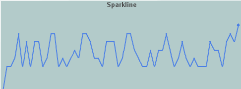
Sparkline
Sparkline charts (class
name: obj_sparkline) are
generally used to present trends and
variations in a simple and condensed way. As the name implies there is a line
associated with data, but no background or axis. It is possible to add labels at
the beginning and ending points of the line, which then can be toggled on and off.
Using Data Properties
To attach data to your sparkline chart, right-click in the Property
Value field of the value
or valueTable
property and select Attach to Data.
Attach scalar data to the value
property and tabular data to the valueTable
property. Tabular data
attached to the valueTable property should have
two columns: the first must contain numeric
values or time stamps (x-axis values) and the second column should contain the
corresponding (y-axis) numeric values.
Alert Properties
To set marker colors
and styles based on a threshold value, select the corresponding value alarm flags.
| Property
Name |
Description |
| valueHighAlarmEnabledFlag |
Select to enable the high
alarm threshold and the following related properties:
| valueHighAlarm |
Set the value of the high alarm
threshold.
|
| valueHighAlarmLineVisFlag |
Select to display a dotted
line at the high alarm threshold. The color of the line is set to the valueHighAlarmMarkColor. |
valueHighAlarmMarkColor/
valueHighAlarmMarkStyle |
When a trace
marker's value is greater than or equal to the valueHighAlarm property,
the marker will change to the valueHighAlarmMarkColor and valueHighAlarmMarkStyle. |
valueHighAlarmTraceColor/
valueHighAlarmTraceStyle |
When
the value of any segment of a trace line is greater than or equal to the
valueHighAlarm
property, that segment of the trace line will change to the valueHighAlarmTraceColor
and
valueHighAlarmTraceStyle.
NOTE: If valueHighAlarmTraceStyle is set to No Line, then valueHighAlarmTraceColor
will
not change. |
|
| valueLowAlarmEnabledFlag |
Select to enable the low
alarm threshold and the following related properties:
| valueLowAlarm |
Set the value of the low alarm
threshold.
|
| valueLowAlarmLineVisFlag |
Select to display a dotted
line at the low alarm threshold. The color of the line is set to the valueLowAlarmMarkColor. |
valueLowAlarmMarkColor/
valueLowAlarmMarkStyle |
When the trace
marker's value is less than or equal to the valueLowAlarm property,
the marker will change to the valueLowAlarmMarkColor and valueLowAlarmMarkStyle. |
valueLowAlarmTraceColor/
valueLowAlarmTraceStyle |
When
the value of any segment of a trace line is less than or equal to the valueLowAlarm
property, that segment of the trace line will change to the valueLowAlarmTraceColor
and
valueLowAlarmTraceStyle. |
|
Background Properties
Specify how the background
is displayed in your chart.
Data Properties
Specify how data is displayed
in your chart.
| Property
Name |
Description |
| maxPointsPerTrace |
The default is set to 1000. The maximum value for
this property is 30000. |
| value |
Attach your scalar data to the value
property. |
| valueDivisor |
Divides y-axis values
by the number entered. |
| valueTable |
Attach your tabular data to the valueTable
property. Tabular data attached must have
two columns: the first must contain numeric
values or time stamps (x-axis values) and the second column should contain the
corresponding (y-axis) numeric values. |
yValueMax
yValueMin |
Controls the range of
y-axis if the yAxisAutoScaleMode is set to
Off. Select
On for the yAxisAutoScaleMode to calculate the y-axis range
according to data values being plotted. To calculate the y-axis range including
yValueMin and yValueMax, select
On - Include Min/Max. |
Data Format Properties
Specify data format in your
chart.
| Property
Name |
Description |
| yValueFormat |
Select or enter the numeric
format of values displayed in the legend and popup legend. To enter a format,
use syntax from the Java DecimalFormat class. |
Historian Properties
| Property
Name |
Description |
| historyTableName |
Specify
name of table in your history database in which to store tabular data.
See
History Tables>Tabular Data for information. |
|
historyTableRowNameFlag |
If
selected, data from the row name field will be stored in the first column of the
table specified in historyTableName. |
Interaction Properties
| Property
Name |
Description |
| command |
Assign a command to
your chart. See Building
Displays>Define/Execute Command for information. |
|
commandCloseWindowOnSuccess |
If selected, the
window that initiates a system command will automatically close when the system
command is executed successfully. This
property only applies to system commands.
With data source commands, the window is closed
whether or not the command is executed successfully.
For multiple commands, this property is applied
to each command individually. Therefore if the first command in the multiple
command sequence succeeds, the window will close before the rest of the commands
are executed.
NOTE: The commandCloseWindowOnSuccess
property is not supported in the Display Server. |
|
commandConfirm |
If selected, the
command confirmation dialog is enabled. Use the commandConfirmText
property to write your own text for the confirmation dialog, otherwise text from
the command property will be used. For
multiple commands, if you Confirm the execution then all individual commands
will be executed in sequence with no further confirmation. If the you Cancel the
execution, none of the commands in the sequence will executed. |
|
commandConfirmText |
Enter command
confirmation text directly in the Property Value field or select the  button to open the Edit commandConfirmText dialog. If
commandConfirmText is not specified, then
text from the command property will be used.
button to open the Edit commandConfirmText dialog. If
commandConfirmText is not specified, then
text from the command property will be used. |
| cursorColor |
Select the
button and choose a color from the palette to set the color of the cursor. |
| cursorFlag |
Select to enable the cursor.
When the cursor is enabled, select the chart and point to a location on
a trace to see a cursor line at that location and display the time and
values of all traces at the cursor line on the legend. Hold down the control
key to snap the cursor to the closest data point. Select the legendPopupFlag
to display the legend along the cursor. |
| drillDownTarget |
Name of display (.rtv)
file targeted as a drill down. See Building
Displays>Drill Down Displays for information. |
Label Properties
| Property
Name |
Description |
| label |
Edit label text directly in the Property Value
field or select the
button to open the Edit Label dialog. |
| labelMinTabWidth |
Specify minimum width of the label tab.
This property is only applies if labelTextAlignY is
set to TabTop. |
| labelTextAlignX |
Select x-axis position of label text from the
drop down menu. |
| labelTextAlignY |
Select y-axis position of label text from the
drop down menu.
| Outside Top
|
Position label well above the background rectangle. |
| Top
|
Position label just above the background rectangle. |
| Title Top |
Position label along the top line of the background rectangle. |
| Tab Top |
Position label tab just above the background rectangle. Height and width of
the tab is dependent on the height and width of the text. Use the
labelMinTabWidth property to specify a minimum tab width. |
| Inside Top |
Position label inside the top of the background rectangle. |
|
| labelTextColor |
Select the
button and choose a color from the palette to set the label text color. |
| labelTextFont |
Select font style of label text from the drop
down menu. |
| labelTextHeight |
Set the height of the label text in pixels. |
Legend Properties
Specify the way the legend
is displayed in your chart.
| Property
Name |
Description |
| legendBgColor |
Select the
button and choose a color from the palette to set the background color
of the legend. |
| legendBgGradientColor2 |
Select the
button and choose a color for the second
color in the gradient. Default is white. NOTE: The legendBgColor property sets
the first color in the gradient. |
| legendBgGradientMode |
Display a gradient
in the legend background. Select from the following options:
| |
None |
No gradient |
| |
Diagonal Edge |
Gradient is drawn
at a 45 degree angle from the top left to the bottom right corner of the
object. |
| |
Diagonal Center |
Gradient is drawn
at a 45 degree angle from the center to the top left and the bottom right
corners of the object. |
| |
Horizontal Edge |
Gradient is drawn
horizontally from the top to the bottom of the object. |
| |
Horizontal Center |
Gradient is drawn
horizontally from the center to the top and bottom of the object. |
| |
Vertical Edge |
Gradient is drawn
vertically from the left to the right of the object. |
| |
Vertical Center |
Gradient is drawn
vertically from the center to the left and right of the object. |
|
| legendTimeFormat |
Set the format for the time
displayed in the legend using syntax from the Java SimpleDateFormat class.
For example, MMMM dd,
yyyy hh:mm:ss a would result in the form August 30, 2003 05:32:12
PM. If no format is given, the timeFormat
will be used. |
| legendValueMinSpace |
Specify the minimum distance
between values and labels in the legend. |
| legendVisFlag |
Select to display the legend. |
| legendWidthPercent |
Set the percent of the total
width of the object used for the legend. |
Marker Properties
Specify the way markers
are displayed in your chart.
| Property
Name |
Description |
| markDefaultSize |
Set markDefaultSize
to specify the size of the markers in pixels. |
Object Properties
| Property
Name |
Description |
| anchor |
Specify where to
anchor an object in the display. NOTE: If an object has the dock property
set, the anchor property will be ignored.
The anchor property is only applied when the
dimensions of the display are modified, either by editing
Background Properties or resizing the window in
Layout mode
Select None, or one or more the following
options:
| None
|
Object
not anchored. This is the default. |
| Top |
Anchor
top of object at top of display. |
| Left |
Anchor
left side of object at left of display. |
| Bottom |
Anchor
bottom of object at bottom of display. |
| Right |
Anchor
right side of object at right of display. |
When a display is resized, the number of pixels
between an anchored object and the specified location remain constant. If an
object is anchored on opposite sides (i.e. Top and Bottom or
Left and Right), the object will be stretched to fill the available
space. |
| dock |
Specify the docking
location of an object in the display.
Select from the following options:
| None
|
Object
is not docked. This is the default. |
| Top |
Dock
object at top of display. |
| Left |
Dock
object at left of display. |
| Bottom |
Dock
object at bottom of display. |
| Right |
Dock
object at right of display. |
| Fill |
Dock
object in available space remaining in the display after all docked objects
are positioned. |
If the dimensions of the display are modified,
either by editing Background Properties or
resizing the window in Layout mode, the
properties (objX, objY, objWidth and objHeight) of
docked objects will automatically adapt to match the new size of the display.
When multiple objects are docked to the same side
of the display, the first object is docked against the side of the display, the
next object is docked against the edge of the first object, and so on.
When objects are docked to multiple sides of the
display, the order in which objects were added to the display controls docking
position. For example, let's say the first object added to the display is docked
at the Top and the second object is docked at the Left.
Consequently, the first object will fill the entire width of the display and the
second object will fill the left side of the display from the bottom of the
first object to the bottom of the display.
Objects in a display have the dock property set
to Fill, are laid out across a grid in the available space remaining
after all docked objects are positioned. By default, the grid has one row and as
many columns as there are objects in the display. You can modify the grid in the
Background Properties dialog.
Once an object is docked, there are some
limitations on how that object can be modified.
- Docked objects cannot be dragged or
repositioned using objX and objY properties.
- Docked objects cannot be resized using the
objWidth or objHeight properties. To resize you must drag on the
resize handle.
- Docked objects can only be resized toward the
center of the display (e.g. If an object is docked at the Top, only its
height can be increased by dragging down toward the center of the display).
- Docked objects set to Fill cannot be
resized at all.
- Docked objects cannot be moved using Align.
Non-docked objects can be aligned against a docked object, but a docked object
will not move to align against another object.
- Docked objects are ignored by Distribute.
|
| objHeight |
Set height of the object in pixels. |
| objName |
Name given to facilitate object management via
the Object List dialog. Select Tools>Object List. |
| objWidth |
Set width of the object in pixels. |
| objX |
Plot x-axis position of object. |
| objY |
Plot y-axis position of object. |
| transparencyPercent |
Set transparency of the object. Enter a value
between 0 and 100. A value of 0, the default, sets the object to be completely
opaque. A value of 100 will render the object completely transparent. |
| visFlag |
Control visibility of the object. |
Plot Area Properties
Specify the way the plot
area is displayed in your chart.
| Property
Name |
Description |
| traceBgColor |
Select the
button and choose a color from the palette to set the background color
of your chart. |
Trace Properties
Specify how traces are displayed
in your chart.
| Property
Name |
Description |
| traceLabel |
Set a label for your trace. |
| traceLineColor |
Select the
button and choose a color from the palette to set the trace line color. |
| traceLineStyle |
Select the style of the
line used to display the trace from the drop down menu:
No Line, Solid, Dotted,
Dashed or Dot
Dashed. |
| traceLineThickness |
Select the thickness of
the line used to display the trace from the drop down menu: Thin, Medium
or Thick.
|
| traceMarkColor |
Select the
button and choose a color from the palette to set the trace marker color. |
| traceMarkStyle |
Select the style
of the marker used on the trace from the drop down menu:
No Marker, Dot, +,
*, o, x, Filled Circle, Filled Diamond,
Filled Triangle, Filled Square or Filled Star. |
| valueHistoryFlag |
If you enable
this property, Enterprise RTView will attempt to
load initial data from the
Historian database
for the corresponding trace. NOTE: Only data within the specified timeRange
will be loaded and the chart will update as live data becomes available. |
X-Axis Properties
Specify the way the x axis
is displayed in your chart.
| Property
Name |
Description |
| timeRange |
Control the total amount
of time, in seconds, plotted on the chart. If you attach data to trace*ValueTable,
set timeRange to
-1so the time range of the chart is driven
by the time range in the data attachment. NOTE: timeRange is ignored
if both timeRangeBegin and timeRangeEnd are set. |
| timeRangeBegin |
Set the start time value
of the data to be plotted on the chart.
Supported formats are:
mm/dd/yyyy
hh:mm:ss (e.g., 01/16/2004 12:30:03), yyyy-mm-dd hh:mm:ss (e.g.,
2004-01-16 12:30:03), and the number of milliseconds since midnight, January
1, 1970 UTC. NOTE: If only the time is specified, then today's date will
be used. |
| timeRangeEnd |
Set the end time value of
the data to be plotted on the chart.
Supported formats are:
mm/dd/yyyy
hh:mm:ss (e.g., 01/16/2004 12:30:03), yyyy-mm-dd hh:mm:ss (e.g.,
2004-01-16 12:30:03), and the number of milliseconds since midnight, January
1, 1970 UTC. NOTE: If only the time is specified, then today's date will
be used. |
| timeRangeOfHistory |
Specify how much historical
data is loaded into the chart, in seconds. If timeRangeOfHistory
is set to zero or less (default is -1), or if it is less than the value
of timeRange, then the timeRange property determines the
amount of historical data to be loaded into the chart. |
Y-Axis Properties
Specify the way the y axis
is displayed in your chart.
| Property
Name |
Description |
| yAxisAutoScaleMode |
The yValueMin and
yValueMax
properties control the range of the y-axis for this trace if the yAxisAutoScaleMode
is set to Off. Select On for the yAxisAutoScaleMode
to
calculate y-axis range according to data values being plotted. To calculate
the y-axis range including yValueMin and yValueMax, select
On
- Include Min/Max.
If yAxisMultiRangeMode
is set to Multiple Axis or Strip Chart, then use the trace*YAxisAutoScaleMode,
trace*YAxisValueMin
and trace*YAxisValueMax properties to control the range of the y-axis. |
|