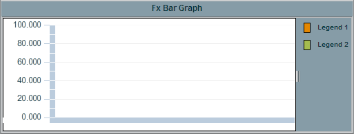
Fx Bar
Graph
Bar graphs are useful for comparing columns or rows of numeric data
from a tabular data element returned by your data attachment. The Fx bar graph
(class name: obj_fxbar) has many features that standard bar graphs do not, such
as:
- Data
tips that display detailed information about associated column data
- Graph background with alternating row colors
and a configurable grid color
- Multi-position legend that can be resized
interactively
Data
Properties
Attach your data to the valueTable
property. It is possible to graph multiple columns or rows of numeric data.
If you include a label column in your data attachment for valueTable,
it can be used to label either the x-axis or the legend, depending on whether
the rowSeriesFlag is selected or deselected. The
rowSeriesFlag
controls how row and column data populate the graph:
|
If the
rowSeriesFlag
checkbox is selected, one group of bars will be shown for each numeric
column in your data attachment. Within the group for each numeric column,
there will be a bar for each row in that column. Column names will
be used for the x-axis labels. |
|
If the
rowSeriesFlag
checkbox is not selected, one group of bars will be shown for each row
in your data attachment. Within the group for each row, there will be a
bar for each column in that row. Column names will appear in the legend.
|
Data
Properties
| Property
Name |
Description |
| valueDivisor |
Divides bar and y-axis values
by the number entered. |
yValueMin
yValueMax |
Controls the range of y-axis if the yAxisAutoScaleMode is set to
Off.
Select
On for the yAxisAutoScaleMode to calculate the y-axis
range according to data values being plotted. |
Data Format Properties
Specify the data format
for your bar graph.
| Property
Name |
Description |
| yValueFormat |
Formats the numeric value shown on each bar, if
barValueVisFlag is selected. Formats the numeric value that appears in
each tooltip is mouseOverFlag is selected. |
Background Properties
Specify how the background
is displayed in your bar graph.
| Property
Name |
Description |
| bg3dFlag |
Select to display a 3D edge on the
background rectangle. |
| bgColor |
Select the  button and choose a color from the palette to set the background color. NOTE: Color properties
are treated differently on Fx graphs than on other objects, see the Fx
Graph Colors section for more information.
button and choose a color from the palette to set the background color. NOTE: Color properties
are treated differently on Fx graphs than on other objects, see the Fx
Graph Colors section for more information. |
| bgGradientFlag |
Select to display a gradient
in the background rectangle. |
Bar Properties
Specify the way the bars
are displayed in your graph.
| Property
Name |
Description |
| barImage |
Select an image to display
in the bars. NOTE: If necessary, the image will be stretched to fit the
bar size. |
| barOutlineFlag |
If selected, an outline appears around each bar. |
| barValueTextColor |
Select the
button and choose a color from the palette to set text color
inside the bars if barValueVisFlag is selected. NOTE: Color properties
are treated differently on Fx graphs than on other objects, see the Fx
Graph Colors section for more information. |
| barValueTextFont
|
Select font style of the text inside the bars if
barValueVisFlag is selected. |
| barValueTextSize |
Select size of the text inside the bars if
barValueVisFlag is selected. |
| barValueVisFlag
|
Select to
display a label containing the value for each bar. |
Layout Properties
Specify how the background
is displayed in your bar graph.
| Property
Name |
Description |
| draw3dDepth |
Specify width (in pixels) for the shadow of the
bars. |
| draw3dFlag |
Select to change the display
of the bars from 2D to 3D. |
| drawHorizontalFlag |
Select to have the bars
in your graph displayed horizontally. |
| drawStackedFlag |
Select to stack each bar
group in your graph. |
| horizAxisLabelRotationAngle
|
Set the amount of rotation of labels
on the horizontal axis. Values range from 0 to 90 degrees. A value of 0 causes
the bar graph to automatically pick the optimum angle of rotation. |
Legend Properties
Specify the way the legend
is displayed in your bar graph.
| Property
Name |
Description |
| legendBgColor |
Select the
button and choose a color from the palette to set the background color
of the legend. NOTE: Color properties
are treated differently on Fx graphs than on other objects, see the Fx
Graph Colors section for more information. |
| legendBgGradientFlag |
Select the legendBgGradientFlag
to display a gradient in the legend background. If legendBgColor is
set to Default then gradient will not display. |
| legendPosition |
Specify the position of the legend. |
| legendValueTextColor |
Select the
button and choose a color from the palette to set the text color
of the legend. NOTE: Color properties
are treated differently on Fx graphs than on other objects, see the Fx
Graph Colors section for more information. |
| legendValueTextFont |
Specify the font style of text of the legend. |
| legendValueTextSize |
Specify the size of text of the legend. |
| legendVisFlag |
Select to display the legend. |
| legendWidthPercent |
Set default percentage of object designated for
the legend. |
Interaction Properties
Select the mouseOverFlag
to enable tooltips for your bar graph. To display a tooltip, select the
graph and point to a bar or marker with your mouse. The tooltip will contain
information from your data attachment about that bar or marker.
Interaction Properties
Specify how you interact
with the data in your graph. See the
Additional Interactivity section for more information on how to interact with this graph
at runtime.
| Property
Name |
Description |
| mouseOverFlag |
Select the mouseOverFlag to enable
tooltips for your bar graph. To display a tooltip, select the graph and point to
a bar with your mouse. The tooltip will contain information from your data
attachment about that bar. |
| drillDownTarget |
Specify a drill
down display. Any display (.rtv) file can be targeted as a drill
down. Once a drill down target has been set, double-click on the graph to
activate the drill down. Drill down displays can be activated in the same
window that contains the graph or open in a separate window. This allows you
to build a customizable hierarchy of displays. |
X-Axis Properties
Specify how the x-axis is
displayed in your bar graph.
| Property
Name |
Description |
| xAxisFlag |
Select to display the x-axis. |
Y-Axis Properties
Specify how the y-axis is
displayed in your bar graph.
| Property
Name |
Description |
| yAxisAutoScaleMode |
The yValueMin and
yValueMax properties
control the range of y-axis if the yAxisAutoScaleMode is set to
Off.
Select
On for the yAxisAutoScaleMode to calculate the y-axis
range according to data values being plotted. To calculate the y-axis range
including
yValueMin and yValueMax, select
On - Include
Min/Max. |
| yAxisFlag |
Select to display the y-axis. |
| yAxisFormat |
Select or enter the numeric
format of values displayed on the y-axis.
To enter a format, use syntax
from the Java DecimalFormat class. |
| yAxisMajorDivisions |
Specify the number of major
divisions on the y-axis. |
| yAxisMinorDivisions |
Specify the number of minor
divisions on the y-axis. |
Alert Properties
To set bar colors, trace
marker colors and trace marker styles based on a threshold value, select
the corresponding value alarm or value warning flags.
| Property
Name |
Description |
| valueHighAlarmEnabledFlag |
Select to enable the high
alarm threshold. |
| valueHighAlarmColor |
When a bar's value is greater
than or equal to the valueHighAlarm property, the color of the bar
will change to the valueHighAlarmColor. |
| valueHighWarningEnabledFlag |
Select to enable the high
warning threshold. |
| valueHighWarningColor |
When a bar's value is greater
than or equal to the valueHighWarning, but less than the valueHighAlarm,
the color of the bar will change to the valueHighWarningColor. |
| valueLowAlarmEnabledFlag |
Select to enable the low
alarm threshold. |
| valueLowAlarmColor |
When a bar's value is less
than or equal to the valueLowAlarm property, the color of the bar
will change to the valueLowAlarmColor. |
| valueLowWarningEnabledFlag |
Select to enable the low
warning threshold. |
| valueLowWarningColor |
When a bar's value is less
than the valueLowWarning property, but greater than the valueLowAlarm
property, the bar will change to the valueLowWarningColor. |
Plot Area Properties
| Property
Name |
Description |
| gridAltBgColor |
Select the
button and choose a color from the palette to set one of the alternating row colors
in the grid
background. The color you specify for gridBgColor will be the other
alternating row color. Default is transparent. NOTE: Color properties
are treated differently on Fx graphs than on other objects, see the Fx
Graph Colors section for more information. |
| gridBgColor |
Select the
button and choose a color from the palette to set the color of the grid
background. Default is transparent. NOTE: Color properties
are treated differently on Fx graphs than on other objects, see the Fx
Graph Colors section for more information. |
| gridBgImage |
Select an image to display
in the grid background of your graph. NOTE: If necessary, the image will
be stretched to fit the grid. |
| gridColor |
Select the
button and choose a color from the palette to set the color of the grid
lines. Default is white. NOTE: Color properties
are treated differently on Fx graphs than on other objects, see the Fx
Graph Colors section for more information. |
Fx Graph Colors
Color properties are treated differently
on Fx graphs than on other objects. In the Display Builder, the color
chooser dialog has 4 tabs. The "RTView Colors" tab shows the
traditional palette of 252 indexed colors; the "Swatches" tab shows a
standard Java color palette; the "HSB" tab allows color selection by
hue, saturation, and brightness; and the RGB tab allows color selection by red,
green, and blue intensity. The color chooser also has a button for selecting a
properties Default color, which is described separately for each color property
above.
Internally, all color properties on Fx Trend and Fx Bar are stored as a 24 bit integer RGB
value in the range of zero (black) to 16,777,215 (white). So if a color property
on an Fx Trend or Fx Bar is attached to data, you must provide an integer value in that
range, not a color index between 0 and 252 as with other objects. A value of -1
indicates the default property color.
Note that the Default color and colors selected from the Swatches, HSB, and RGB
tabs are only supported on Fx graphs. If a color is selected from one of those
tabs and then copied and pasted to a color property on any other object, white
will be used instead.
|