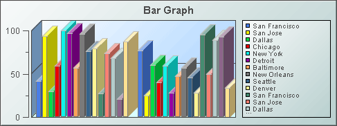
Bar
Graphs
Bar graphs (class name:
obj_bargraph) are useful for comparing columns or rows of numeric data
from a tabular data element returned by your data attachment.
Data
and Data Label Properties
Attach your data to the valueTable
property. It is possible to graph multiple columns or rows of numeric data.
If you include a label column in your data attachment for valueTable,
it can be used to label either the x-axis or the legend, depending on whether
the rowSeriesFlag is selected or deselected. The
rowSeriesFlag
controls how row and column data populate the graph:
|
If the
rowSeriesFlag
checkbox is selected, one group of bars will be shown for each numeric
column in your data attachment. Within the group for each numeric column,
there will be a bar for each row in that column. Column names will
be used for the x-axis labels. If your data attachment has a label column
and the rowLabelVisFlag is selected, data from this column will
be used in the legend. If your data attachment does not have a label column,
select the
rowNameVisFlag
checkbox to use row names in the legend.
By default, the label column is the first non-numeric text column in your
data. Specify a column name in the labelColumnName property to set
the label column to a specific column. |
|
If the
rowSeriesFlag
checkbox is not selected, one group of bars will be shown for each row
in your data attachment. Within the group for each row, there will be a
bar for each column in that row. Column names will appear in the legend.
If your data attachment has a label column and the rowLabelVisFlag
is selected, data from this column will appear on the x-axis. If your data
attachment does not have a label column, select the rowNameVisFlag
checkbox to use row names on the x-axis. By default, the label column is
the first non-numeric text column in your data. Specify a column name in
the labelColumnName property to set the label column to a specific
column. |
Attach your data to the
traceValueTable
property
to add one or more traces to your bar graph. If you include a label column
in your data attachment for traceValueTable, this is used to label
either the x-axis or the legend (depending on the rowSeriesFlag)
if no label is available from the valueTable data attachment.
By default, the label column is the first non-numeric text column in your
data. Specify a column name in the traceLabelColumnName property
to set the label column to a specific column.
| Property
Name |
Description |
| columnDisplayNames |
Set alternate display names
for column names in your bar graph's data. Column names are displayed either
along the x-axis or in the legend, depending on whether or not the rowSeriesFlag
is selected. |
| traceValueDivisor |
Divides trace values by
the number entered. |
traceYAxisValueMin
traceYAxisValueMax |
Select the traceYAxisFlag
to plot the traces against a separate y-axis than the bars. NOTE: The traceYAxisFlag
property is unavailable if the drawHorizontalFlag property is selected.
The trace y-axis will be drawn to the right of the plot area. When the
traceYAxisFlag
is
selected, the traceYAxisValueMin and traceYAxisValueMax properties
are used to control the range of the trace y-axis if yAxisAutoScaleMode
is set to Off or On-include Min/Max.
Select or enter the numeric
format of trace values displayed on the y-axis with the traceYAxisFormat
property.
To enter a format, use syntax from the Java DecimalFormat class. |
| valueDivisor |
Divides bar and y-axis values
by the number entered. |
yValueMin
yValueMax |
Controls the range of y-axis if the yAxisAutoScaleMode is set to
Off.
Select
On for the yAxisAutoScaleMode to calculate the y-axis
range according to data values being plotted. To calculate the y-axis range
including
yValueMin and yValueMax, select
On - Include
Min/Max. |
Column Properties
Specify which columns are
displayed in your bar graph.
| Property
Name |
Description |
| columnsToHide |
Specify columns from the
data attachment to exclude from being used for plotted data or labels.
Data from the labelColumnName column will be used for labels even
if that column name is also specified in the columnsToHide property.
Columns specified in the columnsToHide property can still be used
in the drillDownColumnSubs property. |
Data Format Properties
Specify the data format
for your bar graph.
| Property
Name |
Description |
| labelColumnFormat |
Select or enter the format
of numeric or date labels displayed on the x-axis, in the legend and in tooltips.
To enter a format, use syntax
from the Java DecimalFormat class for numeric labels and syntax from
the Java SimpleDateFormat class for date
labels. To enable tooltips, select the mouseOverFlag. |
| yValueFormat |
Select or enter the numeric
format of bar values displayed on bars, in the legend and in tooltips
To enter a format, use syntax
from the Java DecimalFormat class. To enable tooltips, select the mouseOverFlag. |
| traceYValueFormat |
Select or enter the numeric
format of bar values displayed in the legend and in tooltips.
To enter a format, use syntax
from the Java DecimalFormat class. To enable tooltips, select the mouseOverFlag. |
Background Properties
Specify how the background
is displayed in your bar graph.
| Property
Name |
Description |
| bg3dFlag |
Select to display a 3D edge on the
background rectangle. |
| bgColor |
Select the  button and choose a color from the palette to set the background color.
 |
| bgEdgeWidth |
Set the width of the 3D
edge on the background rectangle. This property is only used if the bg3dFlag
is selected. |
| bgGradientFlag |
Select to display a gradient
in the background rectangle. |
| bgVisFlag |
Select to display the background
rectangle. |
Bar Properties
Specify the way the bars
are displayed in your graph.
| Property
Name |
Description |
| barGradientStyle |
Select None, Shaded, or
Rounded
to set the gradient style of the bars. None is the default setting.
Select
Shaded to display bars with a flat gradient or
Rounded
to display bars with a rounded gradient. |
| barImage |
Select an image to display
in the bars. NOTE: If necessary, the image will be stretched to fit the
bar size. |
| barProperties |
Double-click on barProperties
to specify the color and fill pattern to be used to display each bar in
the graph. |
| barValueTextPosition
|
Select to set the position
of the label relative to the bar. By default, numbers after a decimal point
are not displayed on the labels. |
| barValueVisFlag
|
Select to
display a label containing the value for each bar. |
Layout Properties
Specify how the background
is displayed in your bar graph.
| Property
Name |
Description |
| barCenterFlag |
Select to center the bars
in the plot area. If not selected, the bars will be left or top aligned,
depending on the drawHorizontalFlag. This property is only used
if the barFitFlag is not selected. |
| barFitFlag |
Select to stretch the bars
to fit the available space in the plot area. If deselected, the minBarWidth
is used to determine the bar width. |
| draw3dFlag |
Select to change the display
of the bars from 2D to 3D. |
| drawHorizontalFlag |
Select to have the bars
in your graph displayed horizontally. |
| drawStackedFlag |
Select to stack each bar
group in your graph. |
| drawWaterfallFlag |
Select to stack each bar
group in your graph with an offset between bar sections. |
| horizAxisLabelRotationAngle
|
Set the amount of rotation of labels
on the horizontal axis. Values range from 0 to 90 degrees. A value of 0 causes
the bar graph to automatically pick the optimum angle of rotation. |
| horizAxisMinLabelHeight
|
Set the minimum amount of space to
reserve for labels on the horizontal axis. If axis labels vary over time, this
property may be used to reserve a consistent amount of space to prevent
overlapping. |
| minSpacePerBar |
Set the minimum width for
each bar, in pixels.
If drawHorizontalFlag
is deselected, set the minimum width for each bar, in pixels. If drawHorizontalFlag
is selected, set the minimum height for each bar, in pixels. The default
is set to 1. |
| vertAxisMinLabelWidth |
Specify the minimum width
in pixels for the vertical axis labels. |
| waterfallBarConnectFlag |
If the drawWaterfallFlag
is checked, select to connect the bar sections in each bar group. |
| waterfallTotalFlag |
If the drawWaterfallFlag
is checked, select to display a bar that shows the sum of the bar sections
in each bar group. |
Legend Properties
Specify the way the legend
is displayed in your bar graph.
| Property
Name |
Description |
| legendBgColor |
Select the
button and choose a color from the palette to set the background color
of the legend. |
| legendBgGradientFlag |
Select the legendBgGradientFlag
to display a gradient in the legend background. |
| legendValueVisFlag |
Select to display the numerical
values of your data in the legend. |
| legendVisFlag |
Select to display the legend. |
| legendWidthPercent |
Set the percent of the total
width of the object used for the legend. |
Interaction Properties
Select the mouseOverFlag
to enable tooltips for your bar graph. To display a tooltip, select the
graph and point to a bar or marker with your mouse. The tooltip will contain
information from your data attachment about that bar or marker. Select
the mouseOverHighlightFlag to enable bar highlighting. To highlight
a bar in red, select the graph and point to the bar.
To specify a drill
down display, double click on the drilDownTarget Property
Name. Any display (.rtv) file can be targeted as a drill down. Based on
your data attachment, substitutions are
created that will be passed into drill down displays. To customize
which substitutions will be passed into drill down displays, double-click
on drillDownColumnSubs in the
Object Properties window to open the Drill Down Column Substitutions dialog.
Once a drill down target has been set, double-click on the bar or trace
marker in the graph to activate the drill down. Drill down displays can
be activated in the same window that contains the graph or open in a separate
window. This allows you to build a customizable hierarchy of displays.
Use drillDownSelectMode to control
how a drill down display is activated. Set to Anywhere to activate
a drill down display by double-clicking anywhere on the graph. Set to Element
Only to enable a drill down display only when you double-click on a
bar in the graph.
| Property
Name |
Description |
| scrollbarMode |
Select Never, As Needed,
or Always from the scrollbarMode property to set the behavior
of the x-axis scroll bar in the graph. NOTE: If drawHorizontalFlag
is selected, the x-axis is vertical. Never is the default setting.
If set to Never, some bars may get clipped. Select Always
to display a scroll bar at all times. Set to As Needed to display
the scroll bar when there is not enough space to display all of the bars
in the plot area. Each bar uses at least minSpacePerBar pixels along
the x-axis. |
| scrollbarSize |
Specify the height of the
horizontal scroll bar and the width of the vertical scroll bar, in pixels.
The default value is -1, which sets the size to the system default. |
Trace Properties
Specify the appearance of plotting traces
in your bar graph.
See Data
and Data Label Properties for information on how to add traces
to your bar graph.
| Property
Name |
Description |
|
traceProperties |
Specify the
line color, line style, line width, marker color and marker style of all
traces. |
| traceFillStyle |
Set traceFillStyle
to Solid, Transparent, Gradient, or Transparent
Gradient to fill the area under the trace. Set to None to disable
this feature. None is the default. |
| traceShadowFlag |
Select to enable trace
shadows. |
Marker Properties
Set markDefaultSize
to specify the size of the markers in pixels. Set markScaleMode
to
scale markers according to the order of the data in your data attachment,
e.g., the marker for the first data in the attachment is the smallest and
the marker for the last data is the largest. Select one of the following
from the drop down menu to set the scale mode: No Scale, Scale
by Trace,
Scale Within Trace.
X-Axis Properties
Specify how the x-axis is
displayed in your bar graph.
| Property
Name |
Description |
| xAxisFlag |
Select to display the x-axis. |
Y-Axis Properties
Specify how the y-axis is
displayed in your bar graph.
| Property
Name |
Description |
traceYAxisFlag
|
Select the traceYAxisFlag
to plot the traces against a separate y-axis than the bars.
NOTE: The traceYAxisFlag
property is unavailable if the drawHorizontalFlag property is selected.
The trace y-axis will be drawn to the right of the plot area. When the
traceYAxisFlag
is
selected, the traceYAxisValueMin and traceYAxisValueMax properties
are used to control the range of the trace y-axis if yAxisAutoScaleMode
is set to Off or On-include Min/Max.
|
| traceYAxisFormat |
Select or enter the numeric format of trace
values displayed on the y-axis.
To enter a format, use syntax from the Java DecimalFormat class. |
| traceYAxisMajorDivisions |
Specify the number of major divisions on the
trace y-axis. This option only applies if the traceYAxisFlag is on. |
| traceYAxisMinorDivisions |
Specify the number of minor divisions on the
trace y-axis. This option only applies if the traceYAxisFlag is on. |
| yAxisAutoScaleMode |
The yValueMin and
yValueMaxproperties
control the range of y-axis if the yAxisAutoScaleMode is set to
Off.
Select
On for the yAxisAutoScaleMode to calculate the y-axis
range according to data values being plotted. To calculate the y-axis range
including
yValueMin and yValueMax, select
On - Include
Min/Max. |
| yAxisFlag |
Select to display the y-axis. |
| yAxisFormat |
Select or enter the numeric
format of values displayed on the y-axis.
To enter a format, use syntax
from the Java DecimalFormat class. |
| yAxisGridMode
|
Controls the alignment
of grid lines drawn to the left and right of the bar graph.
By default, yAxisGridMode is set to Bar
Axis which aligns grid lines with the left y-axis. Select Trace Axis
to align with the right y-axis. Select Bar and Trace Axis to draw two
sets of grid lines, one aligned with the left y-axis and the other with the
right y-axis. |
| yAxisMajorDivisions |
Specify the number of major
divisions on the y-axis. |
| yAxisMinorDivisions |
Specify the number of minor
divisions on the y-axis. |
Alert Properties
To set bar colors, trace
marker colors and trace marker styles based on a threshold value, select
the corresponding value alarm or value warning flags.
| Property
Name |
Description |
| traceValueAlarmStatusTable |
Attach an alarm table containing
status indexes to valueAlarmStatusTable to enable rule based alarm
statuses for trace markers. The table attached to valueAlarmStatusTable
must have the same number of rows and columns as traceValueTable.
For each data element in traceValueTable, the status index at the
corresponding position in valueAlarmStatusTable will be used to
set the alarm status of the marker.
Valid indexes are: 0 = use
normal marker color and style, 1 = use low alarm marker color and style,
2 = use low warning marker color and style, 3 = use high warning marker
color and style, 4 = use high alarm marker color and style, -1 = determine
marker color and style by comparing the value to the enabled alarm thresholds.
If no data is attached to
valueAlarmStatusTable,
the alarm status for a trace marker is determined by comparing the marker's
value to the enabled thresholds. |
| valueHighAlarmEnabledFlag |
Select to enable the high
alarm threshold. |
| valueHighAlarmLineVisFlag |
Select to display a dotted
line at the high alarm threshold. The color of the line is set to the valueHighAlarmMarkColor. |
| valueHighAlarmColor |
When a bar's value is greater
than or equal to the valueHighAlarm property, the color of the bar
will change to the valueHighAlarmColor. |
valueHighAlarmMarkColor/
valueHighAlarmMarkStyle |
When a trace marker's value
is greater than or equal to the valueHighAlarm property, the marker
will change to the valueHighAlarmMarkColor and valueHighAlarmMarkStyle. |
| valueHighWarningEnabledFlag |
Select to enable the high
warning threshold. |
| valueHighWarningLineVisFlag |
Select to display a dotted
line at the high warning threshold. The color of the line is set to the
valueHighWarningMarkColor. |
| valueHighWarningColor |
When a bar's value is greater
than or equal to the valueHighWarning, but less than the valueHighAlarm,
the color of the bar will change to the valueHighWarningColor. |
valueHighWarningMarkColor/
valueHighWarningMarkStyle |
When a trace marker's value
is greater than or equal to the valueHighWarning property but less
than the valueHighAlarm property, the marker will change to the
valueHighWarningMarkColor
and valueHighWarningMarkStyle. |
| valueLowAlarmEnabledFlag |
Select to enable the low
alarm threshold. |
| valueLowAlarmLineVisFlag |
Select to display a dotted
line at the low alarm threshold. The color of the line is set to the valueLowAlarmMarkColor. |
| valueLowAlarmColor |
When a bar's value is less
than or equal to the valueLowAlarm property, the color of the bar
will change to the valueLowAlarmColor. |
valueLowAlarmMarkColor/
valueLowAlarmMarkStyle |
When the trace marker's
value is less than or equal to the valueLowAlarm property, the marker
will change to the valueLowAlarmMarkColor and valueLowAlarmMarkStyle. |
| valueLowWarningEnabledFlag |
Select to enable the low
warning threshold. |
| valueLowWarningLineVisFlag |
Select to display a dotted
line at the low warning threshold. The color of the line is set to the
valueLowWarningMarkColor. |
| valueLowWarningColor |
When a bar's value is less
than the valueLowWarning property, but greater than the valueLowAlarm
property, the bar will change to the valueLowWarningColor. |
valueLowWarningMarkColor/
valueLowWarningMarkStyle |
When the trace marker's
value is less than or equal to the valueLowWarning property, but
greater than the
valueLowAlarm property, the marker will change
to the valueLowWarningMarkColor and valueLowWarningMarkStyle. |
Plot Area Properties
| Property
Name |
Description |
| gridBgGradientFlag |
Select to display a gradient
in the grid background. Set the color of the grid background with the gridBgColor
property. |
| gridBgColor |
Select the
button and choose a color from the palette to set the color of the grid
background. |
| gridBgImage |
Select an image to display
in the grid background of your graph. NOTE: If necessary, the image will
be stretched to fit the grid. |
|