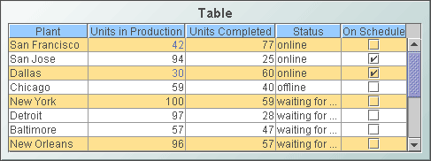
Standard Table
Display your data in a
standard table (class name: obj_table02)
by attaching it to the valueTable property. In a standard table, data
returned is displayed in a series of rows and columns. Row names and column
headers depend on your data attachment. If the table is not large enough
to display all of the data, scroll bars are automatically added.
To add or
remove rows and columns, or edit the value of existing cells to easily update
data throughout the enterprise, see the Table
Edits section for information.
Using the Thin Client in Internet Explorer, you
can copy data to the system clipboard for pasting into another application. In
the standard table, right-click and select
Copy Cell Value. If the selected cell
contains multiline text, each new line is converted to a tab. If the selected
cell displays an image, the underlying text value is copied. Also, the security
option "Scripting: Allow programmatic clipboard access" must be enabled in the
security level that applies to the Thin Client's URL (otherwise, the copy will
fail). The IE security level is configured on the Security tab of
Internet Explorer's
Internet Options dialog.
Alert Properties
Use the value of individual
columns, rows and cells to set font color, background color, row visibility
or replace a cell value with an image. In the
Object Properties window double-click on filterProperties
in the Property Name field, or select
the  button to open the Filter Properties dialog.
Background Properties
Specify how the background
is displayed in a table.
Cell Properties
| Property
Name |
Description |
| cellBgColor |
Select the
button and choose from the palette to set the background color of the cells. |
| cellBgStripeContrast |
Set the contrast level for alternating row
colors. NOTE: This property is only applicable if cellBgStripedFlag is
selected. |
| cellBgStripedFlag |
Select to display alternating row colors. |
| cellTextColor |
Select the
button and choose from the palette to set the color of the cell text. |
| cellTextFont |
Select a font for the cell text. |
| cellTextSize |
Specify (in pixels) the size of the cell text
or enter -1 to use the default size. |
Column Properties
To specify the alignment of a column,
select the ellipsis button
in the columnAlignment property. Select the alignment from
the drop down menu in the Alignment column: Default, Left,
Center
or Right. The default setting depends on the type of column.
To hide a column, select
the ellipsis button
in the columnsToHide
property and select the checkbox under Hide Column.
To specify numerical or date formats
for columns, select the ellipsis button
in the columnFormat property.
Select the format from the drop down menu in the Column Format column.
Use the columnFormatDate property to
specify
the format for all time and date columns in the
table that do not have the columnFormat property specified. For example,
if a table instance contains a date column named X, and the columnFormat
property contains a valid date/time format for column X, then the
columnFormat property is applied to column X. If the columnFormat
property does not contain a valid date/time format for column X, and the
columnFormatDate property does, then the columnFormatDate property
format is applied to column X. If neither property contains a valid date/time
format the default date/time format for the current locale, as returned by
java.text.DateFormat.getDateTimeInstance(), is applied to column X. As with any
object property, an rtview stylesheet entry can be used to set
columnFormatDate globally on all obj_table02 instances. For example:
obj_table02 {
columnFormatDate: "yyyy-MMM-dd HH:mm:ss"
} By default the columnFormatDate
property's value is blank. If the columnResizeEnabledFlag is
selected, table columns can be resized by dragging the vertical separators
between the column headers. The columnResizeEnabledFlag cannot be toggled
in the Display Server. Use the
indexColumns property to maintain
the highlight of selected rows after data updates or table sorts are executed.
Specify the name of one
or more columns that contain data to uniquely identify a row. Selected rows then remain highlighted even if the
order or number of rows in the table changes.
Data Format Properties
Use the removeLineBreaksFlag property to remove line
breaks within text in table cells. This option does not remove line breaks from
drill-down values. For example, if your drillDownColumnSubs property
targets a substitution from a cell that contains a line break, the drill-down
value will contain the line break regardless of the removeLineBreaksFlag
property setting.
NOTE: In the
Thin Client, the drill-down value will contain
the line break regardless of the removeLineBreaksFlag property setting. Interaction Properties
Select Never, As Needed,
or Always from the scrollbarMode property to set the behavior
of the scroll bar in the table.
To specify a drill
down target for the table, double-click on the
drillDownTarget
property in the Object Properties window. Based on your data attachment, preset substitutions
are created automatically and passed into your drill down display. To customize
which substitutions will be passed into drill down displays, in the Object
Properties window double-click on drillDownColumnSubs
in the Property Name field.
Use drillDownSelectMode to control
how a drill down display is activated. The standard table (class name: obj_table02)
supports three modes for drillDownSelectMode:
- Set to Anywhere (0) to activate
a drill down display by double-clicking anywhere on the table.
- Set to Element
Only (1) to enable a drill down display only when you double-click on a
cell in a table. Note that when set to Element
Only, a drill down display can not be activated by double-clicking
in the row label column, since this column does not correspond to an actual
data column in the tabular data.
- Set to Element Only + Auto Update (2)
to enable a drill down display (Element Only mode) and execute
its command automatically, without a user click, when the row selection
changes after a data update. This mode requires that the table's command property be configured to perform a
drill down to the current display in the current window, and the table's
indexColumns property be set to a non-empty string. This mode is useful
in cases where the substitutions set by the table's drill down command need
to be updated if some of the selected rows in the table are removed by a
subsequent data update.
Use the
multiSelectFlag property to enable
the selection of multiple rows. When the user selects
multiple rows and drills down, the drill down substitution values contain a semi colon delimited
list of values, one value for each row that can be
used with most data sources in the Filter Value field of the Attach To Data
dialog.
The tabIndex property allows you to
define the order in which table and control objects will receive focus when
navigated from your keyboard. Initial focus is given to the object with the
smallest tabIndex value, from there the tabbing order proceeds in
ascending order. If multiple objects share the same tabIndex value, then
initial focus and tabbing order are determined by the alpha-numeric order of the
table names. Tables with a tabIndex value of 0 are last in the tabbing
order. NOTE: The tabIndex property does not apply to tables in the
Display Server or to objects that are disabled, invisible, or have a value of
less than 0. Use the rightClickActionFlag
property so that a right-click by the user executes actions (a drill down or execute command)
normally performed only with a left-click, before the right-click popup menu is shown. This is useful when you have a command string
configured to set substitutions in the current window, and the drill down target
is
configured to drill down using those substitutions. In that case, the command is
executed when you left-click and when you right-click so the substitutions are
guaranteed to be set before you select Drill Down from the popup menu.
This option should not be used if the left click is configured to drill down to
another display. NOTE: This property is ignored in the Thin Client on iOS Safari
(iPad/iPhone). Use the menuItemGroup and
rightClickActionFlag properties to extend RTView context
menu items. For details, see
Extending the Context Menu. Use
the clearSelection property to enable a
user to clear multiple selected rows in a table.
Typically, the table's clearSelection
property is attached to a local variable and the local variable is set by a
control object on the same display. For example, to add a "Clear Selection"
button to a display containing a table that supports multiple row selection you
could configure as follows:
1. Add a local variable named $clearSelection with an initial value of
0.
2. Create a button object, with these property values:
label : "Clear Selection"
valueToSet : 1
varToSet : <attached to the $clearSelection variable>
3. Set the table object's properties:
clearSelection : <attached to the $clearSelection
variable>
4. If the table object has a drilldown command or a drillDownTarget
configured, add this to its Drill Down Substitutions :
$clearSelection : 0
(This step is required to reset value of the $clearSelection
variable to zero when the user selects a row in the table.)
When the property is set to a value of 1, all rows in the table are
deselected. When the property is set to a value of 2, all rows are
deselected and either the table's action or its drillDownTarget is
invoked.
Object Properties
| Property
Name |
Description |
| anchor |
Specify where to
anchor an object in the display. NOTE: If an object has the dock property
set, the anchor property will be ignored.
The anchor property is only applied when the
dimensions of the display are modified, either by editing
Background Properties or resizing the window in
Layout mode
Select None, or one or more the following
options:
| None
|
Object
not anchored. This is the default. |
| Top |
Anchor
top of object at top of display. |
| Left |
Anchor
left side of object at left of display. |
| Bottom |
Anchor
bottom of object at bottom of display. |
| Right |
Anchor
right side of object at right of display. |
When a display is resized, the number of pixels
between an anchored object and the specified location remain constant. If an
object is anchored on opposite sides (i.e. Top and Bottom or
Left and Right), the object will be stretched to fill the available
space. |
| dock |
Specify the docking
location of an object in the display.
Select from the following options:
| None
|
Object
is not docked. This is the default. |
| Top |
Dock
object at top of display. |
| Left |
Dock
object at left of display. |
| Bottom |
Dock
object at bottom of display. |
| Right |
Dock
object at right of display. |
| Fill |
Dock
object in available space remaining in the display after all docked objects
are positioned. |
If the dimensions of the display are modified,
either by editing Background Properties or
resizing the window in Layout mode, the
properties (objX, objY, objWidth and objHeight) of
docked objects will automatically adapt to match the new size of the display.
When multiple objects are docked to the same side
of the display, the first object is docked against the side of the display, the
next object is docked against the edge of the first object, and so on.
When objects are docked to multiple sides of the
display, the order in which objects were added to the display controls docking
position. For example, let's say the first object added to the display is docked
at the Top and the second object is docked at the Left.
Consequently, the first object will fill the entire width of the display and the
second object will fill the left side of the display from the bottom of the
first object to the bottom of the display.
Objects in a display have the dock property set
to Fill, are laid out across a grid in the available space remaining
after all docked objects are positioned. By default, the grid has one row and as
many columns as there are objects in the display. You can modify the grid in the
Background Properties dialog.
Once an object is docked, there are some
limitations on how that object can be modified.
- Docked objects cannot be dragged or
repositioned using objX and objY properties.
- Docked objects cannot be resized using the
objWidth or objHeight properties. To resize you must drag on the
resize handle.
- Docked objects can only be resized toward the
center of the display (e.g. If an object is docked at the Top, only its
height can be increased by dragging down toward the center of the display).
- Docked objects set to Fill cannot be
resized at all.
- Docked objects cannot be moved using Align.
Non-docked objects can be aligned against a docked object, but a docked object
will not move to align against another object.
- Docked objects are ignored by Distribute.
|
| objHeight |
Set height of the object in pixels. |
| objName |
Name given to facilitate object management via
the Object List dialog. Select Tools>Object List. |
| objWidth |
Set width of the object in pixels. |
| objX |
Set the x position of the object. |
| objY |
Set the y position of the object. |
| styleClass |
Enter the style class name for this object as
defined in your style sheet.
If not specified, the object class name is used. NOTE: The value entered
must not contain spaces and cannot start with rtv-. |
| visFlag |
Control visibility of the object. |
| webGridFlag |
Set the table for HTML implementation. The web
grid is available in the Thin Client only. For details, see Web Grid. |
Row Header Properties
To lock the first column
in a table, select the rowHeaderEnabledFlag property. The rowHeaderEnabledFlag
cannot
be toggled in the Display Server. When enabled, you can set the
appearance of the row header column using the rowHeaderBgColor,
rowHeaderTextColor,
rowHeaderTextFont,
and rowHeaderTextSize properties. The rowHeaderFilterColorsEnabledFlag
property sets whether the row filter colors are applied to the row header.
Row visibility filters are applied to the row header regardless of the
rowHeaderFilterColorsEnabledFlag
setting.
Resize the row header column by selecting the ellipsis button
in the columnProperties property.
The row header column cannot be hidden using the columnsToHide property
and a warning message is displayed if this is attempted.
Sort
Properties
Select the showSortIconFlag
checkbox to enable column sorting. To sort a table by a specific column,
click on the column header.  To reverse the sort order, click on the column header again.
  To clear the sort, click on the empty column header at the top left of
the table or delete the Property Value of sortColumnName
in the
Object Properties window. NOTE: Sorting is disabled if the sort icon is
not visible in the column header.
To clear the sort, click on the empty column header at the top left of
the table or delete the Property Value of sortColumnName
in the
Object Properties window. NOTE: Sorting is disabled if the sort icon is
not visible in the column header.
Web Grid
The web grid is an advanced HTML implementation of
obj_table02 which provides enhanced filtering. The web grid is available in the Thin Client only.
To display your data in a web grid,
select the obj_table02 instance in the Builder and check its webGridFlag
property in the property sheet. By default, the webGridFlag property is
unchecked, which specifies use of the "classic" HTML grid in the Thin Client.
Alternatively, the web
grid can be enabled on all obj_table02 instances by adding the following rule to
an rtview stylesheet (.rts) file loaded by the Display Server:
obj_table02 {
webGridFlag : 1
}
Requirements
If webGridFlag is true the web grid appears in the
Thin Client in any
modern version of a supported browser. No plugin is required. For Internet
Explorer users, version 9 or newer is required and version 11 is recommended for
best performance. In IE8 or older, the web grid is not supported so the classic
grid is used regardless of the webGridFlag setting. In this release the web
grid is not supported on iPad but might be supported in the future.
Features
The web grid supports advanced,
interactive table features in the Thin Client: sorting on multiple columns,
filtering on multiple columns, column resizing, column reordering, and hiding
columns. In addition, you can unsort a previously selected sort column and, in a
grid with rowHeaderEnabledFlag = true, additional columns can be
locked into the row header. You can save all of those column settings
permanently so that they are restored when you return to the display later. Many
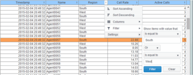
of these features are accessed from the column menu, shown in the screen shot
above, opened by clicking on the menu icon in each column's header.
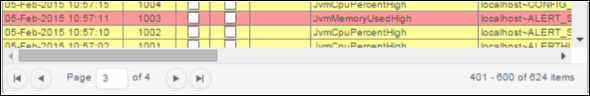
Also, for improved performance and usability, if a
data table contains more than 200 rows the web grid displays it in pages of 200
rows, using a page control that appears at the bottom of the grid:
|
 |
Column Sorting
You can click on a column header to sort the table by that column. On the
first click, the column is sorted in ascending order (smallest value at the
top), on the second click the sort is in descending order, and on the third
click the column is returned to its original unsorted state. A sort on a string
column is case-insensitive.
You can select multiple sort columns. In that case, the sorting is performed in
the order that the column headers were clicked. Multiple column sorting is a
very useful feature, but can also cause confusion if you intend to sort on a
single column, but forget to "unsort" any previously selected sort columns
first. You should check for the up/down sort icon in other column headers if a
sort gives unexpected results.
Column sorting is reflected in an export to HTML and Excel.
Column Visibility
You can hide or show columns in the table by clicking on any column's menu
icon, and choosing Columns from the menu. This opens a submenu with a
checkbox for each column that toggles the visibility of the column. All columns
in the data table appear in the Columns menu, even those that are
initially hidden by the obj_table02 property columnsToHide.
|
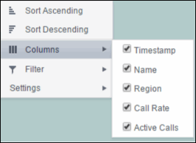 |
If the grid
has the rowHeaderEnabledFlag property checked then the leftmost column
(the row header column) cannot be hidden.
Column visibility changes are NOT reflected in an export to HTML and Excel.
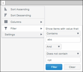
Column Filtering
You can create a filter on any column. If filters are created on multiple
columns, then only the rows that pass all of the filters are displayed. That is,
if there are multiple filters they are logically "ANDed" together to produce the
final result.
The background of a column's menu icon changes to white to indicate that a
filter is defined on that column. This is intended to remind you which columns
are filtered.
You can configure a filter on any column by clicking on the column's menu icon
and choosing Filter from the menu. This opens the Column Filter
dialog:
Options in the Column Filter
dialog vary according to the data type of the selected column:
- String columns: You can enter a
filter string such as "abc" and, from the dropdown list, select the operator
(equal to, not equal to, starts with, contains, etc) to be used when
comparing the filter string to each string in the column. All of the filter
comparisons on strings are case-insensitive. You can optionally enter a
second filter string (e.g. "xyz") and specify if an AND or OR combination
should be used to combine the first and second filter results on the column.
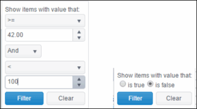
- Numeric columns: You can enter
numeric filter values and select arithmetic comparison operators, (=, !=,
>, >=, <, <=). You can optionally enter a second filter value and comparison
operator, and specify if an AND or OR combination should be used to combine
the first and second filter results.
- Boolean columns: You simply
select whether matching items should be true or false.
The numeric and boolean filter dialogs are
shown below.
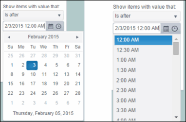
- Date columns: You can select a
date and time and choose whether matching items should have a timestamp that
is the same as, before, or after the filter time. The date is selected by
clicking on the calendar icon and picking a date from a calendar dialog. The
time is selected by clicking on the time icon and picking a time from a
dropdown list:
Alternatively, a date and time can be typed into the edit
box. (See the limitations section for a note on time filtering when the
client and server are located in different time zones).
Data updates to the grid are suspended while
the filter menu is opened. The updates are applied when the menu is closed.
Column filtering is reflected in an export to HTML and Excel.
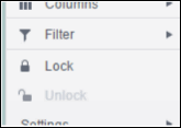
Column Locking
This feature is available only if the obj_table02 instance has the row
header feature enabled (rowHeaderEnabledFlag is checked). If so, the
leftmost column is "locked" in position, meaning that it does not scroll
horizontally with the other columns in the table. If the row header is
enabled, then two items labeled Lock and Unlock appear in the column
menu. These can be used to add or remove additional columns from the
non-scrolling row header area.
If the row header is enabled, at least one
column must remain locked.
Column locking is NOT reflected in an export to HTML and Excel.
Column Reordering
You can reorder the grid columns by dragging and dropping a column's
header into another position. If the grid has rowHeaderEnabledFlag checked,
then dragging a column into or out of the row header area (the leftmost
columns) is equivalent to locking or unlocking the column.
Column reordering is NOT reflected in an export to HTML and Excel.
Paging
If the data table contains more than one page of rows, the page controls
are displayed at the bottom of the grid. The default page size is 200 but
can be set on each obj_table02 instance via the new property named
webGridRowsPerPage. The default value of that property is zero, which
indicates that the default size (200) should be used. If the height of the
grid is less than about 64 pixels, there is insufficient space to display
the page controls so only the rows on the first page is viewable.
Row Mouseover
A new property named webGridHoverColor is available on obj_table02. It
is visible only if webGridFlag = true. The default value of webGridHoverColor is checked. If it is set to any other color index value,
then that color is used to highlight the row that is under the mouse
cursor. But if the obj_table02 filterProperties feature is used to color
rows, that color takes precedence, so the webGridHoverColor may not be
useful in those cases. Also, if the row header is enabled, the row header
column and the other columns are highlighted separately, according to which
section of the grid the mouse is over.
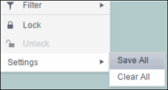
Saving Settings
You can permanently save all of the custom settings made to the grid,
including filtering, sorting, column size (width), column order, column
visibility, and column locking. This is done by opening any column menu,
clicking Settings, and then clicking Save All:
|
 |
The grid's settings are written as an item in the browser's local storage.
The item's value is a string containing the grid's settings. The item
uses a unique key comprised of the URL path name, the display name, and the
obj_table02 instance's RTView object name. If the Thin Client's login
feature is enabled, the key will also include the username and role, so
different settings can be saved for each user and role for a grid on any
given display, in the same browser and host.
If the user saves the grid settings and navigates away from the display or
closes the browser, then the next time the user returns to the display in
the same browser the settings are retrieved from the browser's local storage
and applied to the grid. The browser's local storage items are persistent,
so the grid settings are preserved if the browser is closed and reopened or
if the host system is restarted.
If the obj_table02 has autoResizeFlag = true then the column widths
are not
restored from the saved settings, and the values computed by the
auto-resize feature is used instead. This is by design.
You can delete the grid's item from local storage by clicking Settings ->
Clear All in any column menu. This permanently deletes the saved
settings for the grid and returns the grid to the state defined in the
display file.
Note that each browser has its own local storage on each host. The local
storage items are not shared between browsers on the same host or on
different hosts. So, if a user logs in as Joe with role = admin, in Internet
Explorer on host H1, and saves grid settings for display X, then those grid
settings are restored each time a user logs in as Joe, role admin, on
host H1 and opens display X in Internet Explorer. But if all the same is
true except that the browser is Chrome, then the settings saved in Internet
Explorer are not applied. Or if the user is Joe and role is admin and
the browser is IE and the display is X, but the host system is H2 not H1,
then the grid settings saved on H1 are not applied.
Support for Large Tables
The web grid can support data tables with many rows and columns.
However, for best performance the display server's cellsperpage property
should be specified so that the server sends large tables to the client
in pages, rather than sending all of the rows. In this server paging mode,
large tables are also filtered and sorted in the Display Server, to improve
performance and decrease data traffic. The cellsperpage option is not new or
specific to the web grid, it has been available for several years. See the
RTView documentation for a description of the cellsperpage property, and the
related cellsperexport and cellsperreport properties. A typical value for
cellsperpage is 20000.
Unsupported obj_table02 Features
The following are existing features of obj_table02 that are not
supported by the web grid.
- The rowHeaderEnabledFlag property is
supported, but rowHeaderBgColor, rowHeaderTextColor, rowHeaderTextFont,
rowHeaderTextSize are ignored. Instead the row header column is rendered
like all other columns.
- The columnResizeEnabledFlag is ignored
if it is false, the web grid always allows column resizing.
- The editDataEnabledFlag is ignored, the
table editing feature using custom commands is currently not supported.
Other limitations, and differences
between the new and classic grids:
- Time zones: The strings shown in a
date column are formatted by the display server using its time zone.
But if a filter is specified on a date column, the date and time for
the filter are computed using the client system's time zone. This
can be confusing if the display server and client are in different
time zones.
- Selected rows: The grid's row
selection is cleared if the sort is changed or if columns are
resized or reordered.
- Scrollbars: In general the grid only displays scrollbars when they are needed. However, the web grid
and the classic grid use different algorithms for deciding when to
show or hide scrollbars, and do not use identical row heights and
column widths. So the web grid may sometimes display scrollbars when
the classic grid does not, for a grid instance with a given width
and height.
- Keyboard traversal: In the classic
grid, selecting a row and then using the up/down arrow keys changes the selection to the previous/next row. In the web grid, the
arrow keys moves the keyboard focus to another row, as indicated
by a highlight border around the focused table cell, but the user
must press the space bar to select the row that contains the
highlighted (focused) cell.
- Column widths: On a web grid with no
locked columns (rowHeaderEnabledFlag = false), columns expand
to fill any unused width in the table, even if autoResizeFlag =
false. That is, if the total width of the columns is less than the
grid width (ie. the columns don't use all of the available width)
then each column is expanded proportionally to fill the table. In
contrast, the classic and Swing (Viewer) grids just leave unused
space at the right edge of the grid. If the grid has locked columns
(rowHeaderEnabledFlag = true), then the web grid behaves the same as
the classic and Swing grids.
- Export: The export to HTML and
Export to excel features are supported on the web grid, and behave
much the same as on the classic grid. The exported table respects
the grid's filter and sort settings but ignores any column
reordering, sizing, or hiding changes made by the user.
- Data updates to the grid are
suspended while the filter menu is opened. The updates are applied
when the menu is closed.
Implementation Note for Custom Web
Page Developers
The RTView Thin Client now uses two versions of the jQuery
javascript library
- jQuery 1.3.2, to support the
jQuery UI components used for panels, layout, and (some)
navigation controls.
- jQuery 1.9.1, to support the web
grid.
Version 1.3.2 is bundled into the
Thin Client js file named rtvNav1.js, while version 1.9.1 is
loaded as a separate js file. To prevent conflicts between the
two libraries, the jQuery $ alias is no longer used by
RTView and is intentionally removed. Instead the jQuery 1.3.2
library is referenced by the alias rtv.jqNav as needed,
and the jQuery 1.9.1 library is referenced by the alias
rtv.jq as needed.
This could affect existing custom javascript code that users
have written. For example, the following is a snippet of
javascript from a custom html page that uses jQuery UI tabs for
navigation
<script src="rtvNav1.js"></script>
<script>
$(document).ready(function () {
var outerLayout = $('body').layout({
north__size:64, north__spacing_open: 0,
});
$('#tabs').tabs();
...
The code above uses the jQuery $ alias, which it assumes is
defined in the rtvNav1.js file. But that is no longer
true, so the custom code should be rewritten to use the
rtv.jqNav alias for jQuery in place of the $ alias,
as follows:
<script src="rtvNav1.js"></script>
<script>
rtv.jqNav(document).ready(function () {
var outerLayout = rtv.jqNav('body').layout({
north__size:64, north__spacing_open: 0,
});
rtv.jqNav('#tabs').tabs();
...
|