Tree Control
The tree control (class name: obj_c1tree)
allows you to create a rich and compact visual presentation of hierarchical
data. This control is most often used in a multi-panel application for display
navigation. The control tree can also be used in any application where
hierarchical data is most effectively displayed using expandable/collapsible
tree nodes.
There are two methods for creating a tree-driven
multi-panel application: the static tree navigation panel and the tree control.
Use the static tree navigation panel method if you know the specific sources
that are to populate the tree and they remain constant for the life of the
application. For example, if you know all the displays that compose your
application and the static representation of a tree will only be used for
navigating those displays, the static tree navigation panel is suitable
(and is easier to configure). To configure the static tree navigation panel, add
the tree using the
rtvTreePanel tag to the PANELS.ini
file. For details about configuring the tree, see
Multiple Display Panels.
Use the tree control method if the number of nodes or leaves, labels or icons of
the tree change during the lifetime of the application. Data can be provided
that will change the nodes and leaves of the tree and also change the labels,
and icon representations on the tree with dynamic data.
When constructing
an application with multiple panels using the tree control, one panel displays
an RTView file that has instanced the tree control and the other contains the
displays which are drilled down to by selecting items on the tree.
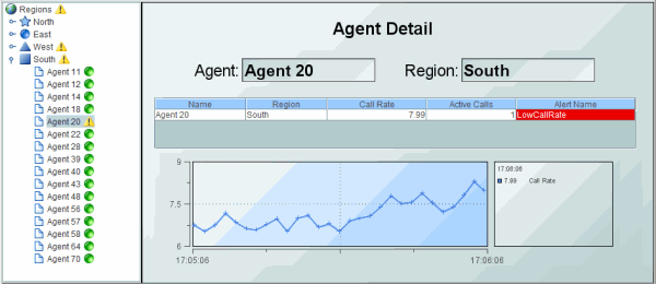
The following illustrates a two-panel
application in which the tree control in the left panel
updates
the display in the right panel:
You can optionally configure
tree icons, using images of your choice, to visually indicate the type
of elements in the tree (for example, Production or Sales),
whether the element is in a critical state, and to also propagate the status of
priority elements to the top of the tree.
To see an example of
a
multi-panel layout that uses a tree control to display live status information
(based on alerts) and perform navigation via drill-down in another panel, see the
Tree Control Demo, located in the RTV_HOME\demos\treecontrol directory.
This demo illustrates how to define the
rtvDisplayPanel tag for the tree control
in the PANELS.ini file. NOTE: The tree
control demo does not illustrate how the
number of tree nodes is updated in the control.
For details about creating an application with
multiple panels, see
Multiple Display Panels.
Creating Trees
The input of tabular data determines the content
of the tree control, as well as the appearance of each object in the tree.
As with other controls, to configure a
drill-down, set substitutions, or execute a command when a user clicks a tree
node, use the actionCommand property. As with other table-driven
objects, the drillDownColumnSubs property can be configured to set substitutions
to column values from the row in the valueTable that corresponds to the selected
tree node.
After you attach your tabular data to the
tree
control valueTable property, specify the table format for the tree
in the
valueTableFormat property. The table format is determined by the format of
the table you attach to the valueTable property. There are two table format
options, each with their own requirements:
- Row-Leaf:
This format is intended for use when the
valueTable property is attached to an indexed table
and all leaves in the tree are at the same depth. For example, where the
tree control is attached to the current table of an indexed cache.
Typically,
the RTView cache data source is indexed. That is, the cache indexColumnNames
property specifies the columns to index. If those index
columns represent a hierarchy (for example, server, application, process or
country, state, city), the cache current table could be used as the
valueTable property of a tree control in the Row-Leaf format.
In
other cases, a table in the Row-Node format might be required.
- Row-Node:
If the Row-Leaf format is not suitable for your data, use the Row-Node
format. This format is intended for use when the valueTable property is
attached to an un-indexed table. Your data table must also contain a row for each node
in the tree, including the top-level node (rather than just the leaf nodes,
as with the Row-Leaf format), as well as a column for the node and a column for the
parent node. The Row-Node format allows each leaf of the tree to have a different
depth.
The default table format is Row-Leaf. The
following are examples of the Row-Leaf and Row-Node table formats which both
produce the tree on the right (and are described at length in the following
sections):
|
Row-Leaf |
|
Row-Node |
|
 |
|
App Name |
PID
|
|
Node |
Parent |
|
| App0 |
1000 |
|
app0 |
<blank> |
|
| App0 |
1004 |
|
1000 |
app0 |
|
| App0 |
1008 |
|
1004 |
app0 |
|
| App1 |
1001 |
|
1008 |
app0 |
|
|
| App1 |
1005 |
|
app1 |
<blank> |
|
|
| |
|
|
1001 |
app1 |
|
|
| |
|
|
1005 |
app1 |
|
|
After you configure the tree table format,
you can optionally configure the Tree Icons.
For details about creating an application with
multiple panels, see
Multiple Display Panels.
Create a Row-Leaf Format Tree
In the Row-Leaf table format, there is one
row in the table for each leaf node in the tree. A leaf node is added to the tree for each row in the
valueTable. The path to a leaf node (that is, the ancestor nodes of the leaf)
is determined by the values in each of the table columns specified by the
nodeIndexColumnNames property. When the valueTable property is attached to the current
table of an indexed RTView cache, the tree nodeIndexColumnNames property is
typically set to the same columns that are specified for the cache index
columns.
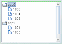
To illustrate how to create a tree using the Row-Leaf format, let us say we have a cache named Applications that has two index
columns,
App Name
and PID, and the current table in that cache
has the following rows:
| App Name |
PID
|
| App0 |
1000 |
| App0 |
1004 |
| App0 |
1008 |
| App1 |
1001 |
| App1 |
1005 |
We set the tree control:
- valueTable property to attach to the
cache data,
with the following fields specified in the Attach To Cache Data
dialog:
|
Cache: |
Applications |
|
Table: |
Current |
- valueTableFormat property to the Row-Leaf
format
- nodeIndexColumnNames property to
App Name;PID
The following figure illustrates the structure of
the tree. There are two nodes labeled
App0 and
App1. Node
App0 has three child nodes labeled 1000, 1004, 1008. Node
App1 has two child nodes,
labeled 1001 and 1005.
Let us say we add another index column,
AgentName, to the Applications
cache, so that the current table now has the following rows:
| AgentName |
App Name |
PID
|
| Agent1 |
App0 |
1000 |
| Agent1 |
App0 |
1004 |
| Agent1 |
App0 |
1008 |
| Agent1 |
App1 |
1001 |
| Agent1 |
App1 |
1005 |
| Agent2 |
App0 |
1000 |
| Agent2 |
App0 |
1004 |
| Agent2 |
App1 |
1001 |
We also update the tree control nodeIndexColumnNames
property to AgentName;App Name;PID.
The following figure illustrates the new
structure of the tree. The tree now
has two top-level nodes labeled Agent1 and Agent2, each with two
child nodes, app0 and app1.
As illustrated above, the label string for a node at depth
N is taken
from the Nth column in nodeIndexColumnNames property. Therefore, the labels for the top-level
nodes come from the first column in the nodeIndexColumnNames property (AgentName), the
labels for the second-level nodes come from the second column in nodeIndexColumnNames
property (App
Name),
and so forth.
To specify node labels from a different set of valueTable
columns, use the
nodeLabelColumnNames property.
Enter a semicolon-separated list of column names in
the
nodeLabelColumnNames property,
one for each level in the tree,
where the Nth column name in the list contains the labels for tree nodes
at depth N.
To modify tree
icons or configure icon behavior, see
Tree Icons.
For details about creating an application with
multiple panels, see
Multiple Display Panels.
Create a Row-Node Format Tree
In the Row-Node table format, there is one row in the table for each node in the
tree, including the top-level node (rather than just the leaf nodes, as with the
Row-Leaf format).
NOTE: For a demo of a tree control that uses a
data table in the row-node format, see the treecon.rtv display, located
in the RTV_HOME/demos/features directory. The tree in that display is
attached to an XML file (navtree_rownode.xml) that defines a navigation
tree containing display titles and filenames in the row-node format. To view the
demo: in
an initialized command window,
navigate to the RTV_HOME/demos/features
directory, and type: run_viewer -panelconfig:PANELS_treecon.ini.
There are two columns in the table that help define the tree structure:
- One of the table columns contains a node ID string and
is identified by the nodeIdColumnName property. By default, the node ID string is used as the
node label in the tree. The node ID
string must be unique among all nodes with the same parent. Or, if the uniqueNodeIdFlag
property is checked, each node ID string must be unique in the entire tree.
- Another table column contains the ID of
the parent node, which is identified by the parentIdColumnName
property.
To create the same tree as with our Row-Leaf
format example, a table representation of the tree control using the
Row-Node format would be as follows:
| Node |
Parent |
|
app0 |
<blank> |
| 1000 |
app0 |
| 1004 |
app0 |
| 1008 |
app0 |
|
app1 |
<blank> |
| 1001 |
app1 |
| 1005 |
app1 |
The <blank> entries represent an empty string, which indicates that nodes
app0 and
app1 have no parent, making them top-level nodes in the tree.
We set the tree control:
- valueTable property to attach to the
unindexed table
- valueTableFormat property to
the Row-Node format
- nodeIdColumnName property to
Node
- parentIdColumnName property to
Parent
We then have the following tree structure. There are two top-level
nodes labeled App0 and App1. Node App0 has three
child nodes labeled 1000, 1004, 1008. Node App1
has two child nodes, labeled 1001 and 1005.

To add another tree
level for the AgentName, as we did with the Row-Leaf format example, we
modify our table as follows:
|
Node |
Parent |
|
Agent1
|
<blank> |
|
app0 |
Agent1 |
| 1000 |
app0 |
| 1004 |
app0 |
| 1008 |
app0 |
|
Agent2 |
<blank> |
|
app0 |
Agent2 |
| 1000 |
app0 |
| 1004 |
app0 |
|
app1 |
Agent2 |
| 1001 |
app1 |
| 1005 |
app1 |
We also uncheck the
uniqueNodeIdFlag property to allow for node IDs that are not unique, such as
the app0 and 1000 nodes in our example which are used in multiple
tree levels. Because some of the rows are also identical, the order of the table
rows is important. For example, this row appears twice in the table:
1000 app0.
In
each case the
1000 app0
row comes after a unique parent row: first under
app0
Agent1 and then under
app0
Agent2.
The
tree uses this information to determine where to place the node for 1000
in each case.
The following figure illustrates the new
structure of the tree. The tree now has two top-level nodes labeled Agent1
and Agent2, each with two child nodes, app0 and app1.

By default, the node ID string is used as the node label in the tree. If a
different column in the table must provide the label, specify the name of that
column in the nodeLabelColumnName property.
Note that in the Row-Node format each branch of the tree can have a different
depth, while in the Row-Leaf format all branches typically have the same depth
(the number of columns specified in the nodeIndexColumnNames property).
To modify tree
icons or configure icon behavior, see
Tree Icons.
For details about creating an application with
multiple panels, see
Multiple Display Panels.
Tree
Icons
You can optionally configure
tree icons, using images of your choice, to visually indicate the type of
elements in the tree (for example, Production or Sales), whether the element is
in a critical state, and to also propagate the status of priority elements to the top
of the tree.
The use of one or both of these icons is
optional. Each node in the tree control can
display two configurable icons:
- Type Icon:
Use the type icon to assign static images to nodes that indicate either the
type of element it contains, or its level in the tree. By default, a folder
image is used for all non-leaf nodes, and a document image is used for all
leaf nodes.
For example, if you have groups of elements
based on geographic location, you could assign an icon for the country,
state and city (for example, US, California, San Francisco). Or, if you have groups of
elements based on their function, you could assign an icon for each function
(Purchases, Operations, Sales, and so forth). You can also assign images for each depth in the
tree for a visual indication of where you are while navigating within the
tree.
- Status Icon:
Use the status icon to assign images that are used when an element in
the tree has a specified value. You can also configure the status in order of priority
so that the most critical status is propagated up the tree first. By
default, there is no status icon.
If a node has a type icon and a status icon,
the type icon always appears to the left of the status icon.
Attaching an Icon
To Data
For convenience, both the type icon and the
status icon can be attached to data. The type icon and status icon have
different data table requirements. Typically, an attachment to a static XML
file containing the appropriate tables is used. The following describes the data
table format requirements:
- Type Icon: To attach the type icon to data,
use the
nodeTypeProperties property.
The data attachment must be a two-column table.
Typically, a static XML file
containing the table is used. The first column must contain string values of
_node (for non-leaf nodes), _leaf (for leaf nodes), numeric
values for depth, or string values that match the node labels, or the values
from the column in valueTable specified by the nodeTypeColumnName
property. The second column must be the path to the .png, .gif,
or .jpg image. The default assignments are _node,
rtvTreeNode16.png and _leaf, rtvTreeLeaf16.png. The column names
are not important.
- Status Icon: To attach the status icon to
data, use the
nodeStatusProperties property.
The data attachment must be a three-column table.
Typically, a static XML file
containing the table is used. The first column must contain string values
that match values from the column in valueTable specified by the
nodeStatusColumnName
property. The second column must be the path to the .png, .gif,
or .jpg image. The third column must contain the non-negative integer
priority value.
NOTE: A static
XML file is only read once each time you run RTView. If you specify (or modify)
an XML source using the Application Options dialog, you may specify whether that
XML source is static. For details, see
Creating XML Sources.
Type Icon
Type icons indicate the type of node in the tree. The
type icon for each node is determined either
by the value of a column in the valueTable property, or by the node
position in the tree. By default, the type icon appears
to the left of the node label.
This section describes how to configure type icons using the Node Properties dialog. NOTE: You can also configure
type icons by attaching the
nodeTypeProperties property
to
data. For details, see
Attaching an Icon To Data.
To configure the Type Icon
To configure the type icon, use the nodeTypeProperties
property to define a two-column table of data. Select the nodeTypeProperties property in the property sheet, then
click the  button to open the Node Properties dialog.
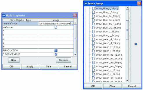
In the Node Properties dialog, the Node Depth or Type
column lists the available nodes. The first two rows,
non-leaf node and leaf node, indicate the default settings: non-leaf
nodes in the tree use a folder image and leaf nodes use a document image. To change the
default setting, click the
button in the Image column for the node and choose an icon from the Select Image
dialog.
The next five rows, numbered 0 - 4,
represent the node depth or level, zero (0) being the root node. The Image column lists the icons being
used for each node. By default, the Image column for all of those rows is
<blank>, indicating that the non-leaf node and leaf node icon
assignments are used. Icon assignments override non-leaf node and leaf node
assignments.
To map an image to a node level
You can assign an image icon based on node
level. The icon provides a visual indication of where you are while navigating
in the tree. To assign an image to a specific node level
in the tree, click the
button for one of the rows numbered 0 - 4 in the Image column and choose an icon from the Select Image
dialog. Repeat for each node level.
To map an image to a node type
You can assign an image icon based on node labels
you create that describe the nodes as a group. For example, in the following illustration the Node Depth or Type column
contains the string PRODUCTION with the
 image
selected, and the string DEVELOPMENT with the image
selected, and the string DEVELOPMENT with the
 image
selected. image
selected.
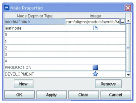
This means that all nodes whose label matches the PRODUCTION
string display the
image in the
tree, and all nodes whose label matches the DEVELOPMENT string display the
image in the
tree.
To assign an image to a specific node type
in the tree, assign a column name in the
nodeTypeColumnName
property. Select the nodeTypeProperties property in the property sheet, then
click on the
button to open the Node Properties dialog.
Click New to add a custom row to the table.
A drop-down list of values for the column assigned to the nodeTypeColumnName property appears in the Node Depth or Type
column. Select a column name from the drop-down list. Click the
button in the Image column and choose an icon (to use for all nodes that
have that column name in the valueTable row that corresponds to the node) from the Select Image
dialog.
You can also type a string in
the Node Depth or Type column and the Image column.
To not use an icon, in the Node Properties
dialog, select the icon in the Image
column, then click Clear.
NOTE: The root node is invisible if the rootNodeLabel property is blank.
See the
Summary of logic
for details about how the type icon is determined.
For details about creating an application with
multiple panels, see
Multiple Display Panels.
Status Icon
Status icons indicate the current state of a
node. You can configure the status icon to propagate the status of a child node
up the tree to its ancestors. The status icon shown for an ancestor node
corresponds to the current highest status priority of all of its descendants.
The status icon for a node is determined by the
discrete value of a specified column in the valueTable.
The values can be strings or numbers. The comparison is done for an exact match.
If the current status value for a tree node does not match any of the values you
specify in the nodeStatusProperties property, no status icon is displayed
for that node.
By default, the status icon appears on the left
of the node label. The value, Left or Right, is specified in the
nodeStatusIconPos property. If a node has both a type icon and a
status icon, the type icon always appears to the left of the status icon. By default, no
status icons appear in the tree.
This section describes how to configure type icons using the Node Properties dialog. NOTE: You can also configure
status icons by attaching the
nodeStatusProperties property
to
data. For details, see
Attaching an Icon To Data.
To configure the Status Icon
To configure the status icon, specify the status
table column name in the nodeStatusColumnName property, then use the nodeStatusProperties property to
define a three-column table of data and configure icon behavior. NOTE: The
nodeStatusProperties property is only visible if the nodeStatusColumnName property is non-blank.
Select the
nodeStatusProperties property in the property sheet, then click the  button to open the Node Properties dialog.
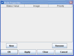
To map an image to a node status
Click New, then click in the
Status Value column. A drop-down list appears containing all values in the node status
column of the valueTable (which you previously specified in the nodeStatusColumnName
property). Select a value from the drop-down list.
Click the
button in the Image column for the node and choose an icon from the
Select Image dialog. The icon is used as the status icon for all nodes that
match the value selected in the Status column.
Click the
button in the Priority column for the node and assign a integer value: 0, 1, 2, 3, 4, 5,
or a higher number (there is no upper limit on the number), where the largest number
is the highest priority and propagated up the tree first, and a value of zero (0)
is not propagated. A value of zero (0) can be assigned to multiple nodes
(so that they do not propagate up the tree). Non-zero values must be assigned
only once.
For example, if we set the nodeStatusColumnName
property to our
Application Status table column of our valueTable, and define the mapping for
the nodeStatusProperties property
as
follows:
|
Status Value |
Image |
Priority |
|
blocked |
 |
2 |
|
running |
 |
1 |
The values in the
Application Status column of each row in the valueTable
is compared to the two values listed in the Status Value column (blocked
and running).
If the
Application Status value in one of the rows is blocked, the
status icon is displayed as the status icon for that row. If
there is no match (for example, the
Application Status value in one of the rows is unknown), no status
icon is
displayed in the tree node for that row.
Because
the
status icon is assigned the highest priority, the
status icon is always propagated up the tree first. If none of the rows has a
blocked
status, the
status icon is propagated up the tree.
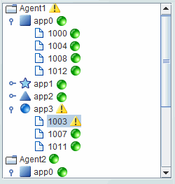
For example, in the following illustration the priority status of
a single node, app3/1003, is propagated up to its parent, app3,
and also to the top-level ancestor,
Agent1.
For details about creating an application with
multiple panels, see
Multiple Display Panels.
Background Properties
Specify how the background
is displayed in the tree control.
| Property
Name |
Description |
| bgColor |
Select the
button and choose a color from the palette to set the background color of the
tree control. |
Data Properties
Specify how data
is displayed in the tree control.
| Property
Name |
Description |
| nodeIdColumnName |
This property is available when the
valueTableFormat is Row-Node. With the Row-Node format there are two
table columns that define the tree structure: the nodeIdColumnName
property and the parentIdColumnName
property specify the two columns. The
nodeIdColumnName property specifies the table column containing the node
ID string. The node ID string must be unique among all nodes with the same
parent. Or, if the uniqueNodeIdFlag property is checked, each node ID
string must be unique in the entire tree. By default, the node ID string is used
as the node label in the tree. |
| nodeIndexColumnNames |
This property is available when the
valueTableFormat is Row-Leaf.
Specifies the path to a leaf node (that is, the ancestor nodes of the leaf).
When the valueTable property is attached
to the current table of an indexed RTView cache, the nodeIndexColumnNames
property is typically set to the same columns that are specified for the cache
index columns.
Enter a semicolon-separated list of column names, where the Nth column
name in the list contains the labels for tree nodes at depth N.
The labels for top-level nodes are defined by the
first column in the nodeIndexColumnNames property, the labels for the
second-level nodes are defined by the second column, and so forth.
For example:
AgentName;App
Name;PID
The labels for the top-level nodes are defined by
the AgentName column, the labels for the second-level nodes are defined
by the App Name column, and labels for the third-level nodes are defined
by the PID column.
To specify node labels from a different set of
valueTable columns, use the nodeLabelColumnNames property. |
| nodeLabelColumnName |
This property is available when the
valueTableFormat is Row-Node.
By
default, the node ID string is used as the node label in the tree. Use the
nodeLabelColumnName property to specify a different
valueTable
column to provide
the label. |
| nodeLabelColumnNames |
This property is available when the
valueTableFormat is Row-Leaf.
Use the
nodeLabelColumnNames property to specify a different
set of
valueTable
columns
to provide
node labels.
Enter a semicolon-separated list of column names, one for each level in the
tree,
where the Nth column name in the list contains the labels for tree nodes
at depth N. |
| nodeStatusColumnName |
This property applies to the status icon. Specifies the
name of the valueTable
column containing node
status values. The column specified populates the Node Properties
dialog Status Value column, in which you map node status values to image icons.
The icons are displayed for any node whose
value matches the value selected. |
| nodeTypeColumnName |
This property applies to the type icon. Specifies the
name of the valueTable
column containing values to use for mapping icon images to node types
in the tree. The column specified populates the list of available values in the Node Properties dialog Node Depth
or Type column, in which you map node types to image icons. The icons are
displayed for any node whose value matches the value selected. |
| parentIdColumnName |
This property is available when the
valueTableFormat is Row-Node. With the Row-Node format there are two
table columns that define the tree structure: the parentIdColumnName
property and the nodeIdColumnName
property specify the two columns. The
parentIdColumnName property specifies the table column containing the
parent node ID. |
| uniqueNodeIdFlag |
This property is available when the
valueTableFormat is Row-Node.
When enabled, specifies that each node ID string
must be unique in the entire tree. When disabled, specifies that each
node ID string must be unique among all nodes with the same parent. For
illustration, see uniqueNodeIdFlag example.
|
| valueColumnName |
Specifies the name of the column whose value is
assigned to the $value variable when a node in the tree is selected. If
not specified, the label string of the selected node is assigned to the $value
variable.
The $value variable is the only substitution that can be used in the
Display Name field of a drill-down command. |
| valueTable |
Attach your tabular input data to this property.
There are two valueTable format options,
each with their own requirements: Row-Leaf and Row-Node.
NOTE: As with other table-driven objects, the
drillDownColumnSubs property can be configured to set substitutions to
column values from the row in the valueTable that corresponds to the
selected tree node. |
| valueTableFormat |
Specifies the format of the valueTable:
Row-Leaf or Row-Node. |
| varToSet |
Allows you to update the attached variable with
the value from the control. |
Interaction Properties
Specify interactions in the tree control.
| Property
Name |
Description |
| actionCommand |
Use the
actionCommand property to assign a command to the tree. You
can configure the tree to open a drill-down
display, set substitutions, or execute a command in response to a user click on
a tree node.
The actionCommand can reference the value
from the tree by using the keyword $value.
When the command is executed, the variable
attached to varToSet is updated with the selected node data.
The drillDownColumnSubs property can be
configured to set substitutions to column values from the row in the
valueTable that corresponds to the selected tree node.
If the execOnLeafOnlyFlag property is
checked, the tree actionCommand property executes only when a leaf node
is clicked (a click on a non-leaf node expands only the node). If unchecked, the
tree actionCommand property executes on all nodes, not just the leaf.
|
|
commandCloseWindowOnSuccess |
If selected, the
window that initiates a system command will automatically close when the system
command is executed successfully. This
property only applies to system commands.
With data source commands, the window is closed
whether or not the command is executed successfully.
For multiple commands, this property is applied
to each command individually. Therefore if the first command in the multiple
command sequence succeeds, the window will close before the rest of the commands
are executed.
NOTE: The commandCloseWindowOnSuccess
property is not supported in the Display Server. |
|
commandConfirm |
If selected, the
command confirmation dialog is enabled. Use the commandConfirmText
property to write your own text for the confirmation dialog, otherwise text from
the command property will be used. For
multiple commands, if you Confirm the execution then all individual commands
will be executed in sequence with no further confirmation. If the you Cancel the
execution, none of the commands in the sequence will executed. |
|
commandConfirmText |
Enter command
confirmation text directly in the Property Value field or select the
button to open the Edit commandConfirmText dialog. If
commandConfirmText is not specified, then
text from the command property will be used. |
|
drillDownColumnSubs |
Use the
drillDownColumnSubs property to set substitutions to
column values from the row in the valueTable that corresponds to the
selected tree node. Select the
button to open the Drill Down Column
Substitutions dialog to customize which substitutions are passed
into drill-down displays. |
|
enabledFlag |
If
unchecked, the tree nodes are the color gray and do not respond to user input.
|
|
execOnLeafOnlyFlag |
If checked, the tree
actionCommand is executed only for leaf nodes, and a click
on a non-leaf node only expands the node. Also, the mouseover tooltip only
appears for leaf nodes.
If unchecked, the tree actionCommand property
executes on all nodes, and the mouseover tooltip appears for all nodes. |
|
mouseOverFlag |
Specifies whether a
tooltip appears when the cursor is positioned over a node. The tooltip
shows the node path (the node label preceded by the labels of all of its
ancestors), the node status (if the nodeStatusColumnName property is
specified), and its value (if the valueColumnName property is specified).
|
| tabIndex |
Use the tabIndex
property to define the order in which the tree receives focus when
navigated from your keyboard. Initial focus is given to the object with the
smallest tabIndex value, from there the tabbing order proceeds in
ascending order. If multiple objects share the same tabIndex value,
initial focus and tabbing order are determined by the alpha-numeric order of the
table names. Tables with a tabIndex value of 0 are last in the
tabbing order.
NOTE: The tabIndex property does not apply to tables in
the Display Server, nor to objects that are disabled, invisible, or have a value
of less than 0. |
Label Properties
Specify the label in the tree control.
| Property
Name |
Description |
| labelTextColor |
Select the
button and choose a color from the palette to set the label text color. |
| labelTextFont |
Select font style of label text from the drop-down menu. |
| labelTextSize |
Set the height of the label text in pixels. |
Node Properties
Specify the node structure in the tree control.
| Property
Name |
Description |
| nodeStatusIconPos |
Specify the status icon position in the tree: Left or Right.
By default, the status icon appears on the left of the node label. If a node has both a
type icon and a
status icon, the type icon always appears to the left of the status icon. By default, no
status icons appear in the tree. |
|
nodeStatusProperties |
This property applies to the status icon. Specifies the status icon for a node.
By default, no status icon is displayed.
Select the
button to open the Node Properties
dialog and map images to values, and set the status priority order for
propagation up the tree.
NOTE: The
nodeStatusProperties
property is visible only if the
nodeStatusColumnName property is non-blank.
You can also use the
nodeStatusProperties property to attach a
status icon to data.
The
data attachment must be a three-column table.
Typically, a static XML file containing
the table is used. The first column must contain string values that match values
from the column in valueTable specified by the
nodeStatusColumnName
property. The second column must be the path to the .png, .gif, or
.jpg image. The third column must contain the non-negative integer
priority value.
NOTE: A static
XML file is only read once each time you run RTView. If you specify (or modify)
an XML source using the Application Options dialog, you may specify whether that
XML source is static. For details, see
Creating XML Sources.
|
| nodeTypeProperties |
This property applies to the type icon.
Specifies the type icon for a node. By default, non-leaf nodes in the tree use a
folder image and leaf nodes use a document image.
Select the
button to open the Node Properties
dialog to map images to nodes. Mapping can be based on the node depth in the
tree or the type of node.
You can also use the nodeTypeProperties property to
attach a type icon to data.
The
data attachment must be a two-column table.
Typically, a static XML file containing
the table is used. The first column must contain string values of _node
(for non-leaf nodes), _leaf (for leaf nodes), numeric values for depth,
or string values that match the node labels, or the values from the column in
valueTable specified by the
nodeTypeColumnName property. The second
column must be the path to the .png, .gif, or .jpg image.
The default assignments are _node, rtvTreeNode16.png and _leaf,
rtvTreeLeaf16.png. The column names are not important.
Logic for
determining which type icon is used:
If the nodeTypeColumnName
property specifies column C, and the value of
C in the valueTable row that corresponds to N is V, and there is a row in
nodeTypeProperties that assigns value V to image I1, I1 is used as the
type icon for N. Otherwise:
- if the label of node N is XYZ, and there is a row in
the
nodeTypeProperties property that assigns value XYZ to image I2,
I2 is used. Otherwise,
- if the depth of node N is D, and there is a row in
the
nodeTypeProperties property that assigns depth D to image I3, I2 is used.
Otherwise,
- if N is a leaf, and the leaf node image is
I4, I4 is used. If I4
is blank no type icon appears. Otherwise,
- if the non-leaf node image is I5, I5 is used. If
I5 is blank
no type icon appears.
NOTE: A static
XML file is only read once each time you run RTView. If you specify (or modify)
an XML source using the Application Options dialog, you may specify whether that
XML source is static. For details, see
Creating XML Sources. |
| rootNodeLabel |
Specify whether the tree root node is visible.
By default, this property is blank and the root node is not visible. |
Object Properties
Specify the layout in the tree control.
| Property
Name |
Description |
| anchor |
Specify where to
anchor an object in the display. NOTE: If an object has the dock property
set, the anchor property will be ignored.
The anchor property is only applied when the
dimensions of the display are modified, either by editing
Background Properties or resizing the window in
Layout mode
Select None, or one or more the following
options:
| None
|
Object
not anchored. This is the default. |
| Top |
Anchor
top of object at top of display. |
| Left |
Anchor
left side of object at left of display. |
| Bottom |
Anchor
bottom of object at bottom of display. |
| Right |
Anchor
right side of object at right of display. |
When a display is resized, the number of pixels
between an anchored object and the specified location remain constant. If an
object is anchored on opposite sides (i.e. Top and Bottom or
Left and Right), the object will be stretched to fill the available
space. NOTE: If the Resize Mode is set to Scale and an
object is anchored on opposite sides, then the object with be moved rather than
stretched to fill the available space. |
| dock |
Specify the docking
location of an object in the display. NOTE: An object should not be docked if
the Resize Mode is set to Scale.
Select from the following options:
| None
|
Object
is not docked. This is the default. |
| Top |
Dock
object at top of display. |
| Left |
Dock
object at left of display. |
| Bottom |
Dock
object at bottom of display. |
| Right |
Dock
object at right of display. |
| Fill |
Dock
object in available space remaining in the display after all docked objects
are positioned. |
If the dimensions of the display are modified,
either by editing Background Properties or
resizing the window in Layout mode, the
properties (objX, objY, objWidth and objHeight) of
docked objects will automatically adapt to match the new size of the display.
When multiple objects are docked to the same side
of the display, the first object is docked against the side of the display, the
next object is docked against the edge of the first object, and so on.
When objects are docked to multiple sides of the
display, the order in which objects were added to the display controls docking
position. For example, let's say the first object added to the display is docked
at the Top and the second object is docked at the Left.
Consequently, the first object will fill the entire width of the display and the
second object will fill the left side of the display from the bottom of the
first object to the bottom of the display.
Objects in a display have the dock property set
to Fill, are laid out across a grid in the available space remaining
after all docked objects are positioned. By default, the grid has one row and as
many columns as there are objects in the display. You can modify the grid in the
Background Properties dialog.
Once an object is docked, there are some
limitations on how that object can be modified.
- Docked objects cannot be dragged or
repositioned using objX and objY properties.
- Docked objects cannot be resized using the
objWidth or objHeight properties. To resize you must drag on the
resize handle.
- Docked objects can only be resized toward the
center of the display (e.g. If an object is docked at the Top, only its
height can be increased by dragging down toward the center of the display).
- Docked objects set to Fill cannot be
resized at all.
- Docked objects cannot be moved using Align.
Non-docked objects can be aligned against a docked object, but a docked object
will not move to align against another object.
- Docked objects are ignored by Distribute.
|
| objHeight |
This property is read only. It shows the height
in pixels of the object which is set by the height of the tree display. |
| objName |
Name given to facilitate object management via
the Object List dialog. Select Tools>Object List. |
| objWidth |
This property is read only. It shows the width
in pixels of the object which is set by the width of the tree display. |
| objX |
Set the x position of the object. |
| objY |
Set the y position of the object. |
| styleClass |
Enter the style class name for this object as
defined in your style sheet.
If not specified, the object class name is used. NOTE: The value entered
must not contain spaces and cannot start with rtv-. |
| visFlag |
Set the visibility of the object. |
Unique Behavior
The following describes properties that behave
uniquely with the tree control.
- valueColumnName: This property specifies the name of the column whose value
should be assigned to the $value variable when a node in the tree is
clicked. If not specified, the label string of the selected node is
assigned to $value. Note the $value is the only substitution that can be used in
the Display Name field of a drill-down command.
- mouseOverFlag: If this property is checked, a tooltip appears when the cursor is
positioned over a leaf node. The tooltip shows the node path (the node label preceded by the labels of all of its ancestors), the node status (if
the nodeStatusColumnName property is specified), and its value (if
the valueColumnName property is
specified).
- execOnLeafOnlyFlag: If this property is checked, the tree
actionCommand property executes only when a leaf node is clicked (a click on a
non-leaf node expands only the node). If unchecked, the tree
actionCommand property executes on all nodes, not just the leaf.
- rootNodeLabel: This property
specifies the tree root node (of which there is only one). By default, this property is blank
and the root node is not visible.
Limitations
In the Display Viewer, mouseover text is displayed only if the tree has focus.
In the
Thin Client:
- The tree node appearance, such as spacing
and fonts, might vary
slightly as compared to the Display Viewer, and also may vary slightly between different
browsers.
- A tree node cannot expand/collapse by double-clicking
on it. The +/- icon must be clicked.
- In Internet Explorer, nodes expand/collapse
even if the tree enabledFlag property
is unchecked. (However, the tree actionCommand cannot be invoked).
- In Mozilla Firefox, the horizontal scrollbar
might appear and disappear after each mouse
click in the tree.
- In iOS Safari (iPad), if the tree mouseOverFlag
property is checked, a user must click a tree node twice to invoke the tree
command. The first click only displays the node mouseover text.
- In iOS Safari (iPad), scrollbars will not
appear in a tree control. If the tree contains more nodes than are visible,
use a two-finger drag gesture inside the tree area to scroll.
- In iOS Safari, a click on the +/- icon expands/collapses the node as
expected. However, if the execOnLeafOnlyFlag property is unchecked, the
tree command is also executed.
|