Enterprise RTView® 
User Guide


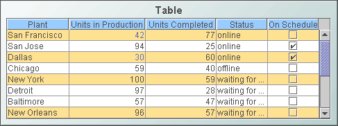
Standard Table
Display your data in a standard table (class name: obj_table02) by attaching it to the valueTable property. In a standard table, data returned is displayed in a series of rows and columns. Row names and column headers depend on your data attachment. If the table is not large enough to display all of the data, scroll bars are automatically added. 

To copy data to the system clipboard so that it can be pasted into another application (e.g., Microsoft Excel), right-click and select Copy Table Values or Copy Cell Value. To add or remove rows and columns, or edit the value of existing cells to easily update data throughout the enterprise, see the Table Edits section for information.


Alert Properties
Use the value of individual columns, rows and cells to set font color, background color, row visibility or replace a cell value with an image. In the Object Properties window double-click on filterProperties in the Property Name field, or s
elect the  button to open the Filter Properties dialog.

Background Properties
Specify how the background is displayed in a table.
 
Property Name Description
bgBorderColor Select the  button and choose from the palette to set the color of the edge on the background rectangle. This property is only applicable if bgBorderFlag is selected.
bgBorderFlag If selected, a border is drawn around the background rectangle,
bgColor Select the  button and choose from the palette to set the background color of the table. 
bgEdgeWidth Set the width of the 3D edge on the background rectangle. This property is only available if the bgStyle selected is 3D Rectangle.
bgGradientColor2 Select the  button and choose a color for the second color in the gradient. Default is white. NOTE: The bgColor property sets the first color in the gradient.
bgGradientMode Display a gradient in the background rectangle. Select from the following options:
 
  None No gradient
  Diagonal Edge Gradient is drawn at a 45 degree angle from the top left to the bottom right corner of the object.
  Diagonal Center Gradient is drawn at a 45 degree angle from the center to the top left and the bottom right corners of the object.
  Horizontal Edge Gradient is drawn horizontally from the top to the bottom of the object.
  Horizontal Center Gradient is drawn horizontally from the center to the top and bottom of the object.
  Vertical Edge Gradient is drawn vertically from the left to the right of the object.
  Vertical Center Gradient is drawn vertically from the center to the left and right of the object.
bgRaisedFlag Reverses the direction of the gradient, as well as that of the 3D edge if the bgStyle selected is 3D Rectangle.
bgRoundness Set the arc length of the rounded corners. This property is only available if the bgStyle selected is Round Rectangle.

NOTE: The value of bgRoundness cannot exceed half the value of the objWidth or the objHeight. If bgRoundness does exceed that value, then half (of the smaller of the two values) of objWidth or objHeight will be used instead. For example if objWidth is 100 and objHeight is 50, then the value of bgRoundness cannot exceed 25. If it does, then half the value of objHeight (25) will be used instead.

bgShadowFlag Select to display a drop shadow on the background rectangle.
bgStyle Choose one of  the following three options from the drop down menu:
 
Rectangle Select to display a background rectangle.
3D Rectangle Select to display a 3D edge on the background rectangle. If selected, use bgEdgeWidth to set the width of the 3D edge.
Round Rectangle Select to display a background rectangle with rounded edges. If selected, use bgRoundness to set the arc length of the rounded corners.
bgVisFlag Select to display the background rectangle.
borderPixels Set the amount of space (in pixels) between the table and the border.
tableBgColor Select the  button and choose from the palette to set the color of empty space in the table area.

Cell Properties
Property Name Description
cellBgColor Select the  button and choose from the palette to set the background color of the cells.
cellBgStripeContrast Set the contrast level for alternating row colors. NOTE: This property is only applicable if cellBgStripedFlag is selected.
cellBgStripedFlag Select to display alternating row colors.
cellTextColor Select the  button and choose from the palette to set the color of the cell text.
cellTextFont Select a font for the cell text.
cellTextSize Specify (in pixels) the size of the cell text or enter -1 to use the default size.

Column Properties
To specify the alignment of a column, select the ellipsis button in the columnAlignment property. Select the alignment from the drop down menu in the Alignment column: Default, Left, Center or Right. The default setting depends on the type of column.
To hide a column, select the ellipsis button  in the columnsToHide property and select the checkbox under Hide Column.

To specify numerical or date formats for columns, select the ellipsis button in the columnFormat property. Select the format from the drop down menu in the Column Format column.

If the columnResizeEnabledFlag is selected, table columns can be resized by dragging the vertical separators between the column headers. The columnResizeEnabledFlag cannot be toggled in the Display Server.

Use the indexColumns property to maintain the highlight of selected rows after data updates or table sorts are executed. Specify the name of one or more columns that contain data to uniquely identify a row. Selected rows then remain highlighted even if the order or number of rows in the table changes.

Row Header Properties
To lock the first column in a table, select the rowHeaderEnabledFlag property. The rowHeaderEnabledFlag cannot be toggled in the Display Server. When enabled, you can set the appearance of the row header column using the rowHeaderBgColor, rowHeaderTextColor, rowHeaderTextFont, and rowHeaderTextSize properties. The rowHeaderFilterColorsEnabledFlag property sets whether the row filter colors are applied to the row header.  Row visibility filters are applied to the row header regardless of the rowHeaderFilterColorsEnabledFlag setting. Resize the row header column by selecting the ellipsis button  in the columnProperties property. The row header column cannot be hidden using the columnsToHide property and a warning message is displayed if this is attempted.

Interaction Properties
Select Never, As Needed, or Always from the scrollbarMode property to set the behavior of the scroll bar in the table.

To specify a drill down target for the table, double-click on the drillDownTarget property in the Object Properties window. Based on your data attachment, preset substitutions are created automatically and passed into your drill down display. To customize which substitutions will be passed into drill down displays, in the Object Properties window double-click on drillDownColumnSubs in the Property Name field.

Use drillDownSelectMode to control how a drill down display is activated. Set to Anywhere to activate a drill down display by double-clicking anywhere on the table. Set to Element Only to enable a drill down display only when you double-click on a cell in a table. NOTE: If drillDownSelectMode is set to Element Only, a drill down display can not be activated by double-clicking in the row label column, since this column does not correspond to an actual data column in the tabular data.

Use the multiSelectFlag property to enable the selection of multiple rows. When the user selects multiple rows and drills down, the drill down substitution values contain a semi colon delimited list of values, one value for each row that can be used with most data sources in the Filter Value field of the Attach To Data dialog.

The tabIndex property allows you to define the order in which table and control objects will receive focus when navigated from your keyboard. Initial focus is given to the object with the smallest tabIndex value, from there the tabbing order proceeds in ascending order. If multiple objects share the same tabIndex value, then initial focus and tabbing order are determined by the alpha-numeric order of the table names. Tables with a tabIndex value of 0 are last in the tabbing order. NOTE: The tabIndex property does not apply to tables in the Display Server or to objects that are disabled, invisible, or have a value of less than 0.

Sort Properties
Select the showSortIconFlag checkbox to enable column sorting. To sort a table by a specific column, click on the column header.  To reverse the sort order, click on the column header again.  To clear the sort, click on the empty column header at the top left of the table or delete the Property Value of sortColumnName in the Object Properties window. NOTE: Sorting is disabled if the sort icon is not visible in the column header.


Enterprise RTView contains components licensed under the Apache License Version 2.0.


Treemap Algorithms v1.0  is used without modifications and licensed by MPL Version 1.1. Copyright © 2001 University of Maryland, College Park, MD


Datejs is licensed under MIT. Copyright © Coolite Inc.


JCalendar 1.3.2 is licensed under LGPL. Copyright © Kai Toedter.


jQuery is licensed under MIT. Copyright © John Resig,

 
JMS, JMX and Java are trademarks or registered trademarks of Sun Microsystems, Inc. in the United States and other countries. They are mentioned in this document for identification purposes only. 

 
SL, SL-GMS, GMS, Enterprise RTView, SL Corporation, and the SL logo are trademarks or registered trademarks of Sherrill-Lubinski Corporation in the United States and other countries. Copyright © 1998-2011 Sherrill-Lubinski Corporation. All Rights Reserved.