Table
Objects
The Object Palette features
three table objects--standard table, rotated table and object grid--that
offer the ability to display large amounts of data. While most objects
are driven by a single variable, table objects are driven by one or two
dimensional arrays of data. Table objects are designed to display all the
information returned by a tabular element in your data attachment. The necessary number of columns and rows
are automatically created. Preset substitutions
are created based on your data attachment as well, which are passed into drill down displays.
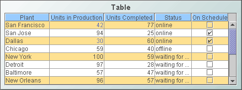
Standard Table (class
name: obj_table02)
Display your data in a
standard table
by attaching it to the valueTable property. In a standard table, data
returned is displayed in a series of rows and columns. Row names and column
headers depend on your data attachment. If the table is not large enough
to display all of the data, scroll bars are automatically added.
To copy data to the system
clipboard so that it can be pasted into another application (e.g., Microsoft
Excel), right-click and select Copy Table Values or Copy Cell
Value. To add or
remove rows and columns, or edit the value of existing cells to easily update
data throughout the enterprise, see the Table
Edits section for information.
Alert Properties
Use the value of individual
columns, rows and cells to set font color, background color, row visibility
or replace a cell value with an image. In the
Object Properties window double-click on filterProperties
in the Property Name field.
Background Properties
Specify how the background
is displayed in a table.
Cell Properties
Select the ellipsis button
 in the cellBgColor property to set the background color of
the cells. Use the cellBgStripedFlag to set alternating striped
rows. Select the ellipsis button
in the cellTextColor property to set the text color of the
cells. Select the desired font in the cellTextFont property. Set
the size of the cell text (in points) in the cellTextSize property.
Include a new line character (\n) in the cell text to display multi-line
text.
in the cellBgColor property to set the background color of
the cells. Use the cellBgStripedFlag to set alternating striped
rows. Select the ellipsis button
in the cellTextColor property to set the text color of the
cells. Select the desired font in the cellTextFont property. Set
the size of the cell text (in points) in the cellTextSize property.
Include a new line character (\n) in the cell text to display multi-line
text.
Column Properties
To specify the alignment of a column,
select the ellipsis button
in the columnAlignment property. Select the alignment from
the drop down menu in the Alignment column: Default, Left,
Center
or Right. The default setting depends on the type of column.
To hide a column, select
the ellipsis button
in the columnsToHide
property and select the checkbox under Hide Column.
To specify numerical or date formats
for columns, select the ellipsis button
in the columnFormat property.
Select the format from the drop down menu in the Column Format column.
If the columnResizeEnabledFlag is
selected, table columns can be resized by dragging the vertical separators
between the column headers. The columnResizeEnabledFlag cannot be toggled
in the Display Server. Use the
indexColumns property to maintain
the highlight of selected rows after data updates or table sorts are executed.
Specify the name of one
or more columns that contain data to uniquely identify a row. Selected rows then remain highlighted even if the
order or number of rows in the table changes. Row Header Properties
To lock the first column
in a table, select the rowHeaderEnabledFlag property. The rowHeaderEnabledFlag
cannot
be toggled in the Display Server. When enabled, you can set the
appearance of the row header column using the rowHeaderBgColor,
rowHeaderTextColor,
rowHeaderTextFont,
and rowHeaderTextSize properties. The rowHeaderFilterColorsEnabledFlag
property sets whether the row filter colors are applied to the row header.
Row visibility filters are applied to the row header regardless of the
rowHeaderFilterColorsEnabledFlag
setting.
Resize the row header column by selecting the ellipsis button
in the columnProperties property.
The row header column cannot be hidden using the columnsToHide property
and a warning message is displayed if this is attempted.
Interaction Properties
Select Never, As Needed,
or Always from the scrollbarMode property to set the behavior
of the scroll bar in the table.
To specify a drill
down target for the table, double-click on the
drillDownTarget
property in the Object Properties window. Based on your data attachment, preset substitutions
are created automatically and passed into your drill down display. To customize
which substitutions will be passed into drill down displays, in the Object
Properties window double-click on drillDownColumnSubs
in the Property Name field.
Use drillDownSelectMode to control
how a drill down display is activated. Set to Anywhere to activate
a drill down display by double-clicking anywhere on the table. Set to Element
Only to enable a drill down display only when you double-click on a
cell in a table. NOTE: If drillDownSelectMode is set to Element
Only, a drill down display can not be activated by double-clicking
in the row label column, since this column does not correspond to an actual
data column in the tabular data.
Use the
multiSelectFlag property to enable
the selection of multiple rows. When the user selects
multiple rows and drills down, the drill down substitution values contain a semi colon delimited
list of values, one value for each row that can be
used with most data sources in the Filter Value field of the Attach To Data
dialog.
The tabIndex property allows you to
define the order in which table and control objects will receive focus when
navigated from your keyboard. Initial focus is given to the object with the
smallest tabIndex value, from there the tabbing order proceeds in
ascending order. If multiple objects share the same tabIndex value, then
initial focus and tabbing order are determined by the alpha-numeric order of the
table names. Tables with a tabIndex value of 0 are last in the tabbing
order. NOTE: The tabIndex property does not apply to tables in the
Display Server or to objects that are disabled, invisible, or have a value of
less than 0. Sort
Properties
Select the showSortIconFlag
checkbox to enable column sorting. To sort a table by a specific column,
click on the column header.  To reverse the sort order, click on the column header again.
  To clear the sort, click on the empty column header at the top left of
the table or delete the Property Value of sortColumnName
in the
Object Properties window. NOTE: Sorting is disabled if the sort icon is
not visible in the column header.
To clear the sort, click on the empty column header at the top left of
the table or delete the Property Value of sortColumnName
in the
Object Properties window. NOTE: Sorting is disabled if the sort icon is
not visible in the column header.
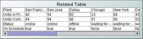
Rotated Table (class name:
obj_table03)
Display your data in a
rotated table
by attaching it to the valueTable property. The rotated table is a standard
table in which the rows and columns have been flipped. Row names are assigned
the name of the column displayed in that row.
Background Properties
Specify how the background
is displayed in a table.
Column Properties
To resize a column in a
rotated table, you must specify the size of each column. Select
the ellipsis button
in the columnProperties
property and enter a width for each column.
Interaction Properties
To specify a drill
down target for the table, double-click on the
drillDownTarget
property in the Object Properties window. Based on your data attachment, preset substitutions
are created automatically and passed into your drill down display.
To customize
which substitutions will be passed into drill down displays, in the Object
Properties window double-click on drillDownColumnSubs
in the Property Name field.
Use drillDownSelectMode to control
how a drill down display is activated. Set to Anywhere to activate
a drill down display by double-clicking anywhere on the table. Set to Element
Only to enable a drill down display only when you double-click on a
cell in a table.
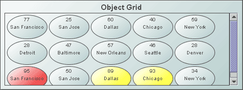
Object Grid Table (class name:
obj_objectgrid)
Display your data in an
object grid
by attaching it to the valueTable
property. An object grid displays returned data as multiple objects,
called icon objects, in a scrollable grid. Each icon object in the
grid is analogous to a row of data in the standard table. Icon objects display the data
using graphic attributes (e.g., color, dimension,
orientation, etc.).
The default icon object displayed in the object grid is obj_circ2d_ilvx_ra4 (shown
below).
Any object that appears in the
Object Palette (with the exception of tables and graphs)
can be used as an icon object. To specify which object to use in the object grid, in the Object
Properties window, double-click on iconProperties
in the Icon category.
Background Properties
Specify how the background
is displayed in the object grid.
Foreground Properties
| Property
Name |
Description |
| fgColor |
Set the color of the space between the objects. Select the
button and choose a color from the
palette. |
| fgGradientColor2 |
Select the
button and choose a color for the second
color in the gradient. Default is white. NOTE: The fgColor property sets
the first color in the gradient. |
| fgGradientMode |
Display a gradient
in the space between the objects. Select from the following options:
| |
None |
No gradient |
| |
Diagonal Edge |
Gradient is drawn
at a 45 degree angle from the top left to the bottom right corner of the
object. |
| |
Diagonal Center |
Gradient is drawn
at a 45 degree angle from the center to the top left and the bottom right
corners of the object. |
| |
Horizontal Edge |
Gradient is drawn
horizontally from the top to the bottom of the object. |
| |
Horizontal Top |
Gradient is drawn
horizontally from the center to the top and bottom of the object. |
| |
Vertical Edge |
Gradient is drawn
vertically from the left to the right of the object. |
| |
Vertical Center |
Gradient is drawn
vertically from the center to the left and right of the object. |
|
Sort
Properties
To sort the object grid
by a column from the data attachment, enter the name of that column as
the Property Value for sortColumnName in the Object Properties window.
The column used to sort the object grid must be also be entered as a Property
Value for iconProperties (e.g., PERCENTCOMPLETED).
Interaction Properties
To specify a drill
down target for the table, double-click on the drillDownTarget
property in the Object Properties window. Based on your data attachment, preset substitutions
are created automatically and passed into your drill down display. To customize
which substitutions will be passed into drill down displays, in the Object
Properties window double-click on drillDownColumnSubs
in the Property Name field.
Use drillDownSelectMode to control
how a drill down display is activated. Set to Anywhere to activate
a drill down display by double-clicking anywhere on the object grid. Set
to Element Only to enable a drill down display only when you double-click
on an object in the grid.
|