 , choose the date and time, then click OK.
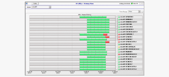
 View historical performance data over time for all URLs in one or all Robots in a status history object. This display also shows the current and historical alert status of the URLs. Each row in the status history object is a different URL. Each column represents a time period. A darker color indicates heavier usage, a lighter color indicates lighter usage.
Use this display to monitor URL performance identify whether URLs encounter alerts during certain periods of time. Observe utilization trends for your entire system. Analyze load distribution, check for bottlenecks and identify URLs with high usage. You can also answer questions such as, Is the web page using what I expect? Is the system using it across URLs in a uniform scale? If there is an issue, mouse-over the heatmap to see when the issue started, what behavior preceded it, and the name of the resource.
Choose one or All Robots from the Robot drop-down menu to filter display data. Change the Time Range to “zoom in” on the graph and see more detail or “zoom out” from the graph to see larger trends over time. To change the time range click Open Calendar , choose the date and time, then click OK.
Drill-down and investigate by clicking a row in the table to view details for the URL in the URL Summary display.
|
Title Bar: Indicators and functionality might include the following: |
||||
|
|
|
|||
|
Color Code: Row color indicates the following: |
|
|
|
|
|
Time Range |
Select a time range from the drop down menu varying from 2 Minutes to Last 7 Days, or display All Data. By default, the time range end point is the current time. 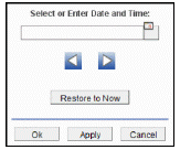
To change the time range for the graph, click Open Calendar Use the navigation arrows Click Restore to Now to reset the time range end point to the current time. |
|


 Open the online help page for this display.
  Red indicates that one or more alerts exceeded their ALARM LEVEL threshold in the row.
 Yellow indicates that one or more alerts exceeded their WARNING LEVEL threshold in the row.
 Green indicates that no alerts exceeded their WARNING or ALARM LEVEL threshold in the row.
 to move forward or backward one time period. NOTE: The time period is determined by your selection from the Time Range drop-down menu.